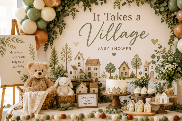
Pink Winter Wonderland Baby Shower Ideas
Baby Shower · Pink Winter Wonderland · Theme Guide
Pink Winter Wonderland Baby Shower Ideas
The rose gold and blush palette rules, a faux fur table direction, and two snowflake variations for the most feminine and most luminous winter baby shower.
The pink winter wonderland baby shower is the intersection of two aesthetic registers that might seem unlikely to belong together — the cool, luminous world of a frost-touched winter landscape and the warm femininity of blush and rose gold — and the reason it works so beautifully is that neither register dominates the other. Soft white provides the winter ground; blush provides the femininity; rose gold bridges them with a warmth that is simultaneously metallic and pink. When any one of these three elements is replaced by a stronger version of itself — bright pink instead of blush, bright silver instead of rose gold, a saturated palette without white — the specific quality of ‘pink winter wonderland’ disappears and what remains is either a pink shower or a winter shower, but not the magical combination of both.
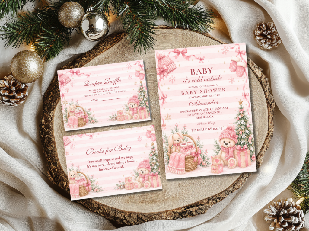
Browse the Pink Winter Wonderland collection — blush and rose gold stationery in the most feminine and most luminous winter baby shower direction.
“Pink winter wonderland is where the magic of a frosted world meets the warmth of the most feminine celebration — blush and rose gold against soft white and silver, as if the snowflakes themselves decided to be pink.”
Section 01 The Pink Winter Wonderland Palette Rule
Three decisions determine whether a pink winter wonderland shower reads as the specific and beautiful direction it is or collapses into either a generic pink shower or a generic winter shower. All three concern how the pink and the winter elements relate to each other rather than to the room.
Rose gold over silver. The metallic tone is the element that most determines whether a winter wonderland palette reads as specifically pink or simply as winter with some pink added. Pure silver — the cool, grey-toned metallic of classic winter wonderland — reads as winter and gender-neutral; it does not shift the palette toward pink. Rose gold — the warm, pink-toned metallic — shifts the entire palette toward femininity through its specific warmth without adding any additional pink element. Every metallic detail in a pink winter wonderland shower should lean toward rose gold rather than toward silver: the candle holders, the balloon arch metallic accents, the ornament details in the centrepiece, the foil elements in the stationery. Where silver appears alongside rose gold — a mix of silver and rose gold ornament balls in the centrepiece, for example — the rose gold should be the dominant metallic and the silver the supporting accent.
Blush, not hot pink. The specific pink tone that works in the winter wonderland aesthetic is blush — the soft, slightly luminous pink that reads as simultaneously warm and delicate. Hot pink, bright pink, or saturated rose all break the ethereal atmosphere of the winter palette immediately: they are too vivid to coexist with soft white and rose gold without dominating both. Blush has a quality that no brighter pink possesses: when placed beside white, it appears to glow rather than to contrast. This quality is what produces the ‘pink snowflake’ visual impression — the sense that the pink is part of the winter world rather than applied to it. Dusty rose can work as a supporting accent in small quantities, but it should not replace blush as the primary pink tone, which tends to read as heavier and less luminous than blush in this context.
White as the base, not pink. The wonderland quality of this direction depends on soft white being the primary ground — the tablecloth, the balloon arch base tone, the invitation card ground, the faux fur runner — with blush and rose gold as the accent tones placed against that white. A palette that reverses this proportion — a primarily pink room with white and rose gold accents — loses the winter register entirely and reads as a pink shower with some winter detail rather than as a winter wonderland with feminine colouring. The soft white is what makes the blush glow; the blush is what makes the white read as warm rather than clinical; and the rose gold is what ties both together into a palette that reads as neither winter nor pink but as the specific magical combination of both.
❄ Styling Tip
The pink winter wonderland test: hold your blush element beside a white snowflake ornament and a rose gold detail. If all three look like they belong to the same magical world — the blush appears soft and luminous, not vivid or saturated — you have the correct palette. If the pink looks bright beside the white — if there is visual competition between them rather than harmony — it is too saturated and will dominate rather than contribute to the ethereal winter register.
The Pink Winter Wonderland collection — blush and rose gold stationery for the primary pink winter wonderland direction.
Section 02 Decor, Cake & Table
The pink winter wonderland table applies the palette rules at every surface layer simultaneously, with the faux fur runner as the hero texture element that produces the direction’s specific atmospheric quality.
Centrepiece: A low white and blush floral arrangement — white spray roses, blush garden roses, or white ranunculus as the primary floral elements — in a clear glass or rose gold vessel, with a cluster of rose gold and silver ornament balls at the arrangement’s base as the metallic texture layer. Slim rose gold or warm gold taper candles in slender holders at the arrangement’s flanks, rising above the florals. Two or three small white or blush snowflake ornaments woven into the floral arrangement at its upper edge — the snowflake motif present in the centrepiece at a delicate scale, as a design detail rather than as the arrangement’s hero element. The arrangement should be low enough that guests across the table can see each other; the candle height provides the vertical element without blocking sight lines.
Faux fur runner and linen: A faux fur runner in soft white or the palest blush across the table’s length is the single most impactful pink winter wonderland table element. The faux fur provides the direction’s hero texture layer — the surface quality that transforms the table from a well-decorated surface into an atmospheric winter world — and its soft white or blush tone sits within the palette without introducing a competing colour. Beneath the faux fur runner, a plain white or soft ivory tablecloth. Blush linen napkins at each setting, folded simply with a small sprig of dried lavender or a single white snowflake ornament as the per-seat personal detail. Rose gold or warm gold cutlery, or standard cutlery in rose gold napkin rings, carries the rose gold metallic tone to the individual place setting.
Balloon arch: An organic asymmetric balloon arch in soft white, blush, and rose gold — with white as the dominant volume (approximately half the balloons), blush as the second volume (approximately a third), and rose gold metallic balloons as the accent (the remaining fifth) — provides the backdrop’s hero element. Matte white and matte blush balloons rather than latex-shiny where available — matte surfaces photograph as more ethereal and more elegant than glossy. Small white snowflake ornament details woven into the arch at intervals as the winter motif. No silver metallic balloons in the arch: silver reads as winter not pink winter wonderland; rose gold reads as pink winter wonderland.
Cake: A smooth or lightly textured white buttercream cake with a single blush snowflake topper — delicate, small-scale, in a fine-detail cut or sugar-craft style — and rose gold leaf at the tier divide. Blush floral sugar details or fresh blush blooms at the tier base as the floral colour element. The cake board in rose gold rather than white. The snowflake motif appears once, at the top tier’s topper, in a delicate scale rather than as a large graphic element. The buttercream should read as soft white or very pale blush rather than as saturated pink.
❄ Styling Tip
A faux fur table runner in blush or soft white is the single most impactful pink winter wonderland table detail — it adds the texture layer that makes the whole table read as magical and feminine simultaneously. It costs very little relative to its visual and atmospheric return, and it photographs beautifully in both natural and warm artificial light. It is the first pink winter wonderland table element to source and everything else should be built around it.
The Pink Winter Wonderland Collection — a curated selection of blush and rose gold stationery for the fully coordinated pink winter wonderland shower.
Section 03 Pink Winter Wonderland Variations
Two sub-directions apply the pink winter wonderland palette to different registers — one more joyful and whimsical, one more refined and elegant — for hosts who want a more specific interpretation of the direction.
3.1 Whimsical Pink Snowflake — Playful & Joyful
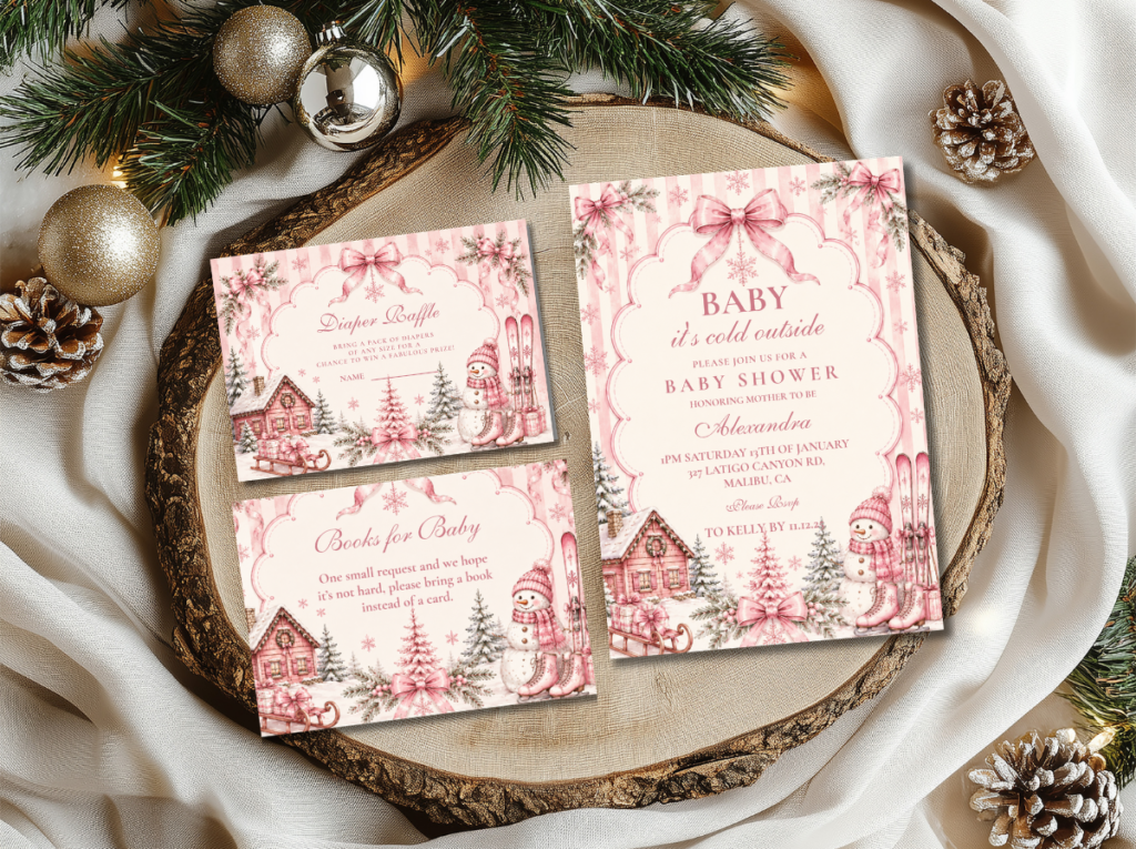
The Whimsical Pink Snowflake direction takes the pink winter wonderland palette into its most celebratory and most baby-specific register: soft pink and white with playful, slightly more prominent snowflake motifs that read as joyful rather than as refined. Where the primary pink winter wonderland direction is ethereal and restrained, Whimsical Pink Snowflake is warm and openly celebratory — the direction that reads as most specifically ‘this is a party for a baby arriving into winter’ rather than as a designed aesthetic statement.
The snowflake motifs in this direction are slightly larger and more prominent than in the primary or refined variations, but they should still be in a cute or fine-illustrated style rather than a bold graphic style. The palette leans slightly more pink than the primary direction — blush is more present, white slightly less dominant — while remaining within the blush-and-soft-pink register rather than crossing into bright or saturated pink.
Direction 3.1
Whimsical Pink Snowflake — Joyful & Baby-Specific
Soft pink and white with playful snowflake motifs in a joyful, baby-forward register — the most openly celebratory and most specifically baby-shower-appropriate direction within the pink winter wonderland family.
3.2 Pink Little Snowflake — Refined & Elegant
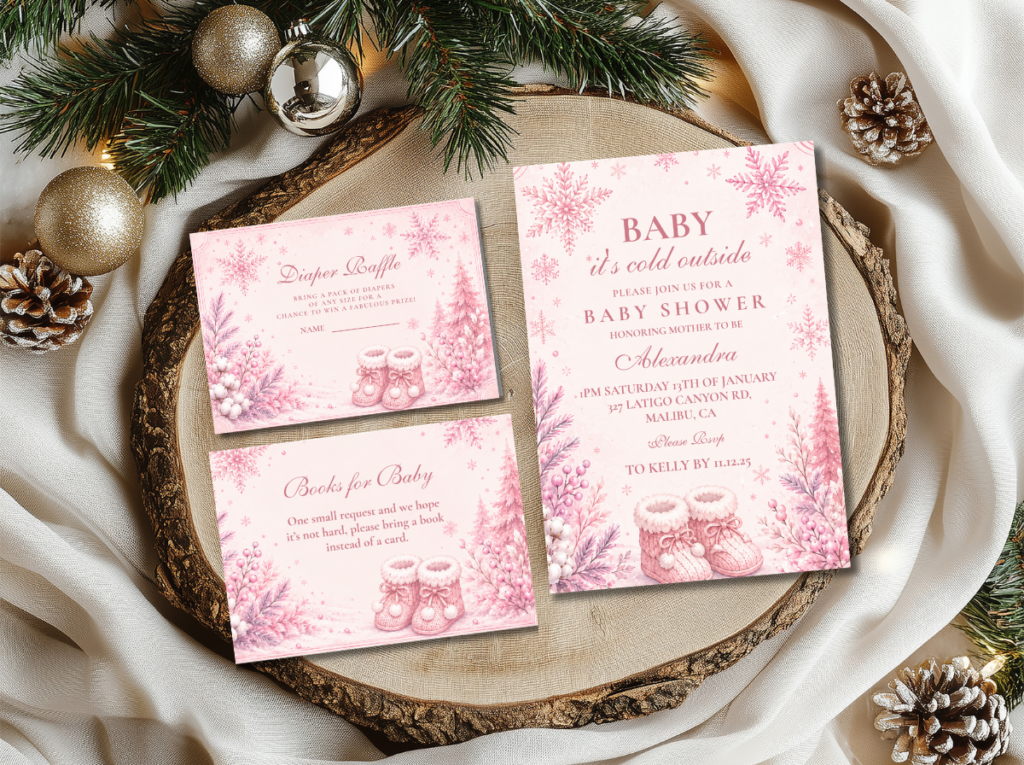
The Pink Little Snowflake direction takes the pink winter wonderland palette in the opposite direction — toward the most refined and the most jewellery-like interpretation of the snowflake motif. Pale blush and soft silver replace the slightly warmer blush and rose gold of the primary direction, producing a palette that reads as cool, luminous, and specifically delicate. The snowflake in this direction is the smallest available: a fine-detail, tiny-scale motif that reads as a hand-engraved decorative element rather than as a seasonal graphic.
This direction is appropriate for the most formally styled pink winter wonderland shower — a seated dinner format rather than a standing gathering, a smaller and more intimate guest list, and a stationery suite where every printed element reads as a collectible piece. The pale blush and silver combination produces a palette that is simultaneously the most specifically winter and the most specifically feminine of the four pink winter wonderland variations.
Direction 3.2
Pink Little Snowflake — Refined & Delicate
Pale blush and soft silver with fine-detail, jewellery-scale snowflake motifs — the most refined and most elegant direction within the pink winter wonderland family. Most appropriate for formal, intimate gatherings.
❄ Styling Tip
Snowflake motifs in the pink winter wonderland direction must be delicate in scale rather than bold and graphic. A large graphic snowflake reads as generic winter decoration regardless of its colour; a small, fine-detail snowflake reads like a jewellery motif or a hand-engraved detail — specifically beautiful and specifically considered. In both the Whimsical and Pink Little Snowflake directions, the snowflake’s scale is the primary quality decision: the same motif at a larger scale reads as a completely different and less considered aesthetic.
Section 04 Invitations & Stationery
The pink winter wonderland invitation is the first piece that communicates the direction’s specific combination of winter luminosity and feminine warmth — and it does so primarily through the proportion of white to blush on the card ground and through the scale and style of the snowflake motif. A soft white card with a delicate blush snowflake border and rose gold foil lettering reads as pink winter wonderland immediately; the same card at a more saturated pink ground with a large graphic snowflake reads as a generic pink party with some winter detail.
The stationery suite should maintain the white-as-base, blush-as-accent proportion consistently across every piece: a white place card with a blush snowflake border, a white food label with a rose gold foil frame, a white welcome sign with blush lettering. The rose gold foil element — even in a small application, as a border line or a letterhead detail — is the stationery equivalent of the faux fur runner: the single element that most immediately communicates ‘pink winter wonderland’ rather than ‘generic winter shower.’ The six collections below cover every palette variation in the pink winter wonderland direction.
Primary Direction
Pink Winter Wonderland
Blush and rose gold stationery in the primary pink winter wonderland direction — the correct starting point for this theme.
Curated Suite
Pink Winter Wonderland Collection
A tightly curated selection of blush and rose gold stationery for full coordination across every shower printed element.
Joyful Direction
Whimsical Pink Snowflake
Soft pink and white with playful snowflake motifs — the most baby-specific and most openly celebratory pink winter wonderland direction.
Refined Direction
Pink Little Snowflake
Pale blush and silver with fine-detail snowflake motifs — the most elegant and most formally appropriate pink winter wonderland direction.
Classic Winter
Winter Wonderland
Soft white, silver, and warm gold — the gender-neutral winter wonderland direction for comparison or as a complementary suite.
Full Winter Suite
Winter & Christmas Baby Shower
The umbrella collection for all winter and Christmas baby shower directions — the broadest stationery starting point.
Browse the full pink winter wonderland stationery range — four directions from primary blush to refined pale snowflake.
Frequently Asked Questions
What colors are used for a pink winter wonderland baby shower?
The core pink winter wonderland palette is soft white as the primary base, blush as the primary accent pink, and rose gold as the metallic tone — with silver used only as a supporting secondary metallic where it is present at all. Specific tones: the white should be soft off-white or ivory rather than bright optical white; the blush should be the pale, slightly luminous pink that reads as soft rose rather than as saturated pink; and the rose gold should lean toward warm pink rather than toward bright gold. Dusty rose can appear as a single supporting accent in small quantities. Bright pink, hot pink, grey silver, and bright gold all break the direction’s specific register and should be avoided.
How do I combine pink and winter elegantly without it looking generic?
Three decisions produce the most elegant result. First, use rose gold rather than silver as the metallic accent — rose gold shifts the winter palette toward feminine without adding additional pink. Second, keep white as the dominant ground tone and blush as the accent — not the reverse, which loses the winter register. Third, use snowflake motifs at a delicate, small scale in a fine-detail style rather than as large graphic elements — the snowflake reads as a jewellery detail at small scale and as a party prop at large scale. The faux fur runner is the single decor element that most efficiently combines both qualities simultaneously: it reads as winter through its texture and as feminine through its soft blush or white warmth.
Can a pink winter wonderland shower work for a gender-neutral celebration?
The pink winter wonderland direction is specifically feminine in its palette and register — it is designed for a girl baby shower and does not attempt to read as gender-neutral. For a shower where the gender is unknown or where a neutral direction is preferred, the classic Winter Wonderland direction — soft white, silver, and warm gold — is the more appropriate choice: it carries all the luminous winter atmosphere of the pink direction without the pink gender signal. The classic Winter Wonderland palette reads as elegant and specifically winter for any gender and any guest list, and it uses the same faux fur, snowflake, and candle elements as the pink direction without the blush and rose gold tones that produce the feminine register.
Rose Gold · Blush Not Hot Pink · White as Base · Faux Fur · Delicate Snowflake
Shop Pink Winter Wonderland Baby Shower Stationery
Blush and rose gold invitations, place cards, and favour tags in four pink winter wonderland directions.