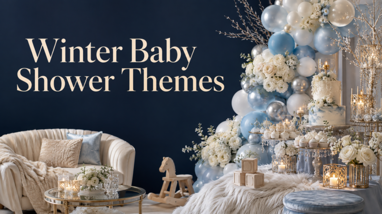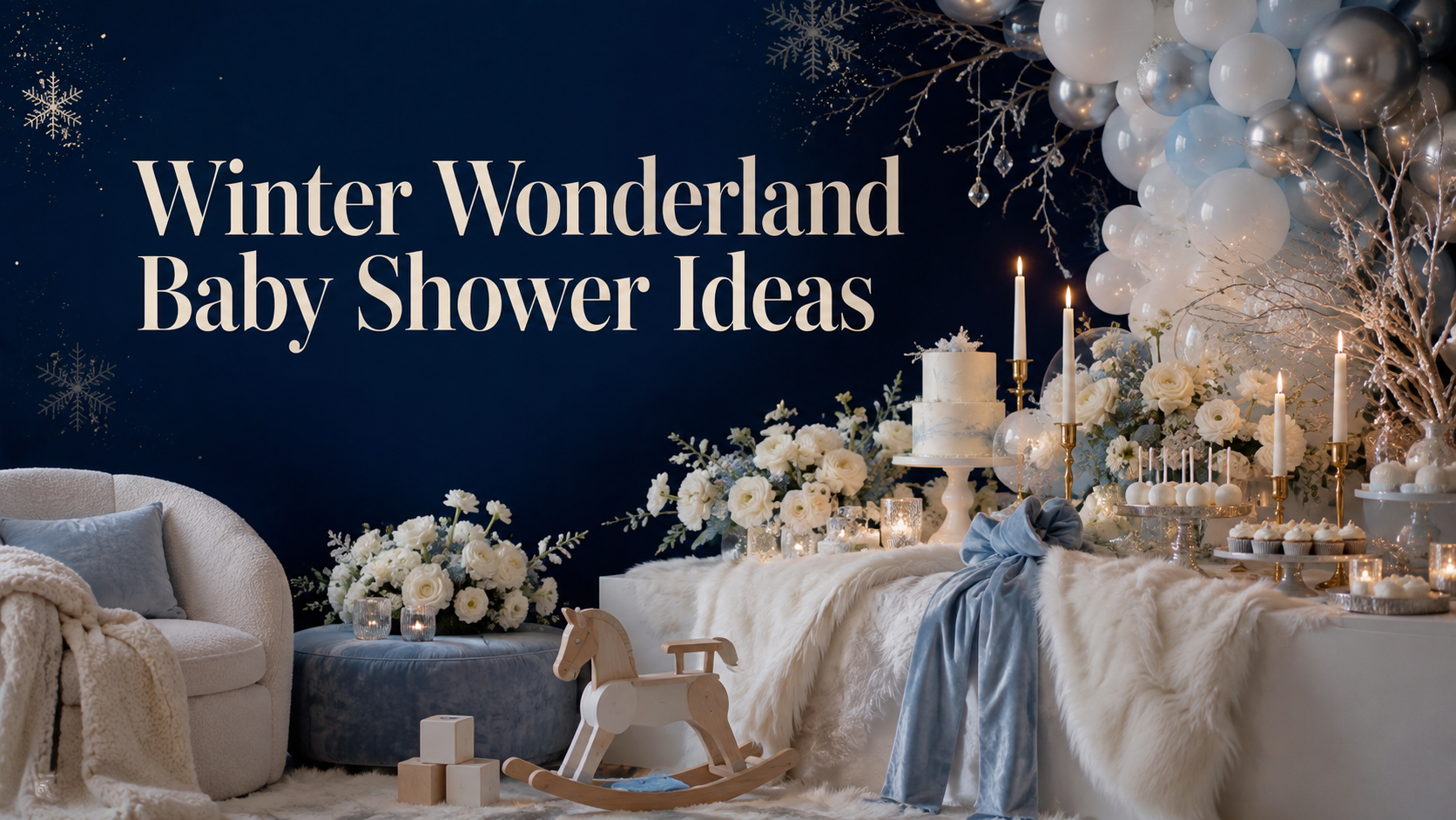
Winter Wonderland Baby Shower Ideas
Baby Shower · Winter Wonderland · Theme Guide
Winter Wonderland Baby Shower Ideas
The three rules that make it feel magical rather than simply white, four distinct directions from classic neutral to editorial blue, and the texture and candlelight decisions that do all the atmospheric work.
The winter wonderland baby shower is one of the most searched and most attempted seasonal shower themes — and one of the most frequently executed in a way that produces a result that reads as a white party rather than as an actual wonderland. The distinction comes down to three specific decisions about warmth, texture, and motif restraint. Get all three right and the room produces the atmosphere that makes the ‘wonderland’ description accurate; miss any one of them and the result, however carefully assembled, reads as a collection of white decorations that happen to be in the same room.
The sections below cover those three decisions in specific terms, four winter wonderland directions with their palettes and collections, the decor and table details that apply the rules, and the stationery choices that carry the aesthetic from the first piece guests receive to the final detail at each seat.
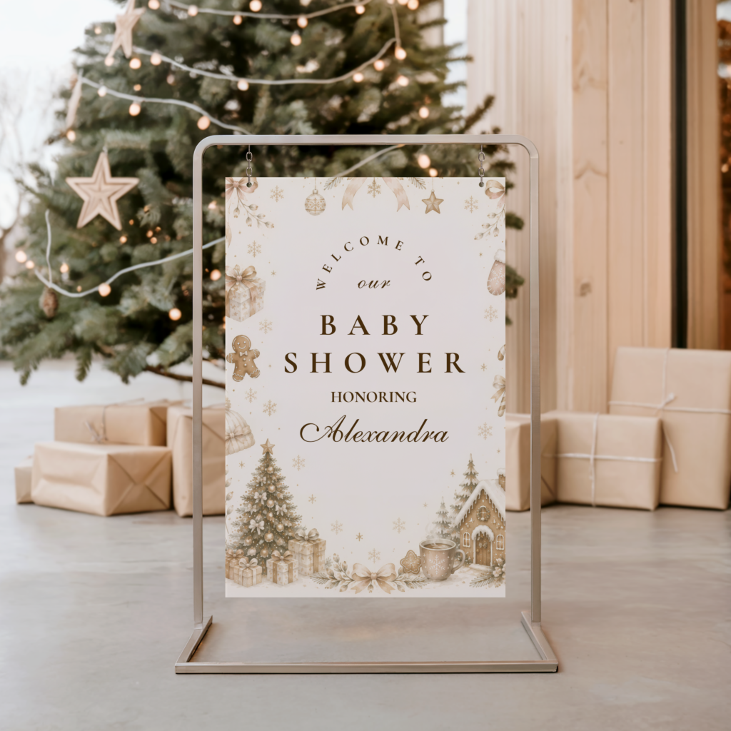
❄️ Shop This Theme
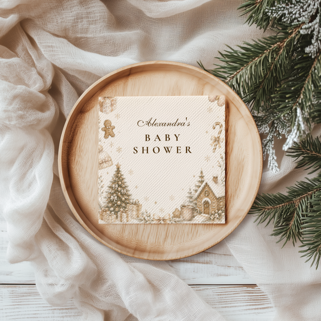
Browse the Winter Wonderland collection — the primary collection for the classic soft white, silver, and gold winter wonderland baby shower direction.
“A winter wonderland baby shower looks like the world went quiet and beautiful outside, and someone brought that stillness indoors — white, silver, and the specific warmth of candlelight against a frosted window.”
Section 01 What Makes Winter Wonderland Distinct
The winter wonderland aesthetic is among the most difficult seasonal party themes to execute well precisely because its palette is so minimal: white, silver, and the right blue. In a palette this restrained, the decisions that are not about colour — about warmth, texture, and restraint in motif — do proportionally more design work than they would in a palette with a wider colour range. Three rules govern this:
Warm gold is mandatory. The failure mode of a winter wonderland baby shower is not too little decoration — it is the wrong temperature. Pure silver and white without any warm gold element reads as clinical rather than magical: it produces the specific quality of a well-lit hospital corridor or a corporate office with holiday decorations rather than the quality of a frost-touched, candlelit winter interior. One warm gold element per zone is the minimum required to prevent this: a gold candle holder at the centrepiece, a gold-edged place card at the table setting, a warm gold ornament cluster at the entrance. The gold does not need to be prominent or dominant; it needs to be present in every zone where the cool palette might otherwise read as sterile. Without it, no amount of silver and white decoration will produce the wonderland atmosphere.
Texture creates the wonderland. A winter wonderland built from flat matte surfaces — matte white tablecloth, matte silver balloons, matte white paper decorations — reads as a white party. The wonderland atmosphere requires reflective and tactile surfaces that interact with the light source rather than simply absorbing it: faux fur that catches candlelight at its surface fibres, crystal or glass ornaments that refract the light, velvet ribbon that reads as both colour and texture simultaneously, metallic paper that reflects its surroundings. These surfaces do not need to be expensive; a faux fur runner costs very little and produces a disproportionate atmospheric return. The specific combination of faux fur at the table base, crystal or glass at the centrepiece, and velvet at the accent textile layer produces the winter wonderland texture vocabulary that makes the room read as designed rather than as assembled.
Snowflakes as accent, not wallpaper. The snowflake is the winter wonderland’s defining motif — and the most frequently overused one. Snowflakes on the tablecloth, the napkins, the balloons, the banner, the cake, the stationery, the favour bags, and the backdrop simultaneously read as a party supply catalogue rather than as a designed celebration. One snowflake motif per zone — a snowflake detail at the cake, a snowflake border on the invitation, a snowflake ornament cluster as the entrance accent — reads as curated and intentional. Every other surface in each zone contributes to the atmosphere through palette and texture rather than through repeated motif. The snowflake is the signature; the texture and the gold are the supporting cast that make the signature meaningful.
❄ Styling Tip
The winter wonderland atmosphere test: light one warm white candle in the styled room. If everything looks more magical with the candle lit — the texture and gold are doing their work and the wonderland atmosphere is present. If nothing changes when the candle is lit — the room is a white party with silver balloons, not a winter wonderland. The candle test is the fastest diagnostic available for whether the atmosphere has been achieved.

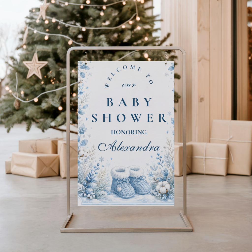
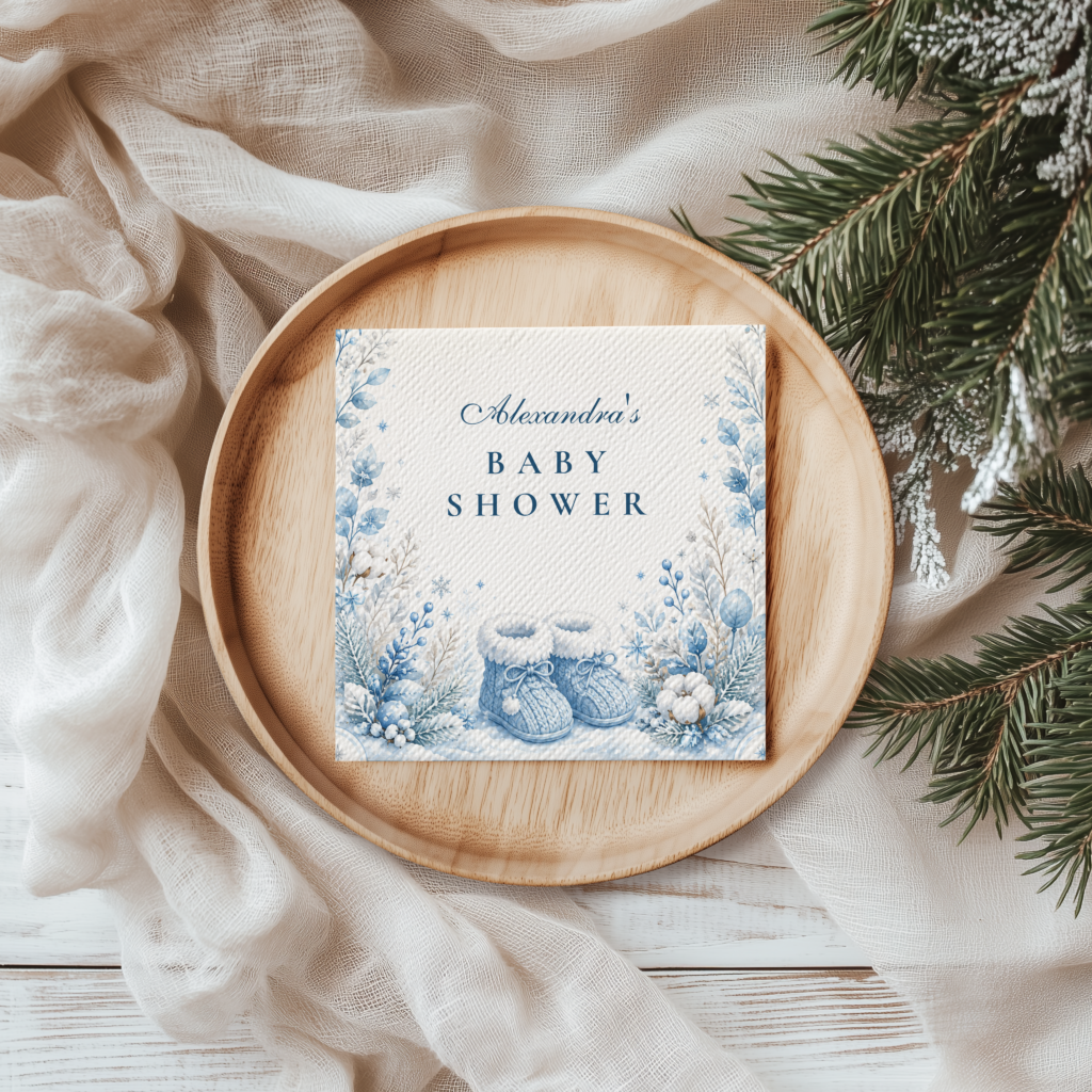
The Winter Wonderland collection — soft white, silver, and warm gold pumpkin stationery for the classic neutral winter wonderland direction.
Section 02 Four Winter Wonderland Directions
Each direction below applies the three rules — gold anchor, texture layer, snowflakes as accent — to a distinct palette and aesthetic register. The palette and emotional character differ; the rules remain constant across all four.
Direction 2.1
Classic Neutral Winter Wonderland
Soft white, silver, and warm gold — the most universally loved and most broadly appropriate winter wonderland direction. The neutral palette carries no gender signal and works for any baby shower guest list from the most intimate to the largest. Classic Neutral Winter Wonderland is the direction that most consistently produces the atmospheric quality the ‘wonderland’ name promises, because the palette’s restraint places full design responsibility on the texture and gold anchor decisions.
❄ Styling Tip
Neutral winter wonderland needs three height levels of white to read as designed rather than as a flat monochrome surface: a tall white floral arrangement or white branch cluster at the highest point, a mid-height silver ornament cluster or white pillar candle grouping, and low white votive candles at the table surface. Three heights, one palette, one gold accent per zone: this three-level structure always reads as intentional. Two heights or one height always reads as incomplete regardless of the number of decorations present.
Direction 2.2
Pink Winter Wonderland
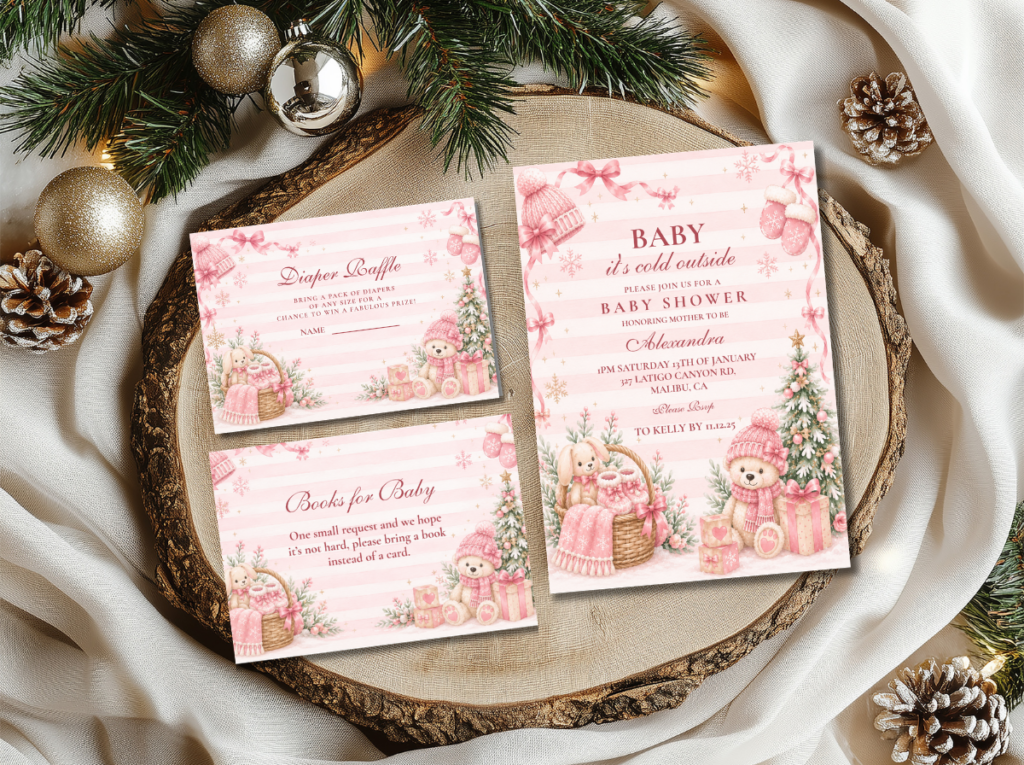
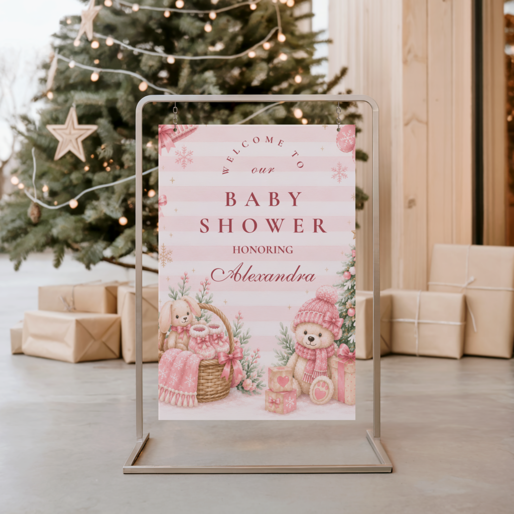
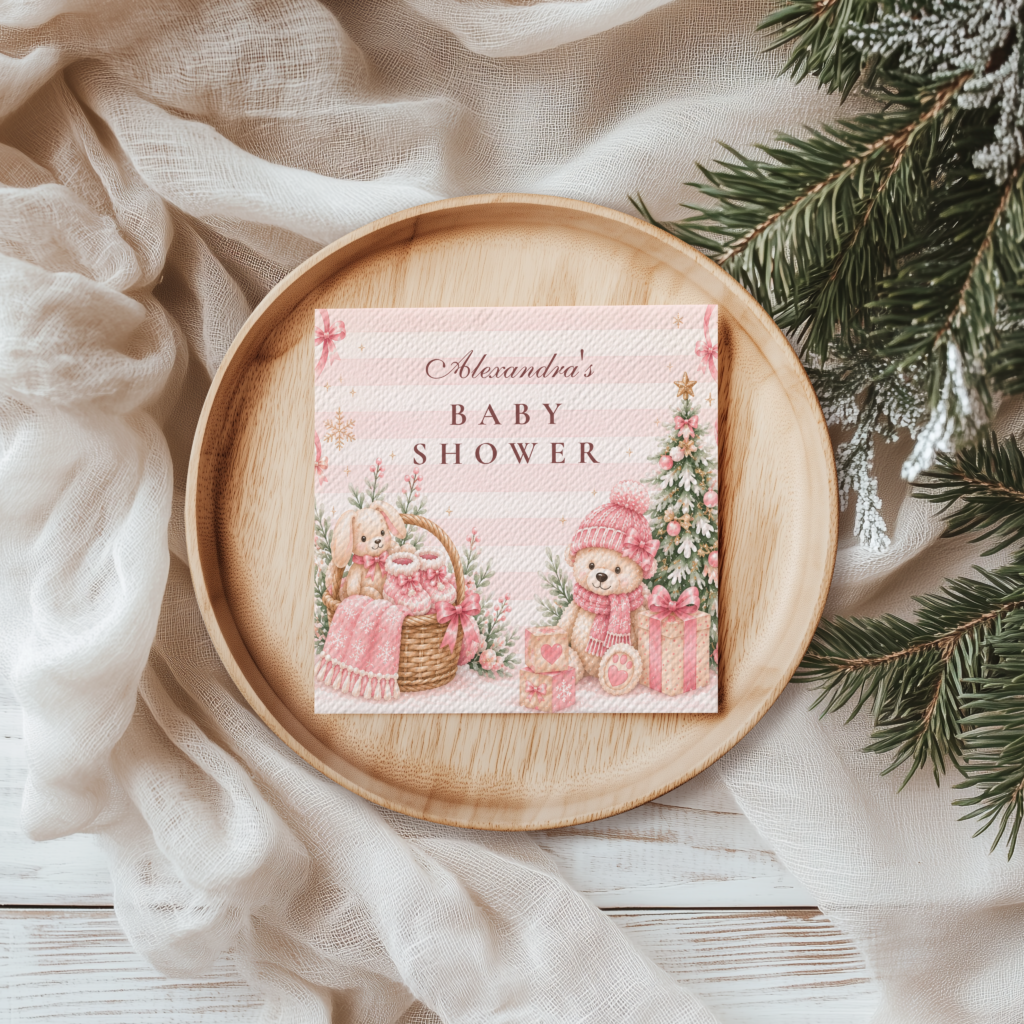
Blush, soft white, and rose gold — the most feminine and most specifically girl-directed winter wonderland direction. Pink Winter Wonderland takes the ethereal quality of Classic Neutral and introduces a warmth that reads as simultaneously wintry and warmly celebratory. The blush and rose gold replace the silver tones in the cool classic direction, producing a palette that is luminous and soft rather than cool and architectural.
Direction 2.3
Pink Winter Wonderland — Curated Collection
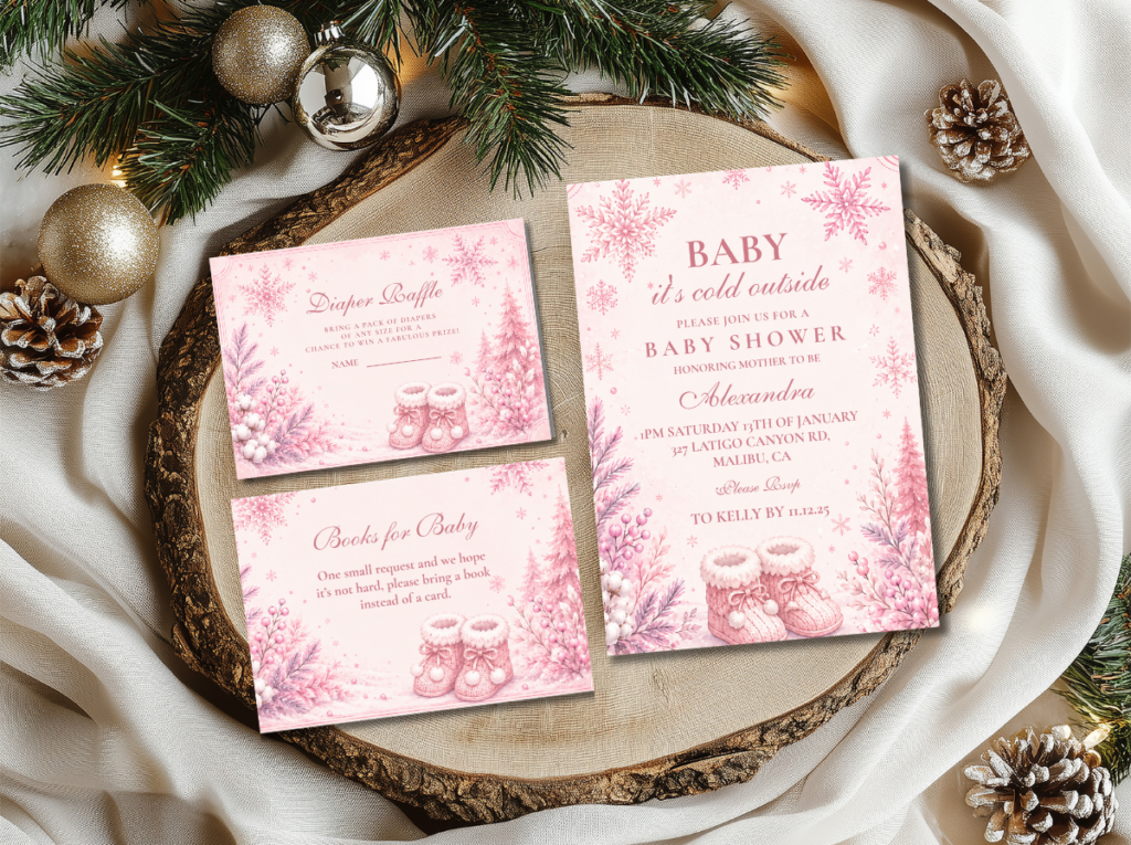
A curated collection direction within the Pink Winter Wonderland aesthetic — a more edited and more specific selection of pink and white stationery elements for hosts who want the Pink Winter Wonderland palette applied with particular precision. The same blush and rose gold palette as Direction 2.2, presented as a more tightly curated suite for stationery coordination across the full set of shower printed elements.
Direction 2.4
Elegant Blue Winter Wonderland
Deep navy, silver, white, and gold — the most sophisticated and most editorial of the four winter wonderland directions. Elegant Blue replaces the soft, ethereal quality of Classic Neutral with a structured, dramatic palette: the deep navy grounds the composition and gives the silver and white elements a dark ground to read against, producing the specific visual quality of a midnight winter sky rather than the pale luminosity of a frost-lit morning. The gold accent is proportionally more important in this direction because it is the sole warm element in a palette otherwise entirely composed of cool tones.
Section 03 Decor, Cake & Table at a Glance
The winter wonderland table applies the three rules to every surface simultaneously: the faux fur runner provides the hero texture layer; the candlelight provides the mandatory warm light source that activates the texture and gold surfaces; and the snowflake motif appears once per zone rather than at every surface.
Centrepiece: A low white floral arrangement — white roses, white spray roses, white amaryllis, or white ranunculus — in a clear glass, silver, or crystal vessel, with a cluster of clear crystal or glass ornaments at the base and a small cluster of dried silver-tipped eucalyptus or silver-painted branches for the botanical and silver texture elements. Slim white or warm cream taper candles in gold or antique silver holders at the arrangement’s sides, at a height that rises above the floral arrangement. The candles are the gold and warm-light anchor for the table’s most central zone; without them, the centrepiece reads as a white floral arrangement in a glass vase rather than as a winter wonderland focal point.
Table runner and linen: A faux fur runner across the table’s length is the single most impactful texture decision available for a winter wonderland table. It costs very little, photographs exceptionally well in both natural and candlelight, and provides the soft, tactile surface that transforms the table from a flat decorative surface into a textured winter landscape. The faux fur runner should be white or cream — not grey or coloured — so that it reads as part of the white and silver palette rather than as a separate texture element. Beneath or beside the faux fur, a pale silver or white linen base tablecloth. Soft white or pale silver linen napkins folded simply at each setting, with a small crystal or silver ornament detail as the per-seat finishing element.
Cake: A smooth or lightly textured white buttercream cake — not bright white, which reads as harsh under warm candlelight — with a single snowflake topper as the primary motif and delicate silver leaf or gold leaf at the tier divide. Small crystal or silver sugar detail at the tier base. A single fresh white bloom or a cluster of dried silver botanical stems at the cake’s base where it meets the cake board. The cake board should be silver or gold rather than white, which provides the metallic ground that reads as part of the wonderland palette. One snowflake motif at the topper — not snowflake piping across all tiers, not snowflake sugar flowers at every level, not snowflake fondant cut-outs on the board. One motif, well executed.
❄ Styling Tip
A faux fur table runner beneath a winter wonderland centrepiece adds the texture layer that transforms the whole table from simply white to genuinely atmospheric. It costs almost nothing relative to its visual impact and photographs beautifully in any light condition — in warm candlelight it reads as softly luminous; in natural light it reads as clean and textural. It is the single highest-return texture investment available for this theme.
The Little Snowflake collection — delicate snowflake stationery in pale blue, silver, and warm gold for the most specifically baby-oriented winter wonderland direction.
Section 04 Invitations & Stationery
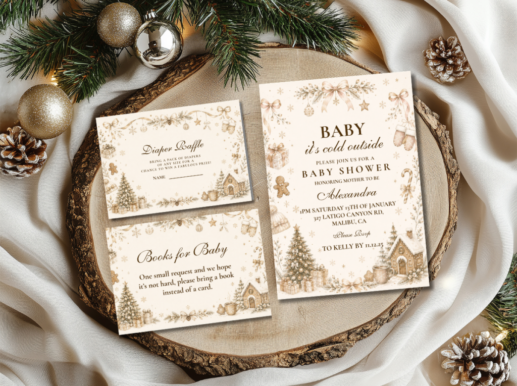
The winter wonderland baby shower invitation does two things simultaneously: it establishes the palette’s cool luminosity and signals the baby’s arrival as the reason for the celebration. The most effective winter wonderland invitation places the baby’s name or the announcement wording as the primary typographic element, with the snowflake or winter botanical motif as the secondary design element — present and beautiful but clearly supporting rather than leading. A soft white card with a delicate silver snowflake border and warm gold lettering reads as a winter wonderland baby shower invitation; a card where the snowflake fills the design and the baby announcement reads as secondary text reads as a winter party invitation with a baby shower note attached.
Across the full stationery suite, the same hierarchy applies: the guest’s name or the shower details are always the primary typographic element; the palette and the motif are the design context that makes the communication feel specifically winter wonderland. The six collections below cover every palette variation in the winter wonderland direction, from the most classic neutral to the most architecturally bold.
Primary Direction
Winter Wonderland
Soft white, silver, and warm gold — the most versatile and most broadly appealing winter wonderland baby shower stationery suite.
Neutral & Curated
Neutral Winter Wonderland
A curated neutral collection for the classic white, silver, and gold winter wonderland direction — edited and precisely coordinated across the full stationery set.
Girl Direction
Pink Winter Wonderland
Blush, soft white, and rose gold — the most feminine and most girl-specific winter wonderland stationery direction.
Pink Curated Suite
Pink Winter Wonderland Collection
A curated collection of pink and white winter wonderland stationery for hosts who want the blush palette applied with full coordination across every printed element.
Editorial Direction
Elegant Blue Winter Baby Shower
Deep navy, silver, and gold — the most sophisticated and most architecturally structured winter wonderland stationery direction.
Baby-Specific Motif
Little Snowflake
Pale blue, silver, and gold with delicate snowflake motifs — the most specifically baby-oriented winter wonderland stationery direction.
Browse the full winter wonderland stationery range — four directions from classic neutral to editorial blue, and six coordinated collections.
Frequently Asked Questions
What colors are used for a winter wonderland baby shower?
The core winter wonderland palette is soft white, silver, and warm gold — with gold as the mandatory warming element that prevents the cool tones from reading as clinical. The specific tones that work: soft off-white rather than bright optical white, which is too harsh; silver in both metallic and pale grey registers; and antique or warm gold rather than bright or lemony yellow-gold. Variations per direction: Pink Winter Wonderland adds blush and rose gold; Elegant Blue replaces the soft white ground with deep navy; Little Snowflake deepens the pale blue. Across all four directions, warm gold is present and constant — it is the element that makes any winter wonderland palette read as magical rather than austere.
How do I make a winter wonderland baby shower feel magical and not generic?
Three specific decisions: add warm gold to every zone, add texture to every surface layer, and use the snowflake motif in one location per zone rather than everywhere. A room that is entirely white and silver without gold reads as clinical. A room that is white, silver, and gold but entirely flat in its surface textures reads as a well-coordinated but not atmospheric celebration. A room that is white, silver, and gold with faux fur, crystal, velvet, and candlelight — and a single snowflake motif at the cake, the invitation, and the entrance, not at every surface — reads as a genuinely designed winter wonderland. The candle test: if lighting one warm white candle makes the room look more beautiful and more magical, the atmosphere is present.
Can a winter wonderland baby shower work for any gender?
Yes — Classic Neutral Winter Wonderland, Elegant Blue Winter, and Little Snowflake all carry no inherent gender signal. Soft white, silver, pale blue, navy, and warm gold are all gender-neutral tones in the winter context. Pink Winter Wonderland is the specifically girl-directed direction. For a boy-specific winter wonderland shower, Elegant Blue’s deep navy is the most naturally boy-adjacent direction. For a gender-neutral shower before the baby’s gender is known, Classic Neutral Winter Wonderland is the most broadly appropriate and most consistently beautiful choice across any guest demographic.
Can a winter wonderland baby shower be held outdoors?
A winter wonderland shower can be held in an outdoor space in mild winter conditions — a covered terrace, a garden room, or an outdoor venue with appropriate heating — but the atmosphere it is trying to create is fundamentally an indoor one: the warmth and stillness of being inside while the winter world is outside. The candlelight, the faux fur, and the crystal surfaces that produce the wonderland atmosphere all require an indoor environment to read correctly. For an outdoor or partially outdoor venue, prioritise the gold accent, the white floral arrangement, and the snowflake stationery motif; the texture layer (faux fur particularly) should be reserved for the indoor table area where it will not be exposed to wind or moisture.
Warm Gold · Faux Fur · One Snowflake Per Zone · Candlelight
Shop Winter Wonderland Baby Shower Stationery
Invitations, place cards, and favour tags in soft white, silver, blush, and gold — four winter wonderland directions and six coordinated collections.