Baby It’s Cold Outside Baby Shower Ideas
Baby Shower · Baby It’s Cold Outside · Theme Guide
Baby It’s Cold Outside Baby Shower Ideas
The warm, cozy indoor aesthetic that separates this direction from every other winter shower — plaid, a clothesline, a hot cocoa bar, and two colour directions.
The ‘baby it’s cold outside’ baby shower theme is the most narrative and most distinctly different direction within the winter shower family — and the one most frequently confused with Winter Wonderland. They are not the same direction. Winter Wonderland looks outward: it brings the icy, luminous quality of the winter landscape indoors through a cool palette of soft white, silver, and pale blue. Baby It’s Cold Outside looks inward: its aesthetic is about the specific warmth of being inside when the world outside is cold, and its palette, textures, and signature details all communicate that specific cozy register.
This guide covers the three decisions that define the direction, the decor and table details that apply them, two colour directions, and the stationery collections that carry the aesthetic from invitation to favour tag.
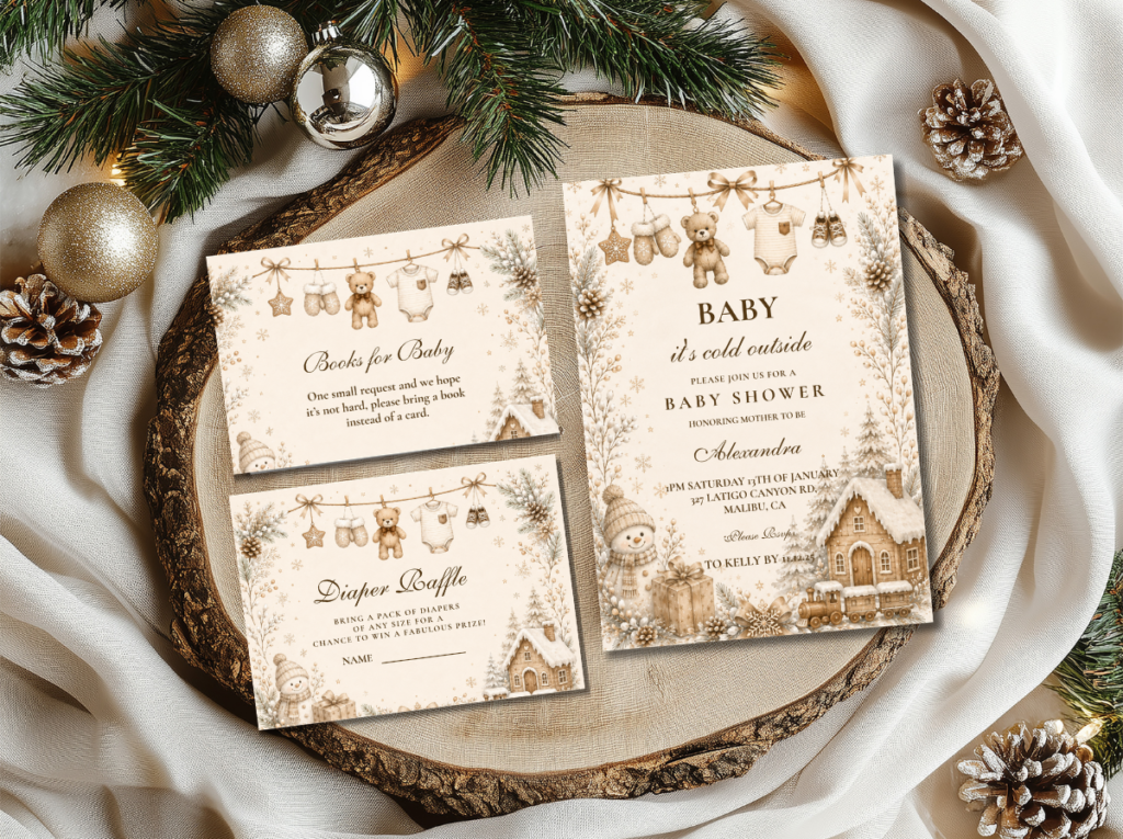
Browse the Baby It’s Cold Outside collection — warm cream and navy stationery in the most cozy and most narrative winter baby shower direction.
“Baby it’s cold outside — the most cozy and most narrative winter baby shower wording. It captures the specific warmth of being gathered indoors when the world outside is cold, quiet, and full of possibility.”
Section 01 What Makes Baby It’s Cold Outside Distinct
Three things define this direction and separate it from every other winter shower aesthetic. All three concern the same fundamental quality: warmth as the subject of the celebration, not winter as a visual backdrop.
Warm not icy. This is the most important distinction to make before any decor purchase: the Baby It’s Cold Outside palette is warm, not cool. Icy blue and silver belong to Winter Wonderland — the direction that references the visual quality of the winter landscape. Baby It’s Cold Outside references the interior: the warm cream of a linen tablecloth, the navy of a throw blanket, the amber of firelight, the natural brown of a wooden tray on a serving counter. Warm cream, navy, plaid, and knit textures are the correct palette and textile family for this direction. A decoration that reads as icy, luminous, or cool — a silver balloon arch, a crystalline centrepiece, a pale blue and white palette — belongs to a different theme.
The clothesline is the signature motif. Every winter shower direction has a signature motif — the Winter Wonderland has the snowflake, the Christmas shower has the ornament — and the Baby It’s Cold Outside direction’s signature is the mini clothesline. A small indoor clothesline strung with tiny knit baby items — miniature mittens, a tiny hat, a small onesie, a mini bootie — communicates the entire theme in one image: the cold outside, the baby arriving, and the warm indoor world being prepared for them. It can be strung across the welcome sign, draped along a mantle, stretched across a backdrop frame, or hung between two small poles on the gift or food table. It costs almost nothing to assemble from craft and baby supply items and photographs as the most specifically ‘baby it’s cold outside’ image in the entire shower’s visual record.
A hot beverage station is mandatory. The hot cocoa bar, mulled cider station, or chai bar is not an optional addition to the Baby It’s Cold Outside shower — it is the hospitality expression of the theme itself. The theme is about warmth, and nothing communicates warmth as directly as offering guests a warm drink the moment they arrive into the celebration. A small styled station — a tray with a vessel of hot beverage, labeled jars of toppings, and mugs in the direction’s palette — performs the function that the beverage bar does at no other shower theme: it makes the ‘cold outside, warm inside’ register physically present for every guest from the moment of arrival. The station should be set up before the first guest arrives and should be styled as carefully as the food table, because it will be the first destination in the room.
☔ Styling Tip
A mini clothesline strung with tiny knit baby items costs almost nothing and immediately signals ‘baby it’s cold outside’ to every guest who enters the room. String it across the welcome sign, the mantle, or the backdrop frame. One detail that tells the whole story — and photographs as the most specifically on-theme image in the shower’s entire visual record.
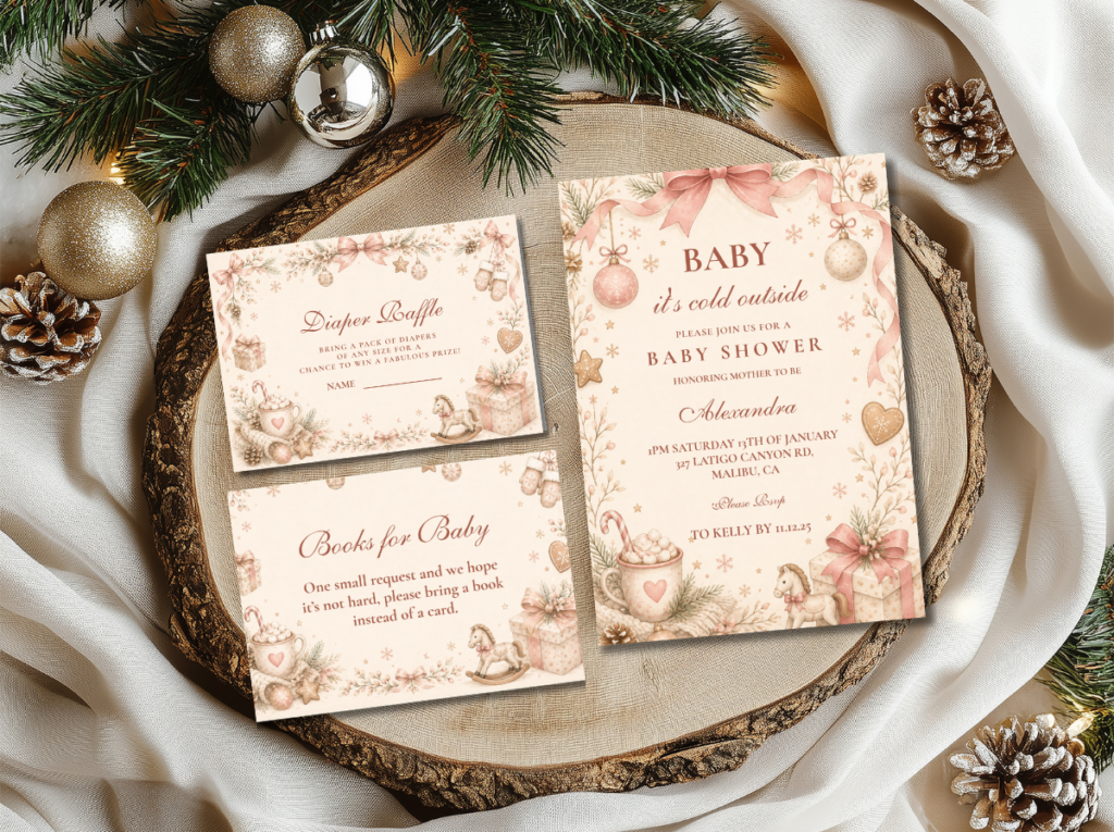
The Baby It’s Cold Outside collection — warm cream and navy stationery for the cozy indoor winter shower direction.
Section 02 Decor, Cake & Table
The Baby It’s Cold Outside table applies warm textures at every surface layer and reserves the cold-outside visual reference for the signature motif and the stationery rather than for the palette or the centrepiece.
Table runner and linen: A plaid or tartan runner — in navy and cream, or in a warm rust and cream, or in a classic black and cream check — across the table’s length is the single most effective surface decision for this direction. Plaid is the textile that most immediately reads as ‘cold outside, warm inside’ without any additional decoration; it does the theme’s atmospheric work at the most fundamental layer. A warm cream or natural linen tablecloth beneath the plaid runner. Cream or warm neutral linen napkins at each setting, with a sprig of dried rosemary or a cinnamon stick tied with a narrow navy ribbon as the per-seat finishing detail — both read as cozy winter and as specifically warm.
Centrepiece: A low arrangement of warm-toned seasonal elements — dried cotton stems, dried eucalyptus, cream dried florals, small pinecones — in a warm wooden vessel or a cream ceramic jug rather than in a glass or crystal vase. Two or three amber or warm cream pillar candles of varying heights beside the arrangement, in simple wooden or cream ceramic holders, provide the warm light source that activates the direction’s most important atmospheric quality. The centrepiece should read as gathered from the natural winter world — organic, warm-toned, and slightly rustic — rather than as designed from a floral studio. A small mini clothesline detail — three or four tiny knit items strung on a thin cord between two small wooden dowels — placed at the centrepiece’s front edge anchors the signature motif at the table’s primary zone.
Hot cocoa bar: The hot cocoa bar is the room’s hero element — the first surface a guest visits and the one that most immediately produces the gathering warmth the theme is named for. A wooden tray or a warm cream surface holds the hot beverage vessel; small labeled glass jars of toppings — mini marshmallows, cinnamon sticks, chocolate shavings, crushed candy cane, dried orange peel — are arranged beside it. Mugs in the direction’s palette — cream mugs with a navy or warm plaid detail — are stacked or arranged at the station’s edge. A small printed sign in the Baby It’s Cold Outside stationery palette — ‘warm up — baby it’s cold outside’ — stands at the station’s rear. The station should be operational and warm before the first guest arrives.
Cake: A semi-naked or lightly textured buttercream cake in warm cream with a navy or deep navy detail — a thin navy stripe at the tier divide, or a small plaid ribbon tied around the base tier — and a clothesline topper: a tiny cord strung between two small wooden or paper poles with a miniature knit onesie or mitten hanging from it. Warm cream and navy is the most legible colour combination for this direction’s cake; a cake in icy blue and silver reads as a Winter Wonderland cake placed at the wrong shower. A few dried cotton stems or a small sprig of dried eucalyptus at the cake’s base as the botanical detail. Gold leaf at the tier divide as the only metallic accent.
☔ Styling Tip
Style the hot cocoa bar first and build everything else around it. It is the most atmospheric and most photographed element in a Baby It’s Cold Outside shower — guests photograph it immediately on arrival, before they have seen the table or the cake. A beautifully styled bar with labeled jars of toppings, matching mugs, and a printed station sign sets the direction’s warm register for every guest from the first moment.
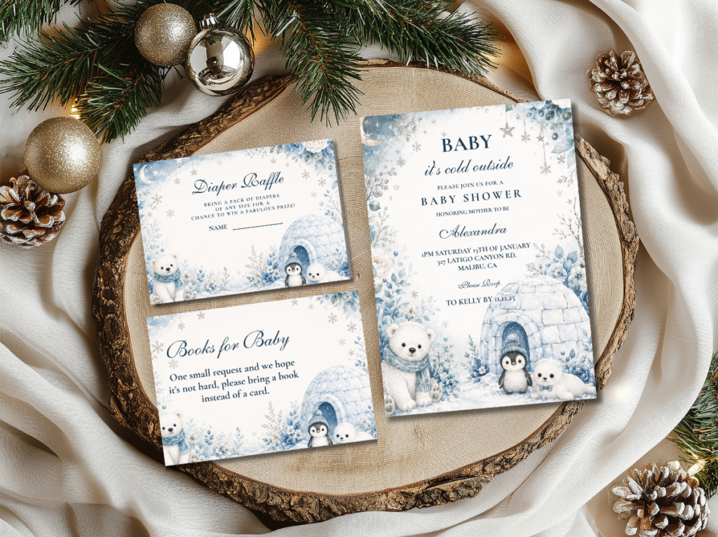
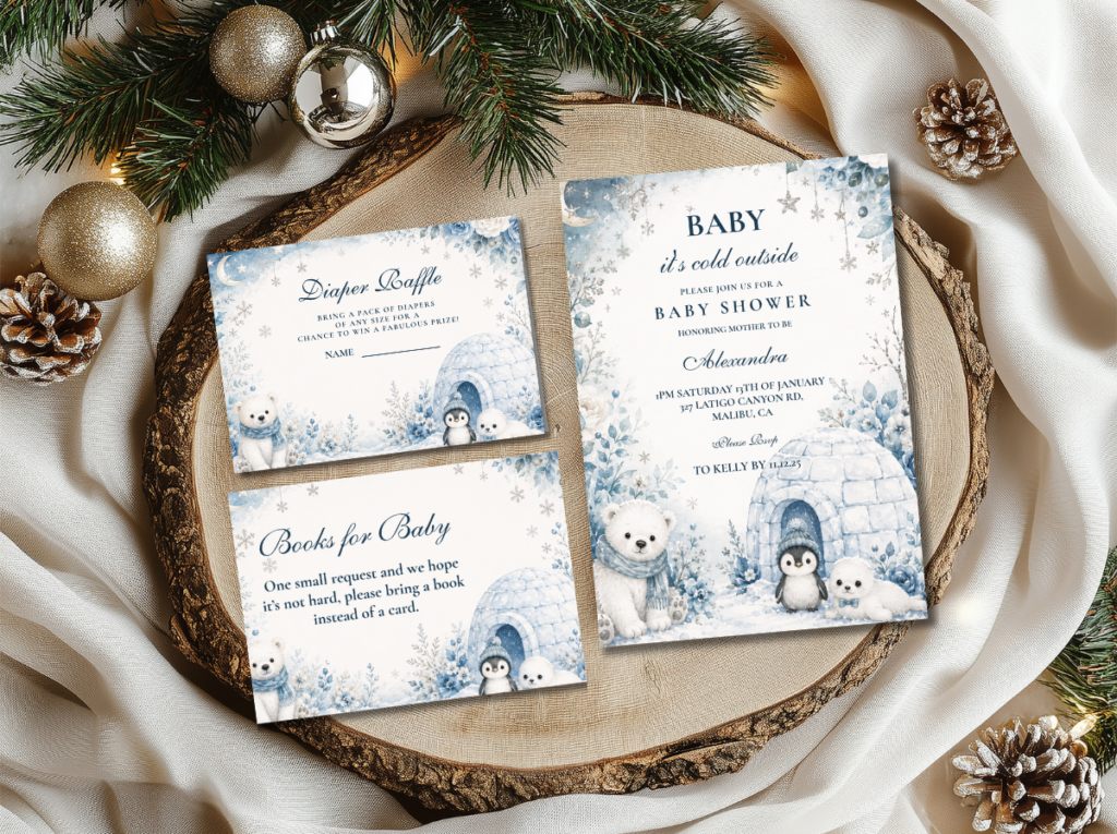
The Blue Baby It’s Cold Outside collection — dusty blue and cream stationery for the cooler-palette direction within the Baby It’s Cold Outside theme.
Section 03 Colour Directions
Two palette variations apply the Baby It’s Cold Outside aesthetic to slightly different colour registers. Both share the warm base tone, the plaid textile, and the clothesline signature; the palette difference is in the directional accent colour.
Direction 3.1
Classic Neutral — Warm Cream, Navy & Plaid
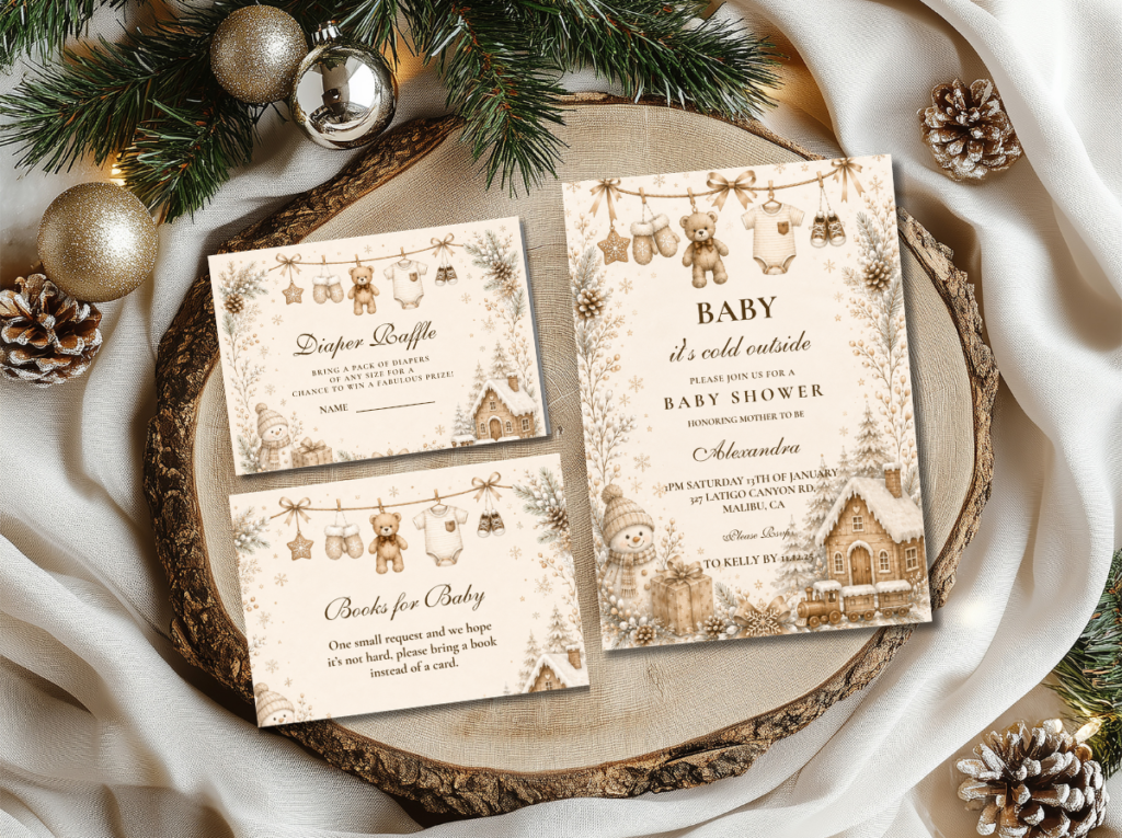
Warm cream as the primary ground, navy as the directional accent, and plaid as the defining textile — the most universally appropriate and most immediately legible Baby It’s Cold Outside direction. Navy reads as both masculine and gender-neutral simultaneously in this context: the warmth of the cream and the cozy quality of the plaid prevent the navy from reading as specifically boy-directed. A warm amber or gold accent at the metallic details ties the palette together.
Direction 3.2
Blue Direction — Dusty Blue, Cream & Gold
Dusty blue replaces the deep navy as the directional accent tone, producing a palette that is slightly softer and slightly more pastel in its register than the Classic Neutral direction. The dusty blue works in the Baby It’s Cold Outside direction because it is warm-adjacent in the way that icy blue is not — it leans toward warm stone and grey rather than toward the cool luminosity of the Winter Wonderland palette. Warm cream and antique gold as the base and metallic tones; dusty blue in the plaid textile, the stationery, and one linen accent element.
☔ Styling Tip
Plaid is the most specifically ‘cold outside’ textile available — one plaid element per zone (runner on the food table, napkins at the place settings, or a folded throw blanket draped over a chair at the seating area) immediately signals cozy winter indoors without any additional decoration. The plaid is the textural signature of this direction in the same way that the snowflake is the motif signature of Winter Wonderland.
Section 04 Invitations & Stationery
The Baby It’s Cold Outside invitation establishes the warm, cozy indoor register before the guest has seen any of the decor — and it does so through both its palette and its wording. The wording ‘baby it’s cold outside’ is the theme’s primary communication tool: it is specific, atmospheric, and immediately evocative of the cozy indoor world the shower is creating. The invitation should place this wording prominently, in the direction’s primary typeface, on a warm cream ground with navy or dusty blue detail and a small clothesline or plaid motif as the secondary design element.
The full stationery suite — place card, food label, hot cocoa bar sign, welcome sign, and favour tag — should apply the same warm cream ground and the same single clothesline or plaid motif consistently, so that every printed element reinforces the direction’s cozy narrative register. The six collections below cover both colour directions and every adjacent winter shower option.
Primary Direction
Baby It’s Cold Outside
Warm cream and navy stationery in the most cozy and most narrative winter baby shower direction — the correct starting point.
Blue Direction
Blue Baby It’s Cold Outside
Dusty blue and cream stationery for the softer-palette Baby It’s Cold Outside direction.
Neutral Clothesline
Neutral Clothesline Baby Shower
Warm neutral clothesline stationery — the most gender-neutral and most understated Baby It’s Cold Outside direction.
Ethereal Winter
Winter Wonderland
Soft white, silver, and gold — the cool, luminous alternative to the Baby It’s Cold Outside warm palette.
Elegant Winter
Winter Baby Shower
Pale blue, silver, and gold — the most seasonally flexible and most broadly elegant winter shower stationery direction.
Festive Winter
Winter & Christmas Baby Shower
Warm festive stationery covering the full range of Christmas and winter baby shower directions.
Browse the full Baby It’s Cold Outside stationery range — warm cream, navy, and dusty blue across the cozy indoor winter shower direction.
Frequently Asked Questions
What colors work for a Baby It’s Cold Outside baby shower?
The correct palette for the Baby It’s Cold Outside direction is warm rather than cool: warm cream as the primary base tone, navy or dusty blue as the directional accent, and antique gold or warm amber as the metallic element. Plaid in navy and cream is the defining textile. Icy blue, silver, and bright white belong to Winter Wonderland — a different direction with a different aesthetic register — and should not be used for a Baby It’s Cold Outside shower, which will read as the wrong temperature if those tones are introduced. The warmth of the palette is what communicates the ‘inside’ part of the theme; a cool palette communicates the ‘outside’ instead.
How do I style the hot cocoa bar for a Baby It’s Cold Outside shower?
Style the bar as its own designed station rather than as a drinks table with a sign added. The components: a warm wooden tray or a cream ceramic surface as the base; one warm beverage vessel — a large ceramic pitcher, a small urn, or an insulated dispenser — in the direction’s warm cream or navy palette; four to six small labeled glass jars of toppings arranged beside it (mini marshmallows, cinnamon sticks, chocolate shavings, and one or two seasonal additions like crushed candy cane or dried orange peel); cream or navy mugs stacked or arranged at the station’s edge; and a small printed sign in the shower’s stationery palette as the finishing element. Set up the bar before guests arrive and ensure the beverage is hot at arrival time — a warm drink available at the precise moment of arrival is the theme’s most effective hospitality gesture.
Can a Baby It’s Cold Outside shower work for any gender?
Yes — the warm cream, navy, and plaid palette of this direction carries no inherent gender signal in the winter context. Navy reads as both masculine and gender-neutral simultaneously when paired with warm cream and plaid; it does not read as specifically boy-directed in the way that bright blue or primary blue does. The Neutral Clothesline direction — warm cream with a softer neutral clothesline motif — is the most broadly gender-neutral option within this theme. The Blue Baby It’s Cold Outside direction with dusty blue is also effectively gender-neutral. For a specifically girl-directed version, a single blush accent element — a blush ribbon on the mini clothesline, a blush bloom in the centrepiece — introduces the gender signal without altering the palette’s warm cozy register.
Warm Not Icy · Clothesline Motif · Hot Cocoa Bar · Plaid Textile
Shop Baby It’s Cold Outside Baby Shower Stationery
Warm cream, navy, and dusty blue invitations, place cards, and bar signs for the coziest winter baby shower direction.