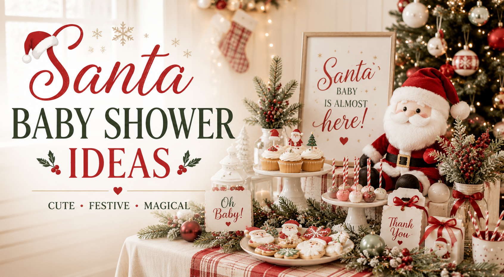
Santa Baby Shower Ideas
Baby Shower · Santa Baby · Theme Guide
Santa Baby Shower Ideas
The illustration style rule, the two-zone red limit, and three directions that make a Santa baby shower feel like a beautiful occasion rather than a generic holiday party.
The Santa Baby shower is the most narrative of all the Christmas baby shower directions — and the most demanding to execute well. Done correctly, it reads as warmly witty and specifically hosted: the festive season’s most beloved character welcoming a specific baby into the world. Done incorrectly — with bright cartoon Santa imagery on every surface and red as the room’s dominant colour — it reads as a Christmas party that also mentioned a baby shower. The difference between these two outcomes is almost entirely determined by three specific decisions made before a single decoration is purchased.
This guide covers those three decisions, three distinct palette directions, and the stationery and decor approach that ties the Santa Baby aesthetic into a coherent and beautiful celebration.
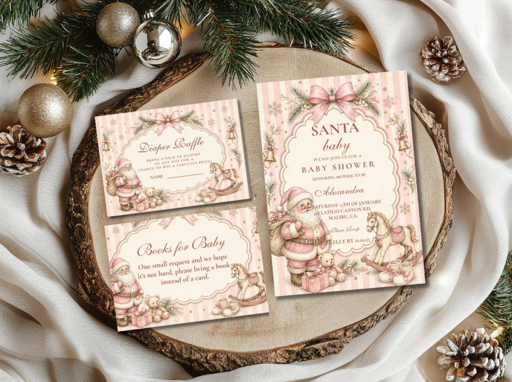
Browse the Santa Baby collection — warm red and cream stationery in the most narrative and most specifically festive Christmas baby shower direction.
“Santa baby — the most playful and most specifically Christmas baby shower wording. Warm, witty, and completely specific to the season that is welcoming this particular little one.”
Section 01 What Makes Santa Baby Distinct
Three decisions determine whether a Santa baby shower reads as a designed and warmly hosted celebration or as a holiday party with baby shower signage added. All three concern the same fundamental question: is Santa the atmosphere the baby is arriving into, or is Santa the whole room?
The illustration style of the Santa motif is the most important design decision. The same subject — a festive, red-suited seasonal figure — reads entirely differently depending on how it is illustrated. A brightly coloured, large-eyed cartoon style reads as a children’s party or a big-box holiday decoration; it communicates ‘holiday season, general audience’ rather than ‘specifically hosted celebration.’ A vintage or fine illustrated style — the kind of illustration that reads as mid-century or as hand-drawn in a warm, slightly nostalgic manner — reads as editorial, beautiful, and appropriate as a keepsake piece. It communicates ‘this was designed for this specific occasion’ rather than ‘this was sourced from a seasonal display.’ The illustration style sets the register for every other element in the room: an invitation with a warm vintage illustration makes the whole celebration feel designed; an invitation with a bright cartoon graphic makes the decorations around it read as similarly generic regardless of their individual quality.
Red as accent, not as dominant colour. The red of the seasonal festive palette is the colour that most immediately reads as Christmas — and therefore the one most likely to tip the celebration from a Christmas baby shower into a generic Christmas party when overused. Red as one accent colour among cream, warm gold, and forest green reads as specifically and beautifully Christmas; red as the room’s dominant colour — red tablecloth, red balloons, red banner, red favour bags — reads as a corporate Christmas party or a generic holiday gathering. The practical rule: red should appear in a maximum of two zones of the room — the backdrop or entrance as one zone, and one table detail (a red ribbon, a red floral element, a red linen napkin fold) as the second. Everything else carries the palette forward through cream, gold, and green rather than through additional red.
The ‘baby’ half needs equal representation. The Santa Baby shower’s most common imbalance is that the ‘Santa’ half of the wording does most of the decorative work while the ‘baby’ half is represented only by the occasion itself. Equal representation means including small, newborn-scale details that balance the Christmas aesthetic with the baby shower register: a pair of tiny booties tied with a red ribbon placed beside the welcome sign, a miniature seasonal hat positioned on the centrepiece as the zone’s baby-specific motif detail, or a small printed tag with the baby’s name or due date worked into the stationery design. These small baby-specific details are what transform the space from a Christmas celebration that happens to be for a baby into a baby shower that happens to be at Christmas — which is the register this direction is trying to achieve.
🎅 Styling Tip
A vintage illustrated seasonal figure on the invitation reads completely differently from a cartoon version — one feels like a beautiful keepsake that belongs in the baby’s first album, one feels like a holiday card from a party supply store. The illustration style is the single most important decision in the Santa Baby direction, and it sets the register for every other element that follows from it.
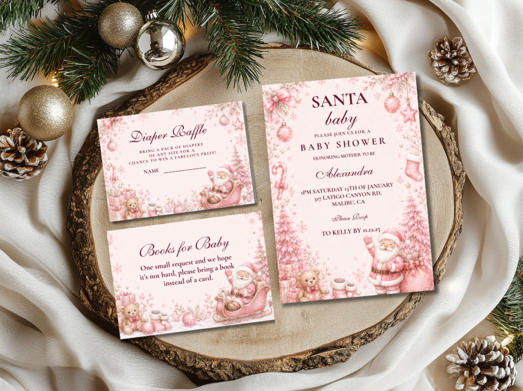
The Santa Baby collection — warm red and cream pumpkin stationery in the narrative festive baby shower direction.
Section 02 Three Santa Baby Directions
Each direction below applies the three rules to a distinct palette and register. All three use the vintage illustration style, the two-zone red limit, and the baby-specific balancing detail; the palette and the specific emotional character differ.
Direction 2.1
Classic Santa Baby — Deep Red, Forest Green, Cream & Gold
The most traditional and most universally loved Santa Baby direction: deep cranberry red and forest green in the warm, slightly aged tones of a mid-century Christmas card, set against warm cream and antique gold. This direction reads as both festive and sophisticated because the red is deep rather than bright — cranberry and garnet rather than primary red — and the cream ground prevents the palette from reading as a saturated Christmas display.
🎅 Styling Tip
Classic Santa Baby works when red appears in a maximum of two zones. Red at the backdrop and one table detail — a red ribbon on the centrepiece, a red linen napkin at each setting — reads as curated and beautiful. Red at the backdrop, on the tablecloth, on the balloon arch, and on the favour bags reads as a Christmas party. The two-zone rule is the single decision that most determines whether this direction reads as designed or generic.
Direction 2.2
Pink Santa Baby — Blush, Red, Cream & Gold
Blush introduced alongside the warm red and cream ground produces the most feminine and most girl-appropriate Santa Baby direction. The blush replaces forest green as the secondary palette tone, creating a warmer and more overtly celebratory register than the Classic direction. In this direction, the red and blush exist in balance rather than dominance: neither tone overwhelms the cream ground, and the gold accent ties both together into a palette that reads as festive and feminine simultaneously.
Direction 2.3
Whimsical Pink Santa — Soft Pink, White & Playful Motifs
The most joyful and most whimsical of the three directions: soft pink and white with playful vintage-illustrated seasonal motifs in a palette that leans toward the lighthearted rather than the traditional. Where the Classic direction reads as warmly sophisticated and the Pink Santa direction reads as festively feminine, the Whimsical Pink direction reads as joyful and specifically celebratory — the register of a gathering where everyone in the room is delighted to be there. Appropriate for any time of day, any guest list size, and any degree of formality.
Section 03 Santa Baby Decor & Table at a Glance
The Santa Baby table applies the three rules to every surface: vintage or fine-illustrated motifs rather than graphic cartoon elements, red present in two zones only, and one baby-specific detail per zone alongside the seasonal one.
Welcome sign and entry zone: A vintage-illustrated welcome sign — ‘a little Santa baby is on the way’ or ‘baby it’s beginning to look a lot like a baby shower’ — in a warm cream ground with deep red lettering and a small seasonal figure illustration in the fine vintage style. A pair of tiny baby booties tied with a red ribbon placed at the base of the sign provides the baby-specific balancing detail at the entry zone. A small wreath of fresh or faux greenery with one red ribbon detail beside or around the sign frame completes the entry moment without introducing additional red zones into the room’s main space.
Table centrepiece and runner: A low centrepiece of fresh or faux greenery — a small arrangement of pine or faux pine boughs, white and cream flowers in the direction’s palette, and a few small warm gold ornament details — in a warm cream or antique gold vessel. One small seasonal hat at the centrepiece’s highest point as the seasonal motif anchor for the table zone — tiny, fine-made, and positioned as a design detail rather than as a prop. A warm cream linen runner beneath the centrepiece; red appears at the table in napkin fold ribbon or a single red bloom, not in the runner or the tablecloth.
Cake: A semi-naked or lightly textured buttercream cake in warm cream with one or two deep red floral elements — a red velvet rose, a deep cranberry bloom — at the tier base, and a small vintage-illustrated seasonal motif topper or a tiny seasonal hat detail at the cake’s highest point. Gold leaf at the tier divide. The cake should read as warm and celebratory rather than as a Christmas cake — which means the red is present as a floral accent rather than as a buttercream layer, and the primary visual impression is warm cream and gold with red as the punctuation.
🎅 Styling Tip
One tiny seasonal hat prop per zone — on the welcome sign, on the cake topper, on the centrepiece as the zone motif. One hat reads as charming, specific, and deliberately placed. Seasonal hats at every zone, on every balloon, and at every place setting reads as a costume party rather than a hosted celebration.
The Christmas Baby Shower collection — deep red, forest green, and warm gold stationery for the most traditional Christmas baby shower direction.
Section 04 Invitations & Stationery
The Santa Baby invitation is the first element that communicates whether the occasion will feel like a beautifully designed celebration or a generic holiday gathering — and it does so almost entirely through the illustration style of its primary motif. A warm cream card with a fine vintage-style illustration, deep red or cranberry lettering, and a small baby-specific detail — a tiny bootie, the baby’s name incorporated into the seasonal wording — reads as a keepsake piece that guests will want to keep. A bright cartoon-illustrated card in primary red and green reads as a party supply store item regardless of the quality of the printing.
The stationery suite — place card, food label, welcome sign, favour tag, and thank-you card — should apply the vintage illustration style and the warm cream ground consistently across every piece, so that every printed element in the room belongs to the same designed world. The six collections below cover every palette direction and every adjacent Christmas shower option.
Primary Direction
Santa Baby
Warm red and cream in the vintage illustration style — the primary Santa Baby stationery collection and the correct starting point.
Classic Direction
Classic Santa Christmas Baby Shower
Deep red, forest green, cream, and gold — the most traditional and most broadly appropriate Santa Baby stationery direction.
Pink & Festive
Pink Santa Christmas Baby Shower
Blush, warm red, cream, and gold — the most feminine and most girl-appropriate Santa Baby stationery direction.
Whimsical & Joyful
Whimsical Pink Santa Baby Shower
Soft pink and white with playful vintage motifs — the most joyful and most whimsical Santa Baby stationery direction.
Classic Christmas
Christmas Baby Shower
Deep red, forest green, and warm gold — the broadest Christmas baby shower stationery collection for the full classic direction.
Full Winter Suite
Winter & Christmas Baby Shower
Warm festive stationery across all Christmas and winter baby shower directions — the umbrella collection.
Browse the full Santa Baby stationery range — three directions and six collections from classic to whimsical pink.
Frequently Asked Questions
What colors work for a Santa baby shower?
The correct Santa Baby palette depends on the direction chosen. Classic Santa Baby uses deep cranberry red, forest green, warm cream, and antique gold — all in warm, slightly aged tones rather than bright primary colours. Pink Santa Baby adds blush alongside the warm red and cream, replacing forest green as the secondary tone. Whimsical Pink Santa uses soft pink and white with gold as the primary palette. Across all three directions, the red is always deep and warm rather than bright and primary, the cream is warm ivory rather than bright white, and the gold is antique rather than bright. The combination of warm red, cream, and gold is the palette core that makes the Santa Baby direction feel designed rather than generic.
How do I make a Santa baby shower feel elegant rather than tacky?
Three decisions: choose vintage illustrated motifs over cartoon graphics, limit red to two zones of the room rather than making it the dominant colour, and include one baby-specific detail per zone alongside the seasonal motif. A vintage illustration on cream reads as a keepsake; a bright cartoon on primary red reads as a party supply item. Red in two zones reads as curated; red in every zone reads as a Christmas party. A tiny bootie detail at the entry, a miniature seasonal hat at the centrepiece, and the baby’s name in the invitation wording — these small baby-specific details are what make the celebration read as specifically about this baby’s arrival rather than as a Christmas gathering that mentioned a baby shower.
Can a Santa baby shower work for a boy shower?
Yes — the Classic Santa Baby direction, with deep cranberry red, forest green, cream, and antique gold, carries no inherent gender signal and works equally well for a boy shower. The warm, slightly aged tones of the classic direction read as sophisticated rather than as directionally feminine; the seasonal motif is universal rather than gendered. For a more specifically boy-directed version, a navy accent — a navy ribbon on the centrepiece, navy napkins at the table settings — can be introduced as a third palette tone alongside the red and cream without compromising the direction’s warm vintage register. The Pink Santa Baby and Whimsical Pink directions are specifically girl-appropriate; the Classic direction is universal.
Vintage Illustration · Red in Two Zones · One Baby Detail Per Zone
Shop Santa Baby Shower Stationery
Warm red, cream, and gold invitations, place cards, and favour tags in classic, pink, and whimsical Santa Baby directions.