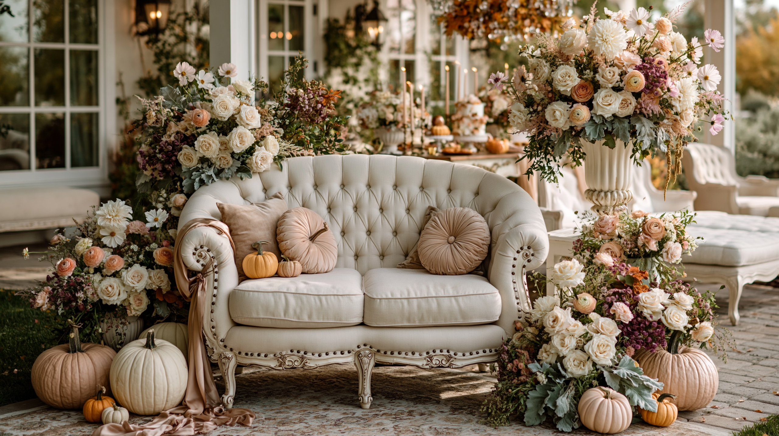
Our Little Pumpkin Baby Shower Ideas
Baby Shower · Our Little Pumpkin Ideas Guide
Our Little Pumpkin Baby Shower Ideas
The wording that shifts a baby shower from celebration to family announcement — with the warm amber palette, the family-forward details, and the one-word principle that changes everything.
‘Our little pumpkin’ is two words longer than ‘little pumpkin,’ but it is an entirely different emotional register. The ‘our’ shifts the celebration from the baby as the subject to the family becoming three as the subject — and that shift changes every detail of how the shower should be designed, worded, and decorated. The stationery suite, the activity cards, the welcome sign, and the favour tags all read differently when the framing is ‘our family’ rather than ‘the baby.’
The sections below cover the three distinctions that make the Our Little Pumpkin direction specific, the decor and cake details that extend the family-forward warmth through every table element, and the three palette directions — gender neutral, girl, and boy — that apply the same wording in different colour registers.
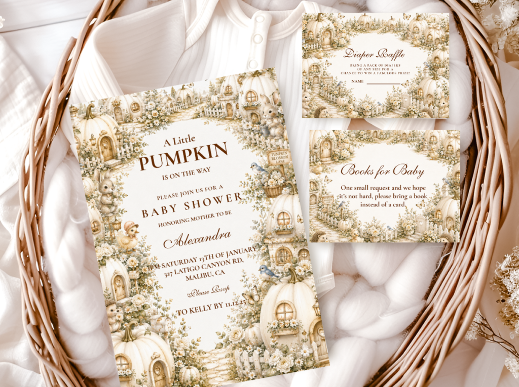
Browse the Our Little Pumpkin collection — warm amber and cream pumpkin stationery in the family-forward harvest direction.
“Our little pumpkin — two words that shift the celebration from baby shower to family announcement; warm, specific, and completely about the three of them.”
Section 01 What Makes Our Little Pumpkin Distinct
Three specific qualities define the Our Little Pumpkin direction and distinguish it from the broader Little Pumpkin theme. Each one follows directly from the single word ‘our’ and the shift in narrative that word produces.
Distinction 1
The ‘Our’ Shifts the Narrative — Family Becoming Three, Not Baby as Subject
Every pumpkin baby shower theme celebrates the baby. The Our Little Pumpkin direction celebrates the family — which is a meaningfully different emotional focus. ‘Our little pumpkin’ on a welcome sign is addressed from the parents outward; ‘little pumpkin’ on a welcome sign is addressed toward the baby. The first frame includes the parents in the story of the celebration; the second places the baby at the centre of a celebration the parents are hosting. For a couple who want their shower to feel like a shared announcement of who they are becoming — a family — the ‘our’ is the word that does that work. Every element of the shower should reflect this: activity cards framed as ‘wisdom for our family,’ a wishes jar for the whole family not just the baby, favour tags that read ‘thank you from our family.’ The wording carries the emotional argument; the design elements repeat and reinforce it.
Distinction 2
Warmer Amber Palette — Richer Harvest Tones Than the Classic Neutral Direction
The Our Little Pumpkin direction suits a slightly richer palette than the classic gender-neutral pumpkin shower. Where ‘a little pumpkin’ or ‘hello pumpkin’ work naturally in pale ivory, soft sage, and light cream, ‘our little pumpkin’ has a warmth and specificity to it that suits warmer, deeper tones: warm amber, honey, and deep cream rather than pale ivory and sage. The difference is subtle but consistent — the warmer palette echoes the warmth of the wording. A welcome sign with ‘our little pumpkin’ in warm amber lettering on a deep cream ground reads as designed and intentional; the same sign in pale sage and ivory reads as slightly cooler than the wording warrants. The amber palette is not mandatory — the direction works in any of the three palette variations — but for the gender-neutral version, warm amber and honey are the tones that most naturally extend the family-forward emotional register of the wording into the visual design.
Distinction 3
Family-Forward Details — Every Printed Element Reflects the Shared Identity
The Our Little Pumpkin direction changes not just the main wording but the framing of every printed element at the shower. Advice cards: ‘Advice for our little pumpkin’s family’ rather than ‘advice for mum.’ Wishes jar: ‘A wish for our little pumpkin’ rather than ‘a wish for baby.’ Favour tags: ‘With love from our family’ rather than ‘thank you from [baby name].’ Guest book: ‘Our little pumpkin’s family tree — write your name and relationship.’ Each of these is a single wording adjustment that costs nothing to implement and changes the entire emotional register of the element from baby-centred to family-centred. The Our Little Pumpkin direction is not a different decoration scheme from the Little Pumpkin direction — it is the same harvest aesthetic applied with a different narrative lens, and that lens is maintained through consistent wording across every printed surface.
🎃 Styling Tip
Change one word on every printed element — ‘our little pumpkin’ instead of ‘a little pumpkin’ on the welcome sign, the favour tag, and the game cards. One word shifts the entire emotional register of the shower from celebration to belonging. The design can stay identical; the wording is what carries the family-forward meaning through every element a guest reads.
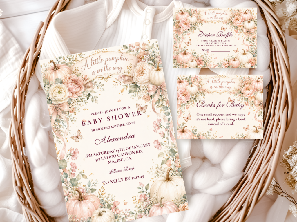
The Our Little Pumpkin collection — warm amber and cream stationery in the family-forward harvest direction.
Section 02 Our Little Pumpkin Decor, Cake & Table
The Our Little Pumpkin table extends the family-forward warmth of the wording into the physical decoration through two specific decisions: a richer, more amber-dominant colour palette than the classic pumpkin neutral, and a honey jar detail that makes the warmth of the theme tangible as well as visual.
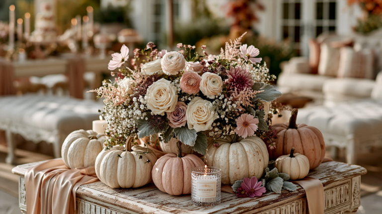
Centrepiece and welcome sign cluster: A welcome sign reading ‘Our Little Pumpkin’ in warm amber or antique gold lettering on a cream or kraft board is the visual anchor of the shower — positioned at the main table or at the entrance, it communicates the family-forward framing before any other element is read. Grouped beside the welcome sign: a cluster of three to five cream pumpkins in varying sizes, a small collection of honey jars (sealed, unlabelled or labelled ‘our little pumpkin’) as the amber-tone prop element, and a loose arrangement of dried botanicals — wheat stems, dried orange slices, cinnamon sticks — as the harvest texture layer. The honey jars are the detail that connects the warm amber palette to the wording in a physical, tactile way: honey, amber, and cream all belong to the same warm harvest world and read as a single designed moment when grouped together.
Table: A warm oatmeal or deep cream linen runner as the base — the specific warm weight of oatmeal linen beside amber and honey tones is what produces the harvest quality of the table. Amber or honey-glass votives at regular intervals along the runner as the light source at table level. Cream pumpkins in two sizes anchoring each end of the centrepiece cluster. A small card reading ‘our little pumpkin’ in the invitation’s typeface beside the centrepiece as the wording detail that ties the decoration to the stationery. The table should read as abundant but not crowded: three to five pumpkins, three to five votives, one welcome sign, one honey jar cluster. Every element in this count belongs to the same warm amber world.
Cake: A semi-naked or textured buttercream cake in warm cream or pale amber with an ‘our little pumpkin’ acrylic topper is the most directly thematic cake option for this direction. The semi-naked finish is the most harmonious with the harvest aesthetic: it reads as warm, slightly rustic, and seasonal in a way that a smooth fondant finish does not. The acrylic topper in warm amber or gold lettering is the wording detail that carries the family-forward theme into the cake; a pumpkin-shaped fondant element at the base of the top tier as the optional harvest accent. Gold leaf at the tier divide as the finish detail that connects the cake to the amber and gold of the palette without adding a distinct third colour.
🎃 Styling Tip
A honey jar cluster beside the ‘our little pumpkin’ welcome sign connects the warmth of the wording to the warmth of the palette physically — honey, amber, and cream all belong to the same harvest world and read as a single designed moment when grouped together. The honey jar costs almost nothing to source and adds more to the amber palette story of the table than any individually purchased amber decoration.
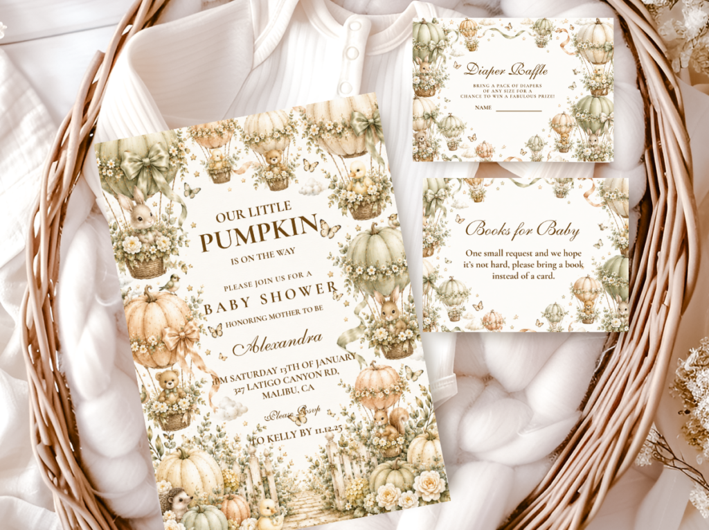
The A Little Pumpkin Theme collection — the full harvest pumpkin stationery suite in warm amber and cream.
Section 03 Our Little Pumpkin for Every Gender
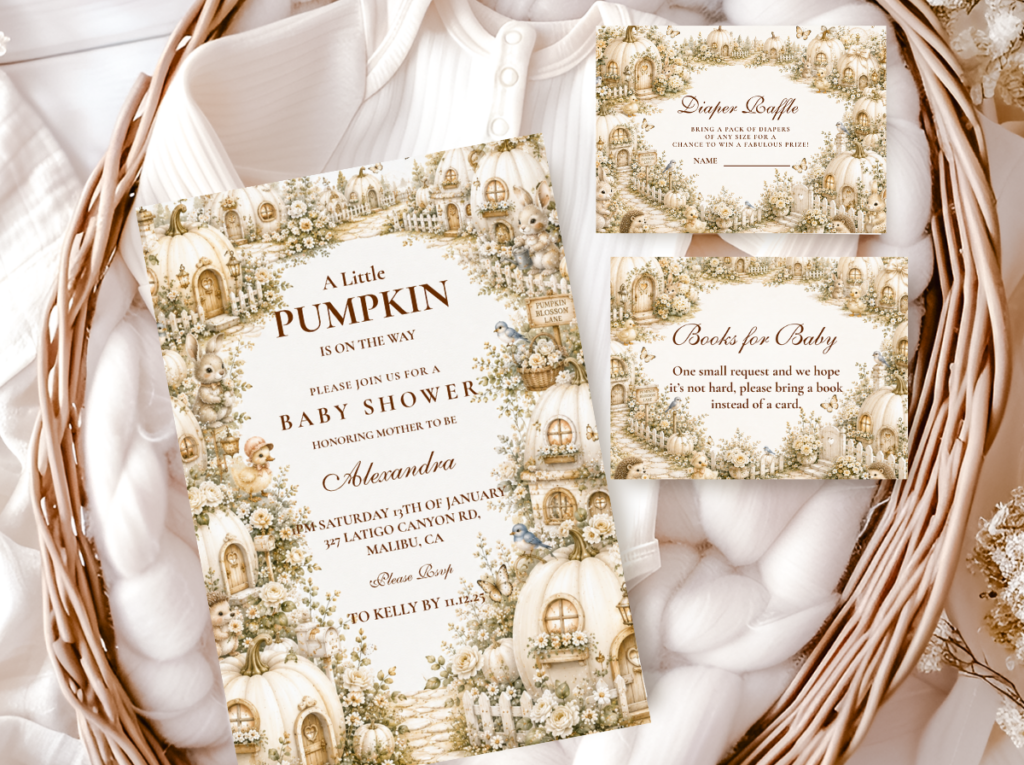
3.1 Gender Neutral — Warm Amber, Cream & Antique Gold
The gender-neutral Our Little Pumpkin direction uses warm amber, deep cream, and antique gold as its three tones — the harvest palette at its most grounded and least gendered. Amber is the dominant accent tone; cream is the base; gold appears at the stationery border, the ribbon detail, and the cake tier divide as the occasion-quality accent. No sage, no dusty rose, no dusty blue: the neutral direction holds to warm tones only, which keeps the palette firmly within the harvest register without introducing a colour that reads as gendered.
Gender Neutral
Warm Amber, Cream & Antique Gold
The warmest and most harvest-grounded of the three directions — amber and cream with antique gold as the occasion accent, suitable for any baby or for a surprise gender reveal shower where the palette should not anticipate the announcement.
3.2 Girl Direction — Dusty Rose, Amber & Cream
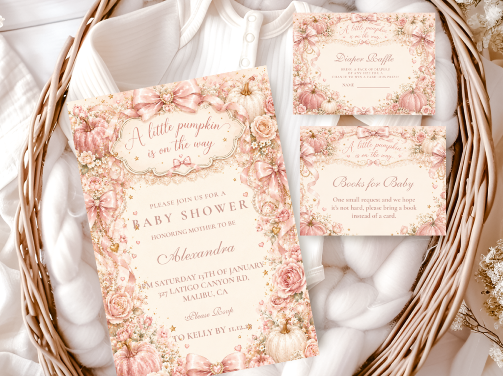
The girl Our Little Pumpkin direction introduces dusty rose as the gender-signalling tone alongside the warm amber base. Dusty rose rather than bright pink — the muted, slightly warm quality of dusty rose sits naturally beside amber and cream in a way that bright pink cannot, because dusty rose shares the muted temperature of the harvest palette. The amber remains present as the harvest anchor; the dusty rose signals the girl direction without overwhelming the pumpkin theme or breaking the warm-toned palette rule.
Girl Direction
Dusty Rose, Amber & Cream
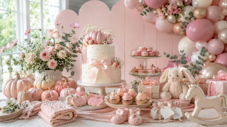
Dusty rose beside warm amber and cream — the girl Our Little Pumpkin direction that keeps the harvest warmth intact while introducing a soft, muted pink as the gender signal. The amber prevents the palette from reading as purely pink; the rose prevents it from reading as purely neutral.
3.3 Boy Direction — Dusty Blue, Amber & Cream
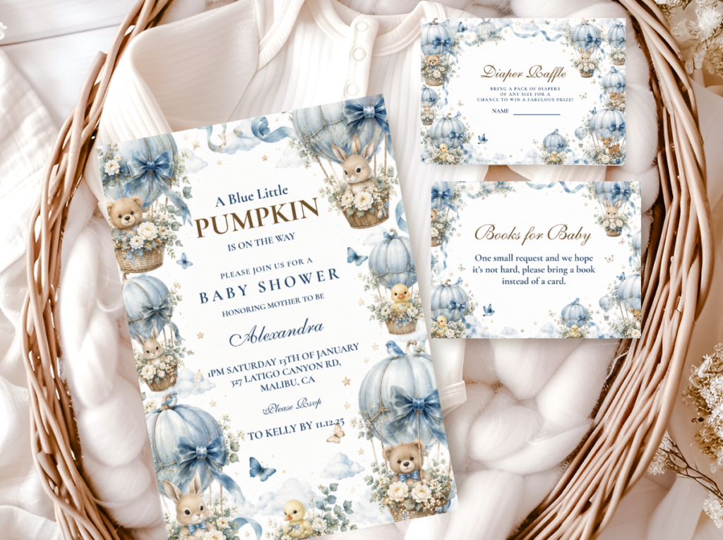
Boy Direction
Dusty Blue, Amber & Cream
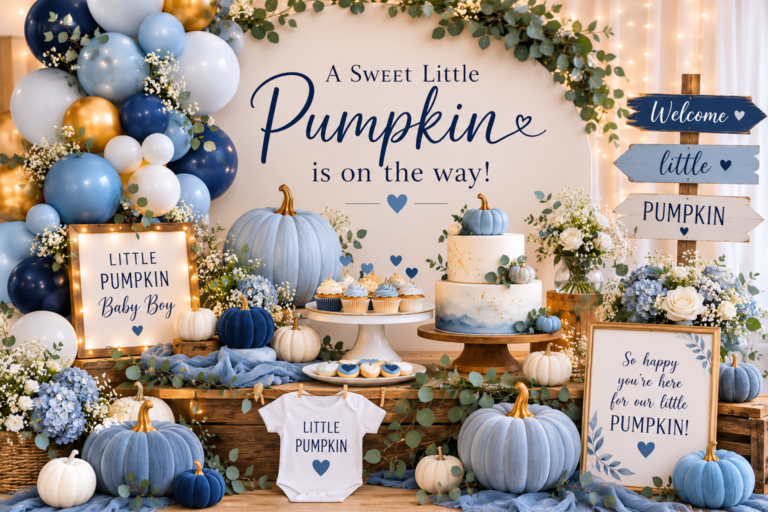
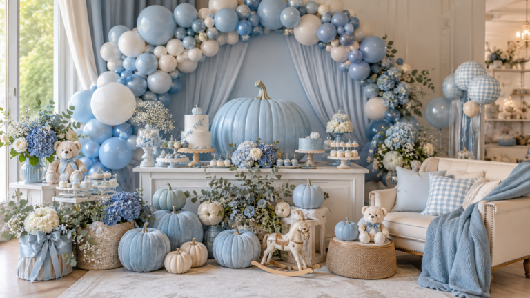
Dusty blue beside warm amber and cream — the boy Our Little Pumpkin direction at its most atmospheric and most harvest-grounded. The blue and amber tension reads as October; the cream holds the palette in the warm, soft register of a baby shower.
🎃 Styling Tip
Our Little Pumpkin works for any gender because ‘our’ is the emotional anchor, not the colour. Choose the wording first — it works equally well in amber, dusty rose, or dusty blue — and then choose the palette direction. The wording does not need the colour to communicate its meaning; the colour follows the wording rather than the other way around.
Section 04 Invitations & Stationery
The Our Little Pumpkin invitation is the element that establishes the family-forward framing before the shower begins — and the first opportunity to apply the one-word principle consistently. An invitation that reads ‘our little pumpkin’ in the header, ‘our family’ in the RSVP line, and ‘with love from our family’ in the closing communicates the direction of the shower in its entirety before a single decoration is seen.
The stationery suite for an Our Little Pumpkin shower should cover at minimum: the invitation, the advice cards, the wishes jar labels, and the favour tags — because these are the four printed elements that guests interact with directly and remember after the event. All four should carry the same wording direction, the same typeface, and the same warm amber and cream palette. The collection showcase below covers all six available stationery directions:
Primary Direction
Our Little Pumpkin
The signature family-forward collection in warm amber and cream — ‘our little pumpkin’ wording across the full stationery suite.
Full Harvest Suite
A Little Pumpkin Theme
The broadest pumpkin theme collection — warm amber and cream across every baby shower paper good, in the harvest register.
Girl Direction
Pink Little Pumpkin
Dusty rose and amber pumpkin stationery — the girl Our Little Pumpkin palette in the same warm harvest register.
Boy Direction
Blue Little Pumpkin
Dusty blue and cream pumpkin stationery — the boy Our Little Pumpkin direction with the harvest amber kept as the secondary accent.
Most Atmospheric
Pumpkin Spice
Warm amber beside cinnamon and cream — the richest and most harvest-grounded of the pumpkin palette directions, natural companion to the Our Little Pumpkin wording.
Gentle Welcome Wording
Hello Pumpkin
A softer wording direction in warm cream and amber — for showers where the welcome register is gentler than ‘our little pumpkin’ but the harvest palette stays consistent.
Browse the full Our Little Pumpkin stationery suite — invitations, advice cards, wishes jar labels, and favour tags in warm amber and cream.
Frequently Asked Questions
What makes ‘our little pumpkin’ different from ‘a little pumpkin’ as a baby shower theme?
The difference is the narrative frame rather than the visual design. ‘A little pumpkin’ places the baby at the centre of the celebration; ‘our little pumpkin’ places the family at the centre. That shift changes the emotional register of every printed element: advice cards become ‘wisdom for our family,’ wishes become ‘a wish for our little pumpkin,’ favour tags read ‘with love from our family’ rather than ‘thank you from baby.’ The decoration scheme can be identical — the same cream pumpkins, the same amber palette, the same harvest botanicals — but the wording direction makes the shower feel like a family announcement rather than a baby celebration. For couples who want the shower to reflect the experience of becoming three rather than the arrival of one, ‘our’ is the word that carries that meaning through every element.
What colours work best for an Our Little Pumpkin baby shower?
Warm amber, deep cream, and antique gold are the three tones that most naturally extend the warmth of the ‘our little pumpkin’ wording into the visual palette — they share the specific quality of the wording: warm, rich, and grounded in the harvest register. For a girl direction, dusty rose beside amber and cream is the most cohesive option: dusty rose is muted enough to sit beside the warm amber without breaking the harvest palette. For a boy direction, dusty blue beside amber and cream is the most atmospheric option: the cool of the blue and the warmth of the amber together produce a specifically autumnal quality. The colours to avoid in all three directions: bright saturated tones that compete with the warmth of the amber. The palette should feel warm and muted across every element; anything brighter or cooler than amber reads as out of register for this theme.
Can ‘our little pumpkin’ work for a twins baby shower?
‘Our little pumpkins’ — plural — works naturally as the wording adjustment for a twins shower and requires no other change to the direction. The family-forward framing of the ‘our’ actually strengthens for a twins shower: the celebration of the family becoming four rather than three is an even more specific and more meaningful announcement than the standard version. The decoration scheme adjusts easily: two small cream pumpkins of equal size at the centrepiece rather than one larger and two smaller; two acrylic toppers on the cake if the design allows; advice cards and wishes jars labelled ‘our little pumpkins.’ The amber and cream palette requires no modification for a twins direction — the wording change from singular to plural carries the full thematic adjustment.
Warm Amber · Cream Pumpkin · Family Becoming Three
Shop Our Little Pumpkin Collections
Family-forward pumpkin baby shower stationery in warm amber and cream — invitations, advice cards, wishes jar labels, and favour tags across six wording and palette directions.