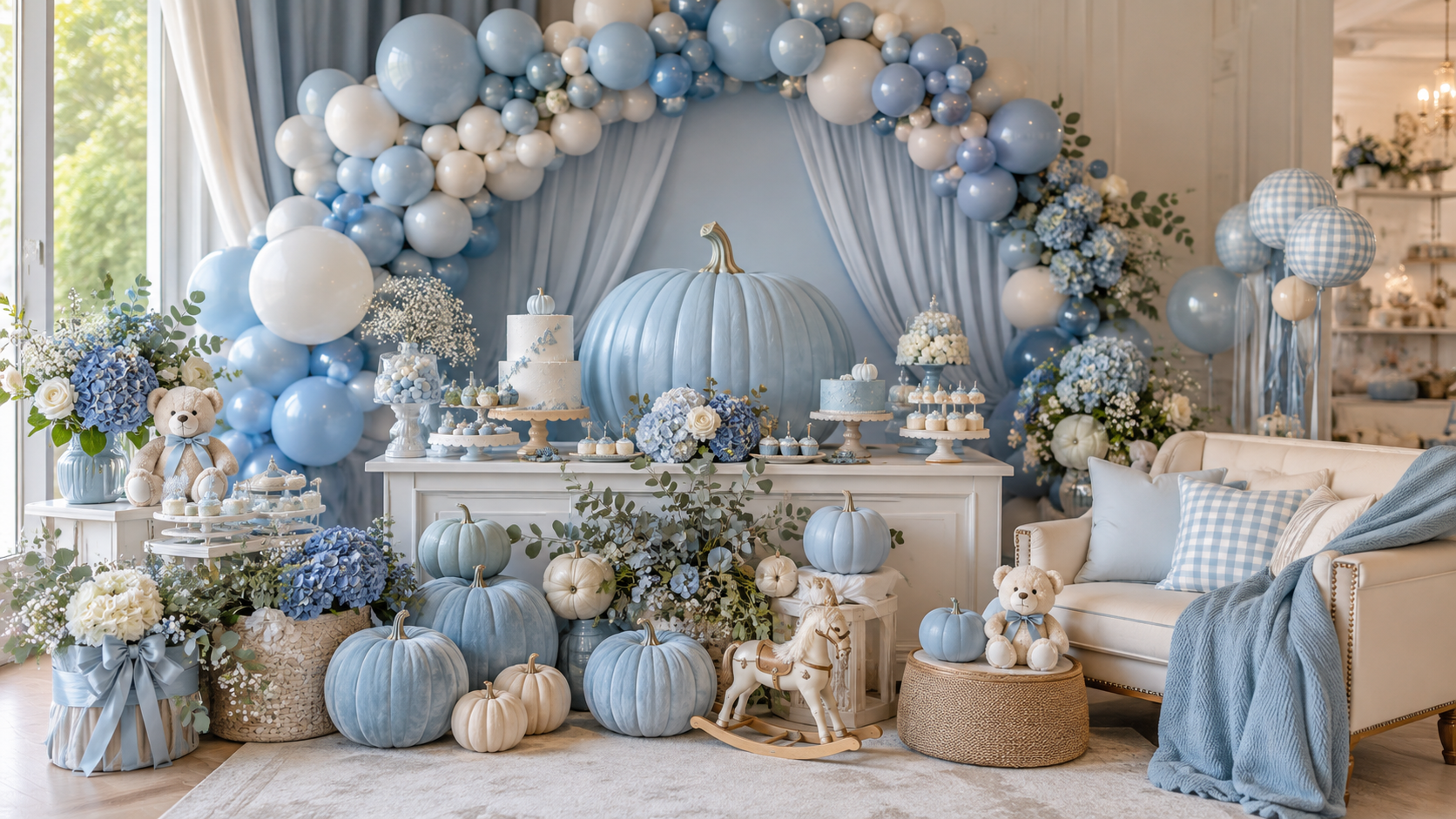
Blue Little Pumpkin Baby Shower Ideas
Baby Shower · Blue Little Pumpkin
Blue Little Pumpkin Baby Shower Ideas
Dusty blue and warm cream beside a little pumpkin — the palette rule, the mini pumpkin scale, and the wording directions that make this the most considered boy pumpkin shower.
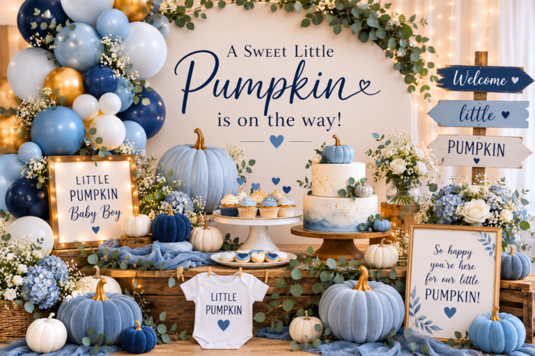
The blue little pumpkin baby shower occupies a specific and unusually beautiful territory: the warmth of the harvest palette combined with the softness of dusty blue in a direction that is neither a standard blue baby shower nor a generic pumpkin theme. The key is the blue — dusty blue specifically, the slightly muted, slightly sage-adjacent tone that sits naturally beside warm cream and antique gold without competing with the pumpkin’s own colour. Bright blue breaks the palette; dusty blue belongs to it.
The ‘little’ wording in the theme name is a design instruction as much as a word choice: it calls for mini pumpkins, delicate botanicals, and small-scale stationery details rather than large statement elements. Everything in this direction is intentionally small, soft, and specifically considered.
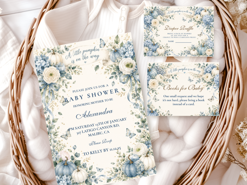
Browse the Blue Little Pumpkin collection — dusty blue and cream pumpkin stationery in the most delicate boy pumpkin direction.
“A little blue pumpkin is on the way — dusty blue and warm cream beside a harvest pumpkin is a combination that belongs together completely. Every detail should feel like the palette was always this way.”
Section 01 The Blue Little Pumpkin Palette Rule
The blue little pumpkin direction has one palette rule that determines whether the whole direction works or breaks down: the blue must be dusty, not bright. Three further distinctions define the direction precisely:
Dusty blue, not bright blue. Bright blue — the saturated, primary-adjacent blue of a standard boy shower palette — competes with the warm cream and amber tones of the harvest palette rather than sitting beside them. Dusty blue — the slightly greyed, slightly sage-tinted blue that reads as both cool and warm simultaneously — belongs naturally to the cream and gold world of the pumpkin theme. The test: hold the blue element beside a cream linen and a warm gold ribbon. If it reads as part of the same family, it is the right blue. If it reads as a separate colour that has been placed beside the warm tones, it is too bright. Dusty blue is the blue that makes the palette feel inevitable rather than assembled.
The ‘little’ scale instruction. As in the pink little pumpkin direction, the ‘little’ wording shifts every decor decision toward smaller and more delicate elements. Mini pumpkins — no larger than a fist — rather than large statement gourds. Fine dried botanicals — dried blue thistle, dried eucalyptus, small dried cotton stems — rather than abundant fresh flower arrangements. Small stationery details in the dusty blue and cream palette rather than oversized graphic elements. A large pumpkin at the centre of a blue little pumpkin table reads as the wrong scale; three mini pumpkins at varying heights with a small botanical cluster reads as precisely correct.
Cream not white, gold not yellow. Warm cream is the correct base tone for this direction — the ivory-adjacent off-white that leans toward warmth rather than toward bright white’s clinical coolness. Bright white sits awkwardly beside dusty blue and harvest cream, pulling the palette toward a cooler register than the pumpkin theme can support. Antique gold — the slightly amber-toned gold rather than bright or lemony yellow — is the correct accent metal: it bridges the dusty blue and the warm cream without either brightening or cooling the palette. Together, dusty blue, warm cream, and antique gold produce a colour story that reads as considered and as specifically belonging to the harvest season in a way that no other blue baby shower palette achieves.
🎃 Styling Tip
The blue little pumpkin palette needs three anchors: one dusty blue element, one warm cream element, one antique gold element. Every purchase for this shower should sit comfortably beside all three. If a blue reads too bright or too primary beside the cream — or if a white reads too clinical — it belongs to a different direction. The dusty blue and warm cream combination is specific enough that deviating from it by even one strong-toned element breaks the palette’s coherence.
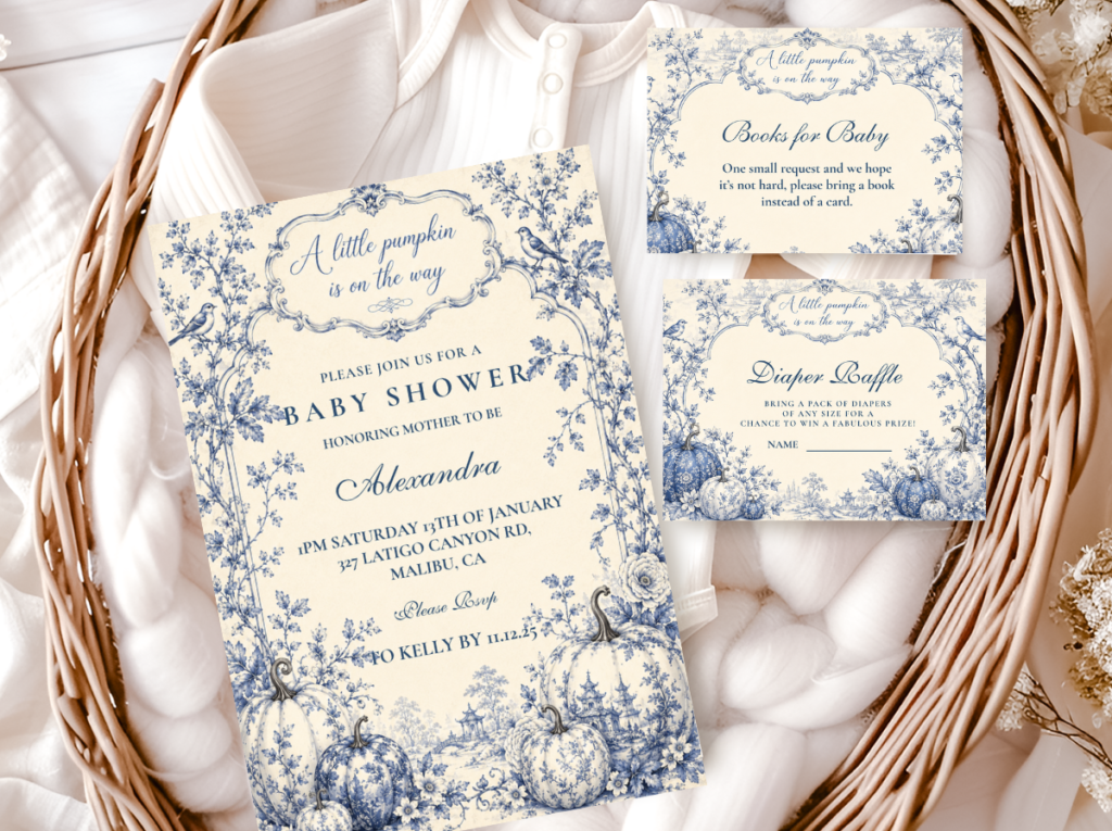
The Blue Little Pumpkin collection — dusty blue and cream pumpkin stationery in the precisely ‘little’ scale.
Section 02 Decor, Cake & Table
The blue little pumpkin table applies the palette and scale rules to every surface simultaneously — the centrepiece, the runner, the cake, and the stationery all belong to the same dusty blue, cream, and gold world at the same delicate scale.
Centrepiece: Three mini pumpkins arranged at varying heights on a warm cream linen runner — one natural cream pumpkin, one small white pumpkin that reads as ivory rather than bright white, and one small standard pumpkin left in its natural orange-amber tone for warmth. A small cluster of dried blue thistle, dried eucalyptus, and two or three dried cotton stems tucked at the arrangement’s base provides the dusty blue botanical element without requiring fresh flowers or water management. A single slim taper candle in an antique gold holder at the arrangement’s tallest point completes the three-height structure: the tall candle, the mid-height pumpkin on a small wooden disc riser, and the low pumpkin directly on the runner. The dried botanical cluster should be small enough that it reads as an accent to the pumpkins rather than as a separate arrangement placed beside them.
Runner and linen: A warm ivory or natural linen runner rather than a bright white cloth. Where a tablecloth is used beneath the runner, it should be in the same warm cream or oatmeal tone rather than bright white. Dusty blue linen napkins — in the muted, slightly sage-adjacent blue of the palette — folded simply at each place setting, with a small sprig of dried eucalyptus or a single dried cotton stem tucked into the fold as the personal seat detail. The napkin is the most visible per-seat colour element and the most efficient way to carry the dusty blue tone from the centrepiece to the individual guest’s experience.
Cake: A semi-naked or lightly textured buttercream cake in warm cream — not white — with a small cream or ivory pumpkin topper and a cluster of dried blue thistle and eucalyptus at the tier base as the botanical accent. Dusty blue buttercream detail at the tier divide — a thin, lightly applied stripe or a small floral pipe in dusty blue rather than a heavy blue layer — carries the palette into the cake without overwhelming the warm cream ground. Gold leaf or antique gold ribbon at the board edge. The cake’s proportion should match the direction’s scale: a two-tier cake in the thirty-centimetre range reads as correctly delicate for the blue little pumpkin direction; a large, multi-tier structure reads as a different register entirely.
🎃 Styling Tip
Mini pumpkins in natural cream and ivory tones beside a small dusty blue botanical cluster read as more delicate and more specifically considered than large statement gourds in this direction. Three mini pumpkins at varying heights — one elevated on a small riser, one at mid height, one directly on the runner — beside a cluster of dried blue thistle is the most refined blue little pumpkin centrepiece available. Resist adding more; the restraint is the direction’s defining quality.
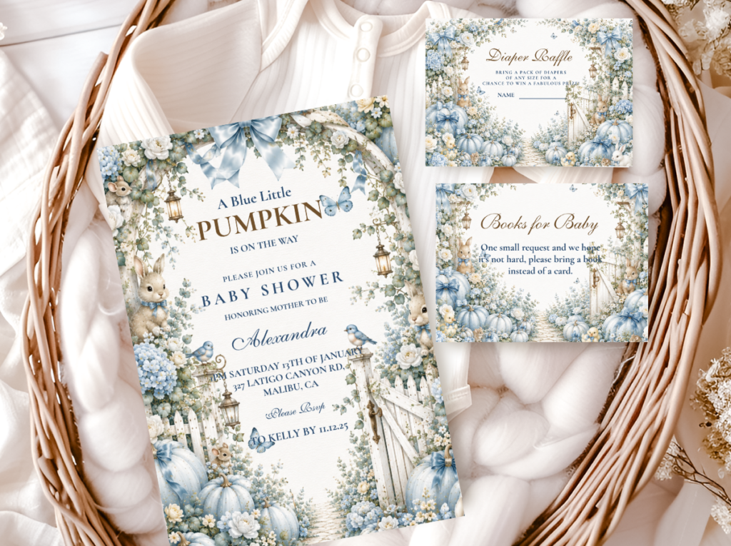
The Boy Pumpkin collection — warm amber and cream pumpkin stationery for the boy pumpkin direction.
Section 03 Blue Little Pumpkin Variations
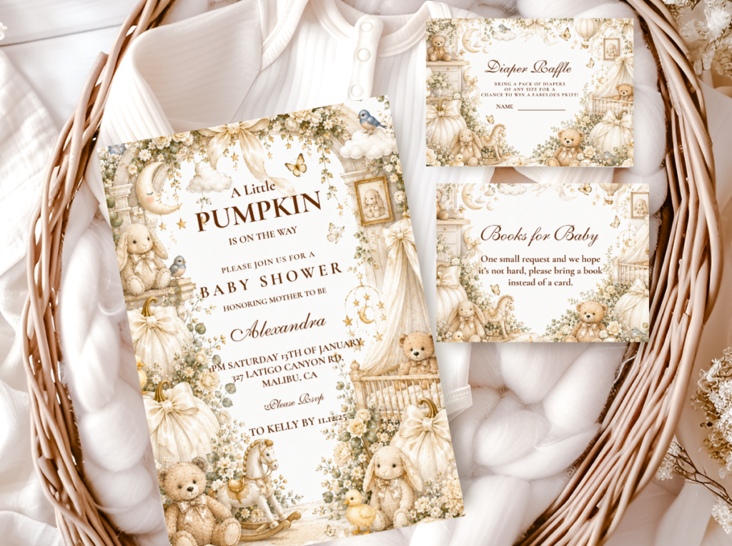
3.1 Our Little Blue Pumpkin — Family-Forward Wording
The ‘our little pumpkin’ wording direction uses the same dusty blue, cream, and gold palette as the primary blue little pumpkin direction but shifts the emotional register of every stationery piece from a baby announcement toward a family celebration. The pronoun ‘our’ places the parents — and any older siblings — at the centre of the celebration alongside the baby, producing a more inclusive tone that many hosts find more natural for a larger, multi-generational shower.
The wording change is the entire difference between this direction and the classic blue little pumpkin: the palette is identical, the decor is identical, and every stationery piece simply reads ‘our little pumpkin’ rather than ‘a little pumpkin’ or ‘our little blue pumpkin’ rather than ‘a little blue pumpkin.’ Applied consistently across every printed element, the shift is complete.
Direction 3.1
Our Little Blue Pumpkin — Family Register
The dusty blue and cream palette with the ‘our’ wording shift. Identical palette to the primary direction; the pronoun change moves the celebration’s emotional centre from baby announcement to family gathering.
3.2 Blue Pumpkin Spice — Warmer, Spice-Forward Register
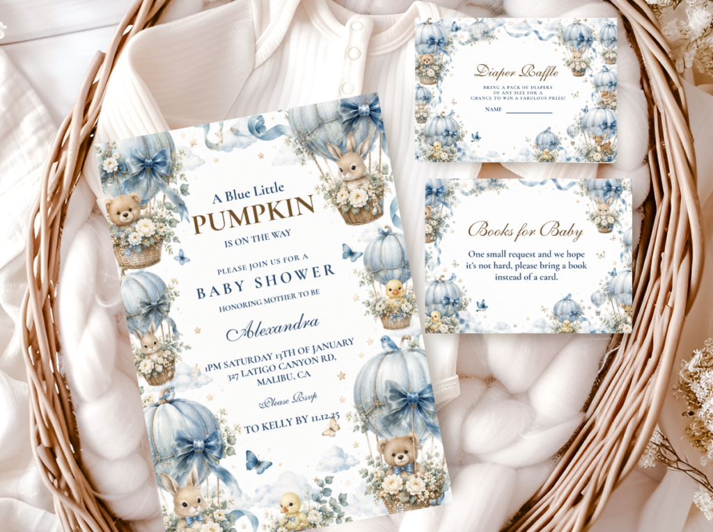
The Pumpkin Spice direction takes the blue little pumpkin palette in a warmer, more amber-forward direction: the dusty blue remains but the cream and gold tones deepen toward warm amber and spice, producing a palette that references the harvest season more explicitly than the primary blue little pumpkin direction does. It is the correct choice for a shower hosted in the height of autumn — October or early November — where a richer, warmer palette suits the seasonal context better than the softer, more pastel register of the primary direction.
The Pumpkin Spice direction uses the same mini pumpkin scale and the same dusty blue botanical elements as the primary direction, but the warm amber tones in the stationery ground and the amber-forward accent colour give it a distinctly harvest-rich quality that makes it feel seasonal in a deeper way.
Direction 3.2
Blue Pumpkin Spice — Warm Amber & Dusty Blue
Dusty blue alongside warm amber and spice tones — the harvest-rich version of the blue little pumpkin direction for a deeper seasonal register. Same mini pumpkin scale, warmer stationery palette.
🎃 Styling Tip
The ‘our’ wording change and the Pumpkin Spice palette shift are the two easiest ways to personalise the blue little pumpkin direction without changing any of the decor decisions. Choose the wording based on the emotional register the host wants — family-forward or baby-announcement — and the palette variation based on the season’s depth. Both use the same dusty blue, cream, and gold anchors.
Section 04 Invitations & Stationery
The blue little pumpkin invitation establishes the palette’s dusty blue and warm cream register from the first piece the guest receives — and that first impression is where the direction’s specificity is most immediately communicated. The invitation ground should be warm cream rather than bright white; the blue element in the design should read as dusty and muted rather than as saturated primary blue; and the pumpkin motif should be small and fine-detailed rather than large and graphic. A small pumpkin illustration in warm amber on a cream card with dusty blue lettering or a dusty blue decorative border reads as blue little pumpkin; the same pumpkin at large scale on a white card with bright blue type reads as something else entirely.
Every subsequent stationery piece — the place card, the food label, the welcome sign, the thank-you card — should apply the same palette and the same scale discipline as the invitation, so that the overall stationery suite reads as a single designed set rather than as individual pieces that happen to share a theme. The six collections below cover every wording and palette variation available in the blue little pumpkin direction.
Primary Direction
Blue Little Pumpkin
The most precisely ‘little’ and most specifically dusty-blue pumpkin stationery suite — the correct starting point for this direction.
Boy Direction
Boy Pumpkin
Warm amber and cream pumpkin stationery for the boy pumpkin direction — the harvest-warm alternative to the dusty blue primary direction.
Family-Forward Wording
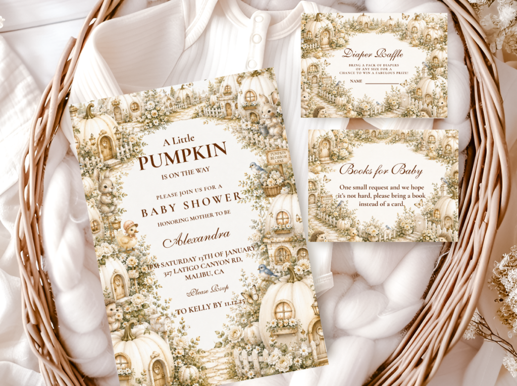
Our Little Pumpkin
Warm cream and amber with ‘our little pumpkin’ wording — the family-forward direction for the blue little pumpkin celebration.
Warm Amber Variation
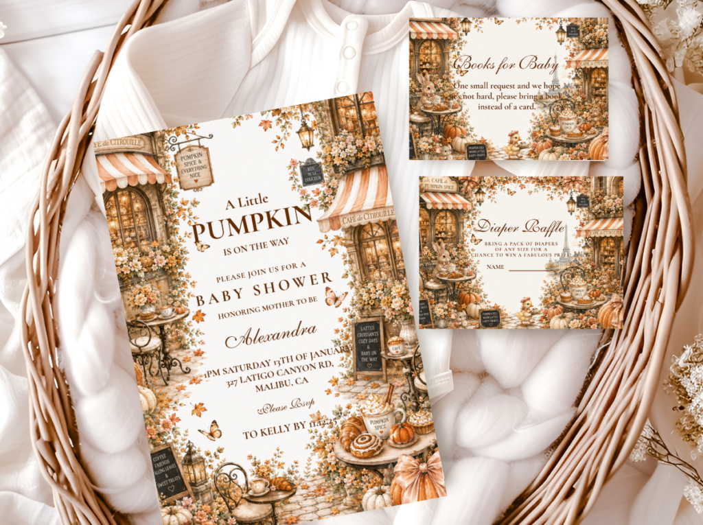
Pumpkin Spice
Dusty blue alongside warm amber and spice tones — the harvest-rich, deeper-palette variation for the blue little pumpkin direction.
Greeting Wording
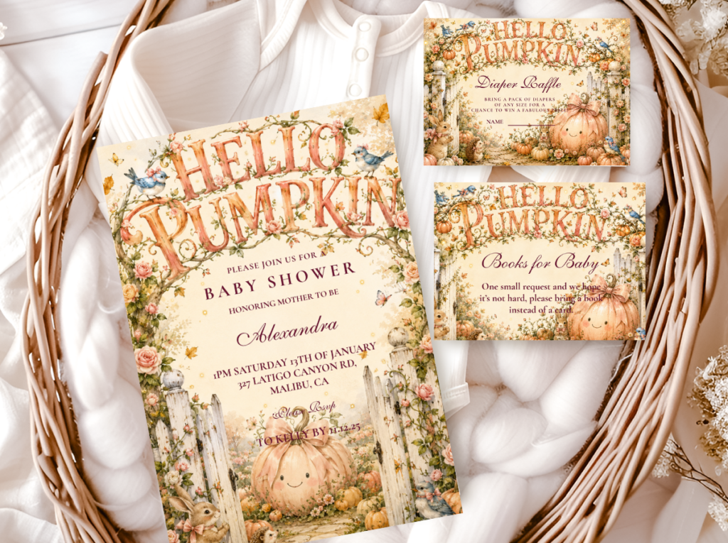
Hello Pumpkin
Warm amber and cream with ‘hello pumpkin’ wording — the joyful arrival direction in the same harvest palette.
Full Harvest Suite
A Little Pumpkin Theme
The broadest pumpkin theme collection — warm amber and cream across every baby shower paper good, the most flexible stationery starting point.
Browse the full blue little pumpkin stationery range — dusty blue, cream, and warm gold across six wording and palette directions.
Frequently Asked Questions
What makes the blue little pumpkin direction different from a standard boy pumpkin theme?
Two specific distinctions. First, the blue: a standard boy pumpkin theme often uses a brighter, more saturated blue that sits beside the harvest palette as a contrast element rather than as part of it. The blue little pumpkin direction uses dusty blue — the slightly greyed, muted blue that belongs naturally to the cream and gold world of the harvest palette. Second, the scale: the ‘little’ wording requires mini pumpkins, fine dried botanicals, and small-scale stationery details throughout. A standard boy pumpkin theme can accommodate larger elements; the blue little pumpkin direction cannot without losing the delicacy that defines it.
What specific colours work for a blue little pumpkin baby shower?
Dusty blue as the primary directional colour — the slightly muted, slightly sage-adjacent blue that reads as neither too bright nor too grey. Warm cream as the base tone — the ivory-adjacent off-white that leans toward warmth rather than bright white’s coolness. Antique gold as the occasion accent — the slightly amber-toned gold that bridges the dusty blue and the warm cream without brightening or cooling either. Natural amber as the pumpkin’s own colour, which contributes warmth to the palette without needing to be replicated in any other element. Avoid bright blue, bright white, and bright yellow — all three break the palette’s considered, muted register.
Can the blue little pumpkin direction work before the baby’s gender is confirmed?
The blue little pumpkin direction is specifically boy-oriented in its palette and wording register. For a shower where the gender is not yet known, the classic pumpkin direction — warm amber, cream, and gold with no directional gender colour — is the more appropriate choice. The ‘a little pumpkin is on the way’ or ‘our little pumpkin’ wording in warm amber on cream reads as gender-neutral and carries all the warmth and delicacy of the harvest palette without the blue directional signal. The same pumpkin theme, applied in the cream and gold palette only, is equally beautiful and equally considered.
Dusty Blue · Warm Cream · Antique Gold · Mini Pumpkins
Shop Blue Little Pumpkin Baby Shower Collections
Dusty blue and cream pumpkin invitations, place cards, and favour tags — six wording and palette directions for the blue little pumpkin baby shower.