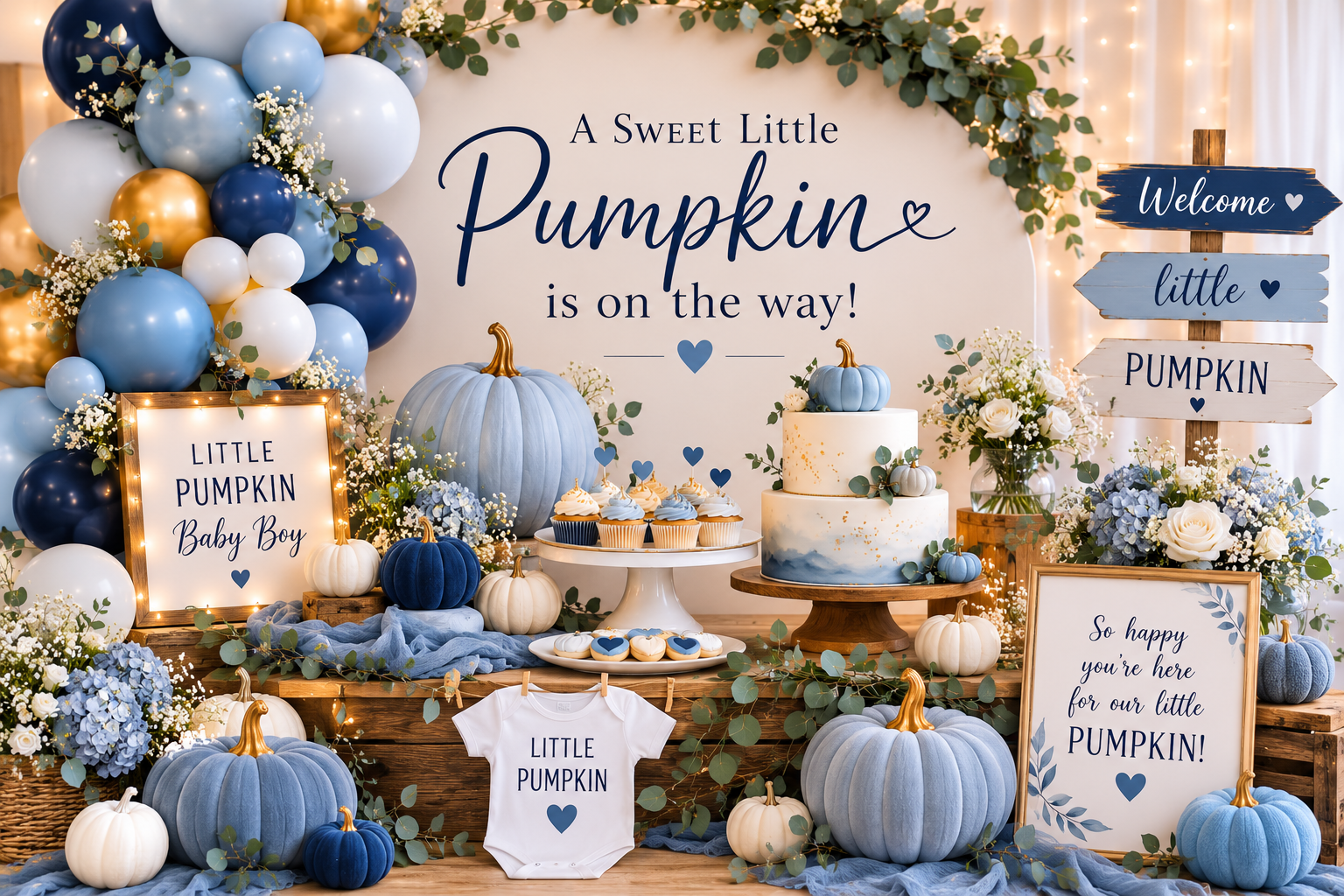
Blue Pumpkin Baby Shower Ideas
Baby Shower · Blue Pumpkin Ideas Guide
Blue Pumpkin Baby Shower Ideas
The exact shade of blue that works beside cream pumpkins, the two-tone palette rule, and every decoration detail for a blue pumpkin baby shower that reads harvest and tailored simultaneously.
The blue pumpkin baby shower sits at a specific intersection — the warmth of a harvest pumpkin theme and the softness of a blue boy palette — and it works beautifully when the right shade of blue is chosen and fails noticeably when the wrong one is. The difference between a cohesive blue pumpkin baby shower and one that looks unresolved is almost entirely a palette decision made before a single decoration is purchased.
The three sections below cover the palette rule that makes or breaks the theme, the decor and cake decisions that extend it consistently through the party, and the two blue pumpkin variations — Blue Little Pumpkin and Blue Pumpkin Spice — that represent the two most distinct directions within the theme.
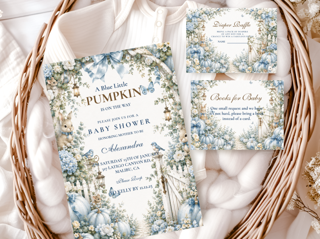
Browse the Blue Little Pumpkin collection — dusty blue and cream pumpkin baby shower stationery in the tailored boy direction.
“Dusty blue and cream pumpkins — the combination that reads harvest and tailored simultaneously, without a single cliché in sight.”
Section 01 The Blue Pumpkin Palette Rule
The single decision that determines whether a blue pumpkin baby shower looks intentional or unresolved is the shade of blue. Not the decoration quantity, not the pumpkin style, not the floral arrangement — the specific blue tone chosen, before anything else is purchased.
There are two categories of blue, and only one of them works beside cream pumpkins and warm harvest tones.
Blues that work — muted, warm-adjacent tones: Dusty blue, slate blue, and muted powder blue all sit naturally beside cream pumpkins and warm brown. They share a quality that makes the combination cohesive: their temperature is slightly neutralised, leaning neither strongly warm nor strongly cool. Dusty blue in particular has a grey or sage undertone that places it comfortably in the same visual world as pumpkin cream and oatmeal linen. Slate blue reads as slightly more sophisticated and slightly more muted — appropriate for an elevated baby shower direction. Muted powder blue is the softest of the three and produces the most delicate palette combination, appropriate for a light and airy blue pumpkin direction rather than a richly decorated one.
Blues that don’t work — bright, saturated, or cool-leaning tones: Bright baby blue, royal blue, and turquoise all fight the harvest palette immediately and for the same reason: they are saturated and cool, and cream pumpkins and warm brown are warm and muted. The contrast is not complementary — it is competing. Bright baby blue beside a cream pumpkin produces the visual impression that two different themes are occupying the same table. Royal blue is too strong for the softness that a pumpkin baby shower palette requires. Turquoise leans green-blue in a way that actively clashes with the warm amber undertones of both the pumpkin and the brown accent tones. None of these three blues can be corrected by adjusting other palette elements — if the blue is wrong, the palette is wrong, and no amount of cream, gold, or sage surrounding it will fix the conflict.
The two-tone rule: Dusty blue and warm cream is always enough as a two-colour base for a blue pumpkin baby shower. Adding a third tone enriches the palette without breaking it if the third tone is warm and muted: sage green adds botanical softness; antique gold adds warmth and a slight occasion-quality. Adding bright orange as a third tone breaks the palette immediately — it reintroduces the saturated warmth that the dusty blue is specifically calibrated to avoid. Adding bright yellow produces the same conflict. The rule: any third tone must be at least as muted as the dusty blue itself. If it is more saturated than the blue, it does not belong in the palette.
🎃 Styling Tip
The blue pumpkin palette passes one test: hold your blue element beside a cream pumpkin. If they look like they belong to the same warm autumn world — it works. If the blue looks brighter or cooler than the pumpkin — it will dominate the palette all day. Test with an actual cream or white pumpkin, a cream swatch, or the cream background of the invitation before committing to any blue in quantity.
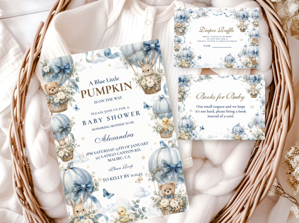
The Blue Little Pumpkin collection — dusty blue and cream pumpkin stationery for a tailored boy baby shower.
Section 02 Blue Pumpkin Decor, Cake & Table
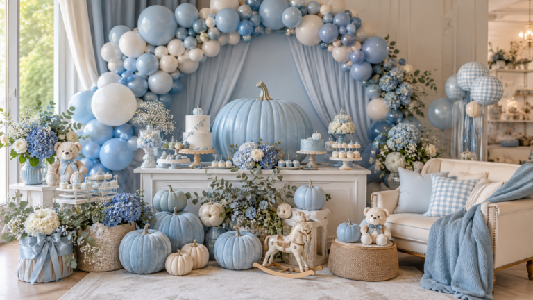
The blue pumpkin baby shower table applies the same palette rule to every decoration layer: dusty blue and warm cream as the two primary tones, with sage botanical accents as the optional third tone. Every element should pass the same test as the blue fabric or paper chosen for the stationery: hold it beside a cream pumpkin and ask whether it belongs to the same warm, muted autumn world.
Balloon arch: A dusty blue, cream, and sage organic balloon arch is the most photographically effective backdrop for a blue pumpkin baby shower. The three tones — all warm-muted, all within the same visual temperature — work as an organic arrangement without the need for a structured or geometric installation. The organic shape of the balloon arch echoes the organic shape of the pumpkin, which is the visual connection that makes the arrangement feel designed rather than assembled. The arch should be anchored at floor level with one or two real cream or white pumpkins at the base — this single prop detail connects the balloon arrangement to the pumpkin theme more effectively than any printed banner.
Table and centrepiece: A warm oatmeal or cream linen runner as the table base — the specific warmth of oatmeal linen beside dusty blue is what produces the harvest quality of the combination. A centrepiece of cream pumpkins in varying sizes, grouped in odd numbers (three or five), with sage botanical accents — dried eucalyptus, fresh sage sprigs, or dried pampas in cream tones — arranged loosely at the base of the pumpkin cluster. Dusty blue votive candle holders at the table level as the colour accent within the centrepiece zone. A single dusty blue ribbon tie on the largest pumpkin as the detail that connects the centrepiece to the invitation palette.
Cake: A two-tier dusty blue buttercream cake with a cream pumpkin topper is the most directly thematic cake option for a blue pumpkin baby shower. The buttercream finish should be matte or lightly textured — a smooth satin finish reads as too formal for the organic warmth of the pumpkin theme; a rough spatula texture or a subtle palette-knife finish sits more naturally in the harvest register. The cream pumpkin topper — either a fondant pumpkin in warm cream or a real small white pumpkin placed at the base of the top tier — is the single themed detail that communicates the pumpkin direction without over-decorating the cake surface. Gold leaf at the tier base as the optional accent.
🎃 Styling Tip
A blue pumpkin balloon arch works when dusty blue, cream, and sage appear together — three warm muted tones in an organic shape. The moment a bright blue or orange balloon enters the arch it shifts the palette from harvest to generic. Order a small quantity of any balloon colour as a sample before purchasing the full arch quantity — balloon colours vary significantly between manufacturers and the colour that reads correctly in a photograph may not match the invitation in person.
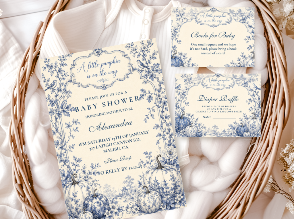
The Boy Pumpkin collection — blue and cream pumpkin stationery for a tailored baby boy harvest shower.
Section 03 Blue Pumpkin Variations
Within the blue pumpkin baby shower theme, two directions produce the most distinct and most cohesive aesthetic results. They share the dusty blue and cream base but diverge in their third tone and their wording register.
3.1 Blue Little Pumpkin — Dusty Blue, Cream & Gold
The Blue Little Pumpkin direction uses ‘little pumpkin’ wording throughout — on the invitation, the banner, the favour tags, and the place cards — as the verbal identity of the theme. The wording is warm and playful without being saccharine; it reads as the right register for a baby shower that is joyful and intentional simultaneously.
The palette in this direction is dusty blue, warm cream, and antique gold. The gold functions as the accent tone that communicates ‘occasion’ within the harvest palette — it appears at the stationery border, the ribbon detail, the candlestick, and the cake tier base rather than as a dominant colour anywhere. The dusty blue and cream carry the palette; the gold lifts it.
Direction 3.1
Blue Little Pumpkin — Dusty Blue, Cream & Gold
Dusty blue and warm cream with antique gold accents — the tailored boy pumpkin direction with ‘little pumpkin’ wording throughout. Ideal for a harvest baby shower that reads sophisticated rather than themed.
3.2 Blue Pumpkin Spice — Dusty Blue, Warm Amber & Cream
The Blue Pumpkin Spice direction replaces the antique gold accent with warm amber — a deeper, richer tone that is closer to the natural pumpkin colour and to the cinnamon and clove register of pumpkin spice as a sensory reference. The result is the most atmospheric of the blue pumpkin directions: dusty blue beside warm amber and cream creates a harvest palette that reads sophisticated rather than themed, with the amber providing genuine warmth that antique gold approaches but does not fully achieve.
This is the blue pumpkin direction that most effectively communicates October — the specific warmth of the amber beside the specific coolness of the dusty blue produces a tension that reads as late-harvest rather than as a decorated party room. It is the most editorial of the blue pumpkin options and the most directly connected to the pumpkin spice sensory world.
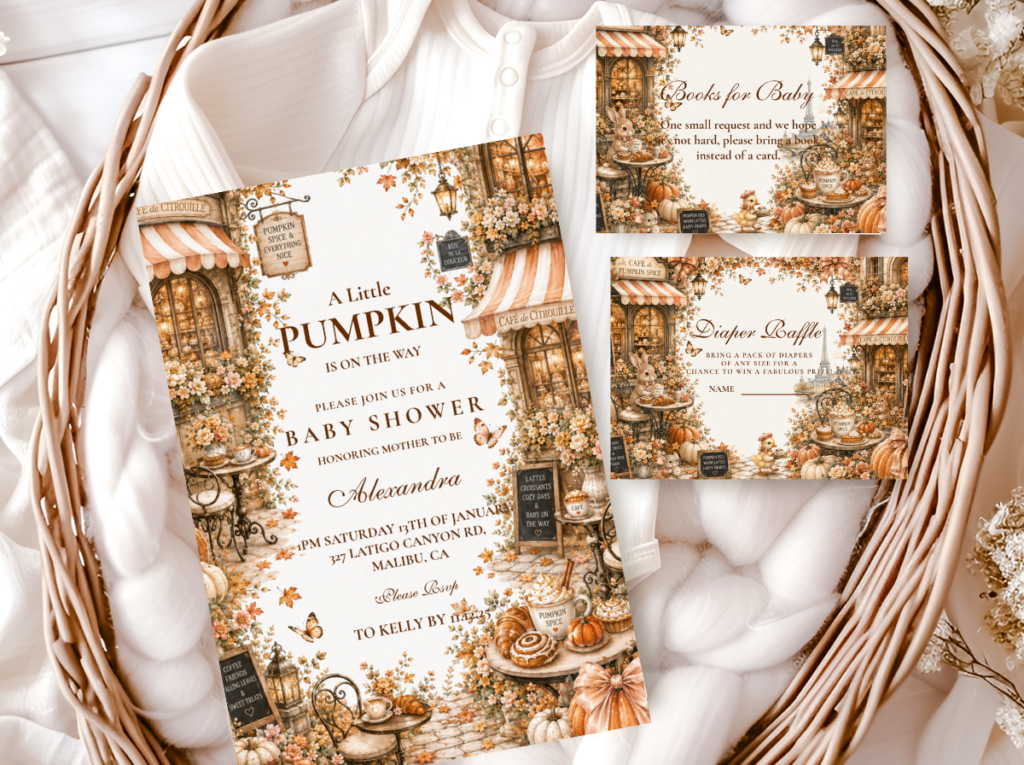
Direction 3.2
Blue Pumpkin Spice — Dusty Blue, Warm Amber & Cream
Dusty blue beside warm amber and cream — the most atmospheric boy pumpkin direction, with the cinnamon and harvest warmth of the pumpkin spice register running through the palette.
🎃 Styling Tip
Blue Pumpkin Spice is the most unexpected and most editorial boy pumpkin direction — dusty blue beside warm amber and cinnamon tones creates a harvest palette that reads sophisticated rather than themed. The amber does what gold approaches but cannot quite achieve: it communicates the actual colour and warmth of the pumpkin rather than the formal accent quality of a metallic. The result is a palette that feels genuinely autumnal rather than simply decorated for autumn.
Section 04 Invitations & Stationery
The blue pumpkin baby shower invitation is the first element that communicates the palette to guests — and the first opportunity to establish whether the blue chosen is the correct muted, warm-adjacent tone or a brighter blue that will misrepresent the theme. The invitation should reflect the exact dusty blue of the decoration palette; a slightly different shade of blue on the invitation creates a disconnection between the stationery and the room that guests may not consciously identify but will register as a slightly unresolved quality.
Six collections in the blue pumpkin direction cover the full range from the most delicate powder blue to the most atmospheric amber-and-blue combination — each with a distinct palette register and wording direction. The showcase below is the full lineup:
Primary Blue Direction
Blue Little Pumpkin
Dusty blue and cream with ‘little pumpkin’ wording — the most tailored and most directly thematic boy pumpkin stationery direction.
Boy Pumpkin Classic
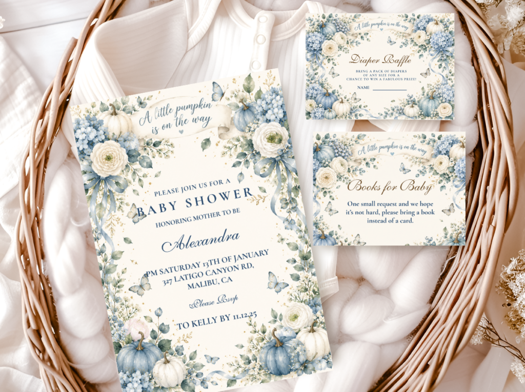
Boy Pumpkin
Blue and cream pumpkin stationery in the classic boy pumpkin register — clean, warm, and seasonally grounded.
Family Wording
Our Little Pumpkin
Dusty blue and cream with ‘our little pumpkin’ wording — the direction that includes both parents in the pumpkin identity of the baby.
Most Atmospheric
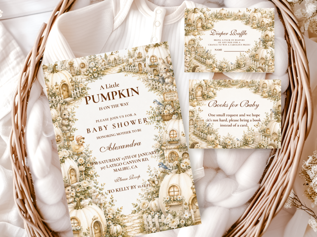
Pumpkin Spice
Dusty blue beside warm amber and cream — the Blue Pumpkin Spice direction with the harvest warmth of cinnamon and amber running through the palette.
Warm Welcome Wording
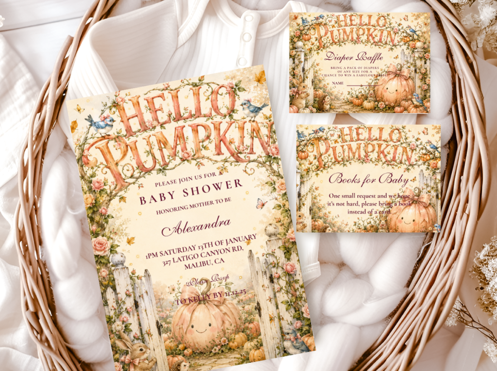
Hello Pumpkin
A gentle ‘hello pumpkin’ wording direction in the blue and cream palette — the softest and most welcoming of the boy pumpkin stationery registers.
Full Pumpkin Theme
A Little Pumpkin Theme
The broadest pumpkin theme stationery collection — blue and cream across the full suite of baby shower paper goods.

Browse all six blue pumpkin collections — dusty blue and cream baby shower stationery in every wording and palette direction.
Frequently Asked Questions
What shade of blue works best for a pumpkin baby shower?
Dusty blue is the most consistently successful shade for a pumpkin baby shower — it has a slightly grey or sage undertone that neutralises its temperature enough to sit naturally beside cream pumpkins and warm brown accent tones. Slate blue is the next best option: slightly more sophisticated and slightly more muted than dusty blue, it works particularly well in an elevated or formal baby shower direction. Muted powder blue is the softest option and works best in a light and delicate blue pumpkin direction. The blues to avoid: bright baby blue, royal blue, and turquoise. All three are too saturated or too cool to sit beside the warmth of cream pumpkins and harvest tones — the contrast reads as competing rather than complementary. If uncertain between two blues, hold both beside a cream pumpkin or a warm cream swatch: the blue that looks like it belongs to the same warm autumn world is the correct choice.
How do I combine blue and pumpkin elegantly?
Three decisions together produce an elegant blue pumpkin combination. First, choose the right blue — dusty, slate, or muted powder, not bright or saturated. Second, anchor the table with cream rather than white: white is too cool a base for the warmth of the pumpkin palette, while cream or oatmeal linen sits in the same visual temperature as the pumpkin and the dusty blue simultaneously. Third, limit the palette to two or three tones maximum — dusty blue, warm cream, and one accent (antique gold or warm amber). The elegance of a blue pumpkin baby shower comes from restraint: the fewer palette tones that appear on the table, the more designed and intentional the combination reads. More than three tones, and the arrangement starts to look decorated rather than designed.
Can a blue pumpkin baby shower work as a gender-neutral theme?
A blue pumpkin baby shower can read as gender-neutral when two adjustments are made. First, use a very muted, almost grey-blue — a slate blue or a blue-grey rather than a recognisably ‘boy blue’ tone. The more neutral the specific blue, the less the palette reads as gendered. Second, use ‘our little pumpkin’ or ‘little pumpkin’ wording rather than wording that specifies a boy — the wording is what carries the gender signal in most pumpkin stationery more than the palette does. A slate blue beside warm cream, oatmeal linen, and sage botanical accents with ‘our little pumpkin’ wording reads as a tailored, seasonal, gender-neutral baby shower direction. The same palette with ‘our baby boy’ wording reads as specifically gendered regardless of the specific shade of blue.
Dusty Blue · Cream Pumpkin · Harvest & Tailored
Shop Blue Pumpkin Baby Shower Collections
Dusty blue and cream pumpkin baby shower stationery — invitations, favour tags, and place cards across six wording and palette directions.