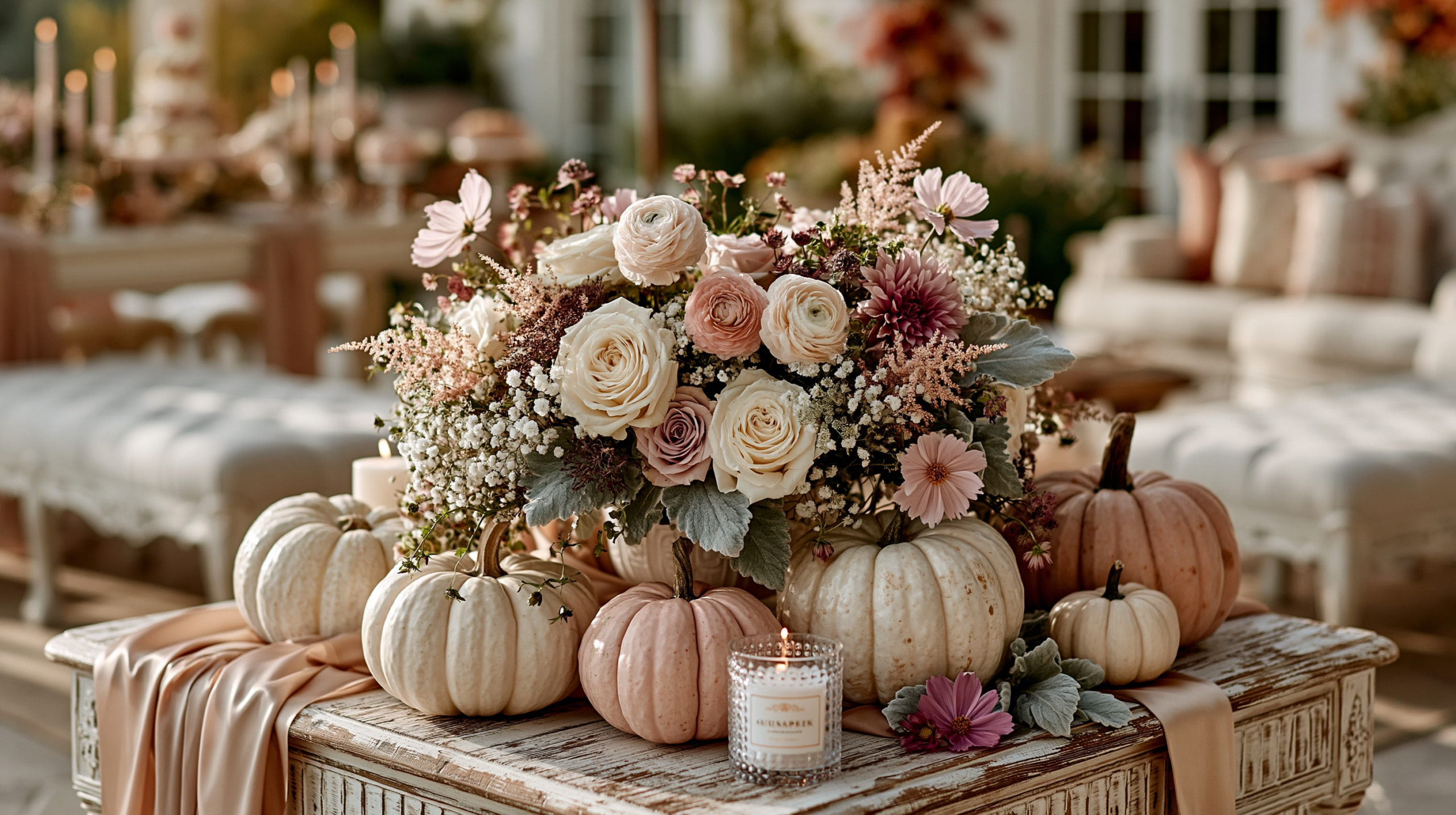
Hello Pumpkin Baby Shower Ideas
Baby Shower · Hello Pumpkin Ideas Guide
Hello Pumpkin Baby Shower Ideas
The greeting wording that frames the whole shower as a welcome, with a slightly warmer palette, more abundant botanical details, and the welcome sign as the hero element that sets the joyful tone before guests enter the room.
‘Hello pumpkin’ is the most joyful of all the pumpkin baby shower wording directions — and the most specific in its emotional framing. Where ‘a little pumpkin’ describes the baby and ‘our little pumpkin’ describes the family becoming three, ‘hello pumpkin’ is a greeting. It faces toward the baby rather than describing them; it communicates anticipation, warmth, and the specific joy of an arrival that is not yet here but is already being welcomed. Every element of a hello pumpkin shower should feel like a welcome rather than a decoration.
The three distinctions below cover what makes the hello pumpkin direction specific — its slightly warmer palette tolerance, its greeting-and-arrival wording register, and its more abundant botanical detail. The sections that follow cover the decor and cake decisions that extend those qualities through the table, and the three palette directions within the theme.
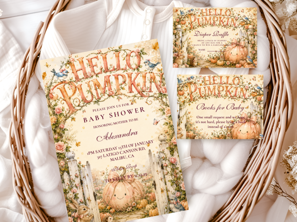
Browse the Hello Pumpkin collection — warm amber and cream pumpkin stationery in the joyful greeting direction.
“Hello pumpkin — the most joyful and most direct pumpkin baby shower announcement; two words that say everything about the warmth and sweetness of what is coming.”
Section 01 What Makes Hello Pumpkin Distinct
Three qualities define the hello pumpkin direction and distinguish it from the other pumpkin wording directions. Each one follows directly from the specific emotional register of a greeting — anticipation, welcome, and the warmth of an arrival being met with joy before it has happened.
Distinction 1
Warmer Orange Tones Are Acceptable Here — The Playful Wording Earns a Warmer Palette
The classic neutral pumpkin baby shower direction holds strictly to muted, cool-leaning tones — pale ivory, soft sage, cool cream — because bright or warm tones break the elegant register of a minimal pumpkin aesthetic. The hello pumpkin direction is different: the wording itself is more energetic and more playful than ‘a little pumpkin,’ and that energy allows — and actually suits — a slightly warmer palette. Soft amber tones, warm honey, and even a gentle soft orange all belong naturally in the hello pumpkin palette in a way they would not in the classic neutral direction. This does not mean bright Halloween orange — the pumpkin baby shower palette should always read as harvest-warm rather than Halloween-saturated. But a warm amber that would feel too energetic in a minimal elegant pumpkin shower feels completely right in a hello pumpkin one. The wording sets the emotional register; the palette follows.
Distinction 2
The Greeting Framing — Every Element Should Feel Like a Welcome
‘Hello’ implies arrival and anticipation — it is a word spoken at the threshold, not after the fact. This framing should be consistent across every printed element of the shower. The welcome sign reads ‘Hello Pumpkin, We’ve Been Waiting for You’ rather than simply announcing the theme. Favour tags read ‘Hello little one’ rather than ‘thank you.’ Advice cards are framed as ‘words of welcome for our little pumpkin’ rather than generic wishes. Activity games ask guests to share their earliest memory of the parents-to-be or their favourite thing about the season the baby is arriving into — questions that face toward the future and toward the baby’s arrival rather than simply celebrating the present moment. The greeting framing is not just a wording choice; it is an editorial direction that makes every element of the shower feel oriented toward the person who is coming rather than toward the party that is happening.
Distinction 3
More Abundant Botanical Details — Vine Illustrations, Leaf Garlands, Harvest Florals
The hello pumpkin aesthetic is slightly more abundant and more botanically detailed than the minimal elegance of ‘a little pumpkin.’ Where the classic pumpkin direction uses a single clean pumpkin silhouette as its primary illustration, the hello pumpkin direction allows and benefits from pumpkin vine illustrations, autumn leaf garland details, harvest floral accents — the visual abundance that matches the warmth and generosity of the greeting wording. A welcome sign with a pumpkin vine border, a vine-illustrated banner, or a garland of autumn leaves at the table edge all read as more in keeping with the joyful ‘hello’ register than a single clean silhouette would. The botanical abundance communicates the same warmth as the wording: both are generous, both are facing outward toward the arriving baby, and both communicate celebration rather than restraint.
🎃 Styling Tip
The hello pumpkin wording works best when it appears on the first thing guests see — the welcome sign. ‘Hello Pumpkin, We’ve Been Waiting for You’ as a welcome sign at the entrance or above the main table sets the joyful, anticipatory tone for the entire shower before guests reach the food, the centrepiece, or the stationery suite. The welcome sign is the element that frames everything else; it should be the largest, most visible printed element in the room.
The Hello Pumpkin collection — warm amber and cream pumpkin stationery in the greeting and arrival direction.
Section 02 Hello Pumpkin Decor, Cake & Table
The hello pumpkin table is slightly more abundant than the classic neutral pumpkin table — more botanical detail, warmer tones, and the welcome sign as the hero element that anchors the entire arrangement. Restraint is still a virtue, but the hello pumpkin direction allows for more visual generosity than the minimal elegant pumpkin direction requires.
Welcome sign as the hero element: A welcome sign reading ‘Hello Pumpkin’ or ‘Hello Pumpkin, We’ve Been Waiting for You’ in warm amber or antique gold lettering on a cream or kraft board — positioned at the room entrance or above the main table as the first element guests read. The welcome sign should be large enough to be legible from across the room: a minimum of A2 or 60×45 cm. Framed in a natural wood or rattan frame if possible, which connects the sign materially to the warm, organic quality of the hello pumpkin palette. A pumpkin vine border hand-lettered or printed around the sign edge is the botanical detail that makes the welcome sign specific to the hello pumpkin direction rather than generic.
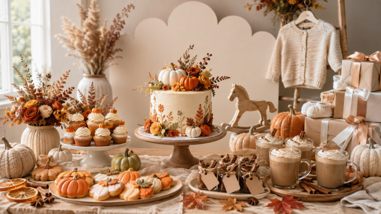
Centrepiece and table: A warm amber and cream pumpkin cluster in three to five sizes, positioned asymmetrically along the centre of the table runner rather than at the exact centre point. A pumpkin vine garland — either real or dried, or a printed paper garland in the palette’s colours — trailing loosely from the centrepiece cluster toward one end of the table as the botanical detail that makes the arrangement feel abundant. Scattered autumn leaves in amber and warm rust tones as the flat confetti layer on the table surface — the leaf scatter is the hello pumpkin equivalent of the standard confetti scatter, and it extends the botanical warmth of the wording into the table surface itself. A warm oatmeal or cream linen runner as the base.
Cake: A semi-naked or lightly textured buttercream cake in warm cream, with a ‘Hello Pumpkin’ acrylic topper as the primary wording detail. The acrylic topper is the single element that makes the hello pumpkin wording direction immediately recognisable to guests who know the theme — it appears on the cake before any other element is read and communicates the specific wording direction of the shower in one phrase. A pumpkin vine detail in the buttercream at the tier divide — either textured into the buttercream with a palette knife or applied as a thin fondant vine strip — extends the botanical abundance of the direction into the cake surface. Gold leaf at the base of the top tier as the occasion-quality accent.
🎃 Styling Tip
A ‘Hello Pumpkin’ acrylic cake topper is the single detail that makes this wording direction immediately recognisable — guests who know the theme see it and respond to the specific warmth of the greeting before they read anything else at the party. Order personalised acrylic toppers at least two weeks in advance to allow for production and shipping time; a standard run of pre-made toppers requires less lead time but may not carry the specific wording of the direction.
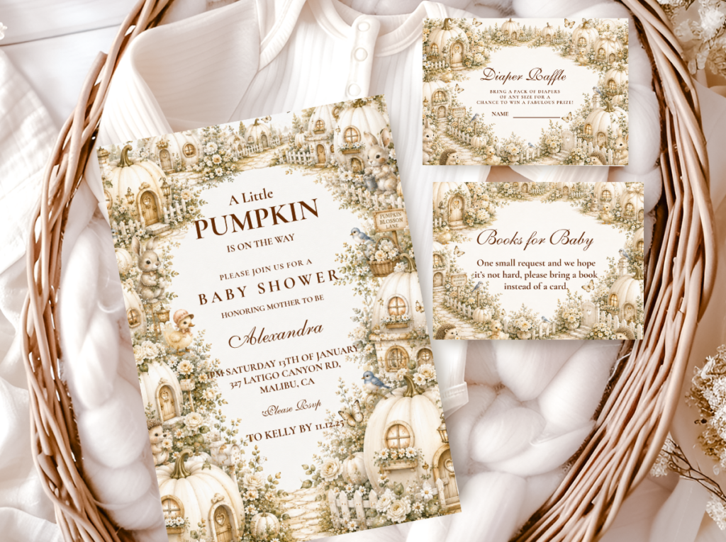
The A Little Pumpkin Theme collection — warm harvest pumpkin stationery across the full baby shower suite.
Section 03 Hello Pumpkin Palette Directions
Three palette directions produce distinct and coherent results within the hello pumpkin theme. All three use the warm amber harvest base; they diverge in the accent colour that determines the emotional register — from the most grounded classic harvest to the most feminine to the most unexpected and most delicate.
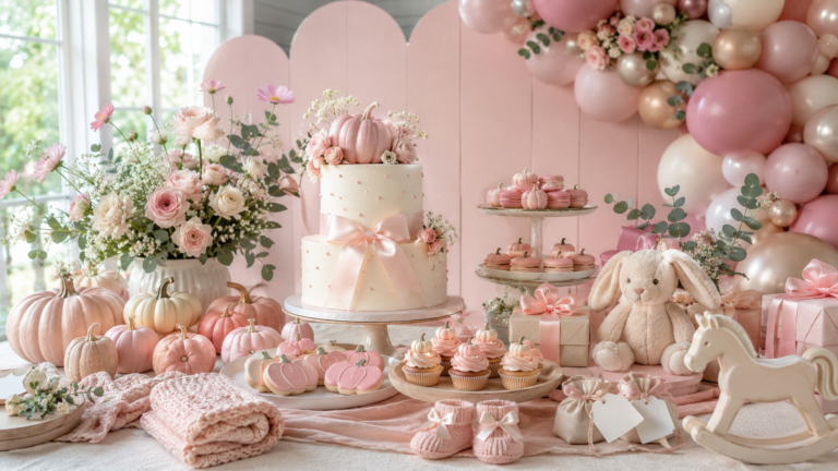
3.1 Classic Hello Pumpkin — Warm Amber, Cream & Gold
The classic hello pumpkin direction uses warm amber, deep cream, and antique gold as its three tones — slightly richer and slightly warmer than the neutral little pumpkin palette. Amber is the dominant accent tone, appearing in the pumpkin cluster, the welcome sign lettering, and the votive candles. Cream is the base, appearing in the linen runner and the smaller pumpkins. Gold appears at the stationery border, the ribbon, and the cake tier accent as the occasion-quality element that communicates ‘this is a celebration.’ The classic direction is gender-neutral and appropriate for any baby or a reveal shower.
Direction 3.1
Classic Hello Pumpkin — Warm Amber, Cream & Gold
Warm amber and deep cream with antique gold as the occasion accent — the richest and most harvest-grounded of the hello pumpkin directions, slightly warmer than the classic neutral little pumpkin palette. Gender-neutral and appropriate for any baby.

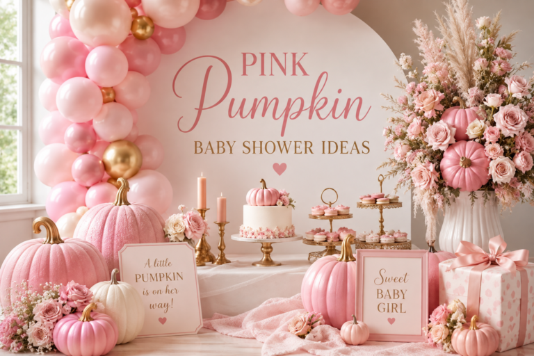
3.2 Pink Hello Pumpkin — Dusty Rose, Warm Amber & Cream
The pink hello pumpkin direction introduces dusty rose alongside the warm amber base — the most feminine of the three hello pumpkin palette combinations. Dusty rose sits naturally beside warm amber in the hello pumpkin palette because both tones are warm and muted: they share a temperature that keeps the palette within the same harvest register rather than introducing a cool or contrasting element. The wording ‘hello pumpkin’ in dusty rose and warm amber reads as specifically feminine without requiring bright pink or an explicitly girl-labelled wording.
Direction 3.2
Pink Hello Pumpkin — Dusty Rose, Warm Amber & Cream
Dusty rose beside warm amber and deep cream — the feminine hello pumpkin direction that keeps the greeting warmth of the wording intact while adding a soft, muted pink as the girl signal. Both tones are warm; neither competes with the other.
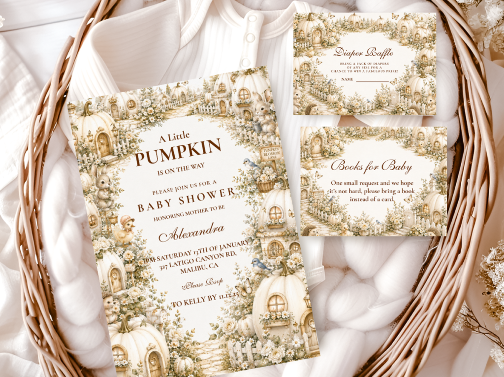
3.3 Pastel Hello Pumpkin — Soft Lavender, Blush & Cream
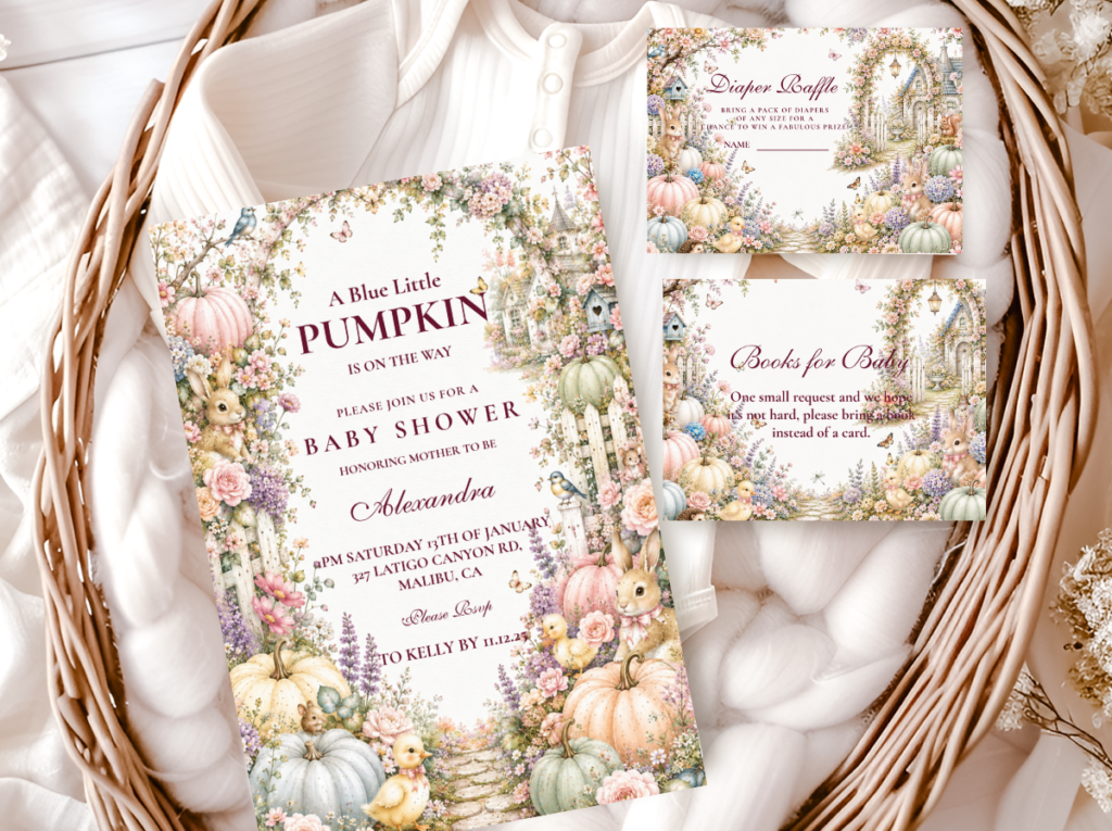
The pastel hello pumpkin direction is the most unexpected of the three — and the most deliberately so. Soft lavender and blush beside cream pumpkins is a palette that would read as disconnected from the pumpkin theme without strong wording to anchor it. With ‘hello pumpkin’ wording throughout, the palette reads as completely intentional: the greeting carries the pumpkin theme when the palette is softer than expected, and the softness of the palette makes the joyful directness of the greeting wording more striking by contrast.
This is the direction for a host who wants a pumpkin baby shower that reads as unexpected and personal rather than as a classic harvest execution. The pastel hello pumpkin direction should be treated as a full commitment — every element in soft lavender, blush, and cream, with ‘hello pumpkin’ wording consistent across the stationery suite — rather than as a pastel palette with a few pumpkin accents.
Direction 3.3
Pastel Hello Pumpkin — Soft Lavender, Blush & Cream
Soft lavender and blush beside cream — the most unexpected and most delicate of the hello pumpkin directions. The greeting wording anchors the pumpkin theme when the palette is softer than expected; the pastel tones make the wording more striking by contrast.
🎃 Styling Tip
Pastel hello pumpkin works because the playful, direct wording carries the pumpkin theme when the palette is softer than expected. Soft lavender and blush with cream pumpkins reads as completely intentional precisely because the ‘hello pumpkin’ wording anchors the theme at every printed surface. Without the wording consistency, the pastel palette reads as disconnected from the harvest theme. With it, the palette reads as a deliberate and personal direction that guests remember specifically because it surprised them.
Section 04 Invitations & Stationery
The hello pumpkin invitation sets the greeting register of the shower before the event begins. An invitation that opens with ‘Hello Pumpkin’ as the headline, followed by the shower details in the harvest palette, communicates the emotional direction of the event — anticipation, warmth, welcome — before a single decoration is seen. The wording should be consistent from the invitation through every piece of the stationery suite: advice cards framed as ‘words of welcome,’ wishes jar labels reading ‘a wish for our hello pumpkin,’ favour tags reading ‘hello little one.’
The botanical illustration style on the hello pumpkin invitation benefits from a pumpkin vine or autumn leaf detail — the same botanical abundance that the direction uses in the table decoration, carried into the stationery surface. A vine-bordered invitation in warm amber and cream reads as more specifically hello pumpkin than a clean silhouette design, and communicates the slightly more abundant, more joyful register of the greeting direction before the wording is read. The collection showcase below covers all six available directions:
Primary Direction
Hello Pumpkin
Warm amber and cream in the greeting and arrival wording direction — ‘hello pumpkin’ across the full stationery suite from invitation to favour tag.
Full Harvest Suite
A Little Pumpkin Theme
The broadest pumpkin theme collection — warm amber and cream across the full baby shower suite, a natural companion to the hello pumpkin wording direction.
Family-Forward Wording
Our Little Pumpkin
Warm amber and cream with ‘our little pumpkin’ wording — the family-forward alternative wording that pairs naturally with the classic hello pumpkin palette.
Pink Hello Direction
Pink Pumpkin
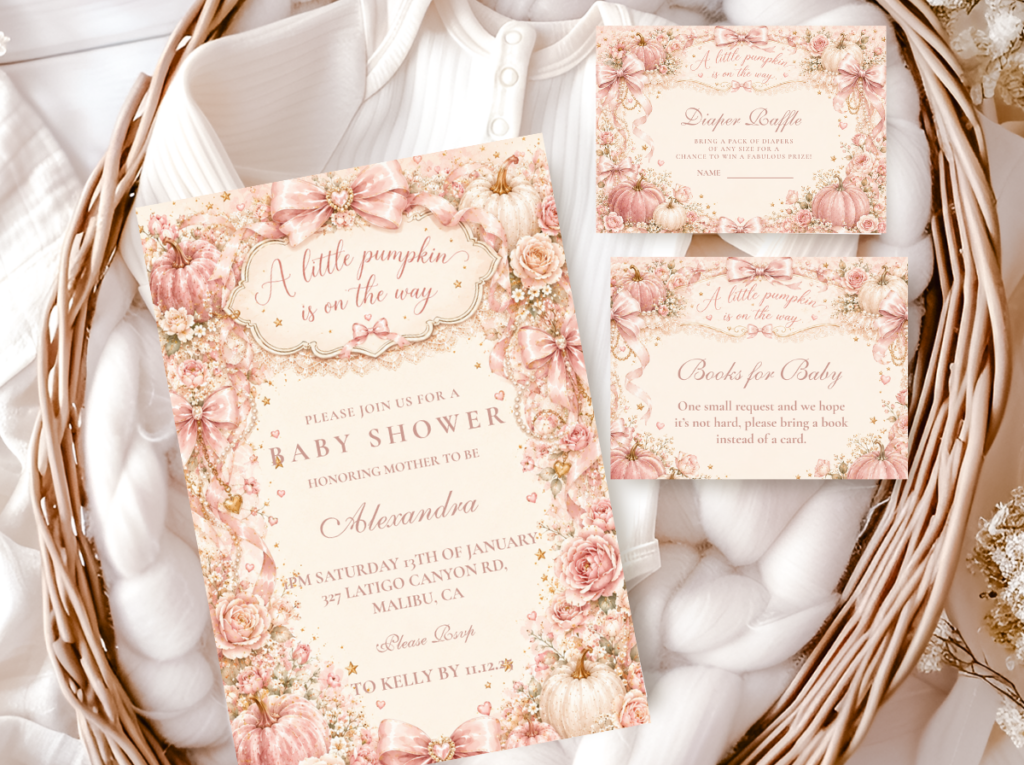
Dusty rose and warm amber pumpkin stationery — the feminine hello pumpkin palette direction in a full baby shower suite.
Most Atmospheric
Pumpkin Spice
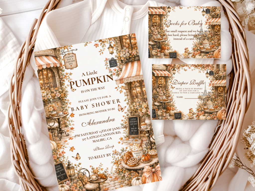
Warm amber, cinnamon, and cream — the richest harvest direction in the pumpkin collection, closest in palette warmth to the classic hello pumpkin register.
Pastel Direction
Pastel Pumpkin
Soft lavender, blush, and cream — the unexpected and delicate hello pumpkin palette direction for a shower that reads as personal and surprising rather than classic harvest.
Browse the full Hello Pumpkin stationery suite — greeting-forward invitations, advice cards, wishes jar labels, and favour tags across six palette directions.
Frequently Asked Questions
What makes ‘hello pumpkin’ different from ‘a little pumpkin’ as a baby shower wording direction?
The difference is the direction the wording faces. ‘A little pumpkin’ describes the baby — it is a portrait in words. ‘Hello pumpkin’ addresses the baby — it is a greeting at the threshold of their arrival. That distinction changes the emotional register of every element in the shower: where ‘a little pumpkin’ creates a celebration around a description, ‘hello pumpkin’ creates a welcome for an arrival. Practically, this means every printed element should face toward the baby rather than describe them: advice cards frame wisdom as ‘words of welcome,’ favour tags read ‘hello little one,’ the welcome sign communicates anticipation rather than arrival. The palette difference is also meaningful: the hello pumpkin direction allows slightly warmer amber and soft orange tones that the minimal elegant little pumpkin direction does not, because the greeting wording has a warmer and more playful energy that the palette should reflect.
What colours work best for a hello pumpkin baby shower?
Warm amber and deep cream are the base tones of the hello pumpkin direction, slightly richer and warmer than the classic neutral little pumpkin palette. The hello pumpkin direction allows soft orange tones that the minimal elegant pumpkin direction does not — because the playful, joyful energy of the greeting wording earns a warmer palette. For the girl direction, dusty rose beside warm amber produces a palette that is feminine without breaking the harvest register. For the most unexpected direction, soft lavender and blush beside cream produces the pastel hello pumpkin palette, which works specifically because the greeting wording anchors the pumpkin theme when the palette is softer than expected. The colour to avoid in all three directions: bright, saturated orange. The hello pumpkin direction allows warmer tones than the classic neutral pumpkin, but the warmth should be harvest-warm rather than Halloween-saturated.
Can a hello pumpkin baby shower work for any gender?
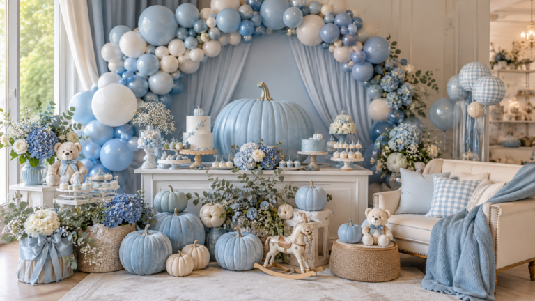
The classic hello pumpkin direction — warm amber, deep cream, and antique gold — is gender-neutral because the palette carries no gender signal, only seasonal warmth. The greeting wording ‘hello pumpkin’ itself is gender-neutral — it addresses the baby without attributing a gender. For a girl direction, dusty rose is introduced alongside the amber base. For a boy direction, dusty blue can be introduced in the same way — muted and warm-adjacent, present in equal visual measure to the amber rather than dominating it. For a reveal shower where the gender will be announced at the event, the classic amber and cream direction is the most appropriate because no palette element anticipates the announcement before it is made. The pastel direction — soft lavender and blush — reads as slightly more feminine than strictly gender-neutral, but the lavender tone keeps it from reading as specifically girl in the way that dusty rose would.
Warm Amber · Greeting Wording · Welcome Sign as Hero
Shop Hello Pumpkin Baby Shower Collections
Greeting-forward pumpkin stationery in warm amber, dusty rose, and pastel — invitations, welcome signs, advice cards, and favour tags across six hello pumpkin directions.