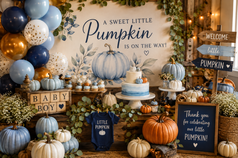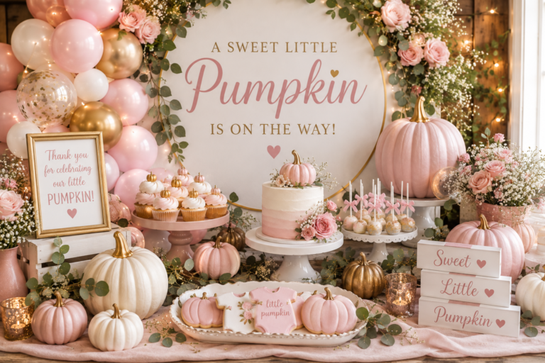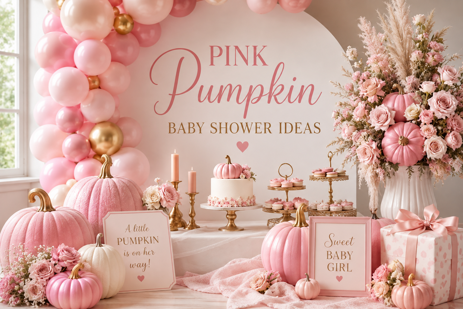
Pink Pumpkin Baby Shower Ideas
Baby Shower · Pink Pumpkin Style Guide
Pink Pumpkin Baby Shower Ideas
Dusty rose and blush beside cream pumpkins and dried pampas — the pink pumpkin baby shower palette rule, complete decor guide, and full stationery showcase.
The pink pumpkin baby shower is the most feminine and most Pinterest-saved direction in the entire pumpkin baby shower category — and the most often executed with the wrong pink. The difference between a pink pumpkin shower that reads as warmly beautiful and one that reads as two separate aesthetics placed on the same table is a single decision: the specific quality of the pink chosen. Dusty rose, warm blush, and antique rose belong to the harvest world. Hot pink, bright magenta, and cool lavender-pink do not. The cream pumpkin is the palette anchor; every pink element in the shower must look natural beside it.
When the pink is right — warm, muted, sitting comfortably beside cream and sage without competing — the pink pumpkin baby shower is one of the most consistently beautiful baby shower aesthetics available. The warmth of the autumn harvest palette and the softness of the dusty rose palette belong together in the same way that dried roses belong in a wheat and pampas arrangement: they were made for the same season.
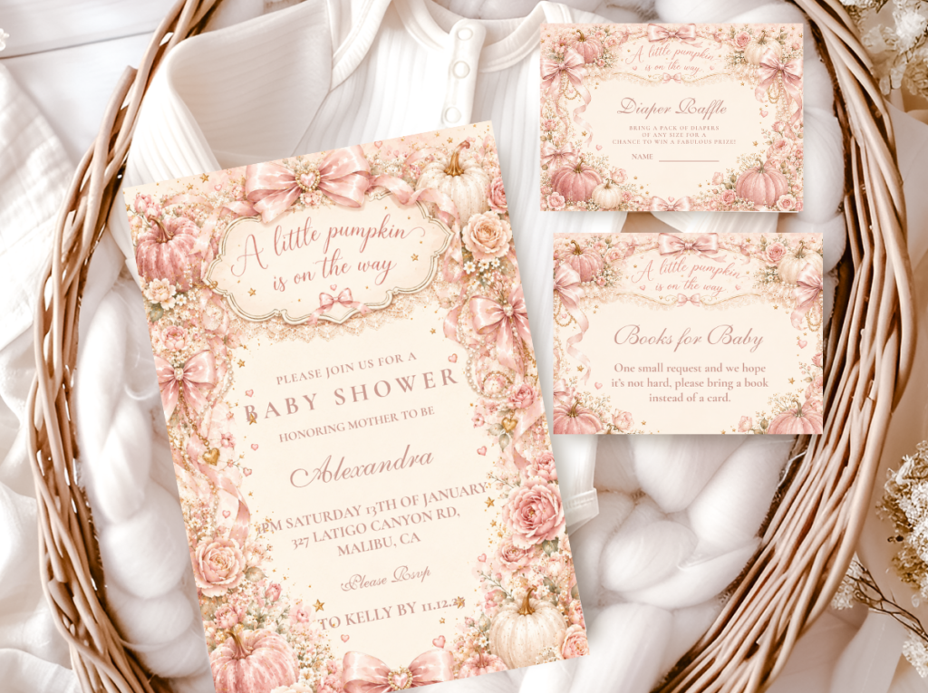
Shop the Pink Pumpkin collection.
Invitations, welcome signs, favour tags, and game cards in the dusty rose and cream pumpkin palette.
“Pink and pumpkin work together for the same reason dusty rose sits beside autumn leaves — warm, soft, and completely at home in the season. The pink must lean warm, the pumpkin must stay cream, and the result reads as a palette that was always meant to exist.”
Section 01 The Pink Pumpkin Palette Rule — Warm Pink Only
The single most important decision in a pink pumpkin baby shower is the specific quality of the pink chosen — and it is the decision most frequently made incorrectly, because ‘pink’ describes an enormous range of colours with very different relationships to the harvest palette.
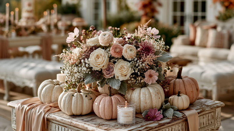
Dusty rose is a warm, slightly greyed rose tone with a peachy undertone — it reads as warm beside cream and warm brown, and it belongs in the harvest palette because autumn has always contained muted, dried flower tones within its colour world. Dried roses, dried strawflowers in antique rose, dried lavender at its warmest end — these are the botanical sources that dusty rose belongs to, and they all belong naturally in a pumpkin baby shower.
Hot pink, bright magenta, and cool lavender-pink are a different category entirely. These are cool-toned or heavily saturated pinks that read as fresh, contemporary, and specifically non-seasonal — the opposite of the warm, organic, harvest quality that the pumpkin palette requires. A bright pink element beside a cream pumpkin and dried pampas creates an immediate visual conflict: one element reads as harvest and one reads as something else, and the combined effect is two separate aesthetics placed on the same table rather than one cohesive design.
🌸 Styling Tip
Hold all your pink elements next to a cream pumpkin before buying — in a shop, in natural light, at the same time. Warm dusty rose next to a cream pumpkin reads as cohesive harvest: the two tones are from the same warm, muted world. Bright or cool pink next to a cream pumpkin immediately reads as two different aesthetics. Every pink element in the shower must lean warm and peachy rather than cool or lavender-toned. The cream pumpkin is the test; it does not lie.
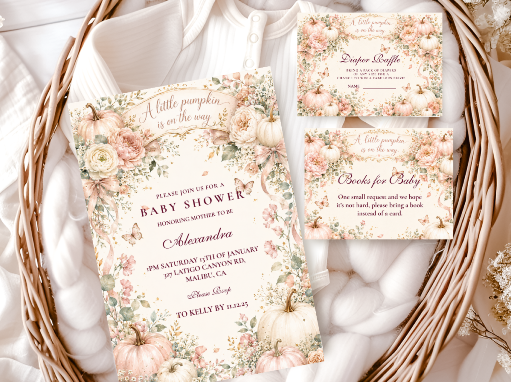
The Pink Pumpkin collection carries the dusty rose and cream palette across the full stationery suite.
Section 02 Pink Pumpkin Decor, Cake & Table
Every decor element in a pink pumpkin baby shower follows the same palette rule as the stationery: dusty rose and blush as the pink tones, cream and warm white as the anchor, sage green as the botanical companion, and antique gold as the single metallic accent. No element should introduce a pink tone brighter or cooler than the dusty rose chosen for the invitation.
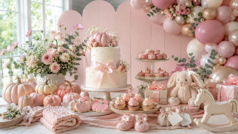
Centrepiece: A cluster of cream and pale blush pumpkins in three sizes on a wooden slice base, with dried dusty rose heads tucked beside the large anchor pumpkin, dried pampas tails rising at the rear in honey cream, and sage eucalyptus draped at the sides. The dried rose detail is the element that most specifically communicates the pink pumpkin direction — it introduces the pink tone through a botanical material that belongs to the harvest world rather than through a synthetic or novelty pink element. Two antique gold votives with warm cream candles at the front of the wooden slice complete the centrepiece at the lowest level.
Balloon arch: A pink pumpkin balloon arch works in the organic, loose-cluster form rather than in a rigidly symmetrical arch — dusty rose and warm blush balloons in two sizes, with cream and sage green as the companion tones. The organic shape allows size variation that reads as abundant and botanical rather than as geometric and manufactured. One warm pink tone only: mixing dusty rose with a different pink saturation within the same arch creates visual noise rather than palette coherence. The sage green balloons provide the botanical accent that connects the arch to the pampas and eucalyptus in the centrepiece and table arrangements.
Cake: A two or three-tier semi-naked cake in warm blush buttercream — the dusty rose blended into warm ivory so the overall impression is a warm blush rather than a clearly pink cake — with dried rose heads, dried pampas sprigs, and a small cream ceramic pumpkin at the topper. The semi-naked finish shows the warm cake layers through the thin buttercream, adding visual warmth that a smooth-finish cake cannot replicate. A small acrylic or wooden ‘a little pumpkin’ or ‘pink little pumpkin’ sign beside the ceramic pumpkin topper adds the narrative wording element that connects the cake to the invitation suite.
Table: A blush or warm cream linen runner on a natural wood or warm linen tablecloth. Cream ceramic dinnerware or warm white plates. Antique gold flatware. Small cream pumpkins as place card holders at each setting. Dusty rose dried rose clusters tucked at intervals along the linen runner beside the small pumpkins.
🌸 Styling Tip
A pink pumpkin balloon arch works when dusty rose leads and cream anchors — not when pink and orange mix. One warm pink tone, cream, and sage green creates a cohesive harvest arch that reads as specifically pink pumpkin baby shower. Multiple pink tones at different saturations — blush beside hot pink beside dusty rose — creates visual noise that no arrangement can overcome. Commit to one pink tone and use it consistently at every scale from the invitation to the balloon to the ribbon on the favour bag.
The Pink Little Pumpkin collection carries the blush and wildflower direction within the pink pumpkin baby shower palette.
Section 03 Pink Pumpkin for a Girl Baby Shower
The pink pumpkin direction is the most consistently Pinterest-saved and the most search-consistent girl fall baby shower direction available — because it solves the central challenge of autumn girl shower styling: how to communicate ‘girl’ within a harvest palette that defaults to gender-neutral warm neutrals. The answer is the specific dusty rose tone, applied consistently and correctly, as the single accent that converts the gender-neutral harvest palette into the specifically feminine one.
Two distinct pink pumpkin girl shower directions exist. The first — the more refined direction — uses dusty rose as a single precise accent within the classic neutral harvest palette: cream pumpkins, sage eucalyptus, pampas, warm linen, and a single dusty rose tone appearing in the dried botanicals, the ribbon detail, the invitation suite, and one or two cake elements. The pink communicates the gender direction with a single clearly made choice rather than with multiple pink elements competing for prominence.
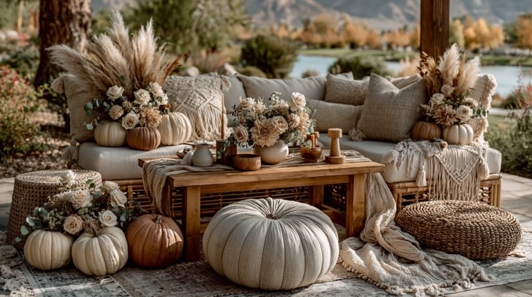
The second — the boho pink pumpkin girl shower direction — is more texture-forward and more abundantly botanical. Terracotta and warm pink appear together with abundant dried florals in rust, cream, and antique rose; rattan vessels and raw clay pots replace the wooden slice as the centrepiece base; and the overall impression is richer and more maximally botanical than the refined direction. The boho direction is the more appropriate choice for an outdoor venue or a marquee where the natural surroundings amplify rather than contrast the organic palette.
🌸 Styling Tip
The pink pumpkin girl shower reads most cohesively when the invitation leads with the specific blush tone and every decoration decision after that matches it exactly. Choose the invitation suite first, hold every other pink purchase beside it in natural light, and reject anything that reads as brighter, cooler, or more saturated. The invitation is the palette brief for the entire shower — treat it as such from the first decoration purchase onward.

The Girl Pumpkin collection carries the earthy boho pink pumpkin direction with terracotta and dried floral detail.
Section 04 Invitations & Stationery — Full Showcase
The stationery suite is where the pink pumpkin baby shower theme becomes specific rather than generic — because the specific pink tone of the invitation is the palette reference for every other design decision in the shower. A dusty rose invitation with a cream pumpkin illustration sets the exact tone that every balloon, every dried botanical cluster, and every table linen should match. A stationery suite chosen separately from the decoration palette produces a shower where the printed elements and the physical elements belong to slightly different pink worlds.
The most important stationery decision is choosing a single collection and using it consistently across every printed element — invitation, welcome sign, game cards, food labels, favour tags, and thank you cards. All six collections below carry different pink pumpkin wording and palette directions; browse each to find the one whose specific pink tone matches your intended decoration palette exactly, then use it as the colour reference for every purchase that follows.
Primary Pink
Pink Pumpkin
Dusty rose and warm cream — the most versatile and most search-consistent pink pumpkin stationery suite.
Wildflower Blush
Pink Little Pumpkin
Blush and cream with wildflower botanical detail — the most feminine and most narrative pink pumpkin direction.
Boho Girl
Girl Pumpkin Boho
Terracotta and warm pink — the earthy boho direction for texture-forward pink pumpkin showers.
Family Wording
Our Little Pumpkin
Warm amber and cream with family-centred wording — pairs with dusty rose decor for a co-ed pink pumpkin shower.
Most Joyful
Hello Pumpkin
Warm amber and gold with the most playful pumpkin wording — works alongside pink decor accents.
Classic Neutral
A Little Pumpkin Theme
Warm cream and sage — the gender-neutral foundation that pairs with any pink accent tone.
Frequently Asked Questions
What shade of pink works for a pink pumpkin baby shower?
Dusty rose and warm blush are the two shades of pink that belong to the pink pumpkin baby shower palette. Both are warm-toned, slightly muted, and peachy rather than blue or lavender in their undertone — which means they read as warm beside cream pumpkins and dried botanicals rather than as cool or contemporary. Hot pink, bright rose, fuchsia, and lavender-pink are explicitly the wrong direction: they read as out-of-season beside a cream harvest palette and create a visual conflict rather than a cohesive aesthetic. The test for any pink element: does it look natural beside a cream pumpkin and dried pampas grass in natural light? If it reads as brighter or cooler than either anchor, it does not belong in the pink pumpkin baby shower palette.
How do I combine pink and pumpkin elegantly?
Three decisions together produce the elegant pink pumpkin combination. First, use cream and white pumpkins rather than bright orange — the cream pumpkin already belongs to the dusty rose world; a bright orange pumpkin conflicts with it immediately. Second, introduce the pink through botanical elements (dried rose heads, dried strawflowers in antique rose) rather than through synthetic or novelty decoration — pink botanicals belong in the harvest world, pink plastic decoration does not. Third, use one pink tone consistently across every element at every scale from the invitation to the balloon to the ribbon — pink tone consistency is the single most visible difference between an elegantly executed pink pumpkin shower and one that reads as assembled from separately sourced pink elements.
Can a pink pumpkin theme work for a gender-neutral shower?
A pink pumpkin shower in the dusty rose direction is not easily made gender-neutral — because dusty rose is a specific gender signal that reads consistently across guest demographics. The most practical approach for a co-ed or gender-neutral shower is to use the classic neutral pumpkin palette (cream, sage, warm brown, antique gold) as the primary stationery and decoration direction, and to add the pink element only in the botanical detail — a single dried rose cluster in the centrepiece, a blush ribbon on the favour bags — as a subtle gender nod that does not define the palette. The Our Little Pumpkin collection in warm amber and cream reads as family-centred and warm without a specific gender direction, and pairs naturally with any amount of pink botanical detail at the decoration level.
Warm Pink · Cream Pumpkin · Harvest Botanicals
Shop the Pink Pumpkin Baby Shower Collections
Six complete stationery suites across every pink pumpkin direction — blush, wildflower, boho, and neutral.