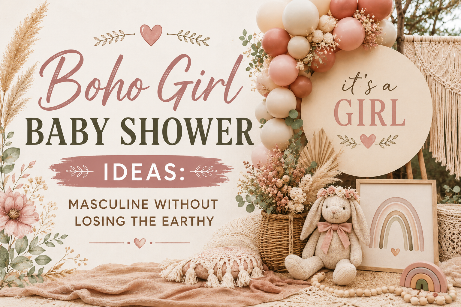
Boho Girl Baby Shower Ideas: Feminine Without Losing the Earthy Register
Baby Shower · Boho Girl Guide
Boho Girl Baby Shower Ideas: Feminine Without Losing the Boho
Three rules that keep femininity and the boho register in balance, four complete palette directions, the decor and cake guide, and the full stationery showcase.
A boho girl shower fails in one specific way: the femininity takes over and the boho disappears. The room becomes a pink party with dried pampas propped in the corner — beautiful, but not boho. The fix is not to dial back the femininity; it is to apply three specific rules that keep every feminine element grounded in the organic, warm world that defines the boho aesthetic. Below is what those rules are, four palette directions built on top of them, and how it all comes together on the invitation.
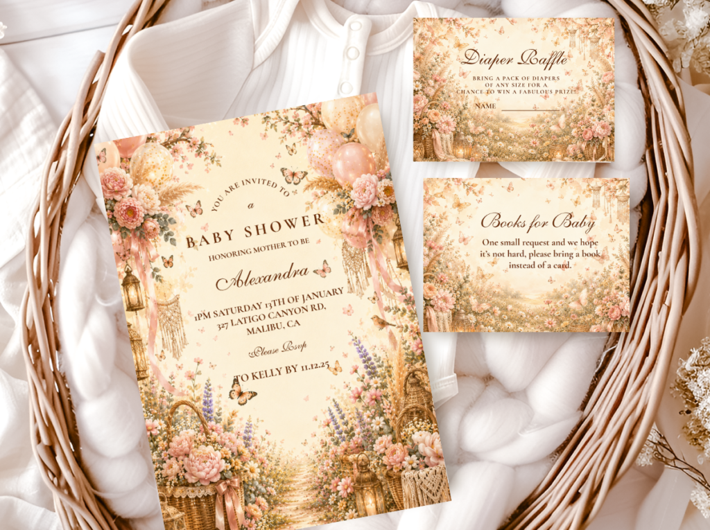
Shop the Pink Boho collection.
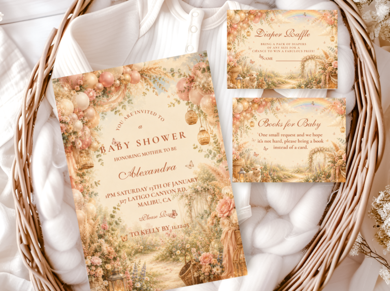
Warm dusty rose, dried floral botanical — the most directly feminine boho stationery direction.
“A boho girl shower at its best looks like a meadow gathered for exactly this celebration — dusty rose and dried wildflowers, organic and warm and completely her own.”
Section 01 Three Rules for Feminine Without Generic
Each rule addresses a specific way a girl boho shower can slip from ‘feminine boho’ into ‘pink party with boho props.’ All three work together — applying two of three still lets the shower drift.
Rule 1
Dusty Rose Only — Never Bright or Cool Pink
Slides toward generic: Bright pink, hot pink, cool-toned blush, or candy pink anywhere in the palette. These tones belong to the generic girl party register rather than to the boho world — they read as saturated and manufactured rather than as warm and organic. Even one bright pink element — a balloon, a ribbon, a cake accent — pulls the entire room toward the generic girl party register.
Stays boho: Dusty rose: the specific warm, peachy-pink of a dried rose petal — warm rather than cool, muted rather than bright, slightly aged rather than fresh. The undertone test: hold the pink next to dried pampas grass or a terracotta pot. If it reads as part of the same warm family, it belongs. If it looks slightly blue or purple by comparison, it is too cool. Warm blush and terracotta pink also belong; any pink that reads as bright, saturated, or cool does not.
Rule 2
Dried Florals — Not Fresh Roses or Garden Blooms
Slides toward generic: Fresh florals as the primary botanical element. Fresh roses, peonies, and garden blooms communicate ‘cultivated at peak beauty,’ which is the opposite of the organic, aged, slightly imperfect quality that defines boho botanical material. Fresh florals beside rattan and dried pampas create an immediate aesthetic conflict.
Stays boho: Dried protea in warm rose-brown (the most dramatically beautiful dried floral in the girl boho direction); dried roses in dusty rose and warm blush; dried lavender bundles; dried chamomile; dried pampas as the tall height element; cotton stems as the soft low element. All dried — the aged, warm, slightly imperfect quality of dried botanical material is what keeps the florals in the boho register.
Rule 3
Gold — Not Silver, Not Chrome, Not Bright Metallic
Slides toward generic: Silver, chrome, or bright metallic gold anywhere in the palette. Silver reads as cool and manufactured, the opposite of the warm and organic boho world. Bright metallic gold reads as formal and event-styled rather than as warm and gathered. Both pull the room out of the earthy, organic world that the boho aesthetic builds.
Stays boho: Antique gold only: the specific warm, slightly aged tone that reads as warm candlelight rather than as sharp metallic reflection. Antique gold beside dried botanical and rattan reads as part of the same warm organic world. Silver or bright metallic gold beside the same elements reads as an object from a different aesthetic placed within the boho room.
✨ Styling Tip
The test for girl boho versus generic girl party: remove all pink elements mentally. If what remains is still a beautiful boho shower — warm, organic, dried botanical material in rattan vessels, oatmeal linen, antique gold accents — the palette is working. If nothing remains once the pink is removed, the pink is doing all the work and the boho register is lost. The boho foundation must stand independently; the pink enhances it rather than creating it.
The Pink Boho collection carries the warm dusty rose palette in the correctly muted register — the full stationery suite from invitation through to favour tag.
Section 02 Four Girl Boho Palette Directions
Four complete directions, all built on the three rules from Section 01. They differ in how much secondary story or motif they layer on top of the base palette.
Most Direct
Pink Boho
Dusty Rose · Terracotta · Cream · Antique Gold
Palette: Dusty rose, terracotta, and cream as the full palette — no secondary motif or narrative. The three rules applied at their simplest.
Materials & motifs: Rattan vessels and terracotta pots; oatmeal linen runner; dried protea and dried rose arrangements; antique gold taper candles in raw clay holders.
Pink Boho is the most flexible of the four directions because the palette carries the aesthetic without requiring a specific motif. The most reliable starting point for a first-time host planning a girl boho shower.
Most Abundant
Wildflower Girl Boho
Dusty Rose (Lead) · Sage · Soft Lavender · Warm Yellow · Cream
Palette: A full muted wildflower meadow palette with dusty rose as the dominant colour and sage, soft lavender, warm yellow, and cream in accent roles.
Materials & motifs: Mismatched vessels (glass bottle, terracotta pot, rattan basket); loose asymmetric wildflower compositions with stems at varying heights; oatmeal linen with pressed dried wildflower scatter.
Every colour must stay at the same muted saturation as the dusty rose anchor — one colour drifting brighter breaks the palette immediately. The most abundant and most meadow-joyful of the four directions.
Most Romantic
Floral Girl Boho
Dusty Rose · Warm Blush · Warm Brown · Warm Ivory
Palette: Dusty rose and warm blush as the lead colours, warm brown as the botanical stem and vessel accent, warm ivory as the base.
Materials & motifs: Dried protea as the hero botanical element; dried roses in dusty rose and warm blush; wide-mouth rattan baskets; warm ivory semi-naked buttercream cake with dried rose topper.
The most romantically beautiful of the four directions — the dried protea and dried rose combination in a wide rattan basket produces the specific quality of abundance that reads as a celebration of something important.
Most Symbolic
Butterfly Girl Boho
Dusty Rose · Warm Blush · Sage · Warm Cream
Palette: The Pink Boho palette with a watercolour butterfly motif layered on top — the butterfly appearing to land on or emerge from botanical elements.
Materials & motifs: Watercolour butterfly illustration only — soft edges, muted colour, organic warmth. Paper butterfly accents landing on arch botanical elements, on the cake topper, and on the welcome sign. One appearance per zone.
The most appropriate direction when the symbolic dimension of the transformation motif matters as much as the palette. The watercolour-only rule is as non-negotiable as the dusty-rose-only colour rule.
✨ Styling Tip
Dried florals only — no fresh roses, however beautiful. A fresh peony beside dried pampas creates an immediate aesthetic conflict: the peony says ‘cultivated at peak beauty,’ the pampas says ‘aged beautifully.’ In the boho world, only the second statement is correct.
Section 03 Girl Boho Decor, Cake & Table
The three rules from Section 01 applied across every surface guests will see. The boho foundation — rattan, linen, dried botanical, asymmetric arrangement — carries the room; the dusty rose accent adds the femininity on top of it.
Dusty rose organic balloon arch with dried botanical integration
An organic balloon arch in dusty rose, warm blush, and oatmeal — no bright pink, no cool-toned blush. Assembled asymmetrically with no geometric curve. Dried pampas tails and dried eucalyptus branches woven into the lower section at irregular intervals, appearing to emerge from the balloon cluster. Without the botanical integration the arch reads as a pink party element placed in a boho room.
Dried floral centrepiece in wide rattan or terracotta vessel
A wide-mouth rattan basket or unglazed terracotta pot as the primary vessel. Dried protea in warm rose-brown as the mid hero element at 60–70% of total arrangement height; dried roses in dusty rose as the secondary element; dried lavender at the base; dried pampas tails as the tall height element leaning clearly to one side. Asymmetric throughout: 2:1 lean, odd number of primary stems, at least one botanical element overhanging the vessel rim. No fresh florals.
Semi-naked buttercream with dried rose and protea topper
Semi-naked buttercream in warm ivory or warm blush — warm, peachy-pink tone, not cool-toned or bright. Topper: an asymmetric cluster of dried rose stems in dusty rose leaning clearly to one side, with dried protea and dried grass tails at the base. Antique gold luster dust applied with a dry brush across the dried rose blooms — one directional stroke per bloom. No fresh flowers on the cake. No plastic or acrylic topper elements.
Oatmeal linen runner with dried petal scatter and antique gold votives
Oatmeal linen runner — undyed or warm oatmeal, not bright white or synthetic. Scattered along the runner: small dried rose petals in dusty rose at irregular intervals (genuinely scattered, not arranged); small dried chamomile heads; antique gold votive candles at irregular spacing. No silver candleholders, no chrome accents, no bright metallic elements on the table surface.
The Floral Boho collection carries warm dried floral botanical illustration — place cards and table stationery for the girl boho table in the same palette direction as the arrangement.
Section 04 Invitations & Stationery
The invitation is where the three rules get their first test in print. Dusty rose must stay warm and peachy rather than drifting cool — printing can push a muted dusty rose toward lavender-adjacent blush more easily than most people expect, and a proof check against dried botanical material before the invitations go out catches the drift before it reaches guests. Paper stock should be warm ivory rather than bright white.
Whichever of the four directions the shower follows, the invitation should carry that direction’s specific palette and illustration language forward. The same watercolour botanical illustration quality that defines the boho world in the decoration should define it in the stationery — loose, slightly imperfect, organic, warm. The suite should be complete: invitation, welcome sign, place cards, food labels, and favour tags all in the same illustration style.
Most Direct
Pink Boho
Warm dusty rose — the defining stationery direction for the Pink Boho palette.
Most Abundant
Wildflower Boho
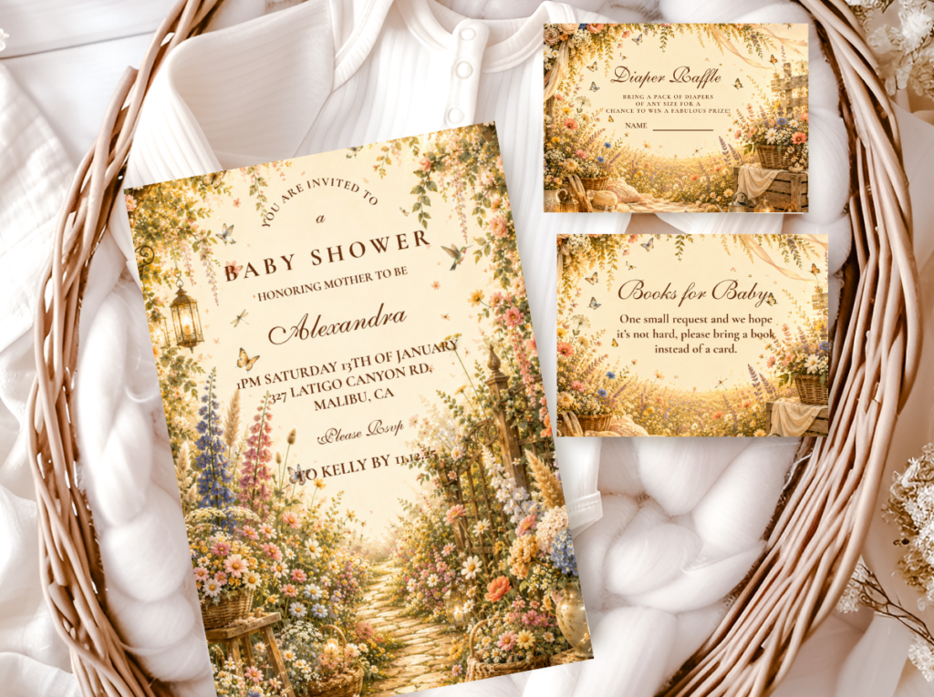
Loose muted meadow illustration — for the Wildflower Girl Boho direction.
Most Romantic
Floral Boho
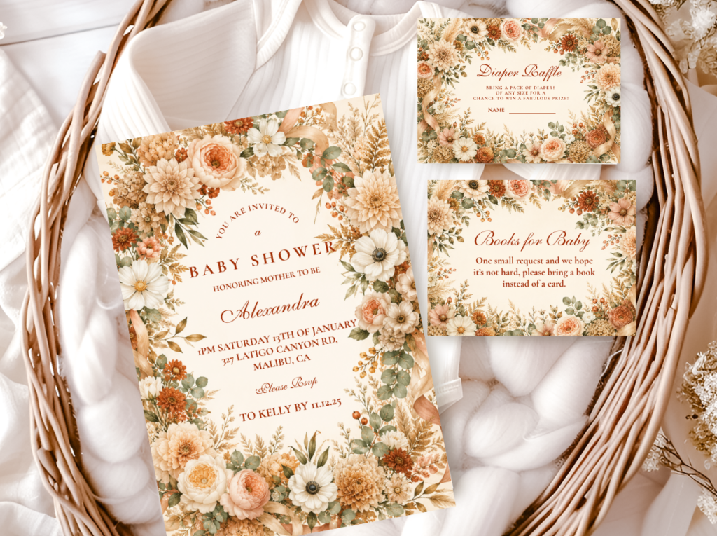
Warm dried floral botanical — the most romantic girl boho stationery direction.
Most Symbolic
Butterfly Boho
Watercolour butterfly in dusty rose — for the Butterfly Girl Boho direction.
Most Varied
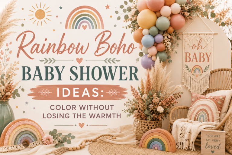
Rainbow Boho
Muted multicolour pastels — for a more colour-varied girl boho direction.
Earthy Base
Boho General
Classic terracotta and oatmeal — the warm earthy foundation alongside any girl boho direction.
Frequently Asked Questions
What makes a boho girl shower look boho rather than just pink?
Three rules applied simultaneously. First: dusty rose only — warm, peachy, muted rather than bright or cool-toned. Second: dried florals only — dried protea, dried roses, dried lavender, dried pampas; no fresh flowers. Third: antique gold as the only metallic — no silver, no chrome. The test: remove all pink elements mentally. If what remains is still a beautiful boho shower — rattan, linen, dried botanical in asymmetric arrangements, antique gold accents — the palette is working. If nothing remains without the pink, the boho register has been lost.
Which of the four girl boho directions is easiest to execute?
Pink Boho is the most straightforward — fewest sourcing decisions, fewest colours (dusty rose, terracotta, cream, antique gold), no secondary motif. Wildflower Girl Boho requires more palette discipline because the multicolour range demands every colour at the same muted saturation. Floral Girl Boho requires quality dried floral sourcing — specifically dried protea in the correct warm rose-brown tone. Butterfly Girl Boho requires the watercolour illustration quality on every butterfly element, which is primarily a stationery and paper-decoration sourcing decision.
Can a girl boho shower work outdoors?
Yes — and outdoors is in some respects the most natural setting, because the warm, organic, botanical aesthetic reads as an extension of the natural world rather than as a decorated interior. In natural light the muted dusty rose palette photographs most warmly. One practical note: keep dried florals away from direct sun exposure for extended periods — dried botanical material can bleach in direct sunlight over several hours, shifting the warm dusty rose tones toward a paler, less warm version of the palette.
Her Adventure Begins
Girl Boho Baby Shower Stationery
Warm dusty rose, dried floral botanical illustration — invitations, welcome signs, and favour tags in the correctly feminine boho palette.