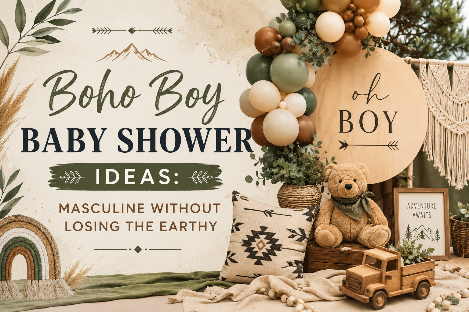
Boho Boy Baby Shower Ideas: Masculine Without Losing the Earthy Register
Baby Shower · Boho Boy Guide
Boho Boy Baby Shower Ideas
Three palette and material shifts that keep boho masculine without sliding into a generic nursery palette, three complete directions, and the full stationery showcase.
A boho boy shower runs into a version of the same problem a boho girl shower does, just from the other direction: lean too hard into ‘boy’ and the room slides toward a bright nursery palette that has nothing to do with boho at all. The fix is a specific, repeatable set of choices — a particular blue, a particular green, a particular class of materials — applied consistently from the pampas arch down to the cake. Below is what those choices are, three directions built on top of them, and how it all comes together on the invitation.
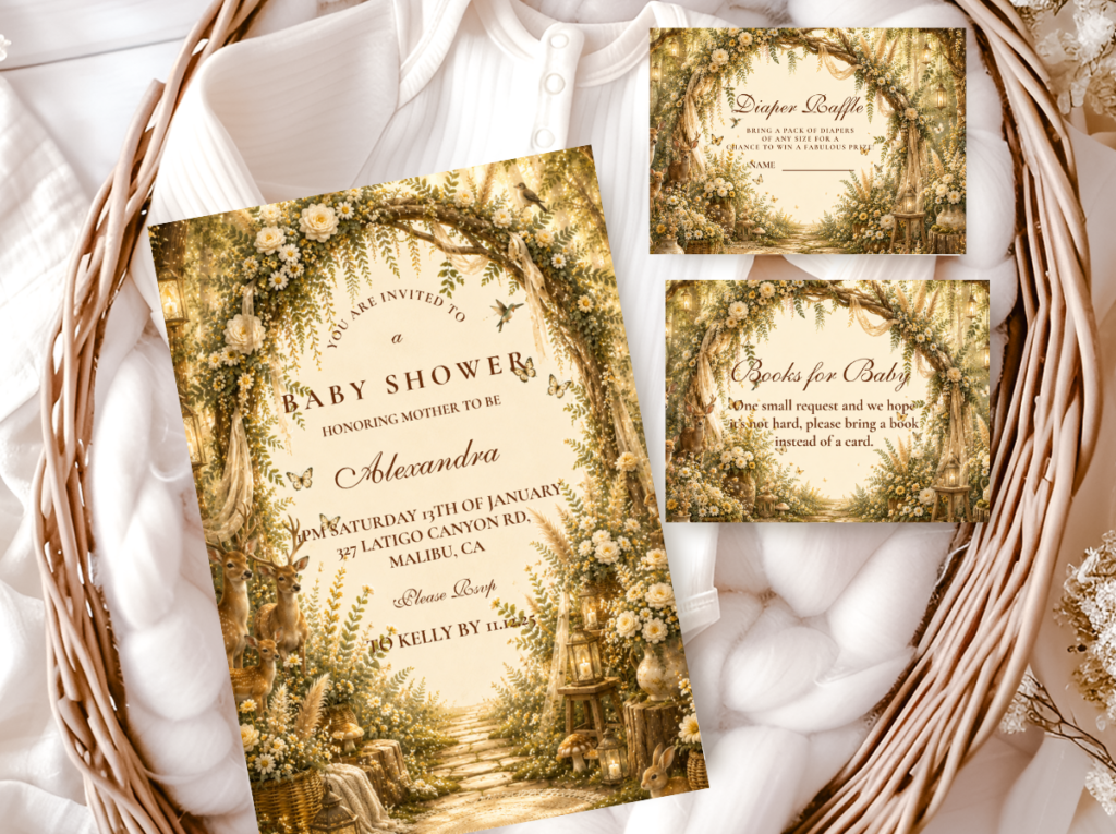
Shop the Boho Boy collections.
Blue Boho, Boy Western Boho, and Woodland Boho — three directions, all in the correct warm, muted register.
“A boho boy shower at its best looks like the natural world rendered in dusty blue and warm brown — wild, organic, and completely his own adventure.”
Section 01 Making Boho Masculine — Three Palette & Material Shifts
Three specific decisions determine whether a boy-leaning boho shower stays boho or slides toward a bright, generic nursery palette. All three work together — skipping one lets the shower drift back toward a neutral or feminine boho register. Each shift is a binary choice: the wrong version breaks the aesthetic; the right version keeps it.
Shift 1
Dusty Blue — Not Baby Blue
Slides away from boho: Bright baby blue. Baby blue belongs to the nursery palette — it reads as a specific cultural convention (‘it’s a boy’) rather than as a colour from the natural world. The specific quality of baby blue — bright, slightly cool, and immediately recognisable as a gender signal — is the opposite of the muted, warm, atmospheric quality that defines the boho palette.
Stays boho: Dusty blue: the specific muted, slightly grey-blue of a coastal horizon or a midwinter sky — warm rather than cool, atmospheric rather than bright. Dusty blue sits in the boho palette for the same reason that muted sage and dusty rose do: it reads as a colour from the natural world rather than from a party supply catalogue. The test: hold the blue next to dried pampas grass. If it looks natural and muted beside the pampas, it belongs. If it looks brighter than the pampas, it will dominate the palette and break the boho register.
Shift 2
Deep Sage or Olive — Not Pale Sage
Slides away from boho: Pale or soft sage as the green element. Pale sage sits in the feminine boho register — it is the green of the Pink Boho and Wildflower directions, the green that reads as soft and romantic rather than as adventure-forward. In a boy-leaning shower, pale sage communicates the wrong direction even when everything else is correctly masculine.
Stays boho: Deep sage (the specific grey-green of dried sage leaves — darker and more muted than pale sage, belonging to the boho earthy vocabulary); or deep olive green (the specific warm dark green of old-growth forest foliage — the green of the Woodland Boho direction, which reads as the most naturally masculine green available). The depth of the green does the same directional signalling as the specific blue does: deeper reads as more adventure-forward; lighter reads as softer and more feminine.
Shift 3
Weathered Wood and Leather Accents — Not Rattan and Linen Only
Slides away from boho: Rattan and linen used as the sole material vocabulary. Both belong to the boho world, but they sit neutral across the entire boho family — they appear equally in the Pink Boho and the Wildflower directions. They do not carry a directional signal toward the masculine register on their own.
Stays boho: Weathered wood (raw wood with visible grain and texture — raw wood slices, birch rounds, bark-wrapped vessels, wooden serving boards with visible ageing) and leather or leather-adjacent accents (natural leather tags, waxed canvas favour packaging, leather-cord detail on centrepiece elements) in addition to rattan and linen. Wood and leather read as adventure and the natural world in a way that rattan and linen alone do not. They shift the material register toward specifically masculine without removing the boho elements that define the aesthetic.
✨ Styling Tip
Test the dusty blue before buying in bulk. Hold it next to dried pampas grass in natural light — if it looks natural and muted beside the honey-cream of the pampas, it belongs in a boho boy shower. If it looks brighter than the pampas or reads as cool and slightly purple beside it, it is too close to baby blue. Order a balloon, a ribbon, or a paper swatch first and check it against the dried botanical material in the specific light of the venue before committing to the full quantity.
The Blue Boho collection carries the dusty blue and warm brown palette in the correctly muted register for a boy-leaning boho shower.
Section 02 Three Boy Boho Directions
Three complete directions, all built on the three shifts from Section 01. They differ in how much of a secondary story they layer on top of the base palette — from the most direct (palette only) to the most thematic (western adventure narrative) to the most atmospheric (forest world).
Most Direct
Blue Boho
Dusty Blue · Warm Brown · Warm Cream · Deep Sage
Palette: Dusty blue as the directional accent; warm brown and warm cream as the earthy neutral base; deep sage as the botanical green accent. No secondary motif or narrative — the palette itself is the design decision, applied consistently across every element.
Materials & motifs: Weathered wood vessels and serving boards; rattan baskets; oatmeal linen; dried pampas in honey-cream; dried eucalyptus in muted sage; natural cotton twine on favour packaging. The material vocabulary is standard boho with the weathered wood shift from Section 01.3 applied.
Blue Boho is the direction to reach for when the shower does not need a thematic story on top of the palette — just the palette decision itself, correctly made and consistently applied from the arch to the cake to the invitation. It is the most flexible of the three directions because the palette alone carries the aesthetic without requiring a specific motif or material narrative.
Most Thematic
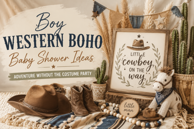
Boy Western Boho
Deep Navy · Warm Amber · Sunflower Yellow · Weathered Brown
Palette: Deep navy as the primary directional accent (this direction uses a slightly deeper blue than standard dusty blue, pushed toward deep navy while remaining in the muted, warm-toned register); warm amber and sunflower yellow as the adventure accent tones; weathered brown as the base.
Materials & motifs: Weathered wood as the primary surface material; leather cord and leather tag details; sunflower dried botanical as the hero floral element; dried wheat bundles; cactus or western botanical motifs on stationery. The western narrative comes from the combination of motif and material rather than from bright coloured props or novelty western decorations.
Boy Western Boho layers a specific adventure narrative on top of the base palette from Section 01 — the western motifs and material language give the shower a clearer theme to plan around for a host who wants something more specific than palette alone. The western aesthetic works in this direction because it belongs to the same warm, earthy, adventure-forward world as the boho base.
Most Atmospheric
Woodland Boho
Deep Forest Green · Warm Brown · Oatmeal · Antique Gold
Palette: Deep forest green as the primary directional colour — no blue required; the depth and warmth of the forest green reads as masculine and adventure-forward without any blue element. Warm brown and oatmeal as the earthy base; antique gold as the sole metallic accent.
Materials & motifs: Raw wood slices and birch rounds as centrepiece bases; bark-wrapped glass cylinders as vessels; preserved moss as ground cover; dried fern fronds, pine cones, and acorns; raw wood name sign or welcome sign on rattan easel. The forest floor botanical vocabulary defines the material register.
Woodland Boho is the most naturally masculine of the three directions because it does not need blue to read boy — the depth of the forest greens, the weight of the forest-floor textures, and the atmosphere of the woodland world carry the directional signal on their own. It also has the longest design lifespan of the three directions, since forest and woodland aesthetics do not read as baby-specific in the way some nursery motifs do.
✨ Styling Tip
Woodland Boho is the most naturally masculine boho direction — deep greens, heavy forest-floor textures, and raw wood surfaces all read as adventure-forward without requiring a single blue element. It is the direction to choose specifically when blue does not fit the venue, the existing decor, or the personal taste of the guest of honour. The depth of the palette and the weight of the materials do the directional work that blue does in the other two directions.
Section 03 Boy Boho Decor, Cake & Table
The three shifts from Section 01 applied across every surface guests will see — no rattan-only softness, no pastel-bright colours, no manufactured or plastic elements.
Deep olive or dusty blue pampas arch — asymmetric, weathered wood base
A pampas grass arch in the direction’s specific palette: honey-cream pampas with dusty blue balloon accents for Blue Boho; honey-amber pampas with dried sunflower for Boy Western Boho; deep eucalyptus and dried fern for Woodland Boho. The arch assembled asymmetrically — heavier on one side, botanical material extending beyond the arch frame boundary at irregular points. A weathered wood slice or a raw birch round at the base of the arch as a ground accent, replacing the standard smooth base frame.
Wooden vessel centrepiece — raw wood base, forest floor or prairie botanical
A raw wood slice (30–45cm) as the centrepiece base, with a bark-wrapped glass cylinder or a wide wooden bowl positioned off-centre. For Blue Boho: dried pampas, dried eucalyptus in muted sage, cotton stems; dusty blue ribbon tied around the vessel neck. For Boy Western Boho: dried sunflower and dried wheat bundle as the hero botanical; leather cord around the vessel. For Woodland Boho: preserved moss ground cover, dried fern, pine cones on natural twine. In all three: asymmetric 2:1 lean, odd number of primary stems, at least one element overhanging the vessel rim.
Semi-naked buttercream with dried botanical topper — dusty blue not bright blue fondant
A semi-naked buttercream in warm ivory or warm oatmeal. For the Blue Boho direction: a dusty blue palette-knife accent swipe on one side of each tier — the specific muted, slightly grey-blue rather than bright blue. The topper: an asymmetric dried botanical cluster in the direction’s palette, with a raw wood name initial positioned at the base of the cluster. Never bright blue fondant — bright blue fondant reads as a birthday party cake regardless of what the surrounding shower decoration communicates. The dusty blue buttercream accent must pass the same undertone test as every other blue element: muted and atmospheric, not bright and saturated.
Weathered wood charger plates and oatmeal linen — no glossy or metallic serving surfaces
Weathered wood charger plates (not rattan — rattan is appropriate but wood is the material that specifically carries the masculine register in this direction); oatmeal linen runner or tablecloth; kraft paper food labels and place cards in the direction’s stationery illustration style. Leather-cord napkin ties instead of linen ribbon. No glossy serving surfaces, no chrome or silver metallic elements — antique gold is the only metallic appropriate in any boy boho direction.

The Botanical Boho collection carries refined deep sage and warm ivory botanical illustration — table stationery and place cards that belong to the same organic world as the boy boho palette.
Section 04 Invitations & Stationery
The invitation is where the dusty-blue-versus-baby-blue decision gets tested first in print — and printing can push a muted dusty blue brighter than intended more easily than most people expect. A matte or soft-finish warm ivory card stock helps keep the printed dusty blue honest to the muted palette the rest of the shower is built around. Requesting a physical proof, or checking a printed swatch beside the dried botanical material and the weathered wood surface before invitations go out, catches a too-bright blue before it reaches guests.
Whichever of the three directions the shower follows — Blue Boho, Boy Western Boho, or Woodland Boho — the invitation should carry that specific material and colour language forward: dusty blue and warm brown for Blue Boho; deep navy and sunflower amber for Boy Western Boho; deep forest green and warm brown for Woodland Boho. The illustration style should be warm and organic (watercolour or hand-drawn quality, not precise geometric botanical) and the typography should be calligraphy-style script rather than clean sans-serif. The specific palette direction on the invitation is what tells guests which world they are walking into before they arrive.
Most Direct
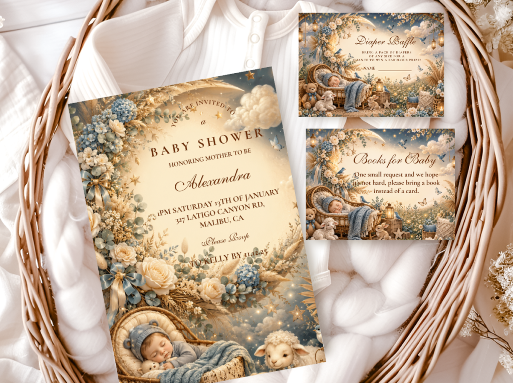
Blue Boho
Dusty blue and warm brown — the most direct boy-leaning boho stationery direction.
Most Thematic
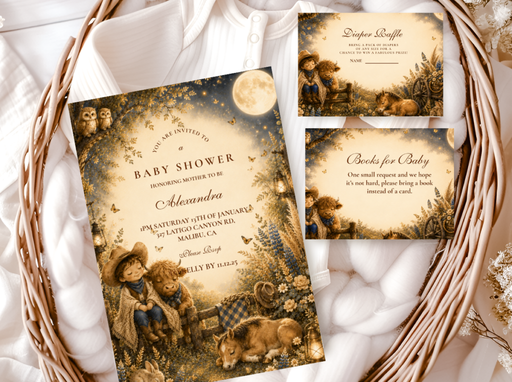
Boy Western Boho
Deep navy, sunflower, and weathered brown — adventure narrative stationery for the western direction.
Most Atmospheric
Woodland Boho
Deep forest green and warm brown — the most naturally masculine boho stationery direction.
Most Editorial
Botanical Boho
Deep sage and warm ivory — refined botanical for a more minimal boy boho direction.
Western Detail
Cactus Boho
Warm cactus and earthy tones — the most adventure-specific botanical for a boy shower.
Earthy Base
Boho General
Classic terracotta and oatmeal — the warm earthy foundation alongside any boy boho direction.
Frequently Asked Questions
What colours work for a boho boy baby shower?
Dusty blue (the specific muted, slightly grey-blue of a coastal horizon — not bright baby blue); warm brown and warm cream as the earthy neutral base; and deep sage or deep olive as the botanical green. The key distinction at every colour choice: muted and warm reads boho; bright and saturated reads nursery. Dusty blue must be visibly more muted than standard baby blue — it should look natural and atmospheric beside dried pampas grass rather than brighter than it. Deep sage must be visibly deeper than pale sage — it should read as adventure-forward rather than as soft and feminine.
How do I make boho masculine without it looking generic?
Apply all three shifts from Section 01 simultaneously: dusty blue instead of baby blue; deep sage or olive instead of pale sage; weathered wood and leather accent materials in addition to rattan and linen. All three work together — applying only two lets the shower drift back toward the neutral or feminine boho register. The most reliable single decision: get the blue right. Dusty blue correctly applied pulls the entire palette masculine; baby blue incorrectly applied makes everything around it read as a generic boy nursery regardless of how correct the other elements are.
Can a boho boy shower work without using blue at all?
Yes — and Woodland Boho is the direction specifically designed for this. Deep forest green, warm brown, oatmeal, and antique gold produce a shower that reads as masculine and adventure-forward without a single blue element, because the depth of the forest greens and the weight of the forest-floor textures — raw wood, preserved moss, pine cones, dried fern — carry the directional signal that blue carries in the other two directions. Woodland Boho is also the direction to choose when the venue has existing wood or earth-toned elements that a blue palette would clash with.
His Adventure Begins
Boho Boy Baby Shower Stationery
Dusty blue, deep forest green, and weathered warm brown — invitations, welcome signs, and favour tags in the specifically masculine boho palette.