Boho Baby Shower Invitations We Love
Baby Shower · Boho Invitation Guide
Boho Baby Shower Invitations We Love
The three decisions that make a boho invitation feel genuine rather than generic, five complete invitation directions, a wording and suite coordination guide, and the full showcase across six boho stationery collections.
The boho baby shower invitation is the first object that belongs to the celebration — the first time the guest encounters the aesthetic world the shower inhabits, weeks before the decoration is assembled and long before the dried pampas is arranged in the rattan basket. The invitation sets the expectation; the decoration confirms it. Which means the invitation must be right first. A wrong invitation — printed on bright white card in a clean sans-serif font with a precisely geometric floral illustration — creates an expectation that the boho decoration then fails to match. A right invitation — warm ivory paper, loose hand-painted botanicals, calligraphy-style script — creates an expectation that the entire shower then lives inside.
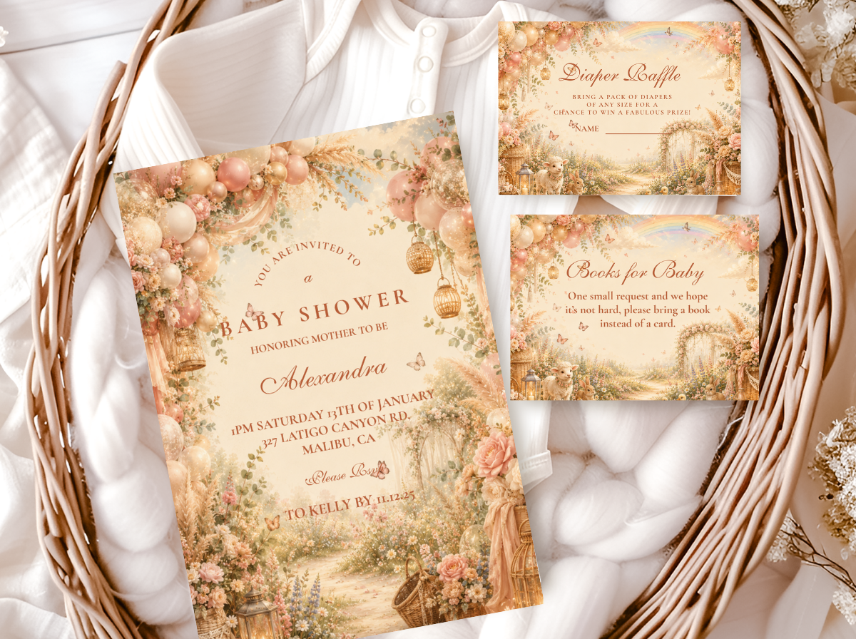
Browse the complete Boho Baby Shower stationery collection.
Invitations, welcome signs, place cards, favour tags — warm, earthy, and fully customisable.
“A boho invitation should feel like it was found pressed between the pages of a well-loved nature journal — warm, organic, and completely specific to this celebration.”
Section 01 The Boho Invitation as a Design Decision
Most boho shower invitations fail not because the design is wrong but because three specific decisions — paper stock, illustration style, and typography — were made independently of each other rather than as a unified system. A warm ivory card with a precisely geometric botanical illustration and a clean sans-serif font produces three correct individual choices that add up to a result that reads as contemporary botanical rather than as boho. All three decisions must speak the same aesthetic language simultaneously.
Decision 1
Paper Stock Is a Palette Decision — Bright White Breaks Boho Before the Design Is Seen
Generic boho: Bright white cardstock. This is the single most common boho invitation failure, and it happens before the guest notices the illustration or reads the typography — it happens the moment the envelope is opened and the card is held. Bright white cardstock has a specific quality: cool, crisp, and manufactured, belonging to the formal and commercial printing register. Placed in the hand of a guest who is being invited to a warm, organic, dried-botanical boho celebration, a bright white card creates an immediate sensory disconnect — the card feels clinical before it is read. The specific quality of cool white in the hand is the wrong first impression for a boho invitation.
Genuine boho: Warm ivory card stock (the specific quality of warm ivory — slightly cream, slightly warm, not yellow but not white — that reads as organic and aged rather than as manufactured and fresh); kraft-toned card stock (the specific warm brown of natural kraft paper, which belongs directly to the boho material vocabulary — the same material as the food labels, the favour tags, and the welcome sign); or recycled-texture card stock (a card with visible natural fibre texture in the paper surface — the texture communicates handmade quality before the design is read). The test: does the card feel warm when held? If yes, the stock is correct. If the card feels cool or crisp — if it feels like commercial printing — it is not the right stock for a boho invitation.
Decision 2
Illustration Style Defines the Register — and Sets the Expectation for Every Element That Follows
Generic boho: Precisely geometric floral illustration (clean, symmetrical, every petal precisely formed — reads as contemporary botanical, which is a beautiful aesthetic but is not boho); cartoon or character illustration (reads as children’s party); or photographic floral (reads as romantic garden or wedding stationery). Each of these illustration styles communicates a specific aesthetic world, and none of them communicates the boho world. The problem is not that they are wrong in the abstract — it is that when placed on a warm ivory card beside calligraphy-style typography, they create a mixed-register result that reads as uncertain rather than as designed.
Genuine boho: Loose hand-painted botanical illustration in a watercolour or gouache style: the specific quality of visible brushstroke variation, slightly imperfect botanical shapes, and the organic line quality of something painted by hand rather than drawn by software. Dried botanical illustration specifically: pampas grass plumes, dried protea, cotton stems, eucalyptus branches, wildflower meadow clusters — motifs that belong to the same visual vocabulary as the dried botanical material on the shower table. The illustration style sets the expectation for every other printed element at the shower: the welcome sign, the place cards, the food labels, and the favour tags should all share the same illustration quality. When they do, the shower reads as a complete designed world; when they do not, it reads as a collection of individually sourced printed items.
Decision 3
Typography Is an Aesthetic Statement — Hand-Lettered or Calligraphy Script Is the Boho Standard
Generic boho: Clean sans-serif typography. Sans-serif fonts — even warm, well-chosen ones — communicate the same quality as precisely geometric botanical illustration: contemporary, considered, and specific to a design aesthetic that is different from the warm, organic, slightly imperfect world of the boho aesthetic. A clean sans-serif beside a loose watercolour botanical illustration reads as two different aesthetic registers placed on the same card — the illustration communicates warmth and organic imperfection; the font communicates precision and contemporary design. The result: a mixed-register card that communicates uncertainty rather than a single clear aesthetic world.
Genuine boho: Hand-lettered or calligraphy-style script typography — fonts that look as though they were written by hand even when they were not. The specific quality: organic variation in letterform, visible pen-pressure weight shifts (thick downstrokes, thin upstrokes), and the slightly imperfect quality of a letter written by a person rather than generated by software. This typography belongs to the same aesthetic world as the loose watercolour botanical illustration and the warm ivory card stock — all three share the quality of the handmade, the organic, and the warm. The secondary typography (event details, address, RSVP instructions) can be in a simple serif or thin script font; the primary display typography (the guest of honour’s name, the celebration header) should be in the calligraphy-style script.
✨ Styling Tip
Choose the boho invitation before buying a single piece of decoration. Every decoration decision that follows should pass one test: does this look like it belongs in the same organic world as this invitation? The linen runner, the rattan basket, the terracotta pot — all of these will pass. The smooth white ceramic cake stand, the bright-coloured balloon cluster, the acrylic banner — none of these will pass, which is useful information before the purchase rather than regretful information after it. The invitation is the aesthetic specification for the entire shower. Use it as one.
Section 02 Five Boho Invitation Directions
Five complete invitation directions, each with a specific paper stock, illustration style, and typography direction. In all five: warm ivory or kraft-toned stock — never bright white; hand-painted or watercolour illustration quality; calligraphy-style script typography.
Most Authentic
Classic Earthy Boho Invitation
Terracotta · Oatmeal · Warm Brown · Antique Gold
Paper stock: Warm ivory card stock — the specific warm-cream tone that reads as slightly aged and organic rather than as commercial printing. The warmth of the stock should be visible in the card’s tone rather than only felt in the texture.
Illustration: Loose watercolour botanical illustration: pampas grass plumes in honey-cream as the primary illustration element, dried eucalyptus branches as the secondary botanical, and one or two cotton stem heads at the base of the composition. The brushstroke quality should be visible — organic line variation, slightly translucent watercolour wash, the specific warmth of hand-applied pigment rather than digitally generated colour.
Typography: Primary display typography in calligraphy-style script in warm brown — the name of the guest of honour in a letterform that reads as written rather than typeset. Secondary information in a thin warm-toned serif or simple script. No sans-serif anywhere on the card.
The Classic Earthy Boho Invitation is the most Pinterest-consistent and the most broadly appropriate boho invitation direction — the pampas and eucalyptus botanical combination in warm ivory and terracotta reads immediately as boho at the thumbnail scale, which makes it the most reliably recognisable invitation for guests who will confirm the aesthetic expectation based on the invitation image alone. The terracotta colour accent in the illustration belongs directly to the warm earthy palette of the shower’s decoration, making the invitation the first palette specification the guest receives.
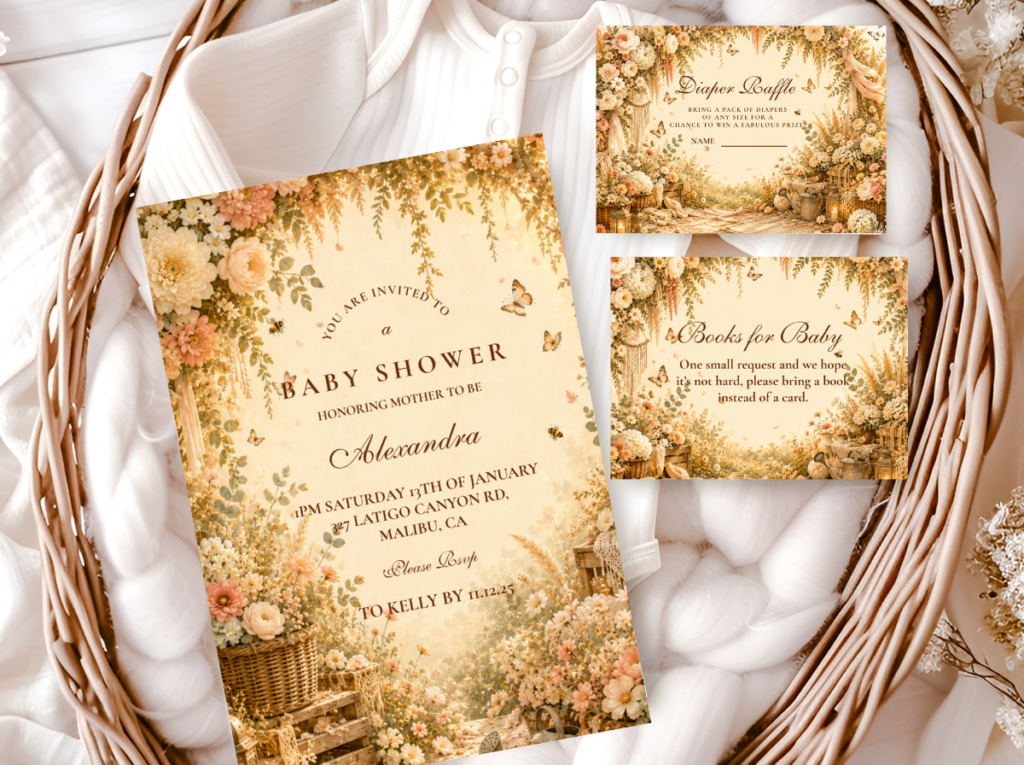
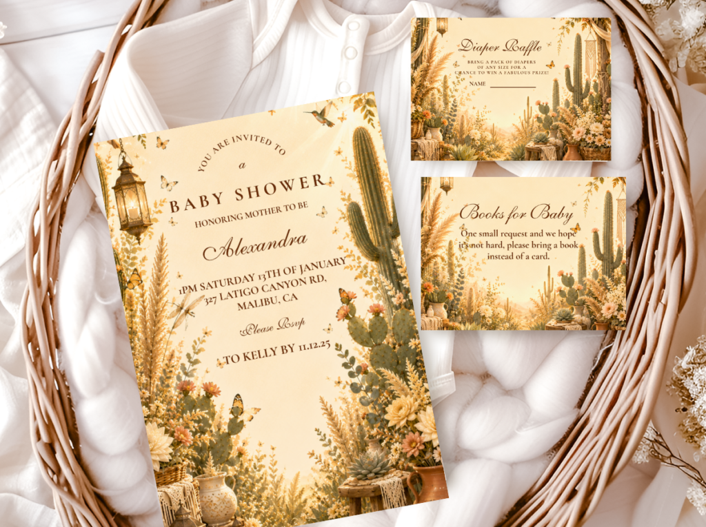
The Boho General collection carries the full terracotta and oatmeal suite: invitation, welcome sign, place cards, favour tags, and thank-you cards in the same warm botanical illustration style.
✨ Styling Tip
A genuine boho invitation illustration should have visible brushstroke quality — organic line variation, slightly imperfect botanical shapes, the specific warmth of something painted by hand. The moment the illustration looks computer-generated or perfectly precise — every petal the same size, every leaf the same shade, every stem perfectly straight — it stops reading as boho and starts reading as contemporary botanical. These are two different and beautiful aesthetics, but only one of them belongs on a boho shower invitation. The test: can you see where the brush lifted from the paper? Can you see the variation between the thick and thin parts of each stroke? If yes, the illustration quality is correct. If the illustration looks as though it could have been produced by software, it belongs to a different aesthetic world.
Most Abundant
Floral Boho Invitation
Dusty Rose · Warm Brown · Terracotta · Warm Ivory
Paper stock: Warm ivory card stock — the warmth of the base stock is more important in the Floral Boho direction than in any other because the dried floral illustration needs a warm base to read as aged and organic rather than as a fresh floral invitation on a cool white background.
Illustration: Dried floral botanical illustration: dried protea as the hero element (its multi-layered, slightly imperfect form is the most specifically boho floral illustration available); dried roses in dusty rose and warm blush; pampas grass tails woven into the floral composition; dried lavender bundles at the base. The illustration should be abundant — generous with botanical material, overlapping elements, the specific quality of a gathered dried arrangement rather than a spare botanical study.
Typography: Calligraphy-style script in warm brown or dusty rose for the primary display text. The script weight should be slightly heavier than the Classic Earthy direction — the abundance of the illustration benefits from a slightly more substantial typography to balance the visual weight of the floral composition.
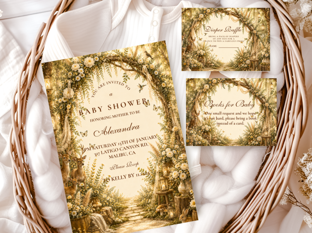
The Floral Boho Invitation is the most romantically beautiful and the most abundantly decorated of the five directions — the dried floral illustration communicates a world of warm, aged botanical beauty that is distinctly boho in its material (dried, not fresh) while being distinctly romantic in its abundance. The most appropriate for a Pink Boho shower direction as well as for the Floral Boho palette direction specifically.
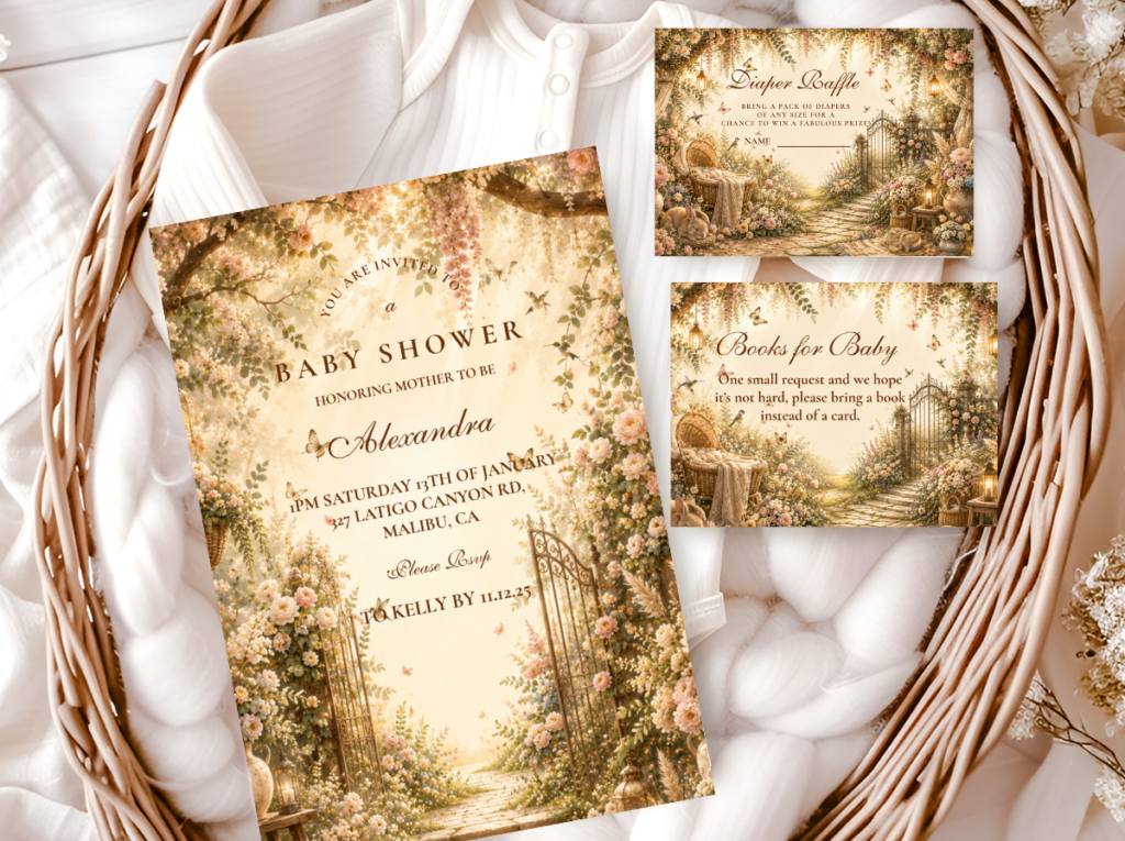
Most Joyful
Wildflower Boho Invitation
Muted Multicolour · Warm Pastel · Warm Ivory · Sage
Paper stock: Warm ivory card stock — the warm base is particularly important in the Wildflower direction because the multicolour muted palette needs a warm, organic background to read as boho rather than as a bright floral card. A cool white base would make the muted pastels read as washed-out rather than as intentionally muted and warm.
Illustration: Loose wildflower meadow illustration in the watercolour style: chamomile, strawflower, lavender, cosmos, and small wildflower varieties in warm muted pastels at varying heights and densities — the loose, slightly scattered quality of a meadow rather than the formal composition of an arranged bouquet. Every flower in the illustration should look slightly different from every other, communicating the organic variety of wildflowers rather than the regularity of a cultivated garden.
Typography: Calligraphy-style script in warm brown or warm sage. The script for the Wildflower direction should be slightly lighter and more flowing than for the Classic Earthy direction — the joyful, loose quality of the wildflower illustration benefits from a script that has the same organic looseness rather than a heavier, more formal calligraphy weight.
The Wildflower Boho Invitation is the most joyful and the most garden-adjacent of the five directions — the multicolour muted wildflower illustration communicates warmth and abundance while maintaining the muted, earthy palette that belongs specifically to the boho world. The saturation rule that governs the Wildflower Boho palette applies equally to the invitation illustration: every colour must share the same muted, warm saturation level. A single bright colour in the wildflower illustration breaks the boho palette coherence immediately.
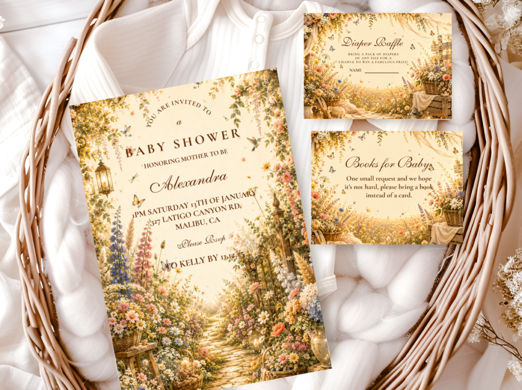
Most Seasonal
Fall Boho Invitation
Warm Amber · Rust · Oatmeal · Deep Sage
Paper stock: Warm ivory or kraft-toned stock — the kraft-toned stock is the most specifically appropriate for the Fall Boho direction because the warm brown of kraft belongs to the same colour world as the autumn palette. A kraft-stock fall boho invitation reads as specifically seasonal in a way that even warm ivory does not.
Illustration: Autumn botanical illustration in the watercolour style: dried maple or oak leaves in warm rust and amber; dried wheat bundle tied with natural twine; dried pumpkin vine element; pampas grass in honey-amber tone. The illustration should communicate the specific quality of the autumn world — warm, slightly drying, the world at the point between abundance and harvest — rather than the bright, saturated quality of commercial autumn decoration.
Typography: Calligraphy-style script in warm amber or deep rust — the script colour in the Fall Boho direction should be the warmest and most specifically autumnal of the five directions, belonging to the same warm amber and rust palette as the illustration. The script colour is the final palette detail that anchors the invitation in the autumn world.
The Fall Boho Invitation is the most urgently seasonal of the five directions — the specific combination of autumn botanical illustration and kraft-toned stock produces a card that reads as belonging to the autumn world before the illustration details are examined. The most important detail: the palette must read as warm and harvest-toned (amber, rust, oatmeal, deep sage) rather than as Halloween (orange, black, bright red). The same autumn motifs in a Halloween palette produce a completely different aesthetic register.
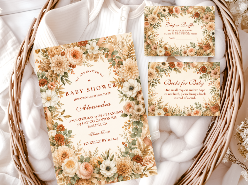
Most Feminine
Pink Boho Invitation
Dusty Rose · Terracotta · Warm Ivory · Warm Blush
Paper stock: Warm ivory stock — warm ivory is more appropriate than kraft for the Pink Boho direction because the dusty rose illustration palette reads most beautifully against warm ivory rather than against the warm brown of kraft. The ivory-versus-kraft decision in the Pink Boho direction: ivory for the most romantic result; kraft for the most specifically earthy result.
Illustration: Soft botanical illustration in dusty rose and warm blush: dried rose blooms in the specific warm, slightly peachy rose of the dusty rose palette; dried protea elements as a secondary botanical; pampas grass tails in honey-cream. The illustration palette must be specifically warm and slightly peachy — cool pink or lavender-adjacent blush in the illustration breaks the boho earthy register immediately and produces a card that reads as a generic floral invitation rather than as a Pink Boho invitation.
Typography: Calligraphy-style script in dusty rose or warm brown — the script in the Pink Boho direction should match the illustration’s specific dusty rose tone (warm and slightly peachy, not cool or bright pink) to create a fully palette-coherent card. The test: does the script colour read as warm and slightly peachy, or as pink? Warm and peachy is correct. Pink is not.
The Pink Boho Invitation is the most feminine and the most specifically warm-pink of the five directions — and the one most frequently executed incorrectly because the pink tone is interpreted as any shade lighter than hot pink. The correct dusty rose for a Pink Boho invitation is specifically warm, peachy, and slightly terracotta-adjacent — the specific quality of dried rose petals in their aged state rather than at peak bloom. The aged quality of the pink is the boho quality.
Section 03 Wording & Coordination Guide
Essential Information Checklist
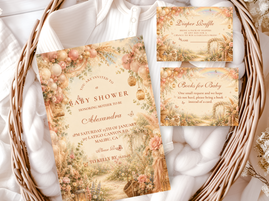
Every boho baby shower invitation must include: the name of the guest of honour (and the baby’s name if known); the celebration type (‘baby shower’ or a boho-appropriate equivalent such as ‘a wildflower gathering for a baby on the way’); the date and day of the week; the start time (and end time if appropriate); the venue name and full address; the host or hosts’ names; the RSVP deadline and RSVP method (email address, phone number, or a specific instruction); and any gift registry information if the hosts wish to include it.
Boho Wording Tone — Warm and Narrative
The wording on a boho invitation should feel like the illustration looks — warm, organic, and specific to this celebration rather than drawn from a generic party invitation template. Three wording registers and their appropriate contexts:
Classic Warm Boho
“A little wildflower is on the way. Please join us to celebrate [Name] as she blooms into motherhood.”
Most appropriate for Classic Earthy and Wildflower Boho directions. The wildflower metaphor belongs specifically to the boho botanical world and communicates warmth without sentimentality.
Harvest & Seasonal Boho
“A new little harvest is on its way. Gather with us to celebrate [Name] before the adventure begins.”
Most appropriate for Fall Boho direction. The harvest metaphor belongs to the autumn boho world; ‘gather’ communicates the specific quality of a boho celebration as a gathering rather than a party.
Romantic Floral Boho
“The most beautiful thing is growing. Join us to celebrate [Name] with wildflowers and warm company.”
Most appropriate for Floral Boho and Pink Boho directions. The botanical metaphor (something growing) is generic enough to apply to any pregnancy without being clichéd; ‘warm company’ communicates the boho aesthetic’s warmth.
Coordinating the Full Stationery Suite
Welcome sign: Same illustration style as the invitation, larger format — displayed at the entrance on a rattan easel or leaning against a wood slice. The first decoration element guests see should confirm the expectation the invitation created.
Place cards: Small kraft or warm ivory cards with the guest’s name in the same calligraphy-style script as the invitation header. A small botanical illustration element matching the invitation’s motif in the corner. Positioned at each table setting leaning against the napkin or plate.
Food labels: Kraft paper tags with food names in the invitation’s secondary typography. Small botanical detail. Positioned in front of each food item on the dessert and food table.
Favour tags: The final stationery element the guest handles — tied to the favour with natural jute twine. Same illustration quality as the invitation. A warm closing message on the reverse. The guest holds the invitation at the start of the celebration and holds this tag at the end.
Thank-you cards: Sent within two weeks of the shower. Same illustration and typography as the invitation suite. A handwritten note inside communicates the same warm, personal quality as the hand-lettered script on the invitation.
✨ Styling Tip
Set the RSVP deadline three weeks before the shower — not two weeks, not one. Bakers need confirmed guest counts at least three weeks before the date for custom orders; favour suppliers need confirmed quantities at the same interval; caterers need final numbers at two to three weeks. A two-week RSVP deadline creates a cascade: the host receives the last RSVPs seven days before the shower and then has seven days to finalise the baker order, the favour quantity, and the catering number simultaneously. A three-week buffer eliminates all three of these last-minute compressions and allows each supplier decision to be made with a calm confirmed number rather than an anxious estimate.
Section 04 Invitations & Stationery — All Six Boho Collections
The collection whose palette temperature and illustration style most closely matches the decoration direction planned for the shower is the correct stationery direction. Browse all six below — each can be personalised with the guest of honour’s name, the date, the venue, and any other details specific to the celebration.
Most Authentic
Boho General
Classic terracotta and oatmeal — the most Pinterest-consistent and most broadly boho invitation direction.
Most Abundant
Floral Boho
Dusty rose and dried floral botanical — the most romantically beautiful boho invitation direction.
Most Joyful
Wildflower Boho
Loose warm meadow wildflower illustration — the most joyful and most colourful boho invitation direction.
Most Seasonal
Fall Boho
Warm amber and rust autumn botanical — the most specifically seasonal boho invitation direction.
Most Feminine
Pink Boho
Dusty rose and warm blush — the most warm-pink boho invitation direction.
Most Editorial
Botanical Boho
Deep sage and warm ivory — the most refined and most minimal boho invitation direction.
Frequently Asked Questions
What makes a boho baby shower invitation look authentic?
Three decisions made simultaneously — all three, not two of three. The paper stock must be warm: warm ivory, kraft-toned, or recycled texture card stock (not bright white — bright white breaks the boho aesthetic before the design is read). The illustration must be loose and hand-painted in quality: organic brushstroke variation, slightly imperfect botanical shapes, visible watercolour or gouache quality — not precisely geometric, not cartoon, not photographic. And the typography must feel hand-lettered: calligraphy-style script with organic letterform variation and visible pen-pressure weight shifts — not clean sans-serif, which reads as contemporary regardless of how warm the colours are. When all three decisions are correct simultaneously, the invitation reads as genuinely boho. When one is wrong, it creates a mixed-register result that reads as close to boho but not quite.
When should I send boho baby shower invitations?
Send invitations six to eight weeks before the shower date for most guests; eight to ten weeks before if guests are travelling from out of town or if the shower falls during a busy holiday period. The RSVP deadline should be set three weeks before the shower — not two weeks, not one. This three-week buffer allows the host to finalise baker orders, favour quantities, and catering numbers with confirmed figures rather than estimates. Sending six to eight weeks out also gives the host time to manage non-responses — guests who have not responded by one week after the RSVP deadline can be followed up personally without creating time pressure on any supplier decision.
What should boho baby shower invitation wording say?
The wording should feel like the illustration looks — warm, slightly narrative, and specific to this celebration rather than drawn from a generic party template. The essential information (name of guest of honour, date, time, venue, host, RSVP deadline and method) must be present and clearly legible. The tone should be warm and organic: ‘a little wildflower is on the way’ communicates the boho world; ‘you are cordially invited to a baby shower’ communicates a different, more formal world. The three wording registers in Section 03.2 — Classic Warm Boho, Harvest and Seasonal, and Romantic Floral — each provide a starting template that can be personalised with the specific details of the celebration.
Do I need a matching welcome sign and place cards, or just the invitation?
A matching stationery suite — invitation plus welcome sign, place cards, food labels, and favour tags in the same illustration style — produces a shower that reads as a completely designed world rather than as a well-decorated room. The invitation creates the expectation; the welcome sign confirms it at the entrance; the place cards bring the designed world to the individual place setting; the favour tag closes the celebration in the same aesthetic that opened it. If only one additional element is added to the invitation, make it the welcome sign — it is seen by every guest on arrival and frames the entire aesthetic expectation for everything that follows. If a second element is added, make it the favour tag — it is the last designed object the guest holds and the one most likely to be kept after the celebration.
Begin Here
Boho Baby Shower Stationery — Six Complete Collections
Invitations, welcome signs, place cards, favour tags — warm, earthy, and fully customisable across six boho palette directions.