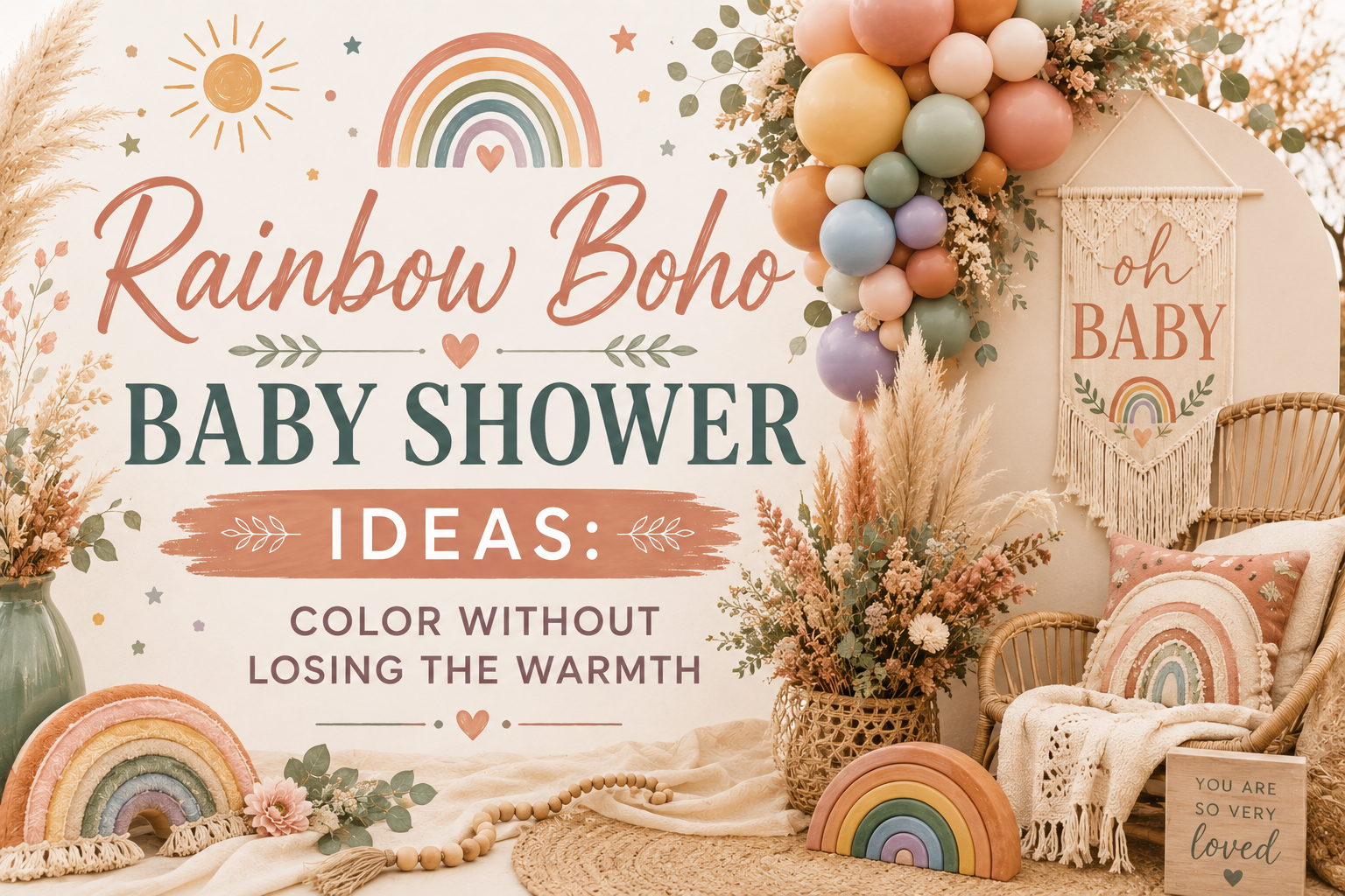
Rainbow Boho Baby Shower Ideas: Color Without Losing the Warmth
Baby Shower · Rainbow Boho Guide
Rainbow Boho Baby Shower Ideas
The one saturation rule that keeps multicolour boho from reading as a birthday party, the decor and cake guide, the girl-leaning direction, and the full stationery showcase.
Rainbow and boho sound like they should not belong in the same sentence — one is built on restraint, the other on maximum colour. In practice they combine beautifully, but only if a single rule is followed from the first decor purchase to the last invitation proof. Get the rule right and a rainbow boho shower looks like the softest, most cohesive celebration in the whole boho family. Skip it and the same colours, in the same quantities, read as a children’s party that wandered into the wrong aesthetic. Below is the rule itself, how it plays out across decor and cake, how the palette shifts for a girl-leaning shower, and how to carry it onto the stationery.
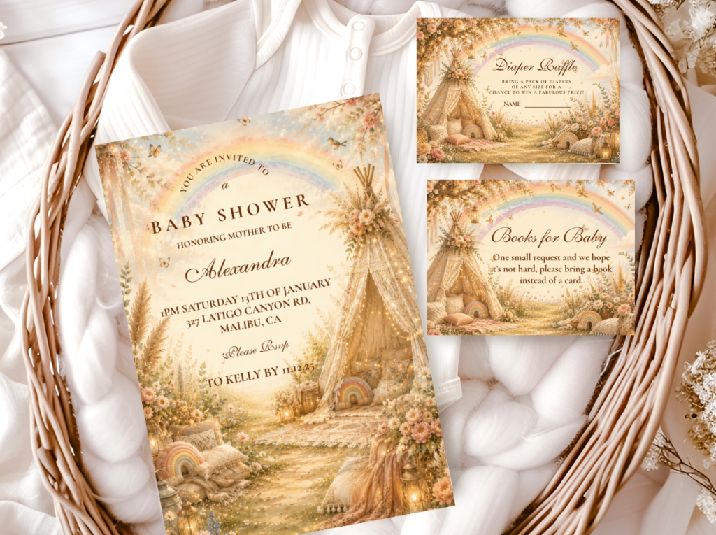
Shop the Rainbow Boho collection.
Muted multicolour pastels — every hue at the same warm saturation level.
“Rainbow boho is the shower that proves colour and warmth are not opposites — every hue soft enough to belong to the same organic world.”
Section 01 The Rainbow Boho Palette Rule — Saturation, Not Hue
Every colour in a rainbow boho palette must share the same muted warmth — that is the entire rule, and it is the difference between a shower that reads as designed and one that reads as a party supply store aisle. Dusty rose, sage, lavender, powder blue, and soft yellow works because every one of those five hues sits at the same low saturation level. Hot pink, lime, purple, turquoise, and bright yellow does not work, even though it covers the same five points on the colour wheel — the saturation, not the hue, is what determines whether the palette reads as boho or as generic rainbow.
This is worth testing before a single item is purchased, because saturation is easy to misjudge from a product photo. A ribbon or balloon that looks soft pastel on a screen can read considerably brighter once it is sitting next to dried pampas grass and warm neutral linen in person. The side-by-side test — holding every colour in the mix against the others in the actual light of the room — is the only reliable check.
The rule holds regardless of how many colours are in play. A three-colour rainbow boho palette and a full seven-colour one succeed or fail by exactly the same standard — every hue at the same muted saturation, no single colour allowed to jump out brighter than the rest. What changes with more colours is the room for error: the more hues in the mix, the easier it becomes for one to sneak in slightly more saturated than the others, which is exactly why the side-by-side check matters more as the palette grows.
The Saturation Test: Same Hues, Different Registers
Reads as birthday party: Hot pink, lime green, bright purple, turquoise, and yellow. These are the same five colour-wheel points as the boho palette — but at full or near-full saturation. In this form they communicate energy, brightness, and the specific cheerfulness of a children’s party. They read as manufactured and vivid rather than as organic and warm. No amount of rattan or dried pampas placed beside them shifts the register — the saturation is louder than everything else in the room.
Reads as rainbow boho: Dusty rose (the specific warm, peachy-pink of a dried rose petal — muted, warm, slightly aged); muted sage (the specific grey-green of dried sage leaves — warm rather than bright green); soft lavender (the specific grey-toned lavender of dried lavender bundles — dusty rather than vivid); powder blue (the specific pale, slightly greyed blue of a morning coastal sky — atmospheric rather than bright); soft warm yellow (the specific honey-cream of dried chamomile or dried wheat — warm and muted rather than vivid or lemon-toned). Every hue should be describable as dusty, muted, or soft.
✨ Styling Tip
Hold all rainbow elements next to each other before buying — in person if at all possible. If one colour reads brighter than the others when placed beside dried pampas grass and oatmeal linen, it will dominate the whole palette and break the boho register. Every colour must feel equally soft, equally warm, and equally muted. The test is not ‘does this read as pastel?’ It is ‘does this read as the same dusty, warm pastel as everything else in the palette?’ One colour drifting brighter is enough to make the room read as inconsistent.
The Rainbow Boho collection carries the full muted multicolour palette across the stationery suite — every hue at the same warm, dusty saturation level.
Section 02 Rainbow Boho Decor, Cake & Table
The saturation rule from Section 01 applied across every surface guests will see. No single colour reads brighter than the others; the palette reads as a single warm, cohesive world rather than as a collection of separate coloured elements.
Organic balloon arch in colour-blocked muted pastels — not alternating stripes
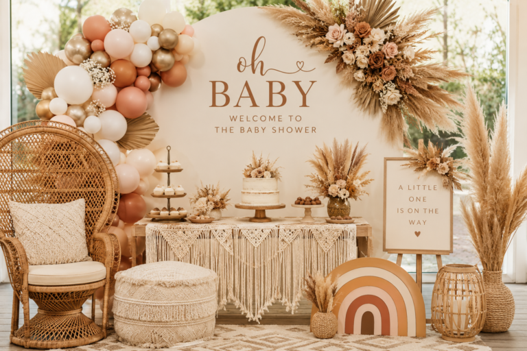
A balloon arch assembled in an organic, asymmetric shape — not structured in rings or columns. The palette: dusty rose, muted sage, soft lavender, powder blue, and soft warm yellow, all in the correctly muted tones from Section 01. The arrangement: colour-blocked clusters (all the dusty rose balloons together, all the sage together, transitioning gradually along the arch) rather than alternating single colours in a stripe pattern. Colour-blocked clusters read as more sophisticated and more cohesive than striped alternation, because they allow the eye to read each colour as a zone rather than as a repeating signal. Dried pampas tails tucked into the lower clusters at irregular intervals; oatmeal linen or jute ribbon tied at the arch base.
Rainbow macramé wall hanging or woven textile backdrop
A macramé wall hanging or woven textile in natural cotton or jute with colour accents woven through in the same muted pastel palette — not the vivid, saturated macramé of a children’s room, but the specific warm, undyed cotton quality of the boho material world with small amounts of muted pastel thread woven at intervals. The macramé carries the rainbow through texture as much as colour, which means the room does not rely on balloons alone to communicate the palette. A purely natural-cotton macramé backdrop with dried pampas and dried eucalyptus branches woven into the hanging is equally appropriate for this direction — the botanical material brings the colour through its natural tones.
Ombré buttercream cake moving through three or four muted pastels
A semi-naked or fully frosted buttercream cake with a soft ombré effect moving gradually through three or four of the muted pastels — not jumping between distinct colour blocks, but transitioning smoothly from one hue to the adjacent one (dusty rose to soft lavender to powder blue, for example). Dried floral accents on the top tier in the matching palette: a sprig of dried lavender, a few dried chamomile heads, a small dried rose cluster. The same saturation check that applies to the balloon arch applies to the buttercream colourant — request a small test swatch from the baker and check it beside the dried botanical material and the linen before the full cake is made.
Warm white or oatmeal linen runner with muted pastel scatter
A warm white or oatmeal linen runner as the table textile base — the warmth of the base is what prevents the muted pastels on top from reading as cool or washed-out beside each other. Scattered along the runner: small dried flower heads in each palette colour (dried chamomile for soft yellow, dried lavender for soft purple, dried rose petals for dusty rose); small antique gold votives at irregular intervals. No bright white runner — the cool quality of bright white beside muted pastels makes the pastels look slightly off-colour rather than intentionally muted.
✨ Styling Tip
A rainbow boho balloon arch must use organic shape, not structured rings or columns. Arrange balloons in clusters of the same colour family rather than alternating single colours in a stripe pattern — colour-block clusters read as more sophisticated and more cohesive. And keep all balloon tones in the same muted pastel register: one balloon drifting brighter than the rest is visible from across the room and breaks the palette at the most prominent visual element in the space.
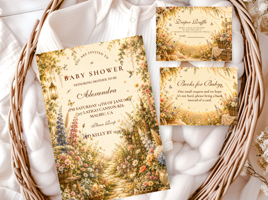
The Wildflower Boho collection carries loose meadow botanical illustration alongside the muted pastel palette — a natural companion for rainbow boho table stationery.
Section 03 Rainbow Boho for a Girl Shower
Rainbow boho shifts into a clearly girl-leaning palette through quantity rather than a change in the colour list — dusty rose and soft lavender simply appear in larger amounts, with sage, powder blue, and soft yellow stepping back into accent roles. It is a small adjustment, but it changes the entire read of the shower without requiring a single new colour to be introduced or any element of the palette to be sourced differently.
This quantity-based approach is what makes rainbow boho more flexible than most themed palettes. The same five muted pastels work for a gender-neutral shower and a girl-leaning shower; the same five work for a boy-leaning shower by reversing the proportions (powder blue and sage in the largest amounts, dusty rose and lavender as accents). The colour list does not change — only the quantity balance between them.
The stationery balance communicates the direction before the guest arrives — an equal-weighted pastel arc on the invitation reads as gender-neutral; a design where dusty rose and soft lavender visibly dominate reads as girl-leaning from the first glance. The same proportion logic that applies to the balloon arch applies to the invitation illustration.
The Quantity Shift: Same Five Colours, Different Direction
Reads as birthday party: Equal amounts of all five colours (dusty rose, sage, lavender, powder blue, soft yellow) across balloons, dried florals, and linen accent. Equal weighting reads as the most gender-neutral rainbow boho direction — no single colour leads, every hue contributes equally to the palette.
Reads as rainbow boho: Dusty rose and soft lavender in the largest quantities — the dominant balloon clusters, the primary dried floral material, the lead colours in the invitation illustration. Sage, powder blue, and soft warm yellow as supporting accents — present but not leading. The proportion shift, not a new colour, is what makes the shower read as girl-leaning.
✨ Styling Tip
Rainbow boho for a girl shower works best when dusty rose and lavender appear in the largest balloon clusters, in the most prominent dried floral positions, and as the lead colours in the invitation illustration. Equal amounts of every colour reads as gender-neutral. Pink-led and lavender-led reads as girl. The saturation rule remains unchanged — the same muted, warm, dusty register applies to every colour at every proportion.
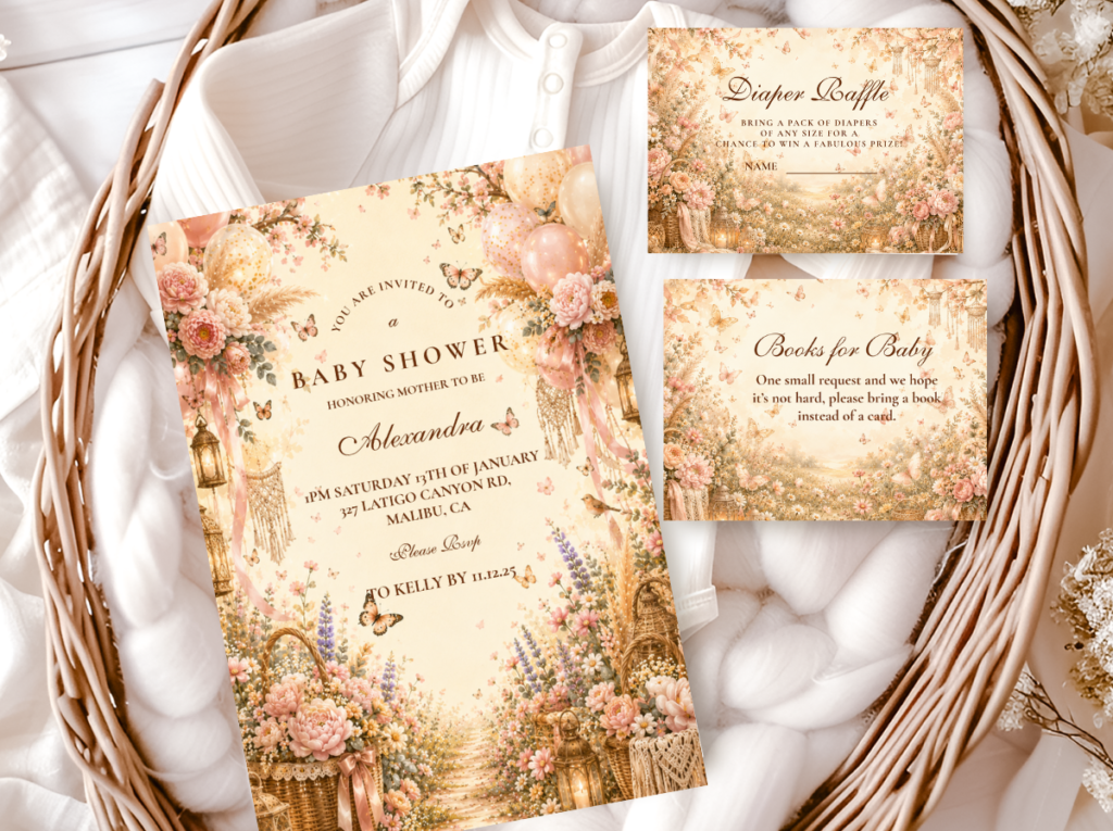
The Pink Boho collection carries the dusty rose-forward palette for the girl-leaning direction alongside the Rainbow Boho stationery.
Section 04 Invitations & Stationery
The invitation is the very first place the saturation rule gets tested in print, and it is an easy one to get wrong — a printed rainbow gradient can run brighter on paper than it did on screen, especially under a glossy finish. A matte or soft-finish warm ivory card stock helps keep the printed pastels honest to the muted palette the rest of the shower is built around. Requesting a physical proof and checking it beside the dried botanical material and the linen before invitations go out catches a too-bright print before it reaches guests.
Whether the shower leans gender-neutral or toward the pink-and-lavender girl direction from Section 03, the invitation should establish that balance visually before the guest arrives. An equal-weighted pastel arc reads neutral; a design where dusty rose and lavender visibly dominate reads girl-leaning from the first glance. Every hue on the page needs to pass the same side-by-side saturation test described in Section 01: if one colour reads brighter than the others on the printed page, it is too bright for this palette.
Primary
Rainbow Boho
Muted multicolour pastels — the defining stationery direction for rainbow boho.
Most Joyful
Wildflower Boho
Loose muted meadow illustration — botanical companion for the rainbow boho palette.
Girl Direction
Pink Boho
Dusty rose-forward — for the girl-leaning rainbow boho direction.
Most Romantic
Floral Boho
Warm dried floral botanical — romantic table stationery alongside the rainbow palette.
Most Editorial
Botanical Boho
Deep sage and warm ivory — refined botanical for a more minimal rainbow direction.
Earthy Base
Boho General
Classic terracotta and oatmeal — the warm earthy foundation alongside any rainbow boho direction.
Frequently Asked Questions
What colours count as rainbow boho?
Dusty rose, muted sage, soft lavender, powder blue, and soft warm yellow — any muted pastel arc where every colour sits at the same low saturation level. The test is not which hue is present but what saturation level it sits at: dusty rose and hot pink share a hue family but only the first belongs to the rainbow boho palette. Bright or vivid versions of any of the five hues fall outside the palette entirely, regardless of how many other correctly muted colours they are placed beside. The side-by-side saturation test — holding every colour in the mix next to dried pampas grass and oatmeal linen — is the most reliable way to check.
How do I keep multicolour boho decor from looking chaotic?
Three decisions made simultaneously. Match every colour’s saturation level before anything else — one colour drifting brighter than the rest will dominate the palette and read as chaotic regardless of how correctly the others are toned. Arrange balloons and dried florals in colour-blocked clusters rather than alternating single colours — clusters read as zones of colour that the eye can move between, while alternating stripes read as patterns the eye has to decode. And keep the balloon arch shape organic rather than rigid — an organic asymmetric arch reads as gathered, which belongs to the boho world; a structured ring or column reads as constructed, which belongs to a different aesthetic register.
Can rainbow boho work for a boy shower?
Yes — by reversing the quantity proportions from the girl-leaning direction. Keep powder blue and muted sage in the largest balloon clusters and the most prominent dried floral positions; allow dusty rose and soft lavender as accent colours in smaller quantities rather than as the lead. The same five muted pastels work for a boy-leaning shower as for a girl-leaning or gender-neutral one — the colour list does not change, only the proportion balance between the hues. The saturation rule remains identical: every colour at the same muted, warm, dusty saturation regardless of which hue leads.
Every Hue in Its Place
Rainbow Boho Baby Shower Stationery
Muted multicolour pastels — invitations, welcome signs, and favour tags where every hue sits at the same warm, dusty saturation.