Best Baby Shower Themes for Every Style
Baby Shower · Theme Guide
Best Baby Shower Themes for Every Style
Four aesthetic families that make theme-choosing fast, whimsical directions from space to silly goose, warm and earthy alternatives, and the three rules that make any theme look elevated.
The baby shower theme question is almost always asked the wrong way. ‘What theme should I choose?’ produces an answer that searches the full landscape of available options — a landscape that has grown very wide. The more useful question is: ‘Which aesthetic family does the guest of honour belong to?’ Once that family is identified, the theme chooses itself from the options within it. This guide introduces the four-family framework, covers every theme direction in detail across each family, and closes with the three rules that elevate any chosen theme from decorated to genuinely designed.
⚠ This post contains affiliate links. As an Amazon Associate, I earn from qualifying purchases at no extra cost to you. I only recommend products I genuinely believe will add value for my readers. Thank you for supporting Baby Wonderland Studio.
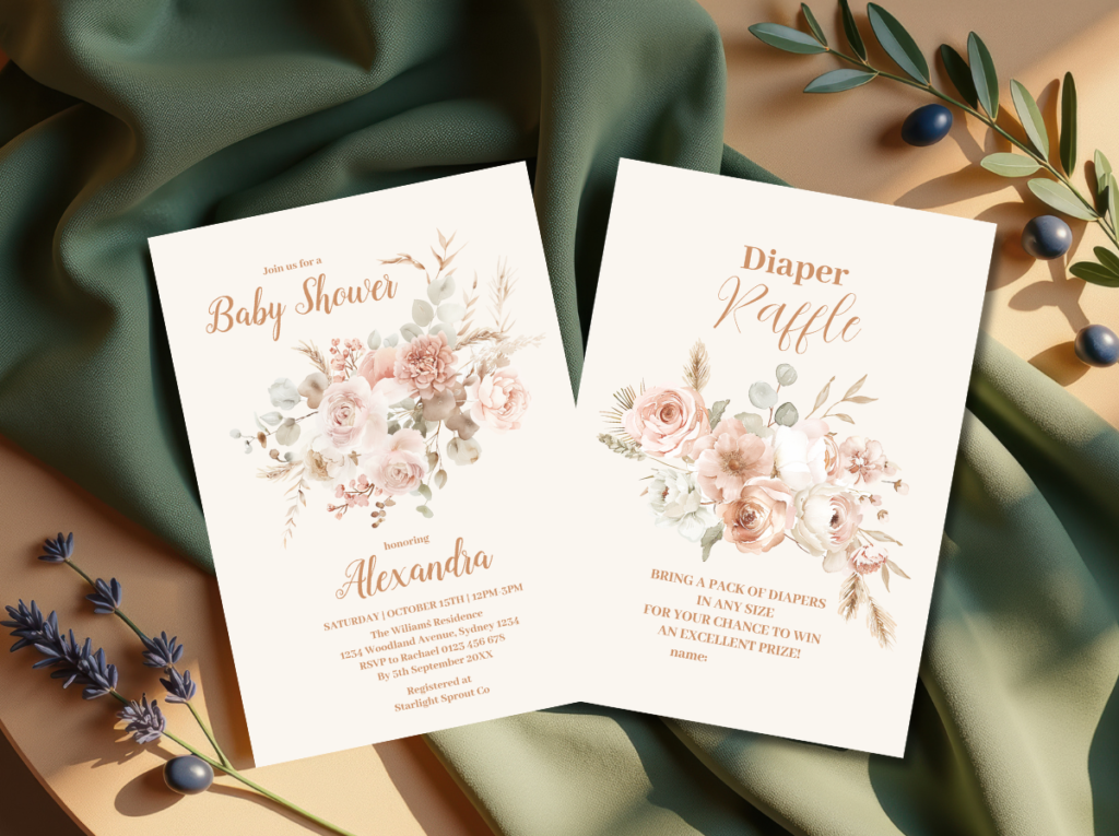
Start with stationery that matches your theme direction.
Invitations, welcome signs, and favour tags — all coordinated across every theme family.
“The best baby shower theme is the one that looks like the guest of honour, not the one that looks like everyone else’s shower from last year.”
Section 01 How to Choose a Theme That Actually Fits
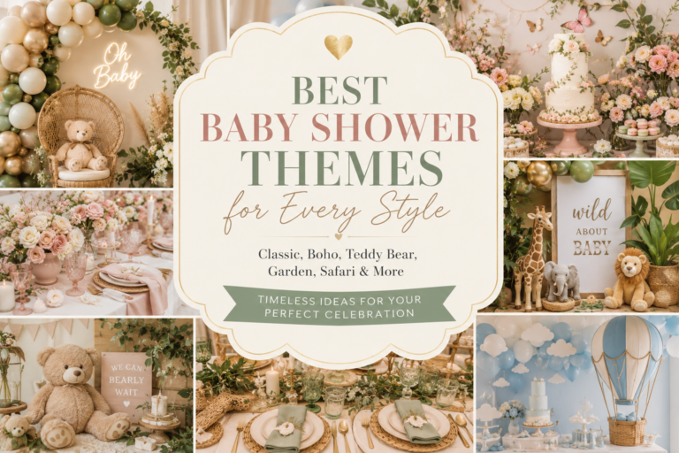
Most theme guides present a list. This guide presents a framework. The reason: choosing from a list of individual themes without first identifying the aesthetic family that fits the guest of honour produces a theme that may be beautiful in isolation but wrong for the specific person at the centre of the celebration. The four aesthetic families below cover every theme direction currently available — and the guest of honour belongs clearly to one of them. Finding the right family narrows the field from dozens of options to three or four, any of which will produce a beautiful and fitting celebration.
Family 1
Whimsical & Playful
Themes in this family: Fairy, Dragon, Space, Silly Goose, Enchanted Forest, Storybook
Guest of honour signal: She lights up at things that are imaginative, funny, or a little bit magical.
The Whimsical family is for guests of honour who value delight over sophistication, who can genuinely appreciate a goose in a party hat as an aesthetic choice, and who approach life with a sense of playfulness that extends to their home, their taste in books, and their sense of humour. A Whimsical theme chosen for someone who belongs to a Natural family will feel forced; a Natural theme chosen for someone who belongs to the Whimsical family will feel serious when it should feel joyful. The diagnostic: does the guest of honour use the word ‘whimsy’ without irony? If yes, she belongs here.
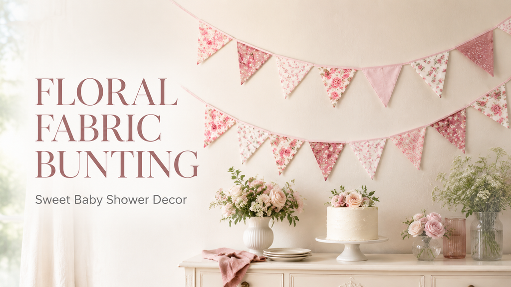
🚩 Fabric pennant banner: A neutral fabric bunting works as a base decor layer no matter which theme you land on — swap theme-specific accent pieces around it instead of committing to a single balloon-heavy centerpiece. Fabric also photographs better than mylar or latex.
Family 2
Warm & Nostalgic
Themes in this family: Teddy Bear, Honey and Cream, Vintage Storybook, Classic Nursery, Cottagecore
Guest of honour signal: She values warmth, gentleness, and things that feel like home.
The Warm and Nostalgic family is for guests of honour whose aesthetic vocabulary includes words like ‘cosy’, ‘classic’, and ‘timeless.’ These are people who keep well-loved children’s books on visible shelves, who prefer warm amber lighting to overhead fluorescent, and who find the specific warmth of a teddy bear theme more appealing than the specific drama of a space theme. The diagnostic: does her home feel warm and gathered? Does she respond more to ‘beautiful and gentle’ than to ‘beautiful and bold’?
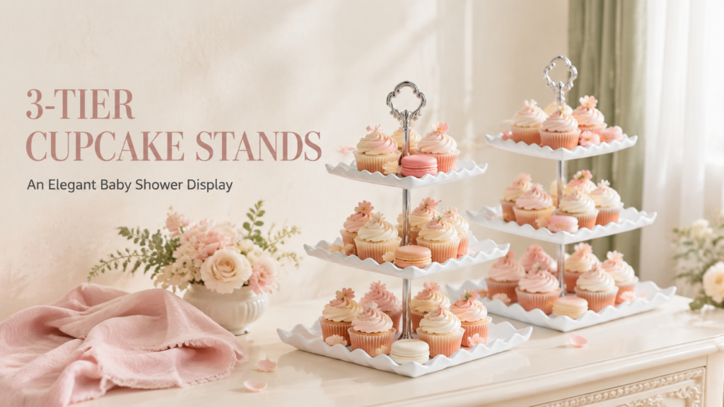
🍰 Tiered dessert/cake stand: A tiered stand instantly elevates the dessert table regardless of theme, and it’s reusable long after the shower for birthdays and holidays. A neutral wood or white finish works across warm, natural, or modern editorial palettes alike.
Family 3
Natural & Organic
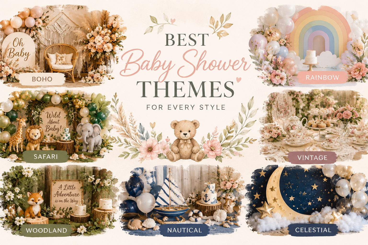
Themes in this family: Boho, Safari, Botanical, Woodland, Garden, Sea
Guest of honour signal: She responds to texture, earthy tones, and things that feel handmade or grown.
The Natural family is for guests of honour whose aesthetic is defined by material quality rather than motif: the specific warmth of rattan, the texture of linen, the organic imperfection of dried botanicals, and the warm natural palette of the outdoors. These are people whose homes feature plants, natural wood, and textiles with visible texture; who find a boho table more beautiful than a formal one; and who respond to the word ‘earthy’ as a compliment. The diagnostic: look at her home. If it contains dried botanicals, rattan, or a gallery wall of natural prints, she belongs here.
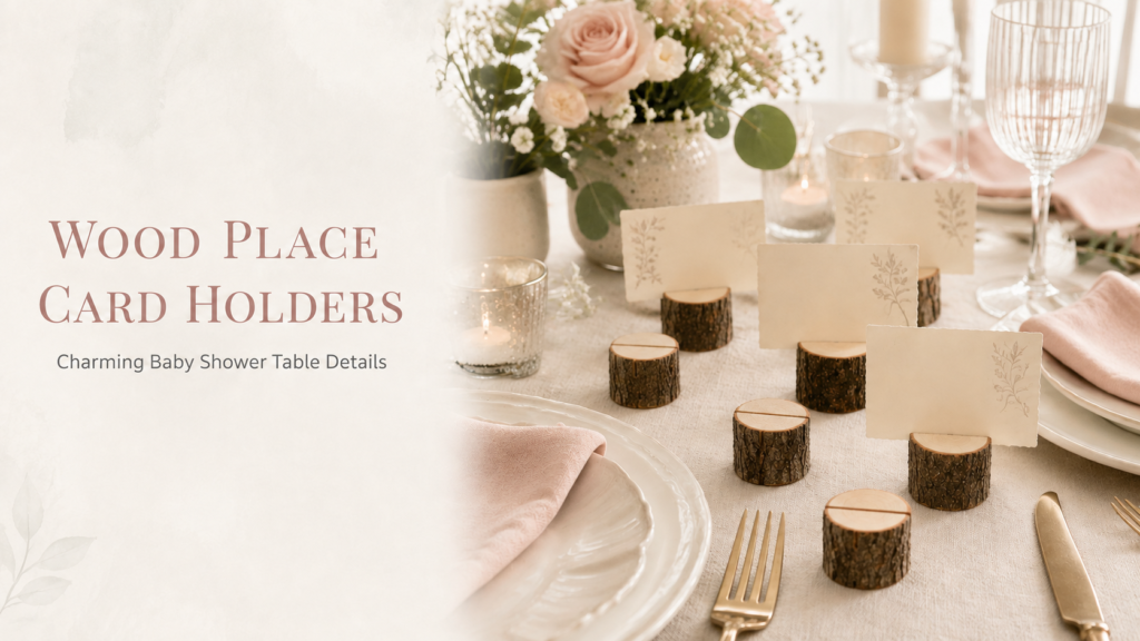
🪵 Wooden place card holders: The article’s stationery-first strategy starts at the table — wood place card holders coordinate across nearly every aesthetic family from cottagecore to boho to modern editorial, unlike printed acrylic stands that lock you into one style.
Family 4
Modern & Editorial
Themes in this family: Celestial, Preppy, Geometric, Monochrome, Architectural Botanical
Guest of honour signal: She has strong design opinions and is more interested in aesthetics than themes.
The Modern family is for guests of honour who would look at a colour-coordinated table and say ‘the proportions are off’ rather than ‘it’s so pretty.’ These are people with interior design opinions, who notice when a typeface does not match the illustration style of an invitation, and who are more interested in a correctly considered aesthetic system than in a charming motif. The diagnostic: would she ever describe something as ‘too cute’? If yes, she belongs here — and the theme for her should have a clear editorial rationale rather than a narrative charm.
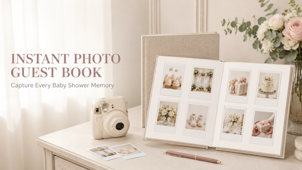
📸 Polaroid-style instant photo guest book: An instant-photo guest book gives guests a more memorable way to sign in than a traditional book, and doubles as a keepsake the parents will actually revisit. Pair it with any instant camera set up at the entrance.
✨ Styling Tip
If you can’t decide between two themes, choose the one with the palette you love more — not the motif you love more. You will look at the palette all day. The balloon cluster, the table linen, the invitation, the cake — all of these will be in the palette. The motif appears only in the details: the cake topper, the stationery illustration, the cookie shape. A palette you love with a motif that’s good enough produces a more beautiful celebration than a palette that’s fine with a motif you adore.
Section 02 Whimsical & Playful Themes
Four theme directions for the guest of honour who values delight and imagination. In every whimsical direction: the palette must be taken seriously even when the motif is not. A carefully considered palette rescues a playful motif from reading as childish.
Whimsical 01
Space & Celestial
Deep Navy · Gold Star · Warm Cream · Midnight Purple
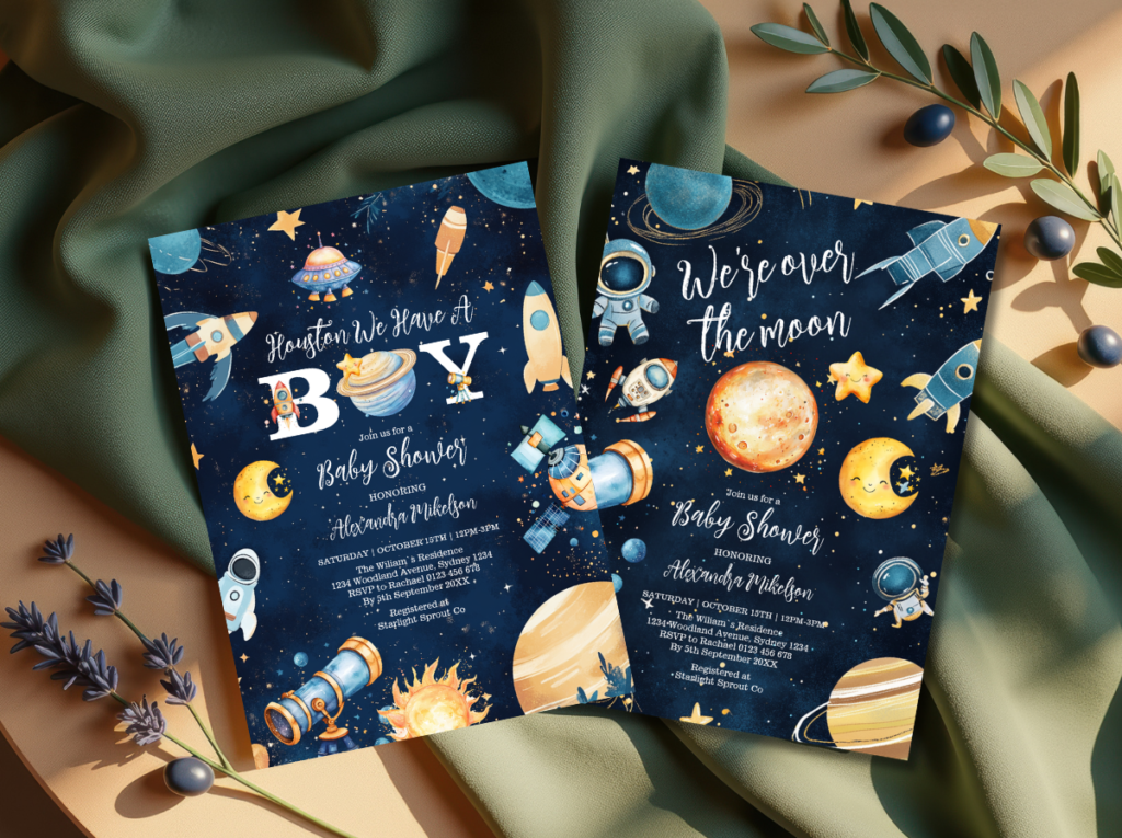
The Space theme is the most dramatically beautiful of the four whimsical directions — it uses the specific visual language of the night sky (deep navy or midnight purple, warm gold stars, soft cream nebula tones) to create a celebration that reads as wonderfully ambitious in its scope. The celestial direction within the Space family softens the drama with gold crescent moons, soft star clusters, and a warm ivory base that makes the celebration feel intimate rather than vast. Best for: a guest of honour who has always been drawn to the night sky, to astronomy, or to anything that references the universe beyond the everyday.
Whimsical 02
Fairy & Enchanted
Soft Lilac · Blush · Warm Gold · Botanical Green
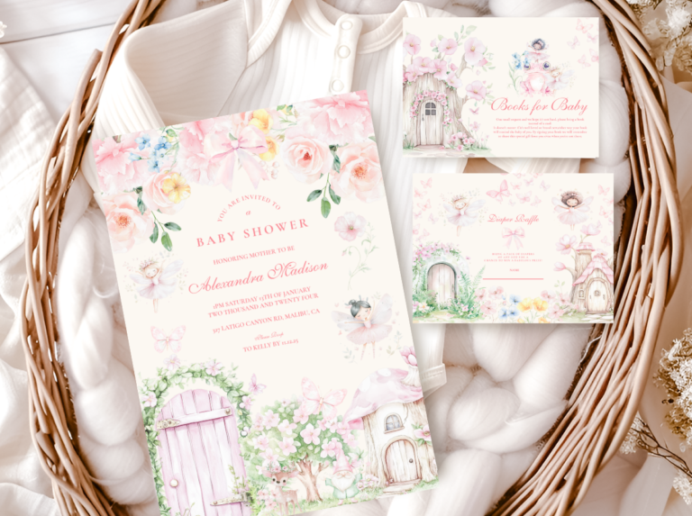
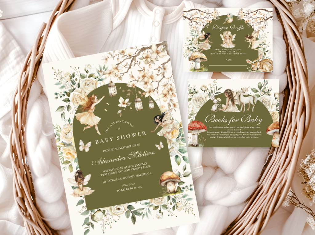
The Fairy theme is the most specifically magical and the most feminine of the four whimsical directions — it uses soft lilac, warm blush, and botanical fairy-world greenery to create a celebration that references an enchanted natural world rather than a fantasy one. The fairy aesthetic at its most beautiful avoids bright primary colours entirely, using soft dusty purples, warm blush pinks, and botanical gold leaf accents on a warm ivory base. Best for: a guest of honour who loves the specific quality of fairy stories that are rooted in the natural world rather than the fantastical one.
Whimsical 03
Dragon Theme
Deep Teal · Warm Gold · Forest Green · Warm Cream
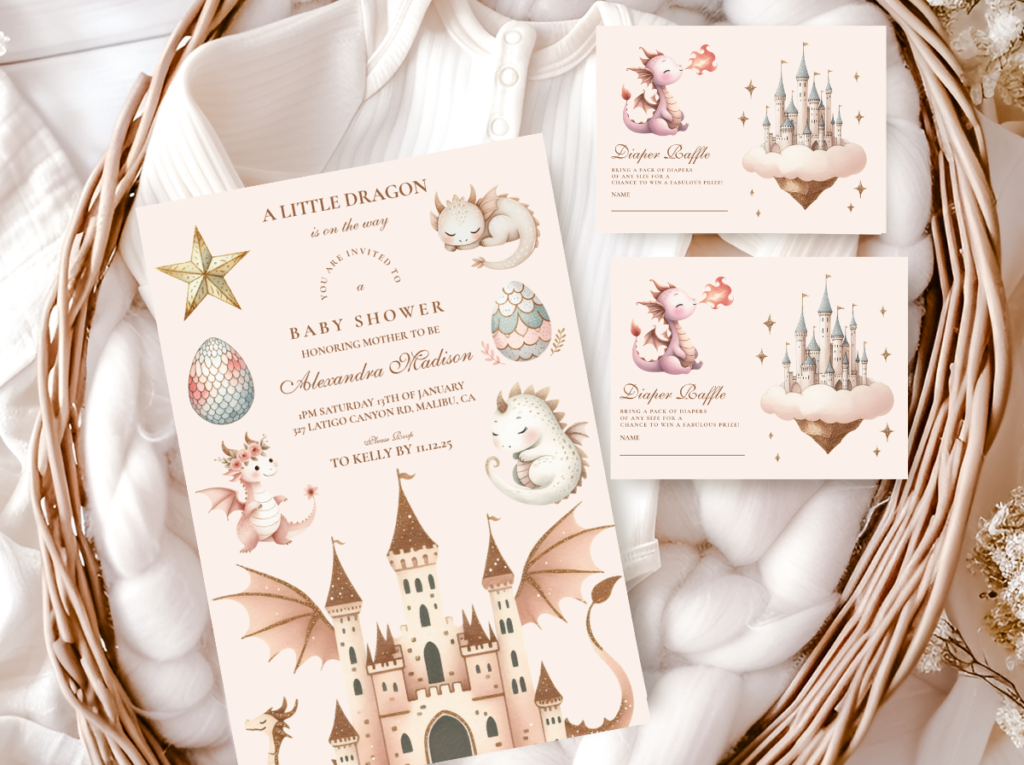
The Dragon theme is the most boldly adventurous of the four whimsical directions and the one most appropriate for guests of honour (or couples) who have a genuine relationship with fantasy literature, tabletop games, or the specific quality of dragon mythology. At its most beautiful, the Dragon theme uses deep forest green, warm antique gold, and warm cream rather than bright primary green and yellow — which produces a celebration that reads as mythologically rich rather than as a children’s party. Best for: a guest of honour who would describe herself as ‘a bit of a fantasy fan’ without embarrassment.
Whimsical 04
Silly Goose
Warm Yellow · Sage Green · Cream · Warm Oatmeal
The Silly Goose theme is the most genuinely funny and most specifically charming of the four whimsical directions — a celebration that commits fully to the absurdist warmth of the Silly Goose aesthetic and produces a result that is both immediately funny and immediately beautiful when the palette is correctly handled. The key: warm yellow (honey, not primary) beside sage green and warm cream reads as specifically considered rather than childish. The same yellow in primary tone beside primary green reads as a children’s party regardless of the goose. Best for: a guest of honour with a genuine sense of humour who would find a goose in a party hat as her shower theme genuinely delightful rather than confusing.

✨ Styling Tip
Whimsical themes work best when the palette is taken as seriously as the motif. A Silly Goose theme in carefully considered warm yellow, sage green, and warm cream reads as charming and specifically designed — the goose becomes a witty design choice. The same theme in primary yellow and bright green reads as a children’s birthday party with a goose on it. A Dragon theme in deep forest green and antique gold reads as mythologically rich; in bright green and red it reads as a children’s classroom display. The palette does not need to be serious — it needs to be deliberate. Deliberate palette + playful motif = whimsical. Undeliberate palette + playful motif = children’s party.
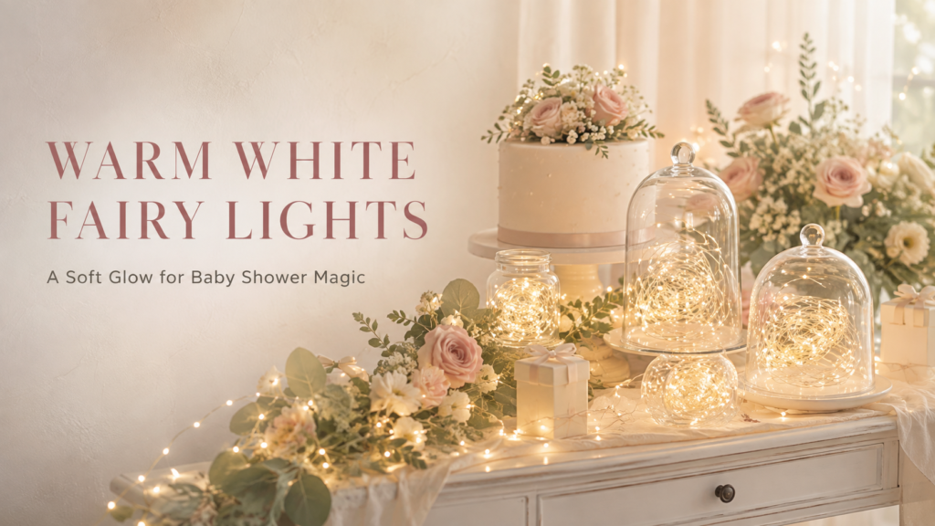
✨ Warm white battery-operated fairy string lights: Battery power means no outlet needed for outdoor or unconventional venues. The warm glow ties together Celestial, Fairy, and Cottagecore themes especially well, but reads elegant enough for a Modern Editorial setup too.
Section 03 Warm & Nostalgic Themes
The Warm and Nostalgic family is defined by the quality of emotional resonance: these are themes that remind guests of something beloved, something gentle, or something that belonged to an earlier and simpler version of the world. They work for any gender and any guest age range because their appeal is not to a specific taste but to a universal human response to warmth, gentleness, and the specific beauty of things that feel genuinely safe and loved.
Teddy Bear & Honey
Warm Honey · Oatmeal · Teddy Brown · Warm Cream
The Teddy Bear theme is the warmest and the most universally beloved of the Nostalgic family — the specific warmth of honey amber, oatmeal, and warm brown beside a teddy bear illustration that references the quality of a genuinely beloved childhood toy (not a cartoon bear, not a cartoon animal, but the specific warm-stitched quality of a teddy that has been loved) creates a celebration that moves guests in a specific way that no other theme does. The honey accent is particularly important: warm honey — amber, slightly golden, unmistakably sweet — belongs to this theme in the same way that the specific warmth of beeswax belongs to the natural world. The Teddy Bear theme works for any gender and any season.
Vintage Storybook
Warm Cream · Muted Sage · Antique Gold · Dusty Rose
The Vintage Storybook theme references the specific visual quality of illustrated children’s books from before the age of digital design: the slightly aged warmth of the page colour, the loose and organic quality of the hand-drawn illustration, the botanical detail in the borders, and the specific warm typography of an era when type was set by hand. This theme is appropriate for any guest of honour who has a relationship with books — who might quote a children’s book from memory, who keeps their favourite childhood illustrated books on adult shelves, or who simply has the quality of someone for whom ‘storybook’ means something specific and personal. The palette should never be bright: vintage means warm, aged, and slightly muted.
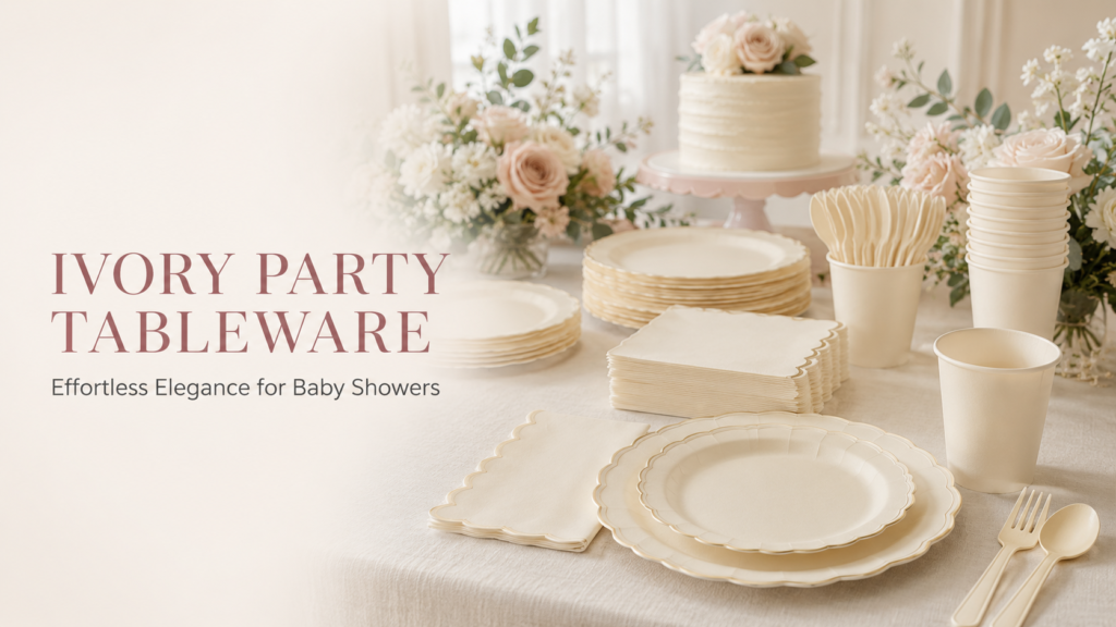
🍽 Neutral tableware set: A cream or kraft-toned tableware set is the practical backbone every theme in this article needs — unlike printed character plates, it works whether the final theme lands on Boho, Safari, or Preppy & Nautical.
Cottagecore & Garden
Wildflower Blush · Sage · Warm Ivory · Botanical Gold
The Cottagecore direction within the Nostalgic family takes the specific warmth of an imagined English country garden — wildflowers in warm blush and dusty rose, botanical greenery in sage, linen in warm ivory — and applies it to a celebration that feels simultaneously as though it belongs in a meadow and as though it was styled with complete intention. The cottagecore theme is more specific in its botanical vocabulary than the garden floral theme: it references the rambling, slightly imperfect quality of a cottage garden rather than the curated quality of a florist’s arrangement. Wildflowers rather than garden roses; herbs alongside florals; botanical imperfection as aesthetic rather than error.
Section 04 Natural & Organic Themes
The Natural family is the largest and the most internally varied of the four — it contains directions as different as boho earthy and ocean coastal. What unites them is the aesthetic priority of material quality over motif: in Natural family themes, what things are made of matters more than what they depict, and the palette is defined by the specific warm tones of the natural world rather than by designed colour choices.
Boho
Terracotta · Oatmeal · Dusty Sage · Natural Linen
The Boho theme is the most texture-forward of the Natural family — it is defined by the specific quality of things that are natural, slightly imperfect, and assembled over time rather than purchased as a set. Rattan, dried botanicals, linen, kraft paper, and warm earthy tones are the material vocabulary; asymmetry, organic arrangement, and layered texture are the design language. The boho shower reads as the most personally assembled of all the Natural family directions, which is also what makes it the most challenging: it requires genuine commitment to the material vocabulary rather than the addition of a pampas stem to a conventionally styled table.
Safari
Warm Cream · Honey Amber · Warm Brown · Antique Gold
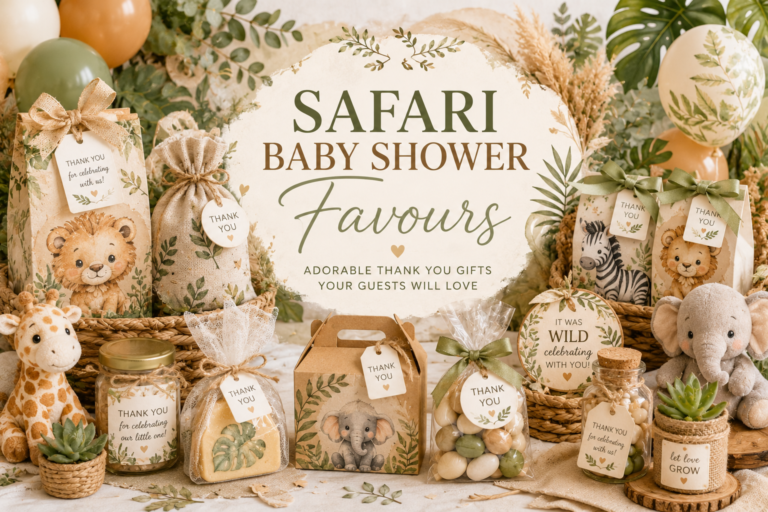
The Safari theme is the most universally appealing of the Natural family — its warm natural palette works for any gender, any season, and almost any aesthetic preference. The five sub-directions (neutral safari, jungle safari boy, pink safari girl, boho safari, and watercolour safari) mean that the safari family can accommodate almost any specific guest of honour preference within the Natural family while maintaining the warm, adventurous, and specifically beautiful quality of the safari aesthetic. The most important single decision in the safari direction is the illustration style: watercolour reads as artistically beautiful; cartoon reads as children’s party.
Woodland & Botanical
Forest Green · Warm Brown · Blush · Warm Cream
The Woodland theme occupies the space between the organic material vocabulary of boho and the warm animal vocabulary of safari — it uses the specific visual quality of a forest floor (the specific dark warmth of forest green, the warm brown of tree bark, the blush of woodland flowers, the warm cream of birch) to create a celebration that feels specifically and genuinely natural. The botanical direction within the Woodland family emphasises the plant world over the animal world: fern, moss, wildflower, and bark rather than fox, deer, and owl as the primary decorative vocabulary.
The Boho Theme collection is the most specifically appropriate stationery direction for Natural family themes — organic illustration quality, warm earthy palette, and botanical detail consistent with the material vocabulary of the Natural aesthetic.
Section 05 Modern & Editorial Themes
The Modern family is the smallest and the most design-forward of the four — it is for guests of honour who approach aesthetics as a discipline rather than an enjoyment, and for whom the coherence of the design system is more important than the warmth of any individual element. Modern family themes require the most specific and the most consistent execution: a single element in the wrong register (a warm handmade element in a geometric celebration; a cartoon illustration in a celestial editorial shower) reads as more jarring than it would in any other family.
Celestial
Midnight Navy · Antique Gold · Warm Cream · Dusty Mauve
The Celestial theme at its most editorial uses the night sky as a design system rather than as a motif: midnight navy and antique gold as the primary palette; crescent moon and star as the graphic elements in a precise and considered layout; warm cream as the light-source colour within the design. The celestial editorial theme is distinct from the Whimsical Space direction by its restraint: fewer graphic elements, more white (or warm cream) space, and typography that reads as considered rather than decorative. Best for a guest of honour with strong graphic design sensibility.
Preppy & Nautical
Navy · White · Red or Gold · Classic Stripe
The Preppy direction is the most classically American of the Modern family — it uses the specific visual language of Ivy League and East Coast coastal aesthetics (navy, white, and red or gold; classic stripe; monogram; anchor) to create a celebration that reads as specifically confident and specifically traditional in a way that is different from the Nostalgic family’s warmth. The preppy aesthetic values precision and clarity over warmth: clean lines, confident colour contrast, and a level of graphic directness that belongs to a different design tradition from the organic material vocabulary of the Natural family.
Geometric Botanical
Sage · Warm Ivory · Black Line · Antique Gold
The Geometric Botanical direction is the most specifically design-forward of the Modern family — it combines the precision of geometric line work (hexagons, clean triangles, linear grid structures) with the softness of botanical illustration in a single aesthetic system where neither the geometric nor the botanical element dominates. The palette: warm sage and warm ivory as the botanical base; clean black or antique gold as the geometric line colour. The result reads as specifically architectural and specifically beautiful in the same way as a well-designed building that also contains plants: designed and organic simultaneously, with neither quality apologising for the other.
Section 06 How to Make Any Theme Look Elevated
The three rules below apply to every theme in every family. None of them requires additional budget. All of them require intentional decisions made before any single decoration is purchased.
Rule 6.1 — The Palette Rule
60–30–10: Choose a primary tone, a secondary tone, and one accent.
60% of every surface should be the primary colour (the table linen, the balloon base, the invitation stock). 30% should be the secondary colour (the botanical element, the secondary balloon tier, the typography). 10% should be the accent (the metallic detail, the single saturated element, the topper). A theme applied with a 60-30-10 palette reads as designed. The same theme applied with five equally weighted colours reads as decorated. The distinction is visible in every photograph taken at the shower and invisible to anyone who has not made the 60-30-10 decision deliberately.
Rule 6.2 — The Texture Rule
Three textures minimum at every zone.
Every major zone (backdrop, guest table, food table, favour table) should contain at least three different textures: one textile texture (linen, cotton, velvet), one botanical texture (fresh, dried, or artificial botanical element), and one material texture (rattan, wood, ceramic, glass). When every zone has three textures, the celebration reads as layered and specifically considered. When a zone has one texture (a balloon arch, a plastic-covered table, a single serving board), it reads as decorated in a single material. The texture rule costs nothing — it requires only the decision to include three materials at every zone rather than one.
Rule 6.3 — The Stationery Rule
Choose the invitation before buying a single decoration.
The invitation establishes the illustration style, the palette temperature, and the typographic register for every other printed element at the shower — and for every decoration element that should match it. A watercolour fairy invitation establishes that the decoration should be in the organic, soft-edged, botanical register of watercolour illustration; a geometric celestial invitation establishes that the decoration should be in the precise, editorial register of the Modern family. When the invitation is chosen first and every decoration is tested against it before purchase, the result is a celebration where every element belongs to the same world. When the invitation is chosen last, it arrives as one more element that may or may not match everything already purchased.
✨ Styling Tip
An elevated baby shower theme is not more expensive than a generic one — it is more considered. The difference between a table that reads as ‘designed’ and one that reads as ‘decorated’ is always three things: a deliberate 60-30-10 palette applied consistently across every zone; three textures at every surface; and a stationery suite that was chosen first and used as the specification for every subsequent decision. These three things cost no more than their absence. They only require the decisions to be made in the right order.
Section 07 Invitations & Stationery
The stationery suite is the element that most directly determines whether a theme reads as designed or assembled. When the invitation, the welcome sign, the place cards, the food labels, and the favour tags all share the same illustration style and palette temperature, the celebration reads as a single complete designed world from the envelope guests open at home to the favour they take away at the end. When these elements come from different sources, the inconsistency is visible at every point where two different illustration registers appear in the same space.
The five collections below cover every aesthetic family in this guide: the Whimsical family (Space, Fairy, Dragon, Silly Goose) and the Natural and Organic family (Boho). Each collection has been designed as a complete suite — from invitation through to favour tag — so that sourcing all printed elements from one collection guarantees palette and illustration consistency without requiring any matching or verification.
Whimsical 01
Space Theme
Deep navy, gold stars, and midnight purple — the most dramatically beautiful whimsical direction.
Whimsical 02
Fairy Theme
Soft lilac, warm blush, and botanical gold — enchanted and specifically feminine.
Whimsical 03
Dragon Theme
Deep teal, antique gold, and forest green — mythologically rich and adventure-forward.
Whimsical 04
Silly Goose
Warm yellow, sage green, and oatmeal — the most charming and most genuinely funny direction.
Natural
Boho Theme
Terracotta, oatmeal, and dried botanical — organic, earthy, and deeply personal.
Frequently Asked Questions
What are the most popular baby shower themes right now?
The five most consistently saved baby shower themes based on current Pinterest engagement are safari (the most broadly popular, working for any gender and any aesthetic family); boho (the most texture-forward and the most specifically of-the-moment in 2025–2026, particularly for outdoor and garden-adjacent celebrations); fairy and enchanted (the most consistently loved feminine whimsical direction); space and celestial (the most dramatic and most gender-neutral of the whimsical directions); and teddy bear (the warmest and most nostalgic, with consistent popularity across all guest demographics). The Silly Goose and Dragon directions have the highest engagement growth rate of any themes currently tracked, suggesting they will be at peak popularity within the next 12–18 months.
What is a unique baby shower theme that isn’t overdone?
The most genuinely unique shower themes are the ones that are specific to the guest of honour rather than specific to a trend. That said, the four currently underused theme directions with the highest aesthetic potential are: the Silly Goose theme (high charm, genuinely funny, and specifically beautiful when the palette is correctly handled in warm yellow and sage); the Dragon theme (strong engagement from fantasy-adjacent communities and genuinely striking when executed in deep teal and antique gold rather than bright colours); Geometric Botanical (the most specifically design-forward option for the Modern family guest of honour); and Vintage Storybook (the warmest and most personal of the Nostalgic directions, increasingly popular for guests of honour who are avid readers or illustrators).
How do I choose a baby shower theme the guest of honour will love?
Use the four-family framework in Section 01. Before looking at any specific themes, answer three questions about the guest of honour: does she respond more to warmth or to drama? Does she value texture and material quality, or motif and illustration? Would she be more pleased to hear her theme described as ‘charming’, ‘cosy’, ‘earthy’, or ‘designed’? The answers place her in the Whimsical, Nostalgic, Natural, or Modern family respectively. Once the family is identified, any theme within that family will feel fitting — and the specific theme within the family can be chosen based on the details of her specific interests, whether that is astronomy for Space, a love of fairy stories for Fairy, or a sense of humour for Silly Goose.
What baby shower theme is best for a gender-neutral celebration?
The most genuinely gender-neutral theme directions by family: in the Whimsical family, Space and Dragon are the most gender-neutral (both read as bold and adventurous rather than as gender-coded); in the Nostalgic family, Teddy Bear in the honey and oatmeal palette (rather than any pink direction) is the most gender-neutral; in the Natural family, Safari Neutral, Boho, and Woodland are the most gender-neutral; and in the Modern family, Celestial and Geometric Botanical are the most gender-neutral. The single most reliably gender-neutral theme across all families is the Safari Neutral direction — its warm cream, honey amber, and antique gold palette communicates no gender direction whatsoever, and the safari animal vocabulary (giraffe, elephant, lion) belongs equally to both.
Shop Your Theme Family
Baby Shower Stationery for Every Theme & Every Aesthetic Family
Invitations, welcome signs, favour tags — all coordinated within each theme direction, fully customisable with your details.