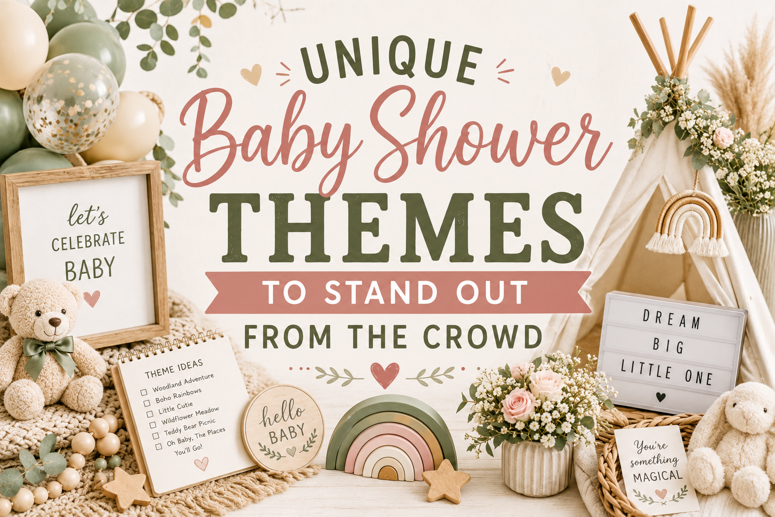
Unique Baby Shower Themes to Stand Out From the Crowd
Baby Shower · Theme Guide
Unique Baby Shower Themes to Stand Out From the Crowd
Three structural reasons unique themes outperform trend themes, eight distinctive theme directions from dragon to deep ocean, the execution rules that make unusual ideas land beautifully, and the stationery that makes the theme argument before a single decoration is in place.
⚠ This post contains affiliate links. If you click and purchase through these links, I may earn a small commission at no extra cost to you. I only recommend products I genuinely believe will add value for my readers. Thank you for supporting Baby Wonderland Studio.
A unique theme is not the same thing as an unusual theme. Unusual means outside the mainstream; unique means unrepeatable — specific to this person in a way that cannot be copied because it comes from who they are. The celebrations in this guide cover both: theme directions that are unusual enough to surprise guests, and the specific execution decisions that transform a surprising theme into a beautiful and specifically personal celebration rather than a decorative experiment.
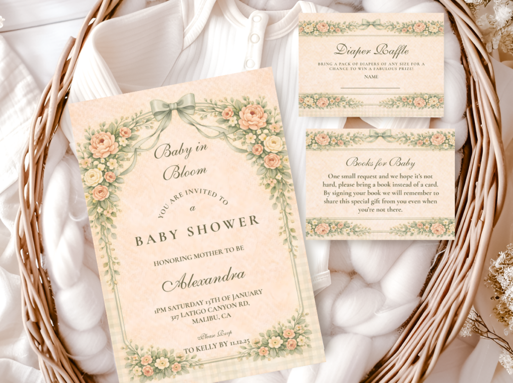
Explore our most distinctive stationery collections.
Dragon, fairy, space, silly goose, and deep ocean — nothing you’ve seen at every shower.
“The most memorable celebrations are the ones where guests couldn’t have predicted what they were walking into — and then immediately understood why it was perfect for exactly this person.”
Section 01 Why Unique Themes Work Better Than Trend Themes
The question to ask before choosing any baby shower theme: “Does this theme tell a story about this specific person, or about what was trending when I planned this shower?” The answer determines whether guests will remember the celebration specifically or generally. A trend theme executed perfectly produces a beautiful room; a personal theme executed well produces a beautiful room that also makes guests feel let into something true about the person being celebrated. The three structural reasons below explain why the second outcome produces better results across every metric that matters.
Reason 1
Longevity in Photographs
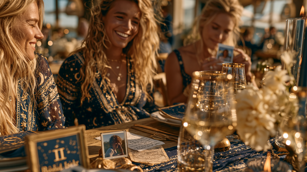
Trend themes date in photographs in the specific way that fashion dates: the combination of motif, palette, and styling choices that reads as ‘contemporary and beautiful’ in the year the shower happened reads as ‘that looks like 2023’ three years later. The trend has moved and the photographs have not. A theme chosen for genuine connection to the guest of honour — because she has always loved the night sky, because the dragon theme is a direct reference to a book she has read four times, because a silly goose genuinely describes her approach to life — does not date in the same way. Photographs of a personally connected theme read as specifically true in five years because the truth was about the person, not about the moment.
What this means: When choosing between two themes you like equally, choose the one with a genuine personal connection to the guest of honour rather than the one that is more broadly popular right now. The personal connection is what separates a beautiful shower from a memorable one.
Reason 2
Guest Engagement and the Personal Recognition Effect
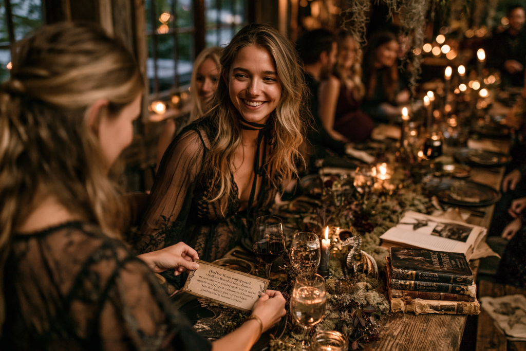
When a theme is clearly connected to the person being celebrated — when guests can see the specific relationship between the dragon motif and the guest of honour’s love of fantasy literature, or between the space theme and her specific obsession with astronomy — they experience what might be called the personal recognition effect: the feeling of being let into something specific and true about someone they care about. This feeling generates the specific kind of emotional engagement that makes guests remember not just that there was a party but what kind of celebration it was and what it said about the person at its centre. A generic trend theme creates a beautiful room but not this feeling — it creates appreciation of the decoration, not recognition of the person.
What this means: Brief guests on the personal connection if it is not immediately obvious. A small card at each place setting that says ‘We chose a dragon theme because [Name] has been reading fantasy novels since she was seven and can quote the entire first chapter of her favourite from memory’ transforms the decoration into a portrait.
Reason 3
Pinterest Performance and the Specificity Advantage
The Pinterest algorithm rewards content that offers something not already abundantly available in the category — which means the most common baby shower themes (safari, garden floral, boho) are competing in the most crowded category space while unusual theme directions are competing in effectively empty space. A dragon baby shower, a fairy enchanted forest baby shower, or a deep ocean bioluminescent baby shower appears in far fewer search results and therefore draws a disproportionately large share of saves when it does appear. The practical implication: if the shower will be photographed and the photographs shared, an unusual theme well executed will reach more people and generate more saves than a common theme excellently executed.
What this means: Plan the unique theme shower with photography in mind. The most Pinterest-savable images have one clearly distinctive element visible from the thumbnail — a deep teal and gold dragon stationery set, a fairy-light enchanted ceiling, a bioluminescent sea creature cake. Identify this element early and give it the highest visual placement and the clearest photography angle.
✨ Styling Tip
The most unique shower theme is not the most obscure one — it’s the one most specifically connected to the guest of honour. A space theme for a mother who has always loved astronomy is more unique than a macro-trend theme executed perfectly, because it is unrepeatable: no other shower will have this exact combination of theme and person. Uniqueness comes from specificity, not from obscurity. The test: could this exact shower — this theme, this palette, this particular collection of personal references — be planned for anyone else? If yes, it is not unique. If no, it is.
Section 02 Whimsical & Fantasy Themes
Three theme directions that work because they are genuinely surprising in a baby shower context, and because the contrast between the drama of the aesthetic and the warmth of the occasion produces something guests find unexpectedly beautiful.
Most Unexpected
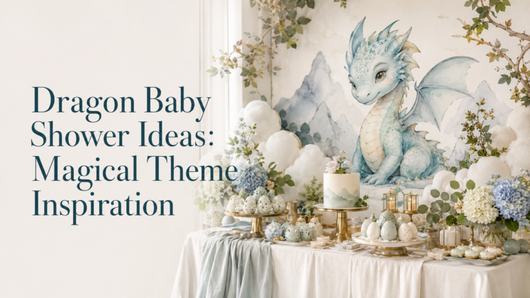
Dragon & Fantasy Theme
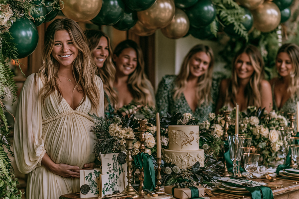
Deep Emerald · Rich Jewel Gold · Warm Cream · Forest Shadow Green
Mood: Dramatically beautiful — the specific contrast between the softness of a new life celebration and the mythological grandeur of the dragon aesthetic creates the most visually unexpected shower direction in this guide.
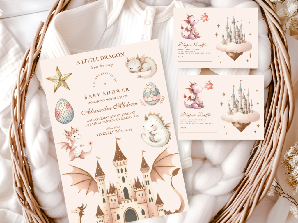
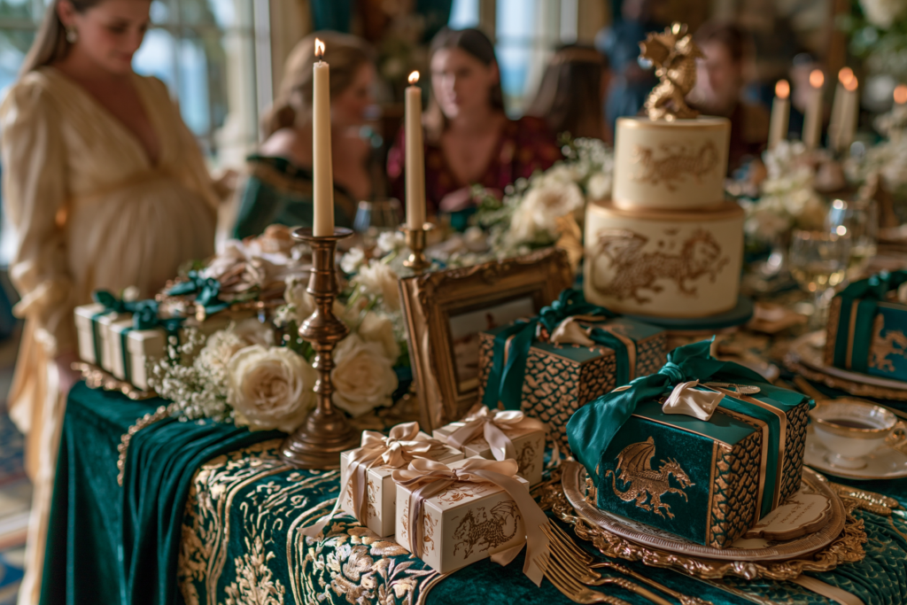
Execution essentials: Deep emerald green as the primary palette colour (not bright green, not lime — the specific warm dark green of a forest canopy at dusk); rich antique gold as the metallic accent (not bright metallic, not silver — the specific aged warmth of antique gold that belongs to a library or a medieval illuminated manuscript); warm cream as the base (the invitation, the table linen, the cake base); and one or two warm black or deep charcoal elements as the framing detail (the invitation envelope, the candle holder, the wax seal). The balloon cluster should be in deep emerald and antique gold only — no additional colours. The stationery should feature organic dragon or botanical illustration in the same deep colour palette, not cartoon dragon, not generic dragon silhouette, but the quality of a natural history illustration applied to a mythological subject.
The version to avoid: Bright green and red dragon elements — which read as a children’s party villain theme. The entire visual argument of the dragon baby shower rests on the palette being jewel-toned and sophisticated rather than primary-coloured and playful.
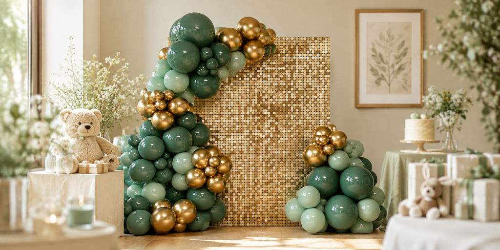
🐉 Emerald green and gold backdrop decorations: The palette foundation for the dragon theme backdrop — deep emerald and antique gold together create the dramatic, magical atmosphere that makes this theme read as genuinely beautiful rather than costume party. The contrast between rich green and warm gold is what gives the dragon theme its editorial quality.
✨ Styling Tip
A dragon theme works because of contrast — the softness of a baby celebration against the drama of a fantasy aesthetic creates a visual tension guests find genuinely surprising and beautiful. The secret is committing fully to the palette: deep emerald, rich antique gold, warm cream. The palette makes it sophisticated. The motif makes it memorable. Half-commitment — deep emerald in some places and bright green in others; antique gold in the stationery but bright metallic gold in the balloons — breaks the visual argument entirely. The sophistication of the palette is what makes the motif work at a baby shower; the motif alone, in an undisciplined palette, reads as a costume.
Most Romantic
Fairy & Enchanted Forest Theme
Soft Lilac · Dusty Blush · Botanical Gold · Warm Ivory
Mood: Ethereally beautiful — the quality of an enchanted place that exists slightly outside of the ordinary world, where botanical detail is extraordinary and light itself seems warm and golden.
Execution essentials: The specific palette decisions that move a fairy theme from ‘children’s party’ to ‘ethereally beautiful’: dusty lilac rather than bright purple (the specific grey-lilac of twilight rather than the saturated purple of a children’s birthday); dusty blush rather than bright pink (warm and slightly aged, not fresh and bright); botanical gold rather than bright metallic gold (the specific warm yellow-gold of candlelight through leaves rather than the sharp metallic of a party supply); and warm ivory as the base stock for all stationery (the warmth of the base communicates warmth of the world; cool white communicates a different world entirely). Fairy lights — warm white, not bright white — as the backdrop lighting element: they should be visible during the shower rather than reserved for evening photography. The botanical detail in the stationery should be intricate rather than simple — the fine botanical line quality of a natural history illustration rather than the bold simplified line of a children’s book illustration.
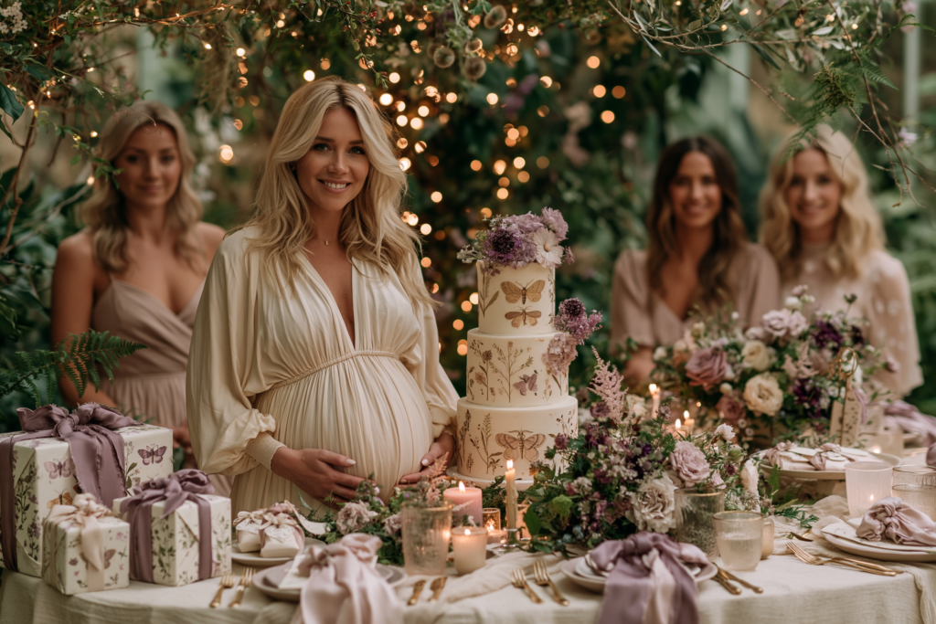
The version to avoid: Bright neon or saturated purple and green; cartoon fairy wings as the primary decoration element; plastic toadstool props that read as a children’s Halloween costume rather than as an enchanted world.
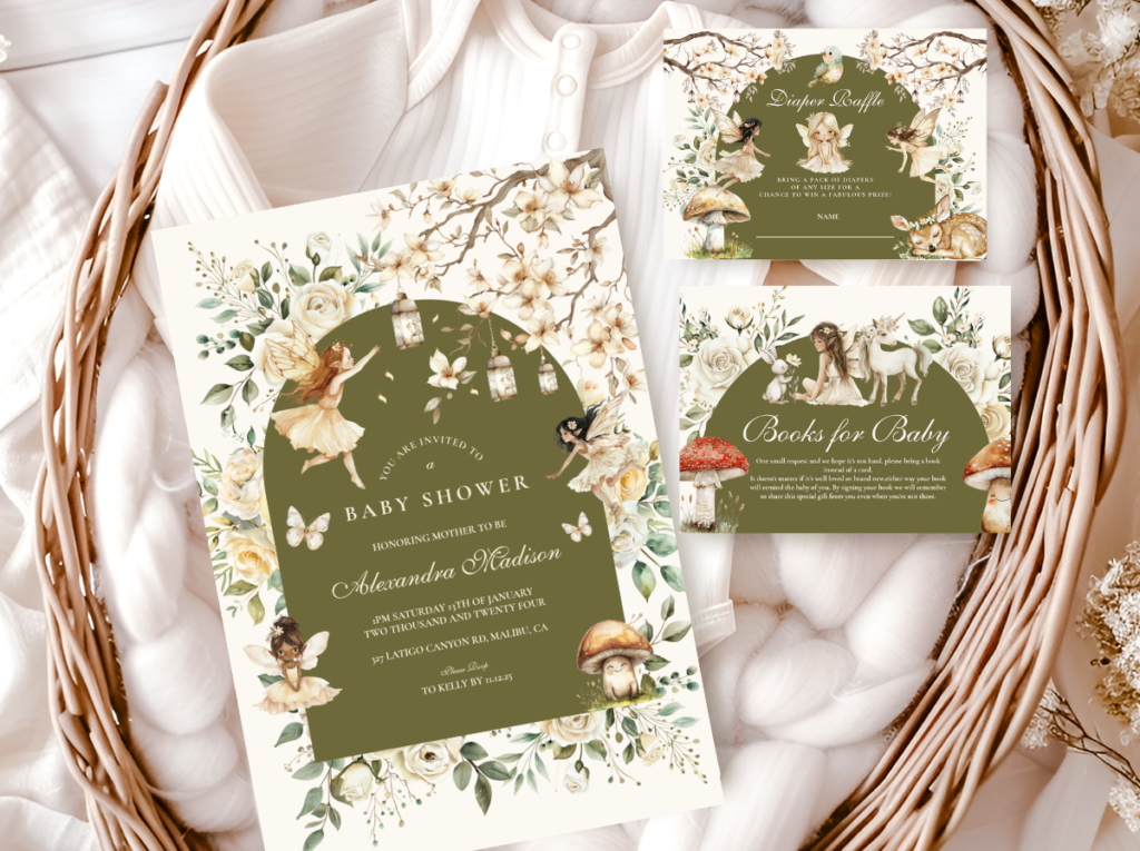
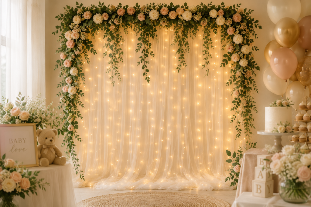
🧚 Fairy lights curtain backdrop: The single most impactful fairy theme backdrop element — a warm white light curtain behind the dessert table or photo backdrop creates the ethereal, enchanted atmosphere that makes the fairy theme feel genuinely magical rather than decorated. Hang botanical garland across the top for the complete enchanted forest effect.
Most Modern
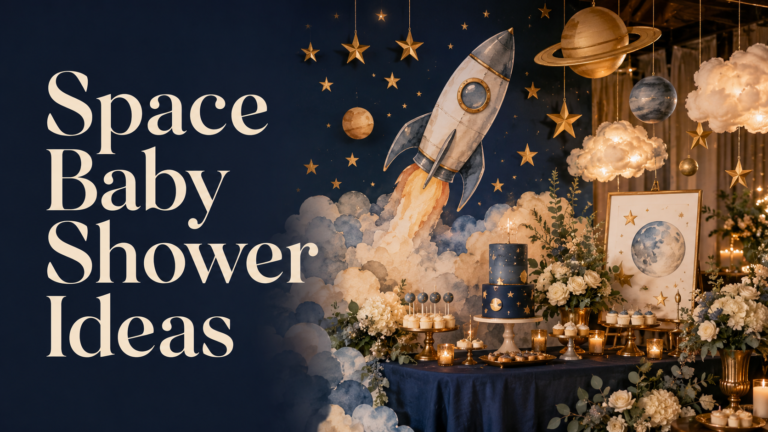
Celestial & Space Theme
Midnight Navy · Antique Gold Star · Warm Cream · Dusty Mauve
Mood: Quietly dramatic — the specific visual quality of the night sky at its most beautiful; vast and intimate simultaneously.
Execution essentials: The specific palette decisions that keep the space theme from reading as cold or clinical: midnight navy (the specific warm dark blue of a clear night sky rather than the cool corporate navy of a business presentation); antique gold as the star element (the specific aged warmth of starlight rather than the sharp yellow of a children’s star graphic); warm cream as the base (the warmth of a page in candlelight rather than the cool white of a screen); and dusty mauve as the optional accent (the specific warm purple-grey of a twilight horizon, which adds warmth without adding pink). The balloon cluster: midnight navy as the primary balloon, antique gold as the accent, warm cream as the base. No bright blue, no silver, no neon — these three colours belong to a children’s space party. Midnight, antique gold, and warm cream belong to the specific world of astronomy and wonder.
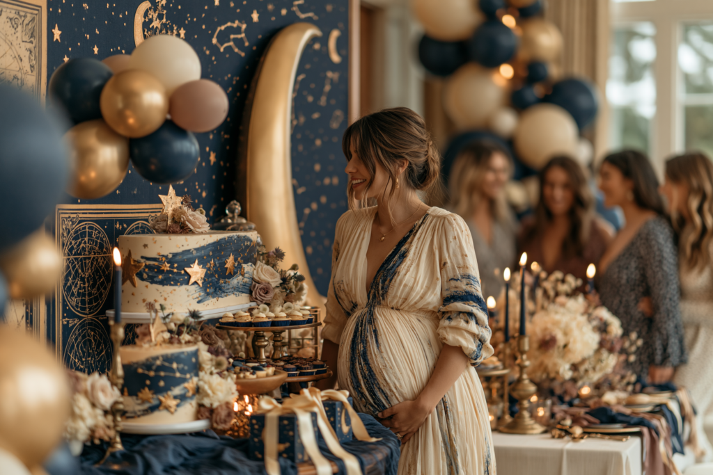
The version to avoid: Bright primary blue and yellow with silver metallic — which reads as a children’s space birthday party. The specific warmth of the navy and the specific aged quality of the antique gold are what make the space theme work at a sophisticated adult celebration.
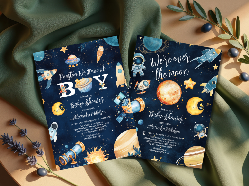
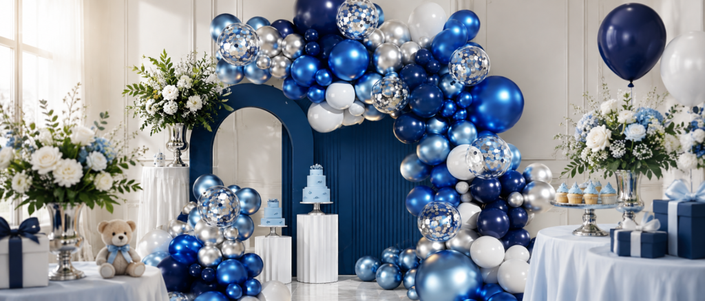
🌟 Navy and gold star balloon garland kit: The palette foundation for a celestial space theme arch — deep navy, warm gold, and cream in varied sizes with star-shaped foil balloons create the night sky atmosphere that makes this theme feel genuinely astronomical rather than generic space party. The warmth of gold against navy is what keeps the space theme from feeling cold.
Section 03 Character & Personality Themes
The Joyful Design Theme — Silly Goose
Most Joyful
Silly Goose
Warm Yellow · Dusty Sage · Oatmeal · Warm Cream
Mood: Specifically joyful — the aesthetic of a celebration that commits to the absurdity of a goose in a party hat and trusts that the specific warm palette will make the whole thing beautiful.
Execution essentials: Warm yellow (the specific honey-yellow of sunlight through autumn leaves — not primary yellow, not neon yellow, not the generic yellow of a party supply catalogue); dusty sage (the specific grey-green of a living botanical, not bright green); oatmeal and warm cream as the base. The goose motif should be illustrated in a warm line-art or watercolour quality — organic, slightly imperfect, specifically charming — rather than as a flat graphic icon. The food labels and place cards should carry a small goose illustration in the same warm palette; the invitation should lead with the goose motif prominently enough that guests understand immediately that the theme is deliberate and intentional rather than accidental. Balloons: warm yellow, dusty sage, and oatmeal — organic arrangement, no symmetry. Cake: warm yellow and sage buttercream in the palette-knife textured style, with a small illustrated goose topper.
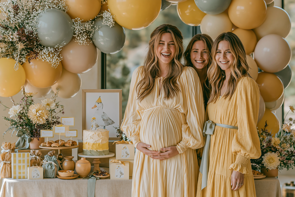
The version to avoid: Primary yellow and bright green — which reads as a children’s birthday party that got confused about whose birthday it was. The entire visual argument of the silly goose shower rests on the palette being warm, considered, and specifically beautiful; the humour makes it distinctive, the palette makes it a celebration.

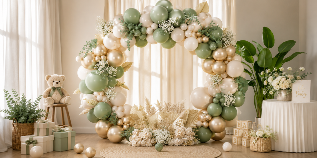
🪿 Sage green and cream balloon arch kit: The palette foundation that makes the silly goose theme read as charming and designed rather than novelty — sage, warm cream, and soft yellow in an organic arch creates a backdrop that is warm and considered regardless of the playful motif. The palette is what elevates a humorous theme into a genuinely beautiful celebration.
✨ Styling Tip
A humorous theme requires more design discipline than a serious one — because the humour is doing half the work and the design must do the other half. A silly goose theme in carefully considered warm yellow, dusty sage, and oatmeal cream reads as charming and witty — a celebration that chose its motif deliberately and trusts its palette completely. The same theme in primary yellow and bright green reads as a children’s party that accidentally ended up at a baby shower. The design does not need to be solemn to be sophisticated. But it does need to be deliberate.
Passion & Occupation Themes
Astronomy
Deep navy, gold constellation, warm cream — for a guest of honour who tracks meteor showers and knows the names of the Pleiades. The space theme in Section 02.3 provides the foundation; personalised constellation map of the sky on the baby’s due date is the specific personal element.
Botany & Plant Science
Deep green, warm gold, botanical illustration — for a guest of honour who names her houseplants and knows their Latin classifications. The specific botanical illustration quality (precise, hand-drawn, scientific rather than decorative) is the visual register that distinguishes this from a generic garden party.
Literature & Stories
Warm cream, antique gold, deep brown, illustrated book motifs — for a guest of honour who can quote extensively from her favourite books and whose home is defined by its shelves. Game: guests write their favourite children’s book passage on a card, and the guest of honour identifies who wrote which.
Travel & Maps
Warm parchment, faded atlas tones, antique compass, warm brown and sepia — for a guest of honour for whom adventure is a primary life value. The specific vintage cartography quality (aged paper, hand-lettered place names, a compass rose) is the visual register that distinguishes this from a generic travel theme.
Music & Performance
Deep warm black, warm gold, illustrated music notation — for a guest of honour whose relationship with music is fundamental rather than casual. The music notation as a decorative element should be of a specific piece that is personally significant — the sheet music of a song she has played, sung, or danced to — not generic musical note clip art.
Travel & Adventure Theme in Detail
Travel & Adventure
Warm Parchment · Antique Sepia · Dusty Teal · Warm Brown
The travel theme executed at the level of a vintage cartography aesthetic rather than at the level of an airport shop: warm parchment as the base palette (the specific aged warmth of an old map, not bright white); antique sepia and warm brown as the primary detail colours; dusty teal as the ocean accent (the specific colour of the sea on a vintage atlas, not bright blue); and illustrated compass and map detail as the primary motif. The food table: food labelled as ‘provisions for the journey’ in a vintage cartography font on warm parchment-style cards. The favour: a small personalised map print showing the route between the city where the couple met and the city where the baby will be born. The invitation: hand-illustrated or high-quality vintage cartography style map of a meaningful route or destination.
Section 04 Nature & Unexpected Themes
Most Visually Distinctive
Deep Ocean & Sea Creatures
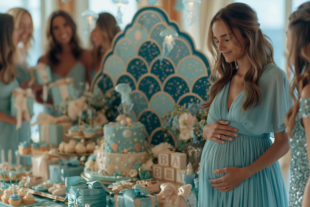
Deep Teal · Bioluminescent Sage · Sandy Ivory · Warm Ocean Gold
Mood: The most colour-rich and most dramatically distinctive nature direction — the specific visual quality of the deep ocean at the point where it becomes luminous.
Execution essentials: The deep ocean direction uses the specific visual register of bioluminescence — the quality of light in the deep sea where creatures produce their own warm glow — as its palette reference: deep teal as the primary tone (the specific dark blue-green of the deep ocean); bioluminescent sage or warm aqua as the glow accent (a muted, warm luminous green that references the specific quality of bioluminescent creatures rather than bright neon); sandy ivory as the warm neutral base; and warm ocean gold as the metallic accent. The sea creature motifs at their most visually effective: octopus, whale, sea turtle, and seahorse in organic illustration quality (natural proportions, soft edges, warm tonal variation) rather than in cartoon format. The cake direction most appropriate: a watercolour deep ocean scene painted on a smooth matte buttercream base in the bioluminescent palette, with one or two hand-sculpted sea creature details.
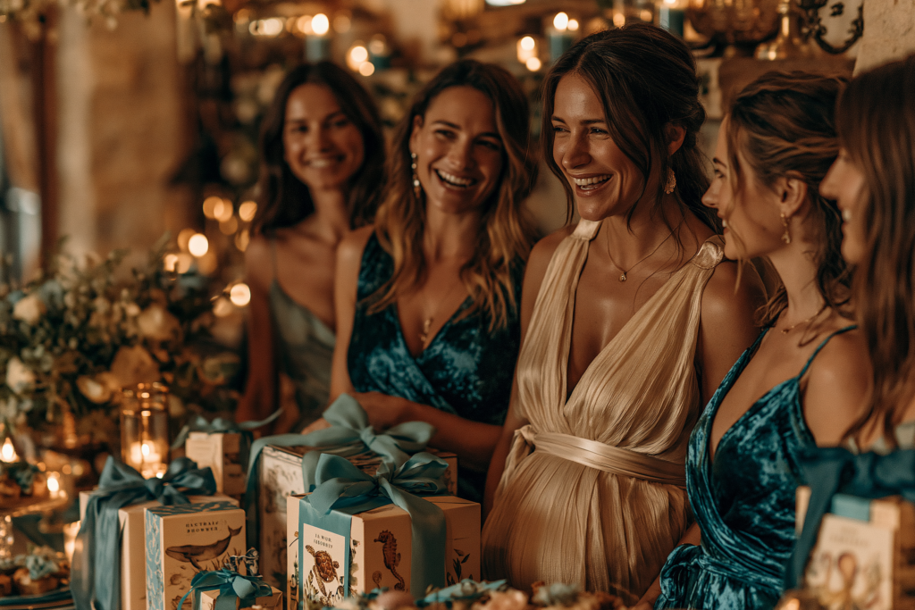
The version to avoid: Bright primary blue with generic fish graphics — which reads as a beach birthday party. The deep ocean direction lives entirely in the specific quality of its tones: dark rather than bright, teal rather than blue, bioluminescent rather than neon.
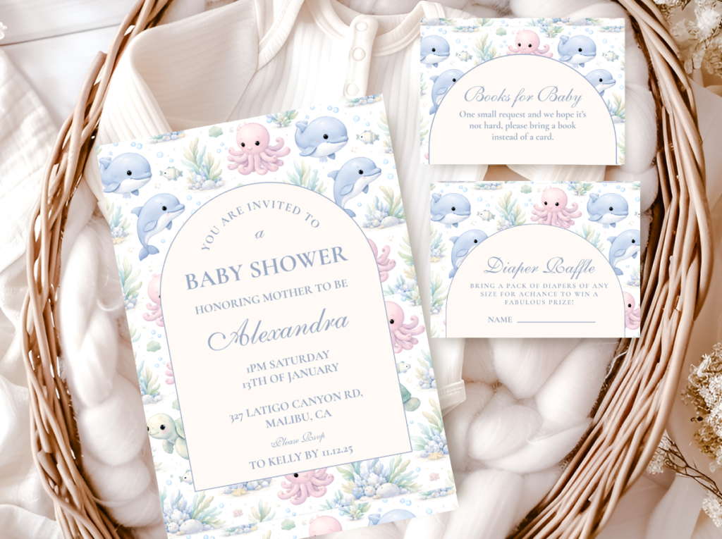
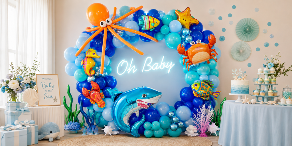
🌊 Teal and blue-green ocean balloon garland: The palette that makes a sea animals theme read as coastal and sophisticated rather than generic blue — dusty teal, soft blue-green, and sandy cream in an organic arch creates the specific quality of natural ocean light rather than a swimming pool. Pair with sand-toned botanical elements at the base for the complete coastal effect.
Enchanted Garden Theme
Wildflower Blush · Botanical Sage · Warm Ivory · Honey Gold
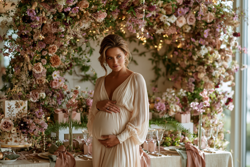
The enchanted garden direction is distinct from the standard garden floral theme by one specific execution decision: the garden must read as slightly magical rather than as well-maintained. Wildflowers rather than arranged florals; botanical plants in slightly unexpected places (a trailing fern across the dessert table, a single large botanical stem in a narrow vase at each place setting); warm fairy lights in low light as the ambient element rather than overhead lighting; and a floral installation that is deliberately abundant to the point of extravagance. The enchanted quality comes from the sense of a garden that has grown beyond its borders rather than been arranged within them. The palette: warm wildflower blush, botanical sage, warm ivory, and the specific warm honey-gold of late afternoon light rather than bright yellow.
Night Garden & Celestial Botanical Theme
Midnight Botanical Green · Moonflower White · Deep Navy · Warm Gold
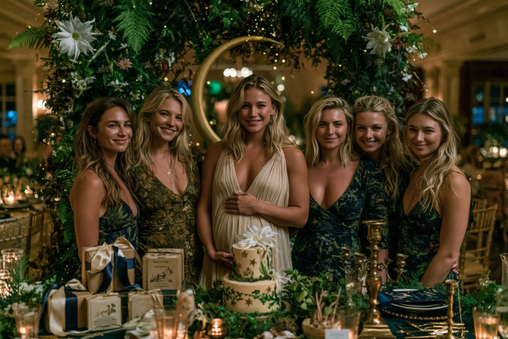
The night garden is the most unusual and the most editorial of the three nature directions — it combines the botanical world with the celestial world at the specific point where they intersect: the garden at midnight, where moonflowers open and the sky is visible above the plants. The palette: midnight botanical green (the specific dark warm green of a garden in darkness, different from daytime garden green in its warmth and depth); moonflower white (the specific warm near-white of a moonflower petal, not cool white); deep navy for the sky element; and warm gold for the star and botanical detail. The botanical illustration should include flowers that specifically open at night (moonflower, evening primrose, night-blooming jasmine) as the central motif — a specific botanical reference that rewards guests who notice it with the particular pleasure of ‘oh, these are night flowers.’
Section 05 How to Execute a Unique Theme With Confidence
Rule 5.1
Commit to the Palette Fully — Half-Measures Create Confusion
An unusual theme is making a visual argument — it is saying ‘this specific combination of motif and palette belongs to a beautiful world.’ The argument holds as long as every element in the room belongs to the same palette. The first element that belongs to a different palette — a bright blue balloon cluster at a midnight navy celestial shower; a primary yellow element at a warm honey silly goose shower; a bright green plant at a deep emerald dragon shower — breaks the argument for every guest who sees it. Palette consistency is twice as important for unusual themes as for conventional themes, because an unusual theme that is internally inconsistent reads as confused rather than as ambitious.
Rule 5.2
Lead With the Stationery — The Invitation Makes the First Argument
The invitation is the first place an unusual theme must make its case — weeks before the shower, in the guest’s hands at home, without any decoration context to support it. If the invitation communicates the unusual theme clearly and beautifully — if a guest opens a deep emerald envelope to find a dragon illustration in antique gold on warm cream card stock — they arrive at the shower already oriented to the world the theme inhabits. They are not surprised by the decoration; they are confirmed in an expectation the invitation created. If the invitation is conventional and the theme is unusual, guests arrive in the wrong aesthetic frame of reference and must adjust upon arrival — which takes attention away from the first impression of the decoration.
✨ Acrylic invitation display stand: Display your invitation as a decoration at the entrance or on the welcome table — an acrylic frame stand presents the invitation at eye level where guests can read it and immediately understand the theme world they are entering. For a unique theme, this is the single most effective way to ensure every guest understands the aesthetic intention before they reach the main room.
Rule 5.3
Give Guests a Way In — One Familiar Element Anchors the Unusual
Every unusual theme benefits from one element that is familiar and welcoming — a conventional gesture that gives guests a comfortable entry point before engaging with the more unexpected elements of the theme. For the dragon theme: a beautiful standard food spread on a conventionally set table (the table setting is familiar; the dragon stationery on the table is distinctive). For the deep ocean theme: a conventional brunch format (familiar; the sea creature cake and the teal decoration are distinctive). For the silly goose theme: a genuine warm welcome and genuinely delicious food (the hospitality is familiar; the goose on every surface is distinctive). The familiar element is not a concession — it is the thing that makes guests feel welcome in an unusual world rather than uncertain about whether they belong in it.
✨ Styling Tip
The test for whether an unusual theme will land: show the invitation to someone uninvolved in the planning. If their first response is ‘that’s so her’ or ‘I’ve never seen that but I love it’ — the theme works. If their first response is ‘that’s interesting’ followed by a pause — reconsider either the theme or the execution. The pause is the moment of uncertainty: the viewer can see something distinctive but cannot yet see why it is beautiful or appropriate. That uncertainty is resolved either by a more specific connection to the guest of honour (‘she has always loved dragons’) or by a more specific palette execution (the invitation looks as beautiful as it is unusual). Fix the invitation first. If the invitation is undeniably beautiful, the theme will land.
Section 06 Invitations & Stationery
The five collections below are the most distinctive in the stationery range — each one is immediately identifiable as belonging to a specific and unusual world, and none of them looks like the invitation that arrived at every other shower this year. Browse all five and look for the illustration quality and the palette temperature. The collection whose world most closely matches the guest of honour’s personal aesthetic is the correct stationery direction — and the correct stationery direction is the foundation of the entire unusual theme’s success.
Most Dramatic
Dragon Theme
Deep emerald and antique gold — mythologically rich and unlike anything else in the category.
Most Romantic
Fairy Theme
Soft lilac and botanical gold — ethereally beautiful, specific in its world.
Most Modern
Space Theme
Midnight navy and antique gold — quietly dramatic and specifically warm.
Most Joyful
Silly Goose
Warm yellow and sage — witty, warm, and charming in the best possible way.
Most Distinctive Nature
Sea Animals
Deep teal and ocean gold — colour-rich and unlike anything in the standard category.
Frequently Asked Questions
What makes a baby shower theme unique?
A baby shower theme is genuinely unique when it cannot be repeated for anyone else — when the choice of theme makes sense specifically because of who the guest of honour is. A dragon theme that was chosen because the guest of honour has a lifelong relationship with fantasy literature is unique; the same dragon theme chosen because it looked unusual on Pinterest is not unique, merely unusual. The three structural reasons in Section 01 explain why this distinction matters in practice: personal themes perform better in photographs over time, create a specific kind of guest engagement that generic themes cannot, and are increasingly advantaged on visual platforms precisely because of their specificity. The most reliable method for creating a unique theme: start with the guest of honour’s specific passions (Section 03.2) and work backward from there to the palette and the motif, rather than starting with an unusual motif and working forward to a personal connection.
How do you make a unique theme look professional, not homemade?
The two elements that most determine whether an unusual theme reads as professionally designed rather than as a creative experiment: the stationery quality and the palette consistency. A dragon theme with high-quality illustrated stationery in a disciplined deep emerald and antique gold palette reads as designed. The same theme with generic clipart stationery in a mixed palette reads as decorated. The investment hierarchy for an unusual theme is therefore: (1) stationery suite first — the invitation, the welcome sign, and the place cards in the same high-quality illustrated style; (2) palette discipline across all elements — every balloon, every linen, every flower arrangement in the same three-colour palette; and (3) one or two high-quality signature elements (the cake, the backdrop) that commit fully to the unusual aesthetic. Generic elements in the wrong palette break the design argument; beautiful elements that belong to the same world complete it.
How do you explain an unusual theme to guests who might not get it?
Two methods: the invitation and the context note. The invitation is the primary communication tool — a beautiful and immediately legible invitation in the unusual theme’s palette and illustration register prepares guests for the aesthetic world they are about to enter and communicates that the unusual choice is intentional. The context note — a small card at each place setting or a line in the invitation itself — explains the personal connection: ‘We chose a dragon theme because [Name] has been reading fantasy novels since childhood and has been telling everyone her baby will grow up to love dragons too.’ Guests who understand why the unusual theme was chosen engage with it warmly; guests who don’t understand why engage with it uncertainly. The explanation converts uncertainty to delight.
Can an unusual theme work if the host doesn’t know the guest of honour’s taste well?
Yes, with one important adjustment: choose an unusual theme that works through palette and aesthetic quality rather than through personal reference. A deep ocean bioluminescent theme — executed in deep teal, sandy ivory, and warm ocean gold with high-quality illustrated sea creature stationery — reads as specifically beautiful and specifically distinctive regardless of whether it references the guest of honour’s personal passions. The threshold for this kind of theme is aesthetic quality rather than personal specificity: if the invitation is beautiful and the palette is disciplined, the theme will read as a considered and generous celebration rather than as a personal reference that the host guessed at. The passion-based themes in Section 03.2 require specific personal knowledge; the fantasy and nature themes in Sections 02 and 04 require aesthetic quality and palette commitment.
Start With the Stationery
Distinctive Baby Shower Stationery — Five Collections Unlike the Rest
Invitations, welcome signs, and favour tags — fully customisable, each one designed to look like nothing else in the category.