Silly Goose Baby Shower Ideas
Baby Shower · Silly Goose Theme · Cottagecore & Vintage
Silly Goose Baby Shower Ideas
Eight cottagecore and vintage goose directions, why the palette makes or breaks a humorous theme, and the design discipline that keeps silly goose looking charming rather than novelty.
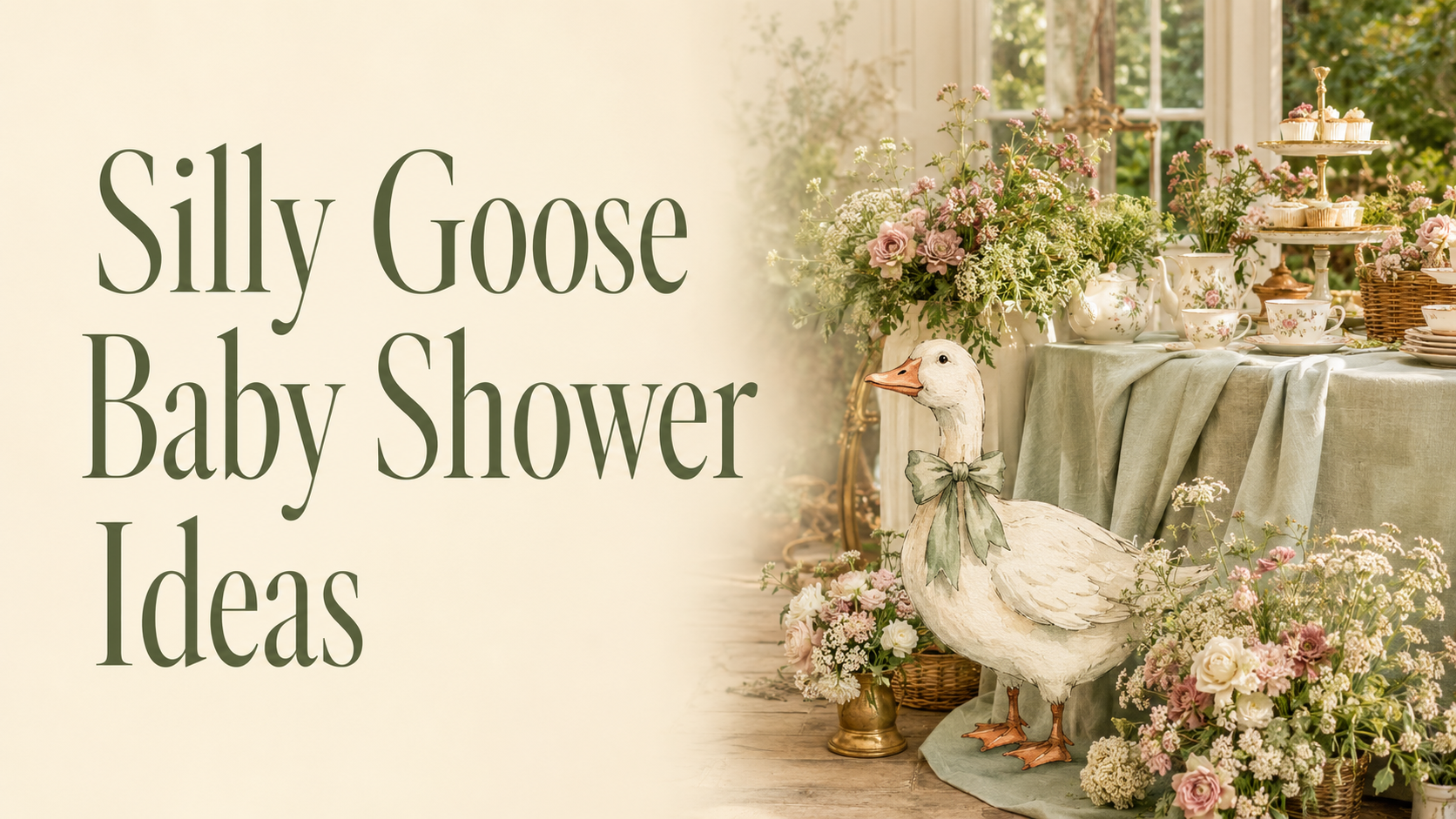
The silly goose baby shower is one of those rare themes that requires genuine design thinking to land correctly. Humor in a celebration context is easy to get wrong — too literal and it reads as a joke party; too restrained and the theme disappears entirely. The version that works puts the goose in the right context: sage green, warm cream, vintage illustration quality, a cottagecore garden world where a well-dressed goose with opinions reads as charming and specifically funny rather than as a novelty item. Eight directions for getting that balance right.
🦚 Browse All Silly Goose Collections
Full Range
Silly Goose
The complete silly goose baby shower stationery collection — all eight directions across every palette and style.
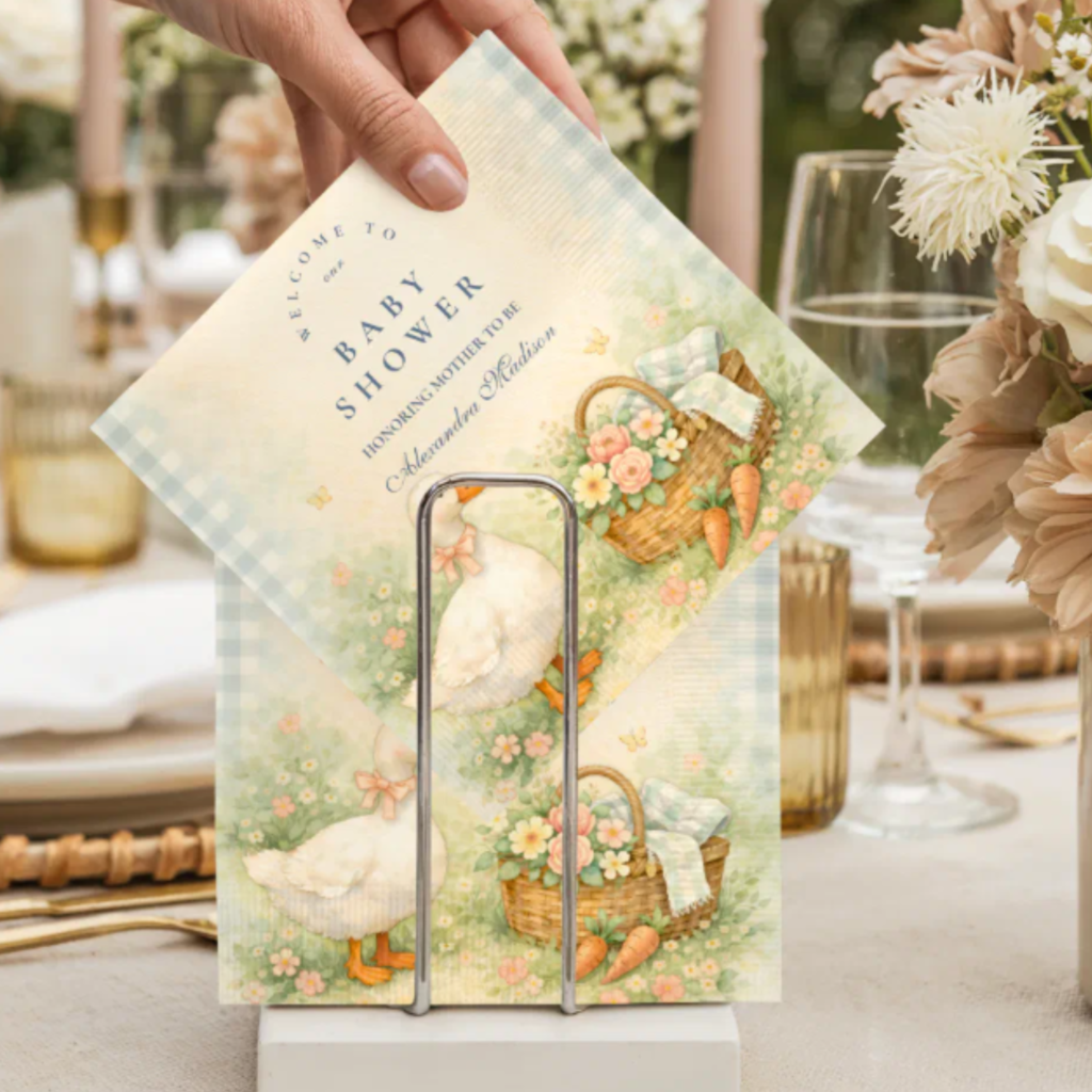
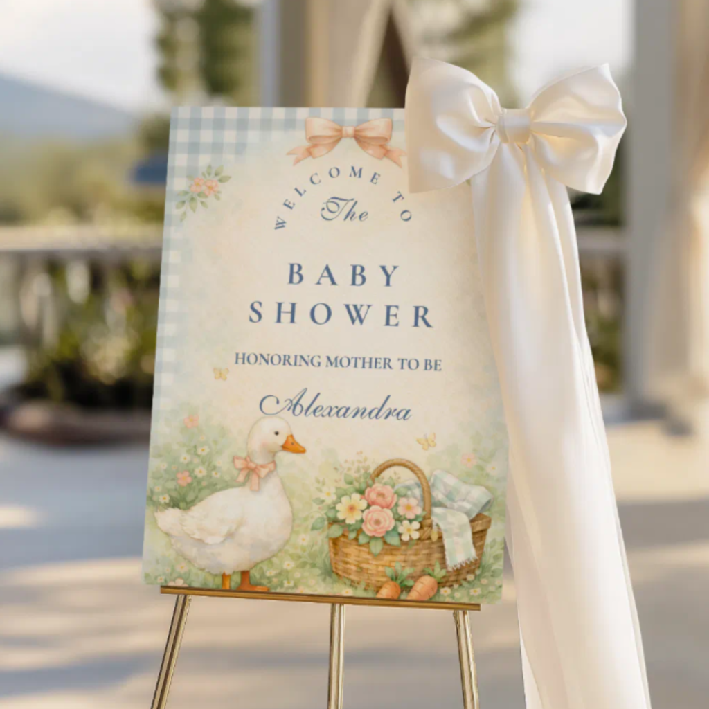
Vintage Garden
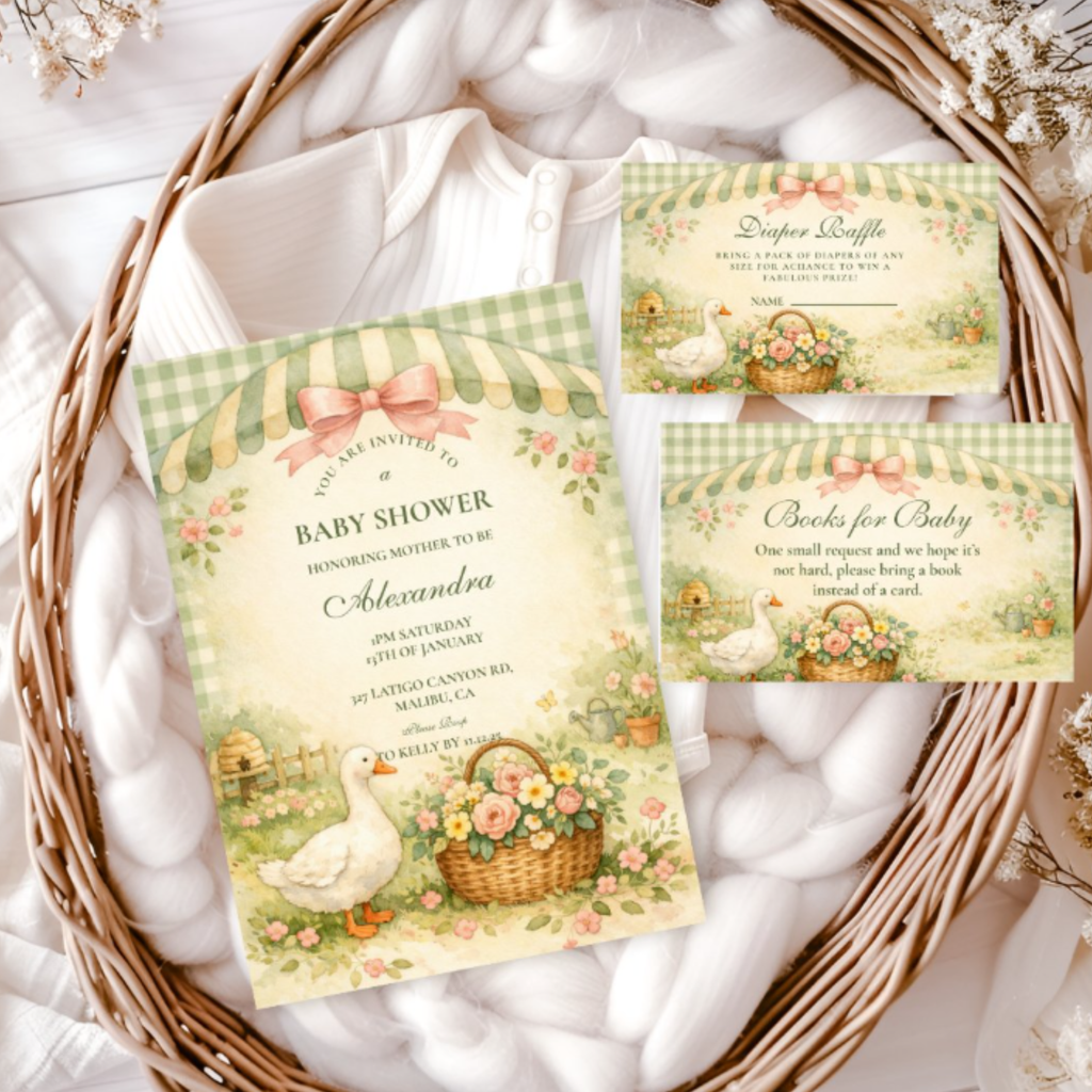
Vintage Silly Goose Garden
Vintage illustration style in a garden palette of sage, cream, and antique gold — the most editorial and most design-forward direction.
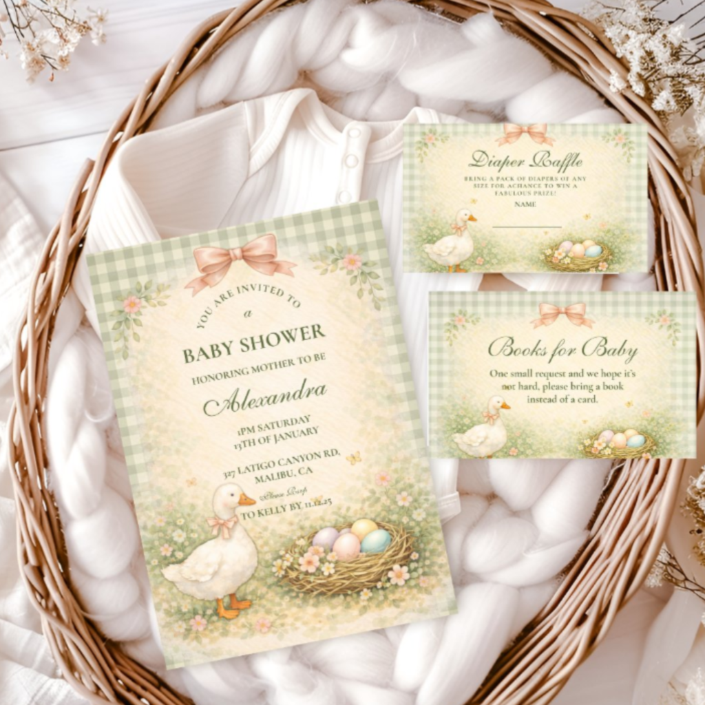
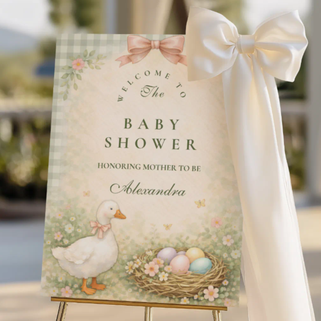
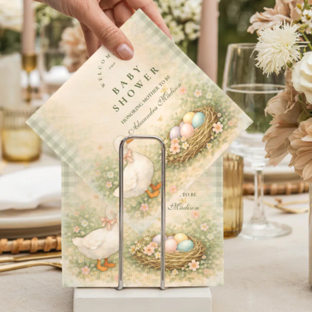
Vintage Storybook
Vintage Storybook Silly Goose
Warm antique illustration quality with the storybook register — the most literary and most timeless silly goose direction.
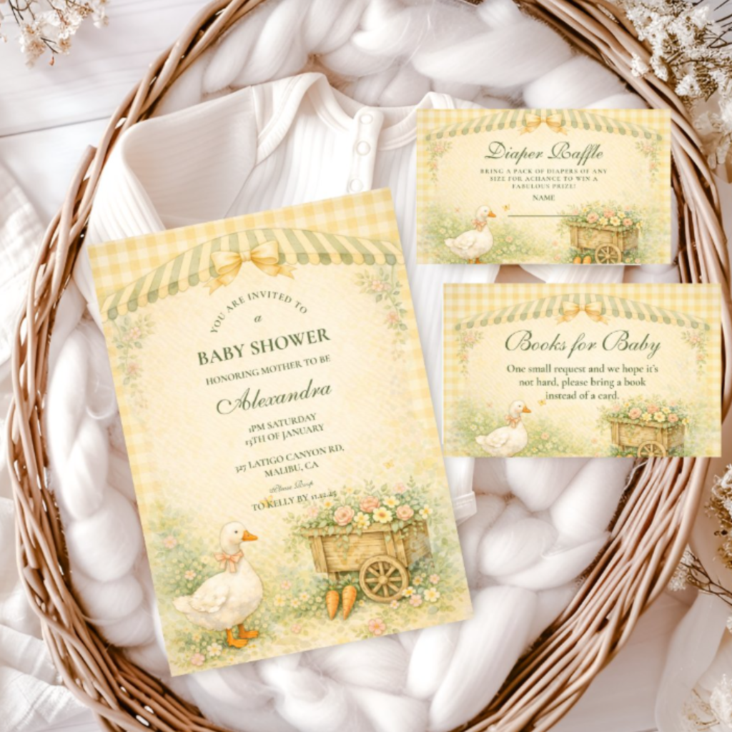
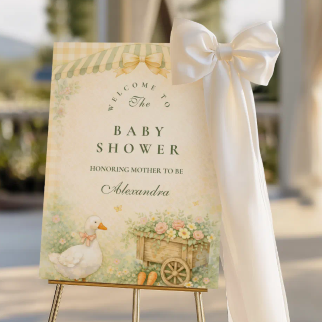
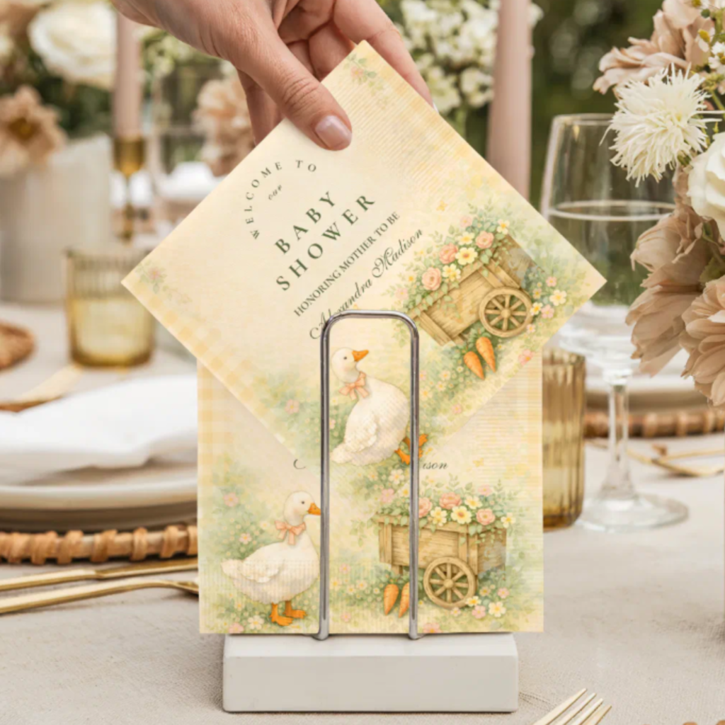
Cottagecore Garden
Cottagecore Silly Goose Garden
Garden florals, wildflowers, and cottagecore warmth — the most pastoral and most characteristically cottagecore direction.
Whimsical Spring
Whimsical Silly Goose Spring
Soft spring palette with a whimsical, freely illustrated goose — the most joyful and most season-specific direction.
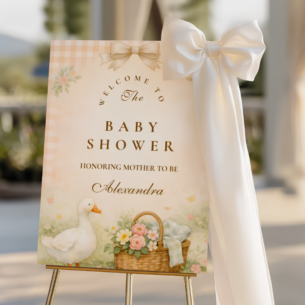
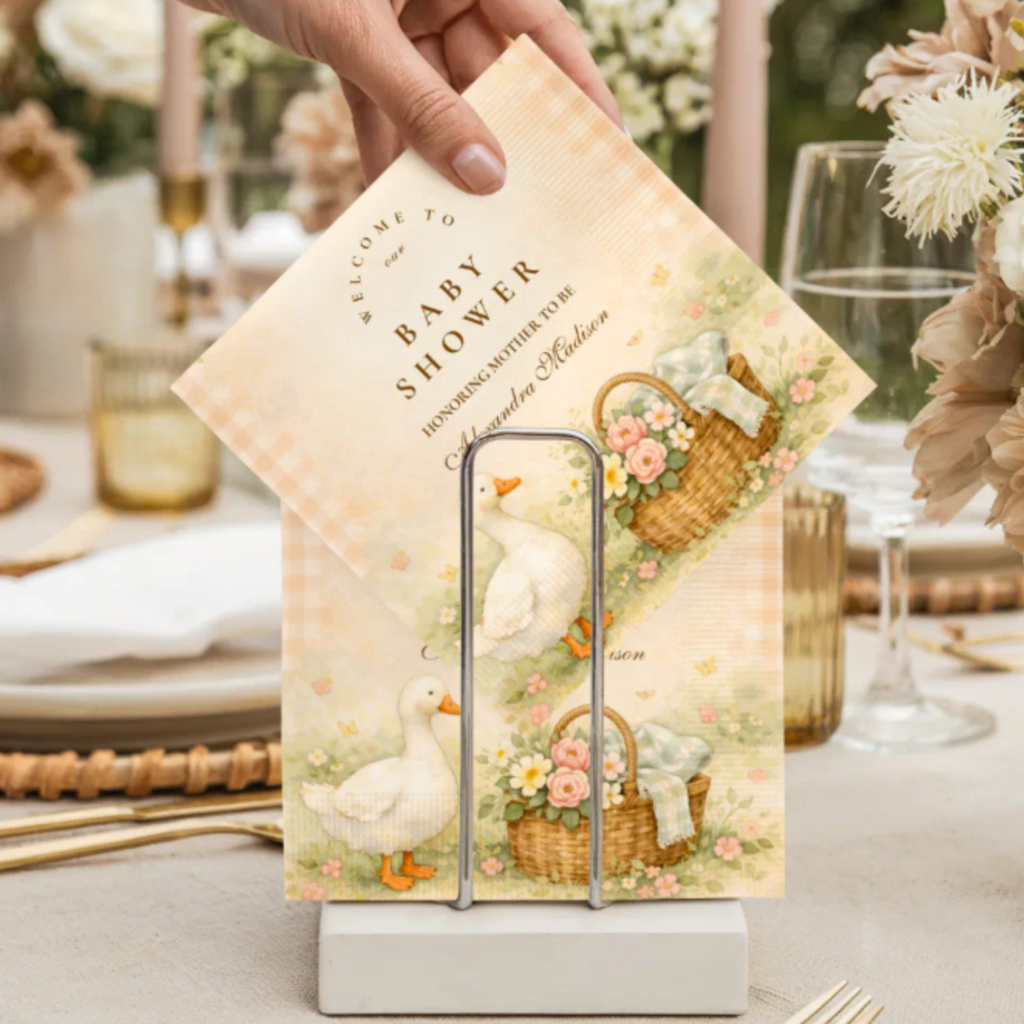
Cottagecore Goose
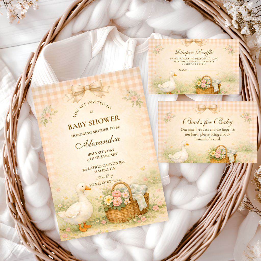
Cottagecore Goose Garden
A softer, more purely cottagecore goose direction — garden warmth and botanical detail without the humor at maximum volume.
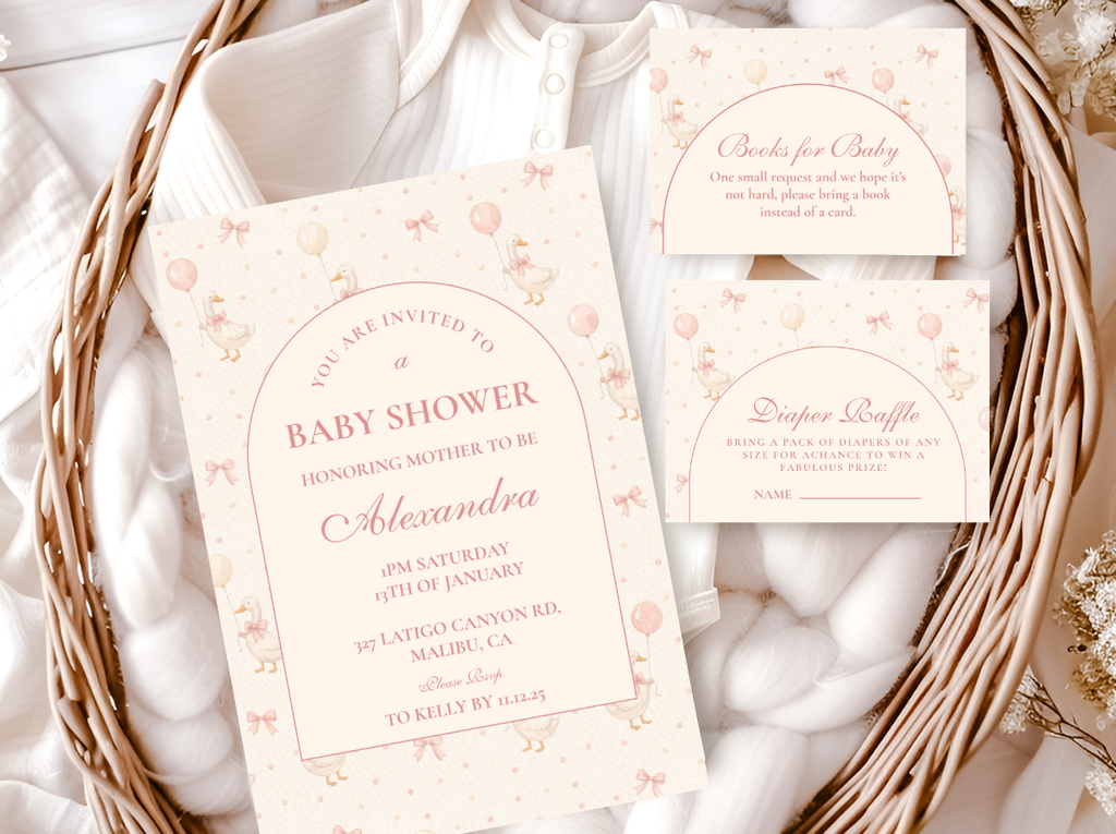
Blush Storybook
Blush Goose Storybook
Blush and rose in a storybook palette — the most feminine and most clearly girl-shower-adjacent silly goose direction.
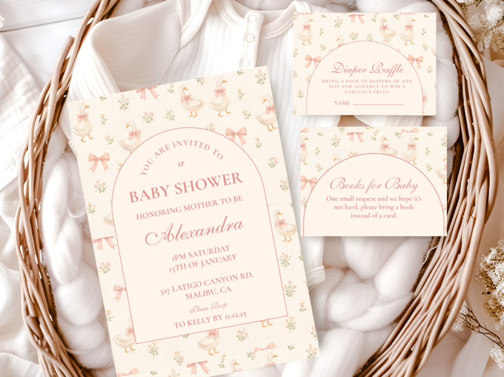
Pastel Farm
Pastel Silly Goose Farm
Pastel tones and farm setting — the softest and most muted direction, the one that reads as most gently humorous.
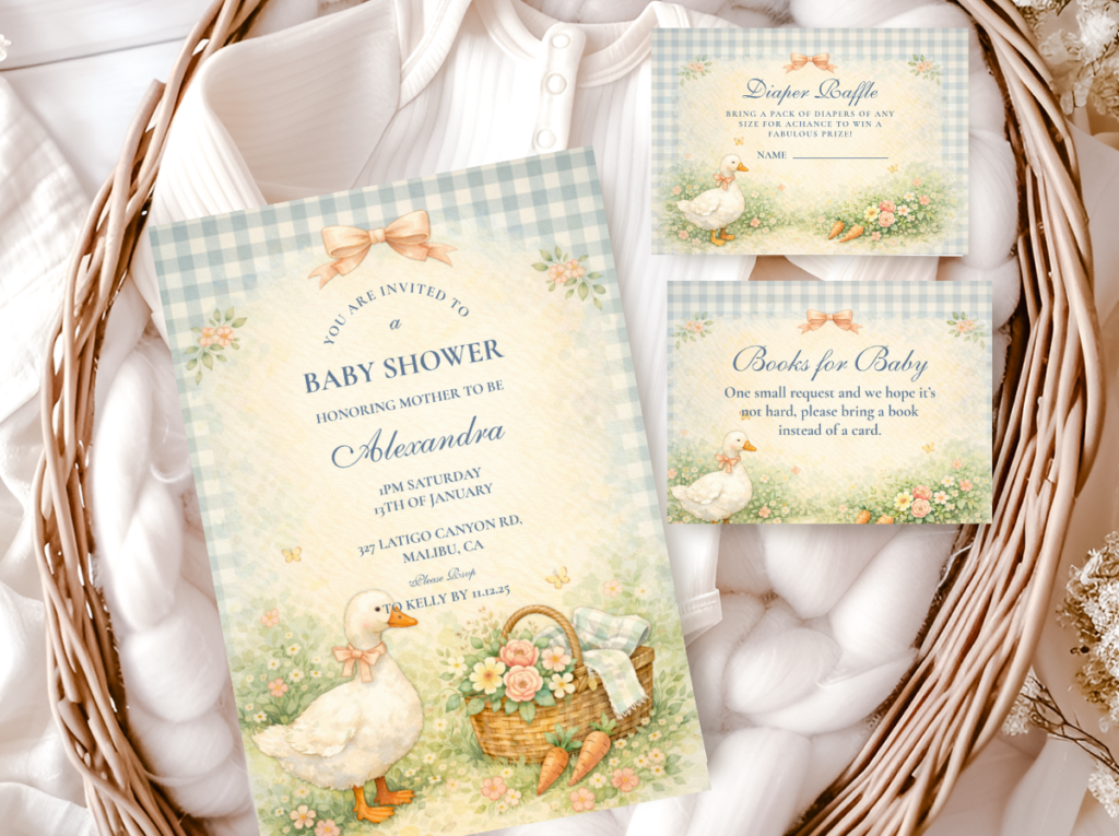
🦚 Shop This Theme
Browse the full Silly Goose collection — cottagecore and vintage goose baby shower stationery across all eight directions.
Section 01 Why Silly Goose Works — and the Design Discipline It Requires
The silly goose theme works because it occupies a very specific cultural space: the goose as a creature of confident, slightly absurdist self-possession, welcomed into the cottagecore aesthetic’s warm, garden-grounded world. When these two elements are in balance — humor and setting — the result reads as genuinely charming and designed. When either element is off, the whole thing collapses.
Palette is the design discipline. A silly goose in sage green and warm cream reads as a witty, deliberate aesthetic choice. The same goose motif in primary yellow, cartoon white, and bold black reads as a novelty item from a party supply catalogue. The palette is not a secondary decision — it is the decision that determines whether the theme reads as designed or as gimmick. Every direction in this guide uses the cottagecore palette vocabulary: sage, dusty rose, warm cream, antique gold, muted green, soft blush. None of them use primary colour combinations that belong to a different, more generic visual world.
Cottagecore is the natural setting. The silly goose theme has gained its cultural momentum because the goose — confident, slightly chaotic, opinionated about nothing in particular — is the perfect resident of the cottagecore aesthetic’s warm, pastoral world. Garden florals, vintage illustration quality, wildflower arrangements, and soft linen textures are the natural context that makes the goose read as charming rather than random. A goose in an office party setting reads as a joke. A goose in a watercolor garden reads as a character.
Vintage illustration over cartoon. The illustration style that elevates the silly goose theme is vintage or watercolor-quality — the kind of goose illustration that could appear in a mid-twentieth century picture book or a botanical print. A cartoon goose with bold outlines and flat colour reads as a children’s party motif. A softly painted, slightly anthropomorphised goose with personality in a warm watercolor render reads as the specifically adult-humour-adjacent character that makes the theme work for a baby shower.
🪴 Styling Tip
The silly goose palette test: can every colour in your chosen direction appear in a cottagecore photograph — sage, cream, dusty rose, antique gold, muted green — without looking out of place? If yes, the palette is working. If a colour belongs in a balloon party display rather than a garden, it does not belong here.
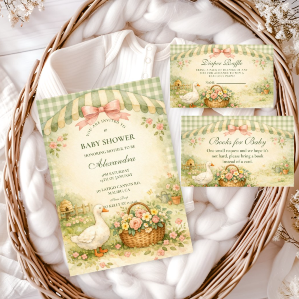
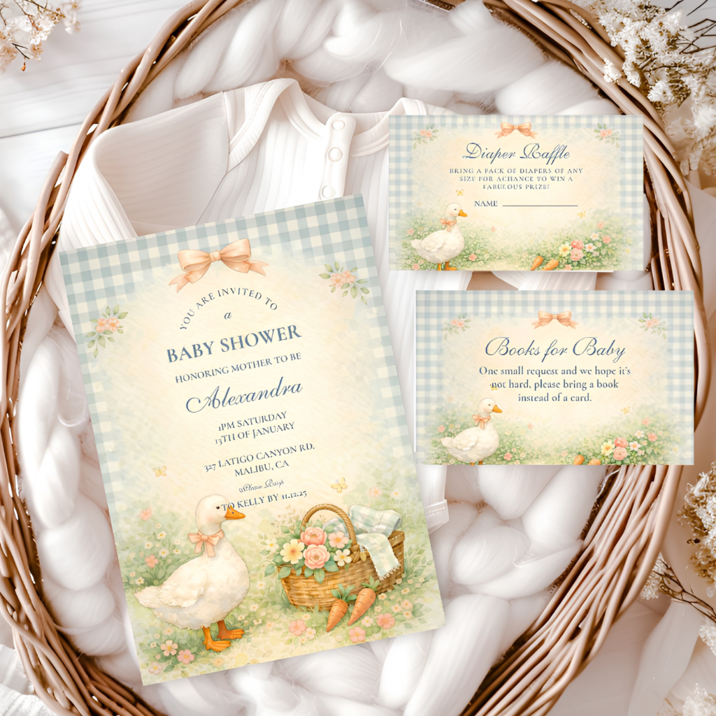
The Silly Goose collection — the complete range of cottagecore and vintage goose baby shower stationery.
Section 02 Eight Silly Goose Baby Shower Directions
Vintage Silly Goose Garden. The most editorial and most specifically design-forward direction in the range: vintage illustration quality — the kind that reads as a print from a mid-century garden catalogue — in sage green, warm cream, and antique gold. This is the direction for a host who wants the silly goose theme to function as a genuine aesthetic choice rather than a humorous concession. The goose here is confident and characterful, placed in a garden context that reads as genuinely beautiful.
Vintage illustration quality in sage, cream, and antique gold — the most editorial silly goose direction.
Vintage Storybook Silly Goose. The most literary direction: warm antique illustration quality with the specific register of a beloved picture book — the kind of book that adults remember from childhood with the same affection they feel toward the goose motif. The storybook palette is slightly warmer and slightly more sepia-toned than the garden direction, which gives it a more nostalgic and more intimate quality.
Warm antique illustration in the most literary and most nostalgic silly goose direction.
🪴 Styling Tip
Vintage illustration style — soft painted lines, warm tonal palette, the quality of something made by hand — does more to elevate the silly goose theme than any other single decision. It is the style choice that moves the theme from novelty to charming, and it costs no more than the cartoon alternative.
Cottagecore Silly Goose Garden. The most characteristically cottagecore direction: garden florals, wildflower botanical detail, and the warm pastoral aesthetic of a summer garden in full bloom. The goose is surrounded by flowers rather than placed against a plain ground, which gives this direction the most lush and most botanically abundant quality in the range.
Garden florals, wildflowers, and warm cottagecore pastoral — the most botanically abundant direction.
Whimsical Silly Goose Spring. The most freely joyful direction: a soft spring palette — pale yellow, soft sage, warm cream — with a goose illustration that has more visual energy and more obvious whimsy than the vintage and storybook directions. This is the direction for a spring baby shower where the season itself is doing some of the atmospheric work.
Soft spring palette and freely whimsical illustration — the most joyful and most season-specific direction.
Cottagecore Goose Garden. A quieter and more purely cottagecore direction — the goose here is part of the garden world rather than the comedic centrepiece of it. Softer illustration, more botanical context, and a palette that reads as garden-first rather than goose-first. This is the direction for a host who loves the cottagecore aesthetic and is using the goose motif as a gentle, knowing wink rather than as the theme’s main event.
A softer, more botanical cottagecore direction where the garden is the hero and the goose is the knowing detail.
Blush Goose Storybook. Blush, warm rose, and soft cream in the most clearly feminine direction in the range — the silly goose baby shower direction that works most specifically for a girl shower without losing any of the theme’s warmth or humor. The storybook illustration quality keeps it firmly in the vintage register; the blush palette provides the feminine signal.
Blush and rose in the most feminine and most girl-shower-specific silly goose direction.
🪴 Styling Tip
Blush Goose Storybook is the answer for anyone who wants a silly goose shower for a girl — the blush palette communicates femininity clearly and gently, and the vintage illustration quality means the theme reads as chosen rather than defaulted to.
Pastel Silly Goose Farm. The softest and most muted direction: pastel tones in a farm setting, where the goose is one resident among many rather than the sole character. The humor in this direction is the quietest — the palette is so gentle and so pastoral that the goose reads as sweet before it reads as silly, which is the correct register for a very soft, very intimate baby shower atmosphere.
Pastel tones and farm setting — the softest and most gently humorous silly goose direction.
Section 03 Silly Goose Baby Shower Decor at a Glance
The silly goose theme’s decoration works on the same principle as its stationery: the palette and the botanical context do the atmosphere-building; the goose provides the character. One goose element per zone is the correct level.
Balloon arch. Sage green, warm cream, and dusty blush balloons in an organic arrangement at the entry or backdrop. No yellow, no primary white, no cartoon-palette colours. The arch reads as cottagecore backdrop first; the goose stationery provides the theme’s specific character at the table.
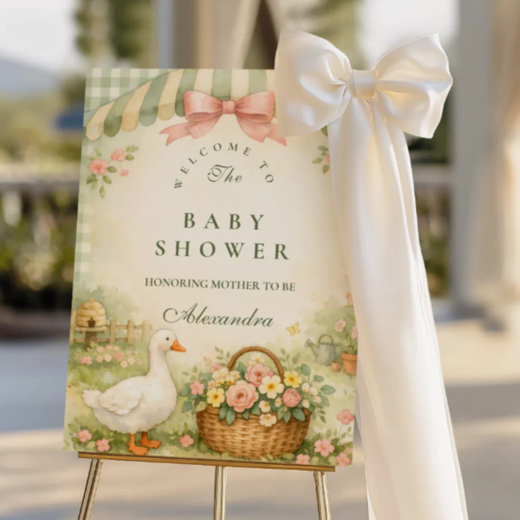
Welcome detail. A printed goose-themed welcome sign or a single illustrated goose prop at the entry — one clear goose element that announces the theme on arrival without populating every zone with goose imagery. A ceramic or resin goose figurine in the sage and cream palette beside the welcome sign is the most elegant single prop decision.
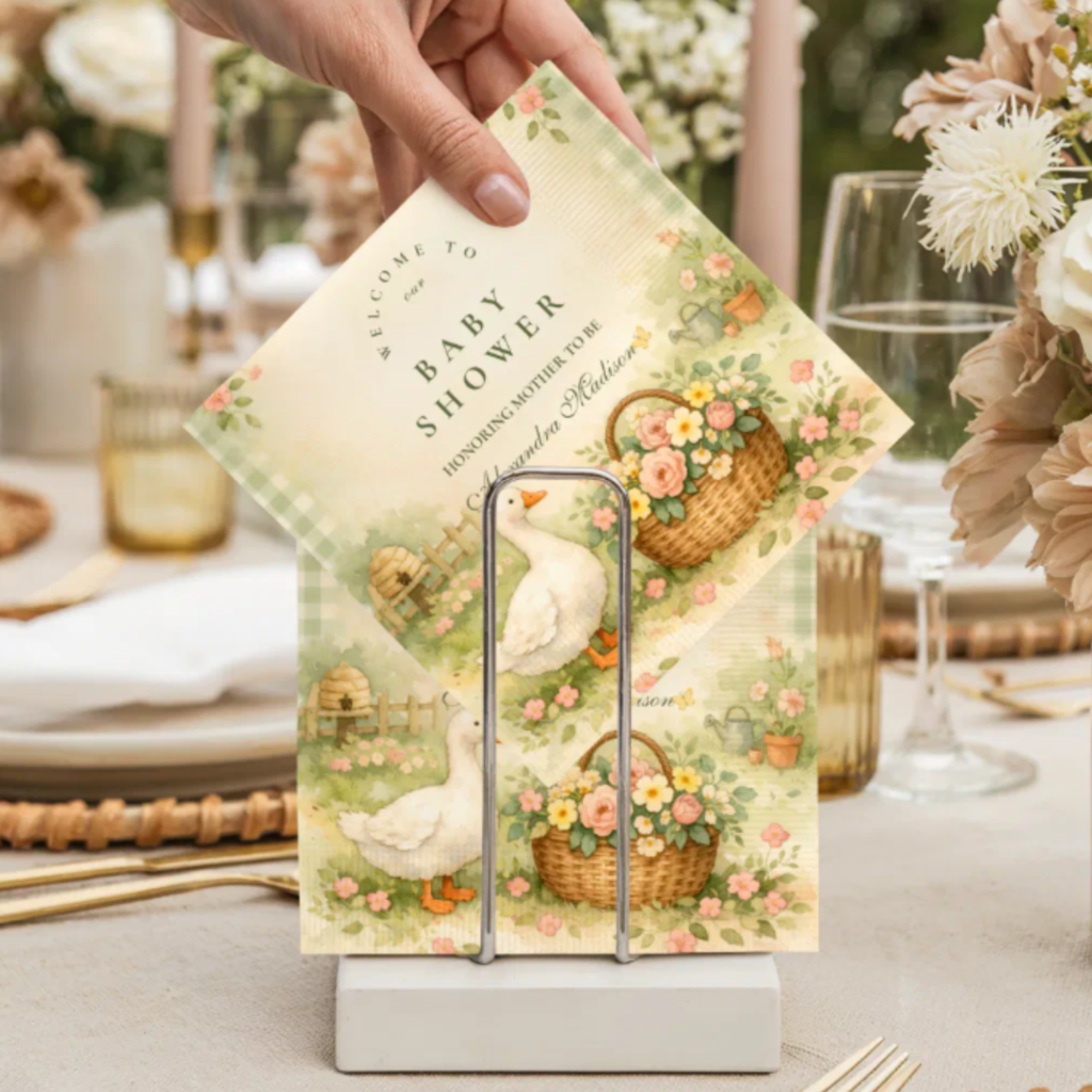
Centrepiece. A wildflower arrangement in a vintage ceramic or terracotta vessel — soft seasonal flowers in dusty rose, cream, and warm yellow — with trailing greenery. The cottagecore centrepiece does the warmth work; the printed place cards or food labels from the chosen direction carry the goose motif to the table scale.
🪴 Styling Tip
One goose prop per zone. A goose welcome sign at the entry, goose stationery at the table, and a goose cake topper: three zones, one goose element each. More than one goose prop per zone shifts the aesthetic from charming character to themed party supply. The discipline is what makes the theme read as designed.
Section 04 Girl vs. Gender-Neutral Silly Goose Shower
The silly goose theme is naturally gender-neutral — the goose carries no gender signal — and most of the eight directions work for any celebration. Two specific adjustments cover the most common gender-specific requests.
Girl shower. Blush Goose Storybook is the most directly girl-adjacent direction — the blush and rose palette communicates femininity clearly without any other design adjustment. Cottagecore Silly Goose Garden in the softer end of its palette range also works for a girl shower, with dusty rose as the dominant tone rather than sage.
Gender-neutral shower. Any of the remaining six directions. Vintage Silly Goose Garden (sage and cream), Whimsical Silly Goose Spring (pale yellow and soft sage), and Pastel Silly Goose Farm (the gentlest muted palette in the range) are the most broadly neutral. All three work across any guest-list expectation without any palette adjustment.
Frequently Asked Questions
What makes a silly goose baby shower look charming rather than novelty?
Two decisions: palette and illustration style. Sage green, warm cream, dusty rose, and antique gold — the cottagecore palette — place the goose in a context that reads as genuinely beautiful, so the humor operates as a layer on top of a well-designed aesthetic rather than as the whole point. Vintage or watercolor illustration quality — soft painted lines, warm tonal palette — does the same: the goose reads as a character rather than a cartoon. A silly goose in the right palette and the right illustration style reads as charming and witty; the same goose in primary colours with bold cartoon outlines reads as a novelty item.
What colors work best for a silly goose baby shower?
Sage green, warm cream, dusty rose, and antique gold are the palette that produces the most consistently beautiful silly goose baby shower. These are the cottagecore palette’s core tones — warm, slightly muted, and capable of working in any light and any venue. Soft blush and warm yellow also belong to this palette family. The colours to avoid: primary yellow (cartoon register), bright white (clinical rather than vintage), and any neon or saturated primary that belongs to a children’s party visual world rather than a cottagecore garden.
Is the silly goose theme more suitable for a girl shower?
The silly goose theme is genuinely gender-neutral by default — the goose carries no gender signal, and the cottagecore palette works across any gender reading. The Blush Goose Storybook direction is the most clearly girl-adjacent, using blush and rose as the primary palette. For a more neutral reading, Vintage Silly Goose Garden (sage and cream), Whimsical Silly Goose Spring (pale yellow and soft sage), or Pastel Silly Goose Farm (the softest muted palette in the range) work for any celebration without adjustment.
How many goose decorations should a silly goose baby shower have?
One goose element per zone — the same rule that applies to any character-based theme. One goose welcome sign or prop at the entry, goose stationery at the guest tables (place cards, food labels, menus), and one goose cake topper or printed banner at the cake table. The restraint is what makes the theme read as a designed aesthetic rather than a novelty party: when the goose appears at every scale on every surface simultaneously, the cottagecore world that makes the goose charming disappears, and what remains is a themed party rather than a beautiful celebration.
Cottagecore · Vintage Illustration · Sage & Cream · Eight Directions
Shop Silly Goose Baby Shower Stationery
Cottagecore and vintage goose invitations and stationery suites — from vintage garden to blush storybook to pastel farm.