Boho Pumpkin Baby Shower Ideas
Baby Shower · Boho Pumpkin Ideas Guide
Boho Pumpkin Baby Shower Ideas
Pampas grass as the bridge element, terracotta pumpkins over cream, asymmetric arrangements, and the three-texture rule that separates a designed boho harvest moment from a generic fall table.
The boho pumpkin baby shower works because the two aesthetics — bohemian and harvest pumpkin — share more visual DNA than they first appear to. Both favour natural textures over manufactured finishes. Both use warm, earthy tones rather than bright saturated colour. Both read as organic and unforced rather than as designed-to-the-centimetre. The combination fails when it is treated as two separate themes placed in the same room; it succeeds when one element is found that belongs to both worlds simultaneously.
That element is pampas grass. The moment oatmeal pampas appears beside a terracotta pumpkin, the boho and the harvest become one world rather than two. The sections below cover the three design distinctions that make the boho pumpkin direction specific, the decor and texture details that apply them across the table, and the two palette directions — classic boho harvest and pink boho pumpkin — within the theme.
Browse the Girl Pumpkin collection — warm harvest stationery for a boho pumpkin baby shower in dusty rose and cream.
“Boho pumpkin is where the organic warmth of autumn meets the specific texture of the natural world — pampas grass and cream pumpkins belong to the same aesthetic family as if they were always meant to be together.”
Section 01 What Makes Boho Pumpkin Distinct
Three design decisions separate a genuinely boho pumpkin baby shower from a generic fall table with some pampas grass added to it. Each one follows from understanding what the bohemian aesthetic actually requires — and what the pumpkin theme provides that generic fall decoration does not.
Distinction 1
Pampas Grass Is the Bridge Element — Not a Decoration Added to a Pumpkin Table
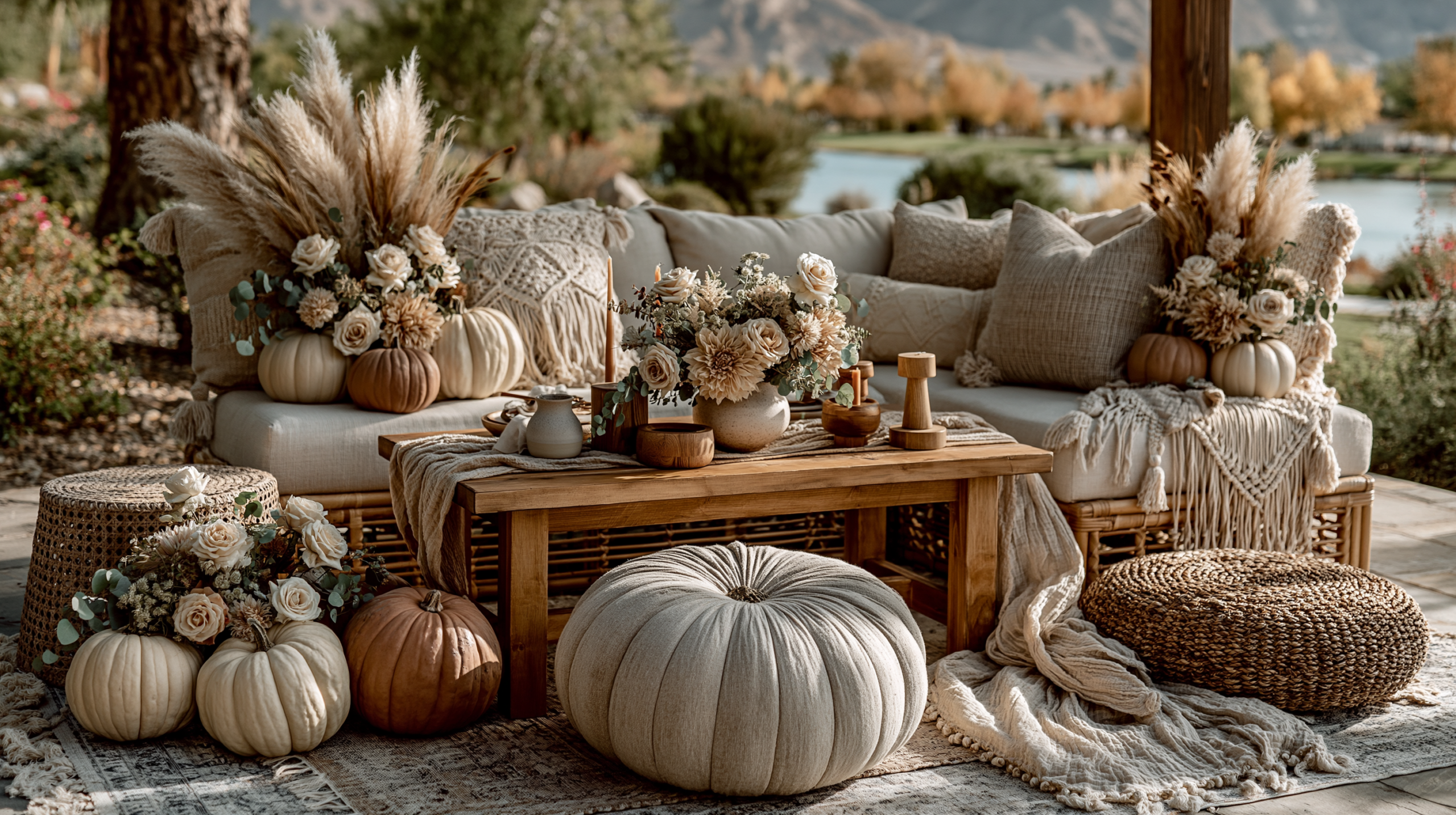
Pampas grass belongs to both the boho aesthetic and the harvest season simultaneously — and that dual membership is what makes it the single most important element in a boho pumpkin baby shower. It does not read as a boho decoration placed beside a pumpkin; it reads as a natural material that the pumpkin and the boho arrangement share. Oatmeal pampas beside a terracotta pumpkin produces the specific visual quality of the boho harvest: warm, textured, organic, and completely coherent. Without pampas grass, the boho and the pumpkin remain two separate aesthetics placed in the same room. With it, they become one world. For this reason, pampas grass should appear in the centrepiece, in the backdrop installation if one is used, and as the primary botanical accent throughout the table — not as a single token stem tucked into one corner of an otherwise conventional pumpkin arrangement.
Distinction 2
Terracotta Pumpkins Over Cream — The Boho Harvest Is Earthier Than the Classic Neutral
The classic neutral pumpkin baby shower uses cream and white pumpkins beside pale ivory and sage — a cooler, softer palette that reads as elegant and understated. The boho pumpkin direction requires warmer and earthier tones: terracotta pumpkins, rust-toned natural pumpkin varieties, and the deep oatmeal of dried pampas rather than the pale cream of fresh-cut flowers. Terracotta is the specific colour that makes a pumpkin arrangement read as boho rather than as classic harvest — it is earthy enough to sit naturally beside rattan vessels, jute runners, and dried botanical textures without any of those elements looking like props. A cream pumpkin beside a rattan vessel reads as a styled arrangement; a terracotta pumpkin beside a rattan vessel reads as if both objects were always going to be in the same place. The earthier the pumpkin tone, the more authentically boho the arrangement reads.
Distinction 3
Asymmetry Is Mandatory — Symmetrical Arrangements Read as Generic Fall, Not Boho
The boho aesthetic is defined by the appearance of organic, unforced arrangement — which means that symmetry is the opposite of what the direction requires. A pumpkin and pampas centrepiece with equal numbers of each element on both sides of a central point reads as a conventional harvest table rather than as a boho harvest table. The boho arrangement clusters most of its height and texture on one side and trails off loosely on the other; it places the tallest element off-centre; it allows pampas stems to extend unevenly in different directions rather than being grouped into a uniform shape. This asymmetry should look like the arrangement settled into place naturally rather than being built symmetrically and then adjusted. If the arrangement requires effort to see the asymmetry, it is not asymmetric enough. The rule of thumb: the most structured element (the pumpkin cluster) should be placed at one end of the centrepiece zone rather than at the centre, with the boho botanical elements trailing loosely toward the other end.
🌿 Styling Tip
The boho pumpkin test: cover the pumpkins with your hand. If what remains still looks like a beautiful boho arrangement — the pampas, the dried botanicals, the rattan vessel — the pumpkins are accents placed correctly within a designed boho world. If nothing of visual interest remains when the pumpkins are covered, the pumpkins are doing all the work and the boho register is missing. The boho elements should be able to stand alone; the pumpkins enrich them.
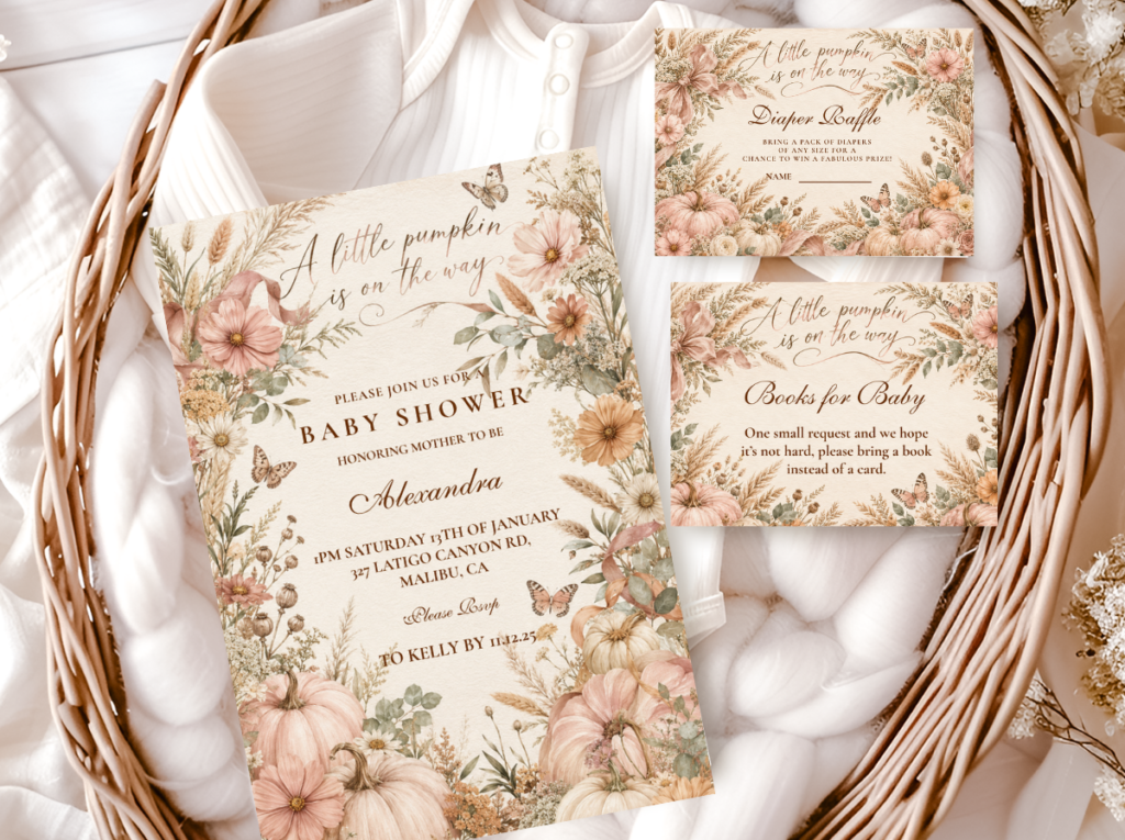
The Girl Pumpkin collection — dusty rose and warm cream pumpkin stationery for the boho harvest baby shower direction.
Section 02 Boho Pumpkin Decor, Cake & Table
Every element of a boho pumpkin baby shower table should contribute at least one of the three textures that the boho harvest direction requires: something round and weighted (the pumpkin), something feathery and movement-suggesting (the pampas), and something dried and structured (protea, cotton stem, wheat spike, or seed pod). The three-texture minimum is what produces the visual richness that reads as designed rather than as a single prop on a table.
Centrepiece: An asymmetric cluster of terracotta and cream pumpkins in three to five sizes, positioned toward one end of the centrepiece zone rather than at the centre. Oatmeal pampas grass stems in a rattan or wicker vessel at the opposite end of the cluster, extending upward and loosely outward. Dried protea or dried cotton stems as the structured botanical element — these provide the architectural quality that pampas alone does not have. Dried orange slices or cinnamon sticks scattered at the base of the pumpkin cluster as the harvest-scent-referencing detail. The rattan or wicker vessel is the material detail that most strongly anchors the boho register: it communicates natural craft in a way that ceramic or glass does not, and it belongs to the same material world as the pampas and the jute runner.
Table: A burlap, jute, or raw linen runner as the table base — the texture of the runner is as important as its colour, because woven natural fibre reads as boho in a way that smooth linen or polyester does not. Terracotta or rust-toned clay votives as the light source at table level: terracotta clay beside terracotta pumpkins is the material-matching detail that produces the most coherent boho harvest table. A small dried botanical arrangement — three to five stems, no more — at each place setting as the individual table detail that repeats the centrepiece material language at guest level. The table should look abundant in texture and natural material rather than in quantity of props: fewer items, richer surface quality.
Cake: A semi-naked or bare-crumb buttercream cake in warm cream or pale terracotta-tinted buttercream is the most harmonious cake finish for the boho pumpkin direction. The semi-naked finish exposes the cake layers slightly, which reads as organic and rustic rather than polished — the boho quality extended to the cake surface. A pampas grass and dried botanical topper — two or three pampas stems, one dried protea or cotton stem, and a small terracotta or cream pumpkin at the base of the top tier — is the topper arrangement that most directly carries the boho harvest theme into the cake. No fondant, no smooth finish, no bright-colour decoration: the cake should read as an extension of the centrepiece, not as a separate event.
🌿 Styling Tip
A boho pumpkin centrepiece needs three textures minimum — something round (pumpkin), something feathery (pampas grass), and something dried and structured (protea or cotton stem). Three textures in one arrangement reads as designed and intentional. One texture reads as a prop placed on a table. Two textures read as almost there. The third texture is what produces the visual richness that makes the centrepiece look like it was styled rather than assembled.
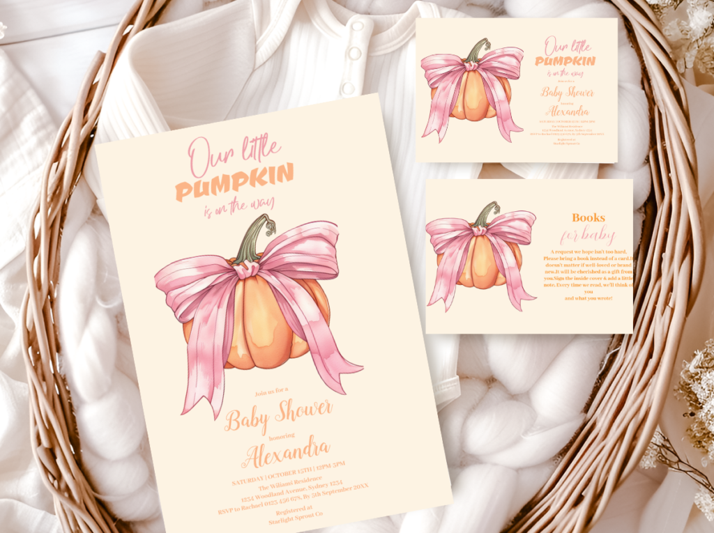
The A Little Pumpkin Theme collection — warm harvest pumpkin stationery across the full baby shower suite.
Section 03 Boho Pumpkin Palette Directions
Two palette directions produce the most distinct and most cohesive results within the boho pumpkin theme. Both use terracotta as the earthy anchor tone; they diverge in the accent colour that determines the emotional register — classic harvest warmth or feminine dusty rose.
3.1 Classic Boho Pumpkin — Terracotta, Oatmeal & Cream
The classic boho pumpkin direction uses terracotta, oatmeal, and deep cream as its three tones — the harvest palette at its most earthy and most gender-neutral. Terracotta is the dominant tone in both the pumpkins and the clay votives; oatmeal appears in the pampas grass and the raw linen runner; cream provides the lightest element in both the smaller pumpkins and the dried cotton stems. No dusty rose, no dusty blue, no sage: the classic direction holds to warm earthy tones only.
This is the most authentically boho of the two directions because it is the most consistent with the earthy, natural aesthetic that bohemian design is grounded in. It works for any gender and for a reveal shower, because the palette carries no gender signal — terracotta, oatmeal, and cream read as seasonal and natural rather than as pink or blue.
Direction 3.1
Classic Boho Pumpkin — Terracotta, Oatmeal & Cream
The most harvest-grounded and most gender-neutral of the boho pumpkin directions — terracotta, oatmeal, and cream in an earthy natural palette that reads as bohemian before it reads as baby shower.
3.2 Pink Boho Pumpkin — Dusty Rose, Terracotta & Cream
The pink boho pumpkin direction introduces dusty rose alongside the terracotta base — the most feminine of the boho harvest palette combinations. Dusty rose rather than bright pink, because the muted, slightly warm quality of dusty rose sits naturally beside terracotta without breaking the earthy register of the boho palette. Bright pink beside terracotta reads as two separate colour stories competing; dusty rose beside terracotta reads as the same warm, muted world in two different tones.
The pink boho pumpkin direction is the most frequently requested of the two for girl baby showers, because it combines the softness of a pink palette with the organic warmth of the boho harvest aesthetic — producing a result that reads as both feminine and seasonal without defaulting to the generic pink-and-gold girl shower format.
Direction 3.2
Pink Boho Pumpkin — Dusty Rose, Terracotta & Cream
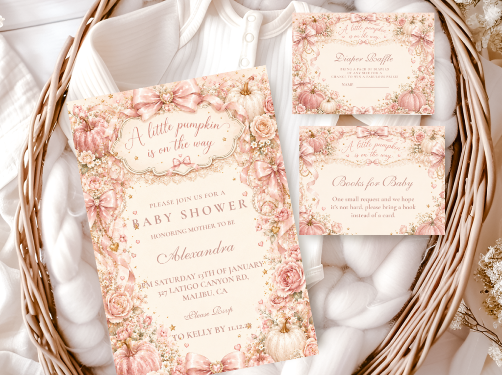
Dusty rose beside terracotta and cream — the feminine boho pumpkin direction that keeps the earthy harvest quality intact while introducing a soft, muted pink. Both tones are warm and muted; neither dominates the other.
🌿 Styling Tip
Pink boho pumpkin works when dusty rose and terracotta appear in equal visual measure — one colour warms the other rather than one overpowering. Too much dusty rose loses the earthy boho harvest register and reads as a pink baby shower with a pumpkin on the table. Too much terracotta loses the feminine softness and reads as a generic harvest table. Equal balance between the two tones is the formula: dusty rose in the stationery, ribbons, and smaller botanical accents; terracotta in the pumpkins, the clay votives, and the larger arrangement props.
Section 04 Invitations & Stationery
The boho pumpkin baby shower invitation should reflect the same visual qualities as the decoration — warm earthy tones, natural textures communicated through illustrated botanical elements, and a typeface that reads as hand-lettered or organic rather than as clean geometric sans-serif. A sans-serif invitation beside a boho harvest table reads as slightly out of register; a brush-script or hand-lettered typeface on warm cream card stock reads as belonging to the same natural, unforced world as the pampas and the terracotta.
The stationery suite for a boho pumpkin shower benefits most from consistency in the botanical illustration style — if the invitation uses a pumpkin with pampas grass as its illustration, the advice cards, wishes jar labels, and favour tags should use the same illustration in smaller scale rather than switching to a different motif at each printed piece. Visual consistency across the stationery suite is what produces the designed quality of the shower as a whole. The collection showcase below covers all six available directions:
Boho Girl Direction
Girl Pumpkin
Dusty rose and warm cream pumpkin stationery — the most directly boho-harvest girl shower collection, with botanical warmth in the illustration and palette.

Full Harvest Suite
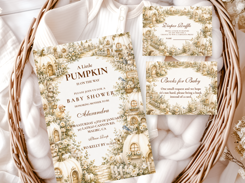
A Little Pumpkin Theme
The broadest pumpkin theme collection — warm amber and cream across the full baby shower stationery suite, natural companion to the boho harvest palette.
Pink Pumpkin Direction
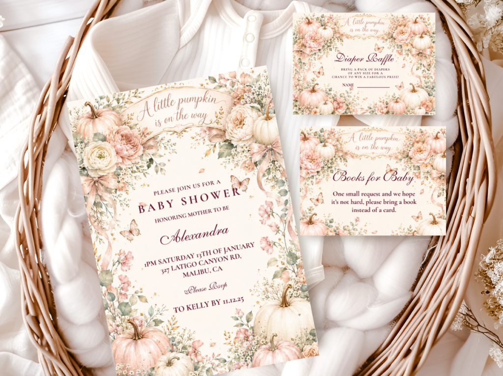
Pink Pumpkin
Dusty rose and terracotta pumpkin stationery for the pink boho pumpkin direction — the feminine harvest palette in a full stationery suite.
Family-Forward Wording
Our Little Pumpkin
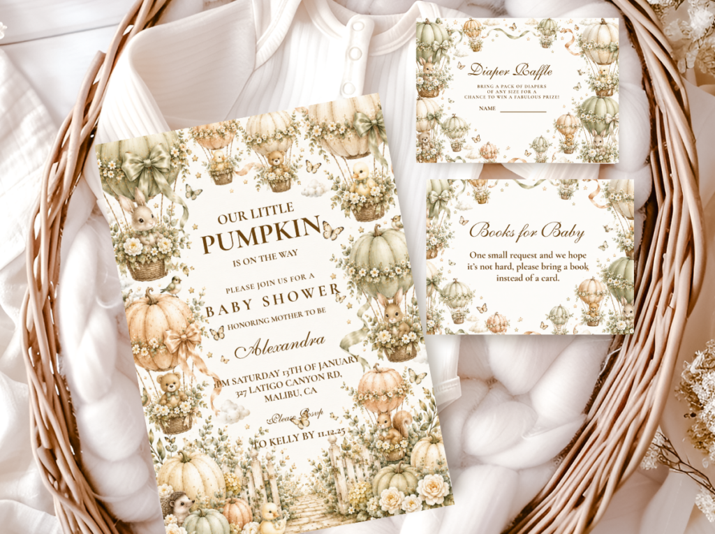
Warm amber and cream with ‘our little pumpkin’ wording — the family-forward wording direction that pairs naturally with a gender-neutral boho harvest palette.
Most Atmospheric
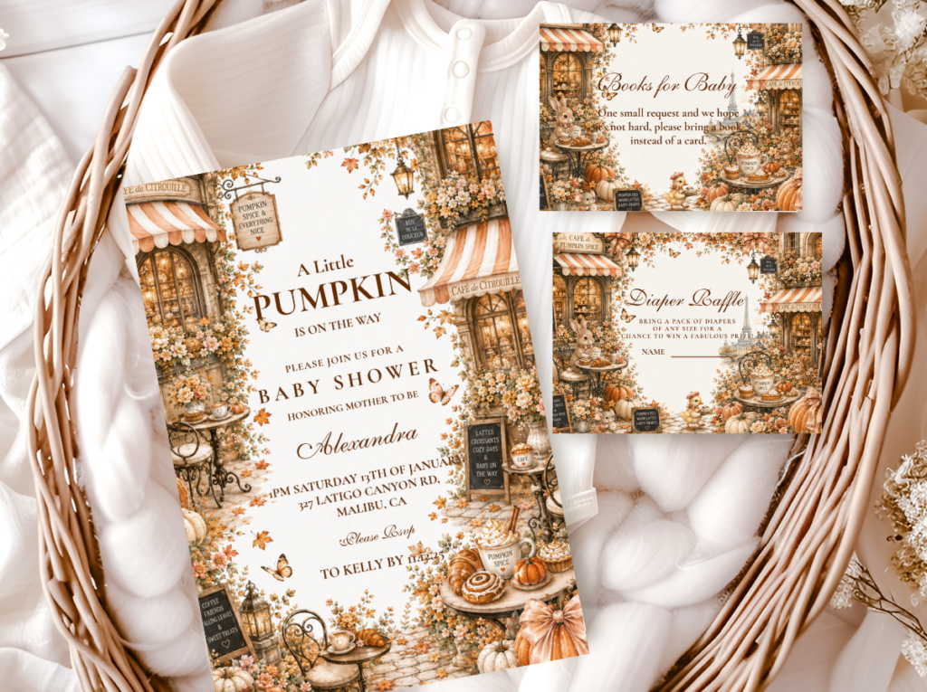
Pumpkin Spice
Warm amber, cinnamon, and cream — the richest and most earthily harvest-grounded of the pumpkin palette directions, closest in spirit to the classic boho terracotta direction.
Softest Direction
Pastel Pumpkin
The palest and most delicate of the pumpkin palette collections — for a boho shower where the colour register should be lighter than the classic terracotta direction.
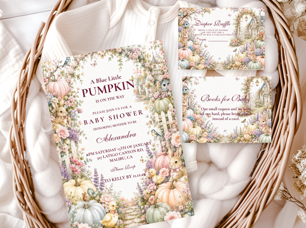
Browse the full boho pumpkin stationery range — dusty rose, terracotta, and warm cream harvest directions across six collections.
Frequently Asked Questions
What is a boho pumpkin baby shower?
A boho pumpkin baby shower combines the bohemian aesthetic — natural textures, asymmetric arrangements, earthy tones, and organic materials like rattan, jute, and pampas grass — with the pumpkin harvest theme. The combination works because both aesthetics share the same underlying qualities: warmth, natural texture, and an organic rather than manicured quality. The defining element that makes the combination coherent rather than two separate themes placed in the same room is pampas grass — it belongs simultaneously to the boho aesthetic and the harvest season, so its presence makes pumpkins and boho decoration feel like one unified world. A boho pumpkin shower is distinguished from a generic fall harvest shower by the mandatory use of asymmetric arrangements, terracotta rather than cream pumpkins as the primary pumpkin tone, and a three-texture minimum in every centrepiece arrangement.
How do I combine boho and pumpkin aesthetics without them looking like two separate themes?
The answer is one element that belongs to both: pampas grass. Place oatmeal pampas beside terracotta pumpkins and the boho and harvest become one world rather than two themes placed side by side. Beyond pampas, three material decisions keep the combination coherent. First, choose terracotta pumpkins over cream — terracotta sits in the same earthy register as rattan, jute, and dried botanicals, while cream pumpkins read as a different and cooler palette. Second, use natural-material vessels: rattan, wicker, or raw clay rather than ceramic or glass. Third, keep all decoration elements within the warm, muted, earthy colour register — nothing bright or saturated. When every element on the table is warm, muted, and natural in material, the boho and the pumpkin become visually indistinguishable as separate themes.
Can a boho pumpkin baby shower work for any gender?
The classic boho pumpkin direction — terracotta, oatmeal, and deep cream — is one of the most genuinely gender-neutral of all baby shower aesthetics, because its palette carries no gender signal. Terracotta and oatmeal read as seasonal and natural rather than as pink or blue, which makes the classic direction appropriate for any baby or for a surprise gender reveal shower where the palette should not anticipate the announcement. For a girl-specific direction, dusty rose is added to the terracotta base in equal measure — producing the pink boho pumpkin direction. For a boy-specific direction, dusty blue can be introduced alongside the terracotta and cream, following the same rule as the pink direction: muted and warm-adjacent rather than bright or saturated, present in equal visual measure to the terracotta rather than dominating it.
Pampas Grass · Terracotta · Three Textures · Asymmetry
Shop Boho Pumpkin Baby Shower Collections
Warm harvest pumpkin stationery in terracotta, dusty rose, and cream — invitations, advice cards, and favour tags across six boho pumpkin directions.