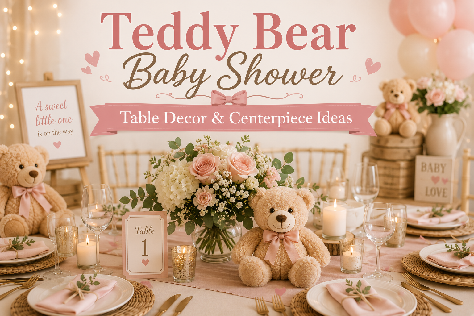
Teddy Bear Baby Shower Table Decor & Centerpiece Ideas
Bear Baby Shower Table & Centerpiece Guide
Teddy Bear Baby Shower Table Decor & Centerpiece Ideas
Five centerpiece directions, a decision framework that works for any table shape, and the specific details that make a place setting look intentional.
Guests spend most of a baby shower seated at a table. The backdrop gets photographed once; the entrance is passed through once; the table is where conversation happens, food is shared, and the printed details — the place card, the menu card, the favor tag — are picked up and examined close. Of all the surfaces in a bear-themed shower, the table is the one that rewards the most considered approach. It is also the one that most planning guides reduce to a single question: “what should my centerpiece be?”
This guide starts with the question most people ask after the centerpiece disappointment: why did it not look right? The answer is almost always in the decisions made before the centerpiece was chosen — the table shape, the ceiling height, the guest count per table. The framework below resolves those decisions before a single flower is ordered. Then five centerpiece directions, the table setting details that complete them, and the stationery that ties every printed element on the surface into a single designed world.
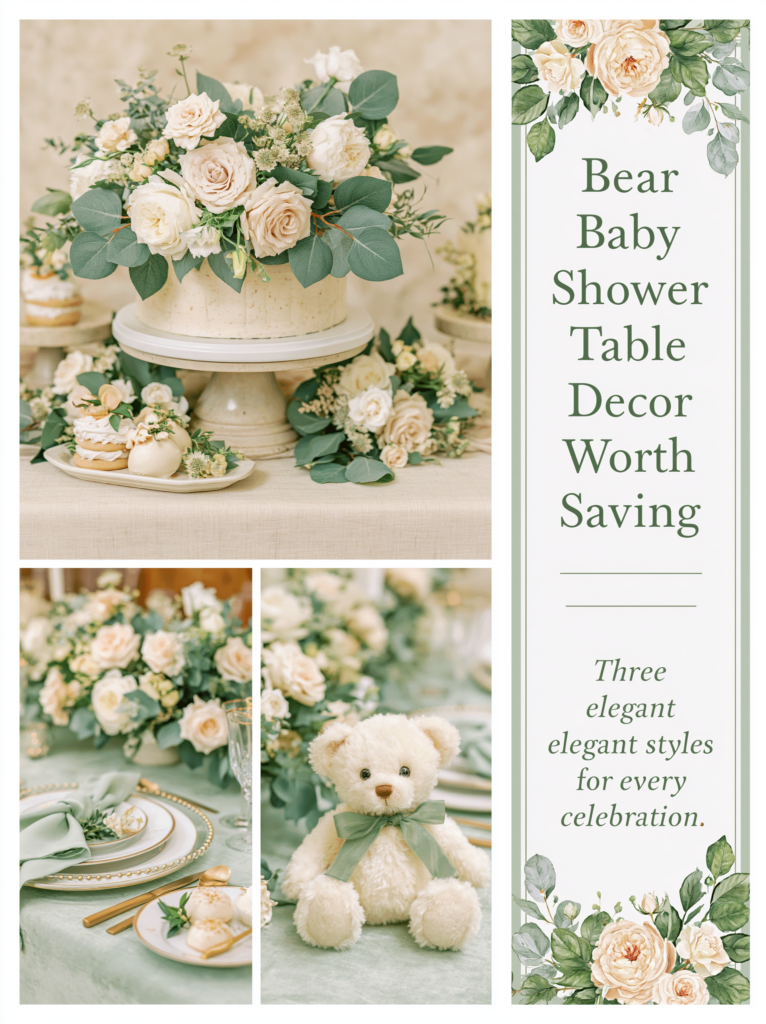
“The table is where guests spend most of the celebration — it deserves to be the most considered surface in the room.”
Section 01 The Centerpiece Decision Framework
Most centerpiece decisions are made based on what looks beautiful in a photo rather than what works for a specific table. The result is a centerpiece that looks right on a Pinterest board and wrong in the room. Three questions, answered in order, prevent this. Each one eliminates a category of mistake before the first purchase is made.
Question 01: What Is Your Table Shape?
Round tables and long tables are fundamentally different design problems, and a centerpiece that solves one creates a problem for the other. A round table works with a single central focal point because every seated guest is equidistant from the center — the eye naturally finds it and rests there. The same single statement centerpiece on a long table produces a dead zone: guests at the far ends of the table have nothing within their visual field, and the one arrangement in the middle reads as marooned rather than composed. Conversely, a repeating row of small arrangements that looks cohesive on a long table will look cluttered and indecisive on a round one, where three small vessels compete for the center position that should belong to one considered piece.
The fix for round tables: one centerpiece, centered, with enough visual presence to anchor the table from every seat. The arrangement does not need to be large — it needs to have a clear focal point that reads as intentional from every angle. A single plush bear in a small vessel surrounded by three bud vases and a cluster of votive candles at varying heights achieves this more effectively than an elaborate floral arrangement that only reads well from one angle. The fix for long tables: an odd number of arrangements — three or five, never two or four — spaced at equal intervals along the table’s length, or a continuous runner with objects placed at rhythmic intervals on top of it. Two arrangements create a visual gap between them that reads as incomplete; three creates a clear rhythm that draws the eye from end to end.
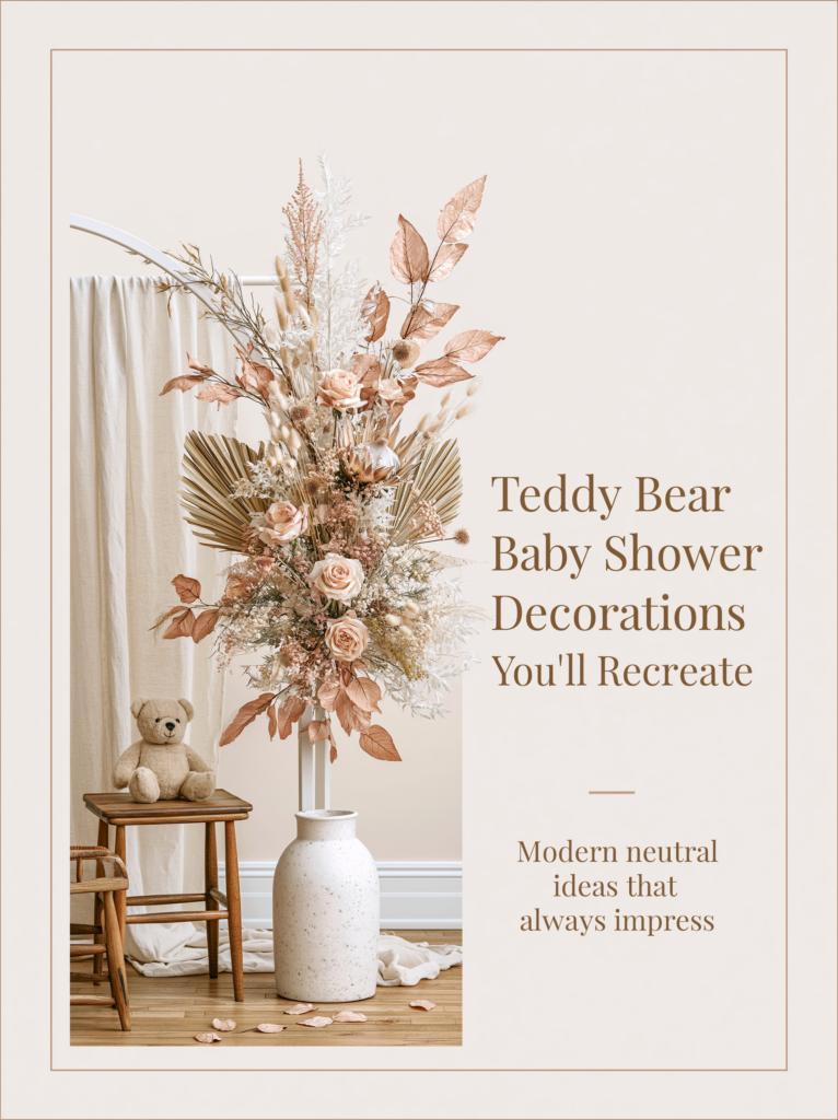
Question 02: What Is Your Ceiling Height?
The relationship between centerpiece height and ceiling height is one of the most reliably ignored rules in event styling, and its violation is one of the most reliably uncomfortable results. A tall arrangement in a low-ceilinged room — anything under ten feet — creates a sense of compression that guests feel without being able to name. The ceiling appears to be pressing down on the table; the room feels smaller and more crowded than it is. A low arrangement in a high-ceilinged room — anything over twelve feet — disappears. The negative space above the table dwarfs the centerpiece and makes the table look underfurnished regardless of how many elements are on it.
The rule: centerpiece height should not exceed one third of the distance between the table surface and the ceiling. For a standard eight-foot ceiling — table surface at approximately 30 inches from the floor, ceiling at 96 inches — that gives approximately 22 inches of vertical clearance above the table before the one-third rule is reached. A centerpiece of 18 to 20 inches sits comfortably within this; anything over 24 inches starts to read as too tall in a standard residential or venue ceiling. For rooms with higher ceilings (twelve feet or more), the calculation inverts: a centerpiece of under 12 inches will likely disappear, and a tall arrangement of 28 to 36 inches becomes appropriate. Measure before you order.
Question 03: What Is Your Guest Count Per Table?
The scale of a centerpiece should be proportional not just to the table but to the number of people sitting around it. An intimate table of four to six guests can hold a single statement piece — a larger arrangement, a tall lantern, a book stack with a bear on top — because the piece has room to breathe and the guests are close enough to appreciate its detail. A table of eight to ten guests is a different problem: a single centerpiece in the center of the table becomes physically remote from guests at the ends, and any arrangement tall enough to read from eight seats tends to obstruct sightlines across the table for the guests in the middle.
The fix for tables of 8–10: either one very large, low arrangement (a wide bowl, a long planter, a flat garland of florals and botanicals) that stays under 14 inches in height and spreads across the table surface, or three smaller arrangements in a line at equal intervals — the flanking two at approximately 12 inches, the center one at 16–18 inches for a gentle height variation. The three-arrangement approach works on any long table regardless of guest count and is the most flexible solution for a mixed-table setup where some tables seat more than others.
Styling Tip
The most reliable centerpiece formula for a bear shower — the one that works on round tables, long tables, intimate tables, and large ones — is three heights in a single focal grouping: one tall element (a floral arrangement, a balloon cluster on a weight, or a lantern), one mid element (a plush bear, a honey jar cluster, or a small candle grouping), and one low element (scattered dried petals, a ring of small votives, or a kraft tag garland laid flat). The three heights create a silhouette that reads as designed from across the room and as detailed up close. The ratio matters: the tall element should be roughly twice the height of the mid element, and the mid element roughly twice the height of the low one. Apply this formula to any of the five directions below and it works.
Section 02 Five Centerpiece Directions for the Bear Theme
Each direction below specifies the table shape and palette it suits, what the arrangement looks like in practice, and the stationery collection that ties its aesthetic into the printed details on the same table.
2.1 The Vintage Floral Centerpiece
The vintage floral direction is the most storybook-appropriate of the five and the one that most naturally extends the honey-and-cream palette of a classic bear shower into the table surface. The focal arrangement is a loose cluster of warm-toned florals — dried strawflowers in amber and rust, dried rose heads in dusty cream, pampas fronds for softness — in an antique-style ceramic or amber glass vessel. The vessel matters as much as the flowers: a mason jar, a honey-colored glass bottle, or a small terracotta pot carries the vintage quality in a way that a generic clear vase does not. This arrangement works as a single focal piece on a round table of up to six guests, or as three repeating groupings on a long farm table, each one slightly varied in height.
The mid element in this direction is a small plush bear in warm honey-brown propped against the vessel or placed on a small wooden round beside it. The low element is a scattering of dried petals, a handful of small kraft tags tied with twine, or a ring of small amber glass votives at the base of the arrangement. The palette is honey amber, warm cream, and muted rust — every element should pass the warmth test (cool tones break the vintage register immediately). For a standard eight-foot ceiling, keep the tall stem or branch in the arrangement to 18 to 22 inches above the table surface.
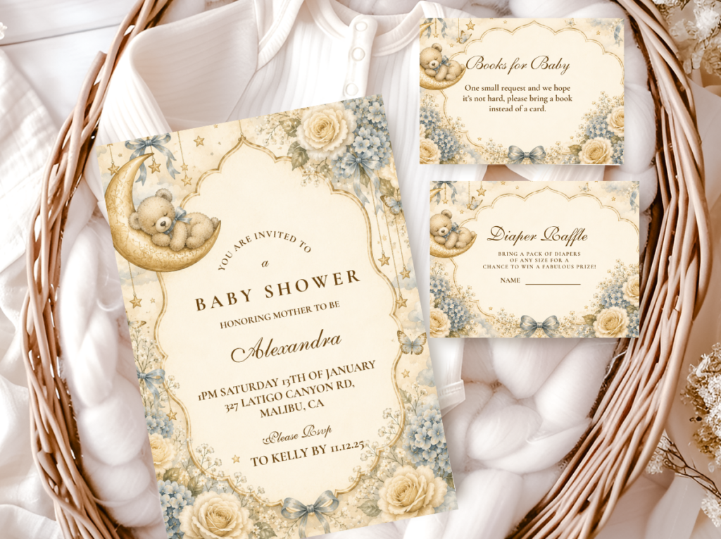
The Vintage Teddy Bear collection brings the honey-and-amber palette into the stationery suite — heritage typography, warm tones, and bear motifs that tie the place cards and menu cards on the same table into the same visual world as the centerpiece.
2.2 The Botanical Floral Centerpiece
The botanical floral direction is the most romantically full of the five and the most palette-adaptable — because the florals can be specified in any of the bear shower’s color directions (dusty rose, sage, honey, lavender, cream) while the structural logic of the arrangement stays the same. The arrangement is a lush, loosely gathered cluster of blooms at one or two heights, in a white ceramic or clear glass vessel, that reads as gathered rather than arranged. The difference between “gathered” and “arranged” is in the uniformity of the stems: a gathered arrangement has stems at slightly different heights with some blooms facing different directions; an arranged one has all stems equalized and all faces forward, which reads as formal rather than organic.
This direction works on both round and long tables but has a specific height consideration for seated guests: the arrangement should stay below eye level when guests are seated. The typical seated eye level is approximately 44 to 48 inches from the floor, which translates to 14 to 18 inches above the table surface. A botanical arrangement taller than 18 inches at a standard dining table will obstruct sightlines between seated guests — which is less of an issue for a dessert table or display table but a real problem for a guest dining table. The fix is either to stay under 16 inches for dining tables, or to use a tall but narrow arrangement (a single stem cluster in a slim vase) that guests can see past rather than through.
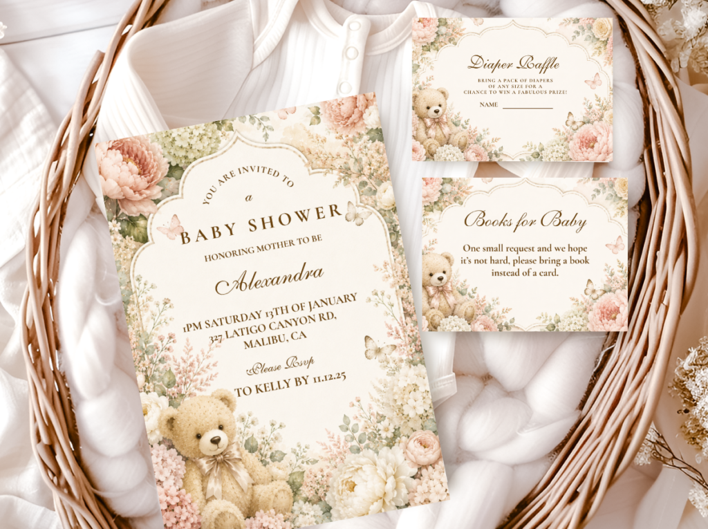
The Floral Teddy Bear collection pairs the botanical centerpiece direction with stationery in the same soft, romantic register — botanical motifs and warm cream tones that connect the table florals to the place cards and menu cards beside them.
Styling Tip
Fresh florals on a guest dining table must stay below the seated eye level — the rule is that seated guests should be able to make full eye contact with the person directly across the table without looking through or around the arrangement. Test this before guests arrive: sit down at the table, look straight ahead, and see whether the arrangement is in your sightline. If it is, either lower the arrangement by trimming the tallest stems, switch to a lower vessel, or replace the single arrangement with three smaller ones that sit comfortably below 14 inches. This test takes thirty seconds and prevents the most common complaint about floral centerpieces at seated events: that the flowers were beautiful but guests could not see each other across the table.
2.3 The Rustic Natural Centerpiece
The rustic natural direction is the most texture-forward of the five and the only one that requires no fresh florals — which makes it the most practical for outdoor events, advance setup situations, or hosts who want to assemble everything the day before without worrying about wilting. The foundation is a wood slice or wooden board as the surface base, positioned flat on the table. On top of it: a cluster of dried botanical stems in a small vessel (pampas, wheat, dried eucalyptus, dried roses), a plush bear propped against the vessel, and a scatter of small natural props — a pinecone, a sprig of dried lavender, a small kraft tag — at the low zone around the base.
The rustic natural centerpiece stays low by nature — dried stems in a small vessel rarely exceed 14 to 16 inches — which makes it inherently appropriate for dining tables without adjustment. This is also the direction that works best as a repeating element on long tables: three identical or near-identical wood-slice groupings at even intervals create the rhythmic visual logic that long tables require, and the slight variations in dried botanical stems (no two bunches are identical) prevent the repetition from reading as manufactured. For long tables over ten feet, use five groupings rather than three; four or two should always be avoided for the reason discussed in the framework above.
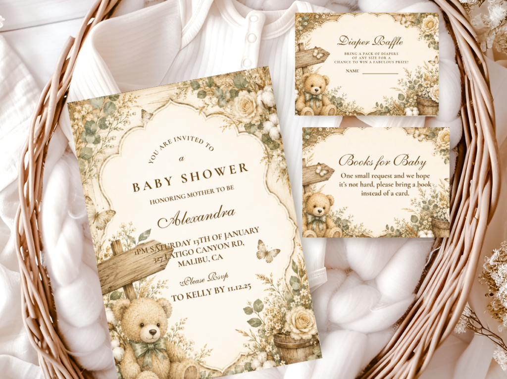
The Rustic Teddy Bear collection pairs the organic, texture-forward centerpiece with stationery in the same natural register — linen-effect stock and warm bear motifs that match the wood-and-dried-botanical aesthetic of the table.
2.4 The Neutral Minimalist Centerpiece
The neutral minimalist direction is the most elegant and the most accessible for DIY execution, because its strength comes from restraint rather than abundance. A cluster of three to five bud vases at slightly different heights — each holding a single stem of dried pampas, eucalyptus, or a simple dried rose — reads as more considered than a large, complex arrangement because the negative space between the vases is part of the design. This is the centerpiece direction that looks intentional precisely because it looks effortless. It suits any table shape and any ceiling height because its low profile and airy quality cause no sightline or scale problems at any dimension.
The palette is all-cream and warm ivory: white ceramic bud vases, pale dried stems, a small plush bear in honey-brown at the grouping’s edge, and a single short white candle in a glass votive at the base. The candle is the detail that transforms this direction from a pretty tabletop arrangement into a table that feels warm and alive — the flame introduces an element that no object can replicate. For this reason, it is the recommended fourth element in the neutral minimalist grouping whenever candles are safe and practical in the event space. The entire arrangement can be assembled in under fifteen minutes per table with materials sourced from a single craft or home goods store.
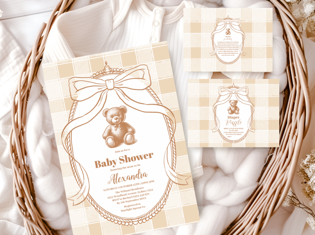
The Neutral Teddy Bear collection pairs the all-cream centerpiece direction with warm ivory stationery and restrained bear motifs — the printed elements that match the quiet, considered quality of the minimalist table.
2.5 The Preppy Graphic Centerpiece
The preppy graphic direction is the most modern of the five and the furthest from the vintage or rustic registers. It suits a white-linen, high-contrast palette — white and navy with honey as an accent, or white and black with gold — and uses structured arrangement over organic looseness as its visual logic. Where the botanical and vintage directions rely on the natural variation of flowers and dried stems for interest, the preppy direction relies on geometric clarity: an arrangement in a clean white ceramic vessel with blooms or stems at deliberately equalized heights, flanked by a single candle in a brass holder and a bear-themed printed element (a framed print, a small monogrammed sign) at the same height level.
The preppy direction is the most appropriate for larger, more formal guest tables — it reads as deliberate at scale in a way that organic arrangements can lose. It also allows for a wider range of bloom choices because the color palette is high-contrast: white blooms against dark foliage, or navy blue accents in the arrangement, work in this direction in a way that would disrupt the warmth of the vintage or rustic palettes. For long tables, the preppy graphic centerpiece repeats in sets of three, with each grouping using an identical vessel but a slightly different bloom composition to create variation within the rhythm. The strict geometry of the vessel ensures the rhythm is maintained regardless of what goes inside it.
The Preppy Teddy Bear collection brings the clean geometric quality of this direction into the stationery suite — graphic bear motifs, crisp typography, and a palette designed for the white-linen, high-contrast table setting.

Section 03 Table Setting Details Beyond the Centerpiece
3.1 Linen Directions Per Palette
The linen is the largest single color element on the table surface and the decision that most determines how every other element reads against it. It should be chosen before anything else — before the centerpiece, before the charger plates, before the napkin color — because every other decision is a response to it. The five palette directions have specific linen pairings that work reliably and specific combinations to avoid.
Oatmeal or warm ivory linen suits the vintage honey and rustic natural directions — its warmth reads as soft and considered against honey amber and dried botanicals, and its slight irregularity in weave texture reinforces the organic quality of both palettes. Crisp white linen suits the preppy graphic direction — it provides the high-contrast ground that the structured arrangement and graphic stationery need to read clearly. Sage or muted green linen suits the rustic and floral directions — it introduces the nature-forward quality of both without requiring additional botanical elements to establish the green register. Warm cream linen (lighter than oatmeal, warmer than white) suits the neutral minimalist direction — it provides the clean backdrop the bud vase cluster needs while staying within the warm tonal range the bear palette requires. The combination to avoid in every direction: bright white linen under warm honey or amber elements, which creates a cold-warm contrast that makes the honey tones look yellowed rather than golden.
3.2 Place Setting Details
Three details distinguish a place setting that looks intentional from one that merely functions: the charger plate, the napkin fold, and the place card position. On charger plates: rattan or woven chargers suit the vintage, rustic, and floral directions — their natural texture reads cohesively with botanical and organic elements. White or cream ceramic chargers suit the neutral and preppy directions, providing a clean geometric frame around the plate. Metallic chargers (gold or copper) work as accents in the vintage honey and preppy directions but should be used sparingly — one metallic element per setting is typically enough; two (gold charger and gold flatware) reads as heavy.
On napkin folds: for most bear shower directions, a simple rectangular fold with the napkin laid flat on the plate is more appropriate than an elaborate decorative fold. The exception is the bear ear fold — a triangular fold with two points pinched up to form rounded ear shapes — which introduces the theme at the individual seat level without requiring any additional decoration. A small kraft tag or sticker at the base of the fold ties it into the stationery aesthetic in a single detail. On place card position: the most visually clear position is at the top of the plate rather than propped in the napkin or laid beside the setting. This position keeps the place card visible when guests approach the table and gives it the dedicated space it needs to function as both a design element and a directional.
3.3 The Table Runner as an Alternative to a Centerpiece
A table runner is the correct choice over a centerpiece in three specific situations: when the table is long and narrow (under 36 inches wide), where a standard centerpiece arrangement would eat into the usable place setting area; when the guest count per table is high and a centerpiece of any significant height would obstruct sightlines; and when the budget is concentrated elsewhere and a well-styled runner with small objects placed along it produces more visual impact per dollar than a single arrangement. A runner is not a budget compromise — it is a different structural decision that suits some tables better than any arrangement would.
A runner for the bear shower aesthetic should be in the linen appropriate to the palette direction — oatmeal linen for vintage and rustic, white for preppy, sage linen for floral and natural. On top of it, at rhythmic intervals: small bud vases (one or three, never two), honey jars, small plush bears, candles, and kraft tags. The objects should be light — nothing that creates height above 10 inches — so the runner reads as a continuous horizontal moment rather than a series of vertical interruptions. The final element to place on a runner, after everything else is positioned, is the place card at each setting: it establishes the human scale that makes the runner’s other objects read as decorative rather than functional.
Styling Tip
A place card does two things simultaneously: it tells a guest where to sit, and it gives them something beautiful to pick up and look at close. Of all the printed elements at a seated shower table, the place card is the one that receives the most individual attention — every guest handles it, reads it, and often takes it home. A bear-themed place card in kraft card stock with a bear illustration and the guest’s name in the invitation suite’s typography does both jobs and costs less than any other individual table decoration while adding more perceived value than almost all of them. It is the highest-return printed detail on the table. If the budget allows only one stationery element beyond the invitation itself, the place card is the one to prioritize.
Section 04 Invitations & Stationery
Every printed element on the table is a stationery decision. The place card that tells a guest where to sit. The menu card that lists what will be served. The table number that identifies the table. The favor tag that will be taken home. Each of these is a physical object that a guest picks up, reads, and holds — and when all of them belong to the same visual family as the invitation, the table reads as a complete designed world rather than a surface that has been decorated. This is the difference that guests notice and describe without always being able to articulate: they say the table “looked so beautiful” or “felt so put-together,” when what they mean is that every object on it spoke the same visual language.
The practical implication is to choose the stationery collection before finalizing any table detail, and to use the printed elements it includes — place cards, menu cards, table numbers, favor tags — as the primary printed layer on the table surface. A kraft place card from the Vintage Teddy Bear suite on an oatmeal linen tablecloth next to a honey jar centerpiece is a cohesive table. The same place card printed in a different font and on bright white stock next to the same centerpiece creates a small dissonance that the eye reads as a mistake even when the brain does not consciously register it. The consistency is the thing that works; the inconsistency is the thing that does not.
The six collections below each correspond to a specific centerpiece direction in this guide — Vintage Teddy Bear for the vintage floral direction, Floral Teddy Bear for the botanical direction, Rustic Teddy Bear for the natural texture direction, Neutral Teddy Bear for the minimalist direction, and Preppy Teddy Bear for the graphic modern direction. The Bear Theme catalogue brings all collections together for hosts who are still choosing between directions. Select the collection that matches the aesthetic of the table, then use it to produce every printed element on the surface — the place card, the menu card, and the favor tag — as a single cohesive suite.
Each collection below links to the full product range for that aesthetic — invitations, place cards, menu cards, favor tags, table numbers, and thank-you cards — designed as a complete suite from the first guest communication to the last detail on the table.
Main Collection
Bear Theme
Browse all bear stationery directions together before committing to a palette and aesthetic.
Vintage Floral Direction
Vintage Teddy Bear
Honey tones and heritage typography — the stationery suite for the vintage floral centerpiece and oatmeal linen table.
Botanical Direction
Floral Teddy Bear
Botanical motifs and warm cream — the stationery pair for the lush floral centerpiece and romantic table direction.
Rustic Direction
Rustic Teddy Bear
Natural-effect stock and organic motifs — the stationery pair for the wood-slice, dried-botanical table direction.
Neutral Direction
Neutral Teddy Bear
Warm ivory and restrained bear motifs — the stationery pair for the minimalist bud vase cluster and cream linen table.
Preppy Direction
Preppy Teddy Bear
Graphic bear motifs and crisp typography — the stationery pair for the structured modern centerpiece and white linen table.
Frequently Asked Questions
How tall should a baby shower centerpiece be?
The correct height depends on two measurements: the ceiling height and whether the table is used for seated dining or display only. For a standard 8-foot ceiling (table surface at 30 inches from floor, ceiling at 96 inches), the maximum appropriate centerpiece height is approximately 22 inches above the table surface — one third of the 66 inches between table and ceiling. For a display-only table (dessert station, gift table) where no one is seated, centerpieces can go taller because sightline across the table is not a concern. For a dining table where guests are seated face to face, the maximum seated-eye-level rule applies: centerpieces on dining tables should stay under 14 to 16 inches to avoid obstructing sightlines between guests. In rooms with ceilings over 12 feet, the minimum rises: a centerpiece under 18 inches will disappear against a tall ceiling, and arrangements of 28 to 36 inches become visually appropriate. Measure the ceiling before ordering.
Fresh florals or faux florals for a bear shower table centerpiece?
Fresh florals photograph with a softness and dimensional quality that faux cannot fully replicate, and they perform best in the botanical floral and vintage floral directions. The significant constraint is timing: fresh florals in a centerpiece need to be placed on the day of the shower, cannot be set up in advance, and will begin to show fatigue after several hours in a warm room. For outdoor summer events, this window is shorter. Faux florals perform well in the vintage and rustic natural directions when the blooms are high-quality silk or dried-looking — not plastic — because these directions rely on a muted, slightly aged quality that good faux florals can achieve. Dried botanicals are the strongest middle option: they are real (which gives them photographic depth and natural variation), they require no water, can be set up days in advance, and will not wilt. For any bear shower centerpiece, a dried botanical arrangement is almost always the most practical and most aesthetically appropriate choice across all five directions, particularly for the vintage honey, rustic natural, and neutral minimalist palettes.
How many centerpieces do I need for a long table?
Always an odd number: three, five, or seven — never two, four, or six. Even numbers create a visual gap at the midpoint of the table or produce a mirrored symmetry that reads as formal rather than composed. Odd numbers create a rhythm with a clear center and equal flanking elements on each side, which reads as intentional and balanced. For a standard 8-foot long table, three centerpiece groupings at evenly spaced intervals (approximately every 30 inches) is the most common approach. For a 12-foot table, five groupings. For anything over 16 feet, seven. The spacing between groupings matters as much as the groupings themselves: equal intervals create the rhythm; unequal intervals break it. Measure and mark the table positions before placing anything, then set up from center outward to ensure the central grouping is genuinely centered.
What are the best budget-friendly centerpiece alternatives that still look elevated?
The three most effective budget-friendly centerpiece approaches for the bear shower, in order of cost-to-impact ratio. First: the bud vase cluster — three to five small ceramic bud vases from a home goods store (typically under a few dollars each), each holding a single dried stem, arranged at varying heights on a small wooden round. Materials cost under twenty dollars per table and the result reads as more considered than most arrangements at ten times the price because restraint photographs as intentional. Second: the stacked book tower — two or three vintage-looking hardcovers from a second-hand shop in warm tan and cream tones, stacked on a wood slice with a small plush bear on top and a single bud vase beside it. The books themselves are the most impactful visual element and can be sourced for minimal cost. Third: the honey jar cluster — three glass honey jars at varying heights using small wooden risers, each with a kraft label and a length of twine. This approach costs the least of the three, references the bear theme most directly, and doubles as a favor or dessert table element, making it the single most budget-efficient centerpiece decision available to the bear shower aesthetic.
Ready to Start Planning?
Find the Stationery That Completes Your Table
The place card, menu card, and favor tag — the printed details that make the table read as one designed world.