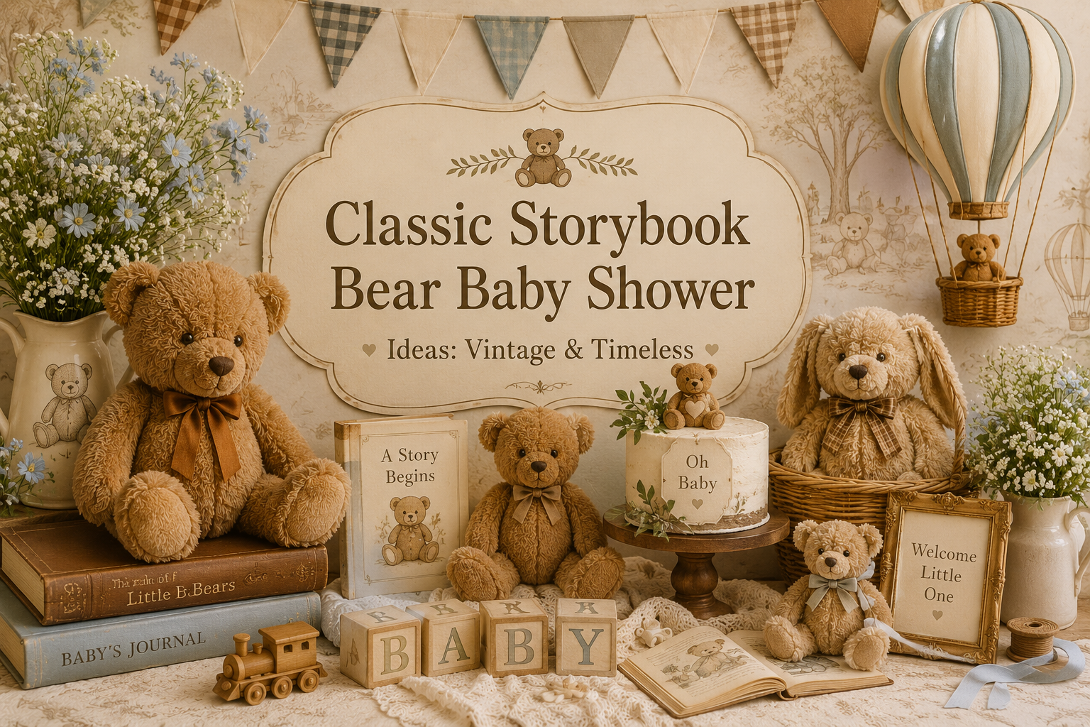
Classic Storybook Bear Baby Shower Ideas: Vintage & Timeless
Classic Storybook Bear Inspiration
Classic Storybook Bear Baby Shower Ideas: Vintage & Timeless
Honey tones, vintage illustration style, and the warm nostalgia of a well-loved children’s book — the aesthetic that never goes out of season.
There is a specific kind of baby shower aesthetic that parents keep returning to — not because it is trending, but because it feels true. It is the aesthetic of a children’s book that has been read so many times the spine has softened: warm honey yellows, gentle creams, the kind of illustration style that looks like it was painted with a fine brush by someone who took their time. It is not a look assembled from a party supply catalogue. It is a feeling — and it is one of the most enduring in the baby shower world.
This guide covers everything that makes the classic storybook bear shower work — the palette logic, the specific details that carry the vintage illustration quality, the decor directions that photograph as beautifully as they feel in person, and the stationery that sets the tone before a guest ever walks through the door.
“Some stories belong to every childhood — and some color palettes belong to those stories in a way that is immediately, universally recognizable.”
Section 01 The Classic Storybook Bear Aesthetic
1.1 What Defines the Look
The classic storybook bear aesthetic is built on four elements that work in specific combination: honey yellow as the dominant accent tone, warm cream as the base that everything rests against, soft red or rust as the accent that adds warmth without loudness, and an illustration quality in every detail that feels hand-drawn rather than digitally produced. It is a palette that exists nowhere in nature but feels entirely natural — because it belongs to a visual memory most people carry without knowing it. The warmth of the honey yellow is not a fashion choice; it is an emotional one. It reads as nourishing, familiar, and gentle in a way that no other yellow quite replicates.
The motif language of this aesthetic is equally specific. Bears appear in a rounded, illustrated form — not sharp or graphic, not photorealistic, but the kind of simplified, warm drawing that a talented illustrator might produce for the opening page of a picture book. Honey pot details, small botanical elements, bees, soft florals in muted tones — these are the supporting motifs. They reinforce the storybook quality without being explicit about it. Together, the palette and the motif language produce a visual world that guests can step into immediately, because they have been there before.
1.2 Why This Aesthetic Has Lasted
The vintage children’s book quality of this aesthetic is not accidental — it is the source of its longevity. Hand-drawn illustration style, warm muted tones, softness over sharpness: these are the visual properties of objects that feel made rather than manufactured. In an era of high-gloss party supply aesthetics and neon balloon arches, the storybook bear shower reads as a deliberate counterstatement. It says that this celebration is not trying to be current; it is trying to be lasting. And because the emotional register it evokes — the specific warmth of a childhood story, a beloved toy, a familiar color — belongs to no single season or trend cycle, it achieves exactly that. Parents who planned their shower in this aesthetic five years ago look at the photos now and see something that has not aged.
1.3 The Storybook Coherence Test
Before purchasing any decoration for this aesthetic, apply three questions. They work as a filter that prevents the storybook bear shower from drifting into something generic.
Question 01
Does it look like it could appear in a vintage children’s book illustration?
A glass honey jar: yes. A shiny foil balloon: no. A woven basket: yes. A plastic centerpiece stand in chrome: no. If the object looks like it belongs in a printed illustration, it belongs in this shower.
Question 02
Is the color warm rather than cool or bright?
Honey, mustard, amber, warm cream, rust, blush: yes. Lemon yellow, sky blue, hot pink, bright white, silver: no. Every color in the frame should sit in the warm half of the spectrum to maintain the storybook register.
Question 03
Does it feel handmade or hand-drawn rather than mass-produced and sharp?
Natural linen: yes. Polyester tablecloth in bright white: no. A kraft paper tag with twine: yes. A printed plastic label: no. The handmade quality is the single most important property of this aesthetic — it is what separates storybook from generic.
Styling Tip
The most common mistake in this aesthetic is introducing bright primary yellow instead of honey or mustard. Bright yellow reads “generic party supplies.” Honey, mustard, and warm amber read “vintage storybook.” The difference is small in description and enormous in the room. When choosing any yellow-toned element — balloons, ribbon, florals, cake frosting — hold it next to something in warm cream and ask whether it looks like it belongs together. If the yellow reads as sharp or electric against the cream, it is the wrong yellow.
Section 02 Palette & Color Story in Detail
2.1 The Honey + Cream Foundation
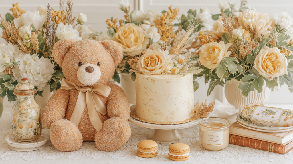
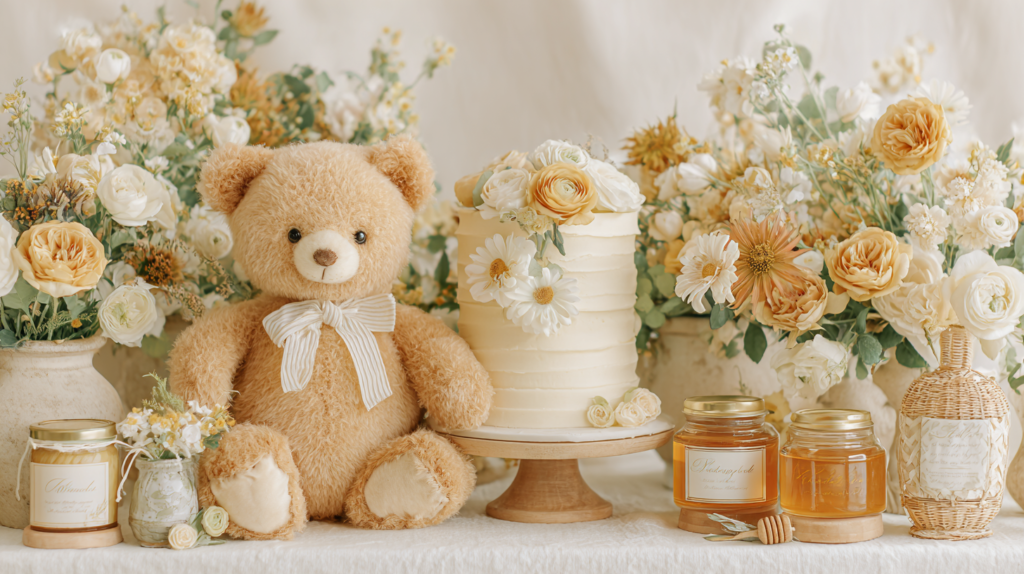
Honey and cream is not a color pairing — it is a temperature. The warmth that honey introduces into a cream-based palette is what makes the storybook bear aesthetic feel enveloping rather than simply pretty. Cream alone reads as neutral; cream with honey reads as golden, held, warm. This is the foundation of the palette and every other decision flows from it. The cream appears in the tablecloth, the cake base, the envelope lining, the backdrop fabric, the favor boxes. The honey appears in the florals, the ribbon, the balloon clusters, the stationery accent tones, and — crucially — in any literal honey pots or jars on the dessert or favor table.
The practical rule for applying this pairing is straightforward: if the overall visual reads as warm ivory with gold-adjacent accents, the foundation is correct. If the room reads as yellow-on-white — too much contrast, too much brightness — the honey tones have been pushed too bright or the cream base has been replaced with a cooler white. Both errors are easy to make and both pull the aesthetic out of the storybook register. The fix is always to bring the base warmer (a true ivory or oatmeal rather than optical white) and to push the yellow accent toward amber (deeper, more golden, less primary).
2.2 Adding Depth: Warm Brown and Vintage Rust Accents
Honey and cream alone produce a palette that is warm and lovely but can tip into flatness if every element sits at the same tonal level. The fix is depth, and depth in the storybook bear aesthetic comes from warm brown and vintage rust — the colors of well-worn leather, dried botanicals, autumn leaves, and aged paper. These tones add shadow and richness to the palette without making it feel heavy or autumnal. The key is proportion: brown and rust sit at the 10% mark, not the 30%. They appear in the ribbon on a favor jar, the ink color on a kraft tag, a single copper candlestick, a cluster of rust-toned strawflowers in the centerpiece. Used at this level, they give the palette the visual complexity it needs to feel curated rather than assembled.
The warm brown also plays a specific functional role in this aesthetic: it is the color of the bear itself. A honey-toned plush bear on a cream tablecloth surrounded by warm honey jar details is the image that anchors the entire storybook aesthetic. The bear’s warmth is what connects the palette to the theme — without it, the honey-and-cream story reads as simply a golden shower rather than a bear-themed one.
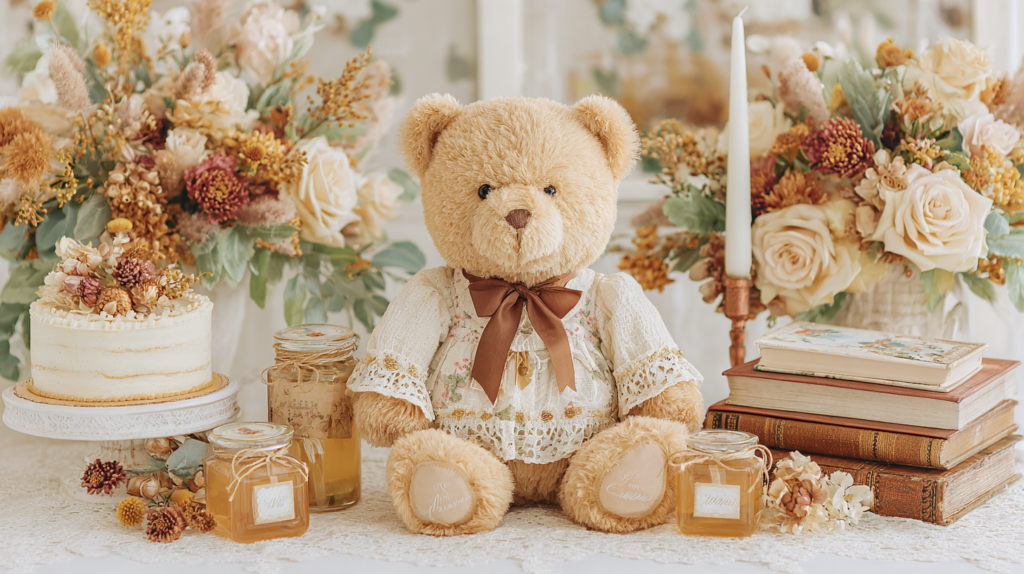
The Brown Bear Baby Shower collection builds the warm-brown palette direction into a complete stationery suite — rich tan and chocolate tones that pair directly with the honey and cream foundation without competing for warmth.
2.3 The Pink Alternative: Blush Instead of Rust for a Girl Shower
The storybook bear palette shifts beautifully toward a feminine register by replacing the rust or warm red accent with dusty blush or soft rose — without changing anything else in the palette. The honey and cream foundation stays exactly as it is; the bear remains warm and golden; the kraft paper and natural textures stay in place. Only the accent color shifts from rust to blush, and the resulting palette reads as unmistakably feminine without tipping into the generic pink-baby-shower territory that has no connection to the vintage storybook aesthetic.
The blush appears in the same places the rust would: the ribbon on the favor jar, a cluster of dried blush roses in the centerpiece, a blush-toned wax seal on the invitation envelope. The honey yellow stays as the dominant accent because it is the color that carries the storybook quality — replacing it with pink would lose the visual anchor that makes the aesthetic immediately recognizable. Blush is the supporting note, not the lead.
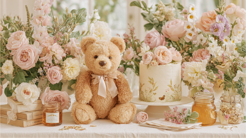
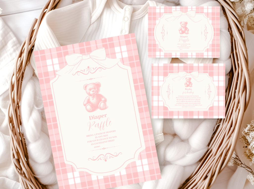
The Pink Teddy Bear collection brings the blush alternative to life in a complete stationery suite — dusty rose and warm cream with bear motifs that stay soft and considered rather than tipping into bright or primary pink.
Styling Tip
Kraft paper is this aesthetic’s secret weapon — kraft tags, kraft-wrapped favors, kraft-background signage all carry the vintage illustration quality built in. No additional decoration required. A simple glass honey jar with a kraft label and twine reads as a complete, styled element on its own. A store-bought favor box in the same color but with a glossy surface loses the handmade quality entirely. The material matters as much as the color. Whenever you are choosing between two options at a similar price point, choose the one that is made of natural material — it will photograph better, feel more intentional, and require less additional styling to look finished.
Section 03 Decor Ideas for the Classic Storybook Bear Shower
3.1 Centerpiece Directions
The centerpiece in a storybook bear shower should feel like a small scene rather than a floral arrangement. The most effective approach clusters three elements at varying heights: a honey jar or small glass vessel as the low element, a plush bear or illustrated bear print as the mid element, and a bud vase or dried botanical sprig as the tall element. The combination creates a still-life quality — as if someone arranged these objects naturally rather than purchasing them specifically for the occasion. This is the visual register the aesthetic is aiming for: the impression of things that simply belong together, gathered in one place.
A stack of vintage-looking hardcover books in coordinating tones — warm tan, cream, dusty yellow — with a small plush bear propped at the top is one of the most photographed centerpiece directions in this aesthetic, and it works because it literalizes the storybook quality in a way that is immediately legible. The books do not need to be bear-related; they need to feel like they belong in a warm, well-read home. Place the stack on a small wood slice and flank with dried botanicals in honey and rust tones to complete the grouping.
For longer guest tables, a repeated centerpiece unit works better than a single statement piece: the same honey jar and bear grouping at every table, with small variations in height and floral composition, creates visual rhythm without monotony. Keep the tallest element consistent across tables — whether that’s a bud vase or a small lantern — and let the supporting elements vary slightly. The consistency of the tallest element is what creates the sense of a designed room rather than individual tables decorated separately.
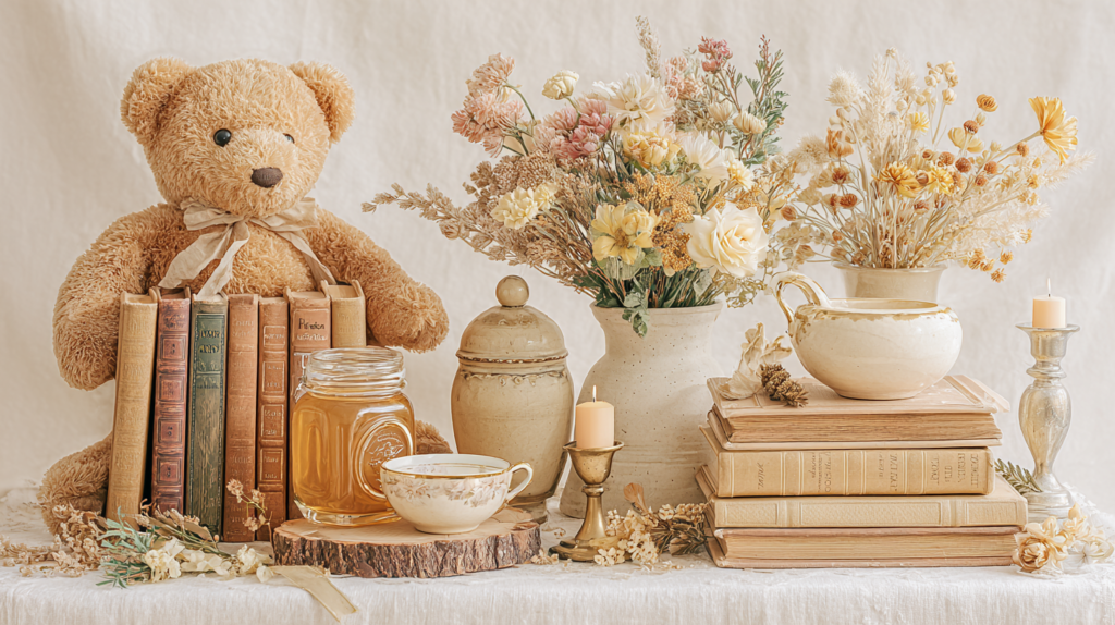
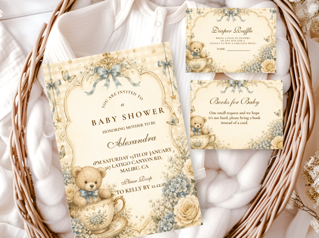
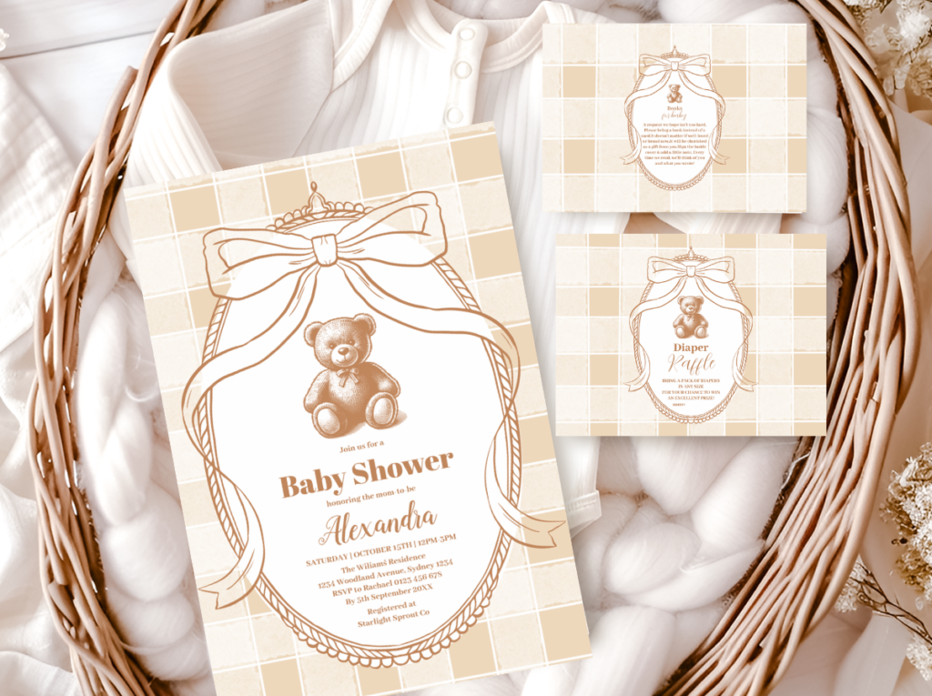
The Vintage Teddy Bear collection brings the illustrated bear and warm-tone stationery into every element of the table — from the centerpiece print to the place card that sits beside it.
3.2 Table Setting Directions
The table setting for the storybook bear aesthetic is built on texture first, then color. An oatmeal or warm ivory linen tablecloth — washed rather than pressed, with a slight imperfection in the weave — is the correct base. This is not a table for crisp white poly-blend linens: those read as catering, not storybook. The linen’s warmth and slight irregularity are exactly what the aesthetic needs as its horizontal surface.
Lay a kraft paper table runner down the center — the same kraft you use for tags and favor wrapping — and place the centerpiece grouping on top of it. The kraft runner ties the table surface into the broader stationery and favor aesthetic in a single material decision. Place settings use warm gold or brass flatware with white or cream ceramic plates; avoid bright silver as it introduces a cool note that fights the honey palette. A kraft place card at each setting, handwritten in warm brown ink, completes the storybook feeling at the individual seat level. The handwriting does not need to be perfect — it needs to feel human.
3.3 Backdrop & Welcome Display
The welcome sign for this aesthetic should look like an illustration pulled from the inside cover of a well-loved book. That means warm cream or aged ivory stock, hand-lettered or vintage-serif typography in warm brown, and a simple bear or botanical illustration that feels drawn rather than digital. Prop it on a natural wood easel at the entrance. Do not surround it with competing elements — the sign is the statement. A single cluster of honey-toned dried botanicals at the base of the easel is enough.
For the backdrop behind the main table or dessert display, a warm-toned balloon arrangement in honey, cream, and amber — with the organic, loose styling that reads as gathered rather than inflated — creates a soft, enveloping background for photos. Balloons in this aesthetic should never be bright or neon; they should look as though they could be the illustration of balloons in a children’s book rather than the balloons themselves. A kraft and twine garland draped across the balloon arch or along the backdrop edge adds the printed-paper texture layer that keeps the visual register consistent with the stationery.
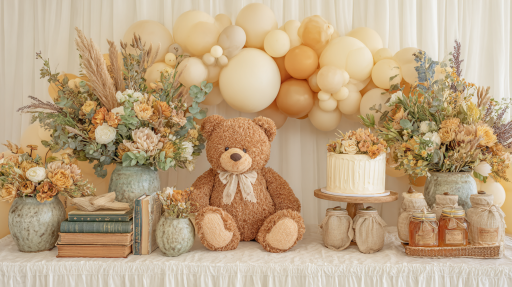
The Neutral Teddy Bear collection offers soft cream and warm ivory stationery with illustrated bear motifs — the natural extension of the welcome display’s aesthetic into every printed element of the room.
3.4 Hot Air Balloon Display as a Storybook Adventure Detail
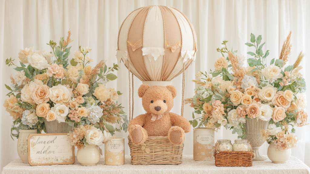
The hot air balloon fits the storybook bear aesthetic in a way that no other motif addition quite does, because it belongs to the same visual vocabulary: the small bear, the soft sky, the sense of gentle adventure that defines the emotional register of the classic illustrated children’s world. A large-scale hot air balloon prop — suspended above the dessert table or positioned at the backdrop — introduces a narrative element that makes the room feel like it is illustrating a story rather than simply decorating for a party.
The palette of the balloon prop should remain in the honey and cream range — warm peach, soft amber, cream, and a single accent of warm sage or dusty blue if additional color is needed. A small plush bear in the basket below the balloon becomes the visual hero of the entire room: the character in the story, the one the baby is being welcomed into. This is the detail that guests photograph, remember, and describe when they talk about the shower later. It is not a trend element; it is a storybook one, which is exactly why it works here.
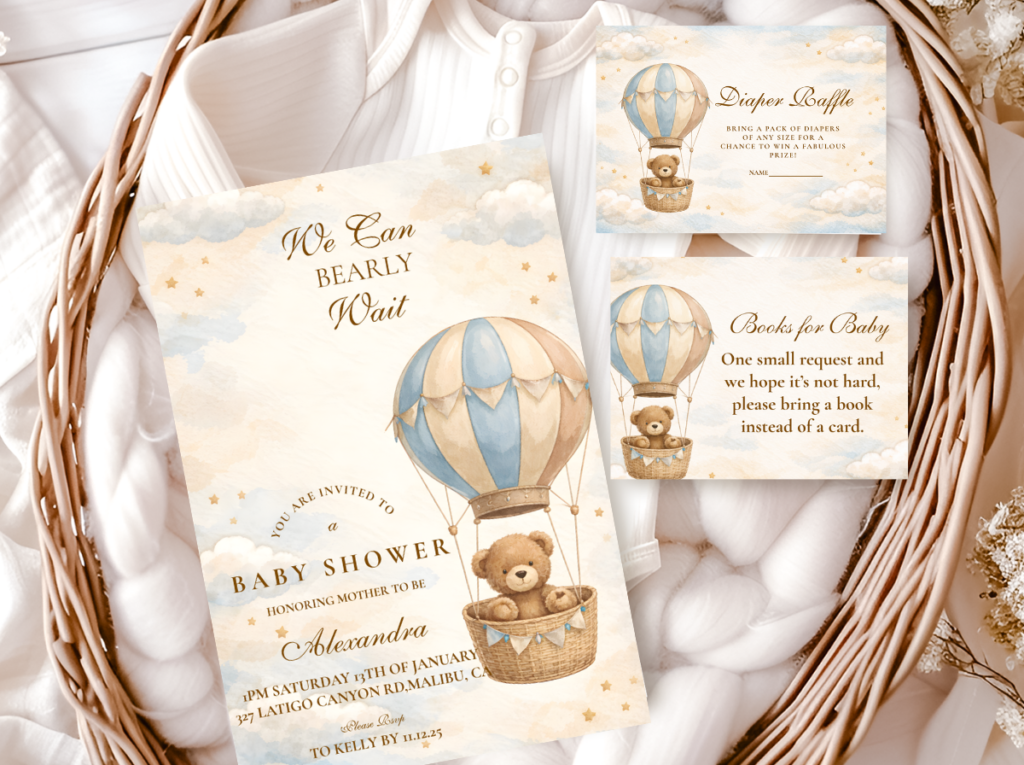
The Bear Hot Air Balloon collection brings the storybook adventure into every printed element — warm sky tones and bear-in-balloon illustration stationery that extends the prop moment into the invitation and table details.
Section 04 Cake & Dessert Table for the Storybook Bear Aesthetic
4.1 Cake Directions: Vintage Illustration-Style Details
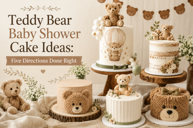
The cake for a storybook bear shower should look like it was baked in a warm kitchen and decorated by hand — not piped with precision on a turntable. The specific details that carry this quality are: a textured buttercream finish in warm ivory or soft mustard yellow (not smooth fondant — the texture is the point); a honey drip in warm amber applied loosely rather than symmetrically; hand-painted botanical or bear details in watercolor-style food coloring rather than icing transfers; and a simple topper that reads as handmade — a plush bear, a small wooden bear cutout, or dried botanicals in honey and rust tones.
When briefing a baker on this aesthetic, the most useful instruction is: “warm, hand-painted, slightly imperfect.” Those three words produce the correct register more reliably than a detailed description of techniques. The honey drip should not be perfectly symmetrical; the botanical painting should have the quality of a sketch rather than a photograph; the buttercream should have texture visible in the final surface rather than the glass-smooth finish of fondant. The slight imperfection is what makes it feel storybook rather than confectionery-shop.
4.2 Dessert Table Styling: Honey Jars, Bear-Shaped Shortbread, Warm-Toned Treats
The dessert table for this aesthetic is built on a color story first. Every element — from the cake base to the smallest cookie — should fall within the honey, cream, and warm brown range. A single bright-colored element breaks the storybook register immediately; the eye goes to it rather than reading the table as a whole. Keep every sweet in the warm tonal range: honey-glazed shortbread in bear shapes, cream cheese frosted cupcakes with honey drip, caramel cake pops in warm brown coating, macarons in dusty yellow and ivory. The treats themselves become part of the color palette of the table.
Height variation is the structural rule for the dessert table display: the cake at the tallest point, cake pops and cupcakes at mid-height on stands, cookies and small jars at the lowest level. Between every tier, small props fill the visual gaps — honey jars, small plush bears, a kraft-labeled jar of shortbread, dried botanicals in bud vases. The kraft labeling on jars is what ties the dessert table into the broader stationery aesthetic; choose labels that match the font and tone of the invitation suite.
Styling Tip
A honey jar as both decor and dessert table element is one of the most cohesive details in this aesthetic — it references the palette, the theme, and the storybook world simultaneously. Style three at varying heights using small risers or upturned books as platforms, label each with a kraft tag in warm brown ink, and tie the neck with a length of natural twine. Place them at the lower level of the dessert table where they anchor the display without competing with the cake above. The jars do double duty as a storybook prop and as a favor guests can take home — one of the rare details that earns its place on two different grounds.
Section 05 Invitations & Stationery
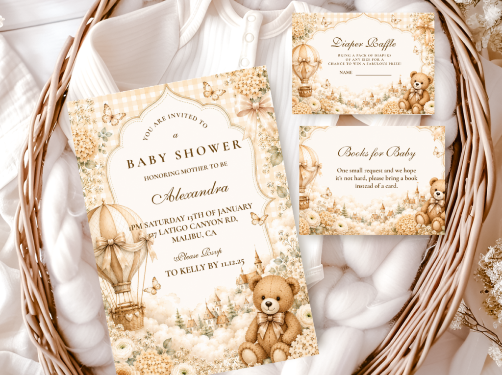
In the storybook bear aesthetic, the invitation is not a formality — it is the opening page. It is the moment a guest encounters the visual world of the shower before they have any other information about it, and it sets an expectation that everything in the room will then either meet or fail. An invitation printed on warm ivory stock with a hand-drawn bear illustration, vintage-feeling serif typography, and honey-tone accents tells the guest exactly what they are walking into: something warm, considered, and genuinely beautiful. An invitation that does not match the aesthetic — bright white stock, digital-feeling fonts, sharp color blocks — creates a dissonance that guests feel even if they cannot articulate it.
The stationery suite for this aesthetic extends well beyond the invitation card. A complete suite includes an envelope with a warm-tone liner (the inside of the envelope is the first thing a guest sees when they open it), a details insert card in matching stock, menu cards for the table in the same typography and bear motif, favor tags in kraft with matching print, and thank-you cards that close the aesthetic loop after the celebration. When every printed element belongs to the same visual family, the shower feels like it was planned by someone who understood that detail is the thing guests remember most clearly and most warmly.
The six collections below represent every direction within the storybook bear world — from the pure vintage illustration warmth of the Vintage Teddy Bear suite to the blush feminine alternative, the grounded warm-brown palette, and the whimsical hot air balloon adventure. Each is designed as a complete print system from invitation to favor tag, so the decision you make at the stationery stage carries through every printed detail of the room without additional sourcing decisions.
Choose the collection that matches your palette direction, then use the stationery as your design anchor — the palette, typography, and bear motif treatment in the invite become the reference point for every other visual decision in the room.
Main Collection
Bear Theme
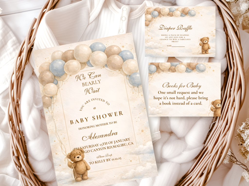
The complete bear stationery range across every palette direction — browse all collections in one place before deciding.
Heritage & Warm
Vintage Teddy Bear
Honey tones, heritage typography, and a hand-drawn bear motif that captures the storybook aesthetic at its most specific and recognizable.
Classic & Timeless
Neutral Teddy Bear
Warm ivory and cream with restrained bear motifs — the most versatile direction for guests who want the storybook quality without a specific palette lock-in.
Grounded & Rich
Brown Bear
Rich tan and chocolate tones that add depth to the honey and cream foundation — the direction that feels most grounded and earthy within the storybook aesthetic.
Soft & Romantic
Pink Teddy Bear
Dusty rose and warm cream with soft bear motifs — the storybook aesthetic shifted feminine without losing the vintage illustration quality that defines the look.
Whimsical & Storybook
Bear Hot Air Balloon
Warm sky tones and bear-in-balloon illustration stationery — the most narrative direction, for showers that want the storybook adventure as a central theme.
Frequently Asked Questions
What colors define the classic storybook bear shower aesthetic?
The four colors that define the classic storybook bear aesthetic are honey yellow, warm cream, soft rust or vintage red as an accent, and warm brown as the grounding tone. Honey yellow is the dominant accent — it appears in the florals, ribbons, balloon clusters, and any literal honey details. Warm cream is the base that everything rests against — the tablecloth, the cake, the invitation stock. Rust or warm red appears sparingly at the 10% level: a flower cluster, a ribbon color, a wax seal. Warm brown is the color of the bear itself, which is also what ties the palette to the theme. The palette works because every tone sits in the warm half of the color spectrum — no cool blues, no bright primaries, nothing that reads as modern or digital. It is an entirely analog color story, and that is precisely what gives it the storybook quality.
How do I make the storybook bear shower feel vintage rather than generic?
The distinction between a vintage storybook shower and a generic bear shower comes down to three things: the specific tone of yellow used, the material choices throughout, and the degree of restraint in the bear motif itself. On yellow: honey and mustard rather than bright primary yellow. The brightness of the yellow is the single most reliable indicator of whether the aesthetic reads as vintage or generic — a slightly deeper, more amber-leaning yellow places the palette in the storybook world immediately. On materials: natural over synthetic, matte over glossy, woven over smooth. Kraft paper, linen, rattan, glass, dried botanicals — these materials carry the handmade quality the aesthetic requires without needing additional decoration. On the bear motif: use it purposefully rather than prolifically. One illustrated bear per printed element; one plush bear as the table focal point; bear-shaped cookies on the dessert table. The moment bears appear on every surface simultaneously, the theme stops feeling curated and starts feeling like a bear-themed party-supply purchase.
What details make the biggest visual impact in this aesthetic?
Three details consistently generate the most comment and appear most in photographs of storybook bear showers. First, the honey jar grouping on the dessert table — three glass jars at varying heights with kraft labels, twine, and real honey — because it simultaneously references the palette, the theme, and the storybook world in one object. Second, the stacked vintage book centerpiece with a plush bear on top, because it literalizes the storybook quality in a way that is immediately legible and photographically distinctive. Third, the welcome sign — an oversized, hand-lettered sign in vintage-style typography on warm ivory stock propped on a natural wood easel — because it is the first visual moment of the celebration and it sets the register for everything that follows. Of these three, the welcome sign has the highest return on investment: one well-designed printed piece creates the entire first impression of the shower.
How do I style the dessert table in the storybook bear aesthetic?
The storybook bear dessert table is built on four rules. First, keep every sweet in the honey, cream, and warm brown tonal range — a single bright-colored element breaks the visual register of the entire table. Second, use height variation deliberately: the cake at the top, cupcakes and cookies at mid-height on stands, small jars and individual sweets at table level. Third, treat the dessert label and tag as part of the stationery suite rather than an afterthought — a kraft tag with the same typography as the invitation links the food table to the rest of the printed aesthetic in one detail. Fourth, include at least one savory detail that belongs to the honey color story — a golden shortbread in a kraft-labeled jar, a honey-drizzled item in a small glass dish — because it extends the palette into the food itself in a way that reads as intentional styling rather than coincidence. The overall goal is a table that looks like it could be illustrated: warm, golden, slightly imperfect, and entirely cohesive.
Ready to Start Planning?
Find Your Storybook Bear Stationery Suite
From invitations to favor tags — the stationery that sets the storybook tone before guests arrive.