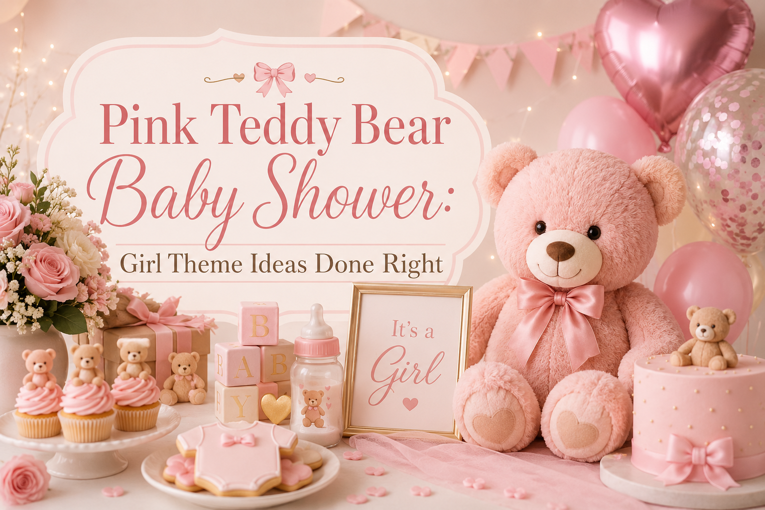
Pink Teddy Bear Baby Shower: Girl Theme Ideas Done Right
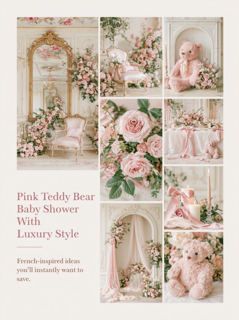
Pink Bear Shower Inspiration
Pink Teddy Bear Baby Shower: Girl Theme Ideas Done Right
Four palette directions, the specific pink that actually photographs beautifully, and the warm anchor that keeps a pink bear shower from reading generic.
Pink and bear is the most saved girl shower combination on Pinterest — and also the one most commonly executed in a way that misses the quality of the images that were saved. The gap between the board and the room is almost always the same issue: the wrong pink. Dusty rose and bubblegum pink are both “pink” in a product description; in a photograph, one reads as soft, romantic, and considered, and the other reads as a party supply store. This guide is about the first kind.
Four pink bear palette directions — from the most-saved blush and cream combination to the romantic pink-and-lavender pairing, the garden party floral direction, and the heirloom vintage register — plus the decor, cake, and stationery decisions that make each one look genuinely beautiful rather than merely pink.
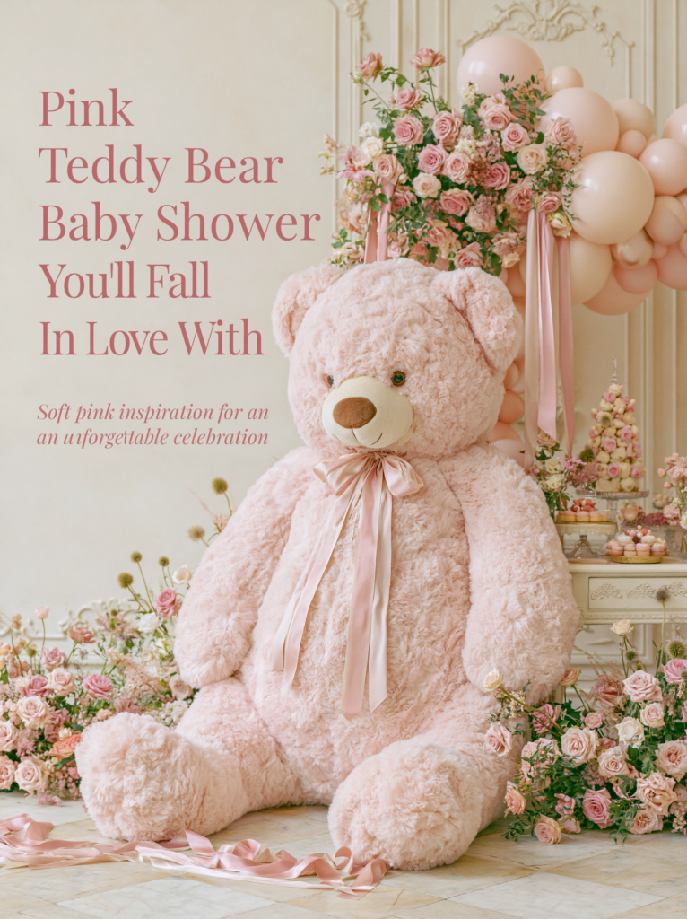
“The difference between a pink shower that feels like a celebration and one that feels like a gift shop is always the same thing: the specific pink, and what sits beside it.”
Section 01 The Problem With Generic Pink
Most pink teddy bear showers that disappoint do so for the same three reasons. None of them are failures of effort or affection — they are failures of three specific decisions that were not made deliberately. Here they are, named clearly, with the fix for each.
Problem 01: The Wrong Pink
The specific shade of pink is the single most consequential decision in this palette, and it is the one most often made by purchasing the first pink item encountered at a party supply store or online retailer. Bright, saturated pink — bubblegum, hot pink, or magenta — reads as a children’s birthday party regardless of how carefully everything else is styled. It is too loud to sit comfortably alongside the warm, soft tones of the bear aesthetic, and it competes with every warm neutral around it rather than harmonizing with it. The bears, the kraft paper, the cream linens, the warm wood details: all of these recede when a saturated pink enters the frame, because the eye goes immediately to the brightest element in the room. When the brightest element is the pink, it is working against the atmosphere rather than contributing to it.
The fix: dusty rose, blush, antique rose, or mauve — pinks that have been softened with either white (blush) or grey-brown (dusty rose, mauve). These are pinks that belong to the warm palette rather than fighting it. They sit beside cream without creating a temperature conflict, they pair naturally with warm honey-brown (the bear’s own color), and they photograph with a softness that saturated pinks eliminate. A simple self-test: if the pink item could appear in a room that also contains a dried floral arrangement and a linen tablecloth without looking out of place, it is the right pink. If it looks like it was bought for a birthday party in a bright hall, it is the wrong one.
Problem 02: No Warm Anchor
Pink — even in its softest dusty rose register — floats without a warm neutral anchor. A palette built entirely in pink tones (blush tablecloth, pink napkins, pink balloons, pink cake) reads as monochromatic and one-dimensional regardless of how carefully the individual elements were chosen. The warm anchor is what gives the pink palette its depth and what keeps the bear theme legible within it: cream, oatmeal, warm ivory, and the honey-brown of the bear prop itself provide the neutral contrast that allows every pink element to read clearly and softly. Without this contrast, the pink tones begin to blend into each other and the palette loses the visual interest that makes it worth photographing.
The fix: warm cream and oatmeal as the base at 60% of the visual palette, with dusty rose or blush at 30%, and a single warm accent (gold, warm brown, or a deeper mauve or terracotta) at 10%. The cream base appears in the linen, the invitation stock, the cake tier, the favor boxes, and the backdrop panel. The pink appears in the florals, the ribbon, the balloon accents, the macaron shells, and the paper napkins. The warm brown appears in the plush bear — which is the detail that ties the palette back to the theme itself and prevents the room from reading as simply a pink event rather than a bear-themed one with a pink palette.
Problem 03: The Wrong Metallic
The metallic accent in a pink palette is the detail most people choose last and most people get wrong. Silver is the default metallic for many pink-themed events — it reads as “pink and silver” in the way that blue and silver, or white and silver, does. But silver is a cool metallic, and pink and cream are warm tones. Silver cools the palette down and introduces a clinical, generic quality that is the opposite of the warmth the bear aesthetic requires. It also signals “standard girl party” in a way that gold does not, because gold is the less expected choice and therefore reads as more considered.
The fix: always gold in a bear shower, never silver. Brushed or matte gold (not high-gloss or shiny) at approximately 10% of the visual palette — a gold envelope liner, a gold wax seal on the favor bag, a gold flatware piece at the place setting, a small gold element in the centerpiece arrangement — warms the pink palette and reads as a deliberate design choice. High-gloss or bright gold should be avoided for the same reason that bright pink should be: it introduces a sharp, reflective element that competes with the softness the palette is built on. Matte gold, brushed gold, or antique gold are the three correct registers for the bear aesthetic.
Styling Tip
Hold your pink elements next to each other before you commit to purchasing them — not individually against a white background or a phone screen, but physically together in your hands or on a table. Blush napkins, dusty rose balloons, and pink macarons can read as three different colors if their undertones do not align. The test is simple: do all of your pink elements lean warm (peachy, salmon, mauve, terracotta-adjacent) or do some lean cool (lavender-pink, magenta, blue-adjacent pink)? Mix warm and cool pinks in the same frame and the palette immediately loses the softness and cohesion that makes the blush bear aesthetic work. Every pink element should pass the same undertone check before it joins the palette.
Section 02 Four Pink Bear Palette Directions
Each direction below uses a specific pink tone, a specific warm anchor, and a specific aesthetic register. They are not interchangeable — choose the one that matches the celebration you want to create.
2.1 Blush & Cream — The Classic Direction
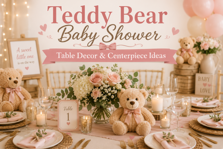
Blush and cream is the most-saved and most versatile pink bear palette on Pinterest, and it works because it is the combination in which the two colors do exactly what the other needs. Blush provides warmth and femininity without loudness; cream provides the ground that gives blush its softness. Together, with warm honey-brown at the 10% accent level (the bear prop, the kraft tag, the ribbon), the palette reads as simultaneously romantic and natural — the specific combination of qualities that makes the bear theme resonate so strongly in its pink expression. The gold metallic accent — a wax seal, a foil-printed favor tag, a brushed gold flatware piece — elevates the palette out of the purely soft register and into something that feels considered and specific.
This direction suits every table shape, every ceiling height, and every aesthetic register from a casual home shower to a formal venue event. It is the direction with the widest guest appeal because the blush and cream palette carries no sharp aesthetic signal — it does not announce an aesthetic school or a strong design opinion. It simply reads as warm and beautiful, which is why it photographs well in any light and why it is the direction most likely to be described by guests in the universal language of “so beautiful” rather than the more qualified language of “I loved the look they were going for.”
The Pink Teddy Bear collection is designed specifically for this direction — dusty rose and warm cream with bear motifs that stay soft and sophisticated rather than tipping into bright or primary pink.
Styling Tip
Blush and cream is the palette that photographs beautifully in any light — morning, afternoon, indoor, or candlelit evening — because neither color has a strong directional quality that reads differently under different lighting conditions. If you are uncertain which of the four pink directions to choose, this is the one that never disappoints in photographs, which is ultimately the record that lasts beyond the day itself. Guests remember the feeling; photographs determine what that feeling is described as afterward. Blush and cream is consistently described as “romantic,” “beautiful,” and “so elegant” — three words that represent the highest possible return on a color decision.
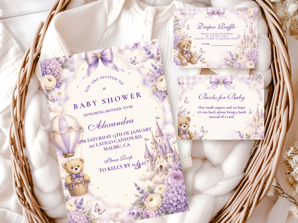
2.2 Pink & Lavender — The Romantic Direction
Blush and soft lavender is the most unexpected and the most romantic of the four pink bear palette directions — and it is consistently one of the most saved combinations on Pinterest because the lavender shifts the aesthetic out of the conventionally feminine and into something that reads as more sophisticated and intentional. The two colors share the same muted, soft quality; they exist in the same tonal register without either one dominating. The result is a palette that feels expansive rather than single-noted — the eye moves between the blush and the lavender in a way that creates gentle variation while maintaining complete cohesion.
The warm anchor in this direction is warm ivory rather than the oatmeal of the blush-and-cream direction — slightly lighter, slightly cooler, which prevents the lavender from tipping into the full pastel rainbow aesthetic and keeps it grounded in the romantic register. The honey-brown plush bear remains the essential warm element: against blush and lavender, the bear reads as both softer and warmer, and its presence immediately grounds the palette in the bear theme rather than allowing it to drift toward a generic floral shower aesthetic. Gold at the accent level — an envelope liner, a favor seal, a small gold foil detail on the invitation — ties the palette together without introducing the warmth of yellow-gold that would conflict with the lavender’s slight coolness.
The Purple Teddy Bear collection brings the lavender side of this direction into stationery — soft purple and warm cream with bear motifs that sit at exactly the muted, romantic register the pink-and-lavender palette requires.
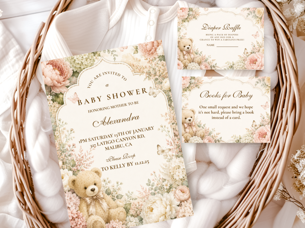
2.3 Pink & Floral — The Garden Party Direction
The pink and floral direction is the most nature-adjacent and the most romantic of the four — it uses fresh or dried botanicals in the shower’s palette tones as both the decorative element and the color carrier, which means the florals are doing the work that balloons, ribbons, and paper goods do in other directions. Dusty rose garden roses, dried blush strawflowers, soft peach ranunculus, and pale green eucalyptus in a loose gathered arrangement introduce the pink and green pairing that makes this direction immediately identifiable as something beyond a standard pink shower. The green botanical element — greenery, fern, dried eucalyptus — is what elevates the pink palette into the garden register and prevents it from reading as indoor and one-note.
This direction suits outdoor or garden settings most naturally, but translates well to indoor spaces when the botanical elements are generous enough to carry the green note throughout the room — a centrepiece, a backdrop garland, and small bud vases of greenery on secondary tables. The pink in this direction should be the most deeply saturated of the four directions, because the green botanical element provides the visual complexity that absorbs a slightly stronger pink without the palette reading as too loud. Dusty rose rather than pure blush; terracotta-adjacent rather than straightforwardly pink at the accent level. The bear prop in warm honey-brown is the single warm element that ties the garden palette back to the bear aesthetic without requiring any additional non-floral decoration.
The Floral Teddy Bear collection pairs the garden party direction with stationery in the same botanical register — soft floral motifs and warm cream tones that connect every printed element in the room to the florals on the table.
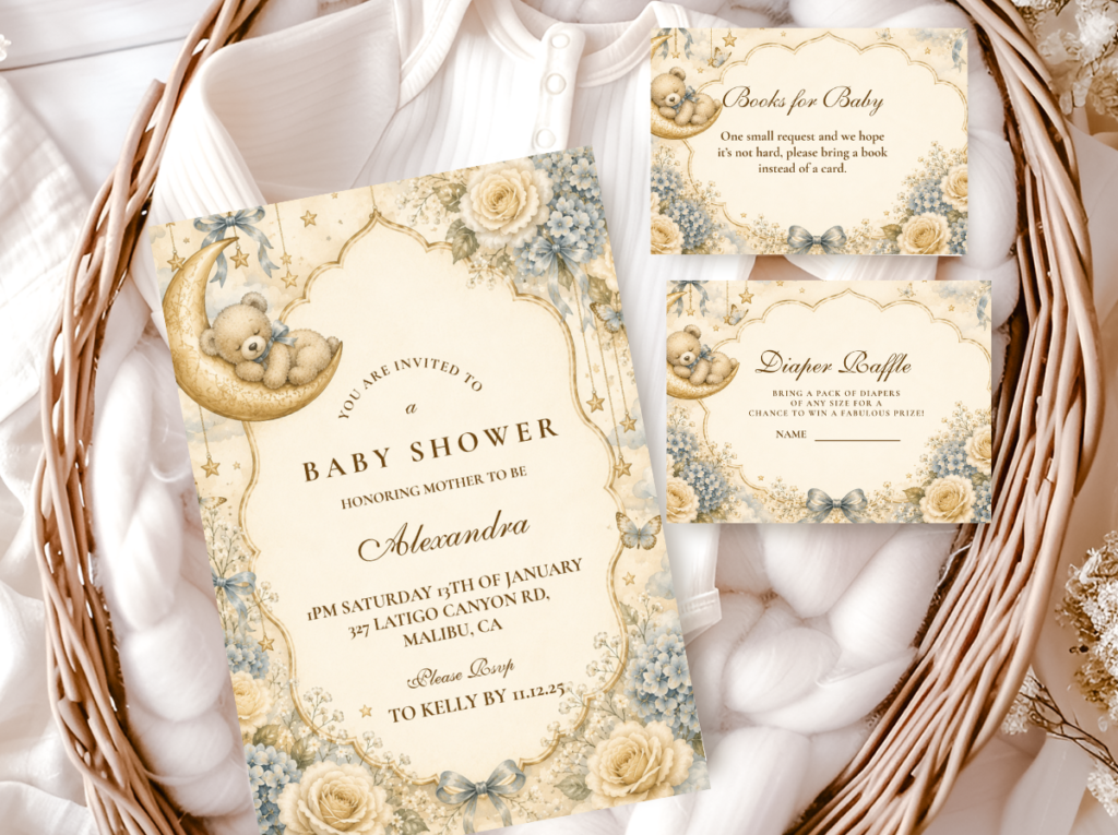
2.4 Pink & Vintage — The Heirloom Direction
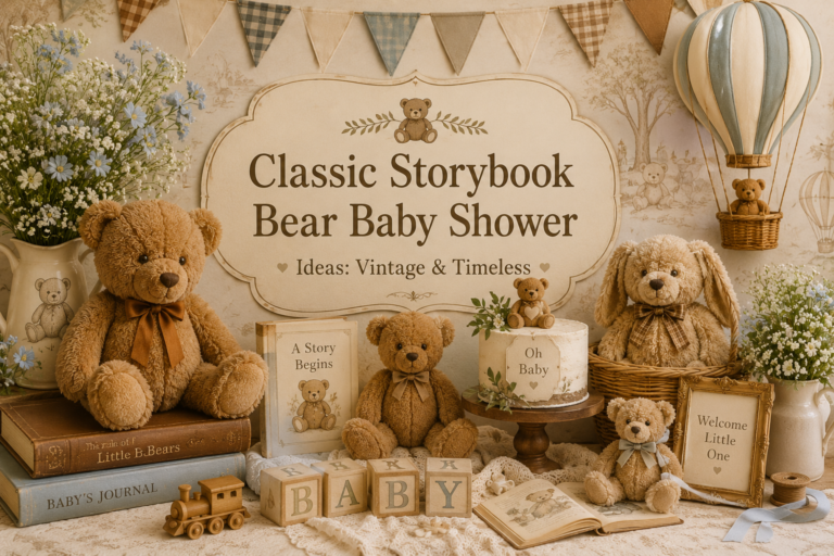
The vintage direction is the most nostalgic and the most timeless of the four — it shifts the pink palette out of the contemporary and into a register that feels like something passed down: an antique rose that has been in the family for decades, a well-loved bear that has softened at the edges. The pink here is antique rose rather than blush — a pink with more depth and warmth in it, sitting closer to the dusty and faded end of the pink spectrum. The warm anchor is honey amber and warm tan rather than neutral cream, which introduces the storybook quality that the vintage aesthetic requires: honey jars, warm wood, aged paper, dried botanicals in amber and rust tones.
The vintage direction works because the antique rose pink and the honey amber warm anchor share the same slightly-aged, muted quality — they look like they have existed for some time rather than having been newly purchased for the event. This is the aesthetic quality that makes the vintage bear shower feel genuinely heirloom rather than simply decorated-to-look-vintage. The stationery in this direction should carry the same vintage illustration quality: hand-drawn bear motifs, heritage typography, warm ivory or aged-parchment stock, and print details that read as crafted rather than digital. A ribbon in antique rose velvet rather than satin, a honey jar with a hand-lettered kraft label rather than a printed sticker: these are the material decisions that maintain the heirloom register throughout every element of the room.
The Vintage Teddy Bear collection brings the heritage register of this direction into stationery — warm honey tones, hand-drawn bear motifs, and typography that reads as storied rather than contemporary.
Section 03 Adding Whimsy — The Cloud & Dream Direction
3.1 Cloud Motifs in a Pink Palette
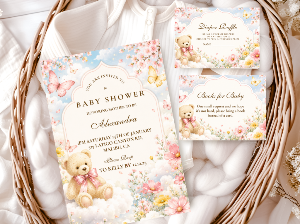
Cloud motifs in a pink bear palette add something none of the four palette directions provide independently: a sense of space and airiness that prevents the pink from reading as heavy or enclosed. White cloud shapes — in balloons, paper installations, or printed as a backdrop motif — introduce a neutral element that floats above the pink palette and gives the eye somewhere soft and open to rest between color moments. In a pink-dominant room, this breathing room is what prevents the aesthetic from tipping from “romantic” into “overwhelming.” The cloud motif also introduces the sky and dream quality that makes the bear-in-a-cloud image one of the most saved in the girl shower category: the bear is no longer simply a prop, but a character in a soft, gentle world.
Cloud motifs work in the blush-and-cream and the pink-and-lavender directions most naturally — the soft sky quality of both palettes makes the cloud element feel like a natural extension of the color world rather than an addition to it. In the garden party and vintage directions, the cloud motif is a less natural fit because those directions are more grounded in texture and earthiness than in sky and airiness. For these directions, consider using cloud motifs selectively — in the invitation illustration or the welcome sign, where they add the dreamy quality to the printed layer without committing to it throughout the three-dimensional room.
The Bear And Clouds collection brings the cloud motif into stationery designed for soft pink and pastel palettes — airy cloud illustrations that complement the blush and lavender directions without competing with either.
3.2 Balloon Styling for a Pink Bear Shower
The organic balloon arch — irregular groupings of different sizes with no visible frame structure, styled in the palette’s warm tones — is the correct balloon treatment for every pink bear direction. The structured, regimented arch (uniform rows, identical spacing, grid-like symmetry) reads as precise and geometric, which conflicts with the softness and natural warmth of the pink bear aesthetic. An organic arch in blush, cream, dusty rose, and a few ivory and white accents reads as gathered rather than constructed, which is exactly the quality the blush-and-cream and vintage directions are building toward.
The color ratio within a pink bear arch: approximately 50% in the base warm tones (cream, ivory, warm white), 35% in the pink accent tones (blush, dusty rose), and 15% in the deeper accent (a slightly richer dusty rose, a warm mauve, or a single deeper pink that reads as a shadow tone). This ratio prevents the arch from reading as all-pink — which tips it toward bubblegum — while ensuring the pink reads as the dominant aesthetic direction. Cloud-shaped balloon additions, positioned at varying heights within or above the arch, add the dreamy quality of the cloud direction without requiring a separate installation.
Styling Tip
A single oversized blush balloon cluster above the gift table costs less than almost any other decoration in the room and does more visual work per dollar than most. Three oversized balloons — one blush (approximately 36 inches), one dusty rose (approximately 24 inches), and one ivory (approximately 18 inches) — held at varying heights with a length of satin ribbon tail, is a complete gift table decoration. No frame, no stand, no balloon strip, no additional investment. The three size variations create the height difference that makes the cluster read as designed rather than placed, and the ribbon tail gives guests something to look at below the balloon line that creates a visual anchor to the table below. Total cost for three oversized balloons with ribbon: typically less than any store-bought decoration of equivalent visual impact.
Section 04 Decor, Cake & Table Notes for the Pink Bear Shower
4.1 Centerpiece Direction Adapted for Pink Palettes
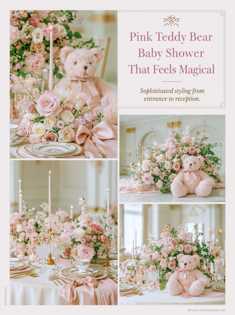
The pink palette centerpiece works best with a white ceramic or clear glass vessel — surfaces that do not add color to the arrangement and allow the blush or dusty rose florals to read clearly against the warm cream linen. The bear prop in any pink centerpiece should be in warm honey-brown; a pink or white bear disappears into the palette and loses the warm-cool contrast that makes it the visual focal point of the grouping. A single gold element — a small gold candle holder, a gold-rimmed ceramic — at the mid zone introduces the metallic accent note that lifts the centerpiece out of the purely soft register.
4.2 Cake Direction for the Pink Bear Shower
The specific combination that works for the pink bear cake is a warm ivory or cream base buttercream with dusty rose accent — not a fully pink cake, which tips the dessert table toward monochromatic in the same way a blue cake tips a blue palette. The honey-brown bear topper or a cluster of dried blush roses at the base of the top tier is the bear-specific element; a honey amber or gold drip at the top tier connects the cake to the warm metallic accent throughout the room. The specific combination to avoid: bright pink buttercream on white fondant, which reads as the generic girl celebration cake rather than a considered bear shower aesthetic.
4.3 Table Linen Direction
Warm ivory linen — not pink linen, not bright white — is the correct base for every pink bear palette direction. Pink linen on a pink-dominant table doubles the primary color and eliminates the contrast that allows each pink element to read clearly and softly. Bright white linen introduces a cool ground temperature that fights the warmth of the palette. Warm ivory linen provides the neutral that lets every pink element breathe: the blush napkins read as pink rather than as the same color as the tablecloth; the dusty rose florals glow against the ivory ground rather than receding into it. The linen is not a decorative element — it is the canvas on which every decorative element performs, and it performs best when it stays warm, neutral, and unobtrusive.
Section 05 Invitations & Stationery
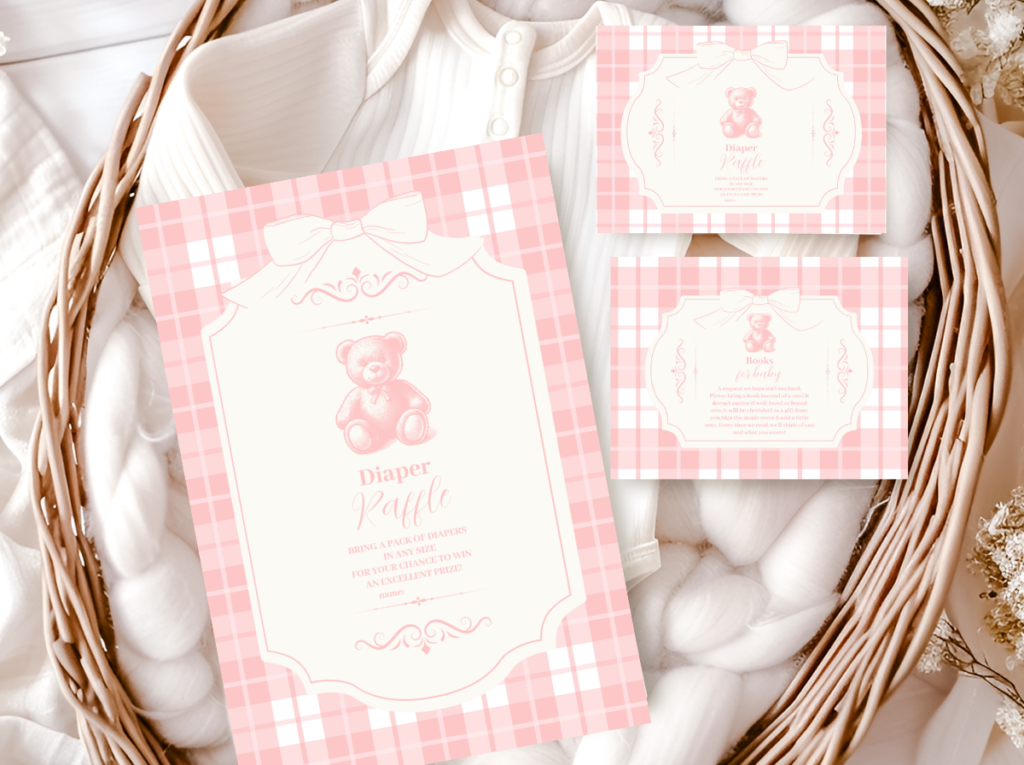
The invitation is the first moment the pink palette makes its impression — before the room, before the balloons, before the florals and the cake. A dusty rose illustration on warm ivory paper stock, a bear motif in honey-brown, typography that reads as romantic and considered rather than printed from a template: this is what creates the expectation that the room will match. When the invitation establishes the correct register of pink — muted, warm, soft — every guest arrives knowing what kind of celebration they are walking into. When the invitation is in the wrong pink register (too bright, too saturated, too generic), the disconnect between the paper and the room is the first impression that requires recovering from.
The stationery suite is also the most practical palette management tool available. The printed invitation becomes the reference object for every subsequent purchase decision: hold the potential balloon, fabric, macaron, or ribbon next to the invitation and check whether the pink tones align. This is the most reliable implementation of the warm-undertone check from Section 01, because the invitation carries the correct pink in a consistent, physical form throughout the planning process. When the printed pink matches the room pink, the celebration reads as complete and intentional from the first envelope to the last moment of the event.
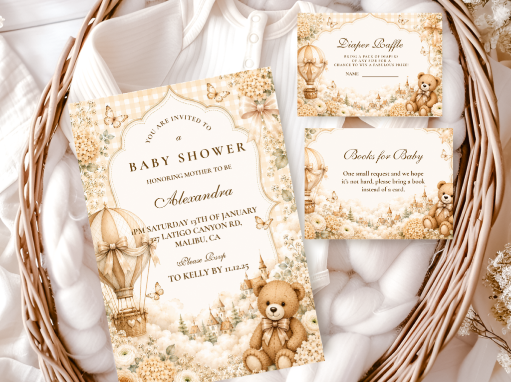
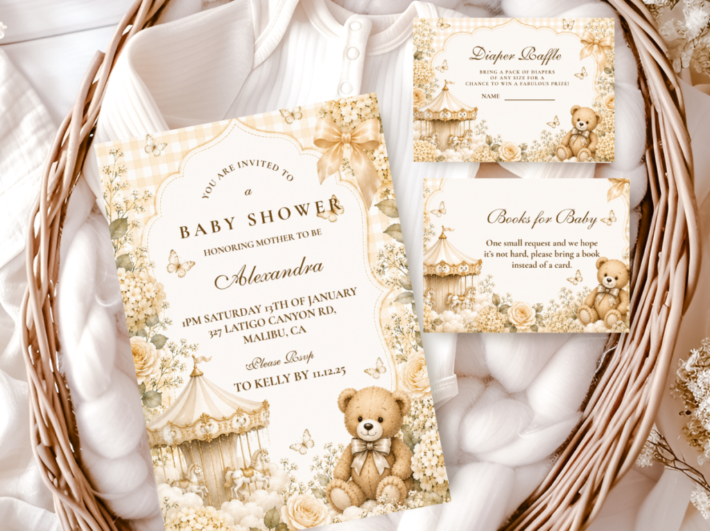
The six collections below cover every direction in this guide. The Pink Teddy Bear suite for the blush-and-cream classic direction; the Purple Teddy Bear suite for the romantic pink-and-lavender direction; the Floral Teddy Bear suite for the garden party direction; the Vintage Teddy Bear suite for the heirloom direction; and the Bear And Clouds suite for the cloud and dream whimsy direction. The Bear Theme catalogue brings all collections together for hosts still exploring their options before committing to a palette direction.
Each collection links to the full product range for that aesthetic — invitation, envelope liner, favor tag, menu card, place card, and thank-you card — designed as a complete suite from the first printed communication to the last. Choose the collection that matches your palette direction and let the stationery become both the aesthetic anchor and the palette reference for the room.
Main Collection
Bear Theme
Browse all bear stationery directions together before committing to a palette or aesthetic.
Classic Direction
Pink Teddy Bear
Dusty rose and warm cream — the most-saved pink bear stationery direction, most versatile across any event format.
Romantic Direction
Purple Teddy Bear
Soft lavender and warm cream — the romantic direction that shifts the pink palette toward the sophisticated and unexpected.
Garden Party Direction
Floral Teddy Bear
Botanical motifs and warm cream — the stationery pair for the pink and floral garden party direction across any event setting.
Heirloom Direction
Vintage Teddy Bear
Honey tones and heritage bear motifs — the stationery pair for the antique rose and vintage heirloom direction.
Cloud & Dream Direction
Bear And Clouds
Soft cloud illustrations and pastel tones — the stationery pair for the dreamy whimsy direction in blush and lavender.
Frequently Asked Questions
What shade of pink works best for a girl bear shower?
Dusty rose and blush are consistently the most successful shades for the pink bear shower aesthetic. Dusty rose — sometimes called antique rose or muted rose when it sits in the deeper end of the dusty spectrum — has warmth and depth that allows it to pair with honey-brown and gold without conflict, making it the most versatile of the two for the full range of pink bear directions. Blush — a lighter pink leaning toward pale peach — photographs with the softest quality of any pink and performs especially well in the flat lay format, which is why it dominates the Pinterest imagery for this category. Both are warm-undertone pinks: they lean toward peachy or salmon rather than toward cool lavender or magenta. The pinks to avoid are any that have a cool or blue-adjacent undertone — these fight with the warm base of the bear palette and produce the generic result that the dusty and blush directions prevent.
How do I keep pink from feeling too sweet or generic?
The three decisions that prevent “sweet and generic”: the specific pink shade (dusty and muted rather than bright and saturated), the warm anchor (cream, oatmeal, and honey-brown at 60-70% of the visual palette, so the pink is an accent rather than the dominant), and the metallic (matte gold rather than silver or bright metallic). Beyond these three, the material choices do significant work: natural linen, rattan, dried botanicals, warm wood, and kraft paper all carry the bear aesthetic’s organic quality and prevent the pink from reading as a party supply palette. The moment natural materials enter the frame alongside the pink, the aesthetic shifts from “pink event” to “pink bear shower” — a meaningfully different visual register. The bear prop in warm honey-brown is the one element that most reliably performs this shift even in the absence of other natural materials, because the warmth of the bear’s own color grounds the pink palette in a way that no other single decoration achieves.
What colors pair best with pink in a bear theme?
Four pairings work consistently well with pink in the bear palette. Warm cream and ivory — the most universally compatible; works across all four pink directions and photographs in any light. Soft lavender — the most romantic and unexpected pairing; produces a palette that reads as sophisticated rather than conventionally pink. Warm honey-brown — supplied by the bear prop itself; the pairing that most clearly identifies the shower as bear-themed rather than simply pink. And soft sage or eucalyptus green — the pairing that moves the palette toward the garden direction and reads as most nature-forward. The pairings to avoid with pink in a bear shower: bright white (too cool), bright yellow (too primary), silver (too cold), and turquoise or teal (too contemporary and at odds with the warmth the bear aesthetic requires). When in doubt: warm cream at 60%, the pink direction at 30%, and one warm accent (gold or honey-brown) at 10% — this ratio works for every pink bear direction without exception.
Can a pink bear shower work for a gender-neutral aesthetic?
Yes, in its most muted form. The blush-and-cream direction — particularly when the blush is very light and the cream is very warm — reads as simply “warm and beautiful” to many guests rather than as a gendered aesthetic statement. The key is the proportion: when cream is dominant at 70% or more and blush appears as a light accent rather than the primary palette tone, the overall visual reads as neutral and warm rather than distinctly pink. The natural materials help further: a room of warm linen, dried botanicals, rattan, and wood with a small blush accent reads as organic and considered rather than pink. The bear element — in warm honey-brown — is the primary gender signal in this setup, and the bear is a universally warm and nostalgic object rather than a coded one. If the goal is a pink-adjacent shower that feels inclusive and beautiful for any baby or any guest list, the blush-and-cream direction at high cream proportion is the most reliable choice.
Ready to Start Planning?
Find Your Pink Bear Shower Stationery Suite
The palette reference that makes every other pink decision in the room easier.