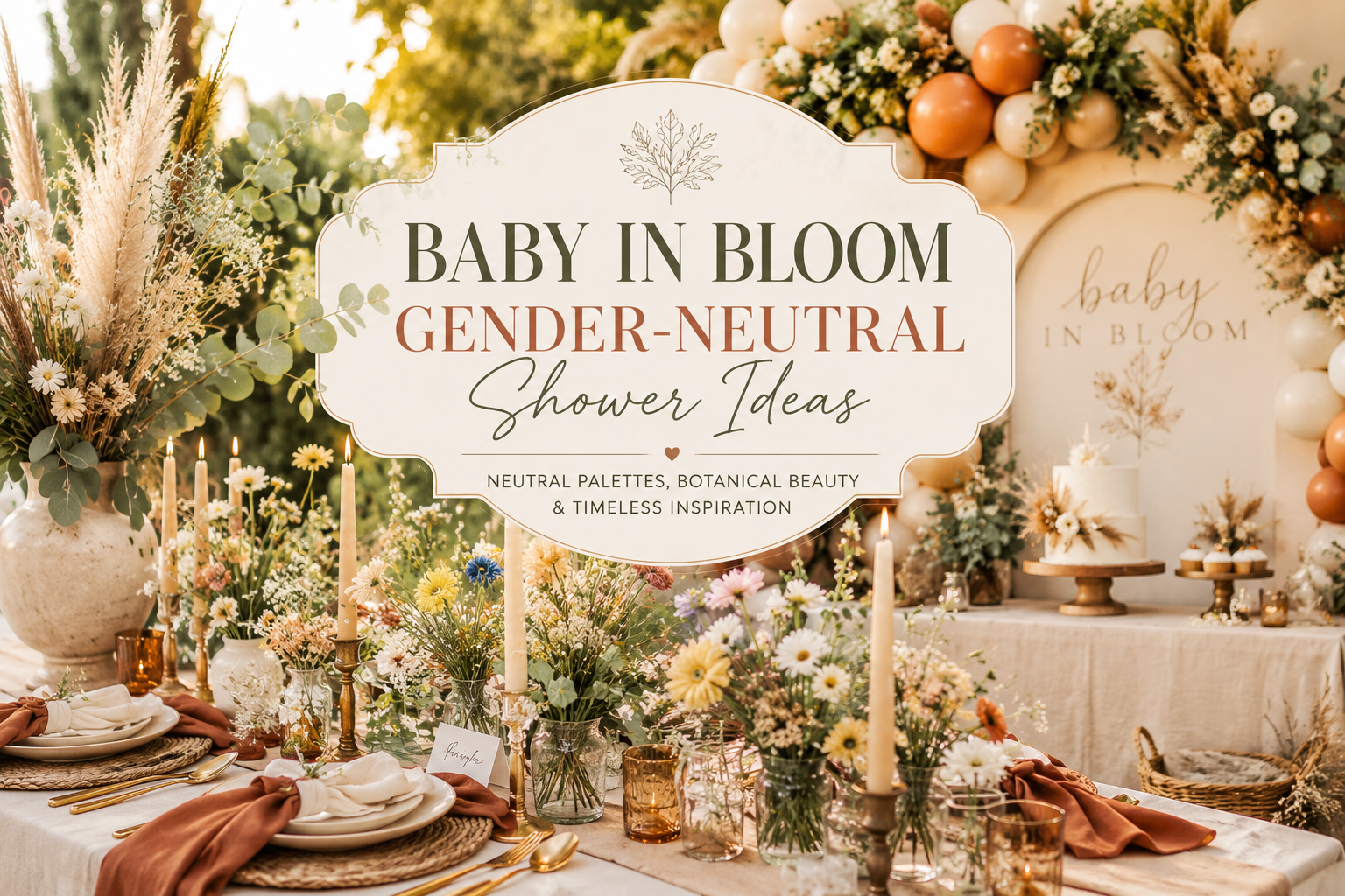
Baby in Bloom Gender-Neutral Shower Ideas
Baby in Bloom · 2026
Baby in Bloom Gender-Neutral Shower Ideas
Whether you don’t yet know the baby’s gender or simply want to skip pink-versus-blue altogether, the bloom theme adapts into something genuinely beautiful — not a compromise between two other options.
A baby in bloom gender-neutral shower doesn’t need a stand-in color to feel complete — it leans on texture, greenery and warm botanical tone instead, and the result is every bit as considered as any other direction in this theme. This guide focuses on exactly that: the philosophy behind a genuinely neutral palette, a close look at the terracotta and warm botanical direction, a whimsical wildflower alternative, and how to keep the whole look rich and elevated rather than flat.
Greenery and warm botanicals don’t need a color cue to feel complete. Texture, abundance and warmth speak for themselves — a room can feel entirely finished without ever answering the pink-or-blue question at all.
Section 01
Why Botanical-Neutral Works for Any Baby
A genuinely neutral baby in bloom shower isn’t built around finding some compromise color halfway between pink and blue — it’s built around a completely different design principle, where texture, greenery and warm earth tones carry the visual interest instead of any single gendered color cue. This isn’t a scaled-back version of the theme; it’s simply a different and equally complete way of expressing the same botanical idea.
The shift in approach is straightforward: where a pink or blue direction leans on one dominant bloom color to establish its identity, a neutral direction leans on variety — different greens, different textures, the warm range of terracotta and rust and cream that a garden offers without any single flower needing to announce the palette on its own. This is, if anything, a more sophisticated styling challenge than choosing a single bloom color, and the result reads as genuinely elevated precisely because it depends on layering rather than a single obvious cue.
Section 02
The Terracotta & Warm Botanical Palette in Detail
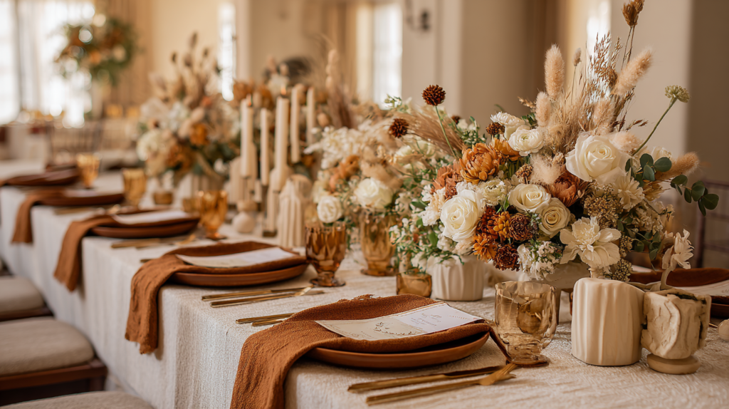
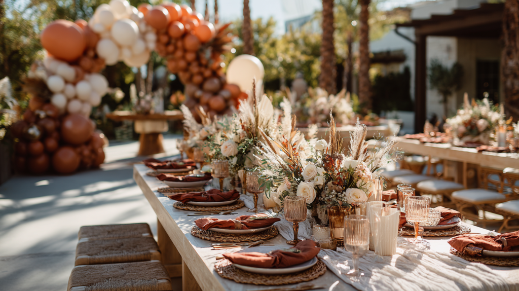
Terracotta, rust and deep green, anchored by warm ivory and antique gold, form the core palette — earthy and warm rather than pastel, which is exactly what makes it read as genuinely neutral rather than a diluted version of a gendered palette. This is the most fully developed neutral direction within the bloom theme, with the same one-dominant-tone-plus-green-plus-gold logic that runs through every other palette, just built around warm earth rather than a single bloom color.
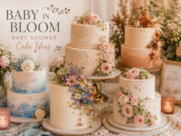
On invitations, terracotta and dried-botanical illustration work beautifully against warm ivory card stock, with the same restrained, asymmetric placement that suits every direction in this theme — a single anchor of botanical detail rather than a busy, fully patterned card. On table linens, warm ivory or cream as the base with terracotta appearing in a runner or napkin keeps the palette feeling grounded rather than overwhelming. On the cake, a warm ivory or terracotta-toned buttercream base topped with dried botanicals or a wheat stalk reads as genuinely sophisticated, and it has the practical advantage of dried elements holding their shape and color for the full length of the party.
Matching Stationery
The Terracotta Floral Baby in Bloom collection is the primary featured palette for a gender-neutral shower — the same warm, earthy tones carried from the invitation suite through every printed detail. Fully customizable with the parents’ names, date, and shower details.

Section 03
Leaning Into Greenery & Texture Over Color
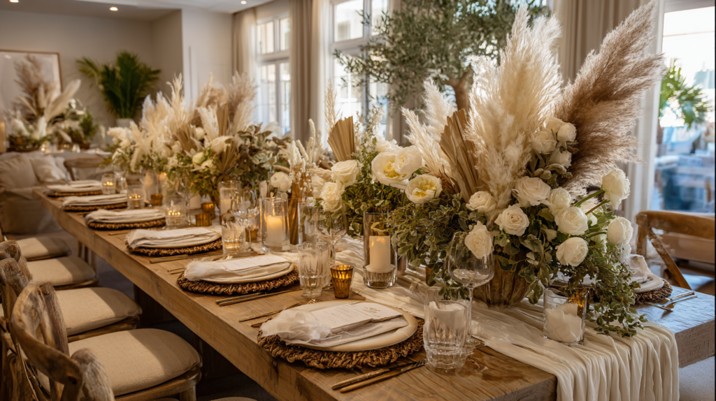
Sage, eucalyptus and dried grasses should form the genuine backbone of a neutral celebration’s styling — not a supporting role behind a dominant bloom color, but the primary material every arrangement, garland and centerpiece is built from. Where other directions in this theme use roughly equal or two-thirds-greenery ratios, a fully neutral palette can lean even further into green and texture, since there’s no single bloom color competing for the eye’s attention.
Layer at least three distinct textures in any given arrangement: something fine and delicate (small ferns, trailing jasmine vine), something structural (eucalyptus, magnolia leaves), and something dried or textural (pampas, wheat, dried grasses). This variety is what does the work that color alone does in other directions — the eye reads richness and intention through texture rather than through a recognizable bloom hue.
A small amount of warm cream or ivory bloom — ranunculus, garden roses in their palest form — can be woven through for softness without introducing anything that reads as gendered, since cream and ivory sit outside the pink-or-blue color logic entirely while still adding genuine floral warmth.
Section 04
A Whimsical Alternative: Wildflower Meadow for a Neutral Shower
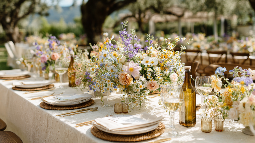
For hosts who want more color variety than the warm-earth terracotta direction offers, Wildflower Meadow is a genuinely neutral alternative within this theme — its multicolor, just-picked mix of blooms doesn’t code toward pink or blue at all, since the whole point of the palette is variety rather than any single dominant hue. A meadow doesn’t ask whether a baby is a boy or a girl, and neither does this direction.
This direction suits a host who wants the neutral shower to feel playful and abundant rather than quietly restrained — a genuinely different mood from the terracotta direction’s grounded warmth, while remaining equally free of any gendered color cue. The loose, gathered quality of the wildflower palette also means individual blooms can lean slightly pink or slightly blue here and there without the overall effect ever reading as one or the other, since the mix itself is the point.
Matching Stationery
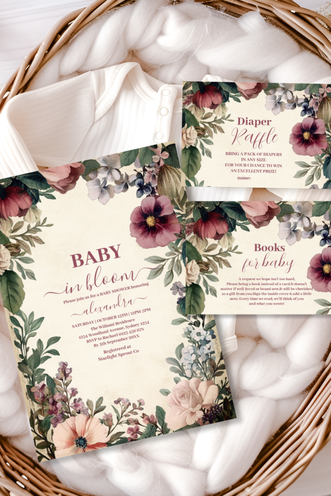
The Baby in Bloom Spring Wildflower collection — the same loose, multicolor botanical illustration carried from the invitation suite through every detail. Fully customizable with the parents’ names, date, and shower details.
Section 05
Quick Decor Touches Adapted for Neutral Palettes
Table settings, centerpieces and backdrops each have plenty of dedicated styling depth elsewhere; here, simply note how the terracotta and wildflower directions adapt into those existing approaches. For table settings, warm ivory or cream linen with terracotta or rust accents (or a mixed wildflower napkin tying) replaces any pink or blue choice, following the same layering principles already covered for any direction. For centerpieces, lean even further into the greenery-and-texture ratio from Section 03 above than other directions in this theme typically call for. For a backdrop or arch, the same flower-wall or balloon-and-floral combination approaches used elsewhere in the theme work identically here, built from dried botanicals, eucalyptus and warm rust tones, or a genuine wildflower mix, rather than any single gendered bloom color.
Section 06
Keeping It Elevated, Not Generic “Neutral Beige”
Gold accents matter even more in a neutral palette than in any other direction in this theme — without a bloom color to provide visual interest on its own, the warm metallic thread running through stationery, candle holders and table details becomes one of the few consistent design elements tying the room together, and skipping it is the single most common reason a neutral palette ends up reading as flat.
Varied texture, covered in depth in Section 03, is what prevents “neutral” from collapsing into “beige and boring” — a room with only smooth, flat, similarly toned surfaces genuinely does read as bland, while the same warm palette built from dried grasses, glossy eucalyptus, matte ceramic and woven natural fiber reads as rich and intentional. Texture is doing the job that color does in other directions, and it needs to be applied with the same level of care.
Avoid the most common mistake that pulls a neutral shower toward genuinely flat territory: choosing a single muted tone and repeating it everywhere with no textural or tonal variation at all. A genuinely successful neutral palette has real depth — darker and lighter values of the same warm tones, several distinct greenery textures, and the gold thread tying it together — rather than one safe, uniform shade applied across every surface.
Invitations & Stationery
Invitations & Stationery
The invitation is where a guest first sees that this celebration has skipped the pink-or-blue question entirely, and it sets the same warm, textured, genuinely considered tone the rest of this guide is built around. A terracotta or wildflower invitation tells guests immediately that the shower won’t be a watered-down version of a gendered palette but a genuinely different and equally beautiful direction in its own right.
It’s worth remembering that Blush & Sage, Dusty Blue and Heirloom Blush, while leaning more conventionally toward a girl or boy direction, can also work beautifully for a neutral shower when styled with the same greenery-forward, texture-rich principles covered in this guide — sage and cream from the Blush & Sage suite, for instance, used without much blush at all, reads as genuinely neutral in its own right. None of the six collections in this theme are rigidly fixed to one gender; the styling choices around them are what determine the final tone.
All six collections below are fully customizable with the parents’ names, date, and every shower detail.
Shop the Collections
Six Baby in Bloom Stationery Collections
Baby in Bloom
The complete collection — every palette and style within the broader theme in one place.
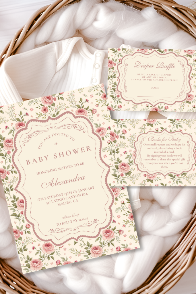
Terracotta Floral Baby in Bloom Shower
Warm terracotta and burnt orange tones — the primary featured palette for a gender-neutral shower.
Baby in Bloom Spring Wildflower
Multicolor, just-picked wildflower brights — a whimsical alternative that never codes toward pink or blue.
Blush Sage Rose Arch Baby Shower
Soft blush roses against muted sage greenery — leans neutral beautifully when styled mostly in sage and cream.
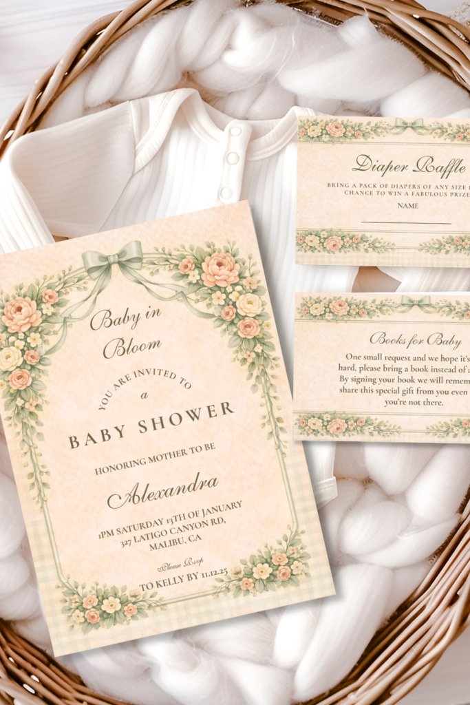
Dusty Blue Rose Arch Baby Shower
Cool, fresh dusty blue blooms — a beautiful option for any shower, neutral included.
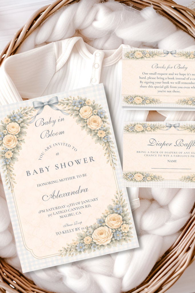
Soft Blush Floral Heirloom Baby Shower
Gentle, vintage-inspired blush florals — timeless and adaptable to a softly neutral celebration.
Frequently Asked Questions
Common Questions
How do I plan a shower without knowing the baby’s gender?
Start with the terracotta or wildflower direction from Sections 02 and 04 above, and build every other decision — invitations, linens, the cake — around that palette rather than trying to find a color that works for either outcome. As covered in Section 01, a genuinely neutral shower isn’t a compromise between pink and blue; it’s its own complete design direction, which makes the planning process simpler rather than more complicated once you commit to it.
Are there neutral palette ideas beyond yellow and green?
Yes — terracotta and warm earth tones, as detailed in Section 02 above, offer a genuinely different neutral direction from the more conventional yellow-and-green combination many hosts default to. A multicolor wildflower mix, covered in Section 04, is another option that skips yellow-green entirely in favor of genuine variety. Both feel considerably more distinctive than the most common neutral baby shower palette.
Does neutral mean boring?
Not when it’s built with genuine texture and a consistent gold thread, as covered in Section 06 above. The most common reason a neutral palette reads as flat is repeating one safe, uniform tone everywhere with no variation — the fix isn’t adding a gendered color back in, it’s layering more texture, depth and warmth into the palette that’s already there. A well-styled neutral shower is genuinely richer in detail than many single-color palettes, not less.
How do I add personality without a pink or blue cue?
Lean on texture variety (Section 03), a consistent gold metallic thread (Section 06), and the choice between the grounded terracotta direction or the playful wildflower direction (Sections 02 and 04) to express the host’s own taste rather than a gender cue. Personality in this palette comes from how richly layered the greenery and warm tones are, not from a single standout color — which, if anything, gives a host more genuine room for personal style than a conventional pink or blue palette does.
Baby in Bloom · 2026
Find Your Botanical-Neutral Palette
Fully customizable soft floral stationery — add the parents’ names, date and shower details online.