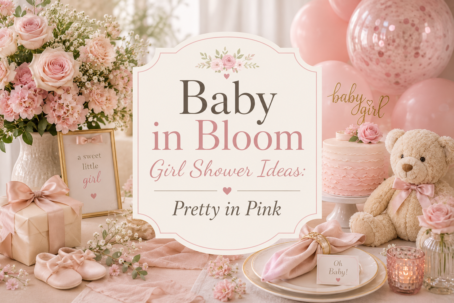
Baby in Bloom Girl Shower Ideas: Pretty in Pink
Baby in Bloom · 2026
Baby in Bloom Girl Shower Ideas: Pretty in Pink
Pink doesn’t have to mean overly sweet — here’s how to keep a girl-themed bloom shower romantic, botanical, and genuinely elevated.
A baby in bloom girl shower can lean fully into pink without ever tipping into candy-shop territory — the difference is almost entirely in how much green sits alongside it. This guide focuses on exactly that balance: why blush and greenery work so well together, a close look at the blush and sage palette, a softer vintage alternative, and how to keep the whole look feeling romantic and grown-up rather than generically sweet.
Soft pink against real greenery looks like a garden caught mid-bloom. Soft pink against more pink looks like a candy shop. The flowers haven’t changed — only what’s standing next to them.
Section 01
Why Pink & Botanical Works for a Girl Shower
Pink is a styling choice within the bloom theme, not a requirement — plenty of hosts choose it for a girl shower because blush genuinely is one of the most beautiful tones a garden produces, not because pink is the only option on the table. What keeps it from tipping into overly sweet territory has very little to do with the pink itself and almost everything to do with what surrounds it.
Balancing pink with a genuine amount of sage greenery is the single principle that keeps this palette elegant rather than one-note: a room built almost entirely from pink, in matching shades layered on top of each other, reads as a candy shop or a children’s party rather than a garden. The same blush tones, set against real green — sage, eucalyptus, soft leafy stems — read as a genuine botanical celebration instead, because the contrast does the work that pink alone can’t do by itself.
Section 02
The Blush & Sage Palette in Detail
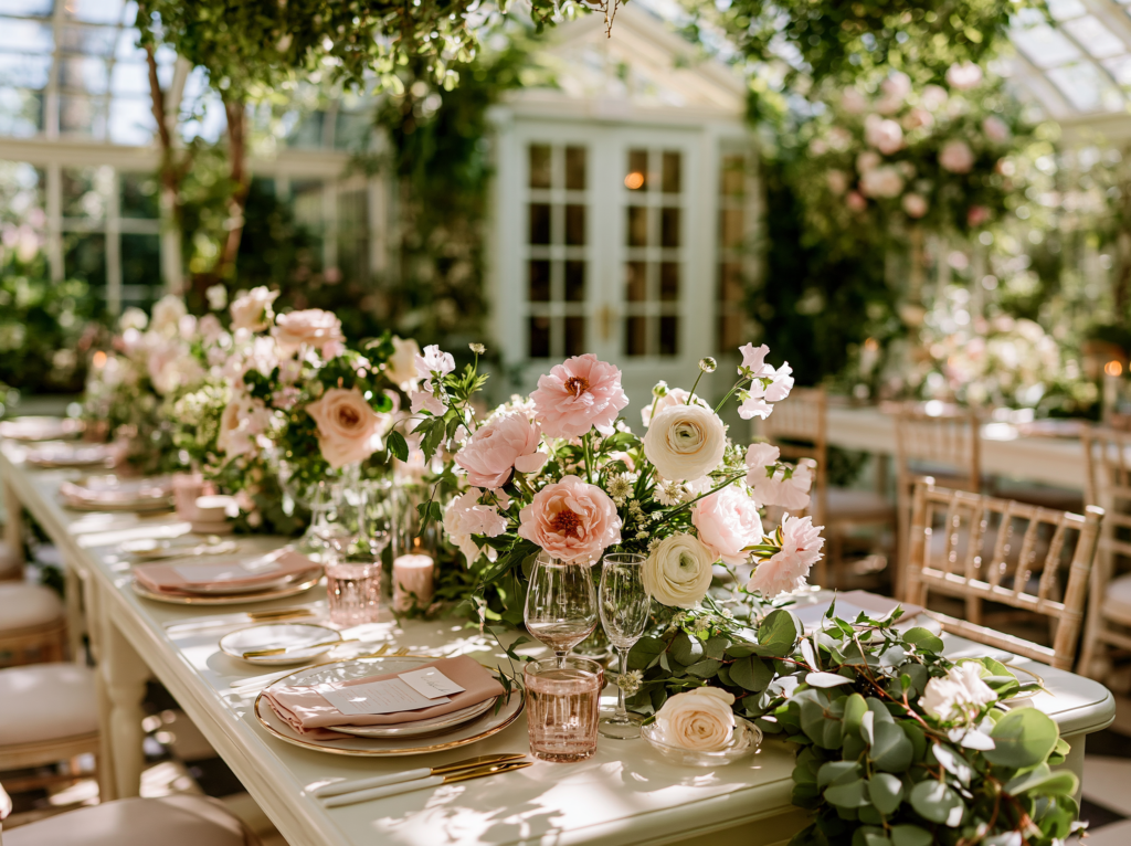
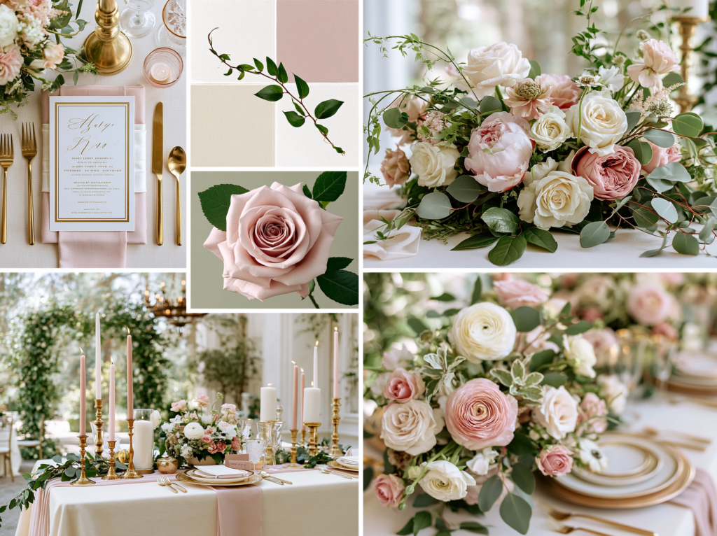
Blush pink, muted sage, and a warm antique gold accent form the core palette — a soft, dusty pink rather than anything bright or bubblegum-toned, which is what keeps it reading as romantic rather than childish. This is the same underlying palette logic as every other direction in the bloom theme: one dominant botanical tone, a green note, and a single warm metallic thread running through every detail.
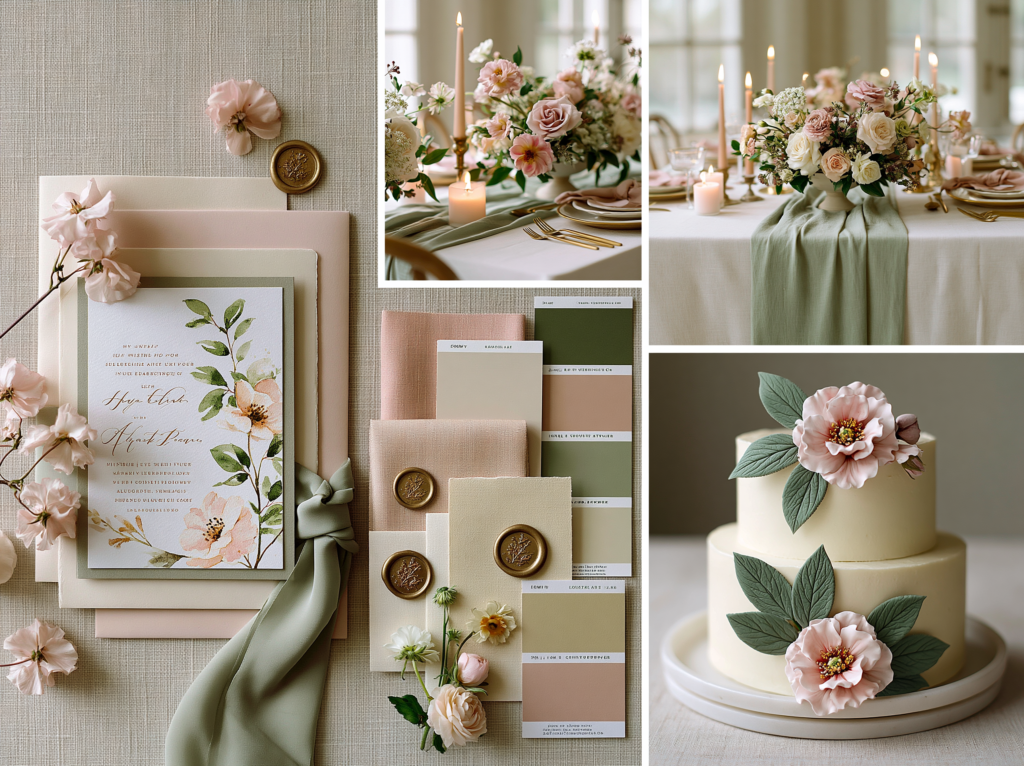
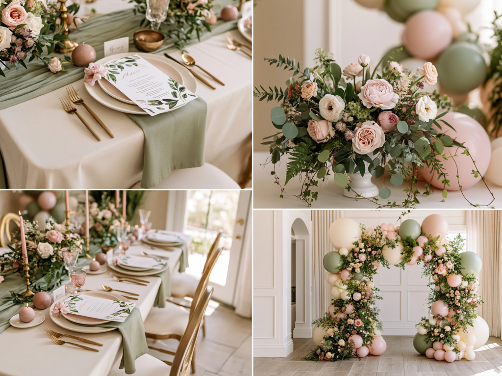
On invitations, blush florals work best with the same restraint that defines every direction in this theme — a soft border or a single corner anchor rather than a fully saturated pink background, with generous cream or white space left around the wording itself. On table linens, a sage runner or napkin against a cream tablecloth, with blush appearing only in the florals and small printed details, keeps the palette from reading as overwhelmingly pink even when blush is technically the “star” color. On the cake, soft buttercream blooms in blush with visible sage piping leaves tucked between them photograph as considerably more sophisticated than an all-pink cake with no green relief at all.
Matching Stationery
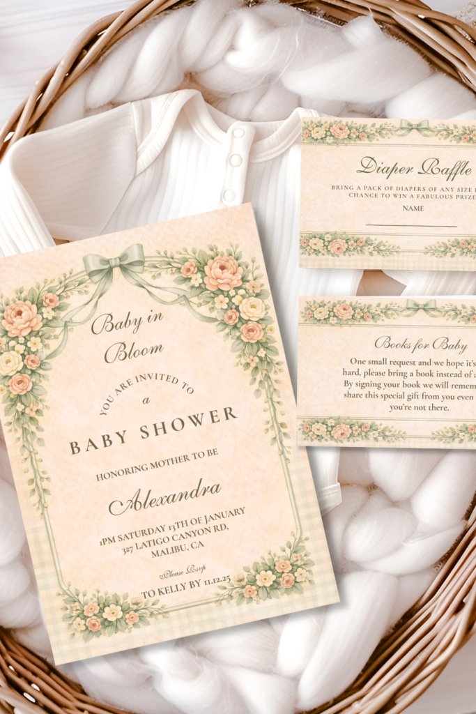
The Blush Sage Rose Arch collection is the primary featured palette for a pink and botanical girl shower — the same soft, romantic tones carried from the invitation suite through every printed detail. Fully customizable with the parents’ names, date, and shower details.
Section 03
Leaning Into Romantic Botanical Details
Garden roses, in their loosely petalled, slightly informal form rather than tight contemporary florist roses, are the single most romantic botanical choice for this direction — their natural, slightly imperfect shape reads as genuinely garden-grown rather than uniformly manufactured, which suits the soft, unfussy quality the whole bloom theme is built around. A few blooms at varying stages of opening, rather than every flower at the same tight stage, adds to this same effortless quality.
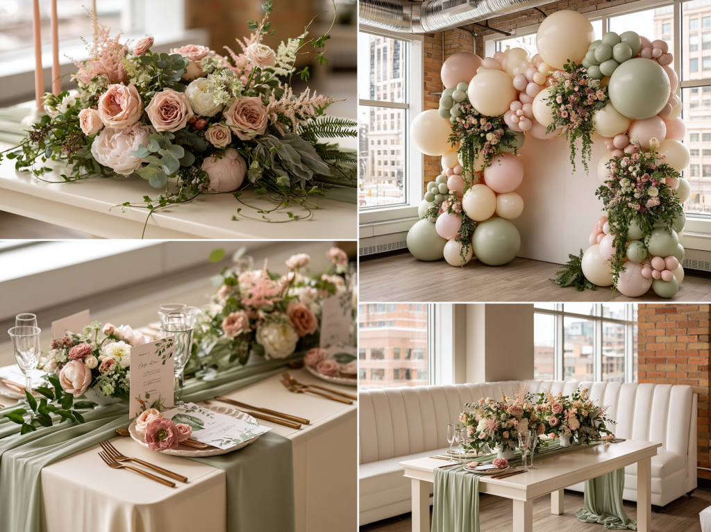
As a rough ratio, aim for roughly equal parts blush bloom and sage greenery in any given arrangement, rather than letting pink dominate — a noticeably more balanced ratio than some other palette directions in this theme, since pink in particular needs a generous amount of green nearby to keep reading as botanical rather than purely decorative.
Delicate texture matters as much as color balance here: fine, trailing greenery (jasmine vine, small ferns) alongside the more structural sage adds a layer of softness that a single uniform greenery type can’t achieve on its own, and it echoes the same delicate, slightly undone quality that the loosely petalled roses bring to the arrangement.
Section 04
A Vintage Alternative: Heirloom Blush for a Girl Shower
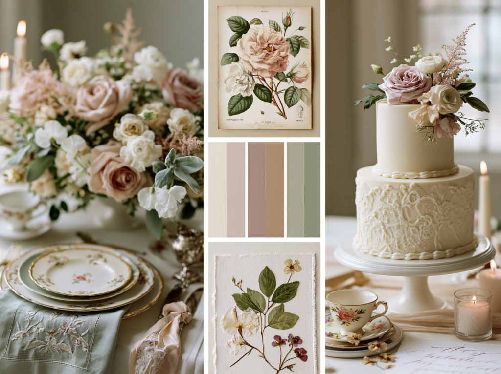
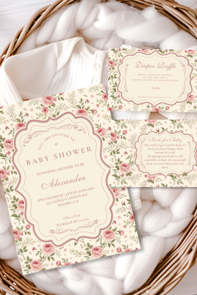
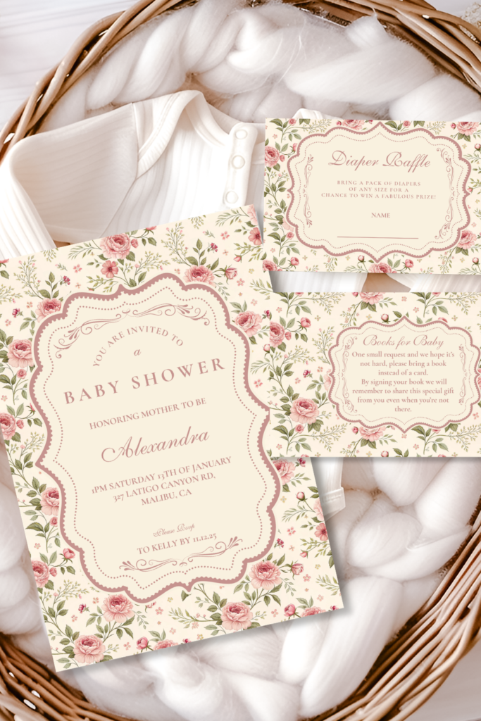
For hosts who want an even softer, more timeless take on pink, the Heirloom direction is the natural alternative within the bloom theme — a gentler, antique-inspired blush rather than the slightly more saturated tone of the classic Blush & Sage direction, paired with delicate piping texture and aged, vintage-style presentation rather than fresh contemporary styling.
This direction suits a host who wants the shower to feel like a quiet family heirloom moment rather than a trend-driven event — mismatched vintage china, lace ribbon, and a slightly aged, faded quality to the overall palette all reinforce this timeless rather than conventionally “cute” feeling, even while staying firmly within the pink and botanical direction.
Matching Stationery
The Soft Blush Floral Heirloom collection — the same gentle, vintage-inspired botanical palette carried from the invitation suite through every detail. Fully customizable with the parents’ names, date, and shower details.
Section 05
Quick Decor Touches Adapted for Pink
Table settings, centerpieces and backdrops each have plenty of dedicated styling depth elsewhere; here, simply note how the blush and sage palette adapts into those existing approaches. For table settings, keep linens mostly cream or sage with blush appearing only in accents and printed details, rather than a fully pink tablecloth, following the same restraint covered in Section 02 above. For centerpieces, follow the roughly equal blush-to-greenery ratio from Section 03 — noticeably more balanced than a centerpiece built almost entirely from pink bloom. For a backdrop or arch, the same flower-wall or balloon-and-floral combination approaches used elsewhere in the theme work identically here, simply built with a generous proportion of sage and greenery worked through the blush rather than blush alone.
Section 06
Keeping It Elevated, Not Generic “Girl Pink”
Gold accents do the same work here that they do throughout the rest of the bloom theme — antique gold flatware, candle holders, or a thin gold rim on stationery and chargers connects the pink and botanical direction to the same warm metallic thread that runs through every other palette, keeping pink from standing alone as the only real design decision in the room.
Greenery is genuinely the single most effective tool for avoiding an overly sweet, cliche pastel look — more so than any other adjustment available. A room with pink balanced by a generous, almost equal amount of sage and trailing greenery reads as a garden; the same pink with minimal or no green relief reads as a nursery-themed party supply aisle. If in doubt, add more green rather than less.
Avoid the most common clichés that pull a shower toward generic “girl pink” territory: bright bubblegum pink rather than the muted blush tone, pink used uniformly across every surface with no green relief anywhere in the room, and overly matched, uniform pink shades stacked on top of each other rather than the layered, slightly varied tones a real garden produces. The same restraint and genuine botanical balance that defines every other direction in this theme is what keeps the pink version feeling like an extension of it, not a simplified “girl theme” on its own.
Invitations & Stationery
Invitations & Stationery
The invitation is where a guest first sees whether this will be a romantic, garden-inspired pink celebration or a more conventionally sweet one, and it sets the same balanced, elevated tone the rest of this guide is built around. A blush invitation with genuine sage greenery worked through the botanical illustration — rather than pink alone — tells guests immediately that this shower will feel grown-up and considered, the same promise the room itself then delivers on.
It’s worth remembering that the bloom theme isn’t limited to pink for a girl shower — some hosts choose Dusty Blue, Terracotta, or Wildflower Meadow for a girl shower too, simply because they love that particular palette more than they feel any need to default to pink. None of the six collections in this theme are inherently gendered; they’re simply different moods within the same botanical idea, and any of them can suit any shower.
All six collections below are fully customizable with the parents’ names, date, and every shower detail.
Shop the Collections
Six Baby in Bloom Stationery Collections
Baby in Bloom
The complete collection — every palette and style within the broader theme in one place.
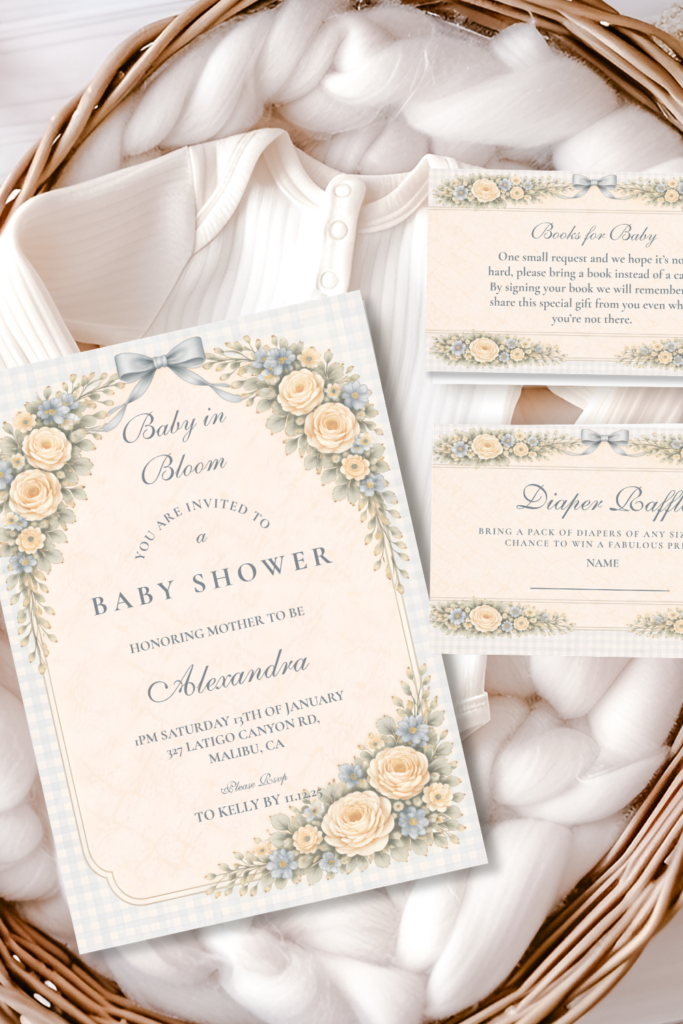
Blush Sage Rose Arch Baby Shower
Soft blush roses against muted sage greenery — the primary featured palette for a pink and botanical girl shower.
Soft Blush Floral Heirloom Baby Shower
Gentle, vintage-inspired blush florals — a softer, timeless alternative for a more antique-leaning girl shower.
Dusty Blue Rose Arch Baby Shower
Cool, fresh dusty blue blooms — a beautiful option for any shower, girl included.
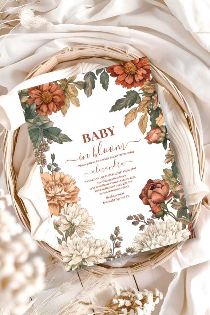
Terracotta Floral Baby in Bloom Shower
Warm terracotta and burnt orange tones — an earthy alternative that suits any shower equally.
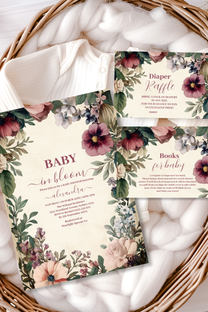
Baby in Bloom Spring Wildflower
Multicolor, just-picked wildflower brights — a whimsical option that’s equally fitting for a girl shower.
Frequently Asked Questions
Common Questions
Does the bloom theme actually work for a girl shower?
Yes — it’s actually the direction the theme is most associated with, since blush and botanical pairings are one of the most popular expressions of the broader bloom concept, as covered in Section 02 above. The key is balance: pairing pink with a genuine amount of sage greenery, rather than layering pink on pink, is what keeps the look feeling like a garden rather than a children’s party theme.
How do I keep pink from feeling too sweet?
Choose muted, dusty blush over bright bubblegum pink, and let sage greenery sit in roughly equal proportion to the pink itself rather than treating green as a minor accent, as covered in Sections 03 and 06 above. Gold details throughout the room add a second design element beyond pink alone, which also keeps the palette from feeling one-note. If a space still feels too sweet once styled, the most reliable fix is almost always to add more greenery rather than less pink.
What palette pairs best with blush?
Sage green and antique gold, as covered in Section 02 above, are the natural and most reliable pairing — the same core palette logic used throughout the rest of the bloom theme, just built around blush as the dominant tone. Cream or white as a base, rather than introducing a second strong color beyond sage and gold, keeps the palette feeling intentional and considered rather than busy.
What are alternatives to traditional pink for a girl shower?
The Heirloom Blush direction in Section 04 above offers a softer, more antique-toned alternative within pink itself, while Dusty Blue, Terracotta and Wildflower Meadow — all genuinely suited to any shower regardless of the baby’s gender — are equally valid choices for a host who wants to skip pink altogether. None of the collections in this theme are tied to a specific gender; the choice comes down entirely to which mood the host loves most.
Baby in Bloom · 2026
Find Your Pink & Botanical Palette
Fully customizable soft floral stationery — add the parents’ names, date and shower details online.