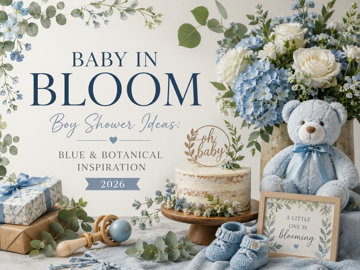
Baby in Bloom Boy Shower Ideas: Blue & Botanical Inspiration
Baby in Bloom · 2026
Baby in Bloom Boy Shower Ideas: Blue & Botanical Inspiration
Yes, the bloom theme works beautifully for a boy — here’s how to lean into dusty blue and greenery-forward botanicals without losing the soft, elevated feeling that makes this theme special.
A baby in bloom boy shower doesn’t require abandoning the theme’s soft botanical heart — it just shifts the palette and lets greenery carry a little more of the visual weight. This guide focuses on exactly that shift: why cooler tones and leaf-forward styling work so well, a close look at the dusty blue palette, a warmer earthy alternative, and how to keep the whole look elevated rather than falling into generic baby-blue territory.
Botanical doesn’t have to mean floral-heavy. A room full of soft greenery and dusty blue carries exactly the same quiet garden feeling as one full of roses — just told in a different, cooler key.
Section 01
Why Blue & Botanical Works for a Boy Shower
A dusty blue palette is a styling choice, not a requirement — plenty of hosts choose it for a boy shower because it pairs beautifully with the theme’s botanical core, not because blue is the only option available. What makes the shift work so naturally is that the bloom theme was never really about pink in the first place; it was always about softness, new growth and garden-inspired abundance, all of which translate just as completely into a cooler palette as a warmer one.
Cooler tones and greenery-forward styling keep the look elevated rather than babyish for a specific reason: dusty blue, unlike a bright primary “baby blue,” is muted and slightly grey-toned, which puts it in the same sophisticated register as the sage, dusty rose and antique gold that already run through the rest of the theme. Letting greenery carry more of the visual weight — rather than leaning hard on blue blooms alone — also keeps the styling from reading as a literal, overly on-the-nose “it’s a boy” theme, and closer to the same considered garden-party feeling the whole bloom aesthetic is built around.
Section 02
The Dusty Blue Palette in Detail
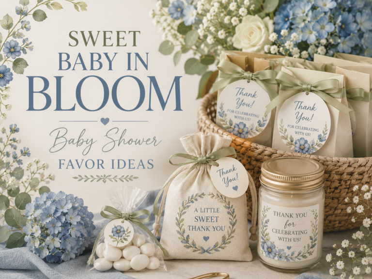
Dusty blue, alongside soft sage and a warm antique gold accent, is the core palette to build around — a muted, slightly grey-toned blue rather than anything bright or primary, which is what keeps it reading as elegant rather than childish. This is the same underlying palette logic as every other direction in the bloom theme: one dominant botanical tone, a green note, and a single warm metallic thread running through every detail.
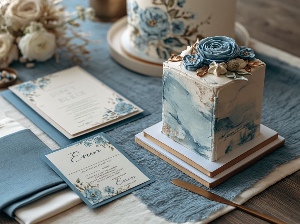
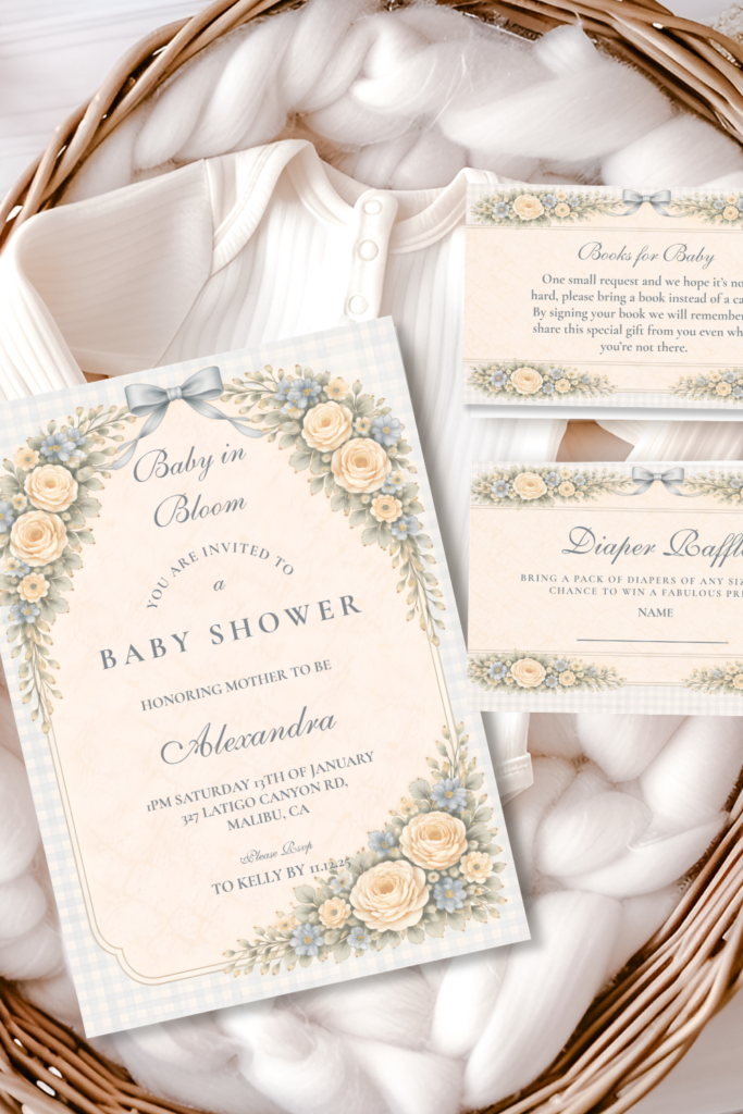
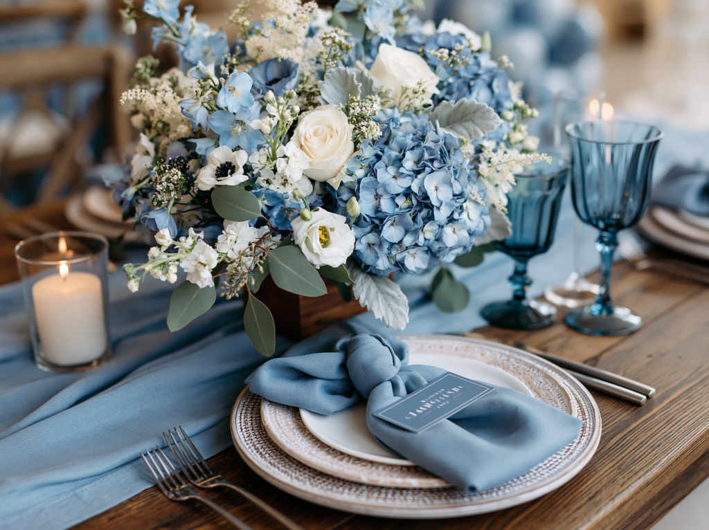
On invitations, dusty blue florals work best positioned with the same restraint as any other direction in this theme — a single corner anchor or a soft border rather than a fully saturated background, with plenty of cream or white space left around the wording. On table linens, a dusty blue runner or napkin against a cream or white base reads considerably more elevated than dusty blue as the dominant tablecloth color, since the contrast keeps the palette feeling intentional rather than overwhelming. On the cake, a soft buttercream watercolor technique in dusty blue tones (rather than piped blue florals) tends to photograph as the most sophisticated version of this palette, letting the color feel painterly instead of flat.
Matching Stationery
The Dusty Blue Rose Arch collection is the primary featured palette for a blue and botanical boy shower — the same cool, fresh tones carried from the invitation suite through every printed detail. Fully customizable with the parents’ names, date, and shower details.
Section 03
Leaning Into Greenery & Texture
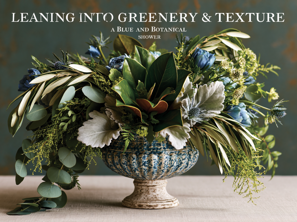
The single most useful styling principle for a blue and botanical shower: let eucalyptus, sage, and other leafy greenery form the backbone of every arrangement, with dusty blue blooms appearing as an accent woven through rather than the dominant material filling the space. A centerpiece built mostly from trailing eucalyptus and soft greenery, with just a few dusty blue flowers tucked in, reads as considerably more sophisticated than one built primarily from blue blooms with greenery as an afterthought.
Texture does a lot of the work that color alone can’t: mix eucalyptus with something slightly silvery (dusty miller or olive branch), something fine and delicate (ferns or small leafy sprigs), and something with a bit more structural weight (magnolia leaves or larger leafy stems) so the greenery itself has visual variety even before any blue is introduced. This layered, mostly-green approach is what keeps the palette feeling like an extension of the broader bloom theme rather than a separate, more limited “boy version” of it.
As a rough ratio, aim for roughly two-thirds greenery and texture to one-third dusty blue bloom across any given arrangement — enough blue to clearly establish the palette, without it overwhelming the soft, garden-grown quality that greenery naturally provides.
Section 04
An Earthy Alternative: Terracotta for a Boy Shower
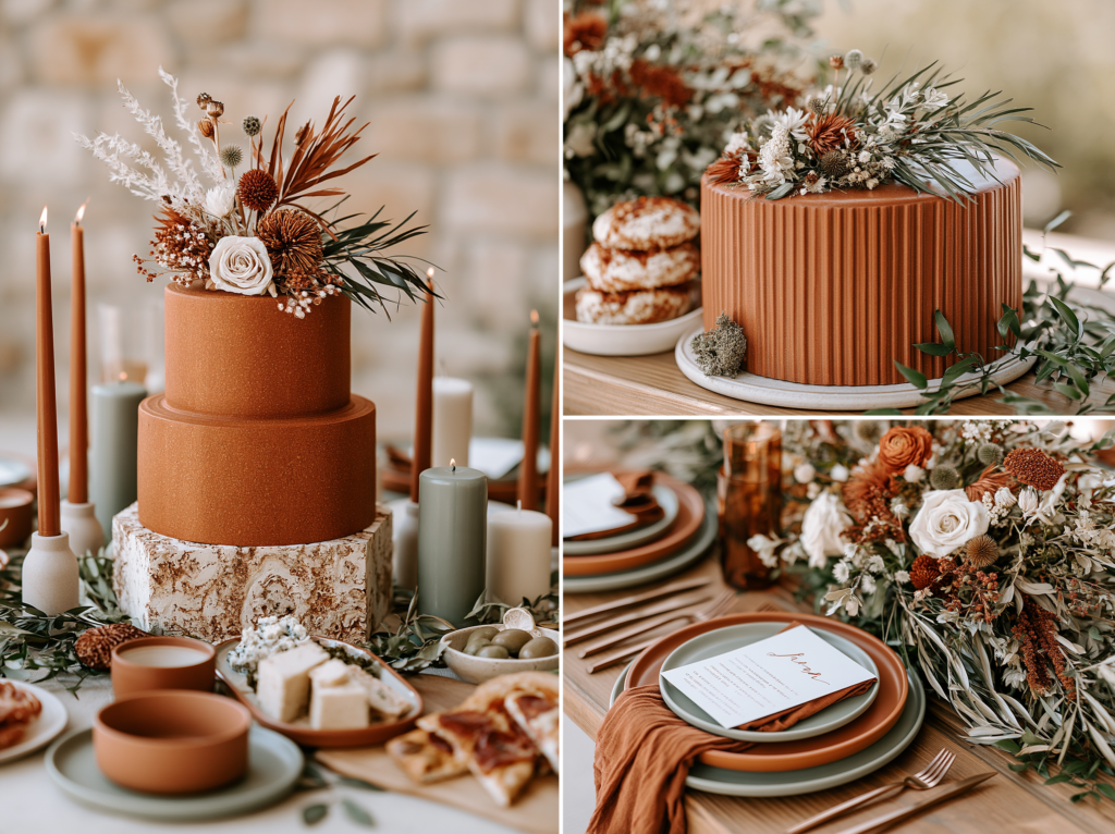
For hosts who want a palette that doesn’t lean on blue at all, terracotta is the most natural alternative within the bloom theme — warm, earthy, and genuinely gender-neutral-leaning rather than read as specifically masculine or feminine. It carries the same botanical richness as the dusty blue direction, just in a warmer register built around rust tones, dried botanicals and deep green foliage.
This direction suits a host who wants the shower to feel grounded and a little boho rather than conventionally soft and pastel, and it works particularly well for an autumn or early-winter boy shower, where the warm terracotta tones feel seasonally at home in a way a cooler blue palette sometimes doesn’t.
Matching Stationery
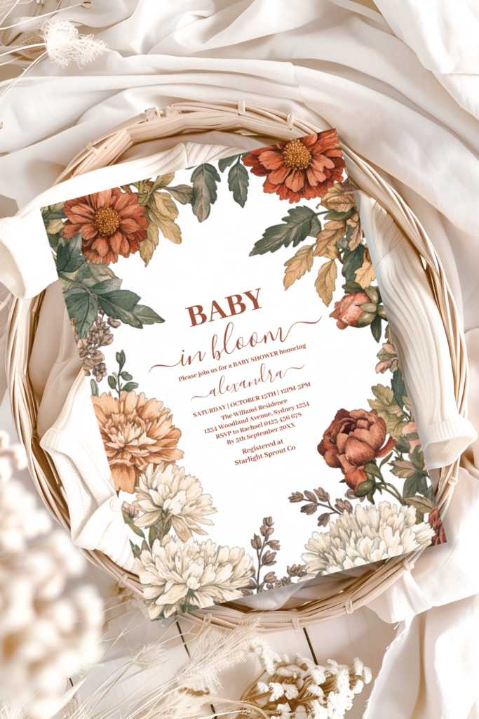
The Terracotta Floral Baby in Bloom collection — the same warm, earthy palette carried from the invitation suite through every detail. Fully customizable with the parents’ names, date, and shower details.
Section 05
Quick Decor Touches Adapted for Blue
Table settings, centerpieces and backdrops each have plenty of dedicated styling depth elsewhere; here, simply note how the dusty blue palette adapts into those existing approaches. For table settings, swap any blush or warm-toned linen for dusty blue, keeping the rest of the layering principles (textured charger, simple fold, matched place card) exactly the same. For centerpieces, follow the same greenery-forward ratio from Section 03 above — mostly leaf and texture, dusty blue as accent. For a backdrop or arch, the same flower-wall or balloon-and-floral combination approaches used elsewhere in the theme work identically here, simply built in dusty blue, sage and white rather than blush and sage.
Section 06
Keeping It Elevated, Not Generic “Boy Blue”
Gold accents are the single most effective way to lift a blue palette out of generic territory — antique gold flatware, candle holders, or a thin gold rim on stationery and chargers connects the blue and botanical direction to the same warm metallic thread that runs through every other palette in this theme, rather than letting blue stand alone as the only design decision.
Varied texture, as covered in Section 03, does more for elevating the look than any single decor choice — a room with only smooth, flat blue surfaces reads as far more conventional than one with linen, dried botanicals, matte ceramic and trailing greenery all working together. The goal is for blue to read as one considered element within a richly textured room, not the single dominant feature everything else is built around.
Avoid the most common literal clichés that pull a shower toward generic “boy blue” territory: solid blue balloon arches with no botanical detail at all, bright primary or sky blue rather than the muted dusty tone, and blue used uniformly across every surface rather than as one note within a varied palette. The same restraint and intentional botanical detail that defines every other direction in this theme is what keeps the blue version feeling like a genuine extension of it, rather than a simplified or separate “boy theme” entirely.
Invitations & Stationery
Invitations & Stationery
The invitation is where a guest first sees that this is a blue and botanical celebration rather than a conventionally pink one, and it sets the same quiet, elevated tone that the rest of the styling principles in this guide are built around. A dusty blue invitation with restrained floral detail and generous white space tells guests immediately that this shower will feel sophisticated rather than literal — the same promise the rest of the room then delivers on.
It’s worth remembering that the bloom theme isn’t limited to blue and terracotta for a boy shower — some hosts choose Blush & Sage, Wildflower Meadow, or Heirloom & Vintage for a boy shower too, simply because they love that particular palette more than they feel any need to default to blue. None of the five collections in this theme are inherently gendered; they’re simply five different moods within the same botanical idea, and any of them can suit any shower.
All six collections below are fully customizable with the parents’ names, date, and every shower detail.
Shop the Collections
Six Baby in Bloom Stationery Collections
Baby in Bloom
The complete collection — every palette and style within the broader theme in one place.
Dusty Blue Rose Arch Baby Shower
Cool, fresh dusty blue blooms — the primary featured palette for a blue and botanical boy shower.
Terracotta Floral Baby in Bloom Shower
Warm terracotta and burnt orange tones — a gender-neutral-leaning alternative for hosts who want less blue.
Blush Sage Rose Arch Baby Shower
Soft blush roses against muted sage greenery — a beautiful option for any shower, boy included.
Baby in Bloom Spring Wildflower
Multicolor, just-picked wildflower brights — a whimsical option that suits any shower equally.
Soft Blush Floral Heirloom Baby Shower
Gentle, vintage-inspired blush florals — timeless and equally fitting for a boy shower.
Frequently Asked Questions
Common Questions
Does the bloom theme actually work for a boy shower?
Yes — the theme’s core idea is softness, new growth and garden-inspired abundance, none of which is tied to any one color palette, as covered in Section 01 above. Shifting to dusty blue, or to the gender-neutral-leaning terracotta direction in Section 04, carries the exact same botanical philosophy in a different palette. Nothing about the bloom concept itself is gendered; only the specific color choice changes.
Is blue too gendered, or can it feel neutral?
Dusty blue, specifically, tends to read as fairly neutral on its own — it’s the muted, slightly grey-toned quality of the color (rather than a bright primary or sky blue) that keeps it from feeling like a literal “it’s a boy” cliche, as covered in Section 06 above. For hosts who want a palette that avoids blue altogether while staying equally suited to a gender-neutral or surprise shower, the Terracotta direction in Section 04 is the most genuinely neutral option in this guide.
What palette pairs best with the dusty blue direction?
Sage green and antique gold, as covered in Section 02 above, are the natural pairing — the same core palette logic used throughout the rest of the bloom theme, just built around a cooler dominant tone. Cream or white as a base, rather than introducing a second strong color, keeps the palette feeling intentional and uncluttered rather than competing for attention with the blue itself.
How do I keep a blue shower elegant rather than babyish?
Choose dusty, muted blue over bright primary blue, let greenery and texture carry more visual weight than the color itself (Section 03), and add gold accents throughout to connect the palette to the rest of the theme (Section 06). Avoiding solid blue balloon arches with no botanical detail and uniform blue across every surface are the two simplest changes that keep the look feeling considered rather than like a generic party-supply-store boy theme.
Baby in Bloom · 2026
Find Your Blue & Botanical Palette
Fully customizable soft floral stationery — add the parents’ names, date and shower details online.