Boho Baby Shower Ideas: The Ultimate Guide
Baby Shower · Boho Guide
Boho Baby Shower Ideas: The Ultimate Guide
The three distinctions that separate genuine boho from generic neutral with pampas grass, five palette directions, decor and dessert ideas, games and favours, and the complete stationery showcase across six boho collections.
Boho is the most searched and the most broadly popular baby shower aesthetic for a specific reason: it is the one theme direction that is defined entirely by warmth — the warmth of natural materials, the warmth of organic texture, the warmth of things that look gathered over time rather than purchased as a matching set. A genuinely boho shower does not look styled. It looks found. This guide covers everything needed to plan, execute, and style a boho baby shower that reads as genuine rather than as a neutral shower with a pampas stem placed in the corner.
Ready to shop? Browse the complete Boho Baby Shower collection.
Invitations, welcome signs, favour tags — warm, earthy, and fully customisable.
“Boho is not a decoration style — it is a feeling. The specific warmth of natural materials, organic textures, and the beauty of things that look handmade rather than manufactured.”
Section 01 What Makes Boho Different From Every Other Theme
Distinction 1
Texture Over Colour — Materials Define the Aesthetic
Generic boho: A neutral palette applied to standard party supplies (smooth white candles, synthetic table runners, paper napkins). The colour may be warm and earthy but the materials are manufactured and smooth — and the result reads as a beige party rather than as a boho shower.
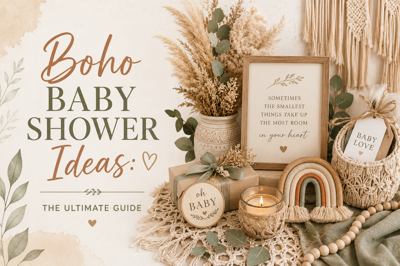
Genuine boho: Rattan vessels instead of ceramic; linen table runners instead of synthetic fabric; dried botanical material instead of fresh or artificial florals; kraft paper for printed elements; raw wood or natural stone as surface materials. The specific warmth of rattan, the specific texture of linen, and the specific imperfection of dried botanical material are what communicate the boho aesthetic — not the palette. A boho shower with smooth, manufactured surfaces and a warm earthy colour palette reads as a neutral shower. A boho shower with rattan, linen, kraft paper, and dried botanical material and a slightly off palette reads as boho. Texture is the primary language. Colour is secondary.
Distinction 2
Dried Not Fresh — Botanical Material Vocabulary Is Non-Negotiable
Generic boho: Fresh florals at a boho shower. This is the single most specific indicator that a shower has been styled as ‘boho’ from a general party supply context rather than from an understanding of the specific aesthetic. Fresh flowers — garden roses, peonies, ranunculus — are beautiful at a romantic or garden floral shower. At a boho shower they communicate the wrong aesthetic register: too cultivated, too temporary, too specifically romantic to belong in the world of aged, warm, imperfect natural materials.
Genuine boho: Dried pampas grass (the primary tall botanical element — warm honey-cream in its natural dried state); dried protea (the most dramatically beautiful dried botanical available, with a warm brown and rust tone that belongs directly to the boho palette); cotton stems (soft, white, and textured, the boho botanical that reads as most specifically warm and organic); dried celosia in terracotta and rust; dried grasses in all their varieties (taller varieties as height elements, shorter grasses as scatter material at the base of arrangements). All of these share the specific quality of the boho aesthetic: aged, warm, slightly imperfect in their natural form, beautiful in the specific way of things that have been allowed to dry and remain rather than cultivated and displayed at peak bloom.
Distinction 3
Asymmetry Is Mandatory — Symmetrical Arrangements Signal ‘Not Boho’
Generic boho: A symmetrical arrangement of dried pampas, dried protea, and rattan in the correct terracotta and oatmeal palette. It looks ordered, balanced, and specifically formal — and it reads as a formally arranged display that happens to contain boho materials rather than as a boho arrangement. Symmetry communicates the intention of a specific kind: the intention to create order and formal balance. This is not the boho aesthetic’s intention.
Genuine boho: Asymmetric arrangement in which one side is clearly taller or fuller than the other; some stems extend beyond the arrangement boundary; the overall impression is of something that has grown or been gathered over time in its vessel rather than placed there in a single construction session. The specific asymmetry formula: a ratio of approximately 2:1 between the taller and shorter sides of any arrangement, with botanical material that extends clearly beyond the vessel outline on the taller side. This asymmetry is not approximate or incidental — it is an active design decision applied to every arrangement in the room.
✨ Styling Tip
The fastest way to spot genuine boho versus generic neutral with pampas grass: look at the arrangement. If it is symmetrical and centred — equal height on both sides, botanical material contained within the vessel outline, the arrangement reading as formally balanced from any angle — it is not boho. Boho arrangements lean clearly in one direction, trail and overflow beyond the vessel on at least one side, and have a specific quality of organic imperfection that reads as grown rather than placed. The asymmetry is not accidental. It is the entire point. Before finalising any arrangement for a boho shower, step back and ask: which direction does this lean? If the answer is ‘neither — it’s balanced’ — pull one side taller, let the other trail lower, and try again.
Section 02 Five Boho Palette Directions
Five complete palette directions, each built on the same dried botanical and natural material foundation. In all five: rattan or raw wood as the vessel material, linen or natural cotton as the textile layer, dried botanical material as the primary botanical element. The palette differs; the material vocabulary is constant.
Most Authentic
Classic Earth Tones
Terracotta · Oatmeal · Warm Brown · Cream
The Classic Earth Tones direction is the most authentically boho and the most Pinterest-consistent palette available in this theme — it is the palette that first established the boho shower aesthetic on visual platforms and the one that appears most frequently in searches for ‘boho baby shower’ because it is the direction most specifically defined by the boho aesthetic’s own material vocabulary. Terracotta (the specific warm clay orange that belongs to both the African savanna and the handmade ceramic vessel); oatmeal (the warm beige of undyed natural linen); warm brown (the specific colour of dried botanical stems, rattan, and raw wood); and cream (warm ivory, never cool white). The most genuinely gender-neutral of the five directions: terracotta and oatmeal communicate no gender direction while communicating complete aesthetic specificity.
Most Seasonal
Fall Boho
Warm Amber · Rust · Pumpkin · Deep Sage
The Fall Boho direction is the most seasonally specific and the most urgently seasonal of the five directions — it takes the warm amber, rust, and pumpkin tones of the autumn world and places them within the dried botanical and natural material vocabulary of the boho aesthetic, which is a specifically natural marriage: the warm orange and rust tones of autumn share the exact same quality as the terracotta and oatmeal base of the Classic Earth Tones direction, extended into the seasonal orange spectrum. Pumpkin and rust belong here in a way that they do not belong in any other aesthetic direction — because the autumn world to which they belong is the same warm, organic, slightly imperfect world as the boho aesthetic. Deep sage (the specific grey-green of dried sage leaves) anchors the warm orange tones with a botanical note that keeps the palette from reading as Halloween.
✨ Styling Tip
Fall boho is the one boho direction where warm orange tones are not just acceptable but essential. Pumpkin, rust, and amber sit naturally alongside dried botanicals in autumn — they share the same warm, organic, slightly-imperfect quality as fallen leaves, dried seed pods, and harvest textures. The specific quality of the orange matters: terracotta and pumpkin belong to the boho autumn world; bright orange belongs to Halloween. The test: does the orange read as warm and clay-toned (boho) or as bright and saturated (Halloween)? If the orange reads warm, it belongs. If it reads bright, it does not.
Most Joyful
Rainbow Boho
Soft Multicolour Pastels · Unified by Warm Muted Saturation
The Rainbow Boho direction is the most joyful and the most visually abundant of the five directions — it introduces multiple colours while maintaining the specific quality that makes boho beautiful: the warmth and the muted, dusty saturation level that keeps every colour reading as organic rather than as synthetic. The most important rule for the rainbow boho direction: every colour in the palette must share the same saturation level. A palette of dusty rose, warm mustard, sage, and warm lavender, all at the same muted dusty saturation, reads as a cohesive rainbow boho palette. The same range of colours at mixed saturation levels — some bright, some muted, some washed — reads as a party supply mixed pack. The test: if any colour in the rainbow reads as brighter or more saturated than the others, it does not belong in the rainbow boho palette.
Most Garden-Adjacent
Wildflower Boho
Meadow Multicolour · Loose Wild Arrangement · Warm Ivory Base
The Wildflower Boho direction is the most garden-adjacent and the most joyfully loose of the five directions — it brings the specific quality of a meadow (abundant, slightly wild, with flowers at varying heights and varying fullness) into the boho material vocabulary. The Wildflower direction differs from the Rainbow Boho direction in its arrangement logic: where rainbow boho is primarily a palette decision (specific saturation across multiple colours), wildflower boho is primarily an arrangement decision (loose, abundant, slightly imperfect in the way of wildflowers rather than deliberately asymmetric in the way of a boho arrangement). In the wildflower direction, the dried botanical element is supplemented with dried wildflowers at varying heights — dried strawflowers, dried chamomile, dried lavender, dried cornflower — in a loose arrangement that reads as recently gathered from a field rather than assembled by a florist.
Most Feminine
Pink Boho
Dusty Rose · Terracotta · Oatmeal · Warm Cream
The Pink Boho direction is the most specifically feminine of the five directions — and the one most frequently executed incorrectly because the pink tone is the most critical decision. Dusty rose (the specific warm, slightly aged pink that sits between pink and blush, with a dusty, slightly peachy quality that belongs to the same colour world as terracotta and oatmeal) belongs in the boho palette. Bright pink, cool pink, or candy pink does not. The test: does the pink read as warm and slightly dusty (boho) or as bright and saturated (girl party)? The correct dusty rose in the boho context reads as a natural tone rather than as a colour statement. Alongside terracotta and oatmeal, dusty rose is a continuation of the warm earthy palette extended into the pink spectrum; beside bright pink, terracotta and oatmeal read as the wrong colours from a different aesthetic world.
Section 03 Decor & Centrepieces at a Glance
Backdrop Zone
Backdrop & Display Wall
- Asymmetric dried pampas wall cluster (3–7 plumes at varying heights, clear lean to one side)
- Macramé panel with dried botanical integration
- Balloon organic arch in the palette direction (honey amber, terracotta, oatmeal — no symmetry, no equal spacing)
- Large botanical foliage arrangement in rattan or raw wood vessel
- Warm fairy lights woven through dried botanical material at the wall
Table Zone
Guest Table & Centrepieces
- Three-height boho centrepiece: tall dried pampas (left or right lean) + mid dried protea cluster + low scatter of dried grasses and votives
- Oatmeal linen runner or tablecloth — the single most impactful boho table decision
- Rattan charger plates under warm cream ceramic
- Kraft paper food labels and place cards in the invitation’s illustration style
- Small terracotta pots with a single dried botanical stem as individual place settings
✨ Styling Tip
Every surface in a boho shower needs at least one texture element — rattan on the table, linen as the runner, kraft paper for signage, dried botanicals in the centrepiece, natural wood or terracotta as the vessel material. When every surface has a texture element that belongs to the boho material vocabulary, the room reads as a complete designed world. When only the centrepiece has texture and every other surface is smooth, manufactured, and colour-coordinated, the room reads as a themed party with a boho centrepiece placed within it. Texture is not optional in boho. It is the primary design language. Colour is secondary.
Section 04 Cake, Cookies & Dessert at a Glance
Cake Directions
Boho Cake Ideas
- Semi-naked buttercream in warm ivory with asymmetric dried pampas and dried protea topper
- Textured palette-knife buttercream in terracotta and oatmeal with a clear asymmetric lean in the topper
- Watercolour botanical scene in warm amber and sage tones on a matte buttercream base
- Warm ivory fondant with a dried botanical arrangement topper and antique gold leaf detail band
- Small individual boho smash cake for the baby in the same palette as the main cake
Dessert & Cookies
Boho Sweet Table
- Boho cookies in warm cream royal icing with dried botanical detail — matte finish, never glossy
- Cupcakes in warm ivory buttercream with a small dried flower topper in the palette direction
- Warm honey drizzle over a cheese board as the savoury-sweet element
- Boho naked cake slices displayed on a rattan or warm wood serving board
- Kraft paper food labels in the invitation’s illustration style positioned in front of every item
Section 05 Games & Favours at a Glance
Boho games and favours follow the same material rule as everything else: natural, warm, and specifically textured wherever possible.
Games
Boho-Appropriate Games
- Baby Bingo printed on warm ivory or kraft card in the boho illustration style
- Advice cards station on a natural wood surface — prompts in the boho stationery palette
- Wishes jar in a glass vessel on a rattan or wood plinth with a personalised kraft tag
- Boho onesie decorating station with fabric-safe markers in the palette colours
- Baby stats predictions printed on warm ivory kraft cards — kept as a memento after the birth
Favours
Boho Favour Ideas
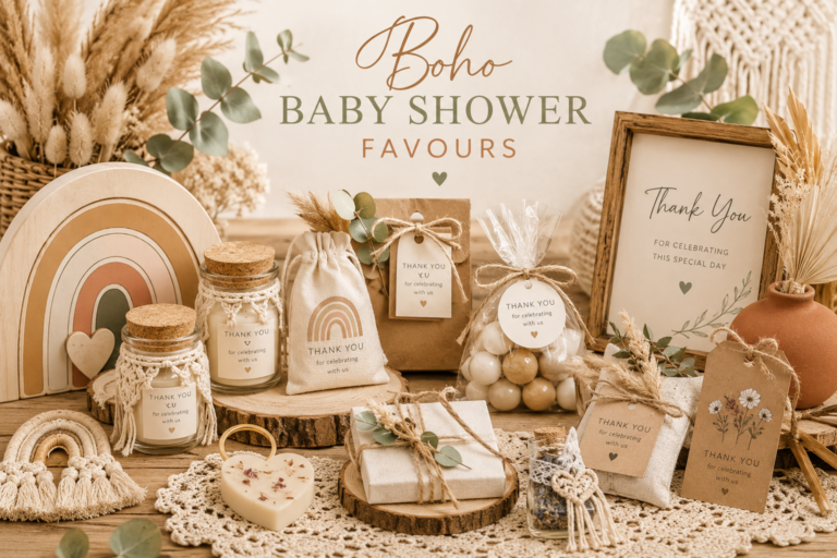
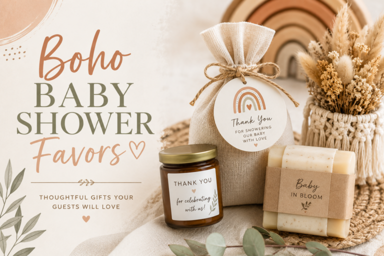
- Custom honey jar with a personalised boho label in terracotta and oatmeal, tied with natural twine
- Wildflower seed packet in a kraft envelope with a personalised dried-botanical tag
- Small soy candle in a warm ceramic vessel with a boho illustrated label
- Dried botanical favour bundle — three to five dried pampas stems tied with natural twine and a kraft tag
- Botanical tea sachets in a kraft envelope with a personalised boho tag
Section 06 Boy, Girl & Seasonal Boho at a Glance
By Direction
Boho Sub-Directions
- Boho Boy: Warm sage, warm brown, cream, and dried botanical — no pink accent; the terracotta and sage direction is the most appropriate for a boho boy shower
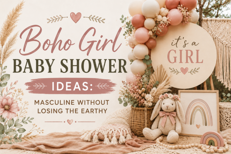
- Boho Girl: Dusty rose, terracotta, oatmeal, and cream — warm pink only; the Pink Boho palette direction (Section 02.5) is most appropriate
- Neutral Boho: Terracotta, oatmeal, warm brown, and cream with no directional accent — the Classic Earth Tones direction (Section 02.1)
- Boho Safari: The intersection of safari animal motif and boho material vocabulary — rattan, linen, dried botanical, with giraffe and elephant illustration in warm brown and cream
By Season
Seasonal Boho Directions
- Spring Boho: Wildflower Boho direction (Section 02.4) — dried wildflowers in warm pastel tones, loose arrangement, abundant botanical
- Summer Boho: Classic Earth Tones or Wildflower Boho — both are appropriate for outdoor summer venues
- Autumn Boho: Fall Boho direction (Section 02.2) — the most specifically seasonal direction; pumpkin, rust, amber, deep sage
- Winter Boho: Classic Earth Tones with warm cream and antique gold accent — dried botanical, candlelight, and warm ivory as the primary palette, with gold as the seasonal warmth accent
Section 07 Invitations & Stationery
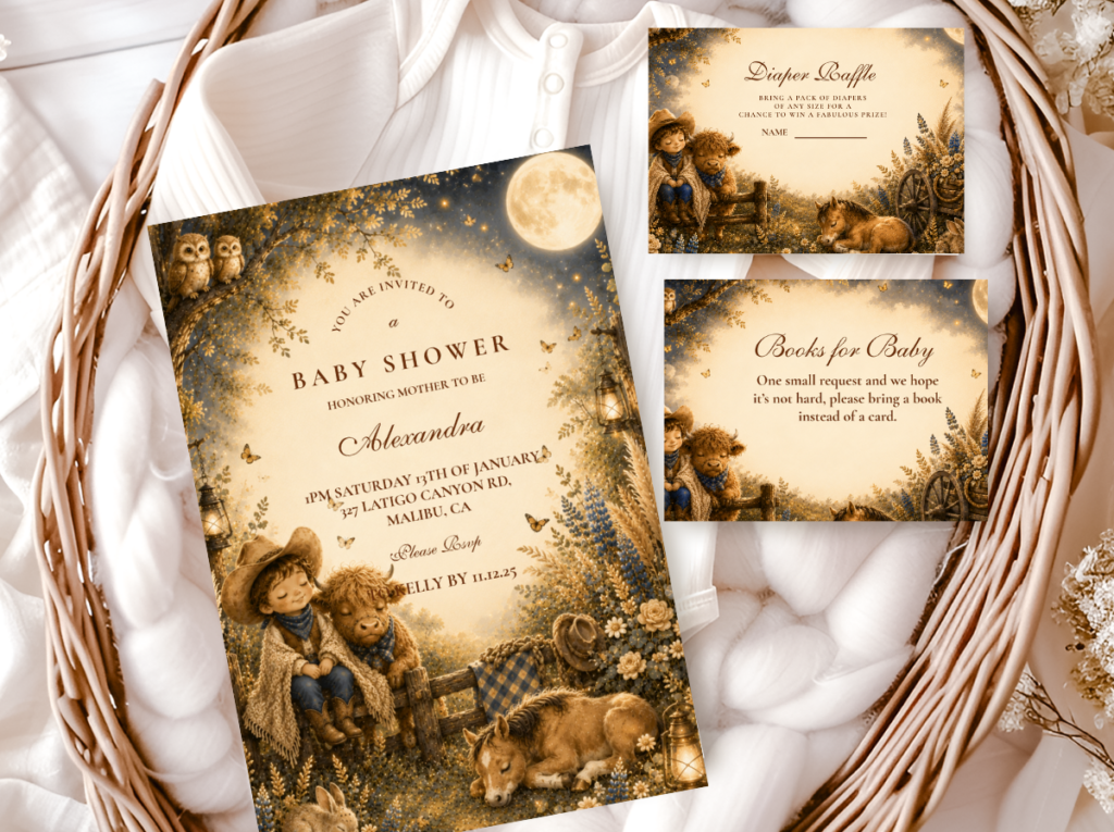
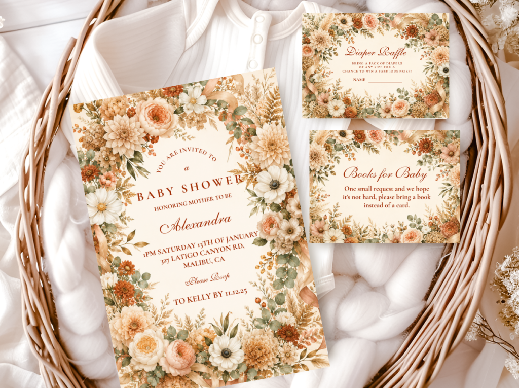
The most important consistency requirement: every stationery element at the shower (welcome sign, place cards, food labels, favour tags, thank-you cards) should be in the same illustration style and palette direction as the invitation. A boho invitation beside a conventionally styled welcome sign reads as two different celebrations happening in the same room. Browse all six collections below — each one represents a complete and internally consistent boho stationery direction, from Classic Earth Tones to Fall Boho to Pink Boho.
Most Authentic
Boho General
Classic earth tones in terracotta and oatmeal — the most authentic and most Pinterest-consistent boho direction.
Most Seasonal
Fall Boho
Warm amber, rust, and pumpkin — the most specifically seasonal boho direction for autumn showers.
Most Joyful
Rainbow Boho
Soft muted multicolour pastels — the most visually abundant and most joyful boho direction.
Most Garden-Adjacent
Wildflower Boho
Meadow-picked multicolour dried wildflowers — loose, wild, and specifically warm.
Most Feminine
Pink Boho
Dusty rose and terracotta — warm pink in the boho earthy palette, never bright or cool-toned.
Floral Boho
Floral Boho
Warm botanical floral illustration — the most floral-forward boho stationery direction.
Frequently Asked Questions
What is a boho baby shower?
A boho baby shower is a celebration that takes the bohemian aesthetic — warm natural materials, organic textures, dried botanicals, and the specific quality of things that look gathered and handmade rather than manufactured and matching — and applies it to a baby shower celebration. The three defining qualities of a genuine boho baby shower are: texture-first decoration (rattan, linen, macramé, dried botanical, kraft paper — not the palette, the materials); dried botanical material exclusively (dried pampas grass, dried protea, cotton stems, dried grasses — never fresh florals); and asymmetric arrangement of every element (arrangements that lean, trail, and overflow rather than sit centred and balanced). A shower that has warm earthy colours and a pampas stem beside a balloon cluster is not a boho shower — it is a neutral shower with a boho element placed within it. A shower where the serving board is rattan, the runner is linen, the centrepiece is a 2:1 asymmetric dried botanical arrangement, and the stationery is in a warm hand-drawn illustration style is a boho shower.
What colors are used in a boho baby shower?
The boho aesthetic is defined by material quality first and colour second — but when the palette is considered, it falls into five directions covered in Section 02. The most common and most authentically boho palette: terracotta, oatmeal, warm brown, and cream (Classic Earth Tones). Other available directions: warm amber, rust, and deep sage for an autumn shower (Fall Boho); unified dusty pastels at the same muted saturation for a more joyful shower (Rainbow Boho); warm meadow tones with dried wildflowers (Wildflower Boho); and dusty rose beside terracotta and oatmeal for a specifically feminine direction (Pink Boho). In all directions: no cool tones, no bright saturated tones, no synthetic materials in the colour field. The palette should feel aged, warm, and organic — as though it came from the natural world rather than from a colour chart.
What decorations do I need for a boho baby shower?
The decoration vocabulary for a boho baby shower is defined by five material categories: rattan (as vessel, serving board, charger, basket, and decorative object); linen (as tablecloth, runner, napkin, and backdrop element); dried botanical material (pampas grass, dried protea, cotton stems, dried grasses — as the primary botanical element in all arrangements); kraft paper (as the material for all printed surface elements — food labels, place cards, favour tags); and natural wood or terracotta (as surface materials for serving boards, vessels, and decorative objects). Every zone of the shower — the backdrop, the guest tables, the food table, the favour table — should include at least one element from each of these five categories. The arrangement of all botanical elements must be asymmetric. The baseline budget for genuine boho decoration is lower than most themed showers because the materials — rattan, linen, kraft paper — are available at modest cost and look significantly more beautiful than the equivalent cost in synthetic or manufactured party supplies.
How is a boho baby shower different from a garden baby shower?
The boho and garden baby shower aesthetics share warmth and botanical vocabulary but differ in three specific and immediately visible ways: the botanical material (garden shower = fresh florals, specifically garden flowers at peak bloom; boho shower = dried botanical material exclusively — pampas, protea, grasses, cotton stems); the arrangement logic (garden shower = floristry principles, often symmetrical and formally beautiful; boho shower = asymmetric arrangement that reads as organic and gathered rather than arranged); and the material vocabulary (garden shower = ceramic, glass, clean linen; boho shower = rattan, macramé, kraft paper, raw wood, terracotta — materials with visible natural texture). A garden shower in boho materials with asymmetric arrangement becomes a boho shower. A boho shower with fresh flowers becomes a garden shower regardless of the pampas grass present in the arrangement.
Shop the Boho Collection
Boho Baby Shower Stationery — All Six Directions
Invitations, welcome signs, favour tags — warm, earthy, and fully customisable across Classic, Fall, Rainbow, Wildflower, Pink, and Floral directions.