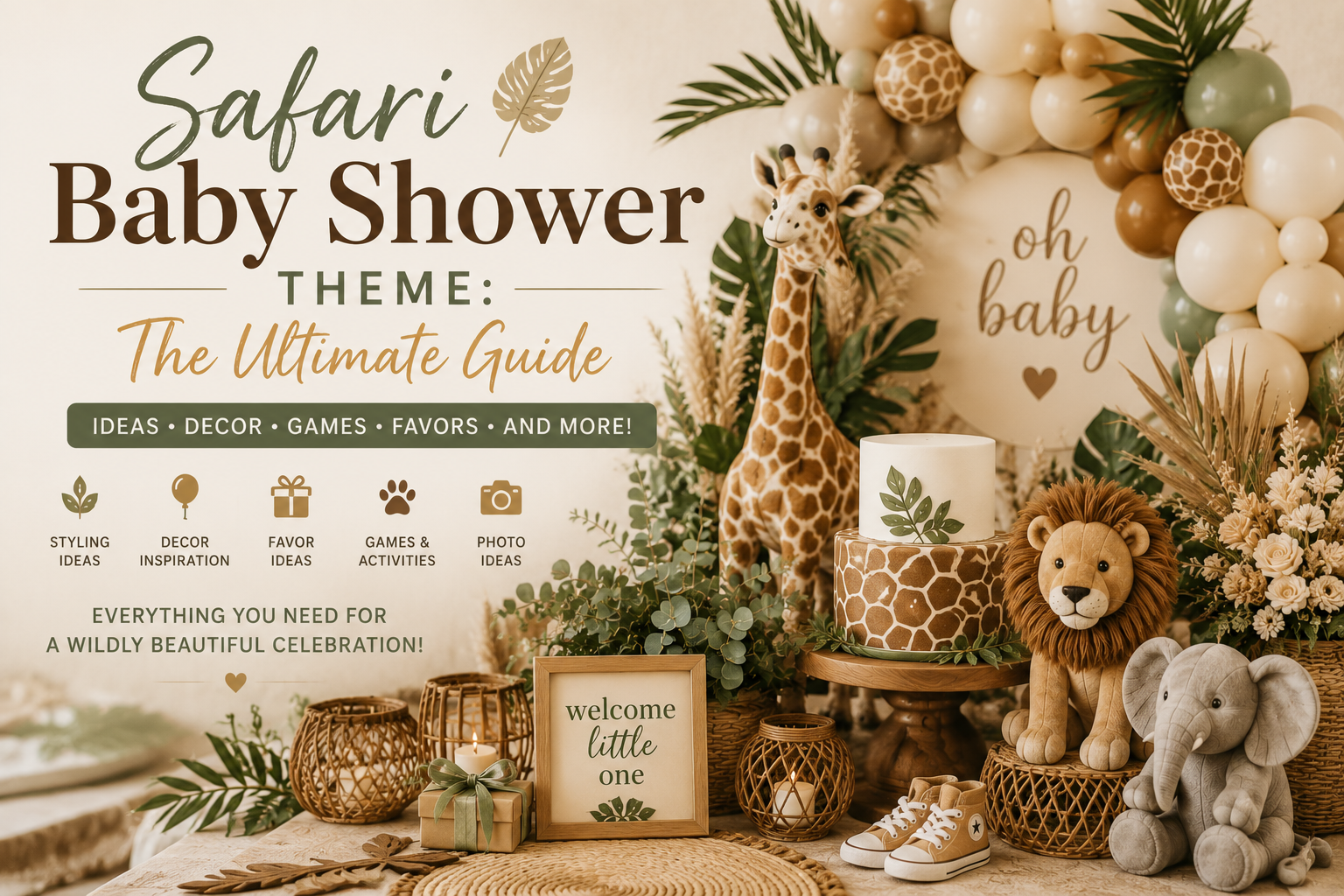
Safari Baby Shower Theme: The Ultimate Guide
Baby Shower · Theme Guide
Safari Baby Shower Theme: The Ultimate Guide
The safari baby shower done properly — palette formula, styling directions for boy, girl, and neutral, decor and table guidance, and the complete stationery showcase.
The safari baby shower has been the most consistently beloved baby shower theme for a decade — and with good reason. It is warm, it is beautiful, it works for any gender, any venue, any budget, and any aesthetic direction from elegantly minimal to botanically lush. The wild animal world of the open savanna belongs to every child who has ever been born, which gives the safari theme a universal quality that most party themes cannot match: there is no guest list on which it does not land perfectly, and no setting in which it looks out of place. This guide covers everything needed to plan, style, and stationery a safari baby shower that looks genuinely designed rather than assembled from a party supply store.
Ready to shop the full safari collection?
Invitations, welcome signs, favour tags, and more — all coordinated and customisable.
“The safari baby shower is the one theme that belongs to every child — wild, curious, and just beginning to explore a world that is vast and warm and full of extraordinary things.”
Section 01 What Makes the Safari Theme Work?
The Core Aesthetic: Adventure, Nature, Warmth
The safari theme works because it is three things simultaneously: it is adventurous (the open savanna, the early morning game drive, the sense that the world is larger and wilder and more beautiful than any interior can contain); it is natural (the palette of the earth itself — warm cream, dusty brown, golden ochre, the specific sage of African scrub vegetation); and it is warm (in every sense — the palette is warm in tone, the animal world it invokes is familiar and beloved from childhood, and the associations it carries are of comfort and wonder in equal measure). No other baby shower theme delivers all three qualities at the same time, which is why the safari theme works for literally every guest list: the grandparents love it because it is wholesome and beautiful, the design-aware guests love it because the palette and motifs are genuinely sophisticated, and the children love it because giraffes and elephants are immediately and unreservedly wonderful.
The safari aesthetic also has the specific quality of being genuinely versatile at different execution levels — a high-budget safari shower and a minimal-budget safari shower both read as beautiful safari showers if the palette is correct and the core motifs are present, because the theme’s visual language does not require expensive props or elaborate decoration. The warm neutral base, the animal detail, and the natural texture do the work regardless of how much or how little is invested in the individual elements.
Safari vs. Jungle: The Distinction Most Guides Skip
The most common planning confusion in the safari baby shower category is the conflation of safari with jungle — and it is worth being specific about why these are completely different aesthetics, because choosing the wrong one is the single most common reason safari showers end up looking generic rather than genuinely beautiful.
The safari aesthetic draws its visual language from the East African savanna: the open landscape rather than the dense forest; warm golden tones (the specific amber and ochre of savanna grass at golden hour) rather than the cool, saturated greens of tropical foliage; animals associated with the open plain (giraffe, elephant, zebra, lion, rhinoceros) rather than the animals of the tree canopy and forest floor; wide, warm skies rather than closed-canopy darkness; and the specific botanical vocabulary of the savanna (acacia trees, dry grasses, scattered low scrub) rather than tropical palms and monstera leaves. The safari palette is warm, dry, and sun-saturated: cream, ivory, oatmeal, warm brown, dusty terracotta, golden ochre.
The jungle aesthetic draws from the tropical rainforest: a completely different visual world of deep, saturated botanical greens; dense overlapping foliage; animals of the tree canopy (monkey, toucan, parrot, tropical frog); monstera and banana leaf botanical motifs; cooler, more saturated greens that read as lush and dramatic rather than warm and open; and the specific quality of filtered light through dense foliage rather than open golden hour light. The jungle palette is cool, saturated, and dramatically botanical: deep emerald, dark palm green, the specific turquoise-greens of tropical birds, contrasting with warm cream. Both aesthetics are genuinely beautiful — but they are not interchangeable, and mixing elements of both (giraffe motifs on a deep monstera-green palette, or palm leaves beside savanna animals) produces a confused visual register that communicates neither direction clearly.
The Safari Palette Formula
The 60-30-10 ratio is the most reliable guide for a cohesive safari shower palette, and understanding why the ratio works is as important as knowing the numbers.
60% Warm Neutral Base. Cream, ivory, oatmeal, warm white, or a pale parchment. This is the colour of the savanna ground — the base on which everything else exists. Tablecloths, plates, napkins, balloons, stationery stock, and any blank surface should all be from this warm neutral family. The warmth of the base is non-negotiable: a cool white base makes the safari palette read as generic party rather than specifically safari, because it loses the golden, sun-saturated quality that gives the aesthetic its warmth and coherence.
30% Nature Accent. Choose ONE direction: sage green and dusty olive (the botanical safari direction); warm brown and terracotta (the earthy safari direction); dusty blue (the boy safari direction); blush pink and dusty rose (the girl safari direction). One direction chosen and applied consistently. The most common palette mistake is choosing two or three of these simultaneously — sage AND blush AND dusty blue — which produces a confused, unfocused palette that reads as a general party rather than a specific aesthetic.
10% Statement Detail. Antique gold, deep warm brown, or a single bold animal motif applied as accent throughout: gold print on the invitation, deep brown for table name cards, gold balloon scatter. The statement detail is the element that lifts the neutral and accent palette from “pleasant” to “designed” — but only at 10%, because more than this converts it from an accent to a competing element that fragments the palette’s coherence.
Section 02 Five Ways to Style the Safari Theme
The same theme, five completely different aesthetics — each achieved primarily through palette rather than through different animal motifs. This is the most important styling insight for the safari shower: the animals are consistent; the palette is what creates the variation.
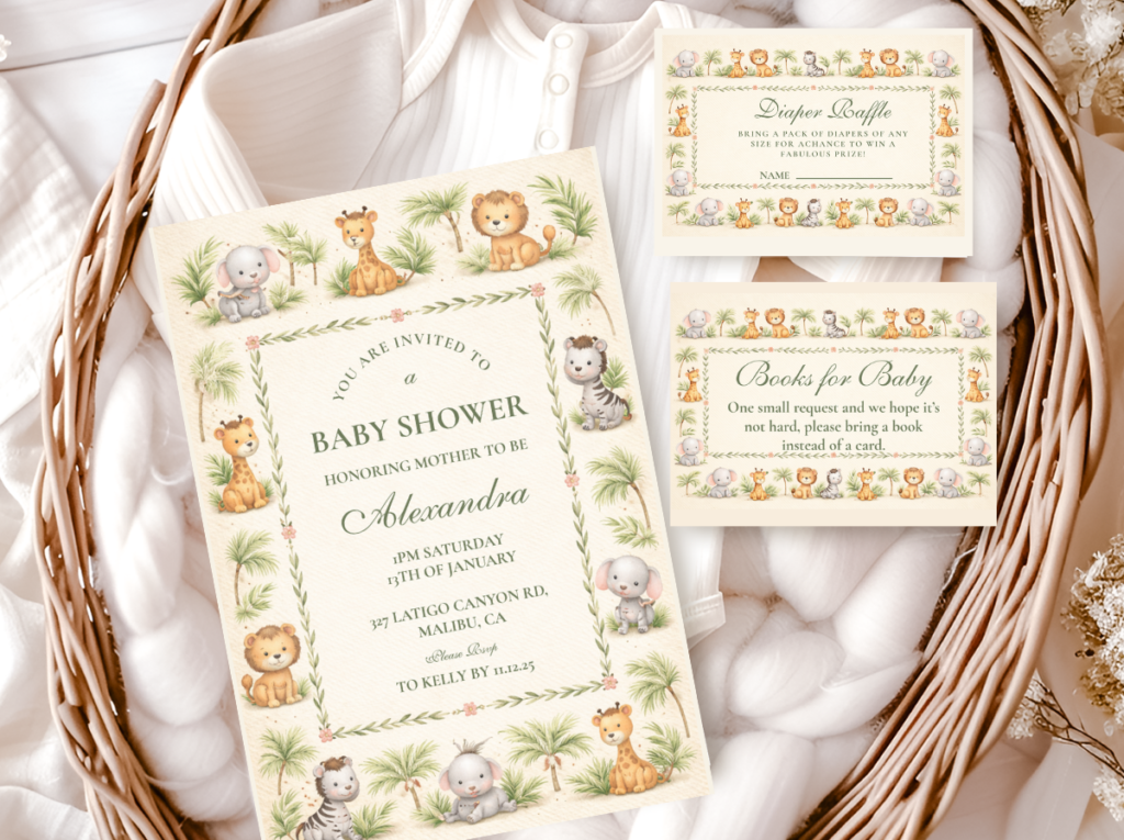
2.1 The Classic Neutral Safari
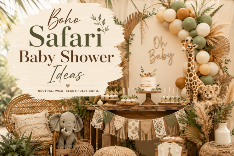
The Classic Neutral Safari is the most broadly beautiful and the most Pinterest-safe of the five directions — it works for any gender, any season, any venue, and any guest list, because its warm neutral palette (cream, oatmeal, warm brown, antique gold) produces a visual world that is universally inviting without committing to any specific gendering or any specific trend. The classic neutral safari is also the most cohesive of the five directions at a practical level: every element — from the invitation to the centrepiece to the dessert table backdrop — is in a palette where nothing can clash, because all tones belong to the same warm neutral family. It is the most appropriate direction for gender-neutral celebrations, for couples who are not revealing the baby’s gender, and for celebrations where the guests have diverse aesthetic preferences that a more directional palette might not satisfy equally.
The Neutral Safari Baby Shower collection covers the Classic Neutral Safari palette in every stationery piece — warm cream and antique gold across invitations, welcome signs, favour tags, and the complete coordinated suite.
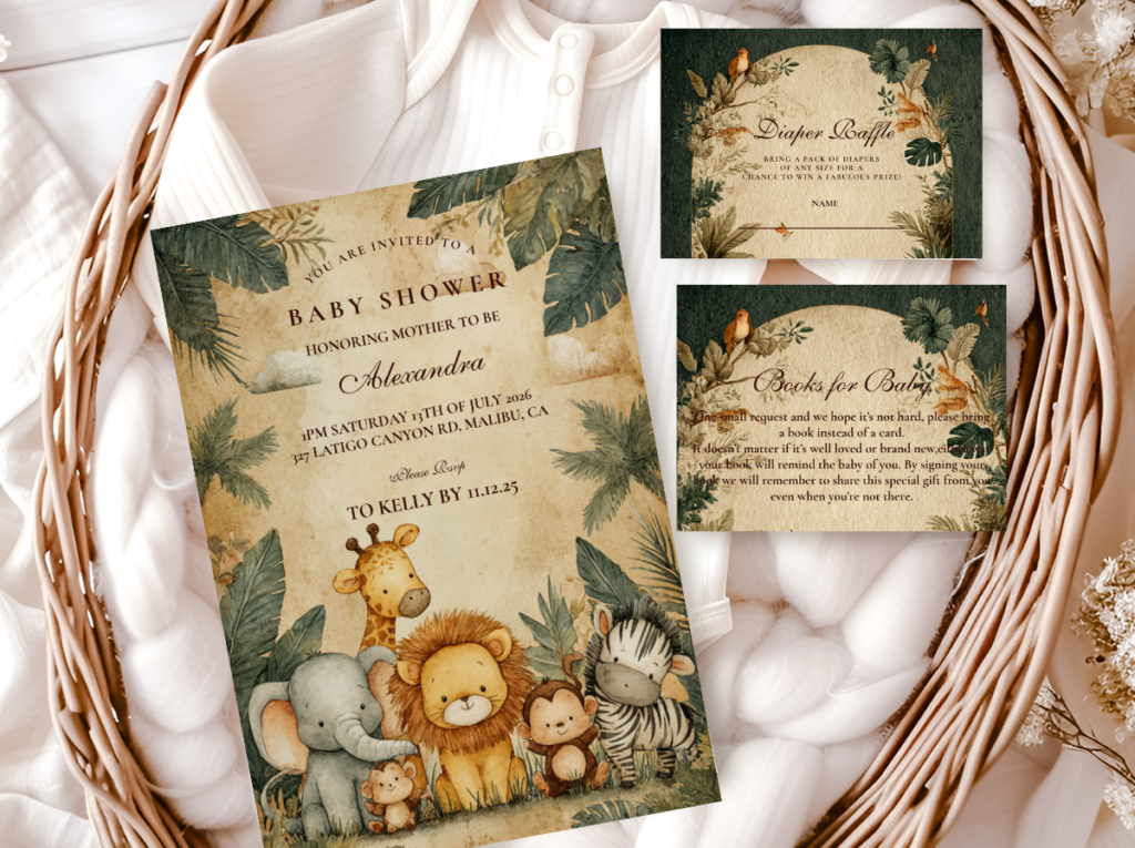
2.2 The Jungle Safari Boy
The Jungle Safari Boy direction is the most bold and the most adventure-forward of the five — it applies the 60-30-10 formula with deep olive green as the 30% accent (the specific dark, dusty green of safari scrub vegetation at its most dramatic) and warm antique gold as the statement detail, producing a colour combination that reads as specifically and confidently masculine without resorting to the specific baby blue that dates so easily. The deep olive and warm brown palette gives the Jungle Safari Boy aesthetic the quality of a vintage wildlife illustration — the specific visual world of the natural history museum, the wildlife documentary, the explorer’s journal — and this quality is what makes it the most visually sophisticated of the boy-directed safari directions.
The Jungle Safari Boy Baby Shower collection carries the deep olive and warm gold palette into every stationery piece — bold, adventure-forward, and specifically beautiful for the little explorer on his way.
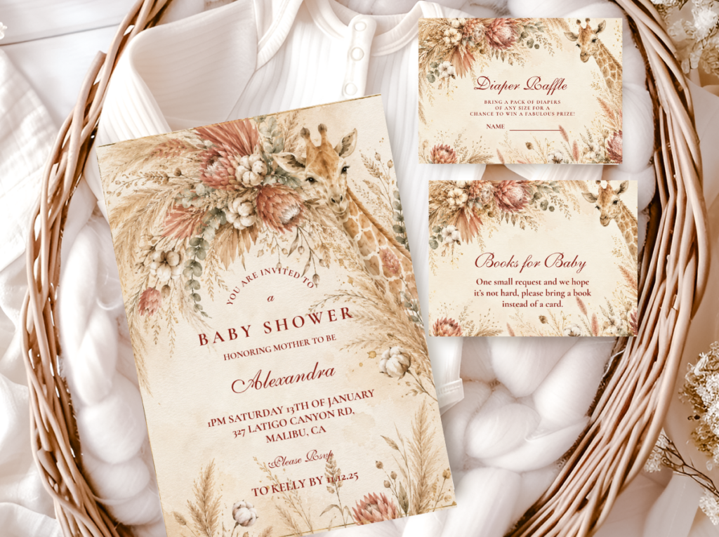
2.3 The Pink Safari Girl
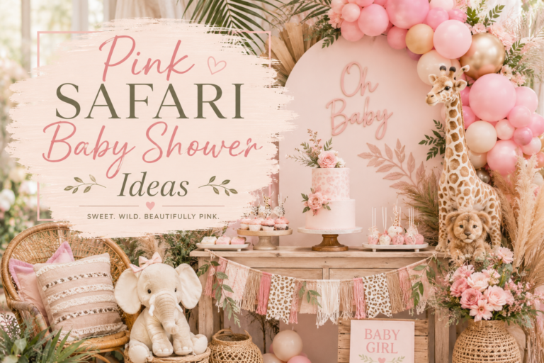
The Pink Safari Girl is the most saved and most consistently popular girl-directed safari direction on Pinterest — because it resolves the specific challenge of making a safari theme read as feminine without making it feel incongruously candy-coloured. The solution: blush pink and dusty rose as the 30% accent (warm, dusty, and specifically beautiful rather than bright and loud), applied within the warm cream and ivory base that gives the safari aesthetic its coherence. The pink safari girl palette reads as romantic and gentle in the same way that the classic neutral safari reads as warm and welcoming — both share the warm base and the antique gold detail; it is only the accent direction that differs, and the blush accent direction is the most broadly beautiful of all the girl-directed options.
The Pink Safari Girl Baby Shower collection brings the blush and warm gold palette into every printed element — the most romantically feminine safari stationery direction available.
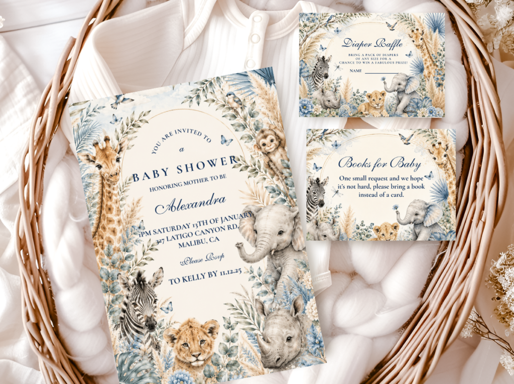
2.4 The Boy Safari
The Boy Safari — distinct from the Jungle Safari Boy in its specific palette direction — takes the 60-30-10 formula with dusty blue as the 30% accent: not the bright baby blue of conventional boy party palettes but a specific muted, dusty, almost grey-blue that reads as elegant and tailored rather than conventionally gendered. Dusty blue and warm brown together produce a palette that is specifically and beautifully masculine in a way that is more sophisticated than its bright-blue equivalent and more palatable to the design-aware guests who find conventional baby shower palettes tiresome. The dusty blue and warm brown safari combination is also the most cohesive-looking of the boy-directed directions in the flat lay photograph — the two warm-cool contrast without one dominating the other.
The Boy Safari Baby Shower collection covers the dusty blue and warm brown palette across every stationery piece — tailored and elegant for the little adventurer.
2.5 The Girl Safari
The Girl Safari — the botanical and sage-forward girl direction — takes the 60-30-10 formula with sage green and warm ivory as the accent pairing: a fresh, botanical direction that reads as feminine in the specific way of the garden and the wildflower meadow rather than in the direction of conventional pink femininity. Sage green and warm ivory with antique gold produces a palette that works as naturally for a gender-neutral celebration (where the green reads as botanical and natural rather than specifically gendered) as for a girl-directed one, which makes the Girl Safari the most versatile of the five directions after the Classic Neutral. It is particularly appropriate for spring and early summer celebrations and for outdoor or garden venues, where the sage botanical quality of the palette reads as contextually appropriate.
The Girl Safari Baby Shower collection carries the sage green and warm ivory palette into every stationery piece — fresh, botanical, and beautifully feminine.
✨ Styling Tip
Safari works for any gender precisely because the palette does the gendering, not the theme. The same giraffe and elephant motifs read completely differently in dusty blue and brown versus blush and sage. Choose the palette direction first and the animal details will follow naturally — you do not need to find “boy-specific” or “girl-specific” safari animals; you need the right colour palette applied consistently.
Section 03 Decor & Centrepieces at a Glance
Centrepiece Directions
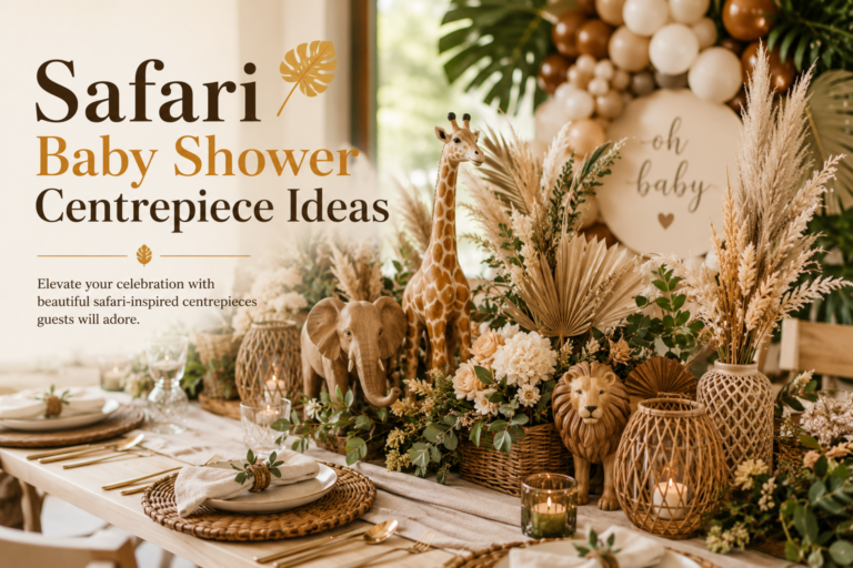
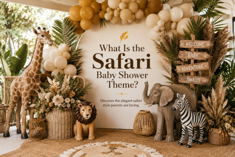
The most effective safari centrepieces combine a natural-material vessel (rattan basket, terracotta pot, wooden crate, or simple ceramic in a warm neutral tone) with one botanical element (dried pampas, dried grasses, a single stem of warm-toned fresh flowers, or a trailing ivy in the jungle safari direction) and one animal detail (a small giraffe or elephant figure at the base, a safari animal balloon above the arrangement, or the safari animal motif on a small printed card within the arrangement). The three-element combination is more reliably beautiful than any more complex centrepiece, because it maintains the 60-30-10 palette logic at the table level.
Backdrop Options
The most effective safari shower backdrop is either a botanical print (large-format dried pampas and warm botanical elements arranged against a warm cream or dusty sage wall) or a patterned fabric in the safari palette (warm cream with gold geometric or botanical print). Both read as specifically safari rather than generically party, and both photograph significantly better than the balloon arch backdrop that has become the party default.
Table Setting
The safari table setting should be built from the warm neutral base outward: cream or oatmeal paper plates; warm kraft or gold-edged napkins; natural wood or bamboo cutlery if available; and the stationery elements (place cards, menu cards, table signs) as the detail layer that carries the specific animal motif and palette accent throughout the table surface.
✨ Styling Tip
The texture rule for safari decor: always mix at least three textures at the table level — something natural (wood, rattan, dried grass, wicker), something soft (linen napkins, a plush animal, cotton balloon), something printed (stationery, signage, paper details). This trio is what makes a safari table feel intentionally designed rather than assembled from a party supply store. Texture variety at three levels (natural / soft / printed) is the difference between a table that looks “done” and a table that looks genuinely beautiful.
Section 04 Cake, Cookies & Dessert Table at a Glance
Safari Cake Directions
The most popular safari baby shower cake direction is the stacked tier cake with warm neutral fondant (cream or oatmeal base) and animal detail either illustrated on the fondant tiers (a giraffe or elephant drawn in food-safe paint in the warm brown and gold palette), applied as fondant figures on each tier, or carried by a personalised topper. Semi-naked cakes in warm ivory buttercream with dried flowers and a gold or wooden animal topper are the current most-saved safari cake direction on Pinterest.
Cookie Styling
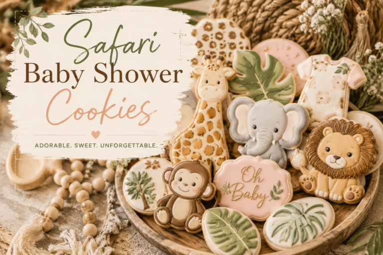
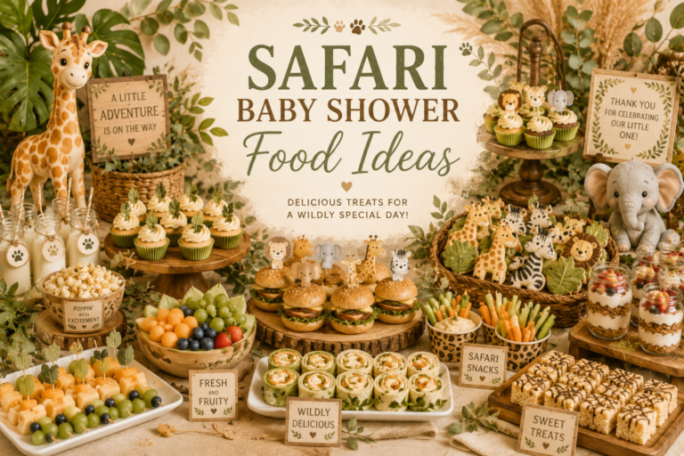
Safari-themed cookies in the shower’s specific palette direction (cream icing with warm brown detail for the neutral direction; cream with sage green for the botanical direction; cream with blush for the pink girl direction) photograph most beautifully when laid flat in a grid composition, with a mix of animal shapes (giraffe, elephant, lion, acacia tree) and text shapes (the baby’s name, the “welcome” text) at approximately equal proportion.
Dessert Table
The most cohesive safari dessert tables use the palette backdrop principle: everything on the table — the cake stand, the cupcake tier, the cookie tray, the favour bags — is in the same warm neutral family, so that the individual food items and the stationery details (personalised labels, a dessert table sign, an “Oh Baby” banner) read as a single composed arrangement rather than a collection of separate items.
Section 05 Games & Favors at a Glance
Safari Games
The most popular safari baby shower games are those that can be tied to the wildlife theme: “Guess the Baby Animal” (matching baby animals to their adult forms — a cub/calf/foal quiz that works for any guest list); “Safari Name That Sound” (matching recorded animal sounds to the correct animal); and the perennial baby bingo in a safari palette, with animal illustrations replacing the standard bingo graphics. All three can be printed in the shower’s specific palette direction so that the game sheets read as part of the coordinated design rather than as generic party inserts.
Favour Ideas
The most consistently appreciated safari shower favours are small, high-quality, and thematically specific: honey jars with a custom safari label (“sweet as can bee” in the safari palette); small potted succulents with a personalised safari pick; handmade safari-scented candles in cream or terracotta pots with a custom label; or a small packet of wildflower seeds with a custom safari envelope — all favour formats that are beautiful, useful, and directly connected to the natural world of the safari aesthetic.
Section 06 Boy, Girl & Neutral Variations at a Glance
Neutral Safari
The neutral safari direction (cream, oatmeal, warm brown, antique gold) is the most cohesive and the most versatile of all safari palette directions — it works before and after gender reveal, for any combination of guests, and with any level of decoration investment. It is also the most broadly photogenic, because the warm neutral palette reads beautifully in any photography light.
Boy Safari Directions
The two boy-directed safari directions — the Jungle Safari Boy (deep olive and warm gold) and the Boy Safari (dusty blue and warm brown) — each achieve their specifically masculine quality through palette rather than through gendered motifs. The Jungle Safari Boy direction is the more dramatic and adventure-forward; the Boy Safari direction is the more tailored and elegant. Both work for any shower where a masculine palette is desired.
Girl Safari Directions
The two girl-directed safari directions — the Pink Safari Girl (blush and warm cream) and the Girl Safari (sage green and warm ivory) — each achieve their feminine quality through the warmth and botanical quality of their accent palette. The Pink Safari Girl direction is the more romantically feminine; the Girl Safari direction is the more botanical and fresh. The Girl Safari palette also works for neutral celebrations, which makes it the most versatile of the girl-directed options.
Section 07 Invitations & Stationery
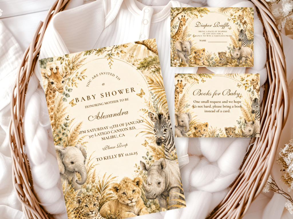
The safari baby shower invitation is the first glimpse of the safari world guests receive — the first moment at which the palette, the animal motifs, and the illustration style communicate what the celebration will look and feel like. A safari invitation in the correct palette direction (warm cream base, the specific accent colour of the chosen direction, antique gold detail, and a genuinely beautiful animal or botanical illustration) sets an expectation that every subsequent detail of the shower will either fulfil or disappoint. This is why the stationery is not the last thing to organise — it is the first aesthetic decision, because it establishes the visual register to which every decoration element must then belong.
The specific stationery elements that matter most for the safari shower: the invitation itself (the primary communication and the first impression); the welcome sign (the largest piece of stationery that guests will see at the entrance, where it sets the visual world of the shower before anything else is seen); favour tags (the detail guests take home, which should be in the same palette as the invitation); and the cupcake toppers, food tent cards, and dessert table sign (the stationery layer within the table, where the palette and motifs reinforce the aesthetic at close range). All of these pieces should be in the same coordinated design and the same palette direction for the 60-30-10 formula to produce its full effect.
The illustration quality of the safari stationery is the detail that most separates a genuinely beautiful safari shower from a generic one: a well-drawn giraffe in warm brown line-work on an ivory base communicates immediately and specifically that the shower has been designed rather than assembled. The animal motif should be illustrated rather than clipart-quality — hand-drawn style illustration in the warm, slightly organic quality that reads as genuinely beautiful rather than as a stock image applied to a template.
All six collections below are fully customisable with the name of the guest of honour, the shower date, the host’s name, and any other specific text information. Browse all six before deciding — the collection that most closely matches the chosen palette direction (neutral, boy olive, boy blue, pink girl, girl sage, or jungle) is the one that will produce the most cohesive and most beautiful printed result.
All Safari
Safari Theme Collection
The complete umbrella collection — every safari style and every stationery piece in one place.
Classic Neutral
Neutral Safari Baby Shower
Warm cream and antique gold — the most versatile direction for any gender, any season.
Jungle · Boy
Jungle Safari Boy
Deep olive and warm gold — bold, adventure-forward, and specifically beautiful.
Pink · Girl
Pink Safari Girl
Blush and warm cream — the most saved girl safari direction on Pinterest.
Dusty Blue · Boy
Boy Safari Baby Shower
Dusty blue and warm brown — tailored and elegant for the little adventurer.
Sage · Girl
Girl Safari Baby Shower
Sage green and warm ivory — fresh and botanical, works for girl or neutral celebrations.
Frequently Asked Questions
What colors work for a safari baby shower?
The most reliable safari shower palette uses the 60-30-10 formula: 60% warm neutral base (cream, ivory, oatmeal, warm white — the base must be warm, not cool white), 30% nature accent in one direction only (sage green, dusty blue, blush pink, or deep olive — choose one and apply consistently), and 10% statement detail (antique gold, deep warm brown, or a single bold animal motif). The most common colour mistake is using too many accent directions simultaneously — sage AND blush AND dusty blue — which fragments the palette and makes the table look assembled rather than designed. Choose one accent direction, apply it consistently, and let the warm neutral base do most of the visual work.
How is a safari baby shower different from a jungle theme?
Safari and jungle are completely different aesthetic directions that are frequently confused. Safari draws its visual language from the East African savanna: warm golden tones (cream, oatmeal, dusty terracotta, golden ochre), open landscape, warm dry light, and animals associated with the open plain (giraffe, elephant, zebra, lion). The palette is warm and sun-saturated. Jungle draws from the tropical rainforest: deep saturated greens (emerald, palm, deep monstera green), dense layered foliage, tropical animals (monkey, toucan, parrot), cooler and more dramatically botanical tones. The palette is cooler and more saturated. Mixing elements of both — giraffe motifs on a deep monstera-green palette, or palm leaves beside savanna animals — produces a confused visual register that communicates neither direction clearly. Choose one and commit to its specific palette and motif vocabulary.
Can a safari theme work for a girl baby shower?
Yes — and very beautifully. The safari theme works for any gender because the palette does the gendering, not the animal motifs. The same giraffe and elephant illustrations read as entirely different aesthetics in dusty blue and warm brown versus blush and warm cream versus sage green and ivory. For a girl safari shower, the two most effective palette directions are: the Pink Safari Girl direction (blush, dusty rose, warm cream, and antique gold — romantic and feminine without being loud), which is consistently the most saved girl safari Pinterest direction; and the Girl Safari direction (sage green, warm ivory, and antique gold — botanical and fresh, which works equally well for neutral celebrations). Both use the same animal motifs as the boy and neutral safari directions; it is exclusively the palette accent that changes.
What’s the easiest way to make a safari shower look cohesive?
The single most effective cohesion technique for a safari shower is coordinated stationery applied consistently throughout the event: the same design on the invitation, the welcome sign, the food tent cards, the favour tags, and any printed signage. When every printed element is in the same design and the same palette, the shower reads as a complete designed world rather than a collection of safari-themed items from different sources. The second most important cohesion technique is palette discipline: choose one of the five safari palette directions in this guide, apply it to every tablecloth, plate, napkin, balloon, and decoration element, and resist the temptation to add accent colours from other directions. The third technique is the texture rule: combine at least three textures at the table level (something natural like wood or rattan, something soft like linen, something printed like stationery or signage). These three techniques together produce a cohesive safari shower at any budget level.
Shop the Complete Collection
Safari Baby Shower Stationery — All Styles & Palettes
Invitations, welcome signs, favour tags, and more — all coordinated and fully customisable with your details.