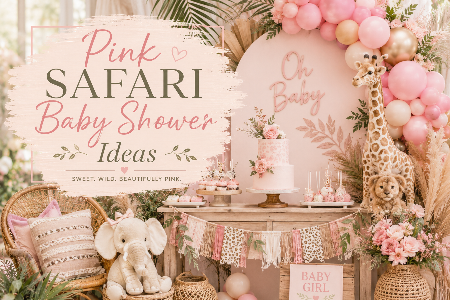
Pink Safari Baby Shower Ideas
Baby Shower · Girl Theme Guide
Pink Safari Baby Shower Ideas
The three pink decisions that make or break the aesthetic, four palette directions from blush classic to boho botanical, and the complete stationery showcase.
Pink and safari work together for the same reason wildflowers grow on the savanna — warmth, softness, and the specific beauty of nature in bloom. The pink safari baby shower is one of the most consistently beautiful and most consistently saved girl shower themes on Pinterest, not because pink and safari are an obvious pairing but because the right pink — dusty, warm, botanical — belongs to exactly the same colour world as the warm cream, honey amber, and antique gold of the savanna palette. This guide explains which pink works, which doesn’t, and how to build a pink safari shower that reads as romantically beautiful rather than generically girly.
Shop the Pink Safari Girl collection
Invitations, welcome signs, favour tags — dusty rose and warm cream, fully customisable.
“Pink and safari work together for the same reason wildflowers grow on the savanna — warmth, softness, and the specific beauty of nature in bloom.”
Section 01 Why Pink Safari Works — And When It Doesn’t
The pink safari shower is the most popular girl safari direction on Pinterest for a reason: when it is done correctly, it is genuinely and specifically beautiful. When it is done incorrectly — which is more often than most planning guides acknowledge — it reads as a generic girl party with a giraffe placed on the table. The difference is three specific decisions, each of which is binary: get it right and the aesthetic works; get it wrong and no amount of additional decoration will fix it.
Decision 1
Warm Pink vs. Cool Pink
When it goes wrong: Bubblegum pink, candy pink, bright magenta, and any pink with a blue or purple undertone reads as a children’s birthday party colour rather than as a safari palette accent. Cool pink fights the warm cream, honey amber, and antique gold of the savanna palette at every level — in photographs, the cool pink reads as a separate visual world from the warm natural colours around it, creating a palette that looks assembled from incompatible sources rather than designed as a coherent whole.
What works: Dusty rose, warm blush, and peachy-pink — any pink with a warm, slightly beige or amber undertone — reads as belonging to the same warm colour family as the safari palette. The test: hold the pink element next to a warm cream fabric or card. If the pink reads as warmer and more peachy next to the cream, it belongs. If it reads as cooler and more lavender next to the cream, it does not.
Decision 2
Botanicals Are Mandatory
When it goes wrong: Pink safari without a botanical layer reads as a generic pink girl party that happens to have a safari animal on the invitation. The animal motif tells the theme; the botanical layer tells the aesthetic register. A pink balloon and a giraffe figure on a table is a pink party with a safari animal. A dusty rose balloon cluster beside a dried protea arrangement beside a watercolour botanical invitation is a pink safari shower. The botanical vocabulary does the work of connecting the pink accent to the natural world of the savanna.
What works: Add at least one botanical element to every zone of the pink safari shower: watercolour botanical illustration on the invitation and all stationery pieces; dried or fresh botanical material in every centrepiece; botanical botanical detailing on the cake (dried florals, pressed botanical elements, a botanical topper); and a botanical garland or pampas element in the backdrop. When botanicals appear consistently across every zone, the pink reads as a natural accent within a botanical safari world rather than as a colour applied to a party theme.
Decision 3
Gold Not Silver
When it goes wrong: Silver and chrome read as cool, modern, and metropolitan — the visual opposite of the warm, natural, sun-saturated quality of the African savanna palette. A silver balloon or a silver metallic detail in a pink safari shower creates an immediate temperature conflict: silver is cool-toned and belongs to a different colour world from dusty rose, warm cream, and honey amber. The conflict is visible in every photograph.
What works: Antique gold exclusively. Antique gold (warm, slightly aged, and muted rather than bright or metallic-bright) belongs to the same warm colour family as the savanna palette and enhances the dusty rose without competing with it. The specific quality of antique gold — warm, not shiny, not cool-toned — is the metallic that reads as specifically beautiful in a pink safari context. Bright gold or chrome gold also reads as too cool and too contemporary; antique gold, at the right level of warmth and muting, is the only metallic that belongs in this palette.
✨ Styling Tip
Hold your pinks next to each other before buying anything. Lay out the invitation, the fabric swatch, a balloon sample, and any pink decoration element on a warm cream or ivory surface and look at them together. Warm pink next to warm pink reads as cohesive — every element in the same peachy-rose direction, with the same warm undertone. Warm pink next to cool pink reads as broken — one element leaning peachy and warm, one leaning lavender or cool, the palette falling apart at the comparison. Every element must lean in the same warm direction. If any element reads as cooler or more purple than the others, replace it before the shower.
Section 02 Four Pink Safari Palette Directions
Four ways to build a pink safari shower — each with a different warmth temperature and a different botanical vocabulary. The right direction is the one whose specific palette feeling most closely matches the intended atmosphere of the celebration.
2.1 Blush & Cream Classic
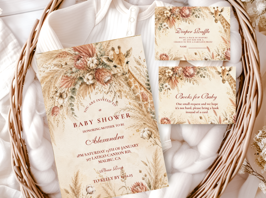
The Blush and Cream Classic is the most broadly beautiful and the most consistently Pinterest-saved pink safari direction — it uses the simplest and the most timeless palette combination in the girl safari category: warm blush and soft dusty rose as the pink accent (at 30% of the visual field), warm cream and ivory as the base (at 60%), and antique gold as the metallic statement detail (at 10%). The result reads as simultaneously romantic and natural — the specific warmth of the blush against the warm cream base produces the visual quality of dried rose petals pressed inside a warm book: aged, specific, and genuinely beautiful.
The botanical vocabulary for the Blush and Cream Classic: dried and fresh protea in warm rose tones as the hero botanical element (the protea is the most specifically African flower available in standard florist stock and belongs directly to the safari world); warm blush garden roses at their most fully open as the secondary floral element; and dried pampas grass in cream as the neutral botanical structural element. The watercolour safari animal illustration on the stationery should be in the same warm rose and cream palette as the decoration — a giraffe or elephant painted in warm rose-brown on warm ivory stock, with antique gold text detail.
The Pink Safari Girl Baby Shower collection carries dusty rose and warm cream into every stationery piece — the most consistently beautiful and most widely saved pink safari direction.
✨ Styling Tip
Blush and cream photographs beautifully in any light — it is the safest and most consistently beautiful pink safari combination available. The warm blush reads as luminous rather than flat in any natural light quality, which means it looks as beautiful in an outdoor morning photograph as in a candlelit indoor evening image. If there is any uncertainty about which pink safari direction to choose, blush and cream is the direction that produces the most reliably beautiful result across the broadest range of venue types, lighting conditions, and photography situations.
2.2 Pink & Sage Botanical
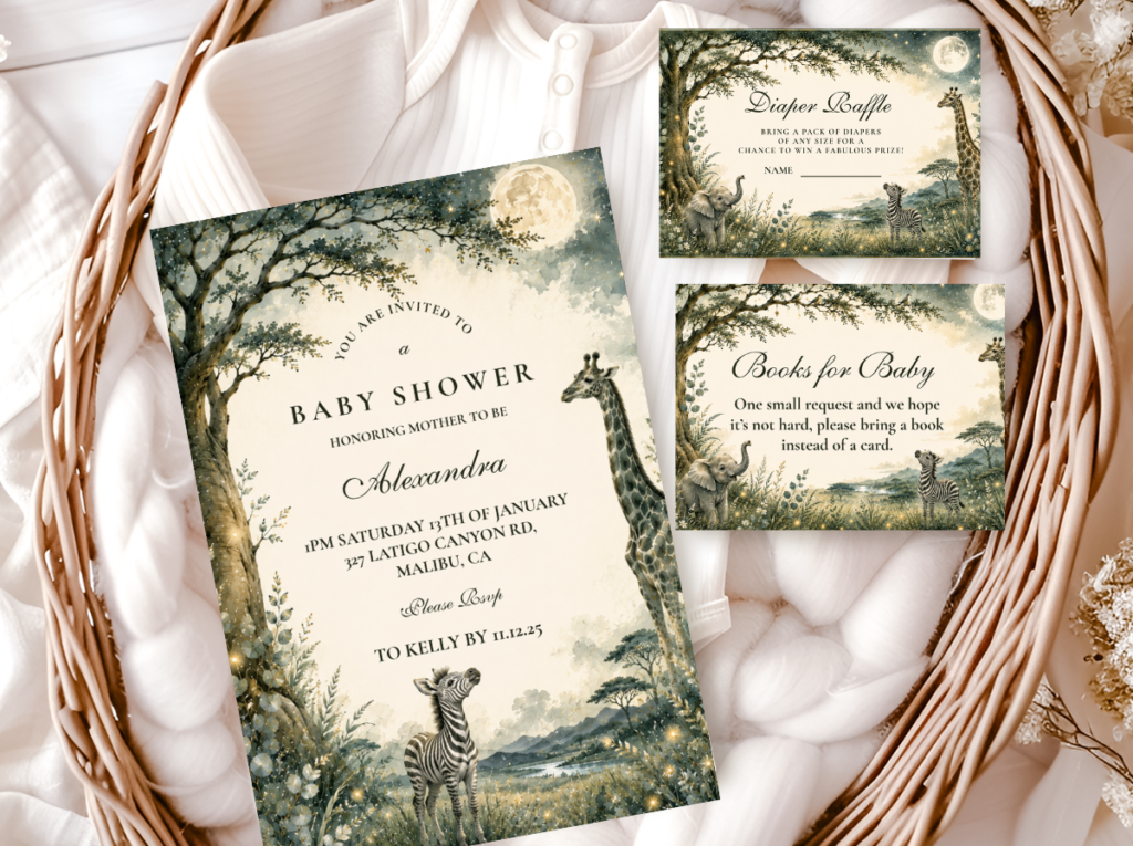
The Pink and Sage Botanical direction is the most contemporary and the most specifically botanical of the four pink safari directions — it pairs warm blush pink with dusty sage green (the two warm natural tones that exist together in the most beautiful botanical world of the savanna edge, where rose-toned wildflowers bloom against dusty sage scrub vegetation) and produces a palette that reads as fresh, botanical, and specifically beautiful rather than conventionally pink. The dusty sage is the element that most specifically connects this direction to the safari world: it references the colour of acacia foliage, savanna scrub vegetation, and the specific grey-green of the botanical savanna edge that makes the warm pink accent read as natural rather than decorative.
The Pink and Sage Botanical direction is most appropriate for spring and outdoor celebrations, for garden venue settings, and for couples who want the girl safari shower to feel botanical and fresh rather than romantically warm. The specific botanical vocabulary: eucalyptus in the round-leaf variety as the primary botanical structural element (its sage tone is the most natural complement to warm blush in any arrangement); blush ranunculus or blush cosmos as the pink floral accent; and dried sage botanical grasses as the natural filler. On the stationery: watercolour safari illustration with a botanical wreath element in sage and blush surrounding the animal detail, on warm ivory stock with antique gold text.
The Sage Green Safari Girl Baby Shower collection carries the sage and warm ivory palette — the most botanical and most specifically fresh direction for a pink and sage safari celebration.
2.3 Pink Boho Safari
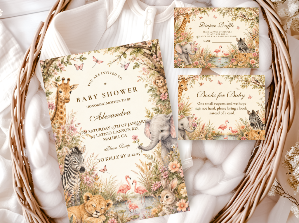
The Pink Boho Safari direction is the most organically earthy and the most texture-forward of the four pink directions — it brings the free-spirited, layered, and gathered quality of the boho aesthetic into the pink safari world and produces a palette that reads as warm, personal, and specifically beautiful in the way of things assembled over time rather than purchased as a complete matching set. The palette: dusty rose and warm terracotta as dual pink-adjacent tones (terracotta as the earthy grounding note, dusty rose as the softer and more specifically pink accent), alongside warm cream and honey amber as the base, with antique gold as the metallic. The texture vocabulary: large dried pampas plumes as the primary botanical element; dried terracotta-toned strawflowers and dried celosia in rust as the secondary botanical material; and macramé or natural linen as the soft texture layer.
The Pink Boho Safari direction is most appropriate for outdoor celebrations, sunset-timing events, and couples whose personal aesthetic is organic and gathered rather than formally designed. The dried botanical quality of the boho direction means that every decoration element can be assembled in advance and stored — unlike fresh floral directions that require same-day assembly — which makes it the most practically convenient of the four pink safari directions for hosts who want to prepare the decoration in stages rather than in one concentrated session before the shower.
The Boho Safari Girl Baby Shower collection carries warm terracotta and earthy botanical illustration — the most organically beautiful direction for a Pink Boho Safari celebration.
2.4 Pink Elegant Safari
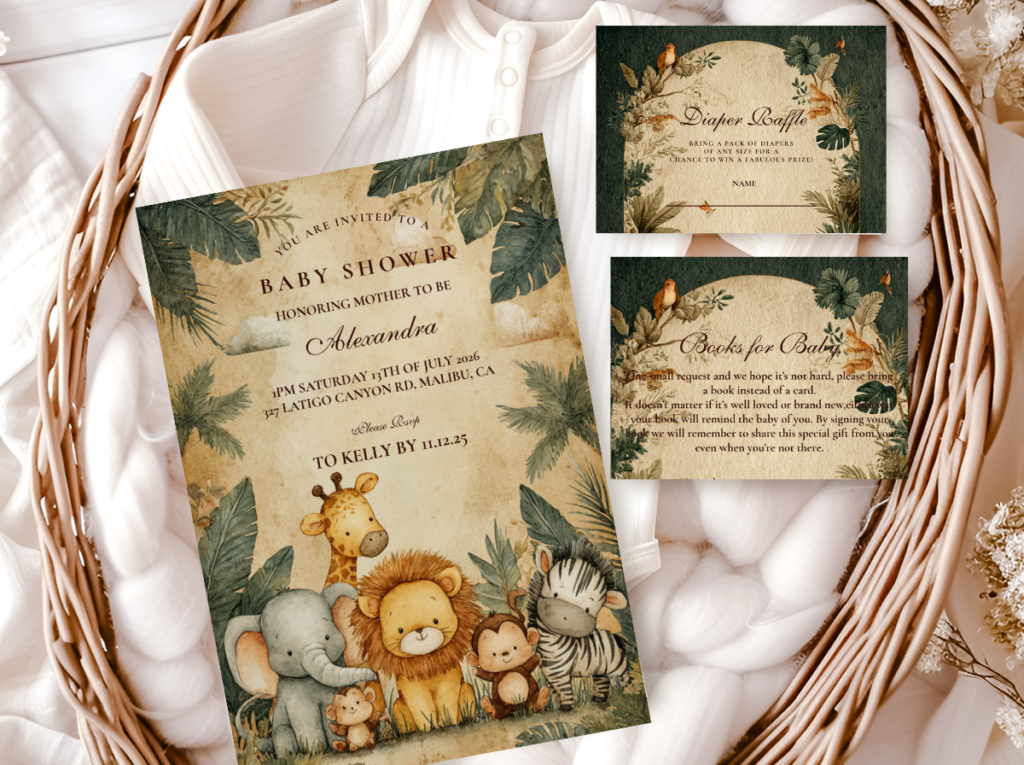
The Pink Elegant Safari direction is the most refined and the most specifically timeless of the four pink directions — it achieves its beauty not through botanical abundance or colour warmth but through the quality and restraint of every material and design choice. The palette is the simplest: warm blush at its most muted and most aged, warm ivory as the base, antique gold as the sole metallic, and no secondary colour. The decoration register: one perfectly arranged centrepiece rather than five adequate ones; one large-format watercolour safari illustration as the backdrop focal point; one quality of stationery that maintains the same illustration and palette standard at every zone from invitation to favour tag. Nothing is excessive; everything is considered.
The Pink Elegant Safari direction is most appropriate for the couple whose aesthetic is specifically refined and who wants the celebration to read as a genuinely beautiful and considered event rather than as a themed party. The invitation is the most important element in the Pink Elegant direction because it is the piece that most specifically communicates the celebration’s register — a watercolour giraffe in warm blush and warm ivory on a heavyweight warm ivory card stock tells every guest, before they have seen a single decoration, that this shower will be warm, beautiful, and specifically intentional.
The Elegant Safari Baby Shower collection carries the most refined stationery direction — warm, watercolour-quality illustration for the most specifically beautiful pink elegant safari celebration.
Section 03 Decor, Cake & Table at a Glance
Pink Safari Backdrop & Welcome Zone
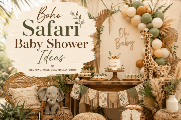
The pink safari backdrop reads most beautifully as a blush and cream balloon organic arch with one botanical panel element — a cluster of dried pampas or fresh protea — integrated within the arch rather than placed beside it. The welcome sign at the entrance should be in the watercolour safari illustration style of the stationery suite, with the safari animal and the botanical wreath element both visible at the welcome sign’s reading distance.
Pink Safari Centrepiece
The pink safari centrepiece uses the three-height formula in the pink direction: a tall dried pampas bundle in warm cream as the tall element; a fresh or dried protea and eucalyptus arrangement in warm blush and sage as the mid element; and three small antique gold tea light votives as the low scatter element. The watercolour place card in the stationery suite’s illustration style at each setting completes the table zone’s stationery layer at the closest examination range.
Pink Safari Cake
The most consistently beautiful pink safari cake direction: a two or three tier cake in warm ivory or warm blush buttercream with a dried botanical and protea topper in the shower’s specific pink and sage or pink and cream palette direction. The cake and the stationery should reference the same botanical illustration vocabulary — when the dried protea on the cake and the watercolour protea on the invitation are in the same warm rose tone, the two most-photographed elements of the shower belong to the same designed world.
✨ Styling Tip
In a pink safari shower, one botanical element per zone is the rule — centrepiece, cake, invitation, favour, backdrop. Consistent botanicals across every zone is what makes the pink read as safari rather than as a generic pink girl party. The botanical layer is the element that connects the pink accent to the natural world of the savanna; without it, the pink is decorative. With it, the pink is specific and beautiful. Ask before placing any pink safari decoration element: where is the botanical in this zone?
Section 04 Invitations & Stationery
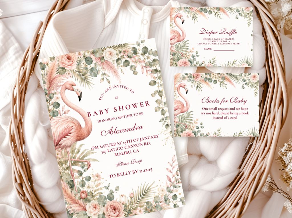
The pink safari invitation is the piece that most specifically establishes whether the shower will read as romantically beautiful or as generically pink. A watercolour giraffe or elephant in warm dusty rose and warm brown on warm ivory stock, with antique gold text and a botanical wreath element surrounding the animal illustration, reads as specifically and beautifully made for this celebration. The warm dusty quality of the rose on the invitation is the quality that every subsequent pink decoration element should match — and the botanical illustration detail on the invitation is the quality that every centrepiece, cake, and favour element should echo.
The stationery consistency rule applies especially to the pink safari direction because pink is the accent most likely to drift in temperature between pieces sourced from different designers. When every stationery piece — invitation, welcome sign, place card, menu card, favour tag — is sourced from the same collection, the specific warm dusty rose temperature is consistent across every piece and every zone. When stationery pieces are sourced from different collections or different designers, the specific temperature of the pink can vary enough between pieces that the palette reads as inconsistent even when every individual piece is beautiful in isolation.
The botanical illustration quality of the stationery is also most specifically important in the pink safari direction because the botanical element is doing the specific work of connecting the pink accent to the safari world. A stationery collection with generic cartoon safari animals and no botanical illustration detail will not produce the specific quality of a pink safari shower — it will produce a pink party with a safari animal applied to it. Browse all six collections below and look specifically for the illustration quality and the botanical detail of each before deciding.
Primary
Pink Safari Girl Baby Shower
Dusty rose and warm cream — the most consistently beautiful pink safari stationery direction.
Girl Safari
Girl Safari Baby Shower
Warm ivory and antique gold — botanical and fresh, most aligned with the Pink & Sage direction.
Sage Botanical
Sage Green Safari Girl
Dusty sage and warm ivory — the most botanical companion to the Pink & Sage direction.
Boho Direction
Boho Safari Girl
Warm terracotta and earthy botanical — most aligned with the Pink Boho Safari direction.
Elegant
Elegant Safari Baby Shower
The most refined direction — most aligned with the Pink Elegant Safari register.
All Safari
Safari Theme Collection
The complete umbrella collection — every safari style, every stationery piece.
Frequently Asked Questions
What pink colors work for a safari baby shower?
The pink colours that work in a safari baby shower are exclusively warm-toned pinks: dusty rose (a warm, slightly peachy, slightly aged rose — the pink most directly associated with dried flowers and vintage linen); warm blush (a very pale, peachy pink that reads as almost cream in some lights and as clearly rose in others); and warm peach-pink (any pink with a warm amber or peach undertone). The test for any specific pink: hold it next to warm cream or warm ivory. If it reads as warmer and more peachy beside the cream, it belongs in the safari palette. If it reads as cooler, more lavender, or more purple beside the cream, it does not belong and will create a palette conflict in every photograph. Bubblegum pink, candy pink, bright fuchsia, and any pink with a blue or purple undertone should be avoided entirely.
What flowers work in a pink safari baby shower?
The most specifically beautiful and most safari-appropriate flowers for a pink safari shower are: dried and fresh protea in warm rose tones (the protea is native to the Cape and is the most directly African flower available in standard florist stock — its large-scale dramatic form and warm rose-to-rust colour range make it the most specifically appropriate hero flower for any pink safari direction); warm blush garden roses at their most fully open form; dried pampas grass in cream as the neutral structural botanical element; round-leaf eucalyptus as the sage botanical foliage element (most appropriate for the Pink and Sage direction); and dried strawflowers in warm rose and terracotta as the small-form scatter botanical. All of these belong directly to the warm, natural, botanical world of the savanna and connect the pink accent to the safari aesthetic rather than simply decorating the table with pink flowers.
Can a pink safari shower work without using obvious safari animals everywhere?
Yes — and a pink safari shower that uses one beautifully illustrated safari animal rather than five competing ones is significantly more beautiful than a shower covered in multiple animal motifs at the same visual weight. The safari aesthetic reads most elegantly when one hero animal (a giraffe or an elephant — the two most specifically savanna-associated and most visually distinctive animals) appears on the invitation, the welcome sign, and the centrepiece detail, with the botanical layer carrying the visual weight of the rest of the decoration. The animal motif is the theme signal; the botanical layer and the warm natural palette are the aesthetic. A pink safari shower with one beautifully watercolour-illustrated giraffe on warm ivory and dusty rose botanical stationery reads as more specifically and more beautifully safari than a shower with giraffe balloons, zebra napkins, elephant cupcake toppers, and lion place cards all competing simultaneously.
Is a pink safari shower only for girls?
The pink safari direction is most commonly chosen for girl-directed celebrations, but the specific palette direction of the pink (warm and dusty rather than bright and saturated) means it reads as warm and botanical rather than as specifically gender-coded to all guests. A pink safari shower with a warm dusty rose palette, botanical stationery, and dried floral centrepieces reads as a warmly beautiful celebration first and as a girl-directed celebration second — which means it is appropriate for any celebration where a warm, romantic, botanical aesthetic is the primary intention, regardless of whether the guest of honour’s gender is announced, known, or relevant to the aesthetic direction. The sage and pink botanical direction in particular (Section 2.2) reads as botanical and fresh enough that it works for neutral celebrations equally well.
Shop the Pink Safari Collection
Pink Safari Baby Shower Stationery — All Directions
Invitations, welcome signs, favour tags — dusty rose and warm botanical, fully customisable with your details.