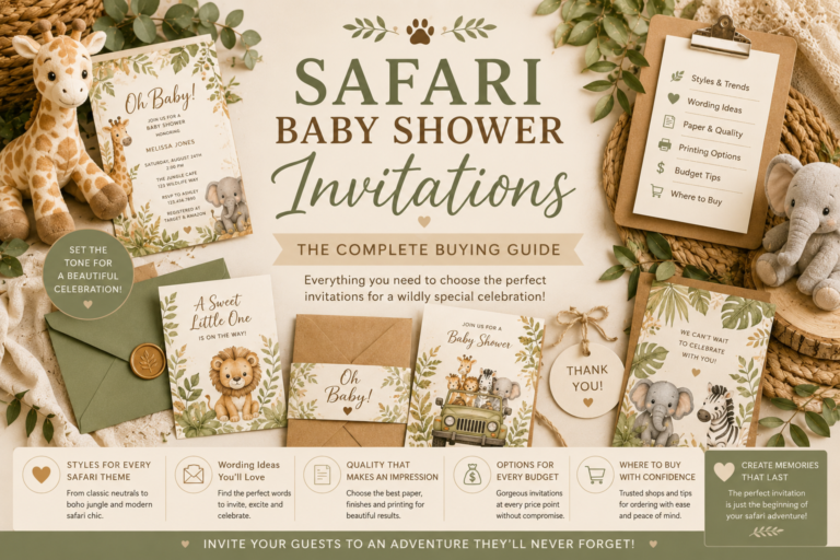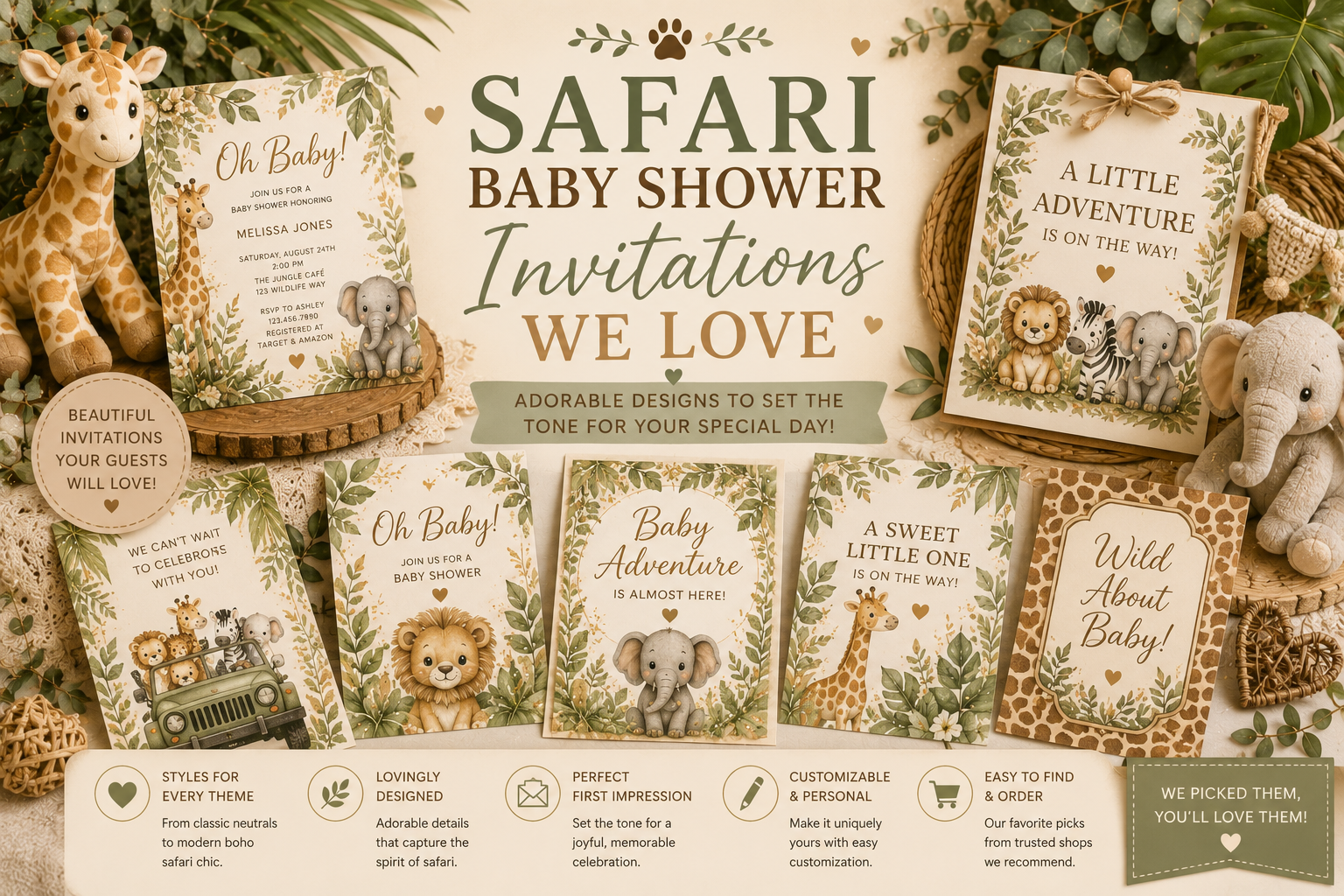
Safari Baby Shower Invitations We Love
Baby Shower · Invitations Guide
Safari Baby Shower Invitations We Love
Why the invitation must come first, five safari invitation directions matched to every aesthetic, what to include and how to word it, and how to extend the design across the complete stationery suite.
The safari baby shower invitation is the first piece of the savanna world guests touch — it arrives in their hands weeks before the celebration, and everything it communicates — the palette temperature, the illustration quality, the paper warmth, the typography register — becomes the expectation against which every decoration, every cookie, every printed element at the shower will be measured. Most safari shower planning guides treat the invitation as one element among many, chosen after the decoration scheme is established. This guide makes the opposite argument: the invitation is the only element that should be chosen first, and the one against which every subsequent decision should be tested.
Browse the complete safari stationery collection
Invitations, welcome signs, favour tags — all coordinated and fully customisable.
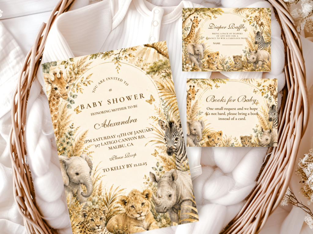
“The safari invitation is the first piece of the savanna world guests touch — it sets the palette, the illustration style, and the tone for everything they will encounter on the day.”
Section 01 The Invitation as the Foundation
Most baby shower planning follows a sequence in which the invitation is chosen late — after the colour scheme has been established, after the decoration has been provisionally planned, after several other design decisions have already been made. This sequence produces a specific and consistent problem: the invitation is then chosen to be ‘compatible’ with the decisions that precede it, which means it is not the source of those decisions but the product of them. The result is a shower in which the invitation feels like one element in an existing scheme rather than the origin of the entire scheme — which is exactly what it is when the planning sequence is reversed and the invitation is chosen first.
Reason 1
The Invitation Establishes the Illustration Style for Everything That Follows
The illustration style of the safari invitation — watercolour, elegant line art, cartoon, graphic — is the illustration style that every subsequent printed element of the shower must match. The cookie illustration must match it. The cake topper illustration must match it. The welcome sign, the place cards, the favour tags, the cupcake toppers — all of them must be in the same illustration register as the invitation, or the aesthetic cohesion of the celebration breaks at the point where two inconsistent illustration styles appear in the same visual field. If the invitation is chosen last — after the cookies, the cake topper, and the signage have all been sourced from different designers in different illustration styles — the invitation arrives as one more incompatible element in an already inconsistent collection rather than as the standard against which all other elements were measured. The invitation must come first because its illustration style is the specification against which every other printed element will either pass or fail.
Reason 2
The Paper Stock Communicates Before the Design Does
A guest receiving a safari baby shower invitation on bright white card stock has already received one piece of information before they have read a word: that this shower’s printed materials are in a cool-toned, commercially smooth register. If the shower decoration is warm ivory, honey amber, and antique gold — the entire warm natural palette of the savanna — the cool white card stock of the invitation has already created a temperature disconnect that the design cannot correct. Warm ivory card stock, kraft-toned paper, or subtly textured warm paper communicates warmth before any element of the design is seen. The paper stock is the first aesthetic decision an invitation makes, and it is one that most print-on-demand product previews do not make sufficiently visible — which is why ordering a physical sample before committing to a full print run is the single most reliable way to verify that the paper warmth is correct.
Reason 3
The Typography Is a Palette Decision
The typeface of the safari invitation is not a stylistic choice separate from the palette — it is a palette decision with the same weight as the colour choice. Serif and script typefaces read as warm, historical, and specifically beautiful: they belong to the same visual world as the organic line-work of watercolour illustration, the warm stock of a quality printed card, and the antique gold of the metallic accent. Sans-serif typefaces read as modern, clinical, and specifically contemporary: they belong to the visual world of digital design and contemporary commercial print, which is a different visual world from the warm natural aesthetic of the African savanna. A watercolour safari animal illustration set in a clean modern sans-serif typeface creates the same kind of visual temperature conflict as a cold white card stock: the illustration says ‘warm and organic’ and the typography says ‘modern and cool’, and the invitation communicates both messages simultaneously rather than one coherent one.
✨ Styling Tip
Choose the invitation before buying a single decoration. Once chosen, pin it to your mood board — physically or digitally — and make every subsequent decoration decision in its presence. Every decoration element should pass one test before being purchased: does it look as though it belongs in the same world as this invitation? The same illustration register, the same palette temperature, the same material quality. If yes, buy it. If not, leave it — no matter how much you like it in isolation, no matter how safari-appropriate it looks on its own. An element that belongs to a different aesthetic world from the invitation will always look wrong beside the elements that belong to the same world as the invitation.
Section 02 Five Safari Invitation Directions
Five complete invitation directions, each establishing a different illustration style, palette temperature, and aesthetic register. The right direction is the one whose specific qualities become the specification for every other printed element of the shower.
Most Artistic
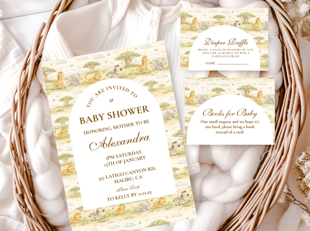
Watercolour Safari Invitation
Warm Ivory Stock · Watercolour Illustration · Script Typography · Warm Gold Detail
The Watercolour Safari Invitation is the most artistically ambitious and the most photographically extraordinary of the five directions — and the one most likely to be kept by guests long after the shower has passed. A watercolour invitation is kept because it is beautiful as an object, not merely functional as a communication: the specific quality of the watercolour safari animal illustration (soft blended edges, visible brushwork, warm tonal variation within the animal form, the specific organic quality of the illustration that reads as made by hand rather than produced by machine) makes the invitation something worth preserving rather than discarding. The palette of the watercolour safari invitation: warm ivory stock (the warmth of the base is the first and most important quality, and it reads immediately against any cool or bright white); warm honey and warm brown as the primary illustration tones; dusty sage as the botanical accent where botanical elements appear in the design; and antique gold as the metallic detail in the typography or the border. The typography: a readable script for the most important information (the guest of honour’s name, the date) and a classic serif for all practical information. Nothing sans-serif.
✨ Styling Tip
A watercolour safari invitation should look as though it was painted specifically for this celebration — organic line-work, visible brush texture in the botanical elements, safari animals that look like wildlife illustrations from a natural history museum rather than like clip art adapted for a party invitation. This quality is immediately visible at close range — the guest holds the invitation and either sees a specific and beautiful painted object or sees a generic digital illustration dressed in watercolour styling — and it is the quality that determines whether the invitation is kept or discarded. The specification question: does the giraffe on this invitation look like a giraffe, or does it look like a giraffe-shaped decoration?
Most Sophisticated
Elegant Safari Invitation
Warm Ivory · Refined Botanical Border · Precise Animal Detail · Antique Gold
The Elegant Safari Invitation is the most refined and the most universally appropriate of the five directions — it achieves its aesthetic through the precision and quality of its illustration rather than through abundance of botanical or colour detail. The animal illustration is in natural proportion (a giraffe that reads as a giraffe at normal viewing distance, not as a cartoon approximation); the botanical border is detailed and genuinely beautiful rather than generic party-supply botanical; and the antique gold metallic is applied as a deliberate accent rather than as a general decorative coating. The typography belongs specifically to the elegant direction: a classic proportioned serif with generous letter-spacing for the primary text, and no script except optionally for the guest of honour’s name. The elegant safari invitation is the most appropriate for a guest list where aesthetic preferences vary widely — it reads as beautiful to guests from every aesthetic tradition because it makes no strongly directional aesthetic statement other than ‘this is a considered and beautiful invitation.’
Boy Direction
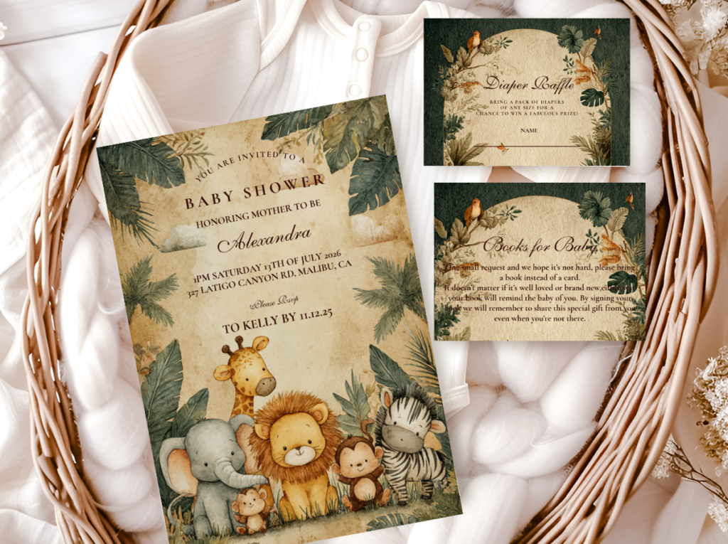
Jungle Safari Boy Invitation
Deep Olive · Warm Brown · Dense Botanical Border · Bold Serif
The Jungle Safari Boy Invitation is the most adventure-forward and the most specifically directional of the five directions — it establishes a dark, dramatic, and botanically dense aesthetic register that every subsequent decoration element must then match. The palette: deep olive as the primary botanical tone (the specific dark, warm yellow-toned olive of savanna scrub vegetation — not bright green, not cool forest green, but the specific dusty olive that reads as African); warm brown as the animal and typography tone; and warm cream as the card stock and text contrast. The botanical border should be genuinely dense — leaves overlapping, stems extending to the edge of the card — to establish the jungle canopy quality that the boy safari aesthetic references. The typography: a bold serif or a bold condensed serif for the primary text, communicating the weight and adventure-forward quality of the aesthetic. No script, no light weight fonts: the Jungle Safari Boy Invitation should read as bold and specifically masculine.

Girl Direction
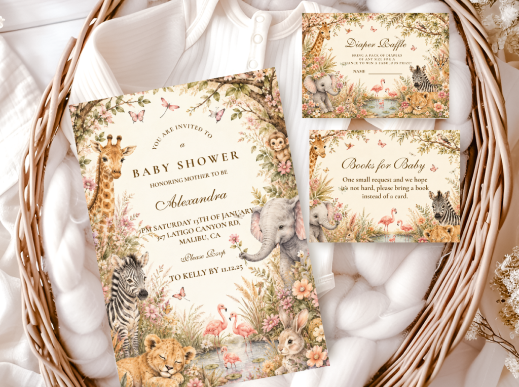
Pink Safari Girl Invitation
Dusty Rose · Warm Blush · Botanical Safari Animals · Script Typography
The Pink Safari Girl Invitation establishes the warm and romantic register of the girl safari aesthetic through the specific quality of its pink — dusty rose and warm blush, never bright or cool-toned — and through the integration of botanical detail with the safari animal illustration. The animal illustration for the pink safari girl direction should include a botanical element alongside or within the animal form: a giraffe with botanical flowers at the base of its legs; an elephant with a floral wreath around its ear; small pressed-flower details in the invitation’s botanical border. This botanical integration is the element that connects the pink accent to the safari world rather than to a generic girl party — the botanical vocabulary does the thematic work of anchoring the warm pink in the natural world. The typography: a romantic script for the guest of honour’s name and the primary wording, and a warm classic serif for all practical information.
Boho Direction
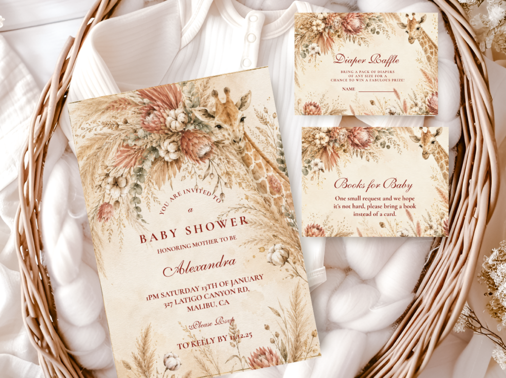
Boho Safari Invitation
Terracotta · Oatmeal · Dried Botanical Elements · Hand-Lettered Style
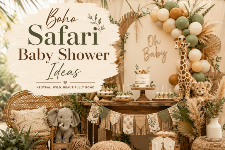
The Boho Safari Invitation establishes the earthy, organic, and specifically textural aesthetic register of the boho safari direction — the register that makes dried pampas, rattan vessels, and linen tablecloths the correct decoration choices rather than fresh flowers, ceramic vessels, and paper napkins. The palette of the boho safari invitation: warm terracotta as the primary accent, oatmeal and warm cream as the base, warm brown as the secondary detail, and antique gold as the minimal metallic. The illustration style: organic and slightly imperfect line-work (the boho aesthetic values the quality of handmade illustration rather than the precision of digital line art) with dried botanical elements (pampas, dried grasses, dried protea illustrated in line-work rather than in painted colour washes). The typography: a hand-lettered or organic script style that reads as written rather than typeset — warm, personal, and specifically earthy rather than formally composed.
Section 03 What to Include & Wording Guide
Essential Information Checklist
Six elements must appear on every safari baby shower invitation, in the following hierarchy of importance: the guest of honour’s name (the largest and most prominent element — the celebration is specifically for this person and the invitation should communicate that immediately); the occasion (‘Safari Baby Shower’ or a personalised equivalent); the date including the day of the week; the time, both start and end; the venue name and full address; and the RSVP information (who to contact, by what method, and by what deadline). A common omission that creates significant practical problems: the RSVP deadline. Many invitations include RSVP contact information without a deadline, leaving guests without a specific date by which to respond and leaving the host without a specific date to begin following up. The RSVP deadline should appear in the smallest type on the invitation but it must appear.
Wording Tone for Safari
The wording register of the safari invitation should sound like the illustration looks: warm, specific, and personal rather than formally generic. ‘You are cordially invited to a baby shower’ belongs to a formal wedding-adjacent register that reads as incongruous beside a watercolour giraffe illustration. ‘A little wild one is on the way — join us to welcome her’ reads as specifically and warmly safari. The test: read the wording aloud beside the invitation and ask whether the wording and the illustration communicate the same event. If the wording is more formal than the illustration, the invitation communicates two different aesthetic registers simultaneously rather than one coherent one.
Safari-Appropriate Wording
A little wild one is on the way — join us in the savanna to welcome [Name]. // Into the wild we go — please join us to celebrate the arrival of [Name]’s little explorer. // Something wild and wonderful is coming — please join [Host Name] for a safari baby shower celebrating [Name].
Wording to Avoid in a Safari Context
You are cordially invited to a baby shower in honour of [Name]. // Please join us to celebrate the upcoming birth of [Name]’s baby. // [Host Name] requests your presence at a baby shower for [Name]. (These register as formal and generic rather than warm and safari-specific.)
Registry Etiquette
The registry information should not appear on the invitation itself — this is the single most consistent etiquette position across every cultural tradition that has addressed it, and it applies to baby showers as much as to weddings. The invitation is for communicating the celebration; the registry is for communicating the gift expectation, and placing a gift expectation on the invitation conflates two communications that should remain separate. The correct approach: include the registry information on a separate enclosure card, and include the enclosure card in the same envelope as the invitation. The enclosure card can be in the same illustration style and palette as the invitation, making the complete envelope content a visually coherent suite. If a physical enclosure card is not possible within the budget, the registry information can be communicated separately by the host to guests who ask, or included in a digital companion to the printed invitation.
✨ Styling Tip
Set the RSVP deadline three weeks before the shower date, not one. The number of suppliers whose timelines are determined by your final guest count is larger than most hosts realise when they are planning the invitation: the food quantity, the favour quantity, the table arrangement, and any activity or game materials that require individual preparation per guest all need a confirmed headcount at least two weeks before the shower. A one-week RSVP deadline gives the host a maximum of seven days between confirmed count and shower date — which is not sufficient for most supplier timelines. Three weeks gives two full weeks of buffer after the RSVP deadline and before the shower, which is sufficient for any last-minute adjustment.
Section 04 Coordinating the Full Stationery Suite
The invitation is the first printed element guests encounter and the one against which every other printed element of the shower should be measured. The stationery suite extends the invitation’s design across every zone of the celebration: the welcome sign (the first element guests see when they arrive, which should read as belonging to the same designed world as the invitation they received weeks earlier); the place cards (the most personally addressed elements, with each guest’s name in the invitation’s illustration register); the menu cards (the longest-held printed element, examined throughout the meal and therefore the most closely read of all the suite pieces); the favour tags (the element guests take home, which keeps the celebration alive in memory longer than any photograph); and the thank-you cards (the final piece of the stationery suite, which closes the celebration experience months after the shower has passed and which should read as clearly as a continuation of the invitation as the welcome sign that opened it).
The consistency principle applies most critically between the invitation and the welcome sign — because these two elements are the most widely separated in time (the invitation arrives weeks before the welcome sign is seen) and yet should read as from the same designed world when the guest sees them in sequence. A guest who received a watercolour safari invitation in warm ivory and dusty sage five weeks earlier and then encounters a cartoon safari welcome sign in bright primary green at the entrance to the shower has experienced the most significant aesthetic discontinuity available in the shower’s stationery. The consistency principle also applies most practically to the favour tag — because the favour tag is the element guests will read again after the shower, when they are unpacking their favour bag or deciding whether to keep the tag as a memento. A favour tag in the same illustration register as the invitation is a favour tag worth keeping.
Browse all six collections below. The most reliable approach is to source every stationery piece — from invitation to thank-you card — from the same collection, ensuring that the illustration quality, the palette temperature, and the typography register are identical across every piece without requiring any matching or verification. When sourcing from the same collection, the invitation becomes the specification and every other piece is already guaranteed to meet it.
All Safari
Safari Theme Collection
The complete umbrella collection — every safari style, every stationery piece, every suite element.
Watercolour
Watercolour Safari Baby Shower
Warm watercolour illustration — the most artistic and most photographically extraordinary direction.
Elegant
Elegant Safari Baby Shower
Refined botanical illustration and antique gold — the most sophisticated and most versatile direction.
Jungle Boy
Jungle Safari Boy Baby Shower
Deep olive and warm brown — the most adventure-forward and most specifically directional boy invitation.
Pink Girl
Pink Safari Girl Baby Shower
Dusty rose and warm cream botanical — the most consistently beautiful girl safari invitation direction.
Boho
Boho Safari Girl Baby Shower
Terracotta and oatmeal organic — the most earthy and the most texture-forward invitation direction.
Frequently Asked Questions
When should I send safari baby shower invitations?
The standard sending timeline is 3–4 weeks before the shower for a primarily local guest list, and 5–6 weeks before for guests who need to arrange travel or accommodation. However, the most reliable practice is to work backwards from the RSVP deadline rather than from the shower date: set the RSVP deadline three weeks before the shower (as argued in Section 3.3), then send the invitation two weeks before the RSVP deadline — which means sending 5 weeks before the shower date for a local event, and 7–8 weeks before for an event requiring travel. This timeline allows the full RSVP window to elapse, a follow-up window for non-responders, and the three-week supplier buffer that most catering, favour, and activity suppliers require. The printing and delivery timeline for print-on-demand invitations should be added to this calculation: typically 7–10 business days for production plus the shipping estimate, which means placing the order 3–4 weeks before the desired sending date.
Digital vs. printed safari invitations — which is better?
Printed and digital safari invitations serve different purposes and produce significantly different impressions. A printed watercolour safari invitation on warm ivory card stock communicates a specific level of aesthetic intentionality — the warmth of the paper, the quality of the print, and the physical weight of the card all make an impression that no digital equivalent can replicate. A digital safari invitation is appropriate for informal celebrations, for budget-constrained situations, and as a supplement to the printed invitation for guests who need an immediate digital record of the event details. The practical recommendation: if the shower has been planned to be aesthetically considered — if the decoration, the stationery suite, and the cake are all being chosen with care — a printed invitation is consistent with that level of consideration. A digital invitation beside a carefully designed printed stationery suite signals an inconsistency in the level of investment in the different elements. If the budget requires a digital invitation, keep all other printed elements (welcome sign, place cards, favour tags) at the highest quality available, and let the in-person printed elements carry the aesthetic standard the invitation could not.
What information is essential on a safari baby shower invitation vs. optional?
Essential — must appear: the guest of honour’s name; the occasion (‘Baby Shower’ or equivalent); the date (including day of week); the time (start and optionally end); the venue name and full address; and the RSVP contact and deadline. Optional — appropriate where relevant but not required: the baby’s gender (if being announced by the invitation); a safari-themed wording element (‘A little wild one is on the way’); a dress code if the celebration has one; and parking or travel directions if the venue is difficult to find. Not appropriate on the invitation itself: registry information (this belongs on a separate enclosure card); any request phrasing that implies an expected gift format (‘No boxed gifts please’, ‘Bring a book instead of a card’); and any information that would be more appropriately communicated by the host directly than by the invitation.
How do I match the invitation to the rest of the safari shower decor?
The invitation-first principle in Section 01 answers this directly: the invitation should be chosen first and every decoration element should be chosen to match it, not the reverse. The specific matching tests: illustration register (watercolour invitation beside watercolour-style signage and hand-painted cookies; elegant line-art invitation beside precisely illustrated signage and clean royal-icing cookies; cartoon invitation beside cartoon-style signage and fondant-decorated cookies — the illustration register must be consistent across all elements); palette temperature (every element warm in the same direction — warm honey versus cool taupe, warm blush versus cool lavender, dusty sage versus bright green — with the invitation as the temperature standard); and material quality (a high-quality printed invitation beside a low-quality digital welcome sign, or a premium invitation beside a cheap paper tablecloth, creates visible inconsistency). The single most reliable method: source all printed elements from the same stationery collection as the invitation, and choose decoration elements whose colour temperature matches the specific palette tones visible in the invitation image.
Start Here
Browse All Safari Baby Shower Invitations
Fully customisable with your names, date, venue, and wording — in every safari palette direction and every illustration style.