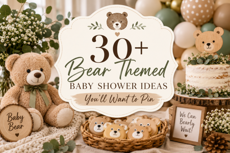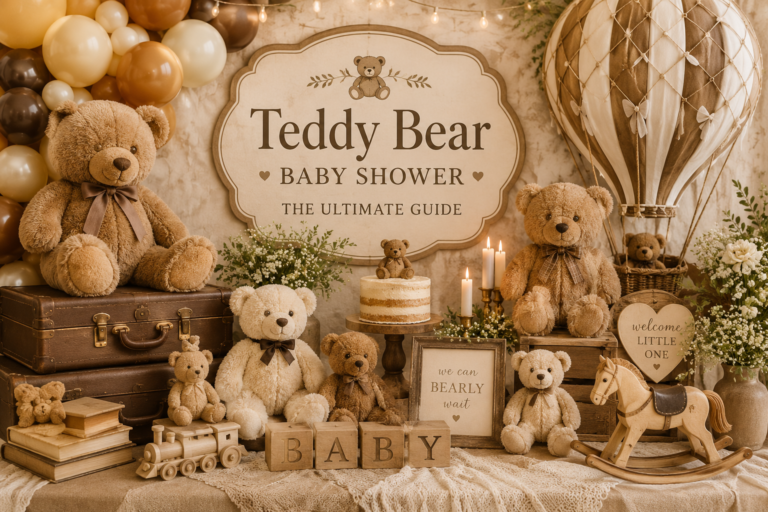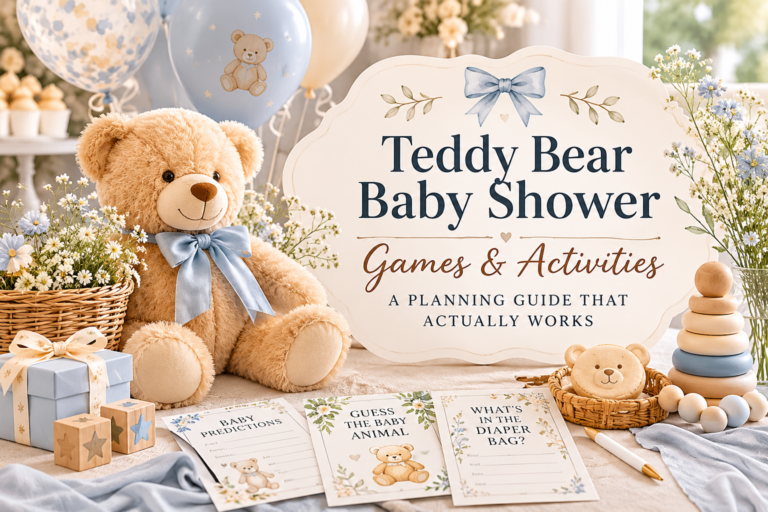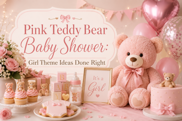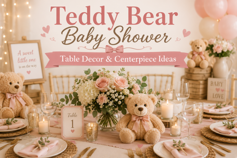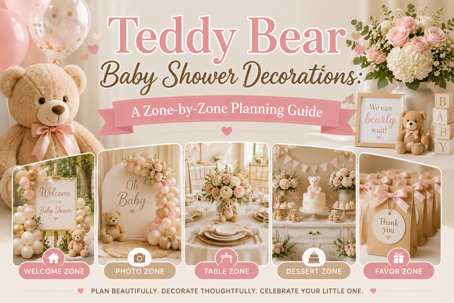
Teddy Bear Baby Shower Decorations: A Zone-by-Zone Planning Guide
Bear Baby Shower Decoration Guide
Teddy Bear Baby Shower Decorations: A Zone-by-Zone Planning Guide
Not a list of bear items to buy — a zone-by-zone plan that ensures every corner of the space feels intentional rather than assembled.
Most baby shower decoration guides approach the room as a shopping list: buy a welcome sign, buy balloons, buy a centerpiece, buy favors. The problem with this approach is that it produces a room where every element was chosen in isolation — each one perhaps lovely on its own, and collectively incoherent. A teddy bear baby shower that looks genuinely designed rather than merely decorated is built zone by zone, with deliberate priority decisions about where to spend time and money and where to practice restraint.
This guide divides the shower space into five zones, assigns each a decoration priority and budget weighting, and specifies exactly what each zone needs at minimum and what makes it exceptional. Then five zones of specific bear shower decoration directions, with the palette bridges and stationery connections that tie every printed element in the room into a single visual world.
“A decorated room and a designed room are not the same thing — the difference is whether every element was chosen to work together or simply chosen to be there.”
Section 01 The Zone-by-Zone Decoration Plan
Before buying a single decoration, divide the space into five zones and assign each a priority level. This is the planning decision that prevents the common failure mode of a shower that feels over-decorated in some areas and empty in others — because without a zone framework, decoration spending is driven by anxiety (filling every visible space) rather than strategy (investing where visual impact is highest).
Zone 1 — Highest Priority
The Entrance
Budget allocation: 15%. Sets the tone and emotional expectation before a guest sees anything else. Minimum: a welcome sign and one framing element (balloon cluster or garland). Common mistake: an undersized or generic welcome sign that communicates no aesthetic intention. What makes it exceptional: a sign in the shower’s stationery typography with a single bear motif, propped at eye level on a natural wood easel.
Zone 2 — Highest Priority
The Backdrop / Photo Wall
Budget allocation: 30%. The most photographed zone; every guest photo is taken here. Minimum: any vertical element at height — a balloon cluster, a garland, a fabric panel. Common mistake: leaving the wall behind the main table bare. What makes it exceptional: a cohesive arch or installation wide enough to frame the table in front of it, with a single bear or theme motif at the focal center.
Zone 3 — High Priority
The Guest Tables
Budget allocation: 30%. Where guests spend most of the event — every detail is examined up close. Minimum: a linen, a centerpiece of any kind, and a place card. Common mistake: all centerpieces at the same height, which creates a flat silhouette. What makes it exceptional: three height zones per table, a stationery suite that connects every printed element, and a single warm candle or votive as the ambient layer.
Zone 4 — Medium Priority
The Dessert & Gift Table
Budget allocation: 15%. A visual focal point but secondary to the backdrop and guest tables. Minimum: a runner or table skirt, and at least one vertical element behind the table. Common mistake: the dessert table treated as a flat surface rather than a three-dimensional display. What makes it exceptional: three height zones, a coordinating backdrop element, and labels and tags from the invitation suite.
Zone 5 — Low Priority
Transitional Spaces
Budget allocation: 10%. Hallways, corners, and secondary walls. These need acknowledgment, not investment. Minimum: one ambient element per transitional space — a lantern, a small balloon cluster, or a garland. Common mistake: spending significant budget on corner decorations while the backdrop remains underdeveloped. Zone 5 is noticed when wrong, not when right.
Styling Tip — Budget Priority
Most decoration budgets are spent in the wrong order — hosts over-invest in Zone 5 (corners and transitional spaces) because they feel visually empty and seem to demand something, and under-invest in Zone 2 (the backdrop) because a well-executed backdrop seems expensive and complicated. Reverse this instinct. A strong backdrop with minimal corner decoration looks designed. A weak backdrop with decorated corners looks like a storage room with balloons. The backdrop is the single most photographed element of the shower; the corner is not photographed at all unless something goes wrong. Before spending anything on Zone 5, ensure Zone 2 has received its full 30% allocation. Zone 5 decorations should function as atmosphere, not compensation.
Section 02 Zone 1 — Entrance & Welcome Decorations
2.1 Welcome Sign Directions
The welcome sign is the entrance zone’s primary element — it does more to set the aesthetic register than any other single piece. The material of the sign communicates the aesthetic intention before anyone reads a word on it. A kraft board or MDF wood sign in a warm cream or honey tone reads as organic, warm, and handmade-feeling — the correct register for the vintage, rustic, and neutral bear directions. An acrylic or clear sign reads as modern and minimal — suited to the preppy or slate blue directions. A foam board or paper-backed sign reads as production rather than considered choice, and should be avoided in any direction where the aesthetic goal is “designed rather than decorated.”
The sign should be at minimum 18 inches wide — anything smaller disappears at entrance scale — and should be propped at eye level rather than flat on a table or hung at ceiling height. A natural wood easel is the most versatile display option because it works for every aesthetic direction, can be used at multiple zones throughout the event, and positions the sign at exactly the right height for photography. The typography and bear motif on the sign should match the invitation suite; a sign in a different font and a different bear illustration from the invitation creates the first visual dissonance a guest experiences.
2.2 Entrance Balloon Cluster
The balloon cluster at the entrance should frame the arrival moment rather than fill it. The specific error to avoid is an arch or cluster that blocks the entrance path — guests should be able to walk through comfortably without ducking or brushing against balloons, which immediately reduces the impression from “beautiful entrance” to “obstacle.” The correct approach is a side column or organic cluster positioned to the left or right of the entrance rather than directly overhead or in the path of traffic.
For the bear theme entrance, the balloon palette should match the shower’s palette rather than serving as a standalone statement — cream and honey-toned balloons in an organic cluster, with a single bear ear balloon pair (two rounds with the smaller positioned as ears) as the bear-specific element that signals the theme. The cluster does not need to be large; a grouping of seven to nine balloons at varying heights is more effective and less obstructive than a full arch at an entrance of any standard residential or venue door width.
2.3 Signage Garland and Door Detail
A kraft paper or dried botanical garland draped across the door frame or along the entrance wall adds the texture layer that a sign and balloon cluster alone cannot supply. The garland should be in the same tonal range as the welcome sign — kraft and twine for the warm organic directions, greenery and dried florals for the rustic and floral directions, ribbon and printed pennants for the preppy direction. The printed pennant garland is the most versatile for a preppy or graphic direction because it carries the palette colors and can be cut from the same paper stock as the invitation suite, creating immediate material continuity between the first thing a guest reads and the first decoration they see.
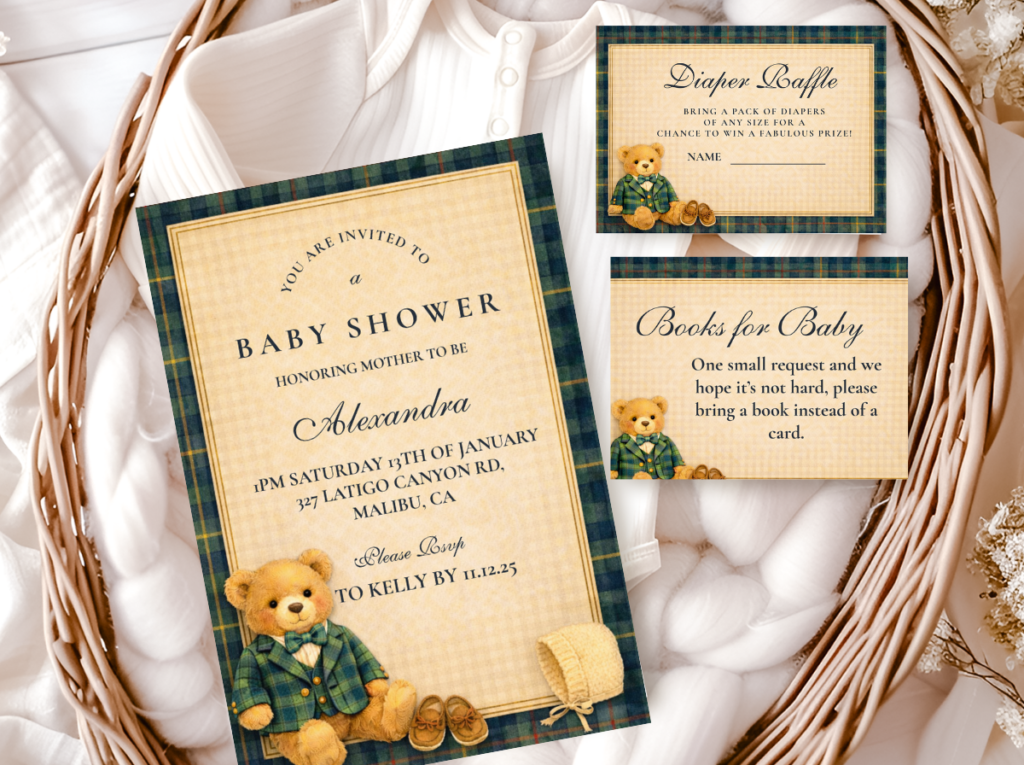
The Preppy Teddy Bear collection offers the clean graphic typography and bear motifs that translate most effectively into entrance signage for the structured, modern direction — the suite that ties the welcome sign, pennant garland, and door detail into a single visual language from arrival.
Section 03 Zone 2 — Backdrop & Photo Wall Decorations
3.1 Balloon Arch Directions for the Bear Theme
The balloon arch is the most versatile backdrop option for the bear theme because it works in any palette direction and at any venue scale — and because the palette combinations that produce well-styled bear shower arches are specific. The warm bear palette arch works in honey amber, warm cream, and caramel brown at the primary color register, with a single accent color pulled from the shower’s secondary palette (dusty rose, sage, or dusty blue) threaded through at approximately 20% of the total balloon count. This ratio — 80% warm neutrals, 20% accent — prevents the arch from looking like it belongs to a different event while introducing enough color identity to place it in a specific palette direction.
The organic arch style — irregular groupings of different sizes, no visible frame, varying heights — suits the bear theme significantly better than the structured grid arch (uniform rows of identical balloons) because it shares the same soft, rounded quality as the bear motif itself. A structured arch in straight rows reads as graphic and precise; an organic arch reads as gathered and warm. For the preppy direction, a structured half-arch in navy and white with gold accents is the exception where structure serves the aesthetic. For all other bear directions, organic is the correct choice.
3.2 Floral or Greenery Backdrop Panels
A floral or greenery backdrop panel is the most photography-consistent backdrop option for the bear theme because it produces a warm, organic background that suits both the bear prop and the warm palette of any direction. The two approaches — a full panel (a pre-made greenery wall or fabric panel covered in faux botanicals) and a garland installation (dried or fresh botanicals draped across a fabric or frame) — differ in cost and flexibility. A garland installation costs less and adapts to different widths and heights; a full panel has more visual density and photographs with more depth. For outdoor events in natural light, the garland installation often reads better because natural daylight already supplies the texture and warmth that artificial light needs the panel to provide.
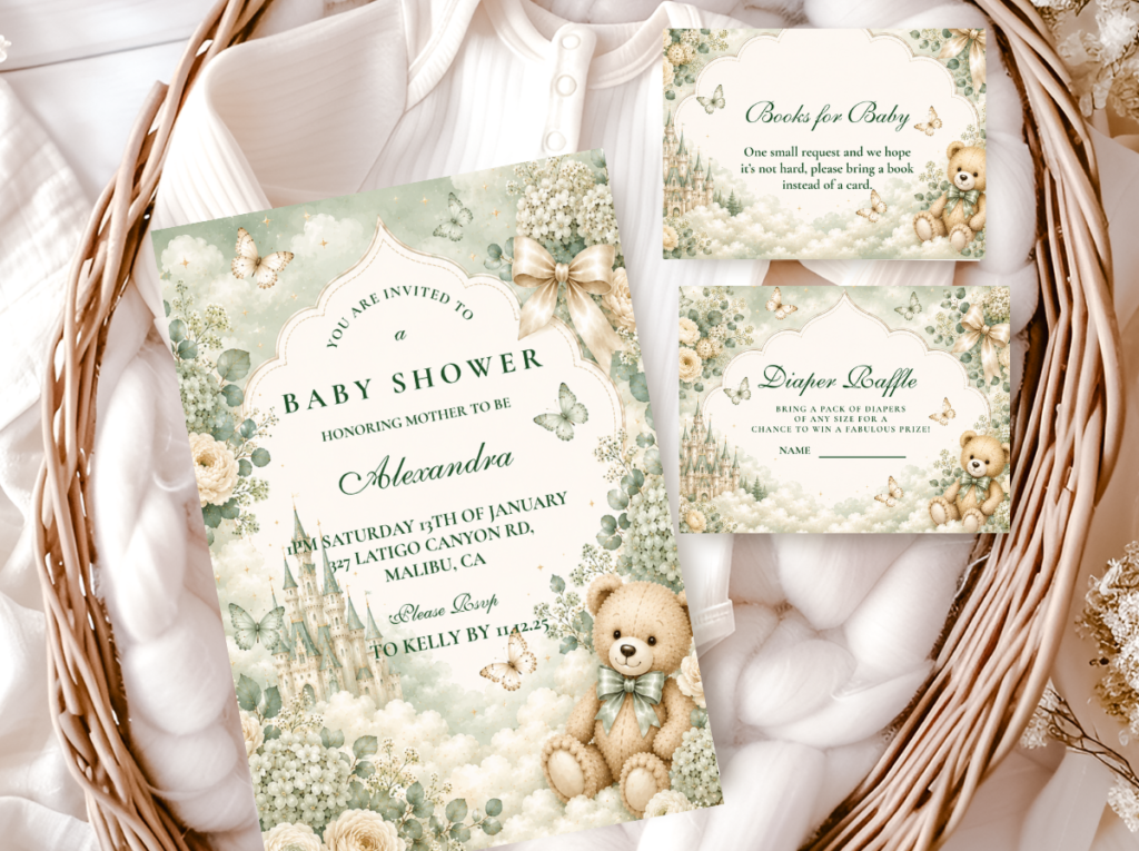
The Green Teddy Bear collection pairs the greenery backdrop direction with stationery in the same sage and forest palette — so the botanical quality of the backdrop continues into every printed element on the table behind it.
3.3 Cloud Backdrop for the Pastel & Whimsical Direction
The cloud backdrop is the most distinctive and most narrative option for the bear theme — it transforms the backdrop from a simple photo wall into a visual world. Cloud-shaped balloon clusters or cloud-cut paper installations in white and very pale blue create a sky register that immediately places the bear (a small, round, soft creature) in a context that feels like illustration rather than decoration. The cloud direction suits the pastel rainbow, the gentle whimsical, and the celestial star-and-moon directions most naturally; it works less well with the rustic, preppy, or fishing/adventure directions, where the sky motif competes with the earthy or graphic quality of those palettes.
The most effective cloud backdrop uses cloud shapes at three heights: large clouds positioned high (at or near the top of the backdrop, creating a skyline), medium clouds at mid-height (the main visual field of the backdrop), and small cloud details at low height (close to the table or floor, creating the sense that the sky extends all the way down). Pastel balloons in the shower’s palette colors interspersed between the cloud shapes bring the color into the backdrop without displacing the cloud-sky quality that defines this direction.
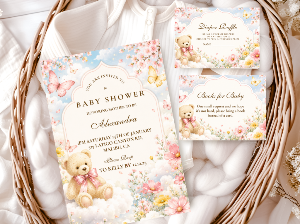
The Bear And Clouds collection brings the cloud motif into a complete stationery suite — soft cloud illustrations and pastel tones that tie every printed element in the room to the sky-world established by the backdrop.
Styling Tip — Backdrop Width
A backdrop only needs to be as wide as the table or chair arrangement in front of it — not the full width of the wall. A 6-foot balloon arch centered behind a 5-foot dessert table looks intentional and framed: the arch is clearly responding to the table, and the table is clearly responding to the arch. The same arch pushed out to fill an 8-foot wall looks like it didn’t quite reach the corners, because the proportional relationship between the arch and the wall is now the subject rather than the relationship between the arch and the table. Before determining backdrop width, measure the table or seating arrangement first and design the backdrop to be that width plus 12 to 18 inches on each side — enough to frame it without filling the wall.
Section 04 Zone 3 — Guest Table Decorations
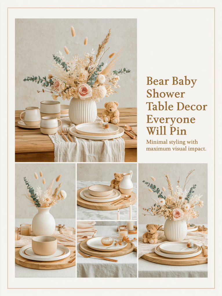
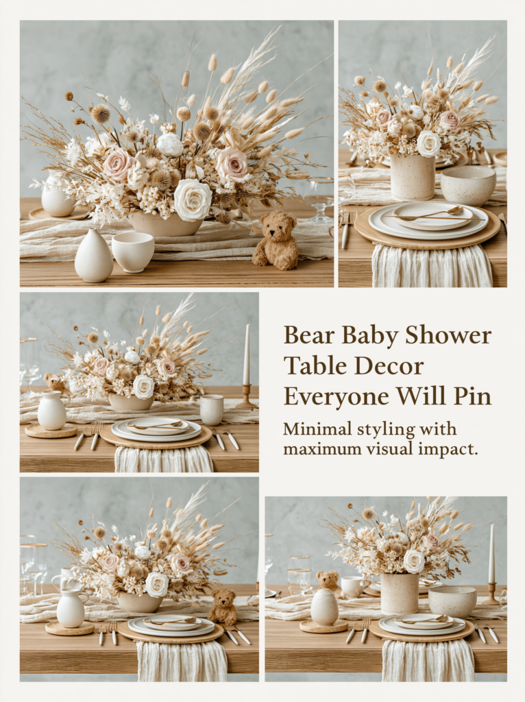
The guest table receives the closest examination of any surface in the room because guests sit at it for the duration of the event. Three decoration decisions are non-negotiable for this zone: centerpiece height (the arrangement must have three distinct height levels visible simultaneously — low, mid, and tall — to prevent the flat silhouette that makes even well-decorated tables read as unfinished), linen color (always chosen before anything else, because it determines the temperature register of every element placed on top of it), and place setting detail (the place card is the single highest-ROI printed element at the table — it is picked up, read, and frequently kept by every guest, making it the detail with the most individual attention of anything in the room).
For long tables, an odd number of centerpiece groupings (three, five, or seven — never two or four) maintains the visual rhythm that makes the table read as designed. For round tables, a single central focal piece with the bear prop incorporated at the mid zone. The linen for the warm bear palette directions should sit in the oatmeal-to-cream range rather than bright white; for the preppy direction, crisp white linen is the correct choice. The place card, menu card, and any table signage should belong to the same stationery suite as the invitation — the font, the bear motif, and the palette should be consistent across every printed element the guest encounters from invitation receipt to table seating.
Section 05 Zone 4 — Dessert & Gift Table Decorations
The dessert table requires a backdrop element — even a minimal one — because a bare wall behind a styled sweet display makes the table read as floating rather than anchored. A single balloon cluster or garland at height behind the table, positioned to be visible in any photograph taken from the front, provides the vertical anchor the zone needs without requiring a full installation. The table surface itself follows the same three-height-zone rule as the guest table: treats and props at low, mid, and tall levels create the silhouette that reads as designed rather than laid out.
A runner or table skirt is the minimum linen element for the dessert table — it grounds the display and signals that the table surface itself is part of the design rather than a neutral base for the food. Natural linen or jute in the palette’s warm register does more visual work per square inch than any single decoration placed on top of it, and can be set up as part of the structural layer the day before with no food-safety concerns. Treat labels and favor tags from the invitation suite tie the Zone 4 display back to the printed aesthetic of the rest of the room in the most cost-efficient way available.
Section 06 Zone 5 — Accent & Atmosphere Decorations
6.1 The Camping Bear Accent Direction
The camping bear direction is the most atmospheric and least expensive Zone 5 approach because it relies on objects that are inherently ambient rather than decorative: lanterns, string lights, and natural wood elements. A lantern cluster in a corner — two or three lanterns of different heights with candles or battery-operated tea lights inside — costs very little, requires no additional styling, and creates a warm pool of light that contributes to the atmosphere of the room more effectively than any balloon cluster in the same position. String lights draped loosely across a corner or along a secondary wall add the same quality of light with even less material investment.
The camping direction suits Zone 5 specifically because its palette — forest green, warm brown, natural wood, candlelight amber — is already low-key and atmospheric. A camping bear accent in a transitional space does not compete with the more statement-driven Zones 1 and 2; it deepens the overall mood of the room without drawing focused attention. Small bear figurines in overalls, a small wooden crate with pinecones and dried grasses, a hand-lettered “Little Adventure Awaits” tag propped against a lantern: these are the details that guests notice in passing and remember afterward without being able to explain why the room felt so complete.
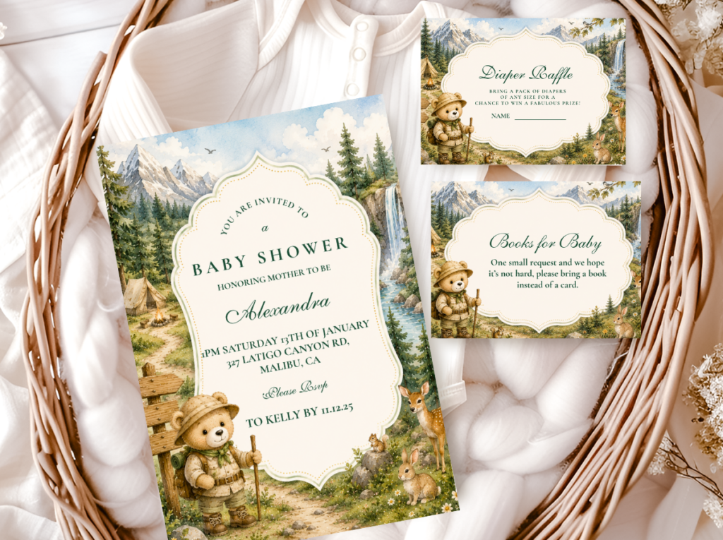
The Bear Camping collection brings the outdoor adventure aesthetic into a complete stationery suite — warm forest tones and bear motifs designed to match the lantern-and-wood atmosphere of the camping accent direction.
6.2 The Travel Bear Accent Direction
The travel bear direction is the most narrative Zone 5 option — it uses vintage suitcases, globe props, and map details to create corners that tell a story about the adventure the baby is about to embark on. A stack of two or three vintage-look suitcases in complementary tones, a small globe or map print in a simple frame, and a bear prop positioned on top of or beside the stack creates a zone 5 moment that reads as considered rather than decorated. This direction suits hosts who want the room to feel like it has a complete visual story — not just a palette and a motif, but a narrative that continues into every corner.
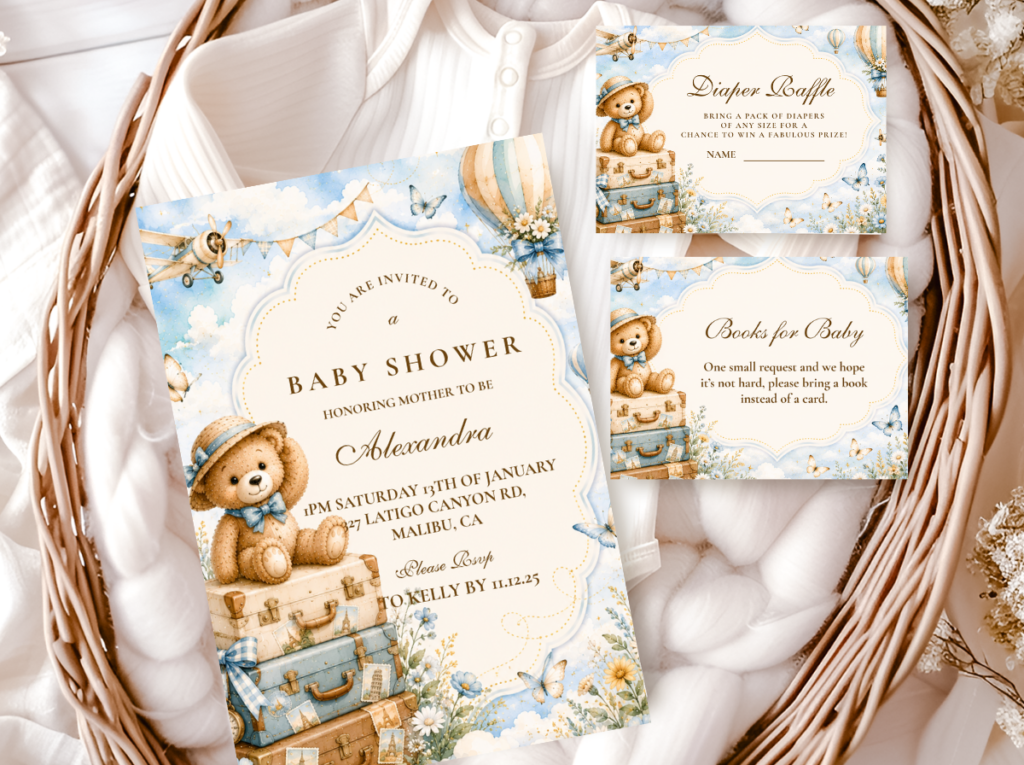
The travel direction works best when its palette is consistent with the main shower palette rather than operating as a separate aesthetic moment in the corner. Vintage suitcase props in cream, tan, and warm brown integrate with any warm bear palette; bright primary-colored props or novelty travel items break the palette even in a transitional space. The invitation suite in the travel direction should be the visual anchor that ties the corner detail back to the printed materials: a bear illustration with travel elements on the invitation is what gives the suitcase corner its context and makes it read as intentional rather than coincidental.
The Teddy Bear Travel collection brings the adventure narrative into stationery — vintage travel motifs, warm tones, and a bear illustration designed to give every corner detail its storytelling context.
6.3 Lighting as the Final Decoration Layer
Lighting is the most underused decoration tool in baby shower planning, and it is the one that does the most work in Zone 5 at the lowest cost. Warm Edison bulb string lights hung across a secondary wall or ceiling area, candle clusters in glass votives on any available surface, or a single well-positioned lamp with a warm-toned bulb in a corner transforms the ambient quality of the entire space without requiring any visual design decision beyond placement. The effect is that Zone 5 spaces feel inhabited and warm rather than underdeveloped, which is exactly the function Zone 5 decorations need to serve: atmosphere rather than focal point.
For daytime outdoor events in natural light, lighting plays a reduced but still meaningful role: clusters of clear glass votives on secondary tables, lanterns in transitional spaces, and string lights positioned to activate as the event moves into late afternoon. For indoor or evening events, a string light canopy at 30% dimming is one of the single most transformative atmosphere decisions available at any budget level — and it costs less per linear foot than almost any other decoration category.
Styling Tip — Zone 5 Budget
Zone 5 decorations should cost no more than 10% of the total decoration budget. If you find yourself spending more on corner details, secondary wall garlands, or transitional space styling than on the backdrop, stop and reallocate. The specific test: stand at the entrance of the room and take a photograph with your phone. What you see in that photograph is approximately what guests see when they arrive. If the backdrop reads as weak or incomplete in that photograph while the corner behind you is fully styled, the budget priorities are inverted. Corners are noticed when they are wrong — when they are visibly empty in a way that reads as oversight — not when they are right. The backdrop is noticed either way. Invest accordingly.
Section 07 Invitations & Stationery
Every printed element in the room — the welcome sign, the place card, the menu card, the favor tag, the table number, the dessert label — is a stationery decision. When they share the same illustration style, the same bear motif treatment, and the same palette as the invitation, the room reads as a complete designed world: the printed layer connects every zone to a single visual identity, and guests move through a space where every detail that can be read speaks the same visual language. When they do not — when the welcome sign is in a different font, the place card in a different bear illustration, the favor tag in a different color tone — the printed details read as individually sourced rather than systemically considered, and the room’s coherence is diminished at exactly the moments of closest attention.
The stationery suite is also the most practical planning tool in the decoration process. The invitation establishes the precise palette — the specific tone of the cream, the warmth of the accent color, the quality of the bear illustration — and every subsequent decoration purchase can be held against it as a reference. This is the most reliable method for avoiding the wrong-blue, the wrong-yellow, and the wrong-linen decisions that diminish room coherence: the printed palette is always available in hand during the planning and sourcing process.
The six collections below cover every direction in this guide — from the clean graphic quality of the Preppy suite for the entrance signage direction, to the botanical Green collection for the greenery backdrop, the soft cloud illustrations of the Bear And Clouds suite, the outdoor warmth of the Camping collection, and the narrative adventure of the Travel suite. Each collection is a complete suite: invitation, envelope liner, favor tag, food label, menu card, place card, table number, and thank-you card. The Bear Theme catalogue brings all collections together for hosts still deciding.
Choose the stationery collection before finalizing any decoration decision — then use every element of the suite to supply the printed layer across all five zones, from the welcome sign at Zone 1 to the favor tag at Zone 4.
Main Collection
Bear Theme
Browse all bear stationery directions together before committing to a palette and aesthetic direction.
Zone 1 Direction
Preppy Teddy Bear
Graphic bear motifs and clean typography — the entrance signage suite for the structured, modern shower direction.
Zone 2 Floral Direction
Green Teddy Bear
Sage and forest greens — the stationery suite that extends the botanical backdrop into every printed element in the room.
Zone 2 Cloud Direction
Bear And Clouds
Soft cloud illustrations and pastel tones — the stationery suite that ties the sky-world backdrop into every printed element.
Zone 5 Camping Direction
Bear Camping
Warm forest tones and adventure motifs — the stationery suite for the lantern-and-wood atmospheric direction in the transitional spaces.
Zone 5 Travel Direction
Teddy Bear Travel
Vintage travel motifs and warm tones — the stationery that gives the suitcase-and-globe corner its narrative context and visual anchor.
Frequently Asked Questions
How many decorations do I actually need for a bear baby shower?
Far fewer than most planning guides suggest, and significantly fewer than the anxiety of empty space will push you toward. The zone framework in this guide is a useful calibration tool: if you have a strong Zone 2 (backdrop), a complete Zone 3 (guest tables with linen, centerpiece, and place cards), and a minimal Zone 1 (welcome sign and one framing element at the entrance), the shower reads as fully designed. Everything beyond that is improvement, not requirement. The showers that feel most considered are often the ones with the fewest decorations, because every element that is present was chosen deliberately and positioned correctly. The specific number varies by guest count and venue size, but the principle is the same: five deliberate decoration decisions across the five zones will produce a more beautiful room than twenty undirected ones. Start with one strong element per zone before adding anything to any zone.
What should I prioritize when decorating on a budget?
The zone framework provides the answer directly: allocate in the order Zone 2 (30%), Zone 3 (30%), Zone 1 (15%), Zone 4 (15%), Zone 5 (10%). On a constrained budget, cut Zone 5 entirely before reducing Zone 2. Then within Zone 2, a well-styled balloon arch using a minimal number of balloons in the correct palette reads more effectively than many small balloon clusters distributed across the room. Within Zone 3, a well-chosen linen and a single considered centerpiece per table reads better than multiple small decorations added around the table without a clear focal point. The two highest-ROI decoration investments for any budget level: the stationery suite (which supplies the printed layer across all five zones) and the linen (which is the largest surface-area element in the room and sets the palette register for everything on top of it).
How far in advance can I set up bear shower decorations?
The structural layer — all Zone 5 and Zone 4 elements that do not involve fresh food or flowers, including runners, risers, garlands, dried botanical arrangements, lanterns, string lights, signage, and stationery elements — can be set up the day before with no quality concerns. Balloon arches and clusters are best inflated the morning of the event: professional latex balloons hold for 8 to 12 hours at room temperature, and an arch assembled the day before in a warm room will begin to look deflated before guests arrive. Fresh floral elements should be placed as close to the event start as practical. The welcome sign and backdrop can be set up the day before, making the day-of setup much lighter. Planning the setup in two stages — structural layer the day before, fresh and balloon elements on the day — reduces day-of time pressure significantly and allows any structural issues to be identified and resolved before the event.
What’s the easiest decoration to DIY that looks expensive?
Three DIY decorations consistently punch above their cost in the bear shower context. First: the stacked book centerpiece — vintage-look hardcovers from a second-hand shop in coordinating tones (cream, tan, warm brown) stacked on a wood slice with a small plush bear on top, total cost typically under ten dollars per table. It reads as considered and literary, and the “gathered from a collection” quality is impossible to replicate with purchased decor. Second: kraft paper favor tags — cut from standard kraft card stock with a bear face stamp or a hand-drawn bear motif, tied to any favor bag or jar with natural twine. A bundle of fifty tags costs approximately the same as two individual store-bought tags, and the handmade quality reads as thoughtful rather than cheap. Third: a dried botanical garland — bundles of pampas grass, dried wheat, and eucalyptus from a craft store, tied at intervals along a length of jute twine. This is the decoration that most guests assume was custom-made by a professional, because the organic variation of dried botanicals makes every garland look unique regardless of the skill level of the person who assembled it.
Ready to Start Planning?
Find the Stationery That Ties Every Zone Together
Choose stationery first — it becomes the palette reference that makes every other decoration decision easier.