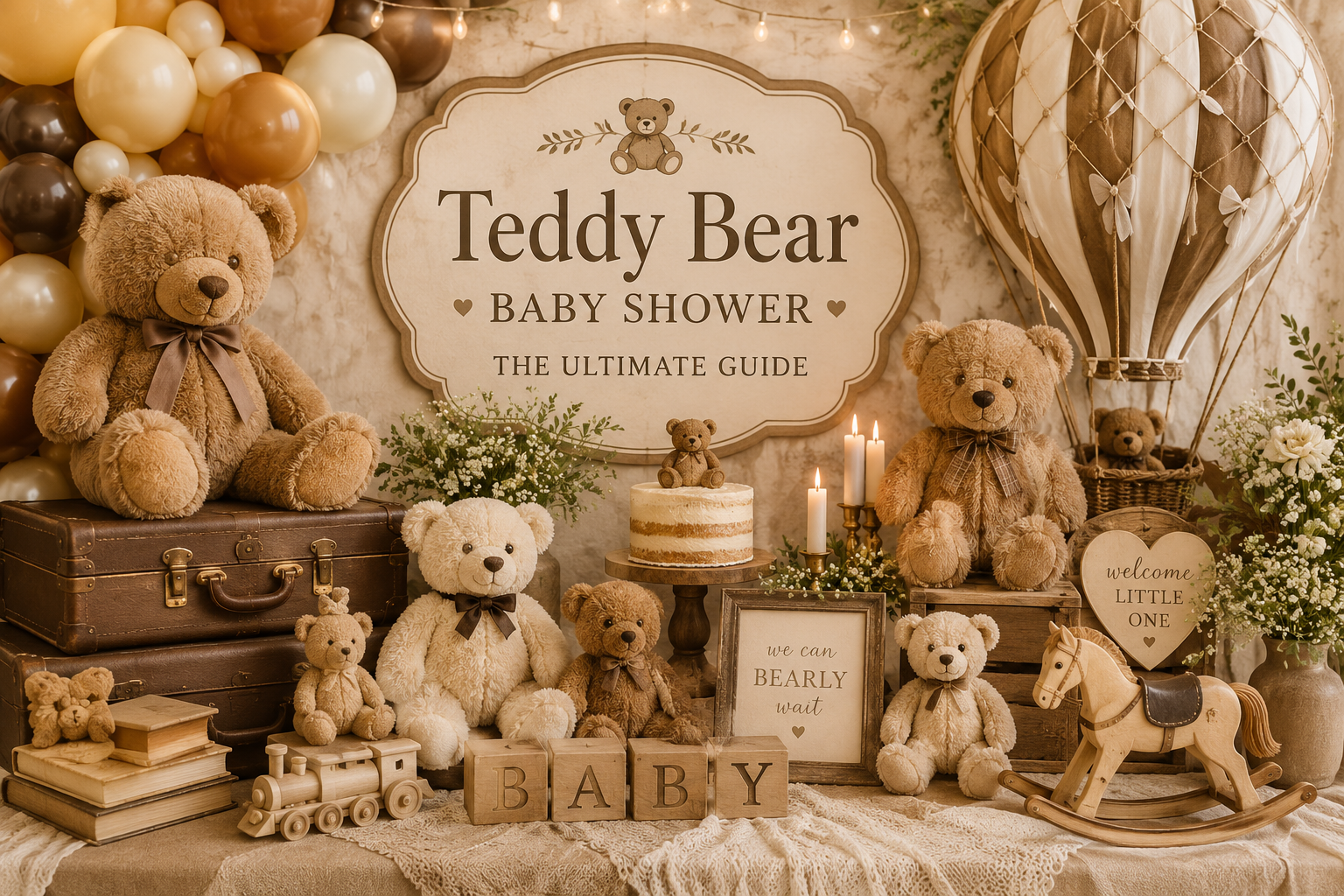
Teddy Bear Baby Shower Theme: The Ultimate Guide
Baby Wonderland Studio · Bear Theme
Teddy Bear Baby Shower Theme: The Ultimate Guide
Everything you need to plan a teddy bear baby shower that feels warm, cohesive, and genuinely beautiful — from palette logic to stationery suites.
“The teddy bear is the one childhood object that belongs to every generation, every family, every story. It carries no nationality, no season, no occasion — only the feeling of being held.”
Section 01: What Makes the Teddy Bear Theme Work?
1.1 The Core Aesthetic: Warmth, Nostalgia, Softness
The teddy bear theme works because its emotional register is specific without being narrow. It reads as warm rather than sweet, nostalgic rather than retro, soft rather than precious. Those distinctions matter: warmth invites; sweetness can cloy. The visual language — muted neutrals, rounded forms, natural textures — feels lived-in in the best possible way. It does not look like it was assembled from a party supply catalogue. It looks like it was curated by someone who understands that the best celebrations feel like home. This is why the teddy bear theme never feels dated: it is not chasing a trend. It is evoking a feeling that does not expire.
1.2 Why It Works for Any Guest List, Any Budget, Any Host Style
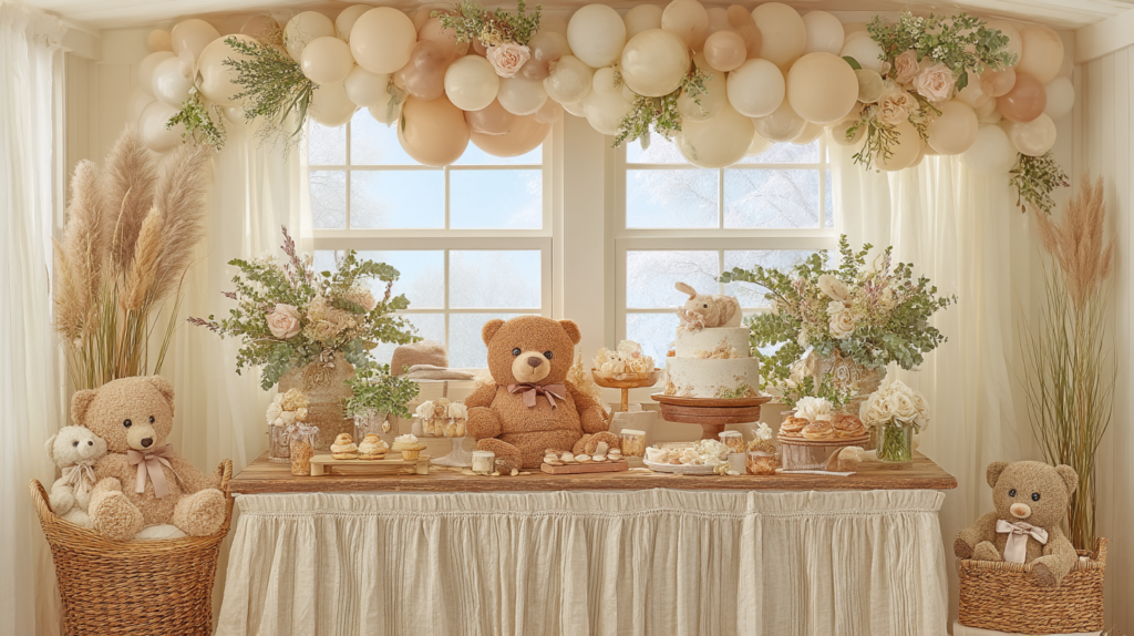
The teddy bear theme scales in a way that few others do. A minimal version — a cream linen tablecloth, a small plush bear, kraft paper tags — reads just as intentional as a fully decorated event space. It translates to afternoon tea gatherings, garden parties, and formal venues without requiring a single adjustment to its core palette. It works for co-ed guest lists and multi-generational ones because the imagery is universally understood: the teddy bear belongs to everyone. And it works for any budget because the theme is defined by proportion and palette, not by the quantity of bear-shaped props purchased.
1.3 The Cohesion Formula: Why Some Bear Showers Look Designed and Others Look Random
The single most useful framework for planning a teddy bear shower is the 60-30-10 rule. It explains the difference between a celebration that looks considered and one that looks like a collection of bear-shaped objects placed on a table.
60% neutral base. Cream, ivory, oatmeal, warm white. This is your tablecloth, your backdrop, your envelope lining, your cake base. It is not boring — it is the quiet that lets everything else be heard. The bear theme reads most clearly when the base has warmth in it: cool whites feel clinical; ivory and oatmeal feel held.
30% warm accent. This is where your palette direction lives. Honey and caramel for a vintage lean. Dusty rose and blush for a feminine one. Sage or dusty blue for something softer and more contemporary. Warm brown for a grounded, earthy approach. This 30% appears in your florals, your ribbon, your invitation design, your balloon clusters, your favour packaging. It creates the mood.
10% statement detail. Gold calligraphy on the invitation. A deep brown velvet ribbon. A honey-toned wax seal. A single deep-toned bloom in the centrepiece. This is the element that makes someone stop and look twice. Used sparingly, it elevates. Used broadly, it competes with everything else and the cohesion dissolves.
To apply this concretely: if you are planning a neutral and cream direction, your base is warm white linen, your 30% is ivory and oatmeal textiles with soft greenery, and your 10% is a single gold-toned detail on the stationery or favour tag. For a vintage honey direction, your base remains cream, your 30% is caramel and honey amber in the florals and ribbons, and your 10% is antique gold lettering. For pink and blush, the base is ivory, the 30% is dusty rose in blooms and textiles, and the 10% is a deeper mauve or champagne metallic. The base never changes. Only the accent palette shifts.
Styling Tip
The most common mistake in bear-themed showers is using too many literal bear elements — plush toys, bear ears, bear prints on every surface. The bear theme reads most elegantly when the palette does the work and the bear details are accents, not wallpaper. One plush bear on the gift table, bear motifs on the invitation suite, and perhaps bear-shaped cookies on the dessert table: that is enough. The moment every surface features a bear illustration, the theme stops feeling curated and starts feeling like a theme park.
Section 02: Five Ways to Style the Bear Theme
The bear theme is not one look — it is five. Each of the following palette directions works within the same 60-30-10 framework, but arrives at a completely different emotional register. Choose based on the feeling you want guests to walk into.
2.1 Classic Neutral & Cream
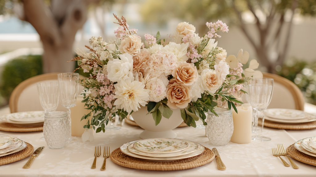
Ivory, oatmeal, and warm white form the most versatile direction in the bear theme — and the most saved on Pinterest. This palette works for any season, any setting, and any guest preference because it makes no strong colour statement: it simply feels clean, warm, and considered. It is the direction that photographs beautifully in any light and ages gracefully in memory. A cream linen runner, cotton ribbon, eucalyptus sprigs, and a honey-toned teddy bear is all this palette needs to feel complete. Because it avoids strong gender signals, it is equally suited to showers where the baby’s sex is unknown and to hosts who prefer not to code the celebration by colour.
Styling Tip
The risk with an all-neutral palette is that it tips into beige monotony. Avoid this by varying texture rather than colour: rough-weave linen against smooth ceramic, dried cotton stems against glossy ribbon, a matte kraft tag against a shimmer-edged invitation card. The contrast is tactile, not chromatic — and that is exactly what keeps a neutral bear table feeling rich rather than flat.
The Neutral Teddy Bear Baby Shower collection was designed specifically for this direction — cream and warm white stationery with bear motifs that feel restrained and grown-up rather than cartoon-bright. Browse the Neutral Teddy Bear collection →
2.2 Vintage Honey & Warm Brown
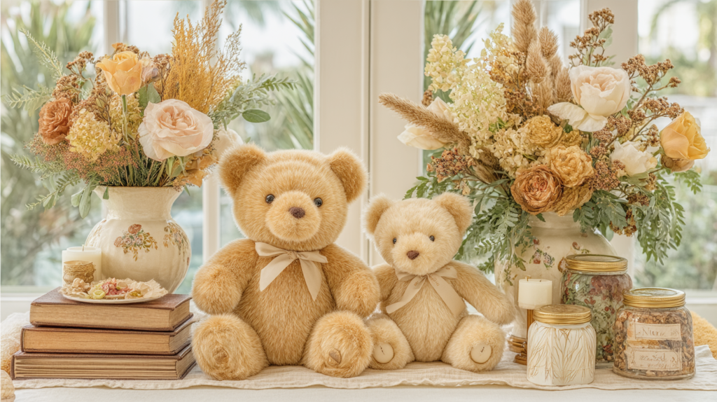
Honey, caramel, and antique gold are the colours of a well-loved teddy bear — the ones that have been held for years and have softened at the edges. This palette leans into the heritage quality of the theme: it feels like something from a family’s history rather than this season’s trend. The visual anchors are amber tones in the florals (dried strawflowers, garden roses in warm peach, touches of rust), aged textures in the paper goods, and warm brown in any wooden or natural element. Antique gold metallic at the 10% mark — on the stationery, the favour seal, or a single candlestick — completes the look without reading as formal.
Styling Tip
Vintage honey palettes fail when the gold reads as shiny rather than aged. The distinction is finish: opt for matte or brushed gold over high-gloss metallic. A satin ribbon in warm caramel reads vintage; a shiny gold balloon reads “party supplies.” Wherever you introduce metallic, ask whether it looks like something that could have existed in 1955. If yes, it belongs here.
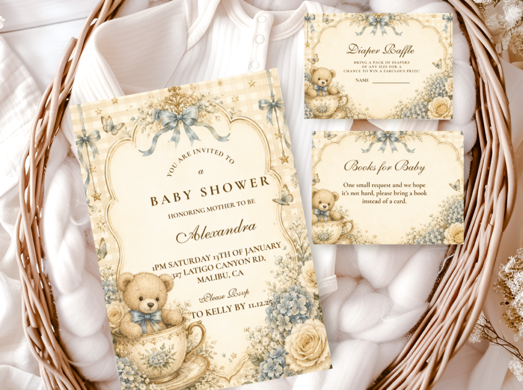
The Vintage Teddy Bear Baby Shower collection brings this palette into the stationery: warm honey tones, heritage typography, and bear imagery that feels storied rather than contemporary. Browse the Vintage Teddy Bear collection →
2.3 Soft Pink & Blush
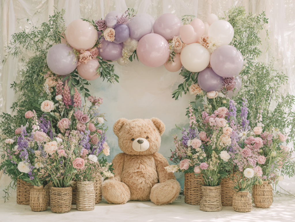
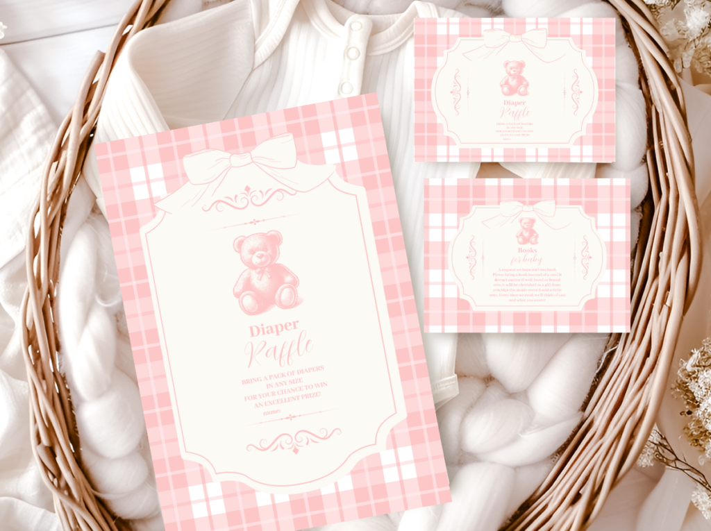
Dusty rose, blush, and cream is currently the most saved bear shower palette on Pinterest — and for good reason. It is romantic and feminine without being loud, delicate without being saccharine, and it photographs with a softness that no other palette quite replicates. The key is keeping the pink firmly in the muted register: dusty rose rather than hot pink, blush rather than bubble gum. When the pink stays dusty, it reads as a colour choice made by someone with taste. When it tips into vibrancy, the theme starts to feel like a children’s birthday party rather than a carefully composed celebration. Cream anchors the palette; the bear motif in warm honey-brown provides the contrast note.
Styling Tip
The blush bear palette needs a grounding element or it reads as insubstantial. That grounding almost always comes from warm brown: a honey-toned plush bear, a brown kraft ribbon, terracotta-adjacent florals, or a brown-ink print on the invitation. Without that warm brown anchor, blush on blush on cream loses its definition. Think of the brown as the outline that gives the painting its form.
The Pink Teddy Bear Baby Shower collection captures this palette with dusty rose tones and bear motifs that stay soft and considered across every piece in the suite. Browse the Pink Teddy Bear collection →
2.4 Blue & Brown
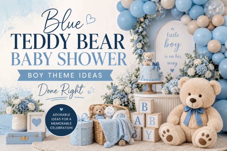
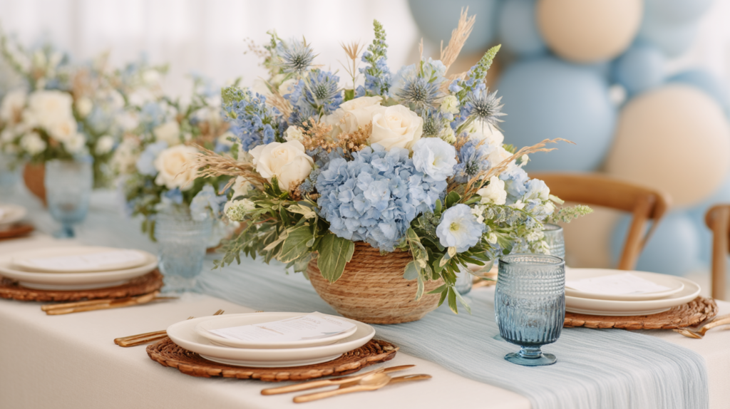
Dusty blue and warm brown is one of the most successful pairings in the entire bear theme — and it is chronically underused. The combination works because the warm brown does exactly what the palette needs: it grounds the blue, prevents it from reading as cold, and introduces the same natural, earthy quality that defines the teddy bear aesthetic. Dusty blue sits at the 30% accent mark; warm brown appears in the bear itself, in any wooden elements, in kraft ribbon and natural textures. The result is a palette that feels tailored rather than generic, considered rather than defaulted-to. It reads beautifully in flat lays and at the table alike.
Styling Tip
Keep the blue firmly in the dusty, muted register — slate blue, denim blue, powder blue with grey in it. The moment it tips into bright or electric, the warmth of the brown cannot rescue it. A simple test: if the blue could appear on a pair of vintage denim, it belongs here. If it looks like it was chosen from a primary colour wheel, it does not.
The Brown and Blue Teddy Bear Baby Shower collection was built around this pairing — dusty blue and warm brown stationery that feels warm and composed from invitation to thank-you card. Browse the Brown and Blue Teddy Bear collection →

2.5 Whimsical Bear Hot Air Balloon
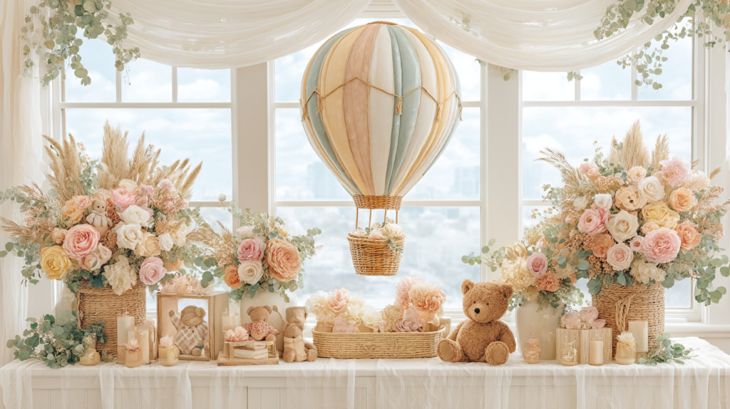
For hosts who want a bear shower that tells a story, the hot air balloon direction is the most narrative and storybook option available. The bear is no longer simply a motif — it becomes a character: the small adventurer setting off toward something new. The palette draws from warm sky tones: soft peach, golden yellow, sage, warm cream — the colours of a late-afternoon flight. It works beautifully for mixed-gender guest lists and for parents who want the celebration to feel like the beginning of something rather than simply an occasion. The imagery translates naturally into every element: invitation illustration, cake topper, balloon clusters in warm tones, bunting in complementary colours.
Styling Tip
The hot air balloon direction works best when the warm sky palette is kept cohesive with the neutral base, not used as a licence for every bright colour at once. Peach, sage, soft gold, and cream is a complete palette. Adding red, teal, or electric yellow “for whimsy” breaks the storybook register and the result reads as carnival, not adventure. Whimsy is a feeling created by scale and narrative — a large illustration, an unexpected detail, a story on the invitation — not by saturation.
The Bear Hot Air Balloon Baby Shower collection brings this storybook direction into the stationery suite — warm sky tones, bear-in-balloon illustrations, and paper goods that feel like the opening page of an adventure. Browse the Bear Hot Air Balloon collection →
Section 03: Decor & Centrepieces at a Glance
3.1 Table Centrepieces
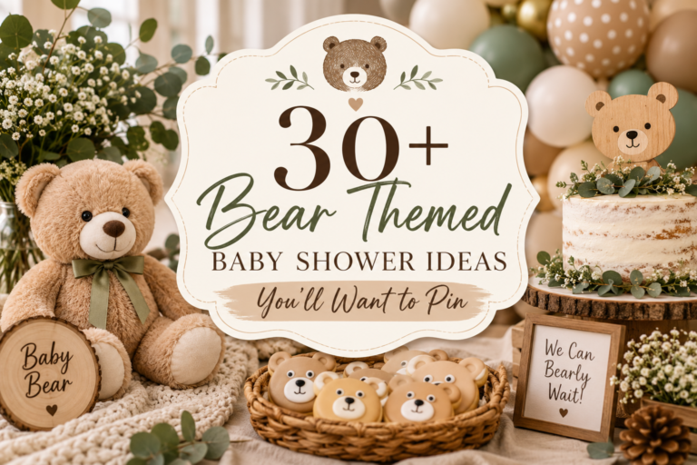
The strongest bear shower centrepieces combine a plush teddy bear as the visual anchor with a low floral arrangement in the palette’s accent tones and at least one natural or wooden element — a small wooden crate, a slice of timber, a bundle of dried grasses. A single bear at the centre of the table reads as intentional; multiple bears on every surface reads as inventory.
3.2 Backdrop Options
A cream or ivory balloon arch with warm-toned florals tucked at the base is the most reliable bear shower backdrop — it photographs in any light and works simultaneously as a photo moment and a cake table backdrop. For a more structured look, a printed fabric or paper backdrop in a subtle bear-print pattern in the palette’s neutral base keeps the imagery present without overwhelming the space.
Styling Tip
The texture rule for bear decor: always mix at least three textures — something plush, something wooden or natural, something paper or printed. A velvet teddy bear, a wooden slice centrepiece, and a printed paper invitation flat-lay: that trio is what makes a bear-themed table feel designed rather than assembled. Single-texture tablescapes — all soft, all shiny, all matte — read as incomplete even when the colour palette is perfect.
Section 04: Cake, Cookies & Dessert Table at a Glance
4.1 Cake Directions
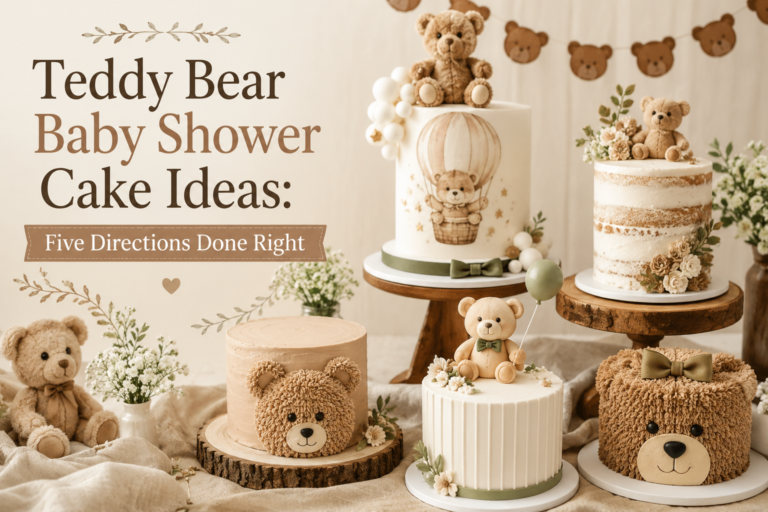
Bear shower cakes work best in two directions: a neutral-frosted tiered cake with a teddy bear topper and simple florals in the palette’s accent tones, or a bear-shaped smash cake in the accent colour alongside a more restrained celebration cake for guests. Both keep the bear imagery present without requiring elaborate decoration.
4.2 Cookie Styling
Bear-shaped iced cookies in the palette’s neutral base — cream royal icing with minimal detail — read as elegant on a dessert table and double as favours in individual bags. The most cohesive approach is one or two shapes only: a bear outline and a simple heart or star in the accent colour, rather than a full set of mismatched designs.
4.3 Dessert Table
A bear shower dessert table is most cohesive when it uses height variation — a tiered cake stand, a low wooden board, individual jars at table level — rather than every item at the same height. The labels and tags on jars, plates, and platters are where the stationery suite does quiet but significant visual work: they tie the food table back to the invitation design and make the whole spread feel like a considered whole.
Section 05: Games & Favours at a Glance
Games
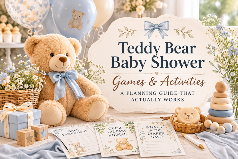
Bear shower games work best when they lean into the warmth and storytelling quality of the theme: a “name the bear” suggestion jar, a bear-themed bingo card, or a “wishes for the cub” card station all feel natural within this aesthetic. Printed game cards in the palette’s stationery design create immediate cohesion between the activity and the table.
Favours
The most appreciated bear shower favours are functional and simple: a small jar of honey with a bear-shaped wax seal tag, a mini candle in a cream vessel with a bear-motif label, or a kraft bag of shortbread tied with satin ribbon and a printed favour tag from the stationery suite. The favour tag is the lowest-effort, highest-cohesion detail in the entire favour station.
Section 06: Bear Theme Variations — Boy, Girl & Neutral
For a Boy
Dusty blue and warm brown create a bear shower palette that feels tailored rather than generic — the brown grounds the blue, introduces natural warmth, and produces a table that reads as considered and quietly handsome without relying on clichéd baby-blue signals.
For a Girl
Dusty rose and blush with a cream base is the most saved bear shower palette on Pinterest for a reason: it is feminine and romantic without tipping into loudness, and the warm honey-brown of the bear itself anchors the softness beautifully so the whole palette feels complete rather than one-note.
Gender Neutral
Ivory, oatmeal, and warm white need no gender framing at all — the palette is simply warm and beautiful, and the classic neutral direction is the one that feels most timeless across any guest list, any season, and any family story.
Section 07: Invitations & Stationery
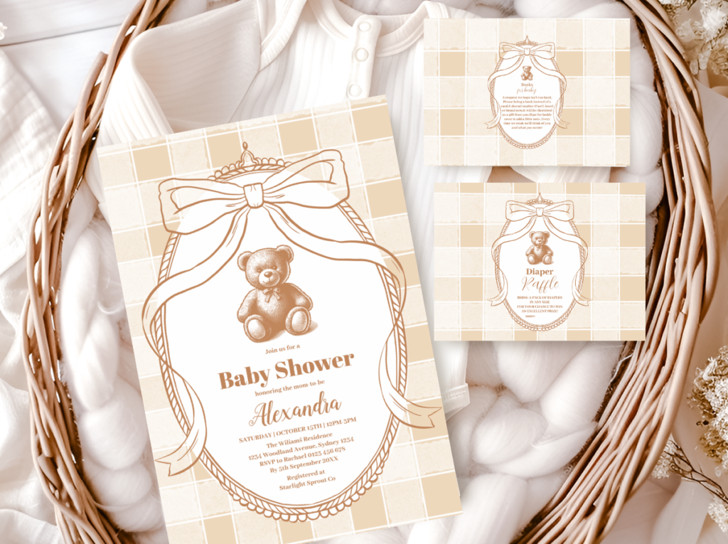
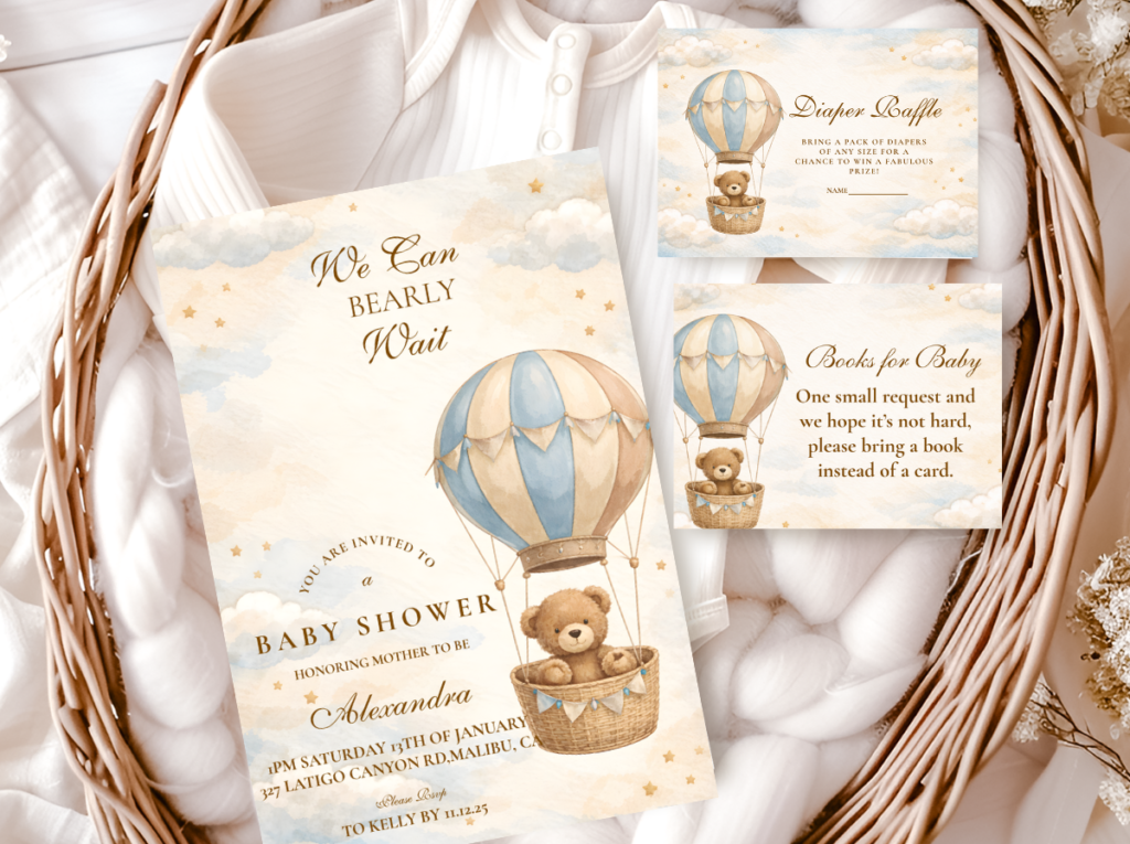
The invitation is the first thing guests experience of your bear shower, and it sets the visual register for everything that follows. A stationery suite chosen with the same care as the palette and the decor makes every other element easier: the colours are established, the tone is established, and guests arrive knowing what they are walking into. A bear shower invitation sitting in a flat lay beside a plush teddy bear and a detail from the table is one of the most saved images in the baby shower category on Pinterest — because it captures, in one frame, the warmth the whole theme promises.
When choosing stationery for a bear shower, the most important principle is palette consistency: the invitation card, the envelope liner, the favour tag, the food label, and the thank-you card should feel like a family — not five different decisions made in five different moments. A cohesive suite does not require identical design across every piece; it requires consistent colour, consistent tone, and consistent bear motif treatment. The bear can appear on every piece or only on the invitation itself; what matters is that the palette and typography remain constant throughout.
Each of the five styled directions in Section 02 has its own stationery collection, designed to bring that palette to life across the complete suite. Whether you are working with a classic neutral aesthetic, a vintage honey warmth, a soft pink register, a blue and brown palette, or the whimsical hot air balloon direction, there is a collection built for it. For hosts who want to browse across all bear theme options before deciding, the full Bear Theme catalogue brings every suite together in one place.
Each collection below links directly to the full product range for that aesthetic — invitations, thank-you cards, favour tags, food labels, game cards, and more. Choose the palette that matches your vision and let the suite do the rest.
Classic & Timeless
Neutral Teddy Bear Baby Shower
Cream, warm white, and ivory stationery with restrained bear motifs. The most versatile direction — works for any palette, any season, any guest list.
Heritage & Warm
Vintage Teddy Bear Baby Shower
Honey, caramel, and antique gold tones with heritage typography. Stationery that feels like it belongs to a family’s history.
Soft & Romantic
Pink Teddy Bear Baby Shower
Dusty rose, blush, and cream with soft bear motifs. The most saved bear shower palette on Pinterest — feminine and romantic without loudness.
Tailored & Grounded
Brown and Blue Teddy Bear Baby Shower
Dusty blue and warm brown — the pairing that feels considered and quietly handsome. The brown grounds the blue with natural warmth throughout the suite.
Whimsical & Storybook
Bear Hot Air Balloon Baby Shower
Warm sky tones — peach, sage, soft gold, cream — with bear-in-balloon illustration stationery. The most narrative direction in the bear theme: for parents who want the celebration to feel like the beginning of an adventure.
Frequently Asked Questions
What colours work best for a teddy bear baby shower?
Any palette built on a warm neutral base — cream, ivory, oatmeal — works for the bear theme. The 30% accent that sits on top of that base is where your direction comes from: dusty rose for something feminine, dusty blue and brown for a more tailored feel, honey and caramel for a vintage warmth, or warm sky tones for the hot air balloon direction. The one colour to avoid at the base level is anything cool or stark — crisp white and grey read as clinical against the warmth the theme requires.
How is the teddy bear theme different from a woodland theme?
The woodland theme is about the forest — mushrooms, foxes, deer, ferns, moss, an ensemble of wild creatures in a natural setting. The bear theme is about one object: the teddy bear, and the warmth and nostalgia it carries. Woodland palettes tend toward sage, forest green, rust, and terracotta. Bear palettes lean toward warm neutrals with accent colours that vary by direction. The key distinction is emotional register: woodland feels like an outdoor world; bear feels like a nursery, a memory, a held thing.
Can the teddy bear theme work for a boy’s baby shower?
Absolutely. The dusty blue and warm brown direction was specifically designed for this: it delivers a palette that feels tailored and warm without relying on traditional baby-blue signals. The brown grounding element does most of the work — it introduces natural warmth and keeps the palette from reading as generic. The neutral cream direction also works beautifully for a boy’s shower and carries no gender association at all.
What is the easiest way to make a bear shower look cohesive?
Choose your stationery suite first and let it lead every other decision. The invitation establishes the palette, the bear motif treatment, and the tone. Once you have that reference point, sourcing the tablecloth, ribbons, florals, and favour packaging becomes straightforward — you are simply matching what already exists on paper. The second shortcut is the 60-30-10 rule: 60% neutral base, 30% accent colour, 10% statement detail. If every element you are considering fits one of those three roles, the table will be cohesive. If it does not fit any of them, it probably does not belong.
Ready to Plan?
Find Your Bear Shower Stationery Suite
Browse all five styled directions — from classic neutral to whimsical hot air balloon — and find the suite that matches your vision from invitation to favour tag.