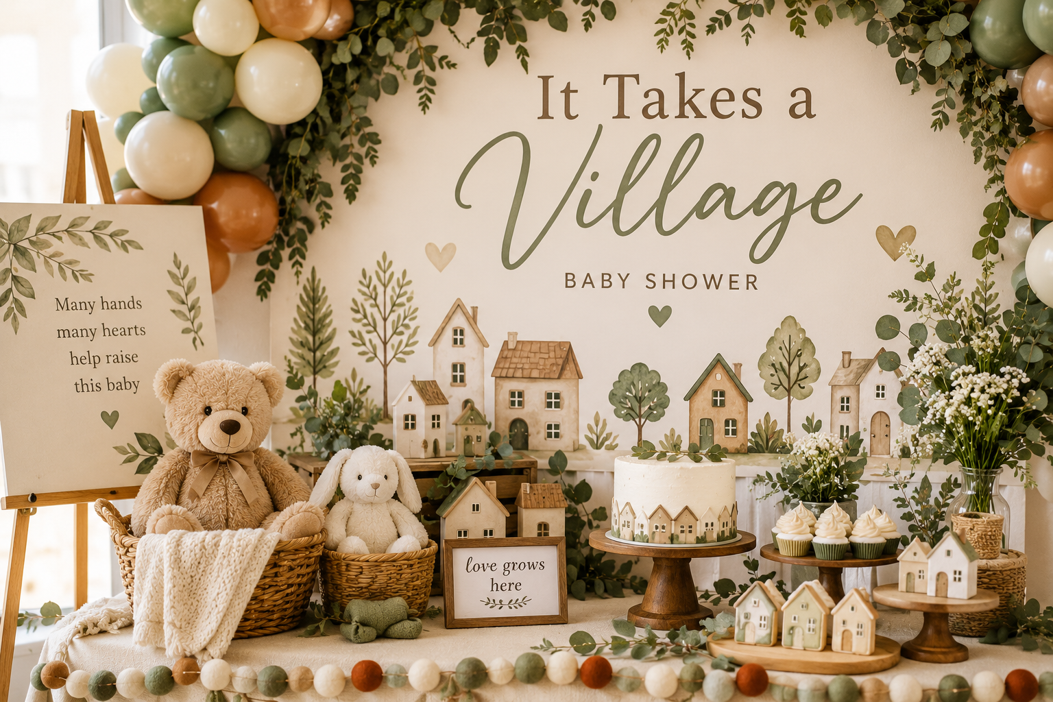
It Takes a Village Baby Shower Theme
Baby Shower · It Takes a Village · Theme Guide
It Takes a Village Baby Shower Theme
The only baby shower theme that centres the community rather than the baby — the clothesline, the village wisdom activity, the neutral palette, and two winter directions.
Most baby shower themes are about the baby — the colour, the gender, the season, the nursery aesthetic. The ‘it takes a village’ theme is the exception: it is about the people in the room. The guests are not just an audience for the celebration; they are the subject of it. The decorations, the activities, and the stationery all point toward the same idea — that the community gathering around this family is the most important thing that will happen on the day the baby shower is held, and that the warm circle of people who will raise this child together is worth acknowledging and celebrating explicitly.
That conceptual shift — from baby as subject to community as subject — is what makes this theme uniquely meaningful and what determines every design decision in it, from the neutral palette to the clothesline to the village wisdom activity.
Browse the It Takes a Village collection — warm neutral stationery for the most communal and most inclusive baby shower direction available.
“It takes a village to raise a child — and a baby shower is the moment the village announces itself. Warm, communal, and completely specific to the people who will surround this baby for a lifetime.”
Section 01 What Makes It Takes a Village Distinct
Three things define this direction and distinguish it from every other baby shower theme — all three following from the same central idea that the community, not the baby, is the subject of the celebration.
The village motif is people, not architecture. A common misreading of the ‘it takes a village’ theme treats ‘village’ as a visual motif — small house illustrations, cobblestone street graphics, whimsical cottage imagery. This is the wrong interpretation. The village in this theme is a metaphor for the people in the room: the family members, the friends, the colleagues, the neighbours who will show up for this family across the next decade and beyond. Every design decision should feel warm, communal, and welcoming rather than architecturally decorative. The stationery should reference the community rather than the built environment; the activities should involve the guests producing something that the baby will one day read; the decoration should feel like a gathering rather than a set design.
A neutral palette is mandatory. The ‘it takes a village’ theme is inherently gender-neutral because it is about the community, not the baby’s gender. Applying a gender-specific palette — pink for a girl, blue for a boy — introduces a specificity that narrows the theme’s communal quality. The village gathers around this baby regardless of the baby’s gender; the palette should reflect that universality. Warm cream, oatmeal, sage green, and antique gold are the palette tones that work most naturally with this theme: they are warm enough to feel welcoming, neutral enough to include every guest, and earthy enough to reference the community and the natural world that the village metaphor inhabits. Even where the baby’s gender is known, the neutral palette serves the theme better than a gendered one.
The clothesline is the signature element. The mini clothesline — a thin cord strung between two small poles or hooks, hung with tiny baby items — is the decoration that most specifically embodies the ‘it takes a village’ theme. In the most participatory version, guests bring a small item for the clothesline — a pair of tiny socks, a small knit square, a piece of fabric from something meaningful — and add it to the line when they arrive, building the clothesline collaboratively over the course of the event. In the pre-styled version, the host hangs the line before guests arrive with small knit items, tiny onesies, and natural-material baby items from the palette. Either approach produces the same reading: the image of a community preparing for a baby’s arrival, one small warm item at a time.
🏡 Village Tip
An advice card station framed as ‘wisdom from the village’ is the most thematically precise activity for this shower — guests write a piece of advice, a memory, or a hope on a kraft card and add it to a labelled jar or a wooden box. The wording ‘wisdom from the village’ transforms a standard advice card activity into part of the theme’s narrative rather than a generic shower game. The cards become a keepsake that the parents will read in the first months and the child may one day receive.
The It Takes a Village collection — warm neutral stationery that centres the community rather than the baby’s gender.
Section 02 Decor, Cake & Table
The ‘it takes a village’ table applies the theme’s communal warmth through natural textures, a neutral palette, and the clothesline as the room’s anchor element — the one decoration that tells the whole story before a guest has read a single piece of stationery.
Clothesline as hero element: The clothesline should be styled before any other decoration in the room, because it is the anchor that the other elements should feel like they belong beside. Hang it across the backdrop frame, stretched between two wooden poles beside the welcome sign, or draped along the mantle. The items on the line — tiny knit mittens, small onesies, a miniature hat, a pair of knit booties — should be in the room’s neutral palette: cream, oatmeal, sage, and a small warm gold or amber accent. A small ‘it takes a village’ banner or printed sign below or beside the clothesline confirms the theme’s wording without requiring additional decoration.
Table and centrepiece: A low centrepiece of dried botanical elements — dried pampas in its natural cream tone, dried eucalyptus, dried cotton stems, and two or three small cream or oatmeal pumpkins or gourds if the shower is in autumn — in a warm wooden vessel or a cream ceramic jug. An oatmeal or warm linen runner across the table’s length. Warm cream taper candles in simple wooden or warm ceramic holders at the centrepiece’s flanks. The table should read as natural, warm, and gathered — as though the materials came from the same community garden rather than from a florist’s catalogue — and it should feel completely consistent with the clothesline’s warm, communal register.
Wisdom from the village station: A small dedicated table or surface beside the main table, styled with a kraft or cream card stack, a small labelled wooden jar or a lidded box (‘village wisdom’ or ‘notes for the village’), and a simple pen holder. The station should be dressed in the same palette and texture as the main table — an oatmeal linen runner, a small dried botanical arrangement, a warm candle votive — so that it reads as part of the celebration’s designed environment rather than as a separate activity station placed beside it.
Cake: A semi-naked or lightly bark-textured buttercream cake in warm cream with a small ‘it takes a village’ topper — a printed or acrylic tag in the theme’s typeface and palette — and a cluster of dried botanical stems (dried cotton, dried eucalyptus, a small sprig of dried sage) at the tier base. Antique gold leaf at the tier divide. The cake should read as warm, natural, and specifically considered — not as a seasonal or themed cake in the conventional sense, but as a bespoke piece that belongs to this particular celebration and no other.
🏡 Village Tip
Style the clothesline before any other decoration — it is the anchor element that communicates the theme to every guest who enters the room before they have read a single label or sign. Once the clothesline is in place, every other decoration should feel like it belongs in the same warm, gathered, communal world. If a decoration does not feel like it belongs beside a clothesline of tiny baby items, it belongs to a different theme.
The It Takes a Village Collection — a curated suite of warm neutral stationery for the fully coordinated village shower.
Section 03 It Takes a Village in Winter
The ‘it takes a village’ theme has a natural affinity with the winter season: the image of a community gathering indoors when it is cold outside is one of the oldest and most resonant communal images available. Two winter directions apply the village theme to the specific atmospheric quality of the winter season.
3.1 Winter Neutral Village — Warm Cream, Sage & Gold
The warm neutral village direction takes the theme’s core palette — cream, oatmeal, sage, and gold — and deepens its winter quality through texture and warm lighting. Plaid textiles, warm candlelight, a clothesline of knit baby items in cream and natural colours, and the specific sensory warmth of a room that smells of warm wax and dried botanical material: these produce the ‘gathered indoors against the cold’ quality that makes the winter neutral village direction feel most specifically seasonal.
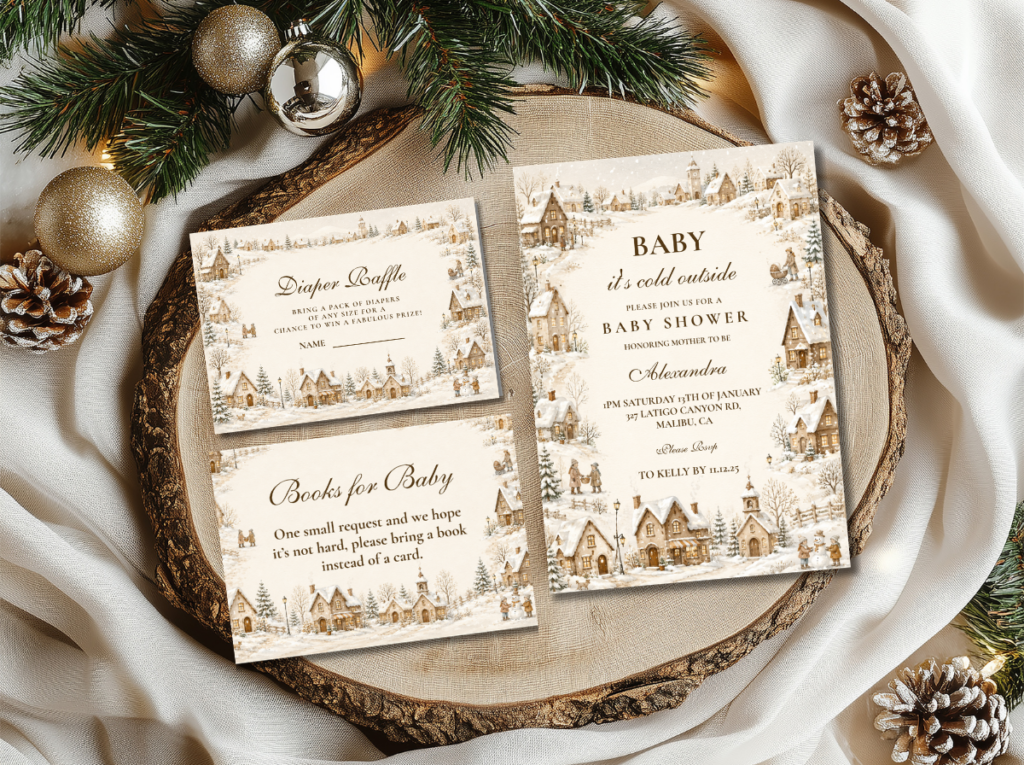
The Neutral Clothesline collection at Lush Party Boutique is the stationery direction that most naturally accompanies this aesthetic: warm cream cards with a clothesline motif in a natural, non-gendered style, in a palette that reads as both communal and specifically winter.
Direction 3.1
Winter Neutral Village — Warm Cream, Sage & Gold
The warmest and most textured winter village direction — cream, sage, and gold with plaid textiles and candlelight. Appropriate for any winter month and for any guest list. The cozy indoor aesthetic of this direction reads as the most specifically ‘it takes a village’ seasonal interpretation.
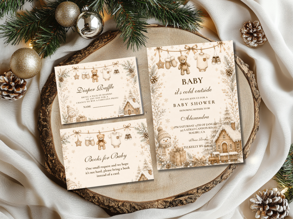
3.2 Winter Wonderland Village — Soft White, Silver & Gold
The Winter Wonderland direction applies the ‘it takes a village’ theme to the cool, luminous aesthetic of the winter landscape — soft white, silver, and warm gold as the primary palette, with the clothesline and the village wisdom station carried into a more ethereal and visually luminous register. The winter wonderland village is the direction for a host whose venue lends itself to a more formal or more styled winter aesthetic — a larger space, a higher-ceilinged room, a shower where the visual scale allows the winter wonderland palette’s luminosity to fully develop.
In the Winter Wonderland village direction, the clothesline items are in white and silver tones rather than cream and oatmeal; the centrepiece is a white floral and silver botanical arrangement rather than a dried neutral cluster; and the candlelight is warm white taper candles rather than amber pillar candles. The village wisdom station maintains the same kraft or warm cream card stock as the neutral direction, providing a warm anchor in an otherwise cool palette.
Direction 3.2
Winter Wonderland Village — Soft White, Silver & Gold
The most luminous and most visually expansive winter village direction — soft white, silver, and warm gold. Appropriate for larger venues and more formally styled gatherings. The clothesline and village wisdom station anchor the communal theme within an ethereal winter aesthetic.

🏡 Village Tip
It Takes a Village works in winter because the cozy indoor aesthetic matches the season perfectly — the village has always gathered indoors when it is cold outside. Lean into warm lighting, candles, plaid textiles, and the scent of warm dried botanicals for the most atmospherically winter village feeling. The season provides the reason to gather; the theme provides the meaning of the gathering.
Section 04 Invitations & Stationery
The ‘it takes a village’ invitation is the first piece of the celebration that the village receives — and it should communicate, from the first line of wording, that this is a gathering of community rather than simply a baby shower. The wording ‘it takes a village to raise a child — and we are building ours’ or ‘come join the village’ or ‘you are part of our village’ places the guest at the centre of the occasion rather than at its periphery, which is the entire emotional point of the theme.
The invitation’s design should be warm, natural, and specifically communal: a kraft or warm cream card ground, a clothesline or botanical motif as the primary design element, and a typeface that reads as warm and personal rather than as formal or elegant. The stationery suite — place card, village wisdom card, food label, welcome sign, and favour tag — should all use the same warm neutral palette and the same clothesline or botanical motif consistently, so that every printed piece the guest encounters reinforces the same communal warmth. The six collections below cover the full range of village shower stationery directions.
Primary Direction
It Takes a Village
Warm neutral clothesline stationery for the primary it takes a village baby shower direction.
Curated Suite
It Takes a Village Collection
A curated selection of village theme stationery across the full it takes a village shower experience.
Neutral Clothesline
Neutral Clothesline Baby Shower
Warm cream and oatmeal clothesline stationery — the most gender-neutral and most natural baby shower direction.
Elegant Winter
Winter Baby Shower
Pale blue, silver, and gold — the most seasonally flexible and most formally elegant winter baby shower stationery.
Luminous Winter
Winter Wonderland
Soft white, silver, and gold — the most ethereal winter stationery direction for the winter wonderland village aesthetic.
Festive Winter
Winter & Christmas Baby Shower
The umbrella collection for all winter and Christmas baby shower directions — the broadest seasonal starting point.
Browse the full It Takes a Village stationery range — warm neutral clothesline stationery for the most communal baby shower direction.
Frequently Asked Questions
What is the It Takes a Village baby shower theme?
The It Takes a Village baby shower theme is based on the proverb ‘it takes a village to raise a child’ and places the community of family and friends — rather than the baby or the baby’s gender — at the centre of the celebration. It is the only baby shower theme where the guests are the subject of the occasion: every decoration, activity, and stationery piece points toward the community gathering around this family as the most important thing happening on the day. The clothesline, the village wisdom activity, and the neutral palette all follow from this central idea. It is inherently gender-neutral because the village gathers around a baby regardless of gender, and it is the most emotionally resonant baby shower theme available for a host who wants to celebrate the people in the room as explicitly as the baby who is coming.
What colors work for an It Takes a Village baby shower?
The neutral palette that works best with the It Takes a Village theme is warm cream, oatmeal, sage green, and antique gold — the earthy, natural tones that read as both warm and specifically communal rather than as seasonally specific or gender-directed. Warm amber and natural brown work as additional accent tones. The palette should avoid both bright primary colours and pastel gender-specific tones; the neutrality of the palette communicates the theme’s inclusivity as clearly as the clothesline communicates its signature motif. In the winter directions, soft white and silver can be added to the neutral palette base without breaking the theme’s communal warmth, provided the gold anchor element is present in each zone.
How do I incorporate the village concept into baby shower decor?
Three specific elements carry the village concept into the physical decoration of the room. First, the clothesline: a thin cord hung with tiny baby items — styled by the host or contributed by guests on arrival — is the most immediately legible village decoration available and the one that most completely communicates the theme’s communal warmth without any supporting text. Second, the village wisdom station: a dedicated surface where guests write advice, memories, or hopes on cards and add them to a labelled jar or box — framed as ‘wisdom from the village’ rather than as a generic shower activity. Third, the stationery wording: every piece of printed material should address the guest as a member of the village rather than as an attendee of a shower. These three elements — the clothesline, the wisdom station, and the stationery wording — carry the community-as-subject concept into the physical experience of the event.
Community Not Baby · Clothesline · Village Wisdom · Neutral Palette
Shop It Takes a Village Baby Shower Stationery
Clothesline invitations, village wisdom cards, and warm neutral stationery for the most communal baby shower theme available.