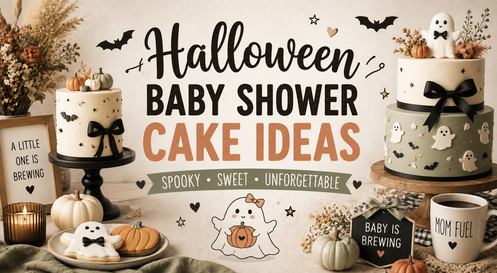
Halloween Baby Shower Cake Ideas
Halloween Baby Shower · Cake Guide
Halloween Baby Shower Cake Ideas
The three mistakes that send a Halloween baby shower cake in the wrong direction, five complete cake styles, the smash cake and cupcake guide, and the stationery showcase.
A Halloween baby shower cake should look like it came from a witch’s kitchen — warm, atmospheric, and completely beautiful in the dark. The three-word brief for any baker: warm, whimsical, elegant. What derails most Halloween baby shower cakes is not the wrong motif or the wrong tier count; it is the wrong colour temperature on the fondant and the wrong register on the decoration. This guide covers both.

Shop the Halloween Baby Shower collection.
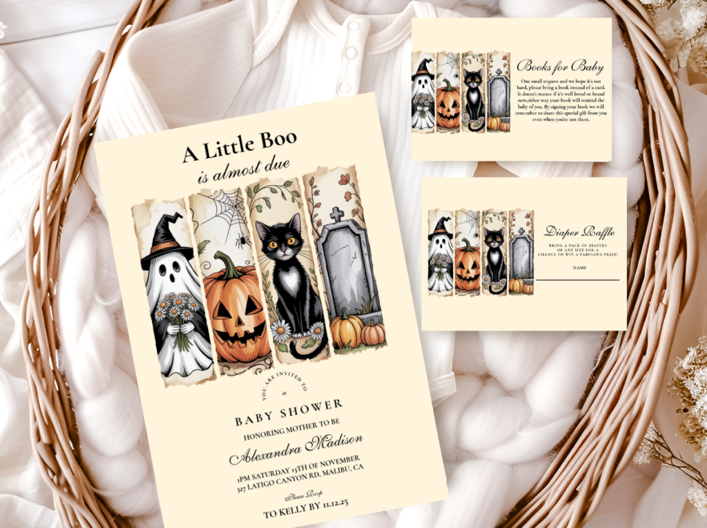
The stationery suite that coordinates with every cake direction below — from the invitation to the cake tag.
“A Halloween baby shower cake should look like it came from a witch’s kitchen — warm, atmospheric, and completely beautiful in the dark. Brief your baker in three words: warm, whimsical, elegant.”
Section 01 Why Halloween Baby Shower Cakes Go Wrong — Three Mistakes
The same mistakes appear consistently across Halloween baby shower cakes that do not quite work — not because the baker did not have the skill, but because the brief was wrong. All three mistakes are avoidable with one clear conversation before the order is placed.
Mistake 1
Too Scary — Horror Register Instead of Whimsical
Wrong: Dripping blood fondant details, genuinely menacing spider arrangements, skull decorations in realistic form, horror-film-adjacent dark imagery. These belong to adult Halloween parties and haunted house installations — they communicate threat and fear, which is the exact opposite of what a baby shower cake should communicate. A guest who sees a horror-adjacent cake element at a baby shower registers cognitive dissonance, not delight.
Right: Cute round-form ghosts with soft expressions placed as fondant accents or as a topper — the ghost that looks slightly confused about being at a celebration rather than genuinely frightening. Small elegant spiders in thin black sugar work placed as accents on the upper tier, not as a focal horror element. Potion bottles in jewel-toned fondant with tiny cork details. Bats in simplified, slightly cartoonish form. Every Halloween motif at the baby shower register should communicate warmth and whimsy — it is a celebration of arrival, not an exercise in gothic atmosphere.
Mistake 2
Wrong Black — Harsh and Cold Instead of Atmospheric
Wrong: Black fondant as the primary colour of a tier. Bright-black fondant with no warm accent reads as harsh, cold, and aesthetically closer to a Halloween party supply product than to a beautifully crafted baby shower cake. The same cool-bright-black that reads as dramatic on a Halloween party invitation reads as cold and unwelcoming on a cake that guests are meant to eat at a warm celebration.
Right: Deep purple fondant or deep plum buttercream as the primary dark element — the specific warm dark that communicates the Halloween register without the coldness of full black. Charcoal or very dark navy as an alternative dark element when a cooler tone is specifically requested. Where black is used at all — in thin fondant ribbon detail, in fine-line spider web sugar work, in typography on a fondant plaque — it should be a single accent detail in a warm palette rather than the primary surface colour of any tier.
Mistake 3
Neon Colours — Halloween Party Supply Palette Instead of Atmospheric
Wrong: Neon orange and neon green fondant decorations — the specific bright, synthetic quality of the commercially available Halloween colour palette. These colours belong to the mass-market party supply Halloween context: they communicate ‘Halloween party’ immediately, clearly, and entirely at the expense of any atmospheric or elegant quality. A neon green potion drip on a dark cake reads as a haunted house prop rather than as a beautifully considered baby shower cake.
Right: Warm amber rather than neon orange — the specific golden-orange of warm candlelight rather than the bright primary orange of a carved pumpkin. Deep sage rather than neon green — the specific muted warm green of certain botanical elements rather than the synthetic bright green of a commercial Halloween kit. Jewel-toned deep teal or deep forest green for a potion drip rather than neon green — the difference between atmospheric and jarring is entirely in the saturation and warmth of the colour.
✨ Styling Tip
Brief your baker with your invitation image and these three words: warm, whimsical, elegant. The invitation image shows the baker the exact palette, the exact register, and the exact level of atmospheric darkness that belongs at your celebration. A Halloween baby shower cake should look beautiful first and Halloween second. If a baker sees your invitation and understands those three words, the cake will belong to the same world as everything else at the shower.
Section 02 Five Halloween Baby Shower Cake Directions
Five complete cake directions, each built from the three-mistake framework above. All five stay warm, whimsical, and atmospheric. None of them uses neon colours, harsh black as a primary surface, or horror-register decoration.
Most Versatile
Classic Halloween Baby Shower Cake
Deep Purple · Warm Amber · Antique Gold · Cream
Finish: Semi-naked buttercream in warm cream with deep purple buttercream swirls applied on one side of the upper tier as the colour accent; or a smooth deep purple fondant single tier with warm amber botanical detail. Both finishes work — the semi-naked reads as warmer and more organic; the smooth fondant reads as more architectural and more editorial.
Topper: One whimsical element placed off-centre at the top: a cute round ghost in white fondant with a soft expression; or a small cluster of antique gold stars in sugar work; or a small blush pumpkin beside a fondant spider in thin-legged elegant form. One topper only — the restraint is what makes it read as designed rather than over-decorated.
Palette rule: Every purple element must stay warm — warm violet-grape rather than cool blue-purple. Every amber element must stay warm — golden-amber rather than bright orange. The two-colour test: the cake should look like it belongs beside a warm amber candle and a deep purple linen napkin at the same table.
The Classic Halloween direction is the most photographically reliable of the five — deep purple buttercream and warm amber detail photograph well under warm artificial light, which is the specific lighting condition of most indoor autumn celebrations. It is also the most versatile: the semi-naked finish works at any venue from a backyard to a formal reception room, and the smooth fondant version scales elegantly from a single-tier intimate cake to a three-tier celebration cake.
Most Narrative
Baby Is Brewing Cauldron Cake
Deep Purple · Deep Teal · Antique Gold · Warm Cream
Finish: Two options, both effective. Option one: a standard round cake with a cauldron-themed drip — a deep jewel-toned drip in dark teal or dark purple applied to the upper tier edge, with small fondant bubbles placed at the base of the drip as the potion-bubbling detail. Option two: a cauldron-shaped cake — a round barrel-form cake in black or very dark charcoal fondant with gold ring detail, topped with a small fondant flame cluster in warm amber.
Topper: For the drip cake: small fondant potion bottle accents placed at the base of the upper tier beside the drip; a hand-lettered fondant plaque reading ‘a baby is brewing’ or ‘brewing since [year]’ in warm gold script; antique gold star scatter in sugar work across the upper tier. For the cauldron cake: small fondant bubble details at the rim of the cauldron form; one fondant bat or star accent placed at the side.
Palette rule: The drip colour is the single most important palette decision in this direction. Deep jewel-toned dark teal or dark purple reads as a beautiful, atmospheric potion drip. Neon green reads as a horror prop. The colour must be deep and muted — darker and less saturated than any commercially available neon green — or the drip breaks the baby shower register immediately.
The Baby Is Brewing cake is the most narrative of the five directions because the decoration tells the same story as the invitation — the cauldron and potion elements confirm the brewing theme in a way that a guest who received the invitation recognises immediately. The coordination between the invitation illustration and the cake decoration is the element that makes the brewing narrative feel designed rather than assembled from separate sources.
✨ Styling Tip
A cauldron drip cake works when the drip colour is deep and jewel-toned — dark purple or deep teal — not bright neon green, which reads as a horror prop rather than a baby shower decoration. The drip should look like something genuinely beautiful is overflowing from the cauldron. Brief the baker with a specific colour reference rather than the word ‘green’ — ‘deep forest teal’ or ‘dark jewel purple’ communicates the register; ‘green’ does not.
Most Editorial
Witch & Spells Cake
Deep Purple · Near-Black Accent · Antique Gold · Warm Cream
Finish: The most dramatically atmospheric of the five cake directions: a smooth deep purple fondant on the primary tier with very fine near-black sugar work applied as a constellation or star map pattern across the surface; or a dark-toned semi-naked cake with deep purple and charcoal buttercream layers visible at the sides and a smooth fondant moon-and-stars detail at the top.
Topper: A moon and stars fondant topper in antique gold — a crescent moon form leaning slightly to one side with three five-pointed stars at varying heights beside it. Or a fondant witch hat in deep purple with a small gold buckle detail placed off-centre at the top of the upper tier. Gold star scatter in sugar work across the upper two-thirds of the cake surface.
Palette rule: Near-black as the accent — in sugar work constellation lines, in the witch hat form — never as the primary surface colour. Deep purple stays as the dominant warm dark element. Antique gold as the only metallic — not silver, not bright gold, but the specific warm aged-gold tone that belongs to the atmospheric Halloween register.
The Witch direction is the most demanding of the five in terms of execution precision — the fine sugar work constellation pattern requires a baker comfortable with detailed surface work, and the moon-and-stars topper reads very differently in skilled and less-skilled hands. Share a specific reference image alongside the three-word brief; this direction rewards a precise brief more than any of the other four.
Most Feminine
Pink Halloween Cake
Dusty Rose · Deep Purple · Antique Gold · Warm Cream
Finish: A semi-naked buttercream in warm cream with dusty rose and deep purple buttercream swirls on one side; or a smooth fondant in warm dusty rose with a deep purple fondant ribbon detail at the base of each tier. The dusty rose must stay muted — bright pink beside deep purple reads as two competing accent colours rather than one designed palette.
Topper: A cute ghost topper in warm cream fondant with a soft expression, leaning slightly to one side; or a small blush pumpkin cluster with a fondant bat accent in simplified form. Small dried rose petals or dried lavender scattered at the base of the tier as a botanical accent that belongs to both the boho and the Halloween worlds simultaneously.
Palette rule: Dusty rose must be the specific warm muted rose — not bright pink, not cool-toned blush, not hot pink. Check the dusty rose fondant colour beside the deep purple before applying: if the rose reads as brighter or cooler than the purple, the batch needs adjusting. The two tones should read as belonging to the same warm world.
The Pink Halloween direction is the most naturally Pinterest-consistent of the five — dusty rose and deep purple in the baby shower context is one of the most reliably saved autumn baby shower images available, and the cake carries that palette forward from the invitation to the dessert table in a way guests recognise and appreciate immediately.
Most Whimsical
Little Boo Cake
Soft Purple · Warm Cream · Antique Gold · Warm White
Finish: A soft purple buttercream — the lighter, warmer end of the purple range rather than the deep dramatic purple of the Classic or Witch directions — in a smooth or very lightly textured finish. Or a warm cream semi-naked with soft purple buttercream swirls at the top tier and warm cream at the lower tiers. The palette is the lightest and the most approachable of the five directions.
Topper: A cute ghost topper in warm white fondant — the ghost form that is rounded, slightly asymmetric, and has a soft expression rather than a frightening one. A small antique gold star beside the ghost. Or a small ghost cluster: three ghosts of different sizes placed together at the top tier, the largest one slightly off-centre and the two smaller ones leaning against it naturally.
Palette rule: Soft warm purple throughout — the lavender-adjacent warm purple rather than the cool blue-lavender that reads as generic rather than atmospheric. Warm white and warm cream for the ghost topper and the neutral tier — cool white beside soft purple reads as clinical rather than whimsical.
The Little Boo direction is the most appropriate of the five for a celebration where young children will be present — it is genuinely child-friendly in a way that the more dramatic directions are not — and the most forgiving for a baker who may not have worked extensively in the Halloween baby shower aesthetic. The soft purple and cream palette reads as warm and celebratory first, and Halloween second, which means the celebration succeeds even if the decoration is simpler than planned.
Section 03 Beyond the Main Cake — Smash Cake, Cupcakes & Toppers
The main cake is the visual centrepiece of the dessert table, but three additional elements — the smash cake, the cupcake tower, and the topper — each require the same palette discipline as the main cake. All three are photographed beside or near the main cake at some point during the celebration, and any one of them in the wrong colour register breaks the visual coherence of the dessert table.
Smash Cake — Same World, Simpler Form
The smash cake is photographed beside the main cake before the celebration and beside the baby during or after it — both contexts require it to belong to the same palette as the main cake. For the Classic Halloween direction: a small single-tier in soft purple buttercream with one fondant ghost accent. For the Pink Halloween direction: a small single-tier in dusty rose buttercream with a single gold star. For the Little Boo direction: a small single-tier in warm cream with a soft purple buttercream swirl at the top. In every direction: soft and warm colours, one whimsical accent, no neon. A smash cake in bright orange and black beside a sophisticated deep purple and gold main cake reads as two entirely different celebrations.
Cupcake Tower — The Palette in Miniature
A cupcake tower in the Halloween baby shower palette follows the same colour logic as the main cake — each cupcake is a miniature of the main cake’s palette rather than a separate decoration decision. For Classic Halloween: alternating deep purple and warm cream buttercream swirls, with antique gold star toppers and small fondant ghost accents on alternating cupcakes. For Baby Is Brewing: dark purple or deep teal buttercream swirls with small fondant potion bottle toppers. For Pink Halloween: dusty rose and warm cream alternating, with small ghost or bat toppers in simplified fondant form. The cupcake tower should read as the same world as the main cake when placed beside it, not as a separate dessert element assembled from different decisions.
Cake Toppers — One Motif, Off-Centre
The topper rule for all five Halloween baby shower cake directions: one motif, placed off-centre, in the warm palette of the direction. A ghost topper for Little Boo and Pink Halloween directions. A moon-and-stars arrangement for the Witch direction. A fondant cauldron or potion bottle for the Baby Is Brewing direction. A simple pumpkin or star cluster for the Classic Halloween direction. Off-centre placement reads as designed; centred placement reads as a standard cake topper. And one topper only — two toppers competing at the top of the same tier read as two decisions rather than one.
✨ Styling Tip
A Halloween baby shower smash cake should match the main cake palette — soft purple and cream, not bright orange and black. The smash cake is photographed beside the main cake before the shower and beside the baby during or after it — in both photographs it needs to belong to the same warm, atmospheric world as the main cake. Brief the baker for the smash cake at the same time as the main cake so both come from the same batch of buttercream and the same palette mix.
Section 04 Invitations & Stationery
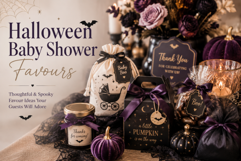
The cake tag, the dessert table label, and the favour bag tag are all printed elements that belong to the stationery suite rather than to the decoration. A beautifully crafted Halloween baby shower cake beside a cake tag printed in generic font on a white card reads as an incomplete presentation — the tag is the final printed element that ties the stationery world of the invitation to the decoration world of the cake.
Every printed element at the dessert table — the cake tag, the cupcake flag, the dessert label, the favour tag — should carry the same palette, the same illustration style, and the same narrative register as the invitation. Below are all six collections, each matched to the specific cake direction it pairs with most naturally.
Classic Direction
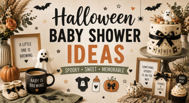
Halloween Baby Shower
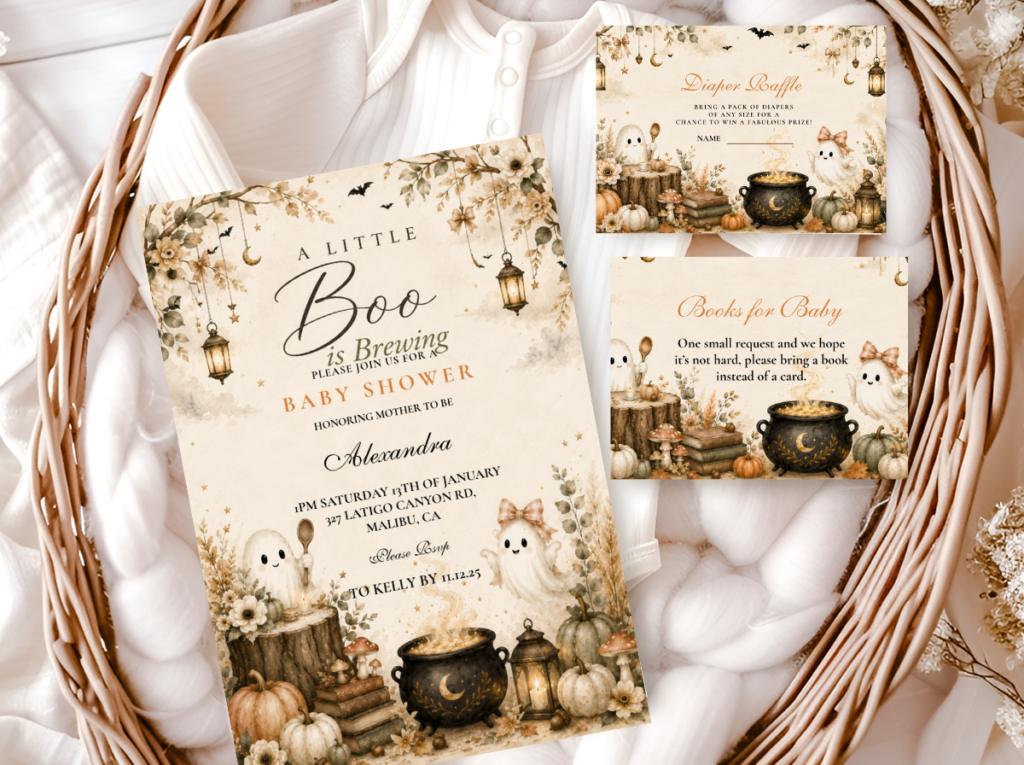
Deep purple and warm amber — coordinates with the Classic Halloween Cake and any direction that uses the full atmospheric palette.
Brewing Narrative
Baby Is Brewing
Cauldron and potion motifs — the stationery suite that matches the Baby Is Brewing Cauldron Cake narrative most directly.
Most Editorial
Witch & Something’s Brewing
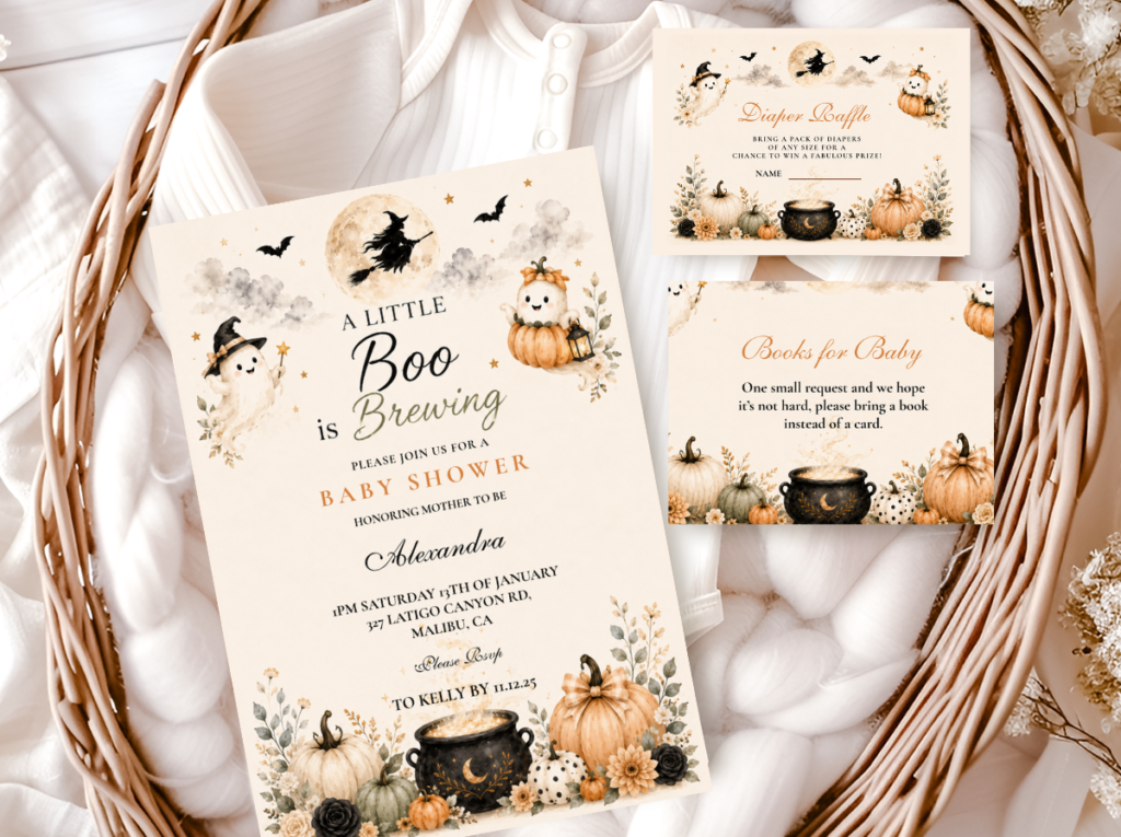
Deep purple and gold in the most dramatically atmospheric register — pairs with the Witch & Spells Cake direction.
Most Feminine
Pink Halloween
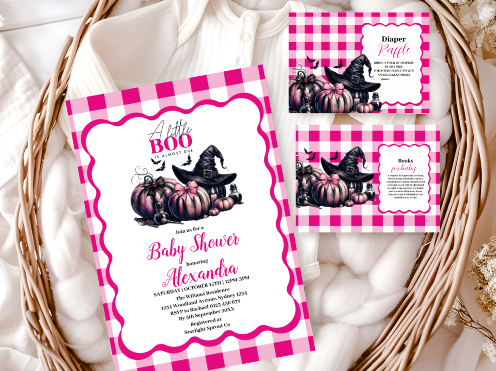
Dusty rose and deep purple — coordinates with the Pink Halloween Cake and the most feminine brewing directions.
Most Whimsical
A Little Boo
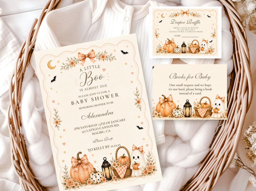
Soft purple and warm cream — the stationery direction that pairs most naturally with the Little Boo Cake.
Coffee Direction
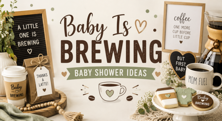
Coffee Baby Brewing
Warm kraft and cream — for the coffee brewing direction cake table labels and favour tags.
Frequently Asked Questions
What colours work for a Halloween baby shower cake?
Warm amber (not neon orange), deep warm purple (not cool blue-purple and not bright neon), antique gold, dusty rose for the girl direction, and warm cream as the neutral. The palette rule: every colour should sit on the warm, muted side of its hue. Warm amber rather than bright orange; deep grape-violet rather than cool blue-purple; dusty rose rather than bright pink; antique gold rather than bright gold. Neon green, neon orange, and cool bright black all belong to the commercial Halloween party supply palette rather than to the baby shower register. Brief the baker with these distinctions explicitly, or share the invitation image as the palette reference.
How do I make a Halloween baby shower cake look whimsical rather than scary?
Three decisions: choose motifs in their whimsical form rather than their horror form (round soft-expression ghosts rather than menacing ghosts; simplified bat silhouettes rather than realistic horror bats; elegant thin-legged sugar spiders rather than large realistic horror spiders); keep every decoration element small and placed as an accent rather than as a focal horror element; and brief the baker with the word ‘whimsical’ rather than ‘scary’ alongside the warm palette reference. The baker cannot read your mind about the register you intend — the brief is the most important design decision in the cake commissioning process.
Should the cupcakes match the main Halloween baby shower cake?
Yes — the cupcake tower is photographed beside the main cake at some point during the celebration, and if the cupcakes use a different palette from the main cake, the dessert table reads as two different celebrations placed beside each other. Brief the baker for the cupcakes at the same time as the main cake so both come from the same buttercream batch and the same palette mix. Each cupcake should be a miniature of the main cake’s palette: one or two colours of buttercream swirl, one small topper in the direction’s motif, no additional decoration that introduces a new element not present in the main cake design.
Warm, Whimsical, Elegant
Complete the Cake Table
The stationery suite that ties the invitation to the cake tag to the favour bag — every printed element in the same warm, atmospheric world as the cake.