Baby Is Brewing Baby Shower Ideas
Baby Shower · Brewing Guide
Baby Is Brewing Baby Shower Ideas
The three brewing directions that share the same pun but look nothing alike, four complete aesthetics, the decor and cake guide, and the full stationery showcase.
‘A baby is brewing’ is the most narrative baby shower theme available — every detail tells the same warm, witty story from the first invitation to the last favour. The challenge most couples encounter is discovering, mid-planning, that the brewing pun covers three completely different aesthetic worlds: one is dark and atmospheric, one is warm and caffeinated, and one is amber and relaxed. Choosing the right direction before buying anything is the planning decision that determines everything else.
Shop the Baby Is Brewing collection.
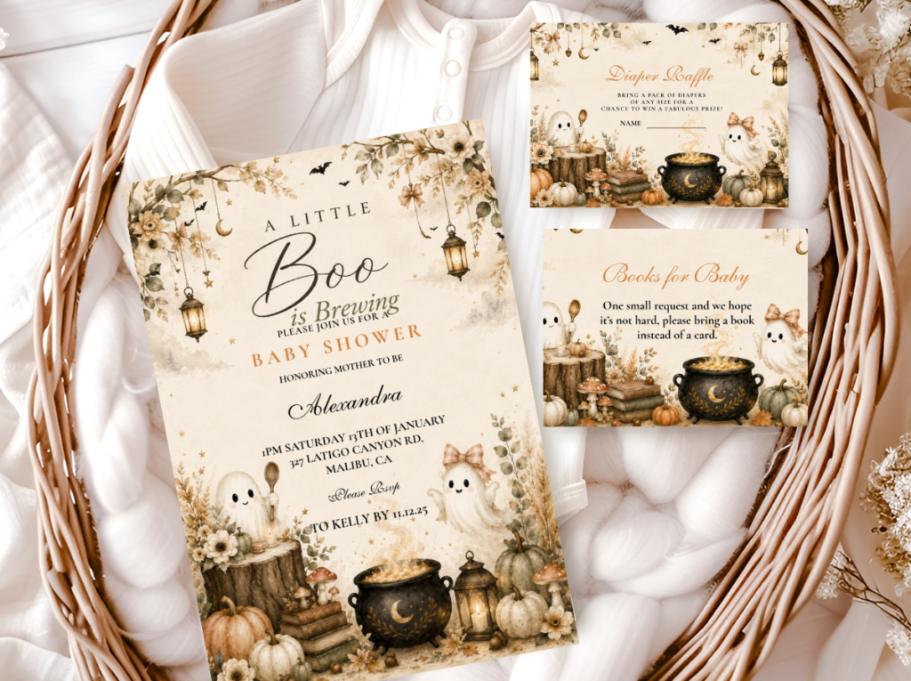
The full brewing suite — invitations, welcome signs, and favour tags in the warm narrative register.
“A baby is brewing — the most narrative baby shower theme available. Every detail tells the same warm, witty story from the first invitation to the last favour. The only question is which brew.”
Section 01 What Makes Baby Brewing Unique — Three Completely Different Worlds
The ‘a baby is brewing’ pun is the most versatile in the baby shower vocabulary because it applies equally to three completely different aesthetic worlds that share nothing except the metaphor. This is the most important planning distinction in the entire brewing category — and the source of almost every planning mistake made in it — because a couple who commits to the witch-and-cauldron direction and a couple who commits to the coffee-bar direction are planning entirely different celebrations that happen to share the same invitation wording.
The three directions are not variations of the same theme. They are genuinely different aesthetics with different palettes, different venues, different decor elements, and different guest experiences. Mixing elements across directions — a cauldron centrepiece beside a burlap coffee station — reads as two parties placed in the same room rather than one designed celebration. The direction must be decided first; every purchase follows from it.
Direction 1
Witch & Cauldron Brewing
Deep Purple · Warm Amber · Antique Gold
The world: Dark magic, atmospheric Halloween, potions and spells — a celebration that belongs to the autumn night and the mystery of arrival.
Palette: Deep purple, warm amber, antique gold, black accent
Hero element: A small decorative cauldron filled with dried botanical material
Mood: Dramatic, atmospheric, narrative-forward — the most editorial of the three directions
Direction 2
Coffee Brewing
Kraft Brown · Warm Cream · Oatmeal · Muted Gold
The world: The coffee bar, the morning ritual, the warmth of a freshly brewed cup — a celebration that belongs to cosy kitchens and warm weekend mornings.
Palette: Warm neutrals (kraft brown, oatmeal, warm cream), coffee bean tones, muted gold
Hero element: A styled coffee bar with a chalkboard menu and mason jar display
Mood: Warm, casual, and domestic — the most approachable and most forgiving of the three directions
Direction 3
Beer Brewing
Warm Amber · Warm Brown · Hops Green · Cream
The world: The craft brewery, hops and amber tones, the relaxed outdoor-adjacent warmth of a celebration built around something handcrafted.
Palette: Amber tones, warm brown, hops green, cream
Hero element: A hops garland or hops-adorned centrepiece as the signature botanical element
Mood: Relaxed, fun, and gender-neutral — the most outdoor-appropriate and most co-ed friendly direction
✨ Styling Tip
The brewing direction you choose determines every other decision — the venue, the palette, the centrepiece, the food labels, the favour packaging. Coffee brewing and witch brewing are completely different showers that happen to share the same invitation pun. Decide the direction first; buy everything after. A cauldron centrepiece beside a burlap coffee station reads as two parties placed in the same room, not one designed celebration.
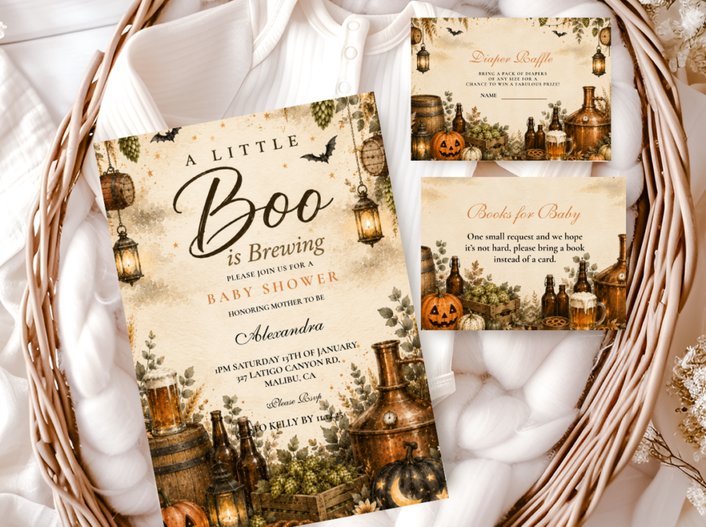
The Baby Is Brewing collection covers all three directions — browse it alongside the specific direction collection before committing to either.
Section 02 Four Baby Brewing Directions
Four complete aesthetics built from the three direction worlds above, each with its own palette, its own hero element, and its own guest experience. None of them looks like the others.
Most Atmospheric
Classic Baby Is Brewing — Witch & Cauldron
Deep Purple · Warm Amber · Antique Gold · Black Accent
The world it inhabits: The witch’s kitchen at the best possible moment: something wonderful is being prepared, the cauldron is bubbling with warmth rather than menace, and the atmosphere is the specific warmth of autumn candlelight in a darkened room.
Palette: Deep warm purple as the dominant base; warm amber as the floral and botanical accent; antique gold as the statement metallic; a single black accent element (in ribbon, in typography, in one candle grouping) as the depth detail. Every purple element must stay warm — cool blue-purple breaks the atmosphere immediately.
Hero element: A small decorative cauldron filled with dried eucalyptus, dried roses in deep burgundy, and dried pampas tails — placed as the centrepiece and nowhere else. The cauldron is a statement prop, not a repeating pattern.
This is the direction that earns the most atmospheric and most photographically striking results — and the one that requires the most palette discipline. The witch aesthetic in baby shower context is always warm and magical rather than cold and menacing. Every element should read as a potion being brewed with love rather than as a Halloween haunted house. The line between atmospheric and generic Halloween is the warmth of the purple and the whimsy of the prop.
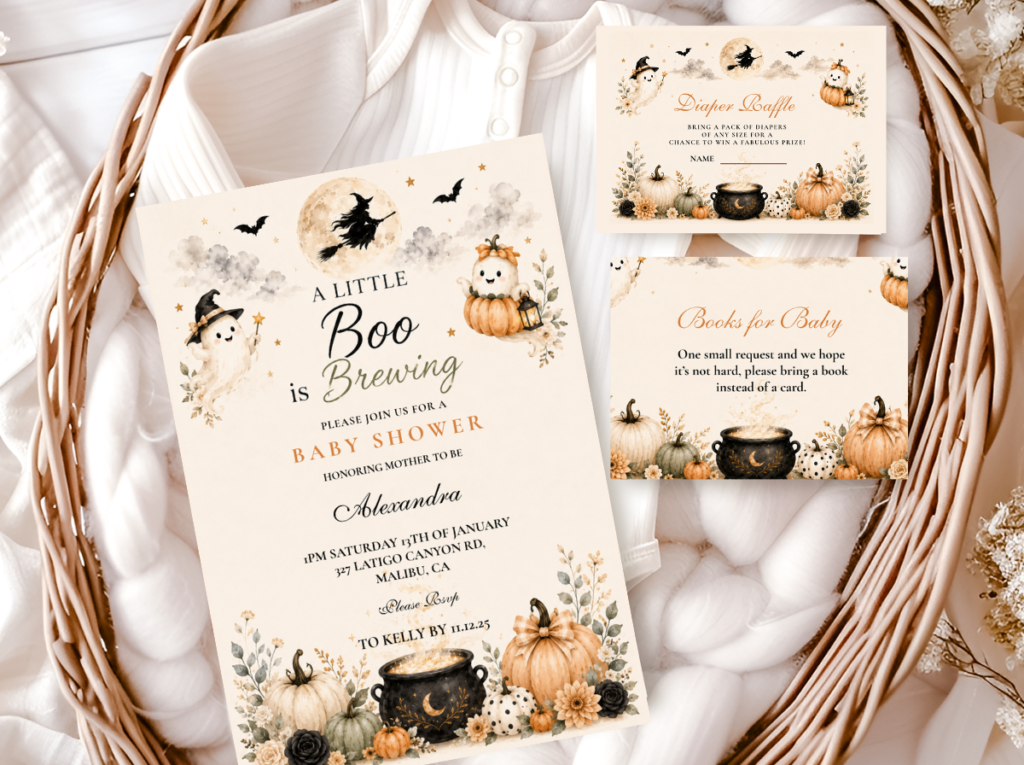
Most Warm
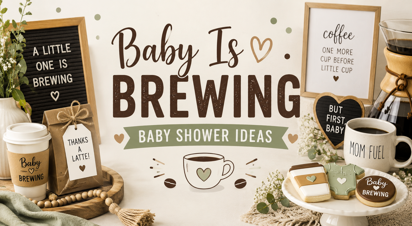
Coffee Baby Brewing
Kraft Brown · Warm Cream · Oatmeal · Muted Gold
The world it inhabits: The coffee shop at its most personal — the specific warmth of a morning ritual turned into a celebration. Mason jars, burlap texture, chalkboard menus, and the specific rich brown warmth of freshly roasted coffee beans.
Palette: Warm neutrals throughout: kraft brown as the primary accent, oatmeal and warm cream as the base, muted gold as the metallic — not bright gold, but the specific aged-warm tone of antique brass. No deep purple, no cauldron elements. The palette is the warmest and the most domestic of the four directions.
Hero element: A styled coffee bar with a chalkboard menu (‘The Brew Bar’, ‘Brewed with Love’, specific offerings listed) as the focal hero element of the celebration. One strong focal point always reads more designed than many competing elements.
The Coffee Baby Brewing direction is the most approachable of the four — the materials are familiar and easy to source, the palette is forgiving, and the coffee bar element gives the celebration a specific functional anchor that guests gravitate toward naturally. It is also the most appropriate direction for a casual or outdoor shower, where the relaxed warmth of the coffee aesthetic reads more naturally than the deeper dramatic directions.
✨ Styling Tip
A coffee brewing shower needs one hero element — a styled coffee bar with a chalkboard menu, mason jar display, and warm linen runner. Everything else in the room can be simple. One strong well-assembled focal point reads as more designed than many competing coffee elements on every surface. The bar is the centrepiece; the rest of the room supports it.
Most Relaxed
Beer Baby Brewing
Warm Amber · Warm Brown · Hops Green · Cream
The world it inhabits: The craft brewery taproom at its most celebratory — the specific warmth of amber tones, natural hops, and the relaxed outdoor-adjacent quality of a celebration that does not take itself too seriously.
Palette: Warm amber and warm brown as the primary palette; hops green as the specific botanical accent that grounds the direction in the brewery world; cream as the neutral. No purple, no dark atmospheric elements — the Beer Brewing direction is the warmest and brightest of the three primary brewing aesthetics.
Hero element: A hops garland or hops-and-wheat botanical centrepiece arrangement as the signature element — the visual element that immediately communicates the craft brewery world to any guest.
Beer Baby Brewing is the most gender-neutral of the four directions — the craft brewery aesthetic has no gender convention attached to it, and the warm amber and hops palette reads as equally appropriate for any shower direction. It is also the most appropriate direction for an outdoor or backyard shower, where the relaxed and casual quality of the brewery aesthetic reads most naturally. The humour of the direction — ‘brewing since’, ‘quality control required’, ‘batch number one’ — is the most overtly witty of the four directions, which makes it the strongest choice for a co-ed shower where the guests include people who might otherwise find a baby shower format unfamiliar.
Most Feminine
Pink Baby Brewing — Girl Direction
Dusty Rose · Deep Purple · Antique Gold · Warm Cream
The world it inhabits: The witch-and-cauldron world shifted into its most romantic and most feminine register — dusty rose alongside deep purple, brewing motifs reframed as magical-feminine rather than dramatically atmospheric.
Palette: Dusty rose as the directional accent alongside deep purple base; antique gold as the metallic; warm cream as the neutral. The brewing motifs — cauldrons, potions, stars — are illustrated in the warm, soft register of the dusty rose direction rather than the darker dramatic register of the Classic direction.
Hero element: Blush pumpkin accents and dusty rose dried floral material alongside the classic brewing motifs — the specific combination that keeps the direction clearly within the brewing world while communicating the girl-leaning palette.
The Pink Baby Brewing direction is the most Pinterest-consistent of the four — dusty rose and deep purple in a brewing context produces one of the most saved autumn baby shower flat lay photographs available. It is also the direction most naturally suited to the overlap between the brewing aesthetic and the girl western boho direction, where the dusty rose and warm brown palette appears in both worlds.
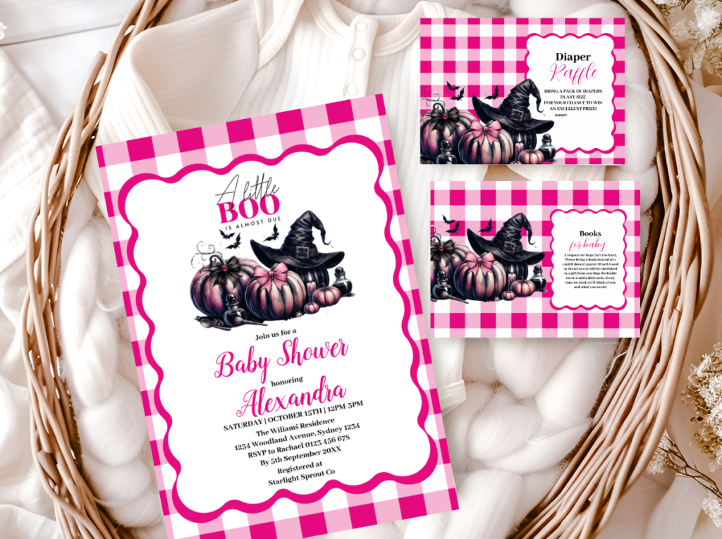
Section 03 Decor, Cake & Table at a Glance
The brewing shower decoration formula is the same across all four directions — one strong anchor element per zone, two supporting texture layers, and the narrative thread visible in every printed element. The specific anchor element changes by direction; the formula does not.
Centrepiece — One Brewing Anchor Per Zone
Witch direction: a small decorative cauldron filled with dried botanical material (dried eucalyptus, dried roses, dried pampas tails). Coffee direction: a styled mason jar display with burlap runner and small potted herbs. Beer direction: a hops garland or hops-and-wheat botanical arrangement in a wooden vessel. Pink direction: a blush pumpkin cluster with dried rose accents and a small cauldron as one of the elements. One anchor per zone — the cauldron is a statement prop, not a repeating pattern across every surface.
Cake — Brewing Motif Topper, Warm Palette
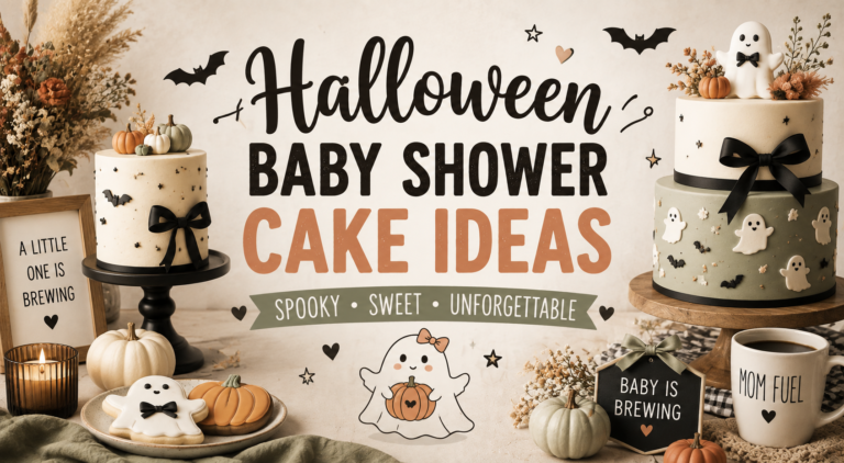
A semi-naked buttercream in warm cream with one brewing-motif topper: a small decorative cauldron beside the top tier (witch direction); a coffee cup or coffee bean topper (coffee direction); a hop cluster and wheat bundle topper (beer direction); a blush pumpkin and cauldron combination topper (pink direction). Cake labels and tags carry the narrative: ‘freshly brewed’, ‘batch no. 1’, ‘brewed with love.’ No bright neon elements; no generic ‘baby shower’ topper.
Food & Drink Labels — The Narrative at the Table
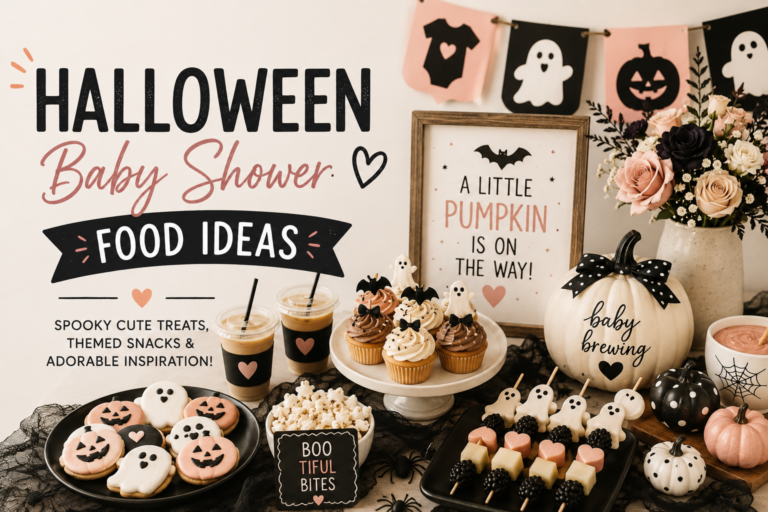
The food table is where the brewing narrative earns its most visible presence. Witch direction: ‘witch’s brew’ punch, ‘cauldron cookies’, ‘potion no. 9’ for drinks. Coffee direction: ‘the brew bar’, ‘dark roast’, ‘decaf for the mama’, ‘freshly ground’. Beer direction: ‘batch no. 1’, ‘quality control required’, ‘brewed since [date]’. Pink direction: ‘brewing something magical’, ‘love potion’, ‘enchanted blend.’ Every label carries the same wording register as the invitation — they are printed on the same warm ivory or kraft card stock and in the same lettering style.
✨ Styling Tip
One cauldron prop per table maximum. A small decorative cauldron filled with dried botanicals or seasonal candy reads as a considered design element — intentional, warm, and belonging to the brewing world. The same cauldron on every surface — on the gift table, on the cake table, on the dessert station, as the centrepiece of every guest table — reads as a Halloween party supply store display rather than a designed celebration. One strong cauldron appearance; organic boho materials everywhere else.
Section 04 Invitations & Stationery
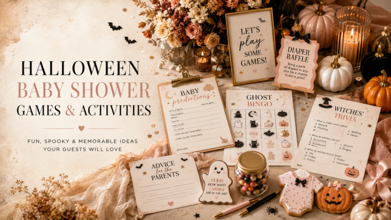
The brewing shower invitation is where the story begins — and the specific wording of that story determines which direction the entire celebration follows. ‘A baby is brewing’ is neutral and works across all four directions. ‘Something wicked this way comes’ is the witch direction. ‘The best things in life are brewed’ is the coffee direction. ‘Brewing up something amazing’ is the beer direction. The wording, the illustration style, and the palette together communicate the direction before any guest arrives.
Every element of the stationery suite — invitation, welcome sign, food labels, favour tags — should carry the same narrative thread and the same palette as the direction chosen. A witch-direction invitation beside a generic ‘Baby Shower’ welcome sign reads as an incomplete narrative; the full suite is what makes the brewing story complete from first impression to last favour.
Core
Baby Is Brewing
The full brewing narrative suite — covers all directions and works alongside any of the five specific collections.
Most Atmospheric
Witch & Something’s Brewing
Deep purple and gold — the cauldron and magic direction at its most dramatic and editorial.
Most Warm
Coffee Baby Brewing
Kraft brown and warm cream — the coffee bar direction at its most domestic and approachable.
Most Relaxed
Beer Baby Brewing
Warm amber and hops green — the craft brewery direction at its most gender-neutral and outdoor-friendly.
Most Feminine
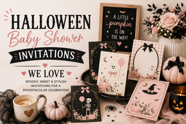
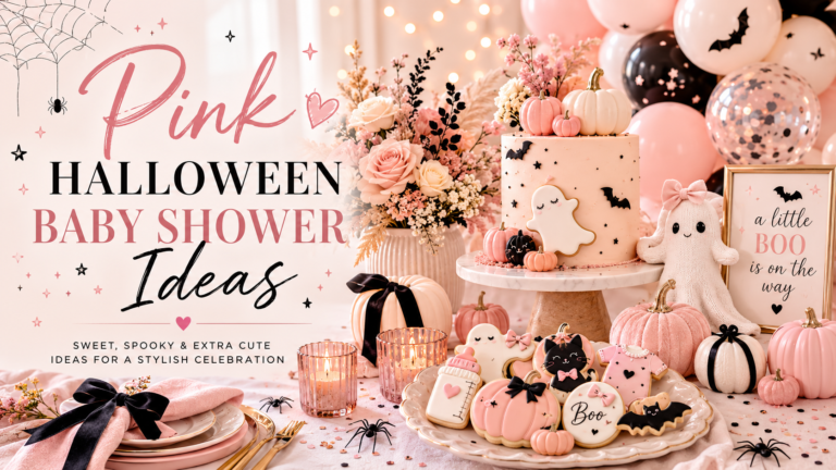
Pink Halloween
Dusty rose and deep purple — the brewing aesthetic in its most romantic and girl-leaning register.
Full Halloween
Halloween Baby Shower
Deep purple and warm amber — the complete Halloween baby shower palette alongside any brewing direction.
Frequently Asked Questions
What is the difference between Baby Is Brewing, Coffee Brewing, and Beer Brewing?
Three completely different aesthetics that share the same pun. Baby Is Brewing in its classic direction refers to the witch-and-cauldron world — deep purple, warm amber, atmospheric and Halloween-adjacent. Coffee Baby Brewing is a warm, domestic, neutral-palette direction built around a styled coffee bar, mason jars, burlap, and the specific warmth of the morning ritual aesthetic. Beer Baby Brewing is a craft brewery-adjacent direction with hops, amber tones, and the relaxed, outdoor-friendly quality of a celebration that does not take itself too seriously. All three use the same wording on the invitation; everything else — the palette, the decor, the venue, the guest experience — is completely different.
Can a Baby Is Brewing shower work for a girl?
Yes — the Pink Baby Brewing direction pairs dusty rose with deep purple and antique gold to create the most feminine version of the brewing aesthetic. The brewing motifs — cauldrons, potions, magic — are illustrated in a softer, warmer register that sits comfortably alongside dusty rose dried florals and blush pumpkin accents. The Coffee Baby Brewing direction is also naturally feminine in its warm neutral palette. The Beer Baby Brewing direction is the most overtly gender-neutral; the witch direction works equally well for any gender.
How do I keep a Baby Is Brewing shower from looking like a Halloween party?
Two decisions made simultaneously. Keep every purple element warm — the specific warm violet-grape tone rather than cool blue-purple. And keep every Halloween motif in its whimsical register — the cauldron is a warm, beloved cooking vessel rather than a menacing prop; the ghost is round and soft rather than terrifying; the witch is magical and powerful rather than frightening. The palette test: every element should read as warm and celebratory beside a warm amber candle. If it reads as cold, bright, or synthetic — it belongs in a Halloween party rather than a baby shower.
What favour works best for a Baby Is Brewing shower?
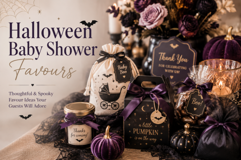
The most appropriate favour is the one that continues the narrative. Witch direction: small beeswax candles in warm amber labelled ‘brewed with love’, or botanical soap in lavender or cauldron-spiced scent. Coffee direction: a small bag of locally roasted coffee beans with a label saying ‘freshly brewed’ or ‘the best things in life are brewed’. Beer direction: a small jar of local honey or a packet of craft salt labelled ‘batch no. 1’. Pink direction: a small dried botanical sachet or a pressed-flower candle. Wrap every favour in kraft paper with natural twine and a printed tag that matches the invitation suite — the favour tag is part of the stationery, not an afterthought.
Something Is Brewing
Baby Is Brewing Stationery
From the first invitation to the last favour tag — the narrative that makes every brewing direction feel designed rather than decorated.