Pink Little Pumpkin Baby Shower Ideas
Baby Shower · Pink Little Pumpkin
Pink Little Pumpkin Baby Shower Ideas
The blush and cream palette, the mini pumpkin scale, the delicate floral register — and why this direction is more specific and more refined than generic pink pumpkin.
The pink little pumpkin baby shower sits in a specific and precise territory: warmer and more delicate than a standard pink shower, more feminine and more specific than a generic pumpkin theme. It is the direction that uses blush as its primary pink — not hot pink, not dusty rose — alongside warm cream and antique gold, and pairs that palette with the small scale of the ‘little’ framing: mini pumpkins, delicate florals, fine-detail stationery. Everything in this direction is intentionally small and soft.
The two sections below cover the palette rules that make this direction specific rather than generic, the decor and table details that apply them, and the wording and stationery variations for the most popular sub-directions.
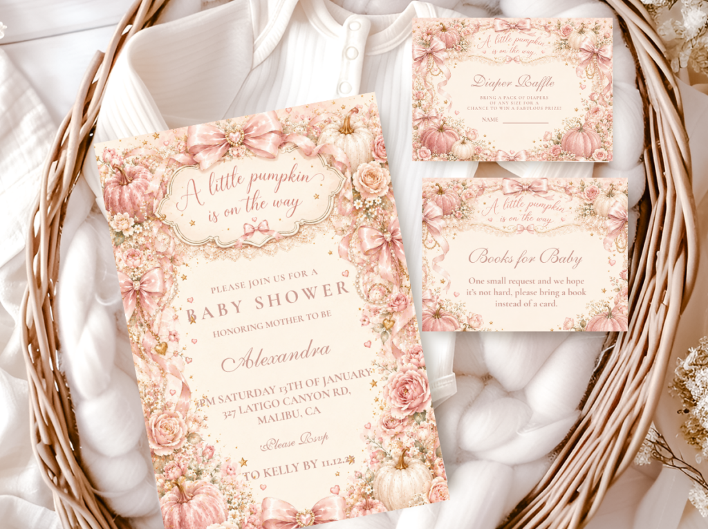
Browse the Pink Little Pumpkin collection — blush and cream pumpkin stationery in the most delicate and most specifically ‘little’ direction.
“A little pink pumpkin is on the way — the most warmly feminine pumpkin announcement available. Every detail should feel like blush and cream were always meant to sit beside a pumpkin.”
Section 01 The Pink Little Pumpkin Palette Rule
The pink little pumpkin direction is more specific than generic pink pumpkin — and that specificity is what makes it work as a cohesive baby shower theme rather than as a combination of two separate aesthetics (pink shower + pumpkin decor) placed in the same room. Three distinctions define this direction:
The ‘little’ wording shifts the scale. The word ‘little’ in the theme name is a design instruction, not just a word choice. It shifts every decor decision toward smaller, more delicate elements: mini pumpkins rather than large statement gourds; fine dried florals rather than abundant full-bloom arrangements; small stationery details rather than oversized graphic elements. A large statement pumpkin at the centre of a pink little pumpkin table reads as the wrong scale — it belongs to the big pumpkin world, not the little one. Three mini pumpkins at varying heights, each no larger than a fist, read as precisely correct.
Blush over dusty rose as the dominant pink. Blush is the correct pink for this direction: softer, more luminous, and more specifically baby-appropriate than dusty rose. Dusty rose reads as sophisticated and slightly aged — appropriate as an accent tone but visually heavy as the dominant pink in a baby shower context. Blush has a brightness that dusty rose lacks, and it sits more naturally beside cream and warm gold than dusty rose does. The rule: blush as the ground and the primary decorative pink; dusty rose, if used at all, as a single accent element — a ribbon, a napkin fold, a small floral cluster — that provides depth without becoming the dominant tone.
Cream not white. Bright white reads clinical and cold in the pink little pumpkin palette, and it breaks the warm harvest register that the pumpkin element requires. Warm cream — the specific off-white that leans toward ivory or warm linen rather than toward bright white — belongs to the blush and gold world naturally. Every surface that might reflexively reach for white in another context — the tablecloth, the cake board, the paper goods ground — should be warm cream in this direction. The cream is not a compromise for white; it is the correct choice.
🎃 Styling Tip
The pink little pumpkin palette needs three anchors: one blush element, one cream element, one warm gold element. Every purchase for this shower should fit within these three tones. If it doesn’t belong beside blush, cream, and gold — leave it. A single item in a competing tone (bright white, hot pink, vivid orange) breaks the delicate register of this direction immediately.

The Pink Little Pumpkin collection — blush and cream pumpkin stationery in the precisely ‘little’ scale.
Section 02 Decor, Cake & Table
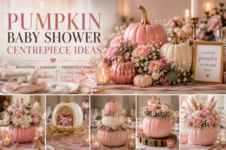
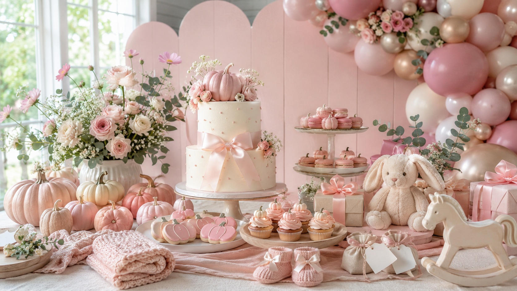
Centrepiece: Three mini pumpkins in blush and cream tones — real mini pumpkins sourced in late September and October, or cream-painted small pumpkins for a more controlled palette — arranged at varying heights on a warm cream linen runner. A small cluster of delicate dried florals — dried rosebuds in blush, dried baby’s breath, a few sprigs of dried lavender in muted pink — tucked at the base of the pumpkin cluster at the lower height. A single thin taper candle in a small gold holder at the arrangement’s tallest point. The three-height rule: one mini pumpkin elevated on a small wooden riser or a folded linen at six to eight centimetres, one at mid-height, one directly on the runner. The dried floral cluster provides the fine organic detail that prevents the arrangement from reading as simply three pumpkins placed on a table.
Runner and linen: A warm ivory or oatmeal linen runner rather than a bright white cloth. The runner should be slightly narrower than the table’s width so that the table’s own surface — natural wood, a warm-toned tablecloth — is visible at the edges and contributes its warmth to the palette. Blush linen napkins folded simply at each place setting, with a small sprig of dried rosebud or lavender tucked into the fold as the personal seat detail.
Cake: A semi-naked or lightly crumb-coated buttercream cake in warm cream — not white — with a small cream pumpkin topper and delicate dried floral accents at the tier base. Blush pressed flower or blush dried rosebud detail applied lightly to the cake’s surface as the colour element rather than as blush buttercream, which tends to read as pink-dyed cream rather than as a considered palette decision. Gold leaf at the tier divide. The cake should be small and delicate in proportion — a two-tier cake no taller than thirty centimetres reads as correctly scaled for this direction; a large three-tier reads as a different celebration register entirely.
🎃 Styling Tip
Mini pumpkins in blush and cream read more delicate and more specifically baby shower than large statement pumpkins in this direction. Three mini pumpkins at varying heights beside a small dried floral cluster is the most refined pink little pumpkin centrepiece available. Resist the impulse to add a fourth or fifth pumpkin — abundance is not the register of this direction. Restraint and delicacy are.
The Pink Pumpkin collection — blush and warm amber pumpkin stationery for the pink pumpkin table direction.
Section 03 Pink Little Pumpkin Variations
3.1 Classic Pink Little Pumpkin — Blush, Cream & Gold
The wording direction for the classic pink little pumpkin shower is straightforward: ‘a little pink pumpkin is on the way’ or ‘little pink pumpkin’ as the invitation header, with the guest’s name and the shower details in a warm serif typeface on a blush or cream ground. Every subsequent stationery piece — place cards, food labels, welcome sign — repeats the same wording register and the same palette.
Direction 3.1
Classic Pink Little Pumpkin — Blush, Cream & Gold
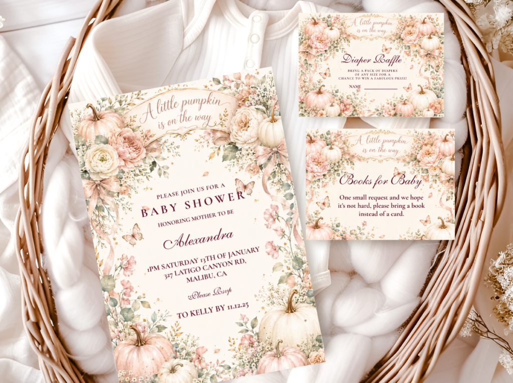
Blush as the primary pink, warm cream as the base, antique gold as the occasion accent. The most delicate and most universally appropriate pink little pumpkin direction — suitable for any guest list and any venue scale.
3.2 Our Little Pink Pumpkin — Family-Forward Wording
The ‘our’ wording change should be applied consistently: every piece of stationery, every food label, every welcome sign reads ‘our little pink pumpkin’ rather than ‘a little pink pumpkin.’ The palette remains identical; the wording shift does all the emotional work.
🎃 Styling Tip
Change one word on every label — ‘our little pink pumpkin’ instead of ‘a little pink pumpkin’ shifts the entire emotional register from baby announcement to family celebration. The palette stays identical; the wording shift is the whole difference between the two directions. Apply it consistently to every printed piece or the shift is lost.
Section 04 Invitations & Stationery
The six collections below cover every wording and palette variation available in the pink little pumpkin direction — from the most precisely pink-and-little to the broader harvest and family-forward alternatives that use the same palette with different wording registers.
Blush & Amber Variation
Pink Pumpkin
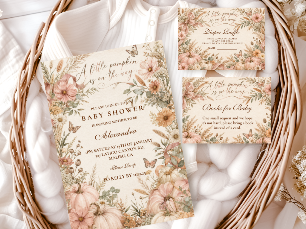
Warm blush and amber pumpkin stationery — for a slightly warmer and more amber-forward pink pumpkin palette direction.
Girl Direction
Girl Pumpkin
The girl pumpkin collection for a classic pink little pumpkin palette — blush, cream, and warm amber across the full stationery suite.
Family-Forward Wording
Our Little Pumpkin
Warm amber and cream with ‘our little pumpkin’ wording — the family-forward direction for the pink little pumpkin celebration.
Greeting Wording
Hello Pumpkin
Warm amber and cream with ‘hello pumpkin’ wording — the joyful arrival direction in the same blush-adjacent palette.
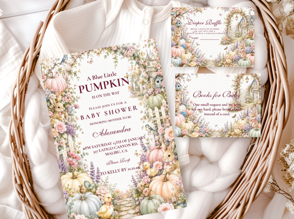
Full Harvest Suite
A Little Pumpkin Theme
The broadest pumpkin theme collection — warm amber and cream across every baby shower paper good, the most flexible stationery starting point.
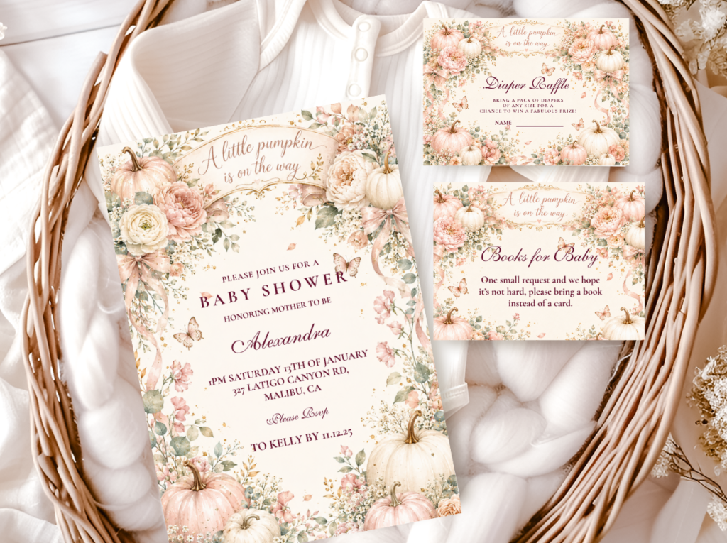
Browse the full pink little pumpkin stationery range — blush, cream, and warm gold across six wording and palette directions.
Frequently Asked Questions
What makes the pink little pumpkin direction different from a generic pink pumpkin theme?
Three specific distinctions separate the pink little pumpkin direction from a generic pink pumpkin theme. First, scale: the ‘little’ wording is a design instruction that requires mini pumpkins, delicate florals, and small stationery details rather than large statement elements. Second, palette specificity: blush — not dusty rose, not hot pink — as the primary pink tone, alongside warm cream rather than bright white. Third, register: the pink little pumpkin direction is deliberately soft and restrained, not abundant or maximalist. A generic pink pumpkin theme can accommodate large elements, saturated pinks, and mixed palette tones; the pink little pumpkin direction cannot without losing the specific delicacy that defines it.
What are the specific colours for a pink little pumpkin baby shower?
Blush as the primary pink — the soft, slightly luminous pink that leans toward pale rose rather than toward dusty or saturated pink. Warm cream as the base tone — specifically the cream that leans toward warm ivory or linen rather than bright white. Antique gold as the occasion accent — present in the stationery borders, ribbon details, and cake tier divides. Dusty rose is acceptable as a single supporting accent element but should not become a dominant tone. Bright white, hot pink, and vivid orange all break the palette’s delicate register and should be avoided. The palette test: hold any item beside a blush pumpkin, a cream linen napkin, and a gold ribbon. If it belongs in that group, it belongs in this shower.
Can the pink little pumpkin direction work for a gender-neutral shower?
The pink little pumpkin direction is specifically feminine in its palette and wording register — it is designed for a girl baby shower and makes no attempt at gender neutrality. For a shower where the gender is unknown or where a neutral direction is preferred, the classic pumpkin direction — warm amber, cream, and gold — is the more appropriate choice: it carries all the warmth and delicacy of the harvest palette without the pink gender signal. The ‘a little pumpkin is on the way’ wording in amber on cream reads as gender-neutral; the same wording with a blush ground reads as girl-specific.
Blush · Cream · Gold · Mini Pumpkins · Delicate Scale
Shop Pink Little Pumpkin Baby Shower Collections
Blush and cream pumpkin invitations, place cards, and favor tags — six wording directions for the pink little pumpkin baby shower.