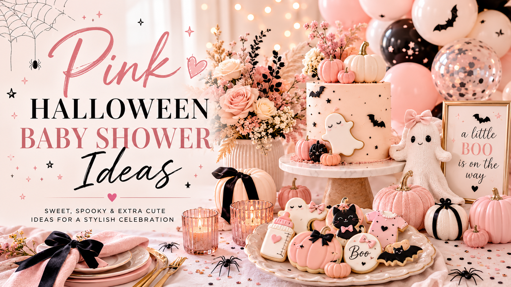
Pink Halloween Baby Shower Ideas
Baby Shower · Pink Halloween Guide
Pink Halloween Baby Shower Ideas
The three-colour formula that makes pink and Halloween work together, the decor and cake guide, the girl shower direction, and the complete stationery showcase.
Pink Halloween is the shower that proves spooky and soft are not opposites. Dusty rose ghosts, blush bats, and deep purple cauldrons in the warmest Halloween palette available — feminine, atmospheric, and completely cohesive when the palette rule is followed correctly. The rule is simple: it applies to one colour choice, and that one choice determines whether the whole aesthetic works or falls apart.
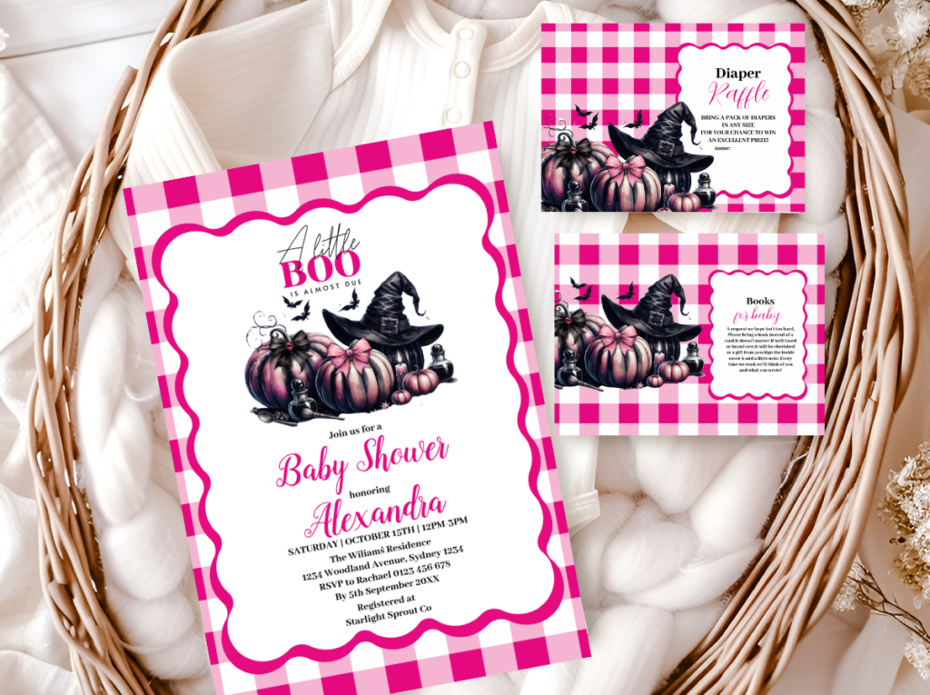
Shop the Pink Halloween collection.
Dusty rose and deep purple — the most feminine and most Pinterest-consistent Halloween baby shower direction.
“Pink halloween is the shower that proves spooky and soft are not opposites — dusty rose ghosts, blush bats, and purple cauldrons in the warmest halloween palette available.”
Section 01 The Pink Halloween Palette Rule
One colour decision determines whether a Pink Halloween baby shower reads as warm and atmospheric or as a generic pink-and-orange party: the specific tone of pink. Dusty rose and warm blush belong to the pink Halloween palette — they are muted enough to sit beside deep purple without competing with it, and warm enough to carry the atmospheric quality of the Halloween register. Hot pink and bright magenta do not belong — they are brighter than the deep purple they sit beside, which means they dominate the palette rather than complementing it, and the Halloween atmosphere disappears.
The three-colour formula that always works for pink Halloween: dusty rose as the directional accent, deep warm purple as the primary base, and antique gold as the metallic. These three colours work together because their relative warmth and saturation are balanced — none of the three is brighter than the others, which means none dominates. The moment a fourth colour enters that is brighter or more saturated than any of the three — bright orange, hot pink, neon green — the palette breaks.
The Three-Colour Formula
Dusty rose — the directional accent. Ghost shapes, bat shapes, dried rose accents, linen ribbon detail. Muted warm rose; never bright pink, never cool blush, never magenta.
Deep warm purple — the primary base. Table linen, balloon base colour, invitation background, bat cookie icing, cake tier accent. Warm violet-grape tone; never cool blue-purple.
Antique gold — the metallic accent. Luster dust on cookies, candle holders, star details on invitation, ribbon tie on favour bags. Aged warm gold; never bright or shiny gold.
✨ Styling Tip
Pink Halloween works when the pink is muted enough to sit beside deep purple without fighting it. The test: hold your dusty rose element next to a deep purple element and look at which colour your eye goes to first. If the pink draws the eye more strongly than the purple, it is too bright — it will dominate the palette and break the Halloween atmosphere. The dusty rose should read as soft and warm beside the deep purple; the purple should read as the dominant depth element. Muted pink reads as feminine; bright pink reads as a different party.
The Pink Halloween collection carries the dusty rose and deep purple palette in the illustration style that belongs to this direction — ghost motifs in blush tones, bat accents, antique gold detail throughout.
Section 02 Pink Halloween Decor, Cake & Table
The three-colour formula from Section 01 applied across every surface guests will see. Dusty rose as the directional accent; deep purple as the primary base; antique gold as the metallic throughout.
Organic balloon arch — dusty rose, soft purple, and cream
An organic balloon arch (irregular, asymmetric, arranged to look gathered rather than structured) in dusty rose, soft purple, warm cream, and warm white. The organic shape is essential — a structured symmetrical arch in the same colours reads as formal and contemporary rather than as warm and atmospheric. The specific colour distribution: dusty rose as the most repeated colour, soft purple as the second, warm cream and warm white as the accent neutrals. No bright orange balloons anywhere in the arch — even one bright orange balloon beside the dusty rose reads as a collision between the pink halloween palette and the generic Halloween party palette.
Pink ghost centrepiece — warm cream, dusty rose accent
A glass vessel filled with dried botanical material — dried roses in dusty rose and warm cream, dried eucalyptus in soft sage, dried pampas tails in honey cream — with a small ghost figure placed beside or on the vessel as the single whimsical accent. The ghost should be in warm cream or very soft white rather than bright white. Warm cream reads as warm and organic beside dusty rose and dried botanicals; bright white reads as clinical. One ghost accent per centrepiece zone — the ghost is a statement accent, not a repeating pattern.
Blush buttercream cake with purple bat topper
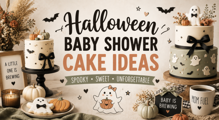
A semi-naked buttercream in warm cream with dusty rose buttercream swirls applied to one side of the upper tier; or a smooth fondant in dusty rose with a deep purple fondant ribbon detail at the base. Topper: a simplified bat silhouette in deep purple fondant, placed slightly off-centre at the top tier; or a small dusty rose ghost in warm cream fondant with a single antique gold star beside it. No bright orange on the cake at any point; no neon elements. The cake should photograph beautifully beside the deep purple linen and the dusty rose botanical centrepiece — all three elements belonging to the same warm, atmospheric world.
Rose gold and purple table setting
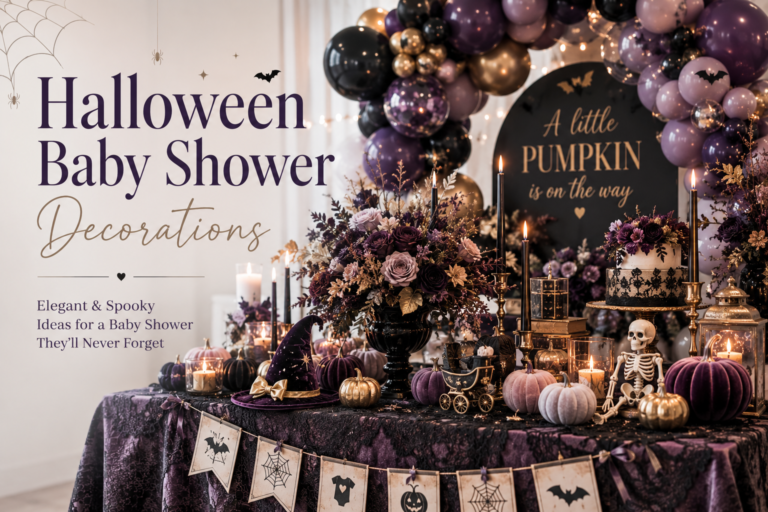
Deep purple linen runner or tablecloth as the primary surface element — the specific warm grape-violet linen rather than cool blue-purple. Warm cream ceramic or warm ivory place settings. Rose gold or antique gold flatware or candle holders as the metallic accent. Small dusty rose dried rose scatter at irregular intervals along the runner. A kraft name tag with dusty rose ribbon at each place setting — the table stationery belongs to the same illustration suite as the invitation. Everything on the table should look like it was assembled from the same warm, intentional world.
✨ Styling Tip
Pink halloween balloon arches work best in an organic shape with dusty rose, soft purple, and warm cream — not bright pink and orange, which reads as a generic halloween party supply purchase. Organic shape plus muted palette equals pink halloween. Structured arch plus bright colours equals halloween party supply store. The organic shape communicates that the arch was assembled with care and intention rather than inflated and placed in a symmetrical row; and the muted palette communicates that the pink element belongs to the same warm atmospheric world as the deep purple and gold rather than to a different party entirely.
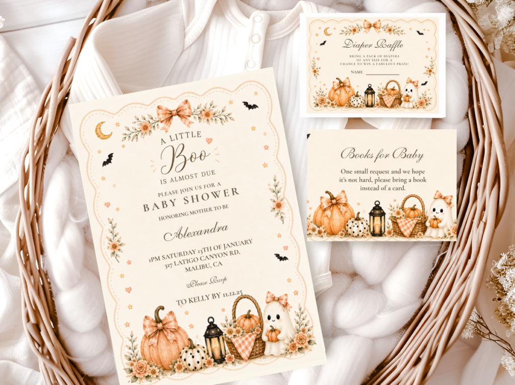
The A Little Boo collection carries the ghost and soft purple motifs that pair most naturally with the pink halloween decor direction — welcome sign, place cards, and favour tags in the warm cream and soft purple register.
Section 03 Pink Halloween as a Girl Baby Shower Direction
Pink Halloween is the most naturally Pinterest-consistent girl Halloween baby shower direction because the dusty rose and deep purple combination is already one of the most saved autumn girl shower aesthetics — and the Halloween motifs (ghosts, bats, cauldrons) simply replace the standard botanical or boho elements that would appear in a non-Halloween girl shower in the same palette. The aesthetic logic is identical; the motif vocabulary changes.
The ghost motif in dusty rose is the specific visual signature of the pink halloween girl shower — it appears on the invitation, on the cake topper, on the cookie platter, and as the centrepiece accent, and in each of those positions it communicates both the Halloween register and the feminine register simultaneously. No other Halloween motif achieves the same dual communication: a bat in dusty rose reads as primarily whimsical; a cauldron in dusty rose reads as primarily brewing-adjacent. The ghost in dusty rose reads as specifically feminine halloween baby shower.
✨ Styling Tip
A pink halloween girl shower reads most cohesively when every printed element — invitation, game cards, favour tags, food labels — shares the same dusty rose and deep purple palette. One element in bright pink breaks the whole aesthetic register. The stationery suite is where the palette discipline is most visible to guests because they hold the printed elements in their hands throughout the shower — an invitation in dusty rose and purple beside a food label in bright pink reads as two different design decisions placed at the same table. Order the full suite from a single collection.
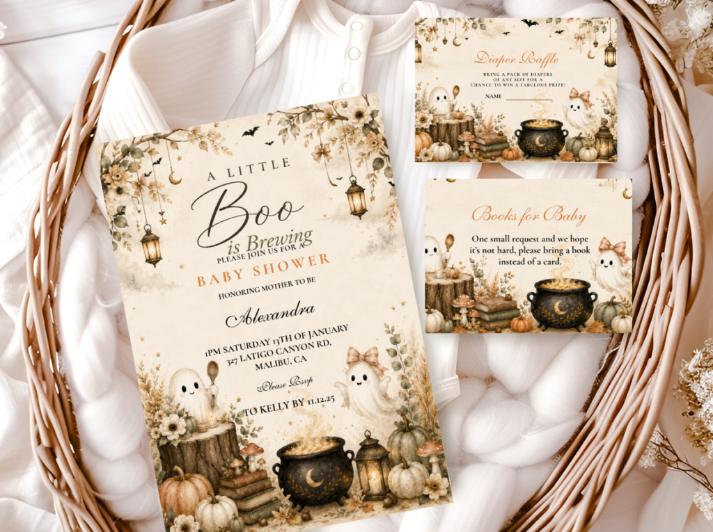
The Halloween Baby Shower collection carries the full atmospheric palette alongside the pink Halloween direction — the broader suite of game cards, welcome signs, and favour tags that coordinate with the dusty rose and purple palette.
Section 04 Invitations & Stationery
The pink Halloween invitation carries the dusty rose and deep purple palette into the first moment guests encounter the celebration — before any room is decorated, before any balloon arch is assembled, before any cake is cut. A guest who receives a dusty rose ghost invitation on warm ivory card stock with deep purple lettering and antique gold accent detail arrives at the shower already oriented to the correct palette and the correct register.
The full stationery suite — invitation, welcome sign, game cards, food labels, favour tags — should all carry the same three colours: dusty rose, deep purple, antique gold. Every collection below covers a different direction of the pink halloween and halloween baby shower aesthetic; browse the full range to find the suite that matches the specific direction of the celebration.
Primary
Pink Halloween
Dusty rose ghost and bat motifs in deep purple — the defining stationery direction for the pink halloween shower.
Ghost Direction
A Little Boo
Soft purple and warm cream ghost motifs — pairs naturally with the dusty rose pink halloween palette.
Full Palette
Halloween Baby Shower
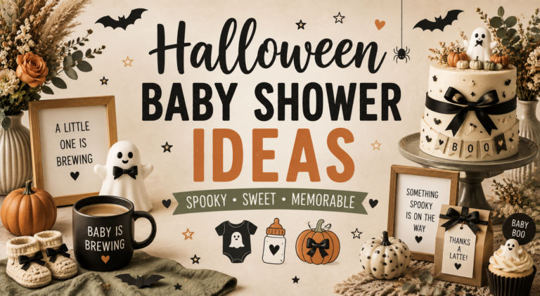
Deep purple and warm amber — the full atmospheric suite alongside any pink halloween direction.
Brewing Direction
Baby Is Brewing
Cauldron and potion motifs — for a pink halloween shower with a brewing narrative thread.
Most Dramatic
Witch & Something’s Brewing
Deep purple and gold on dark — for a pink halloween shower with a more dramatic atmospheric register.
Coffee Direction
Coffee Baby Brewing
Warm kraft and cream — for a pink halloween shower with a coffee brewing aesthetic.
Frequently Asked Questions
What colours work for a pink Halloween baby shower?
The three-colour formula: dusty rose (muted warm rose — never hot pink, bright magenta, or cool blush), deep warm purple (the specific warm violet-grape tone — never cool blue-purple), and antique gold as the metallic accent. These three in the correct tones are the complete palette — no fourth colour is needed. The test: every element should look like it belongs beside a warm amber candle. If any element looks brighter or cooler than that candlelight warmth, it does not belong in the pink Halloween palette.
How do I make a Halloween baby shower feel feminine rather than scary?
Two decisions made simultaneously. Use ghost and bat motifs in dusty rose rather than in their standard dark or white forms — a ghost in dusty rose reads as feminine and whimsical simultaneously; a ghost in bright white or dark grey reads as Halloween-adjacent but not specifically feminine. And keep every motif in its simplified, whimsical register — round ghost forms, simplified bat silhouettes, elegant spider accents — rather than in any horror-realistic form. The pink Halloween aesthetic is the Halloween world in its warmest and most specifically celebratory register; every element should communicate warmth and charm rather than atmosphere and drama.
Can pink Halloween work for a gender-neutral shower?
With adjustment. The dusty rose element is the specifically feminine marker of this direction — replacing it with warm cream or very soft blush cream as the primary accent colour shifts the palette toward gender-neutral while keeping the Halloween atmosphere intact. The deep purple and antique gold base remains identical. Ghost and bat motifs in warm cream rather than dusty rose read as whimsical and gender-neutral rather than specifically feminine. This is a single colour swap — the rest of the formula, the motifs, the decor approach, and the stationery all remain the same.
Spooky & Soft
Pink Halloween Baby Shower Stationery
Dusty rose, deep purple, and antique gold — the warmest Halloween palette available, from the first invitation to the last favour tag.