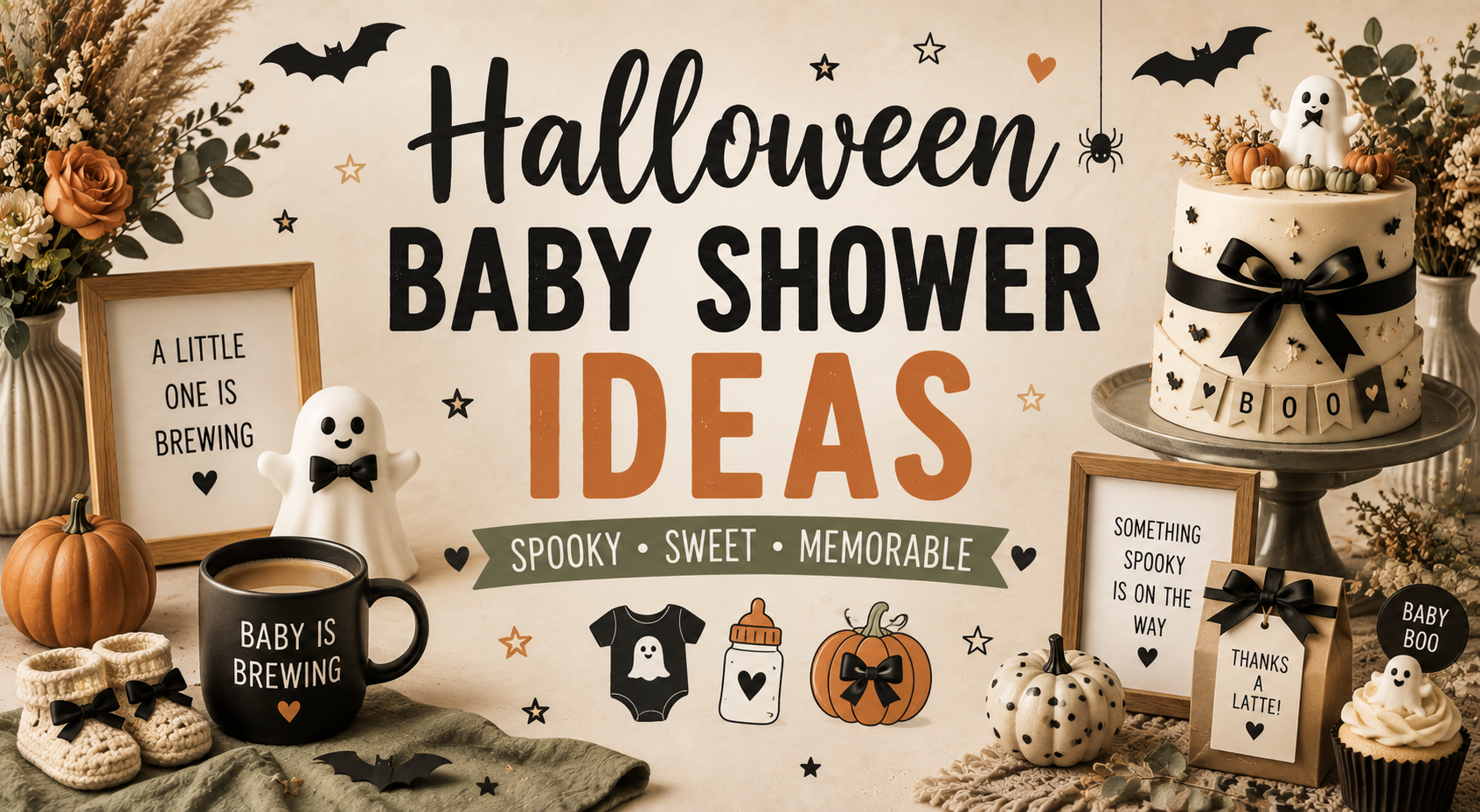
Halloween Baby Shower Ideas
Baby Shower · Halloween Guide
Halloween Baby Shower Ideas
Three distinctions that separate a genuinely atmospheric Halloween baby shower from a generic spooky party, five complete directions, the decor and cake guide, and the full stationery showcase.
A Halloween baby shower is not a spooky party with baby decorations added — it is the most atmospheric and most memorable celebration a baby can be welcomed into. Warm, witchy, and completely its own beautiful world. The challenge is not finding Halloween elements to include; it is knowing which Halloween elements to leave out. The three distinctions below are what separate a celebration that photographs beautifully and feels warm and joyful from one that slides toward haunted house territory before the first guest arrives.
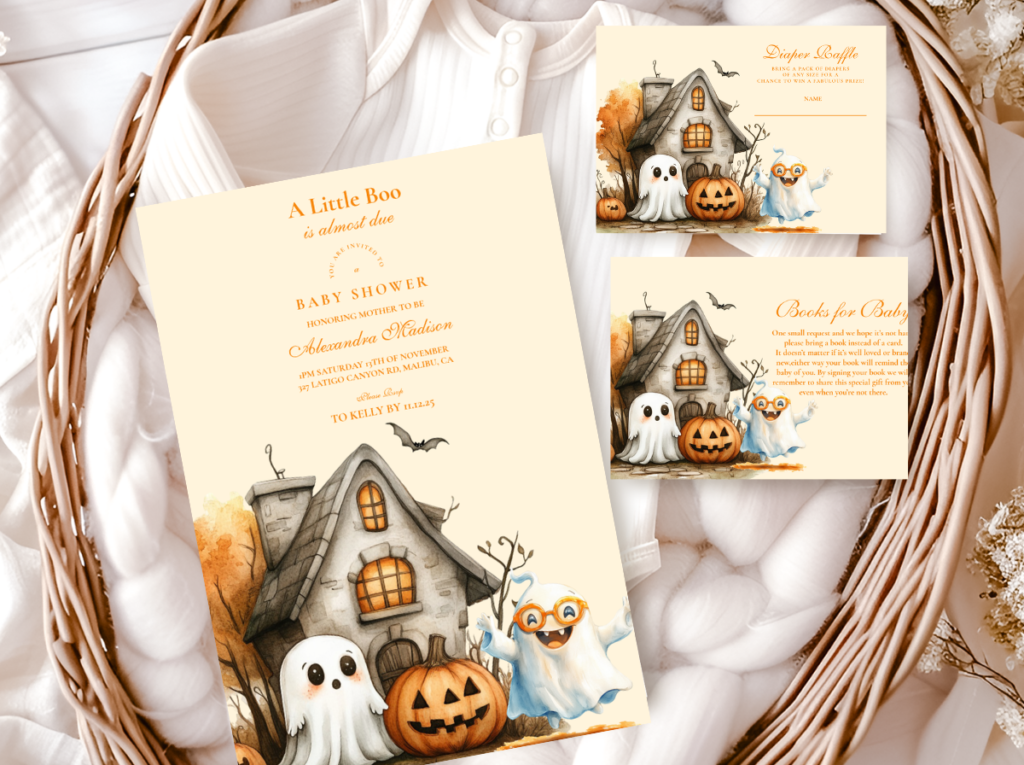
Shop the Halloween Baby Shower collection.
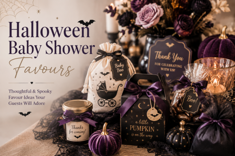
Deep purple, warm amber, and gold — the full atmospheric palette for the most memorable autumn baby celebration.
“A Halloween baby shower is not a spooky party with baby decorations added — it is the most atmospheric and most memorable celebration a baby can be welcomed into. Warm, witchy, and completely its own beautiful world.”
Section 01 What Makes a Halloween Baby Shower Different — Three Distinctions
Three decisions separate a Halloween baby shower that reads as genuinely warm and atmospheric from one that reads as a generic spooky party with a diaper cake placed in the corner. All three work together — getting two of three right still leaves one element that communicates the wrong register.
Distinction 1
Warm, Not Cold
Not this: Neon green, icy blue, harsh black, and the specific cold-bright palette of commercial Halloween decoration. These colours belong to the haunted house register — they communicate fear and coldness, which is exactly the opposite of the warm, celebratory atmosphere a baby shower requires. Even one neon green element in a warm amber and deep purple room reads as borrowed from a different party.
This: Warm amber, deep purple, burnt orange, antique gold, and cream. Every colour in the Halloween baby shower palette should read as warm — the specific warm amber of candlelight, the specific deep warm violet of a grape rather than the cool blue-purple of a cold Halloween sky, the specific burnt orange of autumn leaves rather than the bright primary orange of a plastic pumpkin. The palette test: hold every element next to a warm amber candle. If it looks like it belongs in the same warm, glowing world — it is Halloween baby shower. If it looks like it belongs in a haunted house — leave it.
Distinction 2
Whimsical, Not Scary
Not this: Horror props: realistic spiders, dripping blood details, genuinely menacing imagery, jump-scare aesthetic elements. These communicate threat and fear — two things that have no place at any baby celebration. A ghost that reads as genuinely terrifying is a horror prop; a ghost that reads as round, floating, and slightly confused about being at a party is a whimsical accent. The distinction is real and the guest registers it immediately.
This: Cute ghosts with round shapes and soft expressions; small pumpkins in cream and blush; witches framed as magical rather than menacing; cauldrons associated with brewing potions and warmth rather than with darkness; spiders used as tiny scattered accents rather than as focal horror elements. Every Halloween motif in a baby shower context should communicate warmth, magic, and whimsy. The baby shower register is always celebratory — the Halloween aesthetic is the atmosphere, not the tone.
Distinction 3
Narrative, Not Generic
Not this: A collection of Halloween decorations placed beside baby shower decorations with no connecting story. Pumpkins beside a diaper cake beside a ghost balloon beside a banner that says ‘Baby Shower’ in standard script — each element belongs to its own category, and the room reads as a collision of two parties rather than one specific, designed celebration.
This: A single narrative thread running from the invitation through every decoration. ‘A baby is brewing’: the invitation shows a cauldron, the centrepiece is a small cauldron with dried florals, the food labels use brewing-adjacent language, and the favour tags say ‘freshly brewed.’ ‘A little boo is due’: the invitation shows a small ghost, the cake has a ghost topper, the place cards use ghost motifs. The narrative is what transforms a collection of decorations into a designed world.
✨ Styling Tip
The Halloween baby shower palette test: hold every element next to a warm amber candle. If it looks like it belongs in the same warm, glowing world — it is Halloween baby shower. If it looks brighter, colder, or more synthetic than that candlelight — it belongs in a different party. Warm and atmospheric always wins over cold and scary in a celebration context. The haunted house palette and the baby shower palette share some of the same hues; the temperature of those hues is what separates them.
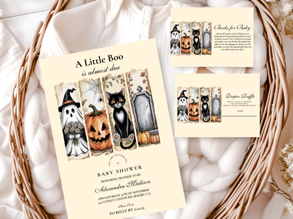
The Halloween Baby Shower collection carries all five directions in the warm amber and deep purple palette — browse the full category before choosing a specific direction.
Section 02 Five Halloween Baby Shower Directions
Five complete directions, all built on the three distinctions from Section 01. The palette and narrative shift between them; the warm, whimsical, atmospheric register stays constant.
Most Versatile
Classic Halloween Baby Shower
Deep Purple · Warm Amber · Antique Gold · Cream
What it is: The most atmospheric and most versatile of the five directions — deep purple and warm amber in the specific combination that reads as sophisticated rather than costume party. Works for any gender and any shower size.
Palette: Deep warm violet as the primary base (the specific warm grape-tone violet rather than cool blue-purple — cool blue-purple breaks the atmosphere immediately); warm amber as the accent and floral colour; antique gold as the metallic detail; cream as the neutral that prevents the room from reading as entirely dark.
Narrative thread: ‘The most atmospheric autumn celebration’ — no specific character or motif required, just the palette and the atmosphere of the season at its most beautiful. Pumpkins, dried botanicals, candlelight, and deep purple linen tell the story without a specific narrative prop.
Deep purple and warm amber is the combination that Pinterest has consistently identified as the most beautiful Halloween baby shower palette — it reads as specifically designed rather than as generic autumn because the purple element removes it from the standard harvest palette and places it firmly in the Halloween register, while the warm amber keeps it from the cold darkness of a haunted house. This is the direction to choose when the goal is a shower that photographs beautifully at any scale and in any venue.

✨ Styling Tip
Deep purple and amber reads sophisticated rather than costume party when every purple element stays warm — violet and grape tones lean warm; cool blue-purple breaks the atmosphere immediately. Check every purple textile, every purple balloon, every purple paper element against a warm amber reference. The moment a cool blue-purple appears beside warm amber, the room reads as two different palettes placed together rather than one designed aesthetic.
Most Narrative
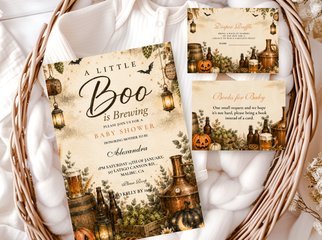
Baby Is Brewing
Deep Purple · Warm Amber · Gold · Cauldron Green
What it is: The most narrative and most story-forward direction — every element connects to the brewing metaphor: cauldron centrepieces, potion bottle favours, brewing-adjacent food labels, an invitation that announces the arrival of a carefully brewed little one.
Palette: Deep purple and warm amber as the base (the same warm palette as Classic Halloween); a small accent of warm sage or warm cauldron-green as the specifically brewing-world element — kept as an accent, not a primary colour, so it reads as part of the potion world rather than as a generic green Halloween colour.
Narrative thread: ‘A baby is brewing’ — the narrative runs from invitation to favour tag: the invitation announces that something wonderful is brewing; the centrepiece is a small decorative cauldron with dried botanical material arranged as though growing from a potion; food labels reference brewing and warmth; favour tags carry ‘freshly brewed with love’ or similar.
The Baby Is Brewing direction is the most cohesive of the five directions because the brewing metaphor applies naturally to almost every element of a baby shower — food, drinks, the baby themselves, the anticipation of arrival. It is also the most gender-neutral of the five directions: the cauldron and potion aesthetic belongs to no gender convention, and the warm purple and amber palette is equally appropriate for any direction.
Most Feminine
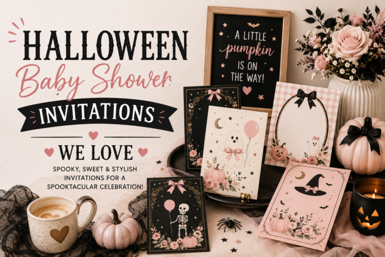
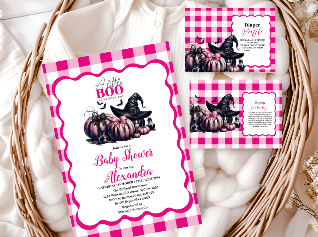
Pink Halloween
Dusty Rose · Deep Purple · Antique Gold · Warm Cream
What it is: The most feminine and most Pinterest-consistent Halloween baby shower direction — dusty rose and deep purple in the specific combination that sits inside the Halloween aesthetic without losing the warm, romantic quality of a girl-leaning celebration.
Palette: Dusty rose as the directional colour (the specific warm, slightly muted rose rather than bright pink — bright pink beside deep purple reads as two competing accent colours rather than a designed palette); deep purple as the depth element; antique gold as the metallic; warm cream as the neutral.
Narrative thread: ‘Our little pumpkin is arriving’ or ‘a little witch is on the way’ — the narrative uses the Halloween motifs (pumpkins, the witch aesthetic) in their most whimsical and most feminine register: small blush pumpkins, dried rose accents, a witch hat as a decorative prop rather than a costume element.
Pink Halloween is the direction that solves the challenge of a girl-leaning Halloween shower without abandoning the Halloween aesthetic entirely. The dusty rose element is warm enough to read as distinctly feminine and specific enough to separate this direction from a standard purple-and-amber shower, while sitting comfortably inside the Halloween palette without the brightness or coolness that would push the pink toward generic party territory.
Most Whimsical
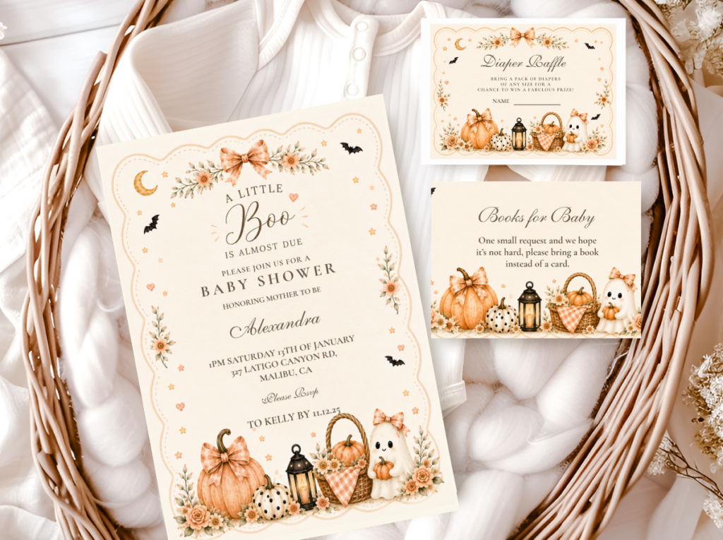
A Little Boo
Soft Purple · Warm Cream · Gold · Warm White
What it is: The most whimsical and most baby-appropriate of the five directions — cute ghost motifs, soft purple and warm cream, the Halloween aesthetic at its most celebratory and most specifically designed for a baby arrival rather than for a Halloween party.
Palette: Soft warm purple rather than deep dark purple (the lighter, warmer end of the purple range — lavender-adjacent but warm rather than cool); warm cream and warm white as the primary neutral (the ghost palette — warm white reads as whimsical; cool white reads as clinical); antique gold as the warm metallic accent.
Narrative thread: ‘A little boo is due’ — the ghost is the hero motif: cute, round, soft-expression ghosts on the invitation, on the cake topper, on the welcome sign. The narrative is about arrival and anticipation rather than anything spooky — the ghost is a friendly, slightly surprised visitor rather than a haunting presence.
A Little Boo is the direction most appropriate for the youngest guests — it is genuinely child-friendly in a way that some of the deeper, more atmospheric directions are not — and it is the most forgiving for a host who is not entirely confident in the Halloween aesthetic. The soft purple and cream palette reads as warm and celebratory first, Halloween second, which means the celebration succeeds as a beautiful baby shower even if the Halloween elements are more restrained than planned.
Most Dramatic
Witch & Something’s Brewing
Deep Purple · Black Accent · Gold · Warm Amber
What it is: The most dramatic and most editorial direction — deep purple with black accent details, gold cauldron elements, and the Halloween aesthetic at its most atmospheric. The witch motif is framed as magical and powerful rather than menacing; the black accent is used sparingly as a depth element rather than as a primary colour.
Palette: Deep purple as the dominant base; black as a single accent element only — in thin ribbon detail, in typography, in a single black candle grouping — never as a primary surface colour; antique gold as the statement metallic; warm amber as the botanical and floral element that prevents the deep palette from reading as cold.
Narrative thread: ‘Something wicked this way comes’ or ‘something’s brewing’ — the narrative draws on the dramatic, atmospheric quality of the witch aesthetic: a celebration of magic, of something extraordinary arriving, of the specific power of bringing a new person into the world. The witch is the wise, powerful, magical figure at the centre of the celebration — not a costume, not a horror element.
The Witch direction is the most demanding of the five in terms of palette discipline — the black accent must stay as an accent, and the purple must stay warm. The moment the black becomes a primary colour or the purple cools toward blue-purple, the celebration slides from dramatic and atmospheric toward cold and generic Halloween. Executed correctly, this direction produces the most photographically striking of all five Halloween baby shower aesthetics.
Section 03 Decor & Centrepieces at a Glance
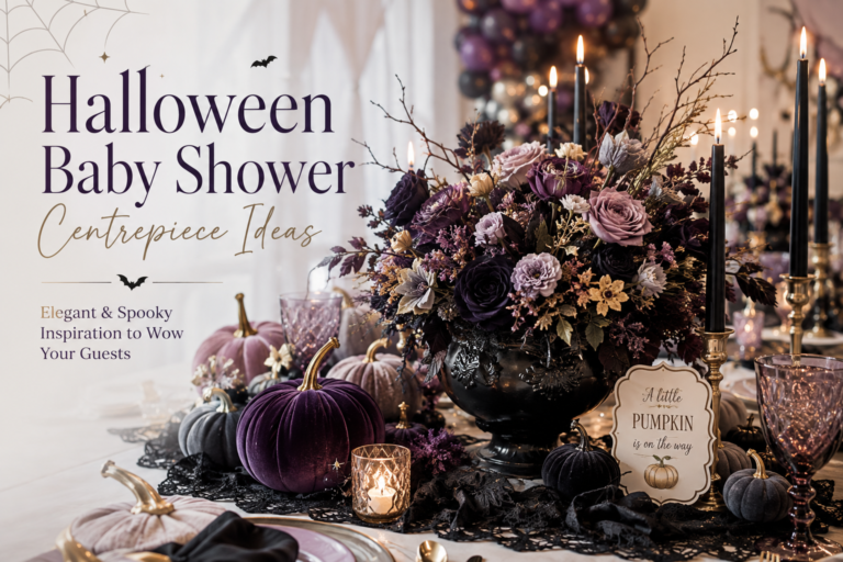
The Halloween baby shower decoration formula follows the same three-layer principle as any boho-adjacent celebration: one strong anchor element per zone, two supporting texture elements, and the palette running consistently across all three. The specific Halloween elements — pumpkins, cauldrons, ghost accents — sit as the anchor; dried botanicals and warm metallics provide the texture; candlelight ties the whole room together.
Centrepiece — One Strong Anchor per Zone
A small decorative cauldron filled with dried botanical material (dried eucalyptus, dried roses in deep burgundy, dried pampas tails) for the Baby Is Brewing direction; a cream pumpkin cluster with dried botanicals for the Classic Halloween direction; a ghost-form vase with dried wildflowers for the A Little Boo direction. One strong anchor per zone — everything else on the table surface supports it rather than competing with it.
Texture — Warm Metallics + Natural Botanicals + Candlelight
Warm metallics (antique gold candleholders, bronze-toned vessels, warm copper accent details); natural botanical material (dried eucalyptus in deep sage, dried roses in burgundy or blush, dried pampas, dried wheat bundles); and candlelight as the unifying warm light source. Three texture layers per zone, one statement whimsical prop per zone, warm candlelight throughout. This is the formula that separates designed from decorated.
What to Avoid
Neon orange and bright green decor elements; plastic spider webs as primary decoration; anything that reads as a horror prop rather than a whimsical accent; harsh black as a primary surface colour (black ribbon trim and black typography are appropriate; black tablecloths and black balloons as primary elements belong to a different party). The warm amber candle test applies to every decor element as much as to every stationery element.
✨ Styling Tip
The texture rule for Halloween baby shower decor: mix warm metallics (gold, bronze, copper) with natural botanical elements (dried florals, dark foliage, candlelight) and one statement whimsical prop per zone — a small cauldron, a ghost cluster, a pumpkin display. Three texture layers, one prop per zone. The formula that separates a designed Halloween baby shower from a decorated one is always the same: fewer elements, warmer palette, more intentional placement.
Section 04 Cake, Cookies & Food at a Glance
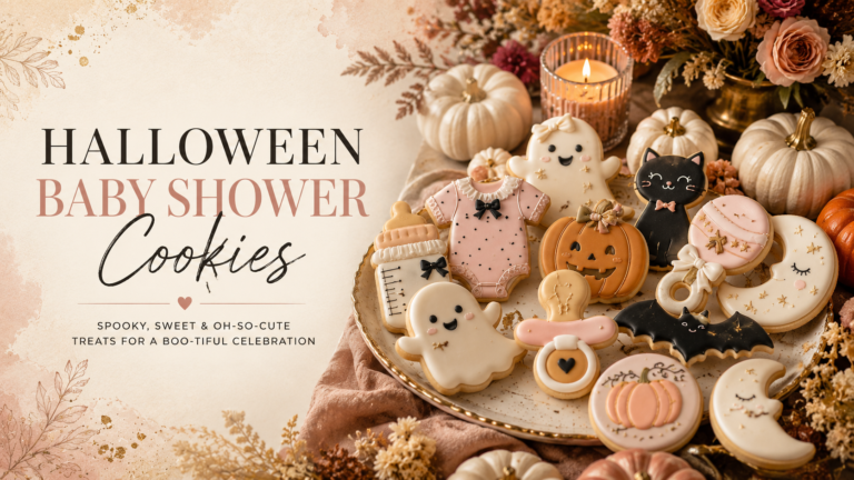
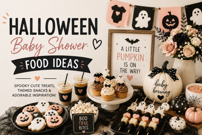
The Halloween baby shower cake belongs to the same warm palette as the rest of the celebration — deep purple buttercream or fondant, warm amber botanical detail, one whimsical motif as the topper. The food and dessert table follows the same narrative thread as the invitation: a Baby Is Brewing shower has ‘freshly brewed’ drinks and ‘potion’ labels; a Little Boo shower has ghost-shaped cookies and ‘boo-ffets.’
Cake — Warm Palette, One Whimsical Topper
A semi-naked buttercream in warm cream with deep purple or warm amber botanical detail, or a smooth fondant in warm purple with antique gold accent. Topper: one whimsical motif — a small ghost, a tiny cauldron, a blush pumpkin — placed off-centre and slightly asymmetrically. No bright orange fondant; no neon green; no horror-adjacent detail. The cake should read as the same warm, atmospheric world as the rest of the room.
Food & Drink Labels — The Narrative Continues
Food labels, drink labels, and dessert tags should carry the narrative thread from the invitation through the table. ‘Witch’s brew’ for purple punch; ‘freshly brewed’ for coffee station; ‘cauldron cookies’ for the dessert table; ‘potion no. 9’ for fruit-infused water. The labels are printed on kraft or warm ivory card in the same warm brown lettering as the invitation suite — they are part of the stationery suite, not an afterthought.
Section 05 Games & Favours at a Glance
Halloween baby shower games follow the same warm, unhurried format as any boho-adjacent celebration — the Halloween aesthetic adds narrative specificity rather than competitive energy. Favours should feel chosen and warm: small beeswax candles in warm amber, botanical soap in lavender or cauldron-spiced scent, seed packets in kraft envelopes, or small jars of local honey with a ‘freshly brewed’ label.
Games — Narrative-Forward
Guess the Potion Ingredient: small jars of dried herbs and spices identified by smell — the Halloween-adjacent version of the Guess the Herb game, reframed as identifying the ingredients in the brew. Don’t Say Baby with a small dried botanical sprig as the forfeit token rather than a plastic prop. Baby prediction cards framed as ‘prophecy cards’ in keeping with the witch or brewing narrative. Each game should feel like it grew from the same story as the invitation.
Favours — Warm and Chosen, Not Generic
Beeswax candles in warm amber; botanical soap in lavender, bergamot, or cinnamon spice; small seed packets of wildflowers or herbs in kraft envelopes with a brewing-adjacent label; jars of local honey with a warm label. Wrap each favour in kraft paper with warm twine and a small dried botanical sprig before the shower begins. Display in a flat rattan basket near the game or dessert station. Warm and chosen reads as designed; unwrapped and generic reads as an afterthought.
Section 06 Boy, Girl & Gender Neutral at a Glance
The Halloween baby shower adapts to any gender direction through one palette shift — the base of deep purple, warm amber, and antique gold is inherently gender-neutral, and the directional accent colour is the only element that changes.
Girl Direction — Pink Halloween
Dusty rose as the directional accent alongside deep purple and warm amber. Blush pumpkins replace cream pumpkins. Dried rose accents in warm dusty pink replace the neutral botanical material. The witch aesthetic shifts toward the magical-feminine register. Everything else stays identical to the gender-neutral Classic Halloween direction.
Boy Direction — Deep & Moody
Deep navy or deep forest green as a secondary accent colour alongside the deep purple base — the two deep tones together read as adventure-forward and masculine rather than romantic. Dried botanical material shifts to deeper tones: dark eucalyptus, dried cotton, dried wheat. The cauldron and witch aesthetic shifts toward the adventurous-magical rather than the romantic-magical register.
Gender Neutral — Classic Halloween or Baby Is Brewing
The Classic Halloween and Baby Is Brewing directions are both inherently gender-neutral — the deep purple and warm amber palette belongs to no gender convention. The Baby Is Brewing direction specifically reads as gender-neutral because the brewing metaphor applies equally to any expectation. For a gender-neutral shower, stay with cream pumpkins, neutral dried botanical material, and the warm amber and purple palette without any directional accent.
Section 07 Invitations & Stationery
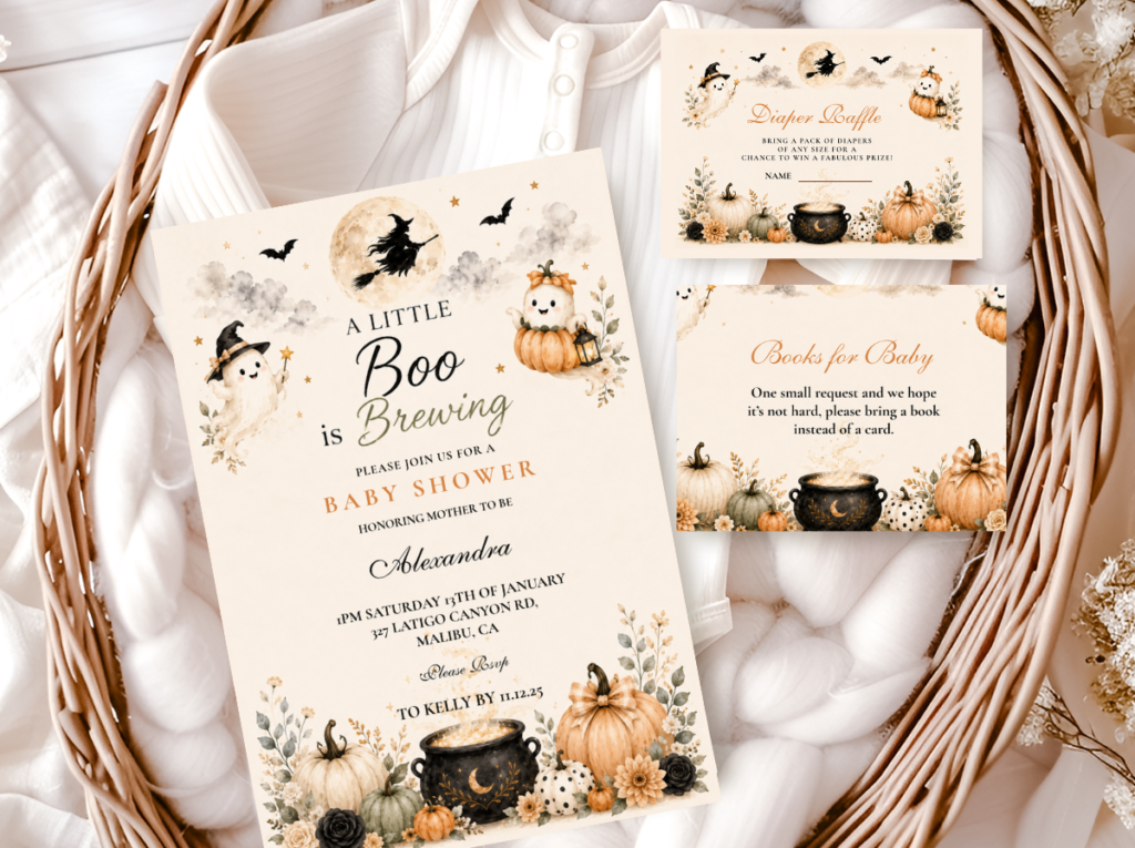
The Halloween baby shower invitation is where the story begins. ‘A baby is brewing’, ‘a little boo is due’, ‘something wicked this way comes’ — these are narrative-first invitations that set the atmosphere before any guest arrives and before any room is decorated. The illustration style, the dark warm palette on warm ivory paper, and the specific wording together signal exactly what kind of beautiful, atmospheric celebration awaits.
Every element of the stationery suite — invitation, welcome sign, food labels, favour tags, place cards — should carry the same narrative thread and the same warm palette. A Baby Is Brewing invitation beside generic food labels and a standard ‘Baby Shower’ welcome sign reads as a designed invitation beside an unfinished decoration scheme. The full suite is what makes the narrative complete.
Most Versatile
Halloween Baby Shower
Deep purple and warm amber — the most atmospheric and most versatile Halloween baby shower direction.
Most Narrative
Baby Is Brewing
Cauldron motifs and brewing metaphor — the most story-forward and most gender-neutral direction.
Most Feminine
Pink Halloween
Dusty rose and deep purple — the most feminine and most Pinterest-consistent Halloween baby shower direction.
Most Whimsical
A Little Boo
Soft purple and warm cream — cute ghosts and the Halloween aesthetic at its most celebratory.
Most Dramatic
Witch & Something’s Brewing
Deep purple, black accent, and gold — the Halloween aesthetic at its most atmospheric and editorial.
Coffee Direction
Coffee Baby Brewing
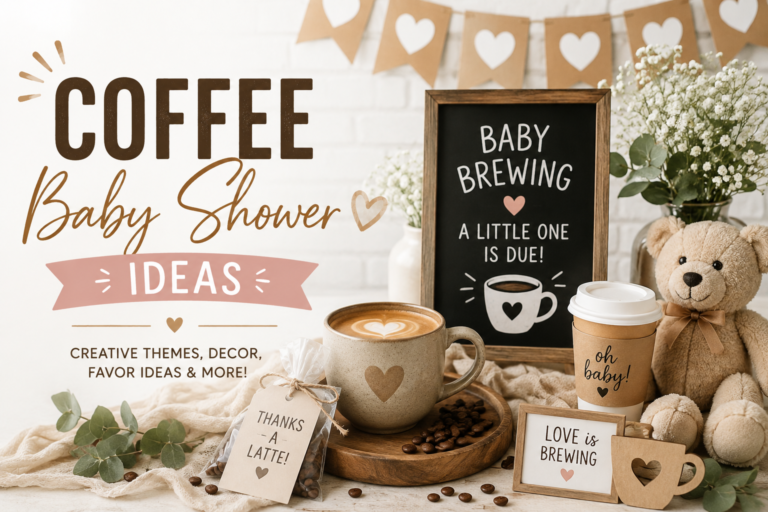
Warm coffee tones and brewing motifs — the most warmly domestic and most coffee-adjacent brewing direction.
Frequently Asked Questions
What colours work for a Halloween baby shower?
Warm amber, deep purple (warm violet-grape rather than cool blue-purple), burnt orange, antique gold, and cream. These are the colours that read as atmospheric and celebratory — warm enough to feel like a joyful gathering and dark enough to carry the Halloween register. The colours to avoid: neon green, icy blue, harsh bright orange, and cool-bright black. Each of those belongs to the haunted house palette rather than the baby shower palette. The palette test: every element should look like it belongs beside a warm amber candle — warm, glowing, and organic rather than cold, synthetic, or fluorescent.
How do I make a Halloween baby shower feel celebratory rather than scary?
Three decisions made simultaneously. Keep the palette warm — no neon, no cool-blue-purple, no harsh black as a primary surface colour. Keep every Halloween motif in its whimsical register rather than its horror register — ghosts are round and soft, witches are magical rather than menacing, spiders are tiny accents rather than focal horror props. And give the shower a specific narrative — ‘a baby is brewing’, ‘a little boo is due’, ‘something wicked this way comes’ — that runs from the invitation through every decoration and makes the Halloween elements feel like they were chosen for this specific celebration rather than borrowed from a costume party.
Can a Halloween baby shower work for any gender?
Yes — the Classic Halloween and Baby Is Brewing directions are both inherently gender-neutral. The deep purple and warm amber base palette belongs to no gender convention. For a girl-leaning direction, add dusty rose as the accent colour (the Pink Halloween direction); for a boy-leaning direction, add deep navy or deep forest green as the secondary accent. The brewing and witch aesthetics are both gender-neutral by nature — magic and the anticipation of arrival belong to any celebration regardless of the baby’s gender.
How far in advance should a Halloween baby shower be planned?
For a shower held in October, begin planning in July or early August at the latest — because the Halloween baby shower stationery is among the most popular autumn shower category, and the best printed elements sell out or have extended production times in the peak planning period of August and September. Order invitations by August 1st for an October shower; order the rest of the suite (welcome sign, food labels, favour tags) at the same time so every element arrives from the same production run and matches precisely. The decoration elements — dried botanicals, pumpkins, candles — can be sourced closer to the shower date, but the stationery planning timeline is the one to watch.
Warm, Witchy & Completely Its Own
Halloween Baby Shower Stationery
Deep purple, warm amber, and gold — invitations, welcome signs, and favour tags in the narrative that begins before the first guest arrives.