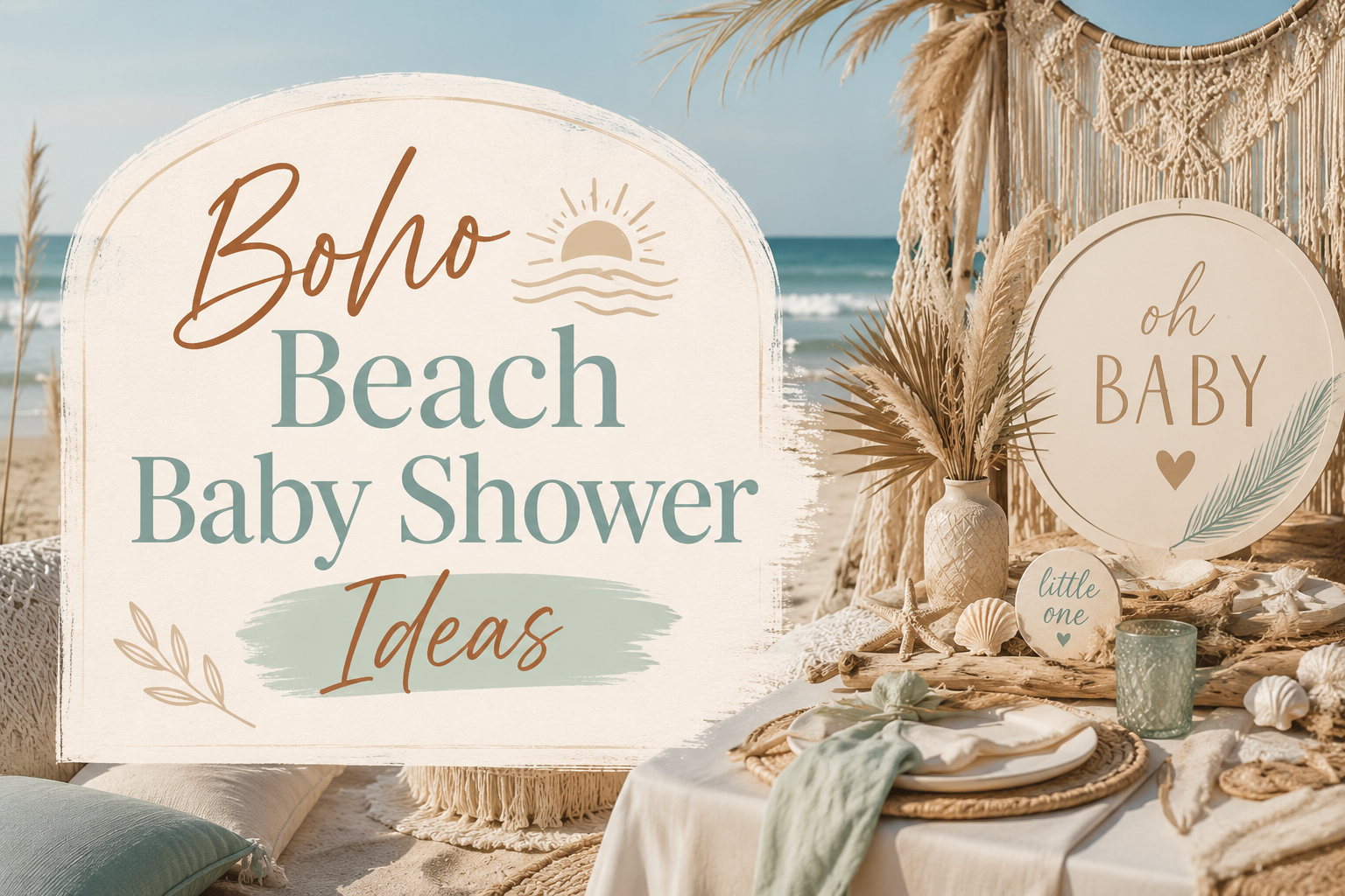
Boho Beach Baby Shower Ideas
Baby Shower · Boho Beach Guide
Boho Beach Baby Shower Ideas
The three distinctions that separate beach boho from nautical, two complete palette directions, the decor and cake guide, and the full stationery showcase across six collections.
A beach boho baby shower is not a nautical shower with pampas grass placed beside the anchor bunting. It is a celebration that takes the specific warmth of the boho aesthetic — natural materials, organic texture, dried botanical material — and grounds it in the palette and material vocabulary of the coastal world: warm sand, driftwood grey, dried sea grass, shells in their natural cream and ivory forms, and pampas grass in tones that belong to the beach rather than to the prairie. The distinction is almost entirely a palette decision, and it is a real and visible one.
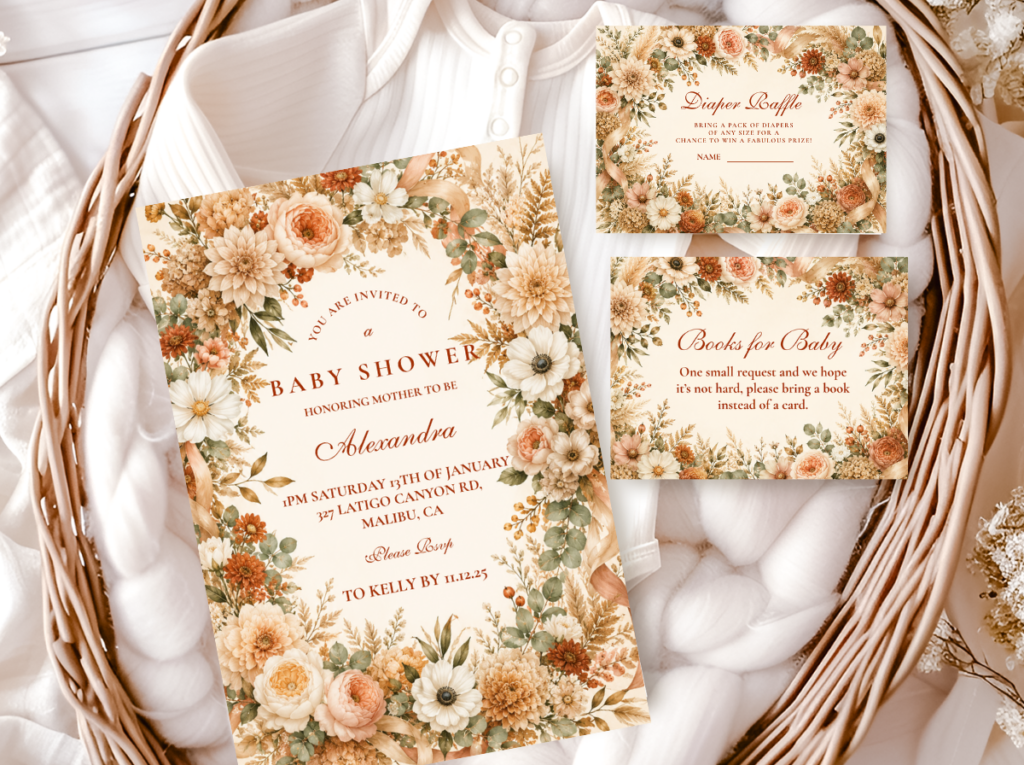
Shop the Beach Boho collection.
Invitations, welcome signs, and every stationery suite element in the warm sand and coastal palette.
“Boho beach is where the organic warmth of boho meets the specific calm of the sea — driftwood and dried botanicals, soft sand tones, and the pale blue of a coastal horizon.”
Section 01 What Makes Beach Boho Distinct — Beach Boho vs. Nautical
Distinction 1
Sand Tones — Not Navy and White Stripes
Nautical shower: Navy and white as the primary palette. This combination is the most recognised coastal palette in the Western party supply tradition — it communicates nautical immediately and specifically, which makes it the wrong starting point for beach boho. Navy reads as the formal, commercial, structured register of the sea — the navy of a sailor’s uniform and a regatta flag. This is not the register of the coastal world that beach boho inhabits.
Beach boho: Warm sand as the primary neutral (the specific warm beige of dry beach sand — more warm and golden than standard beige, less yellow than straw); driftwood grey as the cool accent neutral (the specific cool grey-beige of weathered wood — warm at its warmest, never blue-grey or charcoal); warm ivory as the lightest tone (the specific warm off-white of a sun-bleached shell or a cotton sail in morning light); and pale teal as the water accent (the specific muted, warm blue-green of shallow coastal water — muted and slightly greyed, never bright turquoise or primary blue). The palette test: does every element sit within the driftwood-sand-ivory-pale teal range? If yes, it reads as beach boho. The moment navy or bright turquoise enters, it reads as nautical or tropical, not boho.
Distinction 2
Driftwood and Natural Sea Elements — Not Plastic Anchors, Cartoon Crabs, or Nautical Bunting
Nautical shower: Plastic anchors as decoration; cartoon crab or lobster graphics; bright nautical bunting in navy and white; rope in thick commercial format; tin metal buckets in primary colours; and any illustrated sea creature in a bright, saturated, or cartoon register. Each of these communicates the specific world of a generic beach party or a nautical celebration — they belong in their own context and are wrong in a boho context because they are manufactured, bright, and specifically commercial rather than organic, warm, and natural.
Beach boho: Driftwood pieces in their natural weathered grey-beige form (as centrepiece bases, as backdrop elements, as surface scatter); dried sea grass (the tall, fine-stemmed grass that grows in coastal marshes — in its natural cream-gold dried state, it reads as specifically coastal in the same way pampas grass reads as specifically boho prairie); shells in natural tones only (ivory, warm cream, pale grey — never painted or glittered shells, never bright coloured shells, never plastic shell replicas); sand dollars in their natural bleached cream form; and small amounts of clean natural sand in glass vessels as table scatter. Every element should look as though it was gathered from an early-morning beach walk rather than purchased from a party supply store.
Distinction 3
Pampas Grass as the Boho Bridge — Without It, Beach Decor Reads Coastal Not Boho
Nautical shower: A coastal-palette shower without any dried botanical element. Sand tones, driftwood, and shells are coastal decoration — they produce a beautifully coastal result, but not a boho result. The boho register requires the specific presence of dried botanical material: the organic, warm, slightly imperfect material vocabulary that defines the boho aesthetic across every other direction.
Beach boho: Pampas grass in its natural honey-cream or sandy tone (the specific warm cream of pampas grass belongs to both the boho material vocabulary and the coastal colour world simultaneously — it is the element that bridges the two aesthetics and makes the shower read as beach boho rather than as beach); dried sea grass beside the pampas (the sea grass provides the specifically coastal botanical element while the pampas provides the specifically boho one); and dried eucalyptus or botanical branches in the muted sandy green that belongs to coastal vegetation (the specific greyed sage of salt-resistant coastal plants rather than the lush green of inland vegetation). The dried botanical material is the element that makes a coastal-palette shower read as boho. Without it, the shower is beautiful but it is not beach boho.
✨ Styling Tip
The beach boho palette anchor: driftwood grey + warm sand + pale teal. If every element — the linen, the balloon cluster, the centrepiece vessel, the cake icing, the stationery stock — sits within these three tones, the shower reads as beach boho. The moment navy enters the palette it reads as nautical. The moment bright turquoise enters it reads as tropical. The moment bright white enters as a dominant tone it reads as coastal contemporary rather than coastal boho. Driftwood grey, warm sand, and pale teal: these are the three colours of the specific coastal world that beach boho inhabits. Every other element is determined by whether it belongs within this range.
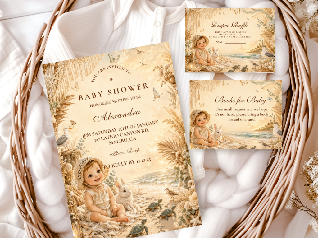
The Beach Boho collection carries the sand and coastal palette in a warm botanical illustration style — invitations, welcome signs, and favour tags that read as beach boho rather than nautical from the moment the envelope is opened.
Section 02 Two Beach Boho Palette Directions
Two complete palette directions, both built on the same driftwood-sand-ivory foundation and the same dried botanical bridge of pampas and sea grass. The palette shift between them is in the water accent: pale teal for the neutral direction, dusty blue for the boy-adjacent direction.
Most Authentic & Gender-Neutral
Classic Sand & Driftwood Boho
Warm Sand · Driftwood Grey · Warm Ivory · Pale Teal
Palette: Warm sand as the primary colour; driftwood grey as the cool accent (provides the visual weight that prevents the palette from reading as entirely monochromatic beige); warm ivory as the base tone for textiles and stationery; pale teal as the water accent (in small quantities — the accent, not the primary). The rule: pale teal should be no more than 20% of the visual palette. Above that threshold, the teal begins to read as the primary coastal colour rather than as a distant water accent, and the beach boho register shifts toward coastal contemporary.
Coastal botanicals & materials: Dried sea grass in its natural cream-gold state (tall, arranged asymmetrically, the hero tall botanical element that references the coastal vegetation world); pampas grass in honey-cream (the boho botanical bridge — its natural tone belongs to both the boho and the beach palette simultaneously); dried eucalyptus in muted sandy sage (the coastal botanical greenery); shells in natural ivory and pale grey form (as accent elements within arrangements, never as the primary decoration element); small pieces of smooth driftwood as base accents.
Vessels & surfaces: Driftwood slice as centrepiece base (weathered and organic, the specific grey-beige of sun-bleached wood); sand-filled clear glass cylinder vessels (warm sand in a glass vessel reads as specifically coastal at the centrepiece level); rattan baskets in natural undyed fibre; flat raw wood serving boards; and natural jute runner as the table textile base.
The Classic Sand and Driftwood direction is the most authentically beach boho and the most broadly gender-neutral of the two directions — the warm sand and driftwood grey palette belongs to no gender convention, communicates the specific world of a coastal morning rather than of a themed party, and photographs most beautifully in natural light (the warm sand tones and the driftwood grey together produce the specific warm-neutral quality of a beach morning photograph that reads as specifically beautiful rather than specifically beige).

Most Boy-Adjacent
Blue Beach Boho
Dusty Blue · Warm Sand · Warm Ivory · Driftwood Grey
Palette: Dusty blue as the directional accent (the specific muted, slightly grey-blue of the sea horizon rather than bright primary blue or cool navy — it should read as sea-toned and slightly hazy, like the ocean seen through early morning coastal light); warm sand maintaining its role as the primary neutral; warm ivory as the base tone. The blue accent can be more present in this direction than the teal in the Classic direction — up to 30% of the visual palette — because dusty blue at this saturation level reads as atmospheric rather than as nautical. The critical distinction: dusty blue and muted slate are beach boho; bright blue and navy are not, at any proportion.
Coastal botanicals & materials: The same sea grass and pampas botanical vocabulary as the Classic direction, with the addition of dried blue-toned botanical elements where available (dried blue thistle; dried lavender in its dried pale grey-blue state; dried nigella seed pods in pale grey). The blue botanical material provides a natural source of the dusty blue palette accent rather than requiring it to come from artificial or manufactured elements.
Vessels & surfaces: The same driftwood, glass, and rattan vessel vocabulary as the Classic direction. Sand-filled glass vessels remain appropriate; a weathered blue-grey driftwood piece (if naturally available) adds the directional accent at the base material level without requiring any painted or manufactured element.
The Blue Beach Boho direction is the most specifically directional for a boy shower that wants to reference the coastal world without using the standard blue-and-white nautical convention. The dusty blue and warm sand palette reads as atmospheric and coastal rather than as gender-coded blue — because the specific quality of the dusty blue (muted, slightly grey, horizon-toned) belongs to the natural world of the sea rather than to the manufactured convention of ‘boy blue.’
✨ Styling Tip
Beach boho centrepieces work best in natural vessels that reference the coastal material world — a driftwood slice as the base, a sand-filled glass cylinder, or a wide rattan basket — rather than in tall, narrow vessels that push the arrangement upward in the way of a formal floral centrepiece. The coastal world is horizontal: the beach, the horizon, the sand. A wide, low arrangement on a driftwood base reads as specifically coastal; a tall arrangement in a narrow vase reads as a floral arrangement in a coastal palette. Dried sea grass and pampas grass are the two hero botanical elements; shells are accent details within the arrangement, never the dominant element. One or two naturally-toned shells placed among the dried botanical material at the base of the arrangement is correctly proportioned. A centrepiece of shells with a few botanical sprigs is not beach boho — it is a shell centrepiece.
Section 03 Beach Boho Decor, Cake & Table
Decor
Pampas and sea grass arch in sand tones
A backdrop arch assembled from dried sea grass (tall, fine-stemmed, in its natural cream-gold dried state — as the primary tall element), pampas grass in honey-cream (providing the boho botanical warmth), and dried eucalyptus branches in muted sandy sage. The arch should be asymmetric — heavier on one side — and the botanical material should extend clearly beyond the arch frame boundary at several points to communicate the organic, gathered quality of the boho aesthetic. The palette of the arch should be entirely within the sand-ivory-pale teal range: no navy ribbon, no bright white elements, no synthetic or manufactured material woven into the botanical arch.
Driftwood centrepiece with dried botanicals
A flat driftwood piece (25–40cm, weathered and grey-beige in tone) as the base, with a sand-filled clear glass cylinder positioned off-centre on the driftwood surface. Dried sea grass and pampas grass arranged asymmetrically in the glass cylinder (tall element on one side, trailing toward table level on the other — the overhang rule applied). Two or three naturally-toned shells placed at the base of the glass cylinder on the driftwood surface, asymmetrically. One or two small smooth pebbles as additional base scatter. The entire centrepiece reads as an object that was assembled from things found at the beach — which is the quality that distinguishes a beach boho centrepiece from a coastal-themed one.
Sand-toned linen runner with coastal scatter
An oatmeal or warm sand-toned linen runner as the table textile base — the specific warm, slightly rough texture of undyed linen communicates the same organic material vocabulary as driftwood and dried botanical. Scattered along the runner: small smooth pebbles at irregular intervals; two or three naturally-toned shells (not arranged, genuinely scattered); small pieces of driftwood bark. The scatter should look as though it was gathered from a beach walk and placed loosely on the table, not arranged with deliberate symmetry.
Cake
Warm ivory semi-naked with dried sea grass and shell topper — no bright blue fondant, no plastic sea creatures
A semi-naked buttercream in warm ivory or warm sand-toned icing — the 70% exposed sponge finish that reads as organic and warm rather than as precisely decorated. The topper: an asymmetric cluster of dried sea grass and pampas grass tails (leaning clearly to one side), with one or two naturally-toned shells positioned at the base of the botanical cluster on the top tier. No bright blue ocean fondant — bright blue fondant reads as a children’s birthday party at the seaside, not as beach boho. No plastic starfish, no plastic sea turtles, no acrylic ‘Baby Shower’ topper. Natural materials on a warm semi-naked buttercream read as specifically beach boho. Manufactured elements on the same cake move it into a different aesthetic world regardless of what the surrounding decoration communicates.
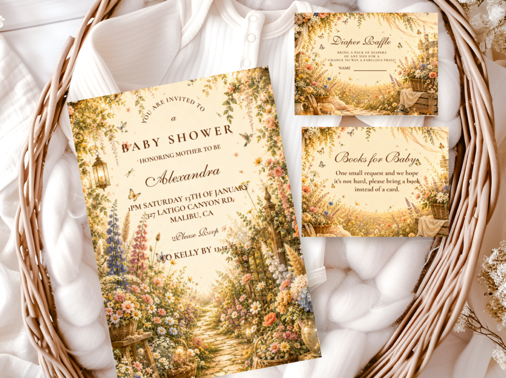
The Wildflower Boho collection carries warm botanical table stationery — place cards and coordinated suite elements that work beautifully alongside the beach boho palette at the table setting level.
✨ Styling Tip
A beach boho cake must never have bright blue ocean fondant or plastic sea creatures on or beside it. Warm ivory semi-naked buttercream with a dried sea grass and pampas grass topper, plus one or two naturally-toned shells placed at the base of the botanical cluster, reads as beach boho: the materials are natural, the icing tone belongs to the sand palette, and the overall effect is of something that grew organically from the coastal world rather than being decorated to look like it. Bright blue fondant reads as a children’s birthday party cake that happened to be placed at a beach shower. Plastic starfish reads as a party supply prop. The natural version is always more specifically beautiful than the represented one.
Section 04 Invitations & Stationery
The most important stationery decision for beach boho: warm ivory or sand-toned card stock rather than bright white. Bright white card stock communicates the nautical register before any design element is seen — it is the cool, crisp, commercially-printed quality of a formal invitation rather than the warm, slightly organic quality of a coastal boho one. The Beach Boho and Blue Boho collections carry the warm coastal illustration style; the Botanical Boho collection adds refined botanical detail appropriate for the Classic Sand direction. Browse all six below.
Primary
Beach Boho
Warm sand and coastal palette — the most specifically beach boho stationery direction.
Boy-Adjacent
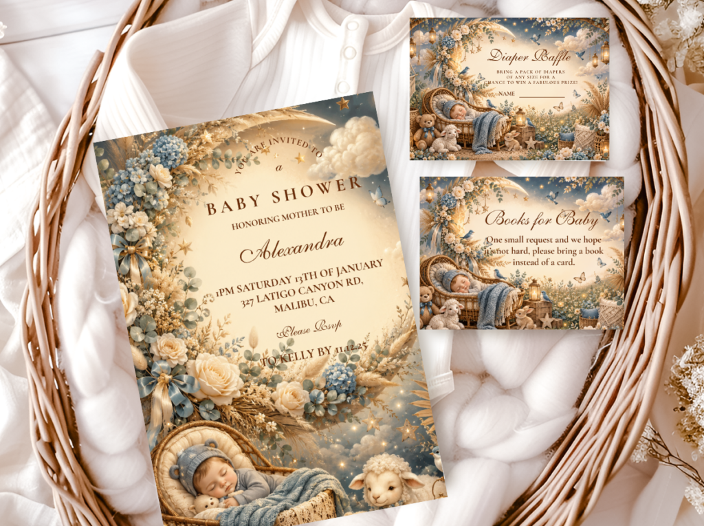
Blue Boho
Dusty blue and warm sand — the most atmospheric boy-adjacent coastal stationery direction.
Most Editorial
Botanical Boho
Deep sage and warm ivory — refined botanical illustration for the Classic Sand direction.
Most Joyful
Wildflower Boho
Loose warm meadow illustration — joyful table stationery alongside the beach boho palette.
Most Romantic
Floral Boho
Warm dried floral botanical — the most romantic stationery complement to the beach boho palette.
Earthy Base
Boho General
Classic terracotta and oatmeal — the warm earthy foundation that works alongside any beach boho direction.
Frequently Asked Questions
What colors work best for a boho beach baby shower?
The beach boho palette is built from four tones: warm sand (the primary neutral — the specific warm beige of dry beach sand, more golden than standard beige); driftwood grey (the cool accent neutral — the specific grey-beige of weathered wood, warm rather than blue-grey); warm ivory (the lightest base tone — the warm off-white of a sun-bleached shell or a cotton sail); and pale teal or dusty blue as the water accent (in small quantities — no more than 20–30% of the visual palette). The palette test: does every element sit within the driftwood-sand-ivory-pale teal range? Navy reads as nautical. Bright turquoise reads as tropical. Bright white reads as coastal contemporary. Driftwood grey, warm sand, warm ivory, and pale teal — these four tones define the specific coastal world that beach boho inhabits.
How do you make a beach shower look boho, not nautical?
Three decisions made simultaneously. The palette must be sand-toned, not navy-and-white: driftwood grey, warm sand, and pale teal replace the navy, white, and bright blue of the nautical register entirely. The decoration materials must be natural coastal elements, not manufactured nautical props: driftwood, dried sea grass, shells in natural ivory and grey tones, and smooth pebbles replace plastic anchors, cartoon crabs, and commercial rope. And dried botanical material — pampas grass and dried sea grass — must be present to bridge the coastal palette to the boho aesthetic register; without dried botanical material, a coastal palette shower reads as coastal rather than as boho. When all three decisions are correct simultaneously, the shower reads as beach boho. When any one is wrong, it reads as either nautical or generic beach party.
Can a boho beach shower work indoors?
Yes — and in some respects an indoor beach boho shower is more achievable than an outdoor one, because the material vocabulary of beach boho is entirely portable. The driftwood base of the centrepiece, the sand-filled glass cylinder, the dried sea grass and pampas grass arch, the linen runner with shell and pebble scatter, the warm ivory semi-naked cake with botanical topper — all of these translate completely to an indoor table and room without requiring any actual beach environment. The specific quality that makes a beach boho shower read as coastal at an indoor venue: the palette (warm sand, driftwood grey, pale teal applied consistently to every element); the material (natural driftwood, dried coastal botanicals, naturally-toned shells); and one focal element that specifically references the sea (the sand-filled glass centrepiece vessel, a single wide piece of driftwood as the table base, or a pampas and sea grass arch that communicates the specific warmth of coastal vegetation). All three are achievable indoors at any budget level.
Walk to the Shore
Beach Boho Baby Shower Stationery
Warm sand, driftwood grey, and coastal botanicals — invitations, welcome signs, and favour tags in the beach boho palette.