Pink Boho Baby Shower Ideas: The One Rule That Keeps It Elevated
Baby Shower · Boho Pink Guide
Pink Boho Baby Shower Ideas
The one undertone decision that keeps pink boho elevated, two complete variations, the decor and cake guide, and the full stationery showcase.
Pink boho is not pink with pampas grass propped in the corner — it is a specific, considered warmth that has to run through every pink element in the room, or the result reads as two different showers accidentally combined. The good news is that the entire decision comes down to one test, applied the same way to a balloon, a ribbon, or a dried flower. Below is what that test is, how it plays out across decor and cake, two variations that build on the same base palette, and how it all lands on the invitation.
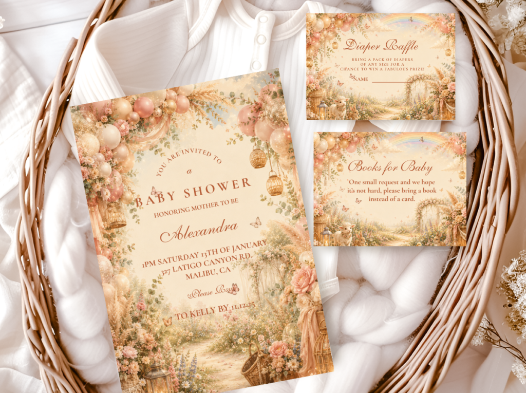
Shop the Pink Boho collection.
Invitations, welcome signs, and every suite element in the warm dusty rose palette.
“Pink boho is not pink with pampas — it is the specific warmth of dusty rose and dried wildflowers, the palette where femininity and the organic world meet without either compromising.”
Section 01 The Pink Boho Palette Rule — Warm Undertone Only
Warm pink only. Dusty rose, blush, and terracotta pink all belong to the boho palette; bubblegum, hot pink, and magenta break it the moment they enter the room. The distinction is not really about how light or dark a pink is — it is about undertone. Every pink in a boho shower needs to lean warm and peachy rather than cool and lavender-toned, and that single test decides almost everything else about whether the palette reads as boho or simply as pink.
This matters more for pink than for most other boho colours because pink has an unusually wide range of undertones packed into what looks, at a glance, like a single colour family. A warm green or a warm brown rarely swings between warm and cool as dramatically as pink does — which is exactly why the undertone test deserves more attention than it might seem to at first. Two pinks can look nearly identical on a screen and still clash badly once they are sitting side by side in person: one leaning warm and peachy, the other cool and slightly lavender-toned.
A practical test: hold the pink up next to something unmistakably warm — a piece of terracotta, a dried peony, a rattan basket. If the pink still reads as part of the same warm family, it passes. If it suddenly looks slightly blue or purple by comparison, it is a cool pink — beautiful in other settings, but not in a boho shower.
✨ Styling Tip
Hold all pink elements next to each other before buying — in person if possible, or at minimum by ordering samples before a bulk order. Warm pink beside warm pink reads as a cohesive boho palette. Warm pink beside cool pink reads as two different showers accidentally combined, and no amount of rearranging the room will resolve the contrast once both are present. Every pink in the shower — balloons, ribbon, dried florals, cake buttercream, linen — must lean the same warm, peachy direction.
The Pink Boho collection carries the warm dusty rose palette across the full stationery suite — the same warm undertone in print as in the decoration.
Section 02 Pink Boho Decor, Cake & Table
The undertone rule from Section 01 applied across every surface guests will see. Nothing here needs to be a saturated statement piece — the warmth is what does the work, not the intensity of the colour.
Dusty rose pampas arch — organic shape, warm palette, sample before bulk order
A dusty rose and warm cream organic balloon arch — not structured or geometrically even, but assembled in the loose, asymmetric format that reads as boho rather than as a formal party arch. The balloon palette: dusty rose (warm, peachy — never hot pink), warm cream, and oatmeal as the neutral, with one or two dried pampas tails woven into the balloon cluster at the lower section of the arch. The critical practical step: order one balloon in the intended dusty rose shade before buying in bulk, and check it against the dried botanicals and linen in person. One balloon shade drifting cool breaks the entire arch palette and is invisible on a product photo until the balloons are inflated beside everything else.
Dried floral centrepiece in blush and terracotta — rattan or terracotta vessel
A dried floral arrangement in the pink boho palette direction: dried protea in warm rose-brown as the mid hero element; dried roses in dusty rose and warm blush; dried lavender bundles at the base; dried pampas tails as the tall height element. All dried — no fresh florals. The vessel: an unglazed terracotta pot or a wide-mouth rattan basket — both belong to the boho material vocabulary and communicate the warm, organic register before the botanical material is even noticed. The arrangement must be asymmetric: the taller elements lean clearly in one direction, the lower elements at the other side, at least one botanical element overhanging the vessel rim.
Semi-naked cake with dried rose topper — undertone check on the buttercream
A semi-naked buttercream in warm ivory or warm blush icing — the specific peachy-warm tone that belongs to the dusty rose palette rather than the cool, slightly lavender-toned blush that printing and baking colorants can drift toward. The topper: an asymmetric cluster of dried rose stems (dusty rose, leaning clearly to one side), dried protea elements, and dried grass tails at the base. The undertone check for the buttercream is the same as for any other pink element: request a small test batch from the baker and check it beside a dried rose or piece of terracotta ribbon before the full cake is made. Cool-leaning buttercream beside warm dried botanicals reads as a palette mismatch at the most photographed moment of the shower.
Warm ivory linen runner with dusty rose and terracotta scatter
An oatmeal or warm ivory linen runner as the table textile base — not bright white, which reads as contemporary formal rather than as organic boho. Scattered along the runner: small dried rose petals in dusty rose; small dried chamomile heads; one or two naturally-toned small shells or smooth pebbles if the direction includes a natural coastal element. The scatter should look gathered rather than arranged — genuinely irregular, with no repeating pattern visible.
✨ Styling Tip
A pink boho balloon arch must be in dusty rose and warm cream — not hot pink, not bright rose, not coral. Hot pink at any point in the arch reads as a different palette from the dusty rose dried botanicals and immediately signals ‘pink party’ rather than ‘pink boho.’ Order a sample balloon in the specific dusty rose shade before purchasing the full quantity — inflate it and hold it beside the dried pampas and the linen in the room where the shower will be held. Natural light and artificial light both shift how pink reads, and a shade that passes the warm test on a product page can still drift too bright or too cool in the specific lighting of the venue.
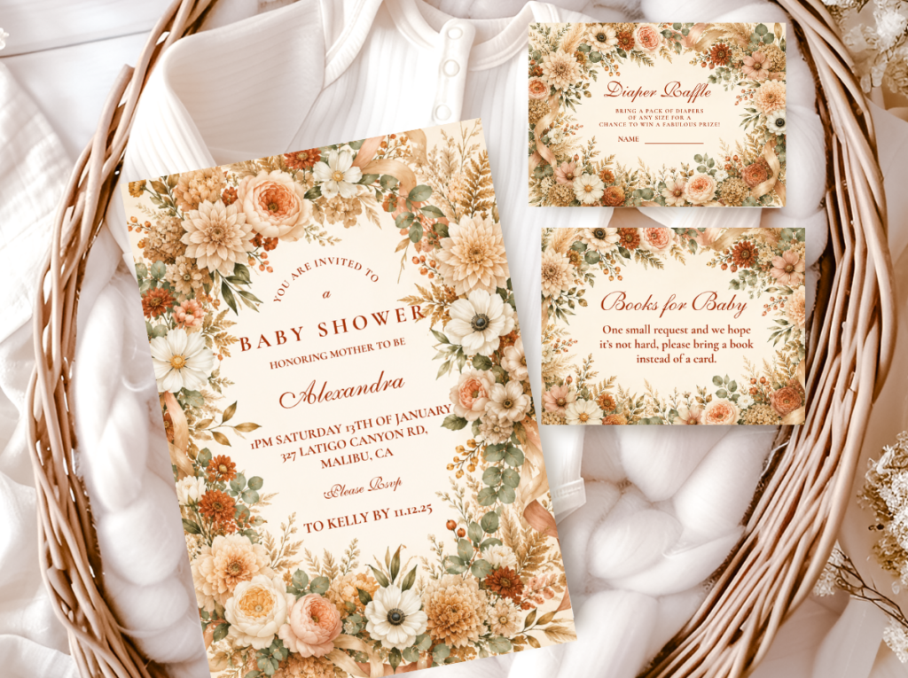
The Floral Boho collection carries warm dried floral botanical illustration — table stationery and place cards in the same pink palette direction.
Section 03 Two Pink Boho Variations
Two complete variations, both built on the same warm undertone rule from Section 01. In both: dusty rose and warm blush lead; no bright, cool-toned, or saturated pinks anywhere.
Most Joyful
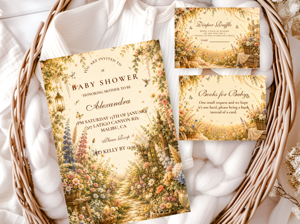
Wildflower Pink Boho
Dusty Rose (Lead) · Sage · Soft Lavender · Warm Yellow · Cream
What it is: A multicolour muted meadow palette with dusty rose stepping forward as the dominant colour and the remaining wildflower hues settling into accent roles. Sage, soft lavender, warm yellow, and cream contribute variety without challenging the rose lead.
Key rule: Every colour in the meadow mix must sit at the same muted warm saturation level as the dusty rose anchor. One brighter or cooler colour breaks the palette immediately. Soft lavender is the colour most likely to drift cool in this direction — check it against the dusty rose and terracotta before buying.
The Wildflower Pink Boho variation is the best option for a shower that wants some of the colour variety of the Classic Meadow Wildflower direction while keeping dusty rose clearly out front rather than sharing equally with every other hue. It reads as pink-led and floral-abundant without losing the specifically boho palette register.
✨ Styling Tip
In the Wildflower Pink Boho direction, every wildflower colour must share the same muted warmth as the dusty rose anchor. One flower element drifting brighter — a coral that reads as too orange, a lavender that reads as too cool, a yellow that reads as too saturated — breaks the palette coherence immediately and makes the dusty rose lead look uncertain rather than intentional. Source each colour in its specifically muted version before assembling: dusty rose, sage, and soft cream are the most reliably muted; lavender and yellow are the most likely to drift outside the register.
Most Romantic
Butterfly Pink Boho
Dusty Rose · Warm Blush · Sage · Warm Cream
What it is: A soft botanical base with a watercolour butterfly illustration in blush and dusty rose tones, giving this variation a narrative, storybook quality that the straight Pink Boho and Wildflower directions do not reach for. The butterfly appears to land on or emerge from the botanical elements rather than float against a plain background.
Key rule: The butterfly illustration must be watercolour only — soft edges, muted colour, the specific organic warmth of a painted creature from the natural world. A cartoon or glitter butterfly, however pink, pulls the shower into a children’s party register that no undertone check can correct. The illustration quality rule is as strict as the undertone rule.
The Butterfly Pink Boho variation is most appropriate for a shower that wants the symbolic dimension of the transformation motif alongside the warm femininity of the pink boho palette. It pairs naturally with the Butterfly Boho stationery collection and with the botanical arch and centrepiece directions from Section 02, with one or two paper butterfly accents landing among the dried botanical material.
Section 04 Invitations & Stationery
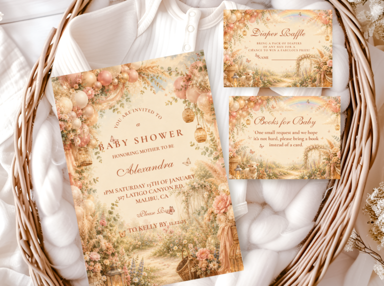
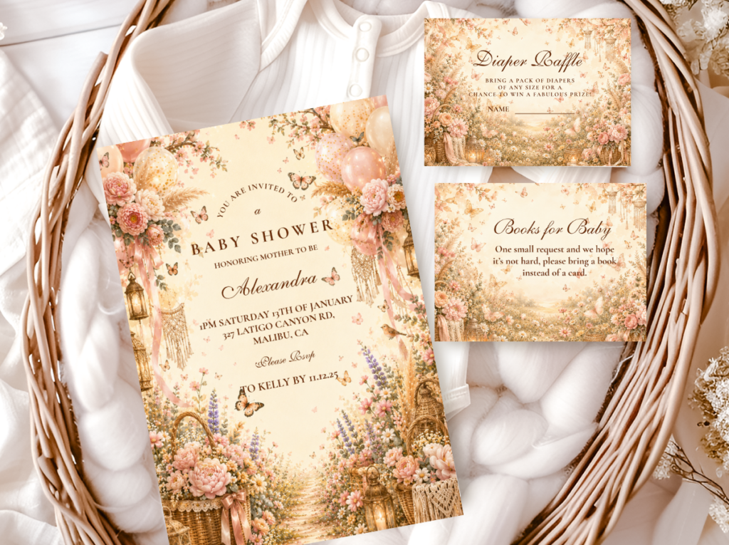
The invitation is the first place the undertone rule gets tested in print — and printing can shift a warm pink cooler than intended more easily than most people expect. A card that looked correctly warm and peachy on screen can come back from the printer leaning slightly lavender, which is the specific cool drift that most commonly affects pink in printing. Requesting a physical proof, or at minimum checking a printed swatch against the dried florals and the linen before invitations go out, catches this before it reaches guests.
Whichever variation the shower follows — the straightforward warmth of Pink Boho, the meadow variety of Wildflower Pink Boho, or the storybook softness of Butterfly Pink Boho — the invitation should carry the same warm, peachy pink forward rather than defaulting to whatever shade a template happens to use by default. The entire stationery suite — invitation, welcome sign, place cards, food labels, favour tags — should share the same warm pink illustration and palette so the shower reads as a single designed world from the first envelope a guest opens to the last object they take home.
Primary
Pink Boho
Warm dusty rose — the defining stationery direction for the Pink Boho palette.
Most Abundant
Floral Boho
Warm dried floral botanical — romantic table stationery in the same pink boho palette family.
Most Joyful
Wildflower Boho
Loose meadow illustration in muted pastels — for the Wildflower Pink Boho variation.
Most Romantic
Butterfly Boho
Watercolour butterfly in dusty rose — for the Butterfly Pink Boho variation.
Most Varied
Rainbow Boho
Muted multicolour pastels — for a pink-adjacent direction with more colour variety.
Earthy Base
Boho General
Classic terracotta and oatmeal — the warm earthy foundation alongside any pink boho direction.
Frequently Asked Questions
What shade of pink works for a boho baby shower?
Dusty rose, warm blush, and terracotta pink — any shade with a warm, peachy undertone rather than a cool or lavender-toned one. The test is not about how light or dark the pink is; it is about which direction the undertone leans. Hold the pink beside something unmistakably warm — a piece of terracotta, a dried protea, a rattan basket — and check whether it reads as part of the same warm family or suddenly looks slightly blue or purple by comparison. Warm and peachy: belongs in the boho palette. Cool or slightly lavender: beautiful in other settings, but not here. Bubblegum, hot pink, coral, and magenta all fall outside the palette regardless of saturation level.
How do I keep pink boho from looking generic?
Two decisions made simultaneously. First: check every pink element’s undertone against the others before buying — warm beside warm, never warm beside cool — so the room reads as a single cohesive palette rather than as several pinks that were chosen independently. Second: keep all pink elements at the same muted, dusty saturation level — balloons, ribbon, cake buttercream, dried florals, and linen all in the same dusty rose family rather than mixing a brighter or more saturated pink for ‘contrast.’ A saturated accent pink in a muted palette reads as an error rather than as a contrast decision. Warmth and muted saturation, applied consistently, produce the specifically elevated quality of pink boho rather than of a pink-themed shower.
Can pink boho work for a gender-neutral shower?
Yes — by stepping dusty rose back into an accent role rather than the lead. In the Wildflower Pink Boho variation, sage, warm cream, and soft yellow can carry more of the palette while dusty rose appears in the dried floral elements and in the invitation illustration detail rather than as the dominant room colour. The result reads as a warm, botanically-driven celebration in which pink is one of several muted natural tones rather than the clear directional statement of a fully pink-led shower. The boho material vocabulary — rattan, linen, dried botanical, kraft paper — is inherently gender-neutral; the dusty rose accent within it reads as warm and organic rather than as gender-coded.
Bring the Theme Together
Pink Boho Baby Shower Stationery
Warm dusty rose, dried floral botanical illustration — invitations, welcome signs, and favour tags in the specifically warm pink palette.