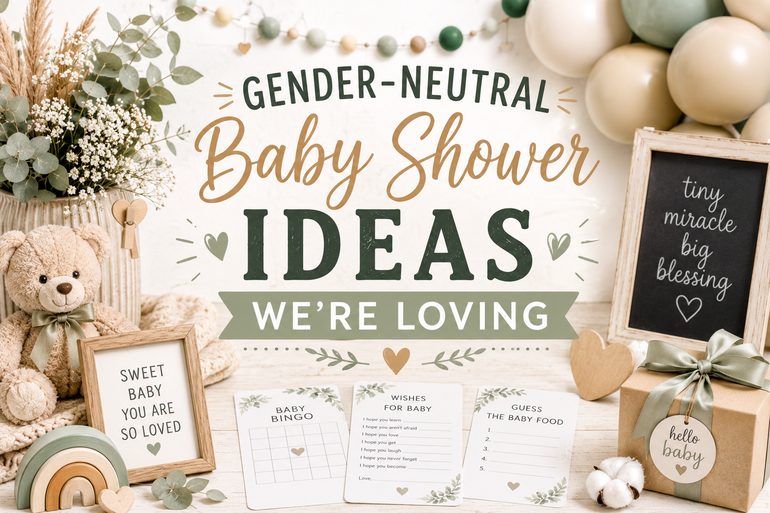
Gender-Neutral Baby Shower Ideas We’re Loving
Baby Shower · Style Guide
Gender-Neutral Baby Shower Ideas We’re Loving
Why gender-neutral doesn’t mean beige, three palette families that are genuinely beautiful and genuinely ungendered, five theme directions, and the decoration and stationery ideas that make the whole thing feel completely designed.
The most common approach to gender-neutral shower planning is to remove colour — to neutralise the palette down to cream and pale yellow and stay safely within a range that offends nobody. The result is a shower that offends nobody and inspires nobody. This guide takes the opposite position: that gender-neutral is not the absence of colour but the presence of colour chosen freely, without the assumption that the baby’s sex determines what is beautiful. The result, when executed with genuine commitment to the palette, is a shower that looks more deliberately beautiful than most gender-coded showers — because every element was chosen for its aesthetic value, not for its conformity to a convention.
Browse our gender-neutral stationery collections.
Warm, earthy, ungendered — beautiful invitations and suite pieces across every theme direction.
“The best gender-neutral shower isn’t the one that avoids colour — it’s the one that chooses colour with intention, free from the assumption that the baby’s sex determines what’s beautiful.”
Section 01 Rethinking Gender-Neutral — Beyond Beige
The assumption that gender-neutral means cream and yellow is the single biggest reason gender-neutral showers look less considered than gender-coded ones. Cream is not neutral — it is the absence of a palette decision, which produces a celebration that reads as cautious rather than considered. Yellow is not neutral either — it is a specific colour that has been culturally designated as the ‘safe’ alternative to pink or blue, which means it carries the specific signal of its own safety rather than of genuine aesthetic intention.
Three palette families are both genuinely gender-neutral and genuinely beautiful. Each communicates something specific about the celebration’s aesthetic world — and none of them communicates uncertainty or caution. The question for choosing between them is the same as for any palette choice: which one most closely matches the feeling the celebration is meant to create?
Palette Family 2
Cool Fresh Neutrals
Dusty Sage · Soft Eucalyptus · Warm Grey · Muted Mint · Pale Stone
The Cool Fresh palette is the most modern and the most specifically design-forward of the three gender-neutral families — it uses the specific quality of colours that are cool-toned but muted, which reads as deliberately considered rather than as a temperature accident. Dusty sage (the grey-green of acacia foliage) and soft eucalyptus are the most naturally gender-neutral botanical colours available because they reference the specific living green of the natural world, which carries no cultural gender coding. Warm grey and pale stone extend the palette into the modern editorial direction. The important distinction: the tones in this palette are muted, not desaturated. A fully desaturated palette reads as cold and clinical; a muted cool palette reads as calm, considered, and specifically beautiful.
Themes that belong here naturally: Botanical, Sea Animals, Celestial (sage direction), Garden (sage and ivory direction)
Best for: Guests of honour with modern interior design sensibility; summer showers; venues with contemporary styling
Palette Family 3
Bold Unexpected Neutrals
Deep Forest Green · Rich Terracotta · Warm Mustard · Charcoal · Antique Gold
The Bold Unexpected palette is the most sophisticated and the most specifically confident of the three gender-neutral families — it operates from the premise that gender-neutral does not mean reduced, and that a palette of deep forest green and antique gold makes a stronger statement about aesthetic intention than a palette of pale yellow and cream. These tones are gender-neutral not because they avoid colour but because they belong to aesthetic worlds that predate and transcend the pink-or-blue convention entirely: deep forest green belongs to the language of forests and libraries; rich terracotta belongs to the Mediterranean and the desert; warm mustard belongs to the specific warm yellow of autumn light before it becomes orange. None of these colours has ever meant ‘girl’ or ‘boy.’ All of them are beautiful.
Themes that belong here naturally: Dragon (deep teal direction), Safari Jungle, Boho (terracotta direction), Woodland (forest green direction)
Best for: Guests of honour with strong design opinions; any season; the most confident and the most editorial choice among the three
✨ Styling Tip
The fastest way to make a gender-neutral shower look deliberately chosen rather than uncertain is to commit to the palette fully. A shower in deep forest green and warm antique gold, executed consistently across the linen, the balloon cluster, the floral arrangement, and the stationery, does not read as ‘we didn’t know’ — it reads as ‘we chose this because it is beautiful.’ A shower in three different neutrals — cream here, pale yellow there, soft grey in another zone — reads as uncertain regardless of how individually appropriate each element is. Confidence in the palette, consistently applied, is the entire difference between ‘gender-neutral shower’ and ‘beautifully designed shower.’
Section 02 Five Gender-Neutral Theme Directions
Five themes, each with a specific explanation of why it is naturally gender-neutral rather than colour-neutralised. The distinction matters: a theme that is naturally gender-neutral communicates beauty. A theme that has been colour-neutralised communicates restraint.
Direction 01
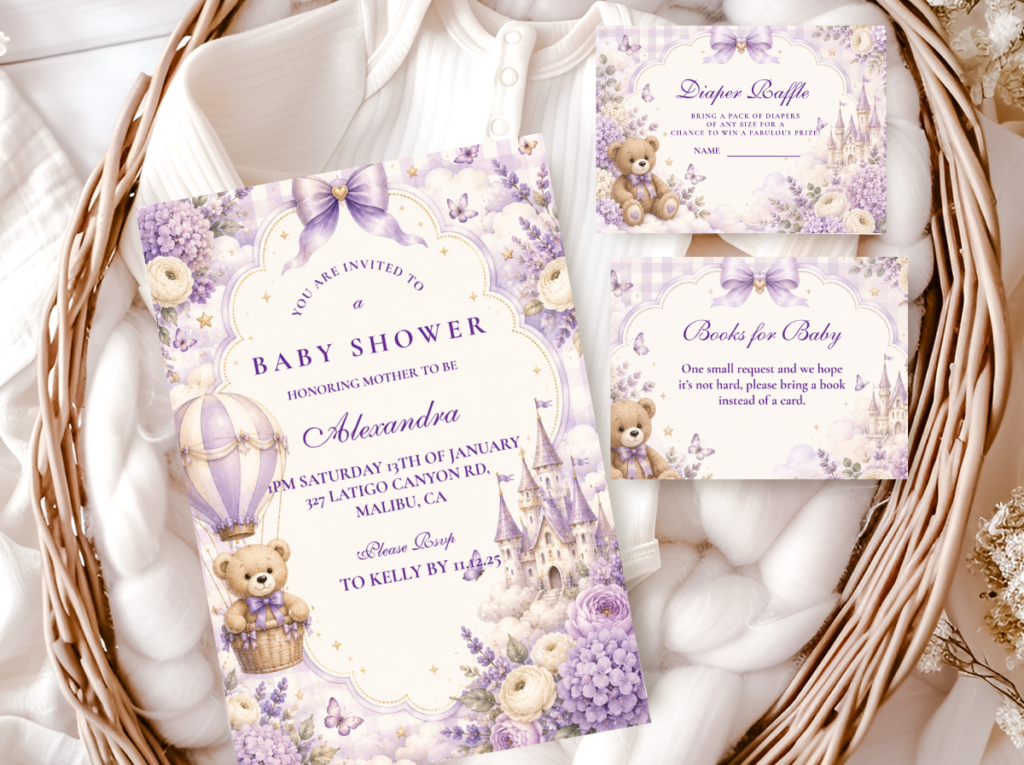
Warm Bear
Honey Amber · Warm Brown · Oatmeal · Warm Cream
Why it’s naturally neutral: the teddy bear is one of the most beloved objects in human childhood and belongs equally to every child who has ever loved one
The Bear theme is naturally gender-neutral because its central motif — the teddy bear — has belonged universally to childhood for over a century without acquiring any gender coding. The honey amber and warm brown palette reinforces this: these are the specific warm tones of wood, honey, and autumn light, none of which has ever been designated as belonging to one gender. The Bear theme direction most appropriate for a specifically ungendered shower: the honey and oatmeal palette (warm honey amber, oatmeal, warm cream, warm brown) with no additional colour accent. The absence of any secondary colour accent — no dusty rose, no slate blue — is the design decision that keeps the palette specifically gender-neutral while remaining entirely warm and entirely beautiful.
Direction 02
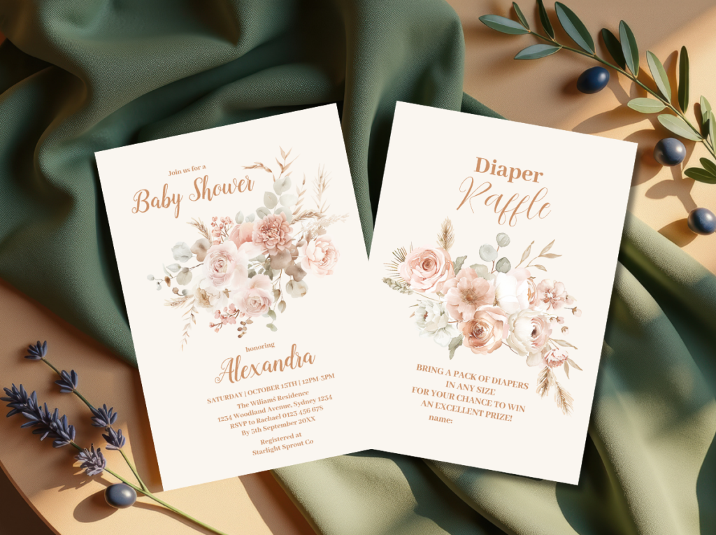
Boho Natural
Terracotta · Oatmeal · Dusty Sage · Natural Linen
Why it’s naturally neutral: natural materials — rattan, linen, dried botanical — have no gender and never have; they belong to the natural world
The Boho theme is the most forgiving gender-neutral direction because its aesthetic is built on natural materials rather than on colour decisions. Rattan, linen, dried pampas, terracotta pots, kraft paper — none of these materials belongs to a gender coding system because none of them was invented by a culture that assigned gender to natural materials. The palette follows naturally from the materials: terracotta, oatmeal, and dusty sage are the colours that natural materials produce when assembled, which means the palette is inherently correct and inherently ungendered without any deliberate colour curation.
✨ Styling Tip
Boho is the most forgiving gender-neutral theme because its aesthetic is built on natural materials that are inherently warm and ungendered. Rattan is not a gendered material. Linen is not a gendered material. Dried pampas grass is not a gendered material. You cannot accidentally buy the wrong colour of dried pampas — its natural honey-cream tone is already the correct gender-neutral palette. For a first-time host planning a gender-neutral shower who is anxious about making a wrong palette decision, boho is the direction with the lowest risk of a colour error because the materials self-select the correct tones.
Direction 03
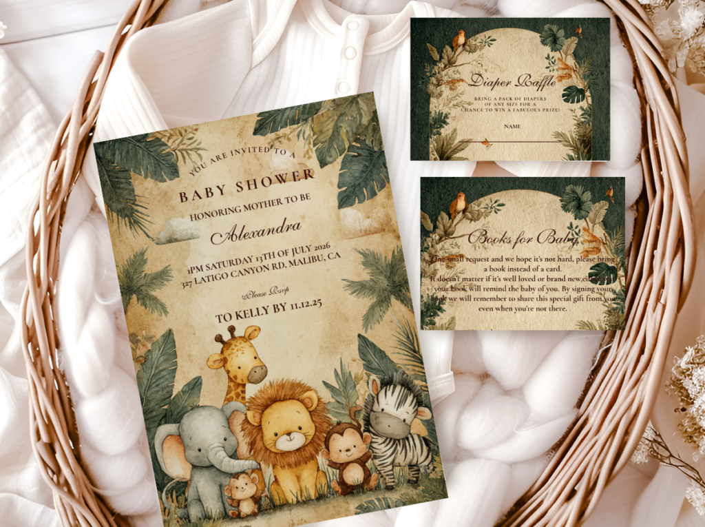
Safari Adventure
Warm Cream · Caramel · Honey Amber · Antique Gold
Why it’s naturally neutral: the animals of the African savanna — giraffe, elephant, lion — belong to the natural world and carry no gender association in any visual or cultural tradition
The Safari theme is the most versatile gender-neutral direction because the safari animal vocabulary (giraffe, elephant, lion, zebra) belongs to the specific world of the African savanna, which is neither culturally masculine nor culturally feminine — it is wild, warm, and specifically adventurous in a way that belongs to every child equally. The palette direction most appropriate for a specifically ungendered safari shower: the warm cream and caramel neutral direction (warm cream, caramel, honey amber, antique gold) without the pink accent of the girl safari or the deep olive of the jungle boy direction. The neutral safari palette is one of the most consistently beautiful and one of the most consistently photographed gender-neutral shower palettes available.
Direction 04
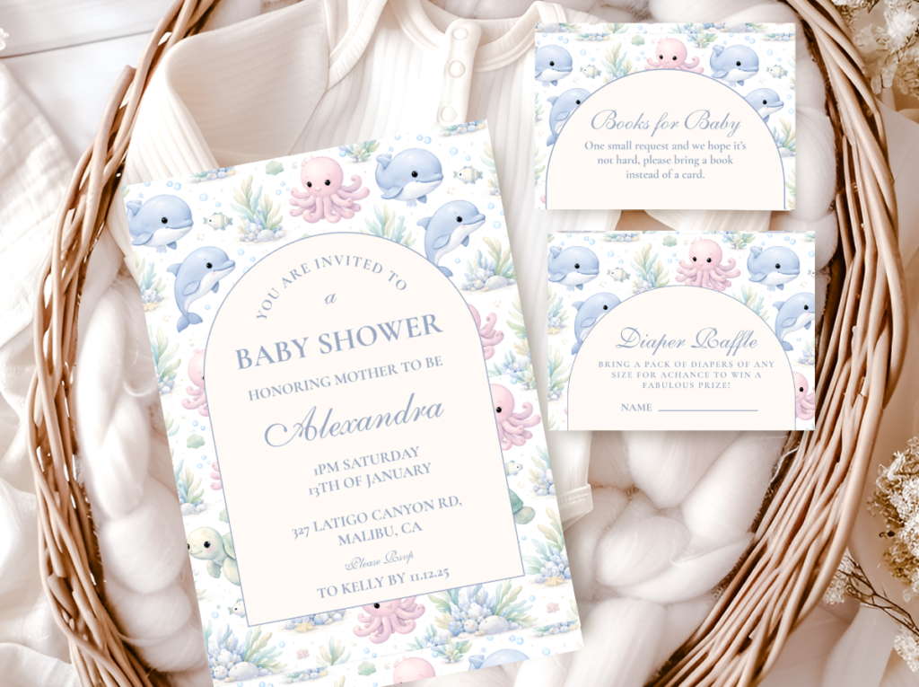
Ocean & Sea
Soft Blue-Green · Warm Sand · Sandy Ivory · Soft Coral
Why it’s naturally neutral: the ocean belongs to everyone; its blue-green tones read as nature, not as a gender convention, when paired with warm sand rather than with bright blue
The Sea Animals theme becomes gender-neutral through one specific palette decision: pairing the blue-green ocean tones with warm sandy neutrals rather than with bright blue. Bright blue beside the sea animal motif reads as boy; warm sand and muted blue-green beside the same sea animal motif reads as the ocean itself, which belongs to no gender. The soft coral accent (pale, warm, and specifically unlike the bright pink of a girl palette) adds a warm note that keeps the palette from reading as cool and clinical while remaining entirely ungendered. Sea creatures — whale, turtle, seahorse, octopus — belong to the natural world with no cultural gender assignment.
Direction 05
Playful & Joyful
Warm Yellow · Sage Green · Warm Oatmeal · Warm Cream
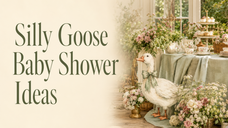
Why it’s naturally neutral: the goose is the most specifically ungendered animal available as a shower motif; its charm comes from its personality, which belongs to no gender
The Silly Goose theme is the most genuinely funny and the most unambiguously gender-neutral of the five directions — because a goose in a party hat has never belonged to either gender coding tradition and cannot be recruited into one. The palette in the warm yellow and sage green direction (honey yellow, dusty sage, warm oatmeal, warm cream) reads as nature-inspired and warm rather than as gender-coded — because warm yellow is the colour of sunshine and honey, not the colour of a nursery convention. This is the direction for parents who want a celebration that is genuinely joyful and genuinely funny, and who do not need the aesthetic to be serious in order to be beautiful.

Section 03 Gender-Neutral Decoration Ideas
Backdrop & Display Wall
Organic balloon arch in warm earthy neutrals
An organic balloon arch (varying balloon sizes at irregular intervals) in the Warm Earthy palette — honey amber, caramel, oatmeal, and warm brown — reads as specifically designed rather than specifically neutral. The organic format (no symmetrical rows, no equal spacing) is the element that communicates artistic intention; a symmetrical balloon arch in the same palette reads as neutral rather than designed. Three sizes minimum: large (36cm), medium (25cm), and small (12cm) in the same palette creates the visual variation that makes the arch read as a complete aesthetic object.
Dried pampas and botanical wall panel
Three to seven large dried pampas plumes, dried eucalyptus branches, and dried grasses assembled asymmetrically against the primary wall. The natural honey-cream tone of dried pampas is self-neutralising — it belongs to the Warm Earthy palette without any deliberate colour selection — which makes this the most forgiving gender-neutral backdrop option available.
Macramé panel with botanical elements
A large hand-knotted macramé panel in natural undyed cotton, with dried botanicals woven into the lower section. The specific quality of macramé — the texture of natural fibre, the organic form of hand-knotting — is inherently gender-neutral and inherently warm, and belongs specifically to the boho and earthy neutral palette directions.
Deep green botanical foliage wall
For the Bold Unexpected palette direction: large-leaf tropical or botanical foliage (monstera, ficus, eucalyptus branches) arranged in a continuous wall panel, in the specific deep forest green of the Bold Unexpected palette. This backdrop reads as dramatically beautiful and specifically ungendered — deep green belongs to the forest and the botanical world, not to any gender convention.
Centrepieces
Three-height earthy centrepiece formula
One tall element (dried pampas or a slim candle pillar in natural beeswax at 30–40cm) + one mid botanical element (a dried floral arrangement in warm earthy tones in a rattan or terracotta vessel) + low scatter elements (small votives in warm cream, a scattered dried petal surface, a small natural stone or piece of driftwood). This formula works at every scale and every budget, and the resulting centrepiece reads as warm, organic, and specifically considered regardless of its total cost.
Warm wildflower and herb arrangement
A loose, organic arrangement of warm-toned wildflowers (sunflowers in honey amber; chamomile; dried strawflower in oatmeal and warm gold; dried celosia in terracotta) in a plain terracotta pot or a warm-glazed ceramic vessel. No floristry precision required — the loose, organic quality of a wildflower arrangement is its aesthetic, and a slightly imperfect wildflower arrangement reads as more specifically beautiful than a formally arranged one.
Natural wood and stone centrepiece
A section of natural wood (a slice of warm-toned wood grain, a small piece of raw birch) beside a small arrangement of smooth natural stones or river pebbles, with a single botanical element (one sprig of eucalyptus, one dried grass stem). The most minimal and most specifically modern-neutral centrepiece available — appropriate for the Cool Fresh or Bold Unexpected palette directions.
Table Setting
Oatmeal linen as the base
Oatmeal or undyed linen as the tablecloth or table runner is the single most impactful and most consistently gender-neutral table decision available. Linen in its natural undyed state belongs to no gender convention — it is the colour of the textile itself, which is the most specific expression of the natural material vocabulary. Bright white table linen reads as formal and cool; oatmeal linen reads as warm, organic, and intentional.
Rattan charger plates under warm ceramic
A rattan charger (natural, undyed) under a warm cream or warm stone ceramic plate is the single serving piece decision that most consistently communicates the gender-neutral earthy aesthetic. Both materials — rattan and warm ceramic — are inherently natural, inherently warm, and inherently ungendered.
Place cards in a natural paper or kraft format
Place cards in warm ivory or kraft paper, in the stationery suite’s illustration style, with a warm botanical or animal motif — positioned at each setting in a way that makes the table feel specifically designed for the people sitting at it. The place card is the only table element that is both aesthetic and personal simultaneously.
✨ Styling Tip
Avoid white as the base for a gender-neutral shower. White reads as ‘we kept it safe’ rather than ‘we made a choice.’ The specific difference between white and warm ivory is almost invisible in description — they are both light, both achromatic in the layered sense — but immediately visible in the room: white reads as cool, clinical, and commercially standard; warm ivory reads as warm, organic, and intentionally chosen. Oatmeal linen is even more specific in its warmth. Any of these is more appropriate than white for a gender-neutral shower that is meant to communicate genuine aesthetic intention rather than aesthetic caution.
Section 04 Gender-Neutral Cake & Dessert Ideas
Cake Directions
Semi-naked buttercream in warm ivory with botanical topper
The most consistently beautiful and most consistently gender-neutral cake direction: a thin crumb coat in warm ivory buttercream (the specific warm tone of the icing is the most important single decision for a gender-neutral cake) with a dried botanical topper in the shower’s specific palette direction. Dried pampas + dried protea in honey and caramel tones = Warm Earthy palette; dried eucalyptus + dried strawflower in sage and oatmeal = Cool Fresh palette. No fondant animals, no gender-coloured tiers — the botanical topper provides all the thematic and aesthetic decoration.
Textured palette-knife buttercream in earthy tones
A textured buttercream application (palette-knife technique, visible in the surface texture of the icing) in warm ivory and warm caramel, with no smooth fondant surface. The textured quality of palette-knife buttercream reads as artisan and organic — the same quality that makes linen and rattan read as natural materials rather than manufactured ones. Appropriate for Warm Earthy and Boho palette directions.
Watercolour botanical scene in warm earthy tones
A hand-painted watercolour botanical or landscape scene (warm golden savanna grass, organic botanical arrangement, a watercolour forest scene) on a smooth matte buttercream base in warm ivory. The illustration should be in warm amber and sage tones — the same palette temperature as the stationery and the decoration — so the cake reads as part of the same designed world.
Dessert Table Palette
Section 05 Games & Favour Ideas
Games Framed Around the Baby Not the Sex
Personality predictions
Guests write their prediction for the baby’s personality on a card: ‘I predict this baby will be…’ (choose three words); ‘The first thing this baby will be obsessed with is…’; ‘The adventure this baby will choose first is…’ The guest of honour opens and reads these at the shower; the cards are kept and revisited as the child grows. This game produces specifically warm and specific engagement with the baby as a future person rather than as a sex prediction.
Wishes jar — ‘wisdom for the adventure ahead’
A wishes jar framed as ‘wisdom and wishes for the adventure ahead’ — guests write one wish or one piece of life wisdom for the baby on a small tag and drop it in the jar. The frame (adventure) is gender-neutral and aspirational; the content (wisdom, wishes) is personal and lasting. The jar becomes an object the family keeps and reads from over the years.
Due date and baby stats predictions
Guests predict the birth date, birth time, weight, length, and hair colour — a game that generates genuine engagement and whose result is revealed after the birth, creating a warm ongoing connection between the family and the shower guests in the weeks following.
Gender-Neutral Favour Ideas
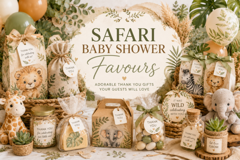
The most genuinely gender-neutral favours are those that belong to the natural world — edible or botanical items that have never been assigned a gender in any cultural tradition:
Custom honey jar
A small honey jar with a personalised label in the shower’s warm earthy palette. Honey is thematically perfect for a gender-neutral shower: it belongs to the natural world, it references the warm amber palette, and its sweetness is a metaphor for new life without any gendered association.
Wildflower seed packet
A kraft envelope of wildflower seeds with a personalised tag in the shower’s illustration style. The wildflower seed favour is the most sustainable and the most specifically gender-neutral favour available — the specific flowers that grow from the seeds belong to the natural world entirely.
Botanical candle or succulent
A small soy candle in a warm ceramic vessel with a label in the earthy palette, or a small succulent in a terracotta pot with a personalised tag. Both are inherently natural, inherently ungendered, and inherently appropriate for every aesthetic family in the gender-neutral direction.
Section 06 Invitations & Stationery
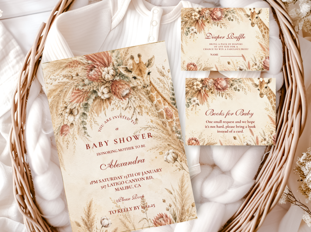
Every collection below has been designed with specifically warm and specifically ungendered illustration quality — the animal and botanical motifs belong to the natural world, the palettes are warm and earthy rather than pink or blue, and the stationery reads as specifically beautiful rather than specifically cautious. Browse all five and look for the palette temperature and illustration style that most closely matches the celebration’s aesthetic direction.
Warm Bear
Bear Theme
Honey amber and oatmeal — the warmest and most nostalgic ungendered invitation direction.
Natural Boho
Boho Theme
Terracotta, oatmeal, and dried botanical — the most material-forward ungendered direction.
Adventure
Safari Theme
Warm cream and honey amber animal illustration — the most versatile ungendered theme direction.
Ocean
Sea Animals
Soft blue-green and warm sand — ocean nature rather than gender convention.
Joyful
Silly Goose
Warm yellow and sage — inherently ungendered, genuinely charming and specifically designed.
Frequently Asked Questions
What colors work best for a gender-neutral baby shower?
The three palette families covered in Section 01 are the most consistently beautiful gender-neutral options: Warm Earthy Neutrals (honey amber, caramel, warm brown, sage green, terracotta); Cool Fresh Neutrals (dusty sage, soft eucalyptus, warm grey, muted mint, pale stone); and Bold Unexpected Neutrals (deep forest green, rich terracotta, warm mustard, charcoal with antique gold). The single most important rule: commit fully to one palette family rather than combining elements from all three. The most consistent advice from hosts who have planned gender-neutral showers: choose one palette and apply it to every element — the balloon cluster, the linen, the flowers, the cake, the stationery, and the favours. The shower that uses the same three tones consistently across every element reads as more confidently designed than the shower that uses ten tones cautiously.
What are the best gender-neutral baby shower themes?
The five most naturally gender-neutral themes — explained in Section 02 — are: Bear (honey and oatmeal palette, universally beloved animal with no gender association); Boho (natural materials that self-select an ungendered earthy palette); Safari Neutral (warm cream and caramel animal illustration that belongs to the natural world); Sea Animals (blue-green and warm sand ocean palette that reads as nature not convention when paired correctly); and Silly Goose (warm yellow and sage, inherently ungendered, genuinely joyful). The most consistently photographed and most consistently appreciated of these by current Pinterest data: Safari Neutral and Boho, both in the Warm Earthy palette direction.
How do you make a gender-neutral shower feel special, not just neutral?
Three specific decisions make the difference between a gender-neutral shower that reads as restrained and one that reads as genuinely designed: (1) Commit to a bold palette within the neutral family — deep forest green and antique gold is more specifically beautiful than pale cream and pale yellow, and the boldness communicates confidence; (2) Invest in texture — rattan, linen, dried botanical, natural wood — because texture communicates warmth and intention in a way that a simple colour palette cannot; and (3) Source the stationery suite first and use the invitation as the aesthetic specification for every subsequent decoration decision. A gender-neutral shower planned in this order — palette, texture, stationery, then decoration — reads as deliberately beautiful rather than as a celebration that was made deliberately vague.
Do you have to keep a gender-neutral shower a surprise?
No — and in many cases, knowing the aesthetic direction in advance produces a better designed celebration than planning in uncertainty. The gender-neutral aesthetic direction can be announced alongside the shower invitation (‘we are keeping the sex a surprise and celebrating with a warm earthy safari theme’) without revealing any information about the baby. Guests who know the palette direction in advance can bring gifts wrapped in the correct palette and make decoration contributions that belong to the same aesthetic world as the celebration. Many of the most beautifully designed gender-neutral showers were planned with the full knowledge and involvement of the guest of honour, who chose the palette direction herself independently of the baby’s sex — because the palette is an aesthetic choice, not a gender statement.
Beautiful by Choice
Gender-Neutral Baby Shower Stationery — Every Theme, Every Palette
Warm, earthy, naturally ungendered — invitations, welcome signs, and favour tags across every theme direction.