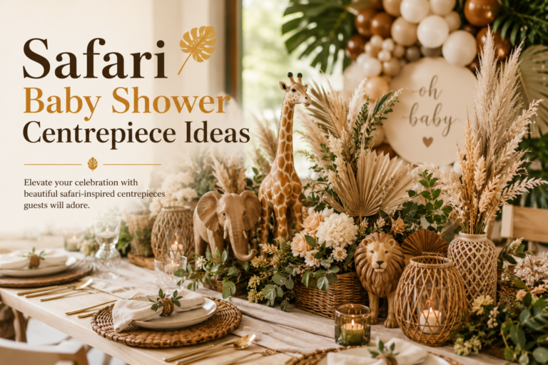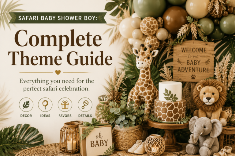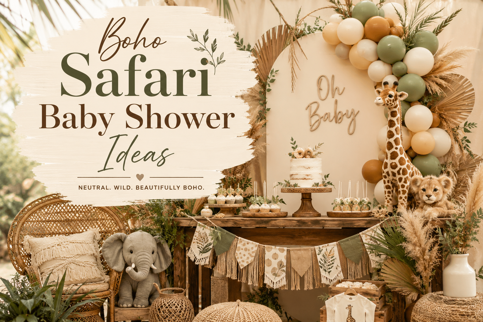
Boho Safari Baby Shower Ideas
Baby Shower · Boho Theme Guide
Boho Safari Baby Shower Ideas
The three distinctions that separate genuine boho safari from generic safari with pampas, four earthy palette directions, and the complete stationery showcase.
Boho safari is the aesthetic that makes the savanna feel like it was always meant to be a celebration — earthy, warm, and alive with the specific texture of the natural world. It is the safari shower direction that values what things are made of over what colour they are painted; that prioritises the specific warmth of dried botanical material over the immediate impact of bright fresh flowers; and that understands asymmetry not as a failure of arrangement but as the entire point. This guide explains what distinguishes genuine boho safari from generic safari with a pampas stem placed in the corner, and how to build a boho safari shower that reads as organically beautiful rather than accidentally earthy.
Shop the Boho Safari Girl collection
Invitations, welcome signs, favour tags — earthy, warm, and fully customisable.
“Boho safari is the aesthetic that makes the savanna feel like it was always meant to be a celebration — earthy, warm, and alive with the specific texture of the natural world.”
Section 01 What Makes Boho Safari Different
The word “boho” is applied freely to safari showers that feature a single pampas stem beside a rattan basket, and the result is a safari shower that reads as earthy by accident rather than as boho safari by design. Genuine boho safari is a specific aesthetic with specific rules — three of them, each non-negotiable — and the difference between following them and ignoring them is immediately visible in photographs.
Distinction 1
Dried Botanicals Only — Fresh Flowers Break the Aesthetic
Generic safari with pampas: Fresh florals — open garden roses, fresh peonies, fresh ranunculus — belong to the romantic and elegant safari directions. They are beautiful and specifically appropriate there. In a boho safari shower, fresh flowers read as too cultivated, too temporary, and too specifically romantic in register to belong to the earthy, aged, and natural quality of the boho aesthetic. A boho safari centrepiece with a fresh flower arrangement and a pampas stem looks like a romantic centrepiece with a boho element added, not like a boho centrepiece.
Genuine boho safari: Dried pampas grass, dried protea, cotton stems, dried celosia, dried strawflowers, dried seed pods, dried grasses in their full range — all of these belong to the boho safari botanical vocabulary because they share the specific qualities of the boho aesthetic: aged, warm, slightly imperfect in their natural form, and beautiful in the specific way of things that have been allowed to dry and remain rather than things that have been cultivated and displayed at peak bloom. Dried botanicals also have the practical advantage of being assembled days or weeks before the shower rather than hours before — which makes the boho safari direction the most practically convenient of all the girl safari directions.
Distinction 2
Texture Over Colour — The Material Language Comes First
Generic safari with pampas: Generic safari with pampas has a safari colour palette with a pampas stem placed within it. The decoration reads as themed — the colour and the motif communicate the theme, and the pampas is an additional texture element. The material quality of the decoration is secondary to its colour and motif.
Genuine boho safari: Genuine boho safari is defined first by its material language: rattan vessels rather than ceramic; linen and natural cotton rather than synthetic fabric; dried botanical material rather than fresh or artificial florals; kraft paper for printed elements rather than coated card; raw wood rather than painted or lacquered surfaces. The colour palette (oatmeal, terracotta, warm brown, sage) is secondary to these material decisions — it follows naturally from the materials rather than being applied to them. A boho safari table that happens to have no safari animal motif but is built entirely from rattan, linen, dried botanical material, and kraft stationery reads as more genuinely boho safari than a table with correct safari colours and cartoon animal prints on manufactured party supplies.
Distinction 3
Asymmetry Is Mandatory — Symmetrical Arrangements Are Not Boho
Generic safari with pampas: A symmetrical arrangement — even one made entirely from dried pampas, dried protea, and rattan in the correct terracotta and oatmeal palette — reads as a formally arranged display rather than as a boho arrangement. Symmetry communicates intention of a specific kind: the intention to create order, balance, and formal beauty. This is not the boho aesthetic’s intention.
Genuine boho safari: Asymmetry in a boho safari arrangement is not an accident or an absence of arrangement skill — it is the active design decision that communicates the boho aesthetic’s core quality: that beauty is organic, imperfect, and found rather than constructed. The specific asymmetry required: the arrangement should lean clearly in one direction (one side taller or fuller than the other); some botanical stems should extend beyond the arrangement boundary on one side; and the overall impression should be of something that grew over time in a vessel rather than something that was placed there in a single construction session. This quality is achieved by actively extending stems beyond the symmetrical boundary rather than by clipping them back to it.
✨ Styling Tip
The fastest way to tell genuine boho safari from generic safari with pampas: look at the arrangement. If it is symmetrical and centred — equal height on both sides, botanical material contained within a regular outline, the arrangement reading as formally balanced from any angle — it is not boho. Boho arrangements lean clearly in one direction, trail and overflow beyond the vessel on at least one side, and have a specific quality of organic imperfection that reads as grown rather than placed. The asymmetry is not accidental. It is the entire point. Before finalising any centrepiece arrangement for a boho safari shower, step back and ask: which direction does it lean? If the answer is “neither — it’s balanced” — pull one side taller and let the other trail lower.
Section 02 Four Boho Safari Palette Directions
Four palette directions — each built on the same dried botanical material foundation, differentiated by the specific warm tone of the primary accent. In all four cases: rattan or natural wood as the vessel material; linen or natural cotton as the textile layer; kraft paper or warm ivory as the stationery base.
2.1 Terracotta & Oatmeal Boho
The Terracotta and Oatmeal direction is the most authentic and the most specifically boho safari palette available — it uses terracotta (the specific warm burnt-orange clay tone that belongs simultaneously to the African earth, the aged ceramic vessel, and the specific warm quality of dried botanical material in autumn light) as the primary accent alongside oatmeal and warm brown as the base, with no secondary colour accent. The result is a palette that reads as completely earthy: every element — the vessel, the textile, the botanical material, the signage — is in the same warm earth-tone family, and the visual cohesion comes from the material quality rather than from any colour contrast.
The dried botanical vocabulary for the Terracotta and Oatmeal direction: large cream pampas plumes as the primary tall element (their honey-warm tone reads as continuous with the oatmeal base, and their voluminous form is the boho element that most strongly communicates the aesthetic at any distance); dried celosia in rust and deep terracotta as the mid botanical element (the specific crested form of celosia is one of the most beautiful dried botanical forms available and belongs directly to the warm earth-tone palette); dried strawflowers in amber and warm gold as the small-form scatter element; and terracotta pots or rattan baskets as the exclusive vessel format. No ceramic, no glass, no painted surface: rattan and terracotta only.
The Boho Safari Girl Baby Shower collection carries warm earthy botanical illustration into every stationery piece — the most authentic boho safari direction, fully customisable.
✨ Styling Tip
Terracotta and oatmeal is the boho safari palette that photographs most consistently — warm, rich, and completely cohesive in any light quality, whether golden-hour outdoor or ambient indoor. The specific warmth of terracotta reads as luminous rather than flat in any natural light, and the contrast between the oatmeal base and the terracotta accent is warm rather than stark, which means it never reads as harsh in photographs regardless of the lighting condition. It is also the most genuinely gender-neutral of the four boho safari directions — terracotta and oatmeal communicates no gender direction whatsoever, which makes it the most appropriate boho safari direction for celebrations where the baby’s gender is not being announced or where an entirely gender-neutral aesthetic is preferred.
2.2 Boho Neutral Safari
The Boho Neutral Safari direction is the most restrained and the most specifically elegant of the four boho directions — it strips the terracotta accent entirely and works within the warm neutral palette of cream, oatmeal, warm brown, and antique gold, applying the boho aesthetic through material language and asymmetric arrangement rather than through accent colour. The result reads as the most quietly beautiful of the four directions: every element is in the same warm neutral family, the dried botanical material provides the texture variation, and the asymmetric arrangement provides the boho quality. Nothing announces itself loudly; everything belongs to the same organic world.
The dried botanical vocabulary for the Boho Neutral Safari direction: large cream pampas plumes as the tall element; dried ivory bunny tail grass and dried oat grass as the mid botanical material (their pale cream tones are monochromatic with the pampas, which makes the arrangement read as a tonal study in warm neutrals rather than as a multi-element composition); dried lunaria seed pods (their translucent silvery-white quality adds a light-catching element without introducing a cool tone); and cream ceramic or rattan as the vessel material (the one direction in which ceramic is appropriate — warm cream ceramic reads as continuous with the warm neutral palette rather than as introducing a manufactured material). The antique gold detail appears only in the stationery metallic and in the smallest accent elements (a single antique gold candle holder, one antique gold napkin ring).
The Neutral Safari Baby Shower collection carries warm cream and antique gold into every stationery piece — the most elegant boho neutral direction for any safari celebration.
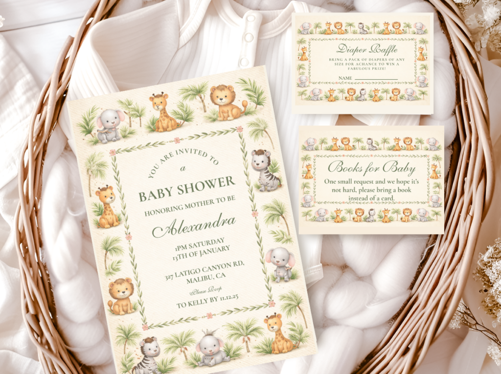
2.3 Boho Sage Safari
The Boho Sage Safari direction is the most botanical and the most nature-forward of the four boho directions — it adds dusty sage green to the warm oatmeal and cream base, using sage as the botanical accent that connects the dried botanical material to the living plant world of the savanna edge. The sage tone is non-negotiable in its specific quality: dusty, grey-toned, and warm rather than bright, saturated, or cool. Bright or cool-toned green immediately breaks the boho aesthetic’s warm, aged, organic register — it reads as a contrasting colour applied to a neutral palette rather than as a botanical accent growing naturally within it. Dusty sage reads as having always been part of the warm palette, which is the specific quality the boho aesthetic requires of every accent element.
The dried botanical vocabulary for the Boho Sage Safari direction: large cream pampas plumes as the tall primary element; dried eucalyptus branches (the specific sage tone of dried eucalyptus in its round-leaf cinerea variety is the most directly boho-appropriate eucalyptus variety — its dusty sage colour and its papery dried texture belong exactly to the boho material vocabulary); dried protea in their brown and rust dried form as the mid botanical; and dried sage botanical grasses as the low scatter element. Rattan and raw wood as the vessel material. The sage accent should be visible in the botanical material but not in the textile or balloon layer — the linen remains oatmeal or warm ivory, and any balloons remain in the warm neutral family.
The Sage Green Safari Girl Baby Shower collection carries dusty sage and warm ivory into every stationery piece — the most botanical and most nature-forward boho safari direction.
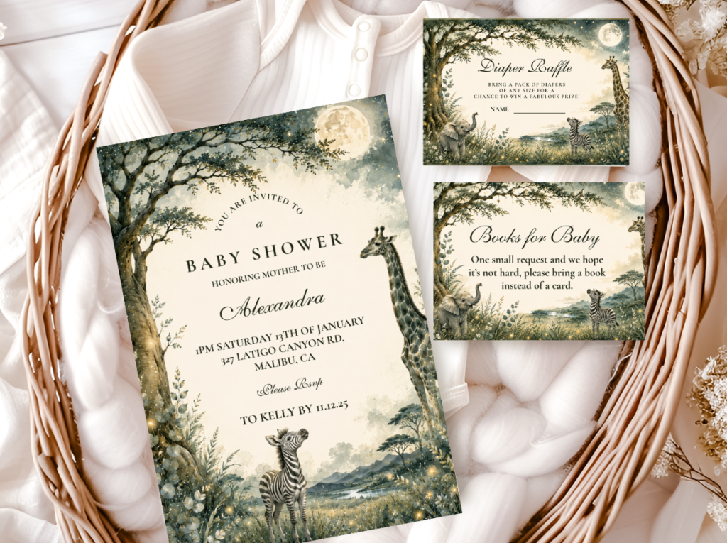
2.4 Boho Watercolour Safari
The Boho Watercolour Safari direction is the most painterly and the most aesthetically layered of the four boho directions — it brings the warm, organic, slightly imperfect quality of watercolour illustration into dialogue with the warm, organic, slightly imperfect quality of the boho material vocabulary, and the result is a celebration where the printed elements (invitation, welcome sign, place cards) share the same visual language as the botanical elements (dried pampas, dried grasses, rattan) rather than being two separate aesthetic systems in the same space. Watercolour illustration is the most appropriate illustration style for the boho safari direction because watercolour’s specific qualities — soft edges, blended colour, visible brushwork, warm paper tone — are the same qualities that define the dried botanical material on the table.
The Boho Watercolour Safari direction works in the warm terracotta and oatmeal palette, the warm neutral palette, or the boho sage palette — the watercolour illustration adapts to the chosen palette direction while maintaining the consistent boho quality of the organic illustration style. The most important consistency requirement: the watercolour palette on the stationery must match the specific warm tone of the botanical material on the table. A terracotta and oatmeal boho table beside a watercolour invitation in cool grey-blue would immediately communicate that the stationery was sourced from a different aesthetic world from the decoration — the temperature must match in both directions.
The Watercolour Safari Baby Shower collection carries warm watercolour-quality illustration into every stationery piece — the most painterly and most aesthetically specific stationery direction for the Boho Watercolour Safari.
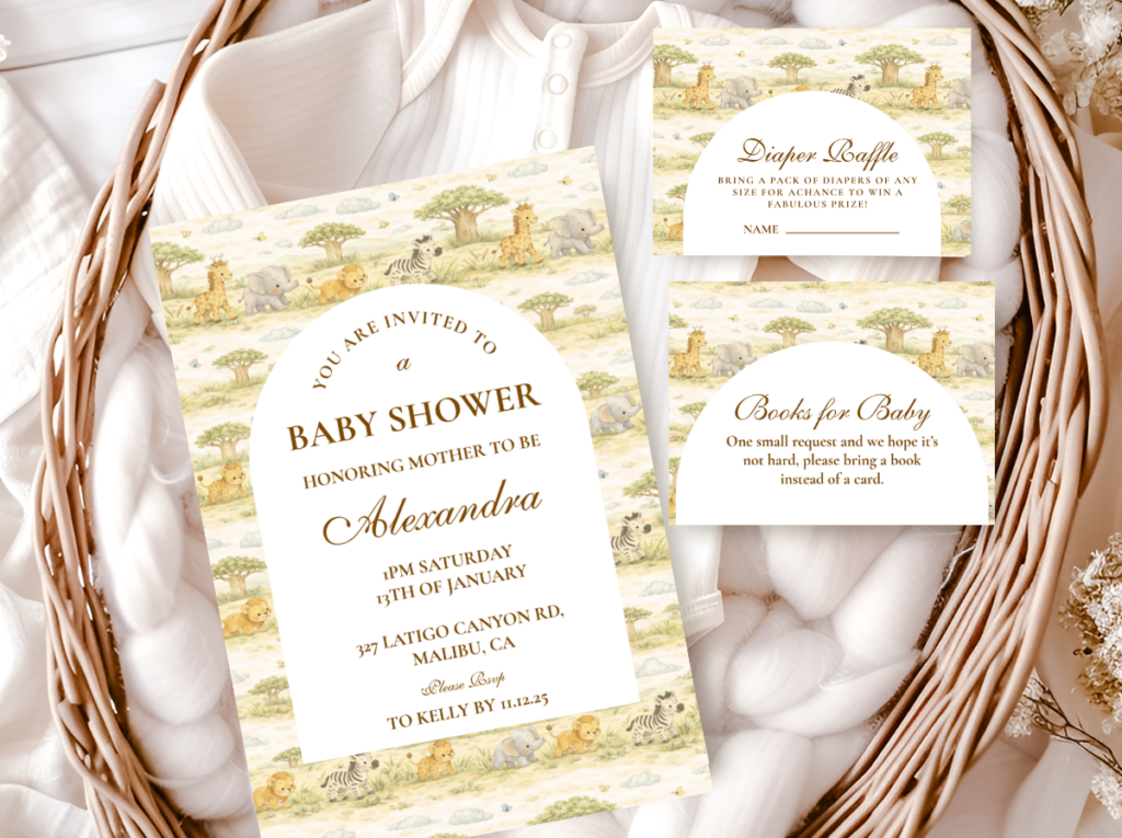
Section 03 Boho Safari Decor, Cake & Table at a Glance
Backdrop & Entrance
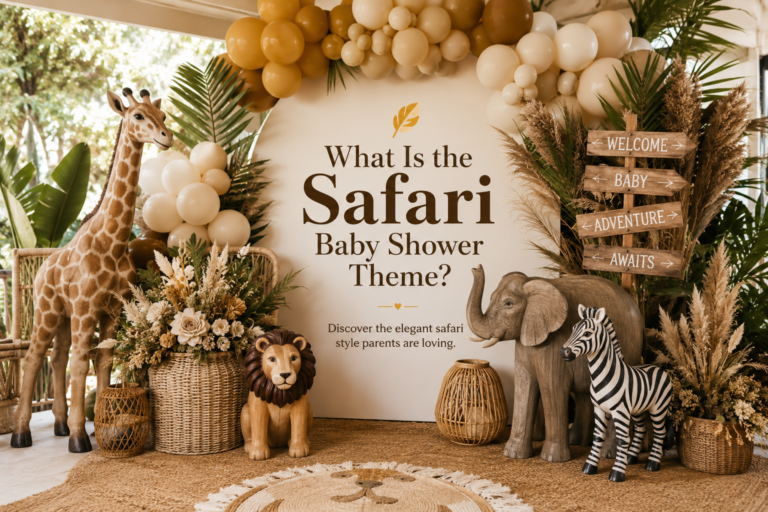
The boho safari backdrop is the one context where large-scale pampas plumes read as specifically appropriate rather than as a token boho gesture — because at backdrop scale, the volume and the specific warm-honey quality of dried pampas plumes in a wall cluster reads as a genuine botanical landscape rather than as a decoration element. The boho safari backdrop: three to seven large dried pampas plumes at varying heights, arranged asymmetrically (specifically asymmetrically — not a centred fan arrangement but a cluster that leans clearly to one side), against a plain warm wall. A rattan wreath with a small dried botanical cluster at the entrance continues the material vocabulary from the first moment of arrival.
Centrepiece
The boho safari centrepiece uses the asymmetric formula in the terracotta or sage palette direction: one tall pampas or dried grass bundle leaning clearly left or right in a rattan or terracotta vessel; one mid dried botanical cluster (celosia, protea, or dried wildflowers) at approximately two-thirds of the tall element’s height on the opposite side; and dried botanical scatter material and small votives at the base extending beyond the vessel boundary on the shorter side. The asymmetry is not approximate — the tall side and the short side should be visibly different heights, with a ratio of approximately 2:1.
Cake & Table
The boho safari cake reads most beautifully as a semi-naked buttercream cake (the crumb coat visible through a thin layer of warm ivory buttercream, communicating the same slightly-imperfect, organic quality as the dried botanical material) with a dried botanical and dried protea topper in the shower’s specific palette direction. The table linen for any boho safari direction: undyed or oatmeal linen as the tablecloth or table runner — natural, slightly textured, warm. Kraft paper for any printed table elements (food labels, menu cards in kraft envelope format, kraft and twine favour tags). The combination of undyed linen, kraft paper, rattan, and dried botanical material across every surface constitutes the complete boho safari material vocabulary at table scale.
The Elegant Safari Baby Shower collection provides refined stationery elements — menu cards and table pieces that add a layer of quality to the boho safari table without losing its earthy, organic register.
✨ Styling Tip
Every surface in a boho safari shower needs at least one texture element — rattan on the table, linen as the runner, kraft paper for signage, dried botanicals in the centrepiece, natural wood or terracotta as the vessel material. When every surface has a texture element that belongs to the boho material vocabulary, the room reads as a complete designed world. When only the centrepiece has texture and every other surface is smooth, manufactured, and colour-coordinated, the room reads as a themed party with a boho centrepiece placed in it. Texture is not optional in boho safari — it is the primary design language. Colour is secondary.
Section 04 Invitations & Stationery
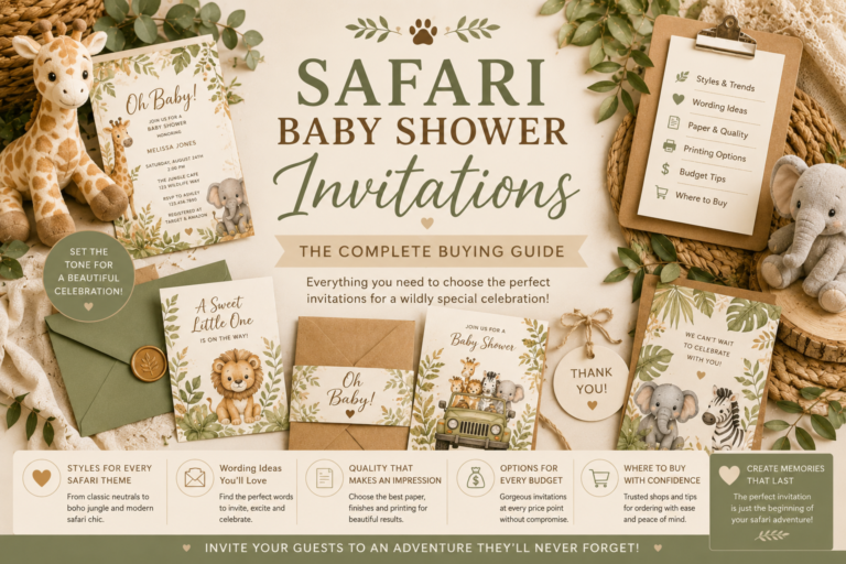
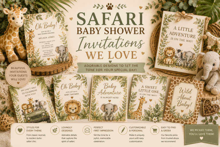
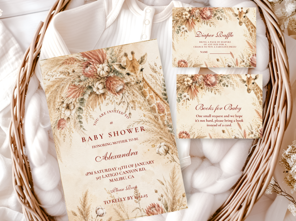
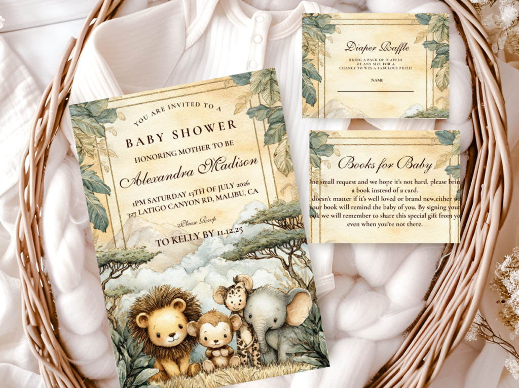
The boho safari stationery suite is the element that most specifically communicates the aesthetic register of the boho direction to guests before they have seen any decoration — because the invitation is the first boho safari object they hold, and its material and illustration qualities establish the entire aesthetic expectation. The warm ivory or kraft paper stock of a boho safari invitation; the watercolour or hand-drawn quality of the safari animal illustration; the dried botanical or pampas detail woven into the design — these are the specific qualities that tell the guest receiving the invitation that this celebration will be warm, earthy, and organically beautiful.
The specific stationery qualities most important for the boho safari direction: a warm paper stock (warm ivory or kraft — cool white reads as belonging to a different aesthetic world from the boho material vocabulary); an organic illustration style (watercolour or hand-drawn rather than graphic or vector, which shares the same warm, slightly imperfect visual quality as the dried botanical material); and a botanical or dried botanical illustration element integrated into the stationery design rather than added as a border or frame. When the dried botanical element on the invitation shares the same visual quality as the dried botanical elements on the centrepiece, the table, and the cake, the stationery reads as part of the same organic world rather than as a printed insert from a different aesthetic system.
The consistency requirement is especially important for boho safari because the boho aesthetic is the one most sensitive to materials from different visual worlds being placed together — and stationery sourced from a non-boho-register collection reads as immediately incongruous against the dried botanical and rattan material vocabulary. Browse all six collections below and look specifically for the paper stock warmth, the illustration quality, and the botanical integration of each before deciding.
Primary
Boho Safari Girl
Warm earthy botanical illustration — the most authentic boho safari stationery direction.
Neutral Boho
Neutral Safari Baby Shower
Warm cream and antique gold — most aligned with the Boho Neutral Safari direction.
Elegant
Elegant Safari Baby Shower
The most refined stationery direction — warm quality for an elevated boho table layer.
Sage Botanical
Sage Green Safari Girl
Dusty sage and warm ivory — most aligned with the Boho Sage Safari direction.
Watercolour
Watercolour Safari Baby Shower
Warm watercolour illustration — most aligned with the Boho Watercolour Safari direction.
All Safari
Safari Theme Collection
The complete umbrella collection — every safari style, every stationery piece.
Frequently Asked Questions
What is a boho safari baby shower?
A boho safari baby shower is a celebration that combines the warm, earthy, natural aesthetic of the boho (bohemian) decoration style with the warm animal and botanical vocabulary of the safari theme. The distinguishing qualities: dried botanicals rather than fresh flowers (pampas grass, dried protea, dried grasses, cotton stems — all aged, warm, and slightly imperfect in the specific way of the boho material vocabulary); natural materials as the primary vessel and surface choice (rattan, raw wood, terracotta, linen, kraft paper — never synthetic, never glossy, never brightly coloured); and asymmetric arrangements as a design requirement rather than a styling choice (boho arrangements lean, trail, and overflow in one direction as an intentional expression of the boho aesthetic’s organic, non-formal quality). The colour palette is secondarily important: terracotta and oatmeal, warm neutral cream and brown, dusty sage, or warm watercolour tones are all correct boho safari palette directions, but the material quality of the elements is the primary aesthetic decision.
How is boho safari different from regular safari?
Regular safari achieves its aesthetic through palette and motif: the correct warm cream and honey palette, the correct safari animal illustration, and the correct botanical accent (dried grasses, eucalyptus) applied to any surface material. Boho safari achieves its aesthetic through material language first and palette second: rattan rather than ceramic, linen rather than paper napkins, dried botanical rather than fresh, kraft paper rather than glossy card — and only then the warm earthy palette applied consistently. The most practical test: remove the colour from the decoration in a grey-scale photograph. A regular safari shower in grey-scale still reads as well-decorated and theme-coherent. A boho safari shower in grey-scale reads as textured, layered, and specifically organic — because the material quality is doing the primary aesthetic work rather than the colour. If the grey-scale version reads as flat and uniform, the decoration is regular safari, not boho safari, regardless of which botanical elements are present.
What colors define boho safari?
Boho safari uses warm earth tones in which the material quality of the element is more important than the specific colour tone. The four main palette directions are: terracotta and oatmeal (the most authentically boho, most gender-neutral, and most consistently photogenic); warm neutral cream and warm brown with antique gold (the most elegant and most restrained boho direction); dusty sage and oatmeal (the most botanical and most nature-forward boho direction); and warm watercolour tones matching the botanical material in the chosen direction (the most painterly direction). In all cases, the palette should be warm, muted, and dusty rather than bright or saturated — boho safari has no room for cool whites, bright greens, or any tone that reads as synthetic or manufactured. Terracotta is the most specifically boho accent colour because its warm, earthy, slightly aged quality belongs simultaneously to the African earth, the handmade ceramic vessel, and the specific warmth of dried botanical material.
Can boho safari work for a boy baby shower?
Yes — and the terracotta and oatmeal direction in particular works for a boy shower because the earthy warmth of terracotta and oatmeal communicates no gender direction. The material language of boho safari (rattan, linen, dried botanical, terracotta pot) reads as organically beautiful and specifically natural rather than as feminine or masculine — which makes it one of the most genuinely gender-neutral decoration aesthetics available in the baby shower category. The boho neutral direction (warm cream, oatmeal, warm brown, antique gold, dried botanical) is even more gender-neutral in palette terms and works perfectly for a boy shower or a gender-unknown celebration. The one boho safari direction that reads as most specifically girl-adjacent is the Boho Sage direction with a dusty rose or blush accent — removing the pink accent entirely and using sage and oatmeal only produces a direction that is warm, botanical, and completely appropriate for a boy celebration.
Shop the Boho Safari Collection
Boho Safari Baby Shower Stationery — All Directions
Invitations, welcome signs, favour tags — warm, earthy, and fully customisable with your details.