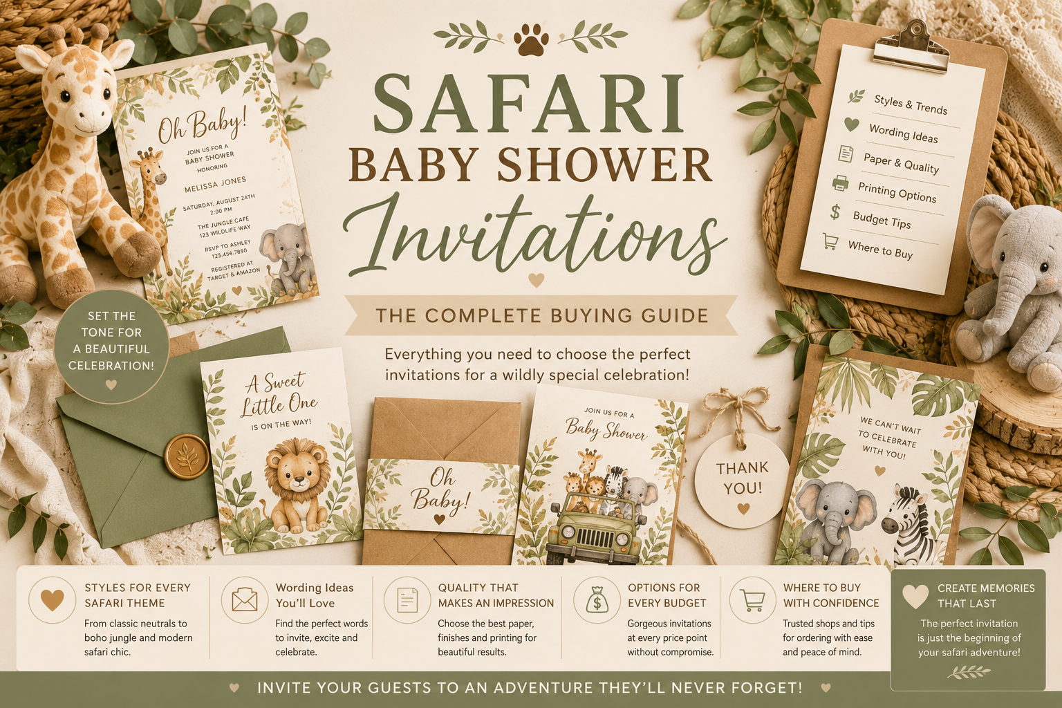
Safari Baby Shower Invitations: The Complete Buying Guide
Baby Shower · Invitations Guide
Safari Baby Shower Invitations: The Complete Buying Guide
What to look for, what to avoid, what every safari invitation should include, the illustration quality question, and the six collections across every palette direction.
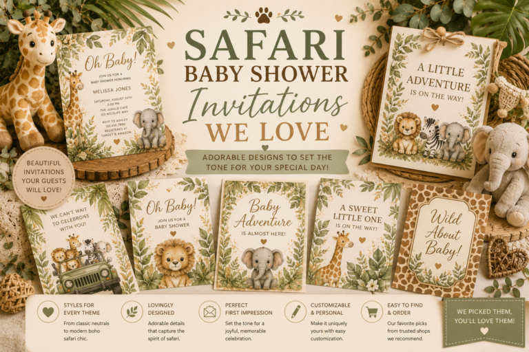
The safari baby shower invitation is a more significant decision than most planning guides acknowledge — because it is not simply a piece of stationery. It is the first object guests hold that belongs to the safari world being created for the celebration; it is the first impression of the illustration quality, the palette, and the register of the event; and it is the single printed element most likely to survive the celebration itself (guests keep beautiful invitations; they do not keep generic ones). This guide explains exactly what to look for, what to avoid, what to include, and which of the six collections available will produce the most beautiful and most cohesive result for the specific palette direction of the shower.
Browse the complete safari stationery collection
Invitations, welcome signs, favour tags — all coordinated and fully customisable.
“Guests keep beautiful invitations. The safari shower invitation that is warm, specific, and genuinely lovely will still be in someone’s drawer five years from now — the generic one will not survive the recycling bin.”
Section 01 What to Look for in a Safari Baby Shower Invitation
Illustration Quality: Watercolour vs. Cartoon
The illustration quality of the safari invitation is the single most important decision in the entire stationery selection process — more important than the specific animal, more important than the specific palette direction, more important than any wording decision — because the illustration quality determines immediately and irrevocably whether the invitation reads as specifically beautiful or as generically safari-themed.
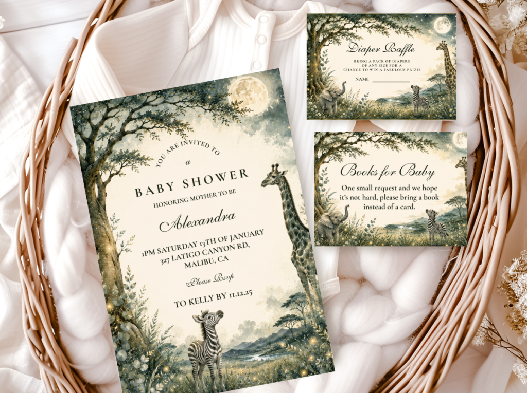
Watercolour safari illustration has four specific qualities that distinguish it from cartoon illustration: soft edges (the animal form blends gently into the background rather than being defined by a hard outline, which produces the specific quality of a thing that belongs in its setting rather than being placed against it); visible brushwork or texture (the specific slightly imperfect quality of handmade illustration that reads as made with care rather than produced by a machine); blended or varied colour (the specific tonal variation of watercolour, where the same hue is darker in some areas and lighter in others, producing depth rather than flat fill); and warmth (the specific warm quality of watercolour pigments on cream or ivory paper, which reads as belonging to the same natural world as the warm cream palette of the safari aesthetic).
Cartoon safari illustration has the opposite qualities: hard defined outlines; flat uniform fill colours; clean uniform saturation; and a cool precision that reads as designed for digital screens rather than for physical print. Cartoon illustration is not inferior as an art form — it is inferior specifically for the safari baby shower invitation because the warm, slightly imperfect, organic quality of watercolour illustration belongs directly to the warm, natural, organic visual world of the African savanna, while the clean graphic precision of cartoon illustration belongs to a different visual world entirely.
✨ Styling Tip
The fastest way to assess illustration quality on any online safari invitation: zoom in on the animal. If the edges are soft and slightly blended into the background, it is watercolour or watercolour-style. If the edges are hard and clean lines, it is graphic or cartoon. If the colours inside the animal vary slightly in tone (darker here, lighter there), it is watercolour. If the colours are completely uniform, it is graphic. Always zoom before you buy.
Palette Temperature: Warm vs. Neutral vs. Bright
The second most important quality criterion for the safari invitation is the palette temperature of the background and the secondary colour elements. The safari palette is warm: the base should be cream, ivory, oatmeal, or warm parchment — never cool white, never stark white, never grey-toned. The animal illustration should be in warm brown, warm honey, or warm gold — never cool grey, never blue-black, never saturated primary colour. Any secondary botanical element (leaves, grasses, acacia details) should be in warm sage or warm olive — never bright green, never lime, never cool teal.
The warm palette test: hold the invitation (or zoom to a large-format preview of it) and ask one question — does it look like it belongs in a warm room with natural light and cream linen, or does it look like it belongs on a bright party table with primary-colour balloons? If the first: the palette is correct. If the second: the palette is wrong, regardless of how many safari animals it contains.
Paper Quality and Print Clarity
On print-on-demand platforms, the paper quality is typically consistent across the product range — the key variable is the print clarity of the illustration. Look for: clear reproduction of any fine line-work in the illustration (the individual hairs of the giraffe’s ossicone, the texture lines of the elephant’s skin) in the product previews; consistent colour across the preview (no areas of patchy or inconsistent printing in the sample images); and a warm-toned ivory or cream paper colour in the product photographs rather than a stark white that photographs as cooler and less warm than the actual invitation stock. Heavier card stock (typically 350gsm or above) produces a noticeably more premium feel when the invitation is held — and for a beautiful watercolour safari invitation, the feeling when held is part of the aesthetic quality.
Section 02 What Every Safari Baby Shower Invitation Should Include
The Essential Information
A baby shower invitation should include seven essential elements in the following hierarchy: the guest of honour’s name (the most important information, and the most personal — the celebration is for this specific person and the invitation should communicate that immediately); the occasion (“Baby Shower” or a personalised equivalent — “Jungle Safari Baby Shower for Emma”); the date (including the day of the week as well as the date — “Saturday, 14 June 2026”); the time (both start and, optionally, end time — a specific start time helps guests plan travel); the venue (full name and address, or if at a private address, the postcode and any parking instructions); the RSVP information (who to contact, by what method — email, phone, or card — and by when); and any special instructions (registry information or website link; dietary restrictions notice if collecting information; dress code if relevant).
The order in which this information should appear on the invitation face: the guest of honour’s name first and largest; then the occasion; then the date and time together; then the venue; then the RSVP information in smaller type at the bottom or on the reverse. This hierarchy mirrors the importance of the information: the who is more important than the when, which is more important than the where, which is more important than the logistics. An invitation that lists the venue address before the guest of honour’s name has its priorities reversed.
RSVP Card vs. RSVP Instructions on the Invitation
For a baby shower (as opposed to a wedding), a separate RSVP card is optional rather than essential — many hosts print the RSVP information on the invitation face and ask guests to respond by email, text, or phone. The advantage of a separate RSVP card: it makes the response process easier for guests who are less comfortable with digital communication, and it allows the host to collect dietary information in a structured format. The advantage of RSVP instructions on the invitation: it reduces printing costs and simplifies the mailing. For a coordinated safari stationery suite, the RSVP card in the same design as the invitation adds a specific quality of completeness to the unboxing experience that is worth the additional investment for the most considered celebrations.
Wording Register: Formal, Warm, or Playful
The wording register of the safari invitation should match the aesthetic register of the illustration style. A watercolour illustration in warm tones reads as warm and personal — it should be accompanied by warm personal wording (first names, direct address, friendly language) rather than formal third-person wording. A more graphic or editorial illustration might accommodate more formal wording. For a safari shower specifically, the most appropriate wording register is warm and specific: “Please join us for a safari celebration” or “Join us for a safari baby shower for Emma” rather than “You are cordially invited to a baby shower in honour of Emma.” The warmth of the safari aesthetic reads best in warm language.
✨ Styling Tip
Write the wording before you start designing or searching for invitations. The number of words and the length of each line directly affect how the text sits within the invitation layout — a very long guest of honour’s name (Emma Rose Alexandra Thompson-Williams) needs a different layout from a short one (Emma). Know the full text before searching so you can assess whether each invitation’s layout will accommodate it comfortably. An invitation with beautiful illustration and cramped text reads as worse than a plainer invitation with well-proportioned text.
Section 03 What to Avoid in a Safari Baby Shower Invitation
The Three Most Common Safari Invitation Mistakes
Avoid
Cool white paper with bright primary accent colours
The most common safari invitation mistake. Cool white reads as party-supply-generic; bright primary colours (especially bright yellow, bright orange, and primary green) break the warm natural temperature of the safari palette entirely. The invitation looks like a children’s birthday party that happens to have a giraffe on it, rather than a specifically beautiful safari celebration.
Avoid
Mixed illustration styles across suite pieces
A watercolour invitation beside a cartoon-illustrated welcome sign beside a graphic-style favour tag: three different illustration registers communicating three different things about the celebration’s aesthetic. The most common cause is sourcing individual pieces from different designers or platforms without checking the illustration register of each against the others. The fix: source the full suite from one collection, or verify that every individual piece uses the same illustration quality before purchasing.
Avoid
All five safari animals at once
Giraffe, elephant, zebra, lion, and rhinoceros all on the same invitation — in equal visual weight, competing for attention simultaneously — produces the same visual confusion as five colours in the palette. Choose one hero animal or one hero pair (giraffe and elephant read as the classic safari pair for good reason: they complement each other in scale and form without competing). The invitation with one beautifully illustrated giraffe is more beautiful than the invitation with five adequate animals at smaller scale.
Section 04 How to Match the Invitation to the Rest of the Shower
The Illustration Register Rule
Every piece of stationery in the shower — invitation, welcome sign, menu cards, place cards, favour tags, cupcake toppers — should be in the same illustration register as the invitation. If the invitation is watercolour, everything else should be watercolour. If the invitation is graphic or cartoon, everything else should be in the same graphic or cartoon quality. The moment any two pieces in the suite use a different illustration quality, the guest notices a discontinuity — not necessarily consciously, but as a feeling that something about the shower is slightly inconsistent. The feeling is the aesthetic difference between a designed celebration and an assembled one.
The Palette Temperature Rule
Every piece of stationery should be in the same palette temperature: warm cream base for all pieces (not cool white for some and warm cream for others); the same specific accent colour across all pieces (the same specific dusty rose, not dusty rose for the invitation and bright pink for the welcome sign); and the same metallic quality (antique gold for all pieces, not antique gold for some and bright silver or bright gold for others). The palette temperature rule is the one most frequently broken in celebrations where individual pieces are sourced from different designers, because each designer’s “blush” or “sage” is slightly different in temperature and saturation, and the cumulative effect of these small differences is a palette that reads as inconsistent even when each individual piece is beautiful.
✨ Styling Tip
Order a physical sample of the invitation before ordering the full quantity — especially if ordering from a platform you have not used before. The warmth of the cream base, the quality of the illustration at print size, and the feel of the card stock are all significantly different in person than on a screen. A warm honey-cream that looks beautiful on a monitor can print as a cooler grey-cream on certain paper stocks. A giraffe illustration that looks beautifully detailed at 300% screen zoom can print as muddy at A5 card scale. The physical sample is the purchase that prevents the expensive mistake.
Section 05 The Safari Invitation Collections
Six coordinated safari stationery collections, each designed as a complete suite from invitation through thank you card. All six use the same warm illustration register across every piece; all six are fully customisable with the guest of honour’s name, the shower date, the venue, and any other personalisation needed. Browse all six before deciding — the most important selection criterion is the palette temperature and illustration quality of the specific direction, not the animal motif or the general category label.
Neutral & Multi-Gender Directions
All Safari
Safari Theme Collection
The complete umbrella collection — every safari style, every stationery piece. The starting point for any safari shower.
Classic Neutral
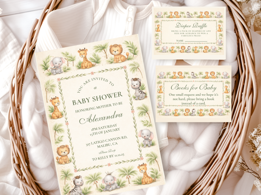
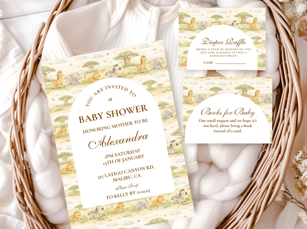
Neutral Safari Baby Shower
Warm cream and antique gold — the most versatile direction, works for any gender, any season, any venue.
Watercolour
Watercolour Safari Baby Shower
Soft organic watercolour illustration — the most photogenic direction, the most specifically warm and beautiful.
Gender-Directed Directions
Boy Direction
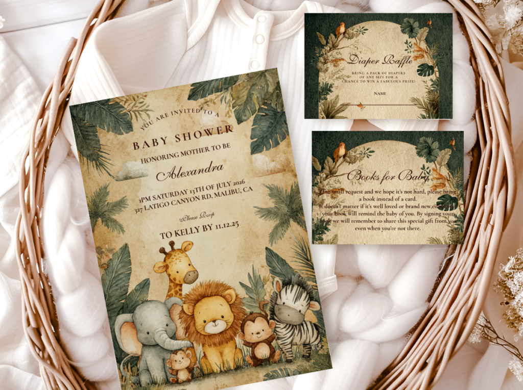
Jungle Safari Boy
Deep olive and warm gold — the most adventure-forward boy direction. Bold, warm, and specifically beautiful.
Girl Direction
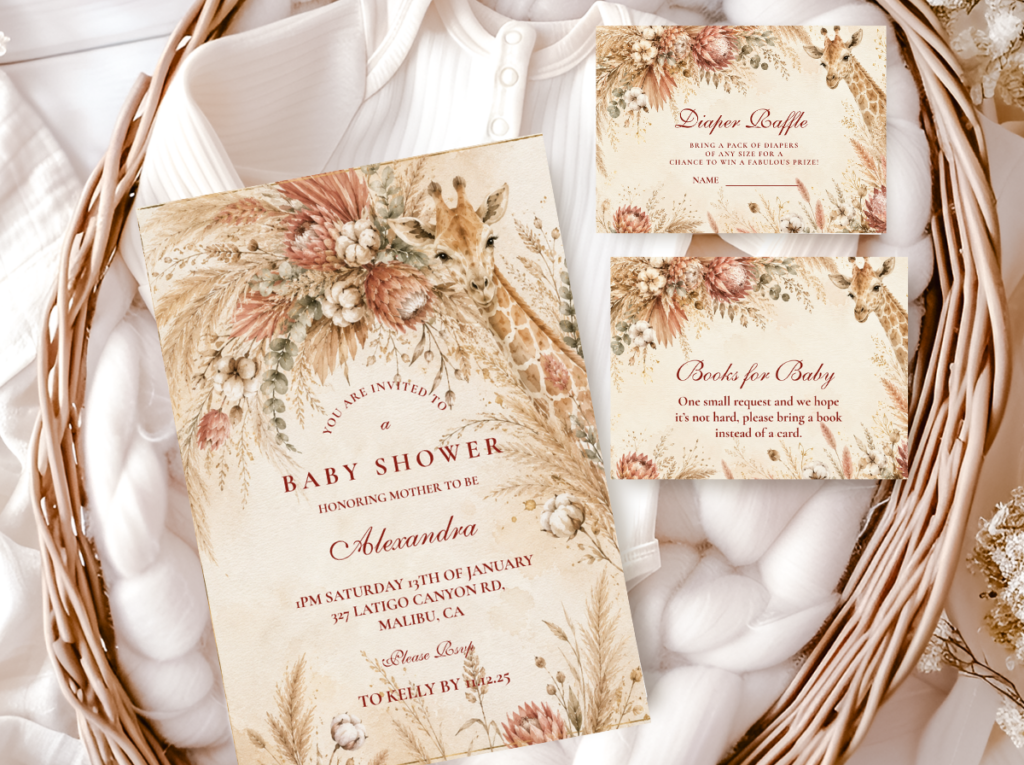
Pink Safari Girl
Dusty rose and warm cream — the most consistently beautiful and most widely saved girl safari stationery direction.
Elegant
Elegant Safari Baby Shower
The most refined and most artistically sophisticated safari stationery direction — watercolour quality, warm restraint.

Section 06 Practical Buying Guidance
How Many Invitations to Order
Order one invitation per household, not one per person (a couple attending together receives one invitation, not two). Count the number of households on the guest list, then add 10–15% to allow for: addressing mistakes; last-minute additions to the guest list; and keepsakes for the guest of honour, the host, and any family members who want one. An event with 30 guests distributed across 22 households should order approximately 25–26 invitations. Small reprints from print-on-demand platforms typically cost more per unit than the original order — always order slightly more rather than slightly fewer.
When to Send Safari Baby Shower Invitations
Standard timing: 3–4 weeks before the shower for a local guest list; 4–6 weeks for guests who need to travel. For a shower with primarily local guests, sending invitations 3 weeks in advance is sufficient; sending earlier does not significantly improve the response rate and means guests have longer to lose or forget the invitation. For guests who need to book travel or accommodation, 6 weeks is the minimum appropriate lead time. Allow one week between ordering and receiving the invitations for printing and shipping, plus one week for addressing and posting — which means placing the order at least 5–7 weeks before the shower for a local event and 7–9 weeks for an event requiring travel.
Digital vs. Printed Safari Invitations
A printed safari baby shower invitation in watercolour illustration quality on warm ivory card stock produces a completely different impression from a digital version of the same design sent by email or messaging platform. The printed invitation is held, examined, and (if beautiful) kept; it creates a specific physical impression of quality that a screen image cannot replicate. The digital option is significantly less expensive and appropriate for informal celebrations or very budget-constrained situations; it is not appropriate for a celebration where the aesthetic register of the shower is specifically considered and specifically warm. If the shower itself is designed to be beautiful, the invitation should be the same.
✨ Styling Tip
If cost is a constraint but a printed invitation is important, print one suite piece at premium quality and reduce on the others: the invitation itself at full quality and card stock weight; the RSVP as a simple matching postcard; the welcome sign as a single-sided flat print. The invitation is the piece most likely to be kept and most likely to survive the celebration; the welcome sign is displayed for hours and then discarded. Prioritise the piece that lasts longest.
Frequently Asked Questions
What should I include on a safari baby shower invitation?
A safari baby shower invitation should include seven essential elements in descending order of importance: the guest of honour’s name (first and most prominent); the occasion (“Baby Shower” or “Safari Baby Shower for [name]”); the date including day of week; the time; the venue name and address; the RSVP information (who to contact, how, and by when); and any special instructions (registry link, dietary information, parking). Optional additional elements: a personalised safari quote or a short “join us for a safari adventure” tagline that communicates the theme before the guest reads the formal information. The order matters: the guest of honour’s name should be the largest and most prominent element; the RSVP information should be the smallest. An invitation that leads with the venue address and buries the guest of honour’s name has its hierarchy inverted.
How do I know if a safari invitation illustration quality is good enough?
Three specific checks assess illustration quality from an online preview: zoom into the animal face and look at the edge quality (soft and blended = watercolour quality; hard and clean = graphic/cartoon); look at the colour fill inside the animal (varied and tonal = watercolour; flat and uniform = graphic); and look at the background (warm cream or ivory with slight texture = appropriate safari palette; stark white or bright = generic party). The illustration should look like something from a storybook rather than something from a clip art library. If you zoom to 200% and the image remains beautiful — the individual brushstrokes visible, the animal form naturally integrated into the background — the illustration quality is high. If it looks like a vector graphic at 200% zoom, the illustration quality is graphic rather than watercolour.
How far in advance should I order safari baby shower invitations?
Allow 5–7 weeks between placing the order and the shower date for a local event (1 week for printing and shipping + 1 week for addressing and posting + 3–4 weeks for the guest RSVP window before the shower). For events where guests need to travel, allow 7–9 weeks (1 week printing + 1 week addressing and posting + 5–6 weeks lead time for the guests). For digital-only invitations, the lead time can be reduced to 3–4 weeks. The most common invitation mistake is underestimating the processing time: print-on-demand invitations are produced on receipt of the order, not from stock, which means a 7–10 business day production window should be factored into the timeline in addition to the shipping estimate.
Can I mix different safari invitation designs for different elements?
Mixing is technically possible but produces a specific risk: the illustration register and palette temperature of two different designs are almost never identical even when they are described with the same terms. One designer’s “watercolour” is not the same as another’s; one designer’s “dusty rose” is not the same temperature or saturation as another’s. The cumulative effect of small differences across multiple pieces is a palette and illustration register that reads as inconsistent even when each individual piece is genuinely beautiful. The safest and most cohesive approach: source every stationery piece for the shower from the same collection. If a specific piece (a cupcake topper or a very specific favour format) is not available in the chosen collection, match it as closely as possible to the collection’s specific palette and illustration quality before purchasing.
Shop the Complete Collection
Safari Baby Shower Invitations — All Styles & Palette Directions
Fully customisable with your name, date, venue, and wording — printed to order in warm, watercolour-quality illustration.