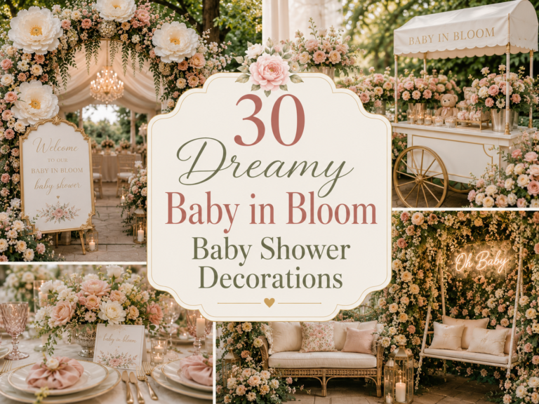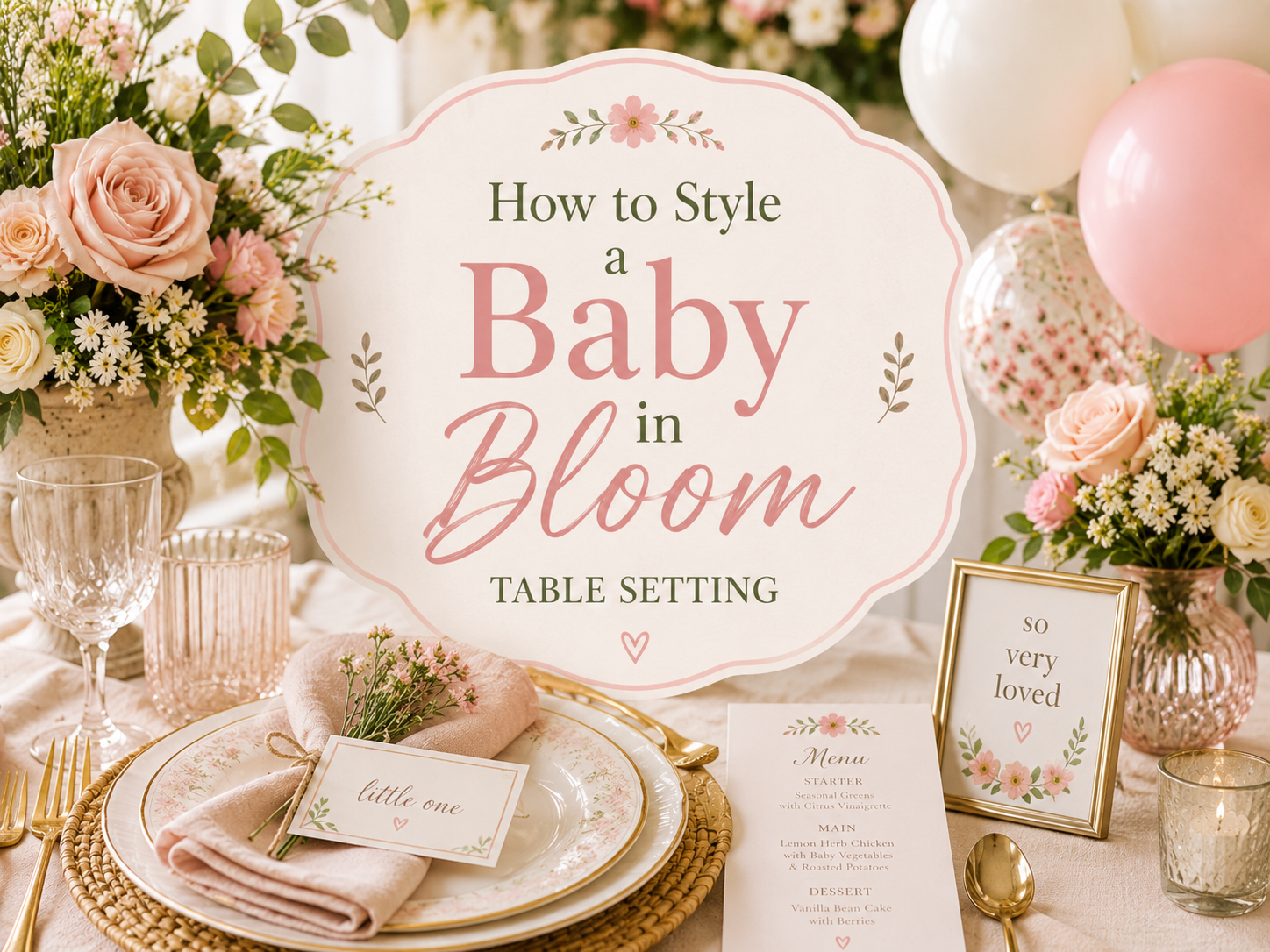
How to Style a Baby in Bloom Table Setting
Baby in Bloom · 2026
How to Style a Baby in Bloom Table Setting
Linens, place settings and the small printed details at every seat — five table styling directions for a soft, botanical baby in bloom celebration.
A genuinely beautiful baby in bloom table setting is built well before any flowers go down — in the linen choice, the layered textures, and the small printed pieces waiting at each seat. This guide focuses entirely on that layer of the table: five styling directions for linens and place settings, plus practical tips for getting place cards, napkin folds and pattern mixing right.
Guests rarely remember the centerpiece by name a week later — but they remember how the table felt to sit at. That quiet impression comes almost entirely from what’s right in front of them: the linen, the napkin, the small card with their name on it.
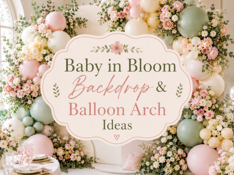
01. Blush & Sage Table Setting
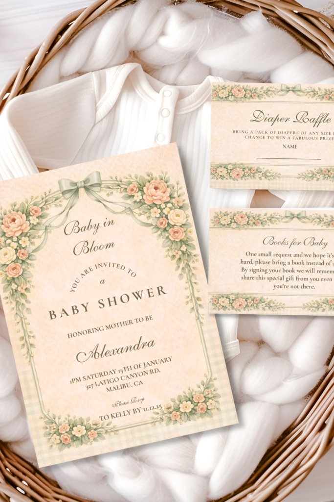
The most classic and romantic of the five — soft blush pink linen as the base, with muted sage napkins folded simply and laid at an angle rather than perfectly squared, and gold-rimmed chargers beneath each plate as the single consistent metallic note across the table. This pairing reads as gentle and timeless rather than precious, especially when the blush tone leans warm and dusty rather than bright bubblegum pink.
Keep the glassware simple and classic — clear stemware rather than colored glass — so the blush and sage palette stays the visual focus rather than competing with a third or fourth color introduced through the glassware. A single sprig of greenery laid across the folded napkin at each place, tied with a thin ribbon in the same sage tone, adds a small botanical touch at the individual setting level without straying into centerpiece territory.
Matching Stationery
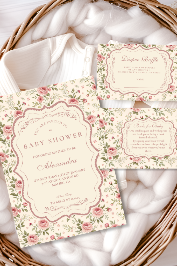
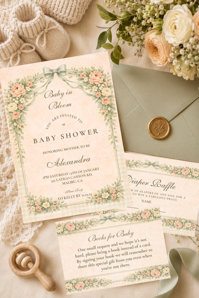
This table setting direction pairs naturally with the Blush Sage Rose Arch collection — the same soft blush and sage palette carried from the invitation suite to every place setting. The Blush Sage Rose Arch Baby Shower collection — fully customizable with the parents’ names, date, and shower details.
02. Dusty Blue Table Setting
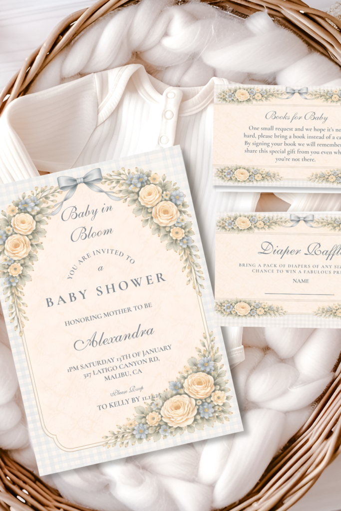
A cooler, fresher take on the same soft botanical foundation — dusty blue linen or a blue-toned napkin against a crisp white or cream tablecloth, paired with modern, clean-lined flatware and glassware rather than anything heavily ornate. This direction reads as fresh and airy, and it’s a strong choice for a boy or gender-neutral shower without ever feeling like a generic “boy blue” table.
Modern flatware with a simple matte or brushed gold finish, rather than polished silver, keeps the table feeling soft and warm despite the cooler linen tone. A folded napkin in dusty blue, set against white or cream plates, gives the eye a clear, uncluttered resting point — this setting works best when it stays relatively simple, letting the cool-toned linen and one clean metallic accent do most of the visual work.
Matching Stationery
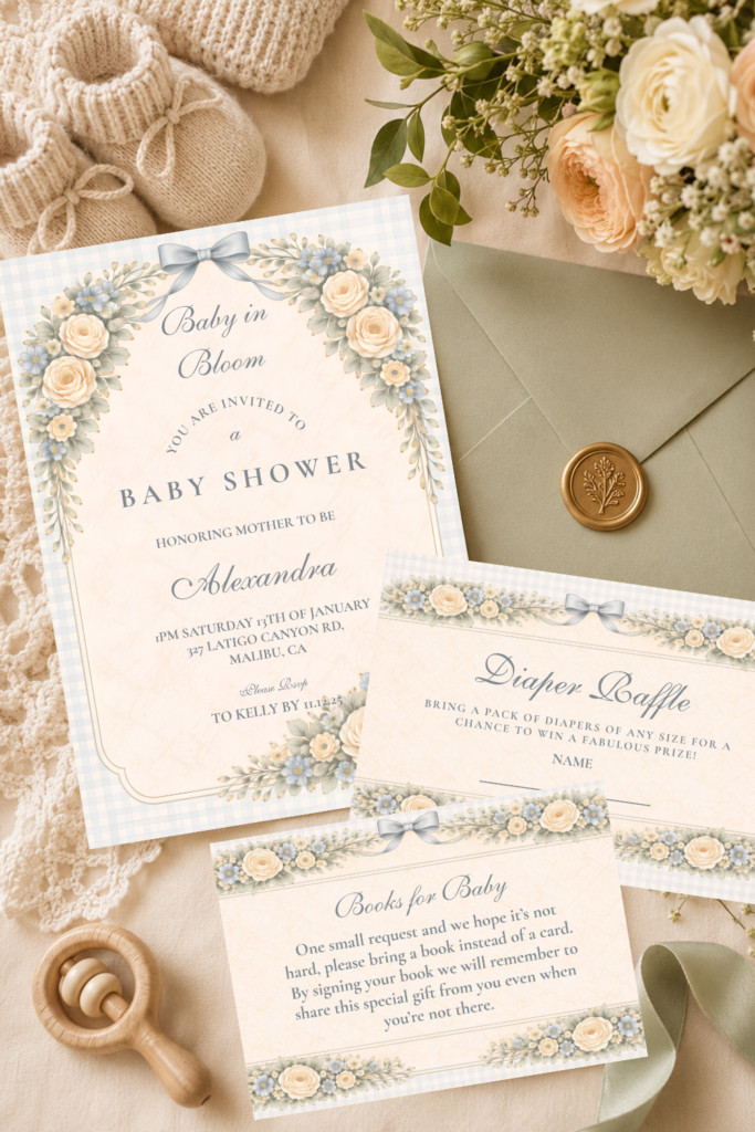
This table setting direction belongs with the Dusty Blue Rose Arch collection — the same cool, fresh palette carried from the invitation suite to the table. The Dusty Blue Rose Arch Baby Shower collection — fully customizable with the parents’ names, date, and shower details.
03. Terracotta & Warm Table Setting
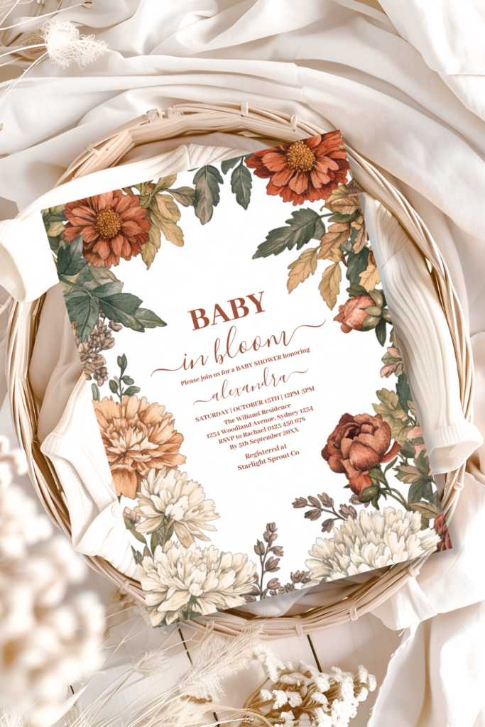
The warmest and most texturally rich of the five — warm terracotta or rust-toned linen, paired with rattan or natural wood chargers rather than ceramic or glass, and woven or linen napkins in cream or warm taupe. This setting leans boho without losing the softness that defines the broader theme, and the natural textures of rattan and wood add genuine tactile interest that flatter linens alone can’t provide.
Layer textures deliberately here: a woven charger beneath a smooth ceramic plate, a linen napkin with visible slub texture, and a simple raffia or twine tie rather than a polished ribbon. This is the one setting in the group where mixing natural materials — wood, rattan, linen, a touch of warm metal — is the whole point, rather than something to keep minimal as in the cooler, cleaner settings above.
Matching Stationery
This table setting direction connects to the Terracotta Floral Baby in Bloom collection — the same warm, earthy palette carried from the invitation suite to the table. The Terracotta Floral Baby in Bloom Shower collection — fully customizable with the parents’ names, date, and shower details.
04. Wildflower Meadow Table Setting
The most eclectic and whimsical of the five — a single small wildflower or sprig tucked into each folded napkin rather than arranged in a vase, with linens and napkins in a soft, slightly mismatched mix of pastel tones rather than one uniform color. The overall effect should feel just-picked and a little spontaneous, as though someone walked through a meadow on the way to setting the table.
Don’t over-coordinate the napkin colors here — two or three soft, complementary pastel tones mixed across the table, rather than one single repeated color, reinforces the gathered, eclectic quality that makes this direction distinct from the more uniform settings above. A simple twine or thin ribbon tie holding the tucked-in wildflower keeps the look from feeling messy rather than intentionally loose.
Matching Stationery
This table setting direction is the natural match for the Baby in Bloom Spring Wildflower collection — the same loose, multicolor botanical illustration carried from the invitation to the table. The Baby in Bloom Spring Wildflower collection — fully customizable with the parents’ names, date, and shower details.
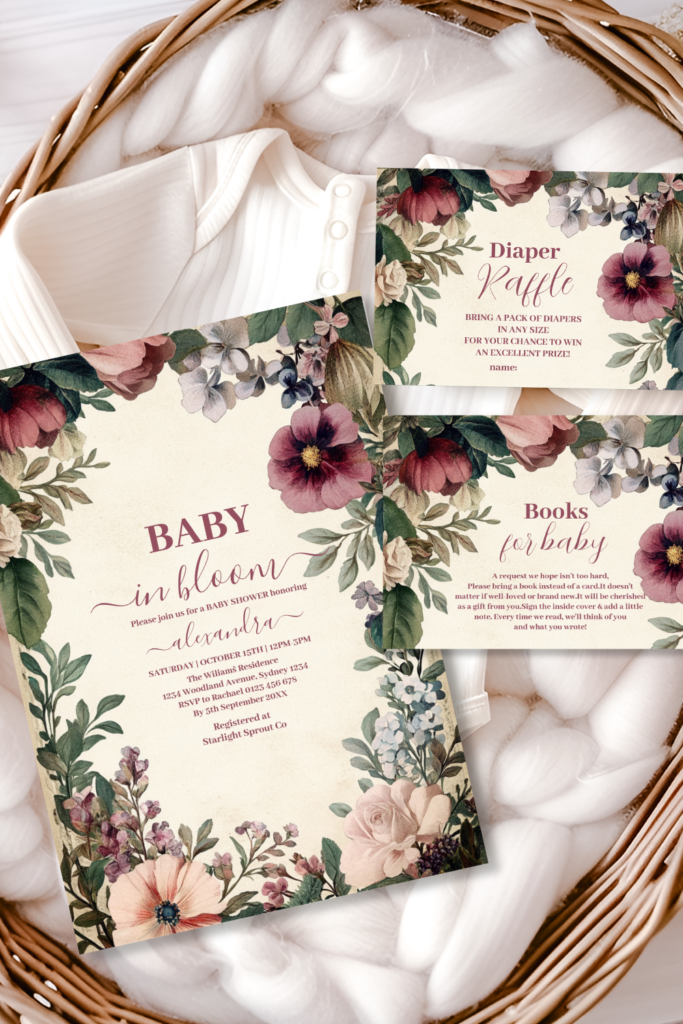
05. Heirloom & Vintage Table Setting
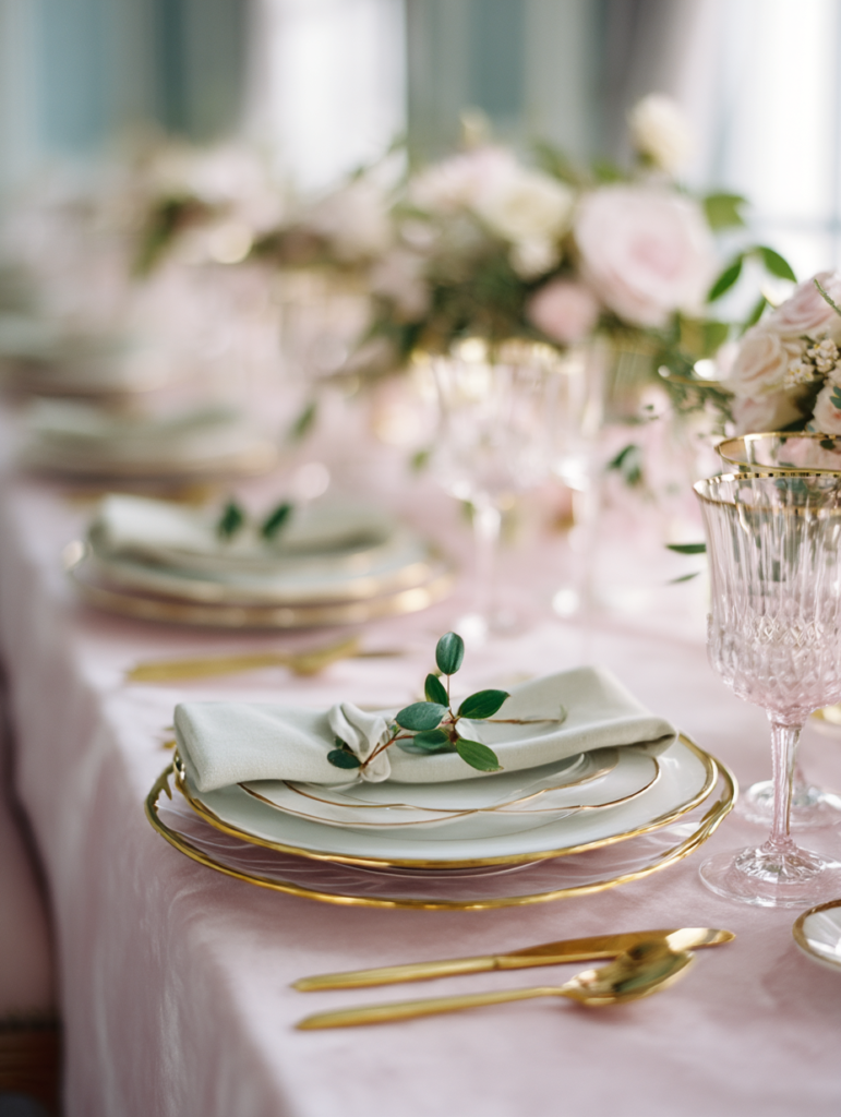
The most nostalgic and timeless of the five — lace-trimmed linen napkins, antique-inspired china patterns (or simple white china with a delicate gold rim, if true antique pieces aren’t available), and soft gold flatware rather than contemporary stainless steel. This setting evokes a treasured family table rather than a trend-driven one, and it photographs beautifully in soft, warm light.
Mismatched vintage-style china across different place settings, rather than one uniform pattern repeated at every seat, reinforces the heirloom quality — a few different but harmonious patterns, all in soft whites and creams with gold detail, read as collected over time rather than purchased as a matching set. A lace or crocheted napkin tie, rather than ribbon, completes the antique feel down to the smallest detail.
Matching Stationery
This table setting direction pairs with the Soft Blush Floral Heirloom collection — the same gentle, vintage-inspired botanical illustration carried from the invitation suite to the table. The Soft Blush Floral Heirloom Baby Shower collection — fully customizable with the parents’ names, date, and shower details.
06. Styling Tips for Place Cards & Menus
The small printed pieces at each seat are where the table setting and the invitation suite meet — a handful of practical principles make sure they meet well.
- Layer textures before adding pattern — a textured linen napkin under a smooth plate, with a simple printed place card on top, gives the eye three distinct surfaces to read before any floral pattern is introduced. Adding a busy patterned napkin on top of an already-patterned charger tends to compete rather than layer well.
- Keep napkin folds simple — a basic rectangle fold laid at a slight angle, or a loose roll tied with ribbon or twine, both photograph better and read as more genuinely elegant than an elaborate fan or pocket fold. The goal is a soft, slightly undone quality, not precision origami.
- Match place cards to the palette, not just the theme — a place card in the exact blush, sage, dusty blue or terracotta tone of the chosen direction reads as intentional; a generic floral place card in unrelated colors breaks the cohesion the rest of the table has built. Pull the place card from the same stationery suite as the invitation whenever possible.
- Use the menu card as a small anchor point — propped against a glass or laid flat at the top of the plate, a menu card in the same paper texture and typography as the rest of the suite gives each setting one more small, considered detail without adding any extra cost.
- Mix patterns by keeping one constant — if linen, china and stationery each carry their own small pattern, hold the color palette steady across all three rather than the pattern itself. A floral napkin, a striped runner and a botanical place card can sit together happily as long as they all pull from the same three or four colors.
Invitations & Stationery
Invitations & Stationery
The invitation a guest opens weeks before the shower is, in a real sense, the very first place setting decision — it establishes the exact palette and paper texture that every linen, napkin and place card at the table will later need to match. A table set beautifully in colors that don’t quite relate to the invitation guests already saw reads as two separate decisions rather than one considered celebration.
Choosing your stationery suite before sourcing linens, chargers or flatware means every other table decision has a clear, exact reference to work from — the precise blush, the precise sage, the precise gold. Place cards and menu cards pulled from the same suite as the invitation, as covered in Section 06 above, are what make a table feel like a single finished thought rather than a collection of separately chosen pieces.
A simple flat lay of the invitation suite alongside a folded napkin and place card in the same palette, photographed before guests arrive, captures the full table story in one frame — from the very first envelope a guest opened to the very last detail waiting at their seat.
All six collections below are fully customizable with the parents’ names, date, and every shower detail.
Shop the Collections
Six Baby in Bloom Stationery Collections
Baby in Bloom
The complete collection — every palette and style within the broader theme in one place.
Blush Sage Rose Arch Baby Shower
Soft blush roses against muted sage greenery — the match for the Blush & Sage table setting.
Dusty Blue Rose Arch Baby Shower
Cool, fresh dusty blue blooms — the match for the Dusty Blue table setting.
Terracotta Floral Baby in Bloom Shower
Warm terracotta and burnt orange tones — the match for the Terracotta & Warm table setting.
Baby in Bloom Spring Wildflower
Multicolor, just-picked wildflower brights — the match for the Wildflower Meadow table setting.
Soft Blush Floral Heirloom Baby Shower
Gentle, vintage-inspired blush florals — the match for the Heirloom & Vintage table setting.
Frequently Asked Questions
Common Questions
How do I set a baby shower table step by step?
Start with the linen as your base layer, then add a charger if you’re using one, the plate on top, a simply folded napkin to one side or on the plate, and flatware in your chosen metallic finish. Place the place card and menu card last, once everything else is in position, since they’re the easiest pieces to adjust and the ones most worth getting precisely right against the palette you’ve chosen from one of the five directions above.
What goes on each place setting?
At minimum: a plate (with or without a charger beneath it), a folded napkin, basic flatware, and a glass. For a baby in bloom table specifically, add a place card in the same stationery suite as the invitation, a small botanical touch like a single tucked sprig or ribbon tie, and a menu card if the shower includes a seated meal. None of these require an elaborate budget — it’s the consistency across all of them, not the quantity, that makes the setting feel complete.
What are budget-friendly linen options?
A plain cream or white tablecloth as the base, with color introduced only through napkins, is generally the most affordable way to get a polished table — a full set of colored tablecloths costs significantly more than a smaller set of colored napkins. Reusable cloth napkins in a solid color, rather than patterned, also stretch further across multiple table-setting directions if you ever want to restyle the same linens for a different palette later.
How do I mix patterns without them clashing?
Hold the color palette constant across every patterned piece — napkin, china, place card — rather than trying to match the patterns themselves, as covered in Section 06 above. A floral napkin, a striped table runner and a botanical place card can sit together comfortably as long as all three pull from the same three or four colors in your chosen palette. The moment a new, unrelated color enters through any one piece, the mix starts to feel cluttered rather than intentionally layered.
Baby in Bloom · 2026
Set the Tone Before the Table Is Set
Fully customizable soft floral stationery — add the parents’ names, date and shower details online.