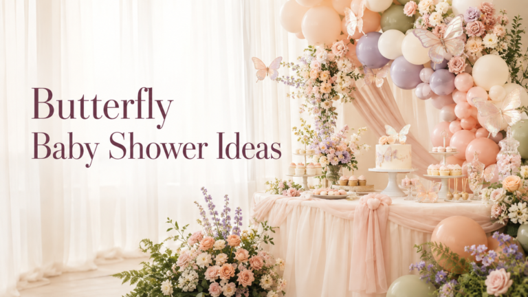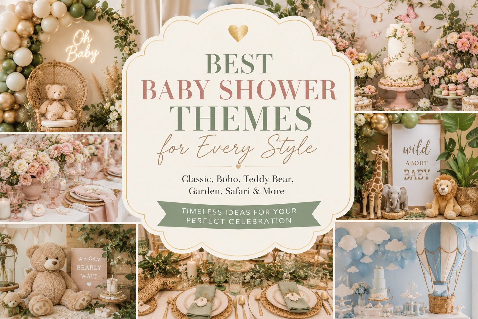
Best Baby Shower Themes for Every Style
Baby Shower Theme Guide
Best Baby Shower Themes for Every Style
Organized by aesthetic register rather than trend — because the right theme is the one that looks like the guest of honor, not the one that looks like everyone else’s shower from last season.
The theme is the first planning decision and the most consequential one — not because the decorations depend on it, but because the feeling of the whole celebration depends on it. A theme that belongs to the guest of honor’s actual taste produces a shower where guests walk in and think “this is exactly her.” A theme chosen because it is trending produces a shower that is beautiful in a way anyone could have planned. This guide organizes themes by the aesthetic register they belong to, so the decision starts in the right place.
Four aesthetic families, each with a set of theme directions that belong to it. The whimsical and playful family, where imagination leads. The warm and nostalgic family, where comfort and sentiment set the tone. The natural and organic family, where texture and the natural world anchor everything. The modern and editorial family, where visual precision and design consciousness produce a shower that looks styled rather than decorated. Find the family first; choose the specific theme within it.
“The best baby shower theme is the one that looks like the guest of honor — not the one that looks like everyone else’s shower from last year.”
Section 01 How to Choose a Theme That Actually Fits
Most theme guides present themes as equal options in an alphabetical or category list — bears beside botanical beside celestial beside dinosaurs, as though the choice between them were simply a matter of preference. It is not. Themes belong to aesthetic families, and choosing within the right family is more important than choosing a specific theme. A guest of honor who loves warmth and sentiment and the specific comfort of something soft and loved will feel most celebrated by a theme in the warm and nostalgic family — not because bears or vintage or storybook are the “correct” themes, but because the entire feeling of that aesthetic family matches her taste. The same applies to every family.
Family 01
Whimsical & Playful
Themes that lean into imagination, fantasy, and joy: fairy, dragon, space, silly goose, mythological. Suits guests of honor who are fun-first, who love character and storytelling, who want the shower to feel genuinely celebratory rather than tastefully restrained. The whimsical family rewards color confidence and motif specificity — the more particular the theme, the more memorable the celebration.
Family 02
Warm & Nostalgic
Themes built on comfort, softness, and the feeling of something beloved: teddy bear, vintage storybook, honey and cream, classic nursery. Suits guests of honor who are sentimental, who value warmth over trend, who want guests to feel immediately at home in the room. The warm and nostalgic family rewards texture and material quality — the more organic and handmade-feeling the execution, the more it reads as genuinely considered.
Family 03
Natural & Organic
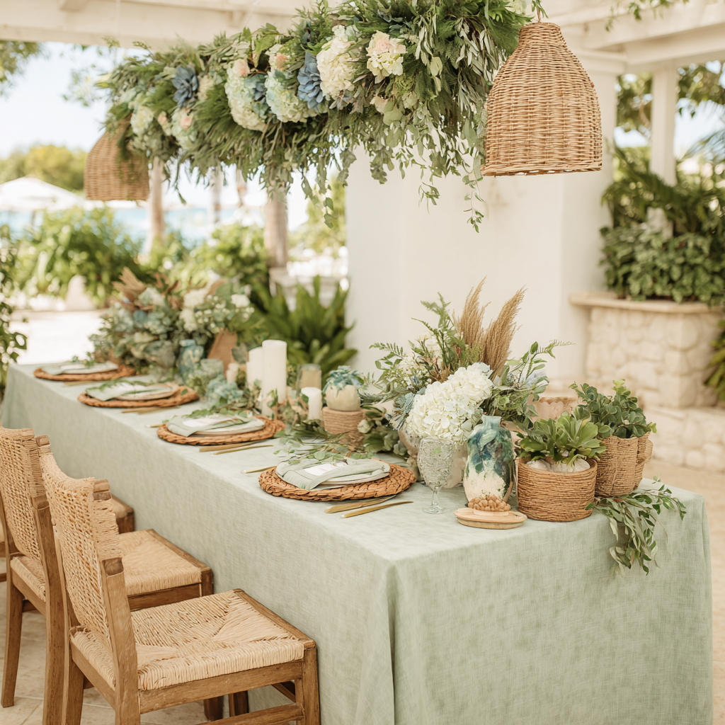
Themes rooted in the natural world: botanical, boho, safari, sea animals, woodland, garden. Suits guests of honor who are drawn to texture, to earthy palettes, to the feeling of a celebration that belongs outdoors even when it is inside. The natural and organic family rewards material authenticity — dried botanicals rather than silk flowers, rattan rather than plastic, natural linen rather than synthetic fabric.
Family 04
Modern & Editorial
Themes with a strong visual point of view and graphic aesthetic: preppy, celestial, geometric botanical, modern monochrome. Suits guests of honor who follow interior design as much as baby trends, who want the shower to look like a styled shoot rather than a decorated room, who prefer considered restraint over abundance. The modern and editorial family rewards proportion and negative space as much as decoration.
Styling Tip — Theme vs. Palette
If you cannot decide between two themes within the same aesthetic family, choose the one with the palette you love more — not the one with the motif you love more. You will look at the palette all day: in the linen, the balloons, the cake, the invitation, the favor tags, the stationery at every place setting. The motif will be visible in specific details — the bear on the cake topper, the fairy on the invitation illustration, the goose on the banner. A theme with the right palette and a motif you like is always more beautiful than a theme with the perfect motif executed in the wrong colors. This is the single most important theme-selection insight available, and it is the one most consistently ignored by hosts who choose themes before they choose palettes.
Section 02 Whimsical & Playful Themes
The whimsical family contains the most distinctive and most memorable theme directions available — the ones that guests describe afterward using the guest of honor’s name (“it was so her”) rather than the theme name.
2.1 Space & Celestial Theme
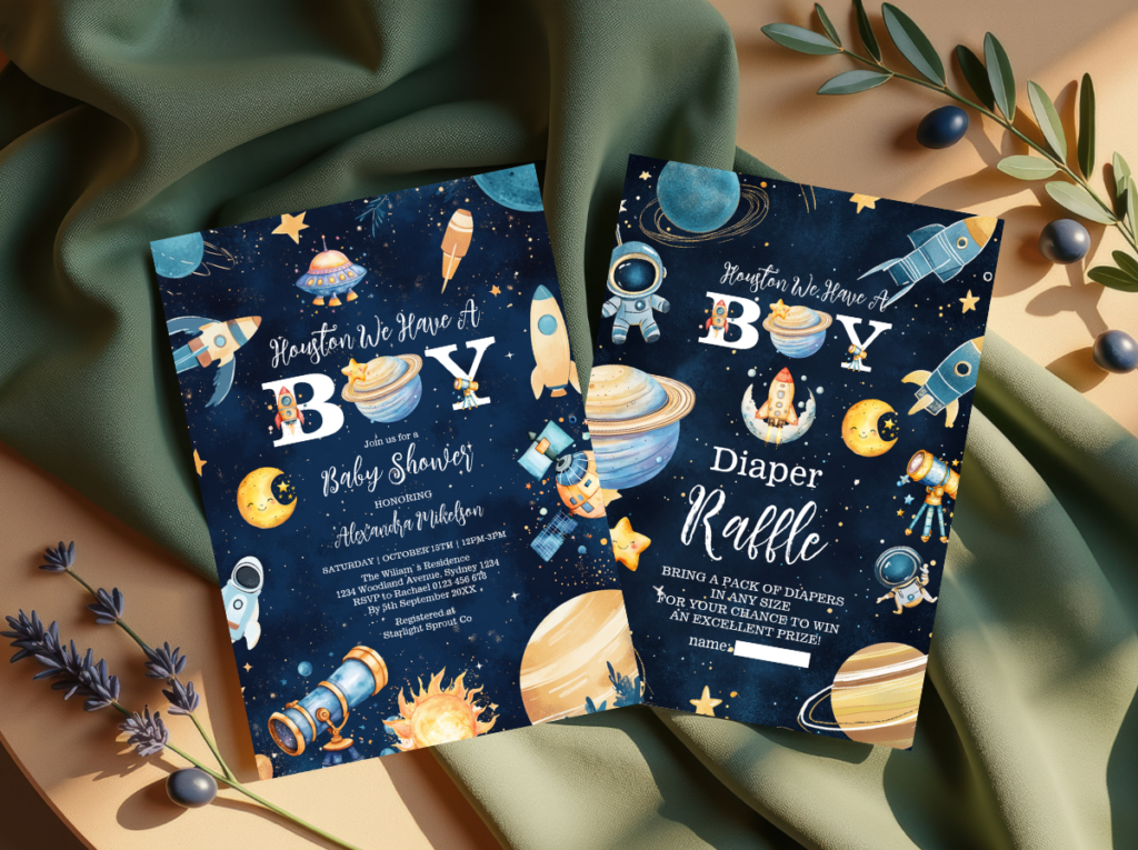
The space and celestial theme is one of the most gender-neutral and most seasonally flexible of the whimsical family — it works in January as naturally as in July, for any palette direction, and for any guest list. The motif vocabulary is rich: stars, moons, planets, galaxies, rocket ships, and the specific visual language of the night sky. The palette decision is what separates the sophisticated execution from the generic one. Bright primary star shapes on a white background reads as a children’s bedroom decoration; a palette of warm midnight navy, dusty lavender, and warm cream gold reads as a genuinely beautiful celebration of the universe the baby is arriving into.
The texture vocabulary for the space direction is more limited than most themes — the visual drama of the night sky is primarily graphic rather than tactile, which means the material decisions matter more than usual to prevent the theme from reading as flat. Velvet in a deep navy or midnight tone provides the texture layer that the celestial palette otherwise lacks; gold luster and metallic detail (in table setting, in invitation finishing, in the favor packaging) provides the shimmer that suggests starlight without requiring any literal star-shaped decoration. The invitation for this direction should carry the key palette colors — warm midnight and gold — and a bear or celestial illustration in the suite’s style, so the transition from paper to room feels visually coherent.
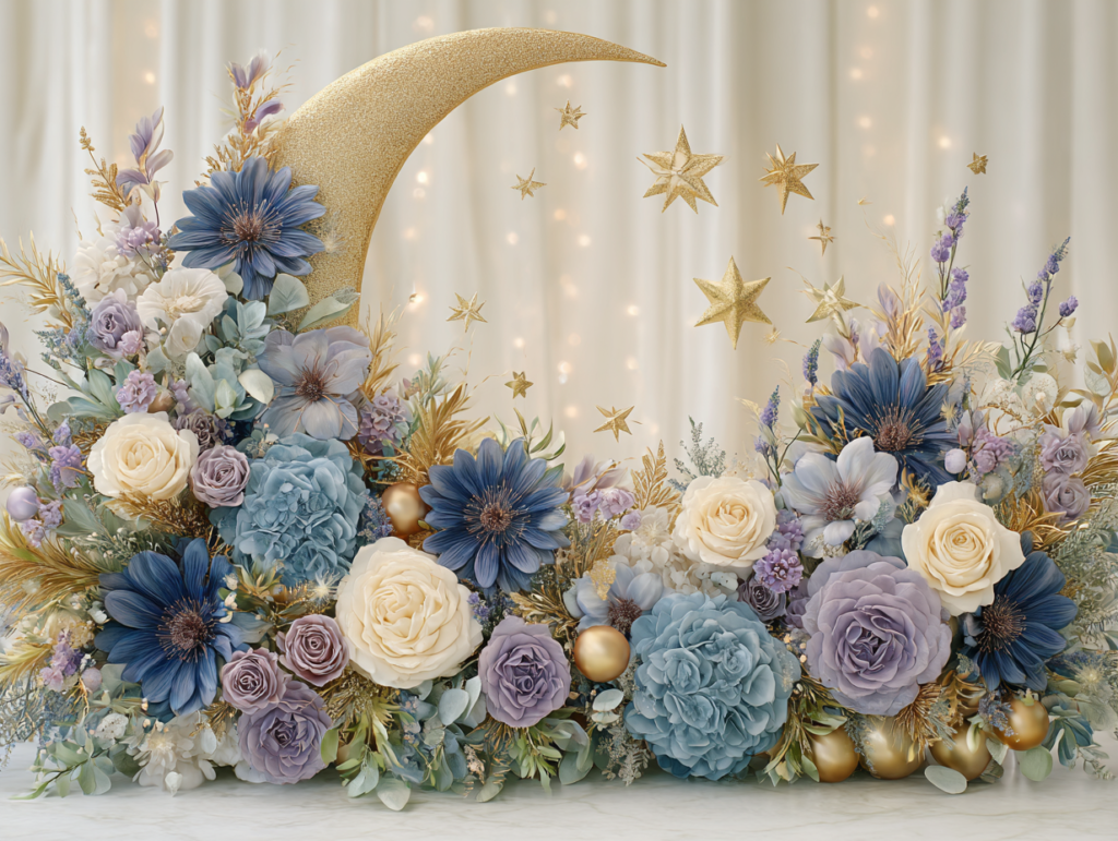
The Space Theme collection brings the celestial direction into a complete stationery suite — warm midnight and gold tones with star and moon motifs across every printed element from invitation to favor tag.
2.2 Fairy & Enchanted Theme
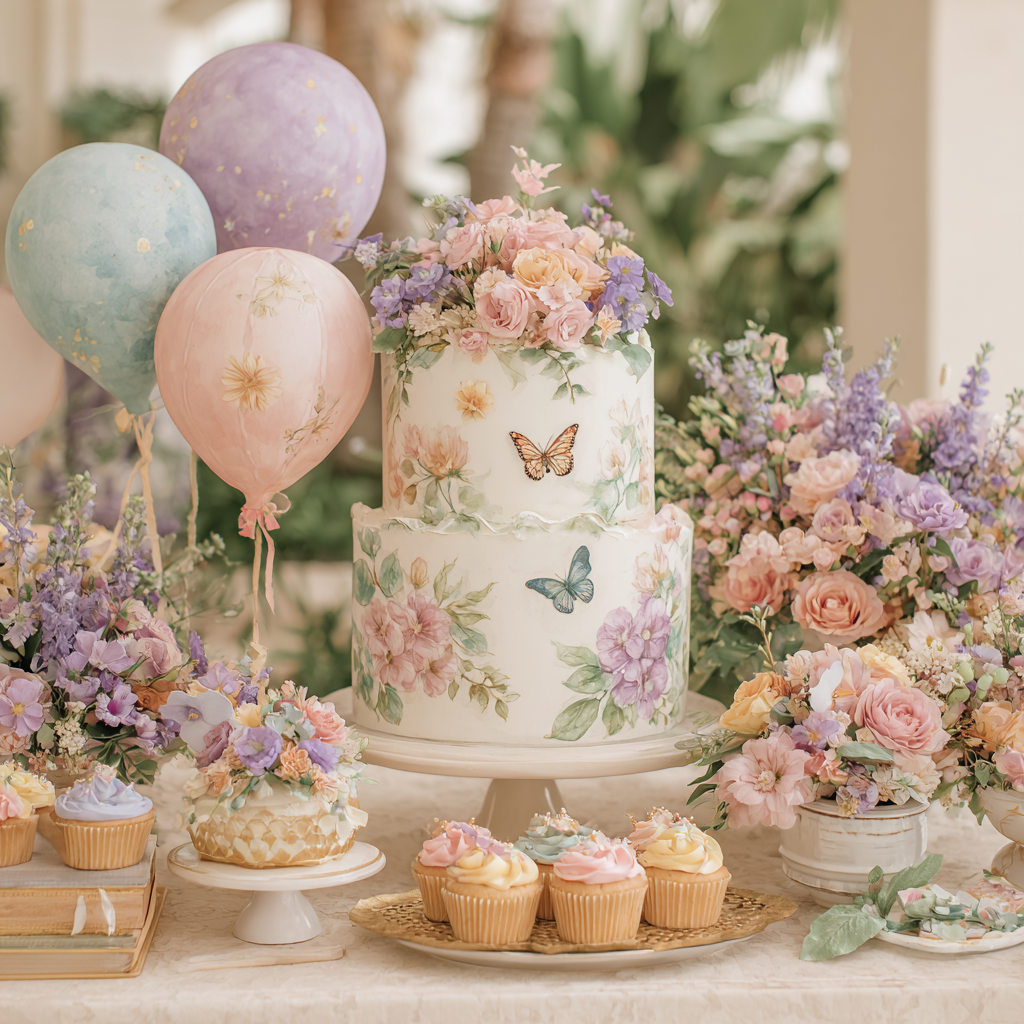
The fairy and enchanted theme is the whimsical family direction with the most overlap into the natural world — it is forest magic, not toy-box magic, which gives it a more sophisticated visual register than many guests expect when they hear “fairy theme.” Mushrooms, toadstools, woodland animals, fern fronds, and delicate butterfly or dragonfly motifs are the decorative vocabulary; the palette is soft dusty rose, sage green, and warm cream with gold as the sparkle accent. The enchanted quality comes from the material choices as much as the motifs: dried botanicals and real pressed flowers in the table settings, string lights or fairy lights that create ambient glow rather than strong overhead lighting, an organic balloon arch in the palette’s muted pastels that reads as cloud-soft rather than festive.
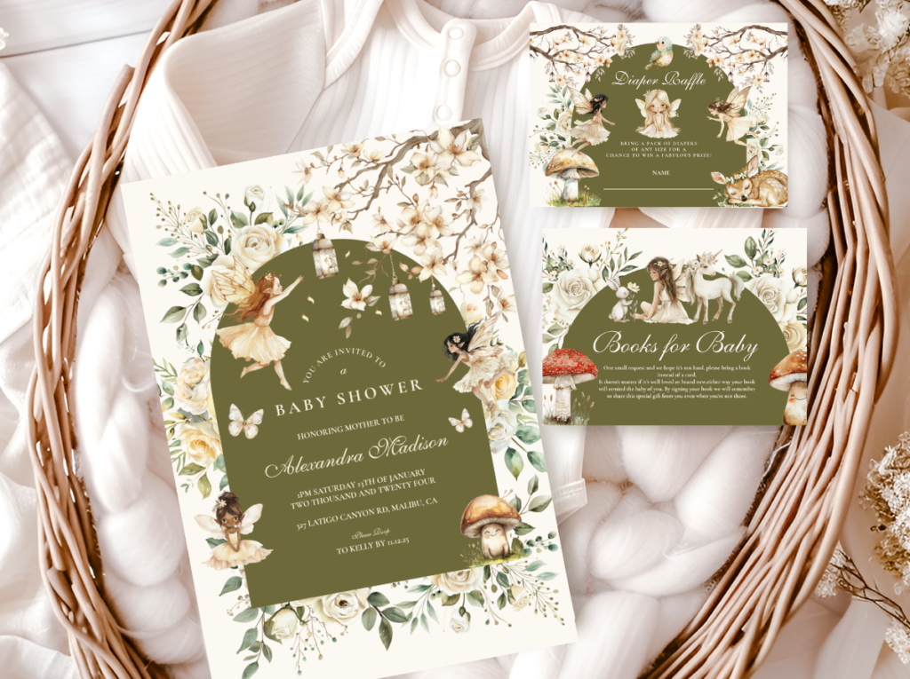
The fairy direction rewards the invitation above all other elements — more than almost any other theme, the quality of the illustration on the invitation establishes whether the world being created feels genuinely enchanted or merely fairy-themed. An illustration that carries the specific visual language of the woodland fairy world — organic line work, a muted pastel palette, botanical accuracy in any plant elements — creates the expectation that the room will be beautiful in a specific way. An invitation in generic pastel pink with a cartoon fairy clip art creates a very different expectation, and the room will have to work much harder to overcome it.
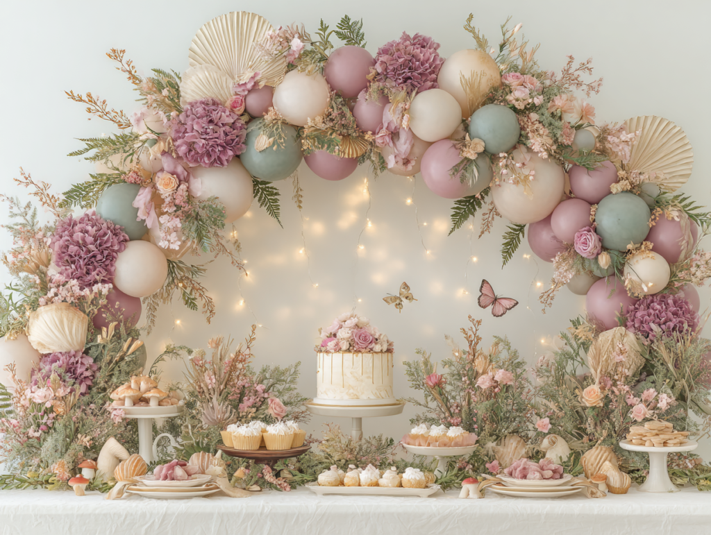
The Fairy Theme collection brings the woodland enchanted direction into stationery — soft dusty rose, sage, and warm cream with fairy and botanical motifs in an illustration style that reads as genuinely magical rather than generic.
2.3 Dragon Theme
The dragon theme is the most unexpected choice in the whimsical family and the one that photographs most extraordinarily when executed with genuine design intention — because dragons, unlike most baby shower motifs, have no established generic aesthetic. There is no standard dragon shower that serves as the default visual reference, which means every execution starts from scratch and the result is inherently more distinctive. The dragon theme works for any gender, for any palette direction, and for any guest list willing to embrace a guest of honor who loves fantasy, mythology, and the specific magic of a creature that belongs to stories.
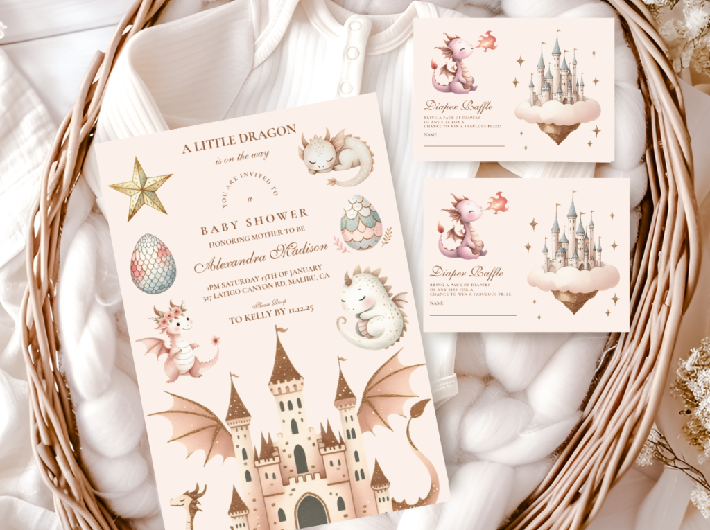
The palette decision is where this theme succeeds or fails. A dragon in deep emerald green and warm gold on a cream background reads as magical and beautiful — the dragon is a fantasy creature rendered in the sophisticated tones of a well-illustrated book, and the room that continues this palette is unmistakably designed. A dragon in primary red and black reads as aggressive and reads as a child’s birthday party decoration. The texture vocabulary for this direction borrows from the fairy family — dried botanicals, warm lighting, organic materials — rather than from the space family’s more graphic approach, because the dragon’s world is one of ancient forests and magic rather than the cosmos. The invitation illustration is the critical element: a dragon drawn with the soft, warm quality of a fairy-tale illustration rather than the hard edges of a gaming graphic immediately establishes the correct aesthetic register for everything that follows.
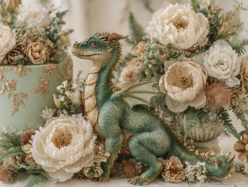
The Dragon Theme collection brings the fantasy direction into stationery — emerald and warm gold with a dragon illustration rendered in a story-book quality that reads as magical rather than aggressive, for any palette direction.
2.4 Silly Goose Theme
The silly goose theme is the most joyful and the most honest celebration of humor available in baby shower planning — it acknowledges directly that the arrival of a baby is not just a solemn or beautiful moment but a genuinely funny one, and that the person at the center of the celebration is someone who does not take herself too seriously. This is the theme that works best for guests of honor who are quick to laugh, who find sincerity in the absurd, and who would be more delighted by a beautifully illustrated goose on their invitation than by a perfectly considered botanical motif.
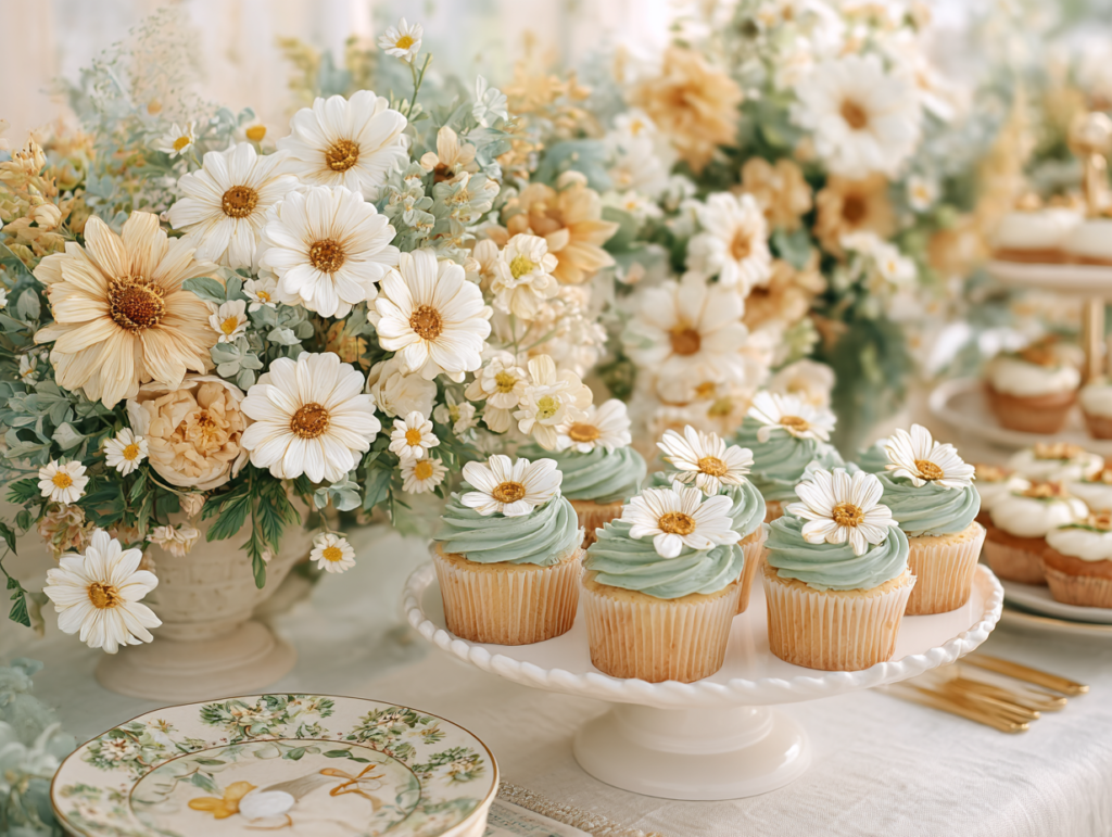
The humor of this theme works only when the design intention is genuine and the palette is treated with the same seriousness as any other direction. A silly goose theme in a carefully considered palette of dusty sage green, warm cream, and soft golden yellow — with a whimsically illustrated goose on warm ivory card stock and the suite’s typography consistent throughout the printed layer — reads as charming and beautifully designed. The same theme in primary colors, plastic novelty goose decorations, and banner lettering reads as a novelty rather than a celebration. The goose is funny; the palette is not. The palette is as carefully chosen as any other direction; the humor lives in the motif and the warmth of the celebration, not in the aesthetic register of the design.
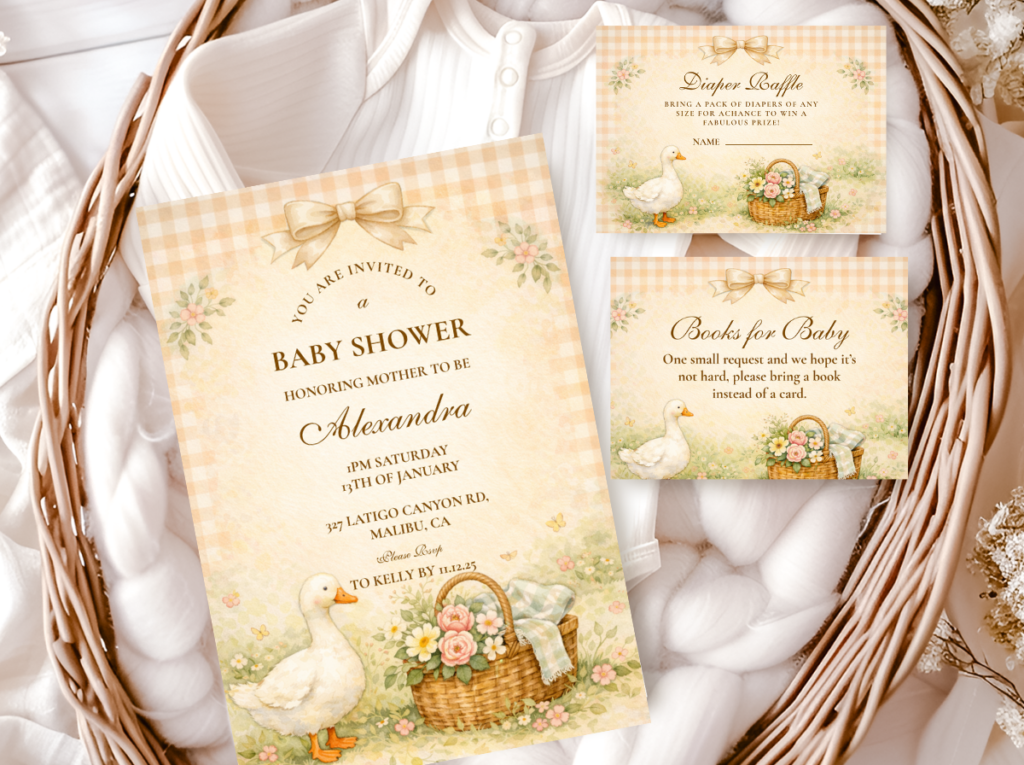
The Silly Goose collection brings the joyful direction into stationery — a charmingly illustrated goose in a warm, considered palette that treats humor as a design choice rather than a novelty, for the guest of honor who celebrates being wonderfully silly.
Styling Tip — Whimsical Palette
Whimsical themes work best when the palette is taken seriously even when the motif is not. A silly goose theme in a carefully considered dusty sage and warm cream palette reads as charming and genuinely designed; the same theme in primary colors and plastic novelty props reads as a children’s birthday party that happened to have adult guests. A space theme in warm midnight navy and muted gold reads as sophisticated and beautiful; the same space theme in bright blue and silver with glow-in-the-dark star stickers reads as a child’s bedroom decoration. The motif is allowed to be playful, unexpected, or even deliberately absurd. The palette is never allowed to be lazy. This is the distinction between a whimsical shower that guests describe as “the most fun and most beautiful” and one they describe simply as “fun” — both are compliments, but only one stays in memory as a designed celebration.
Section 03 Warm & Nostalgic Themes
The warm and nostalgic family is the most universally appealing of the four — because warmth and the feeling of something cherished are universal values rather than specific aesthetic preferences. Guests who do not follow interior design trends, who have no strong personal aesthetic, who simply want the shower to feel warm and beautiful: this family is the correct choice for any guest of honor about whom you are genuinely uncertain. It is also the family with the highest ceiling — a beautifully executed warm nostalgic shower can be among the most emotionally resonant celebrations of any kind.
The Teddy Bear Direction
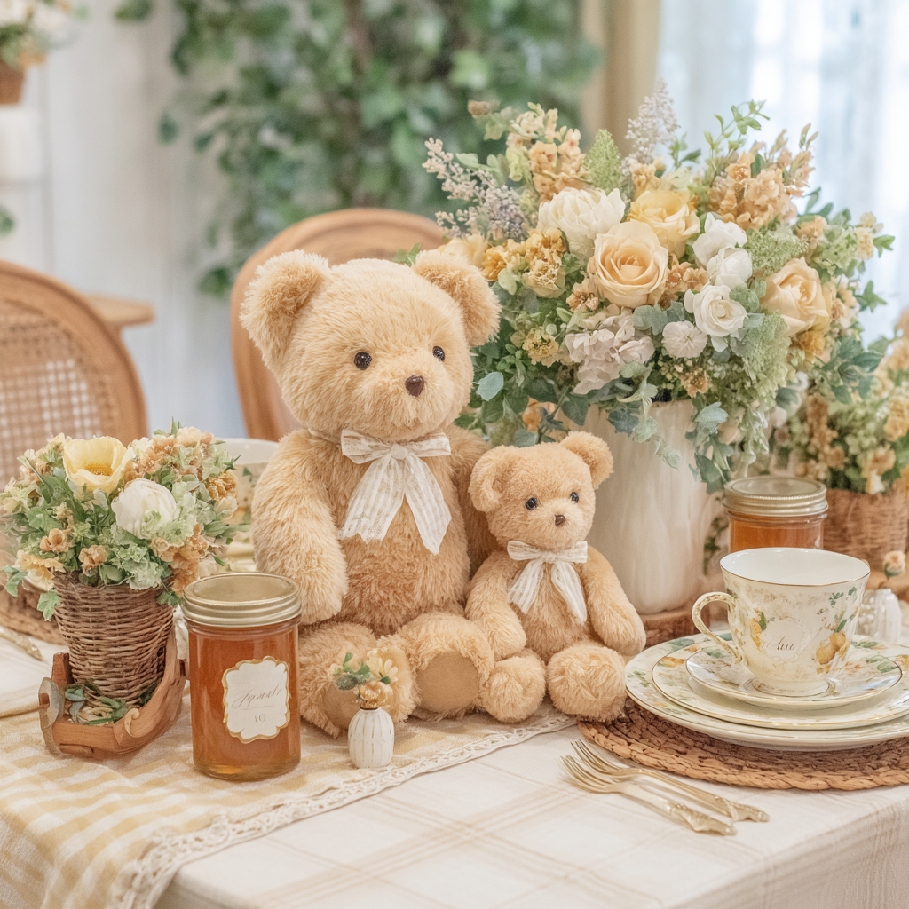
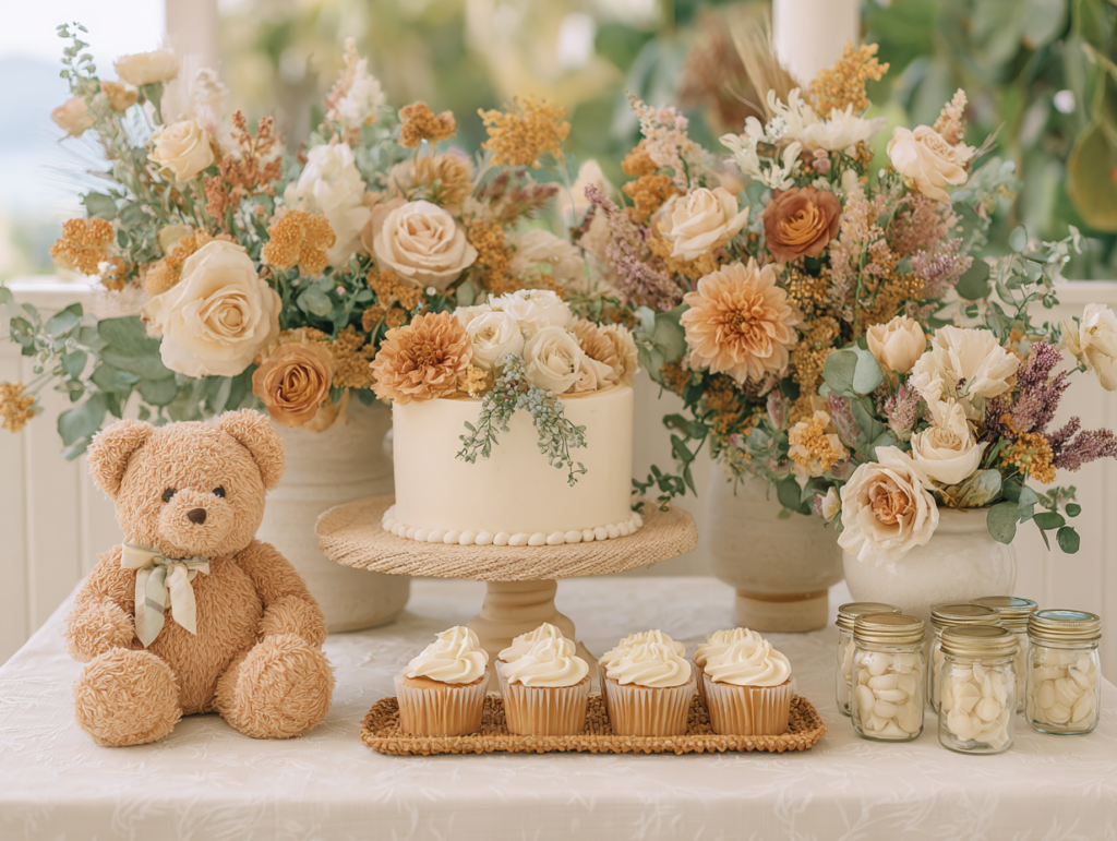
The teddy bear theme is the most emotionally resonant motif in the warm and nostalgic family because it connects to a universal experience — the well-loved bear is an object that almost every guest has a personal memory of, which means the theme operates on a level of feeling that most other themes cannot access. The palette is honey amber, warm cream, and oatmeal, with the natural brown of the plush bear as the warm anchor that makes everything around it glow. The aesthetic works because the bear itself is the most complete thematic prop available — it is the motif, the texture element, the centerpiece focal point, and the natural palette anchor simultaneously. No other theme has a single object that serves all four functions.
The Vintage Storybook Direction
The vintage storybook direction is the warm family theme with the most specific aesthetic requirements — and the most extraordinary results when they are met. The visual quality that defines this direction is illustration: hand-drawn characters and botanical motifs in the style of a well-made children’s book, warm honey and aged-parchment tones, typography that feels calligraphic rather than typeset. The invitation is the most important single element here, even more than in other directions, because the storybook quality lives in the printed layer — in the specific character of the bear or animal illustration, in the hand-lettered quality of the typography, in the warmth of the paper stock. When the invitation is right, the room needs only to echo it in palette and material rather than explain or justify it.
The Honey & Cream Direction
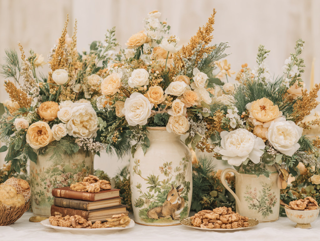
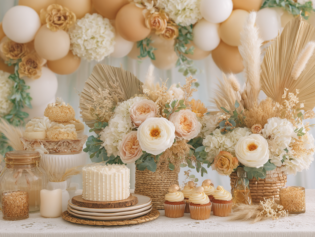
The honey and cream direction is the most palette-forward and least motif-specific of the warm family — it is a feeling more than a theme, and it works for any guest of honor whose aesthetic runs toward natural warmth, organic materials, and the specific beauty of things that look slightly aged and handmade rather than newly produced. Honey jars as both decorations and favors, warm cream linens and rattan vessels, dried botanical arrangements in warm amber and dusty gold tones, a backdrop of warm ivory gathered linen: the room looks like a celebration of warmth itself rather than a celebration of any specific motif. The invitation for this direction should carry the palette without committing to a specific character or animal — a botanical illustration in honey and cream tones, or a hand-lettered design with a honey motif detail, establishes the palette world the room will continue without narrowing the decoration options the way a specific bear or character theme does.
Section 04 Natural & Organic Themes
The natural and organic family is the most texture-rich of the four, which makes it the most forgiving in execution — because natural materials have inherent visual interest that does not require additional decoration to look beautiful. A rattan vessel filled with dried pampas, a linen runner on an unadorned table, a terracotta pot with a succulent on a wooden board: these elements look considered without requiring any additional styling because their materials do the visual work. The natural family is also the most seasonally flexible, because the texture vocabulary of dried botanicals, linen, and natural wood has no strong seasonal association.
The Boho Direction
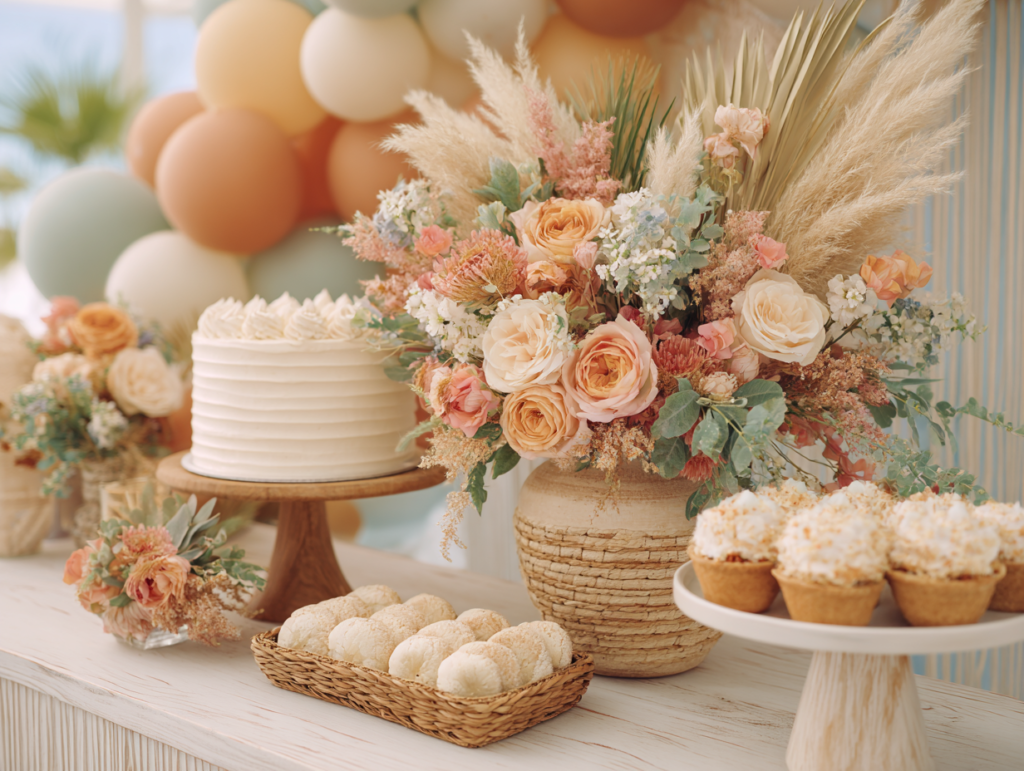
The boho direction is built on texture rather than color, which makes it the most palette-flexible of the natural family. Macrame, dried pampas grass, fringe and tassel details, rattan, woven baskets, and terracotta: these materials define the boho aesthetic before any color decision is made, which means the palette can run from warm terracotta and rust to soft blush and sage to cream and caramel to deep olive and earthy charcoal. The guest of honor who is drawn to this direction typically has a home that references it — woven objects, dried florals, natural material furniture, plants. Bringing the shower palette into dialogue with the aesthetic of her actual life produces the most personally resonant result.
The Safari & Jungle Direction
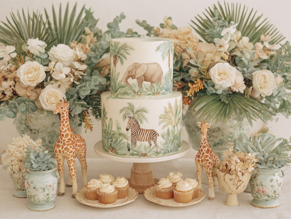
The safari direction is the natural family theme with the widest motif vocabulary — giraffe, elephant, lion, zebra, tropical birds, palm fronds, banana leaves — and the highest risk of generic execution. The risk is palette: bright primary yellow and orange with black safari animal silhouettes is a children’s party aesthetic that produces a shower that reads as birthday rather than baby celebration. The correct palette is warm sage green, caramel, and oatmeal, with animal motifs rendered in the style of natural history illustration rather than cartoon or silhouette. The texture vocabulary for this direction is the most material-specific: woven rattan, natural wood, sisal or jute, leaf textures in the botanical elements. These materials produce the quality of a celebration that looks like it belongs in a beautiful outdoor space rather than a decorated indoor one.
The Sea Animals Direction
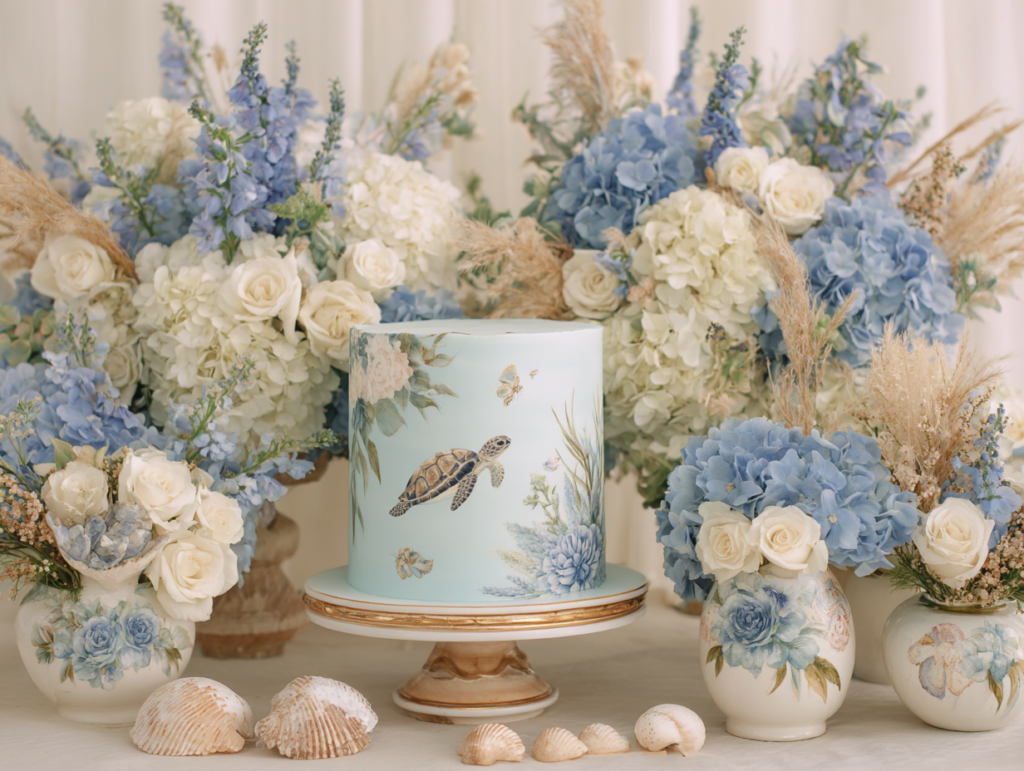
The sea animals direction sits at the intersection of the natural and whimsical families — sea creatures occupy a borderland between the natural world and the fantastical one, which gives this theme more flexibility than either a purely nature-adjacent theme or a purely imaginative one. Octopus, whale, seahorse, crab, turtle, and fish are the motif vocabulary, rendered in a style that matches the palette register chosen: soft watercolor illustration for a warm, gentle coastal aesthetic; clean graphic illustration for a more modern maritime one. The texture vocabulary borrows from both families: driftwood and rope from the natural family, cloud and star shapes from the whimsical family, for a coastal magic quality that suits a wide range of guests of honor.
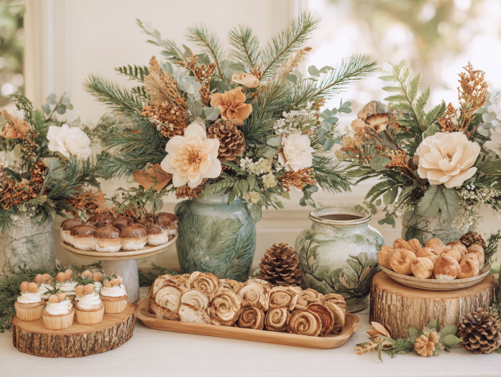
The Woodland Direction
The woodland direction is the natural family theme closest to the fairy direction in visual vocabulary — mushrooms, foxes, owls, deer, fern fronds, acorns, and the specific quality of light that filters through trees — but without the explicitly magical register. Where the fairy theme leans into enchantment and fantasy, the woodland theme leans into the quiet beauty of the real natural world. The palette is forest green, warm brown, rust, and oatmeal cream — the colors of the actual forest floor rather than a fairy-tale rendering of it. This is the direction for guests of honor who love nature in a grounded, practical way rather than a romantic or fantastical one: hikers, gardeners, outdoor enthusiasts who want the celebration to reflect their connection to the natural world.
Section 05 Modern & Editorial Themes
The modern and editorial family is the smallest of the four in terms of theme options but the most specific in terms of aesthetic requirement. The guest of honor for whom this family is correct is someone who notices when a room is well-proportioned, who follows interior design trends as closely as she follows fashion, and who finds most baby shower decoration too busy, too abundant, or too generically sweet. The modern family rewards restraint above all other qualities — the element that is deliberately absent is often as important as the element that is deliberately present.
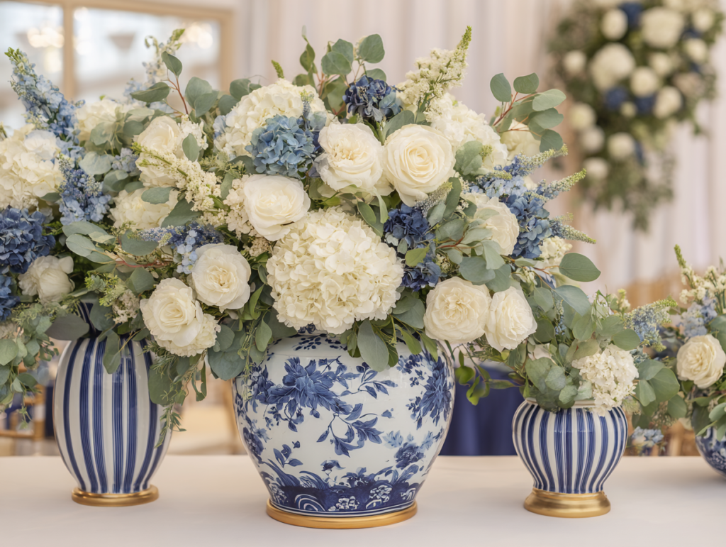
The Preppy Direction
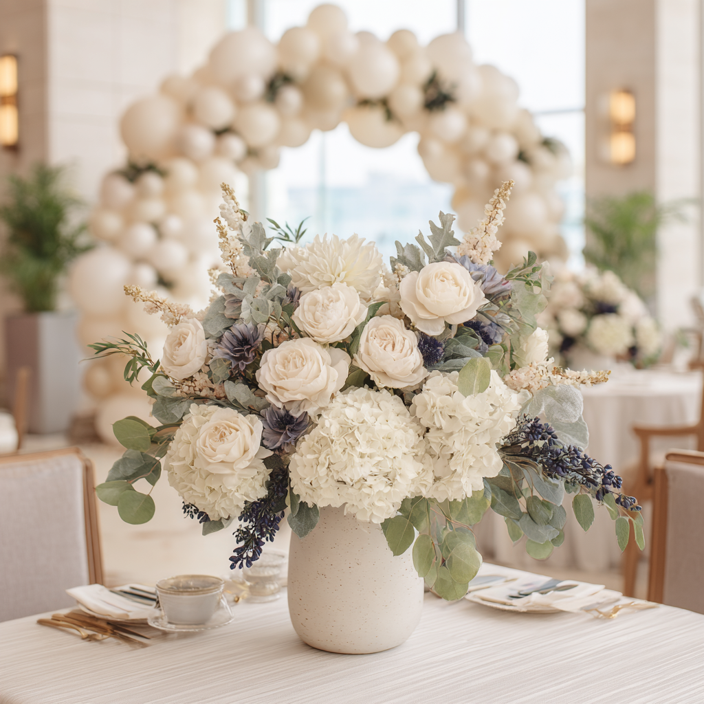
The preppy direction is the most graphic and the most structured of the modern family — it is built on contrast and geometry rather than warmth and softness. Navy and white with gold accents; clean serif typography; crisp pressed linen; the specific precision of a well-set table where every element is exactly in its intended position. This direction suits a guest of honor who has strong aesthetic opinions, who prefers structure to softness, and who would find most traditional baby shower decoration too sweet or too organic. The execution demands are higher than most directions — the room must look considered and deliberately precise rather than warmly abundant — but the result is unmistakably designed.
The Celestial & Astro Direction
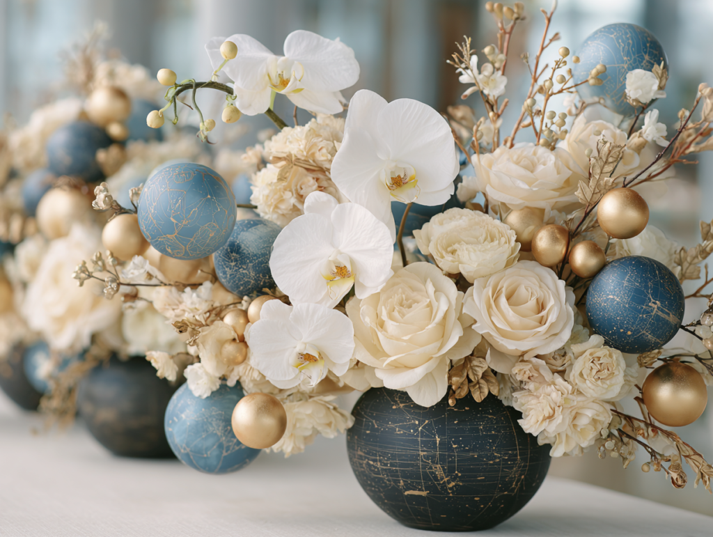
The celestial direction in the modern family is distinct from the space theme in the whimsical family — where the whimsical space theme leans into the imaginative joy of rockets and planets, the modern celestial direction leans into the philosophical and visual beauty of the cosmos as a concept: the celestial sphere, astrological imagery, constellation mapping, the specific graphic quality of a star chart. The palette is darker and more considered — charcoal, deep navy, or warm black with gold and warm cream — and the motifs are more abstract and graphic. This direction suits a guest of honor who has aesthetic opinions about typography and graphic design, who is drawn to objects that look like they were made rather than purchased.
The Geometric Botanical Direction
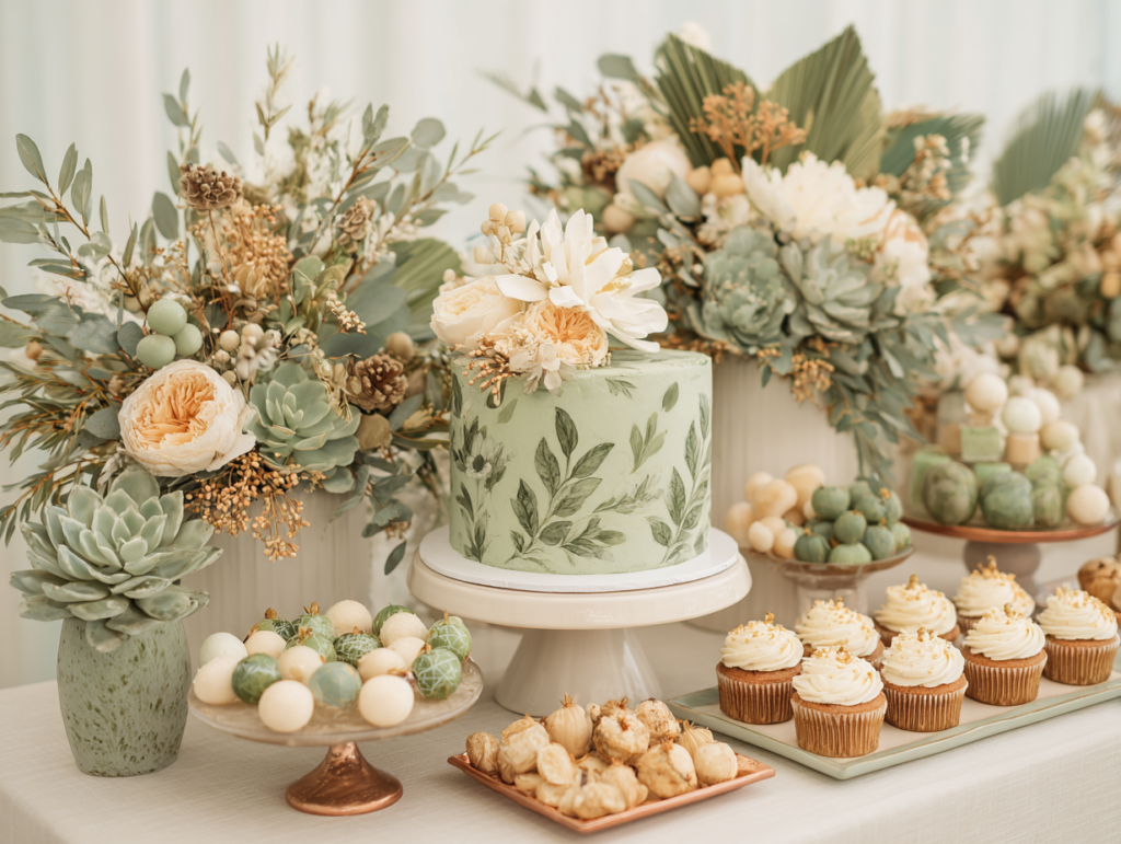
The geometric botanical direction occupies the productive intersection of the natural and editorial families — it uses botanical motifs (leaf forms, flower structures, plant geometries) but renders them in a more precise, graphic style rather than the soft watercolor quality of the natural family. The palette leans toward olive, dusty sage, and warm cream rather than the deeper forest tones, and the decoration vocabulary combines botanical props with geometric vessels (hexagonal terrariums, angular ceramic vessels, structural copper wire frames). This direction is the most interior-design-adjacent of all the themes in this guide — it looks like it belongs in a well-curated contemporary home, which makes it exactly right for the guest of honor who is designing a similarly curated nursery.
Section 06 How to Make Any Theme Look Elevated
6.1 The Palette Rule
Every theme needs three palette roles: a base color, an accent color, and a detail color. The base (approximately 60% of the visual palette) is the neutral that appears in the linen, the wall, the cake base, the invitation paper stock, and the envelope. The accent (approximately 30%) is the theme’s primary identifying color — the dusty sage of the boho direction, the warm midnight navy of the space direction, the dusty rose of the fairy direction. The detail (approximately 10%) is the metallic or contrasting tone that elevates the base and accent out of the expected — matte gold for most directions, warm copper for the rust-adjacent directions, brushed silver for the cooler celestial directions. This 60-30-10 ratio applies to every theme in every family and produces a palette that reads as considered rather than monochromatic or chaotic.
6.2 The Texture Rule
Every theme needs at least three textures minimum: something soft (linen, velvet, plush, fabric), something natural (dried botanicals, rattan, wood, stone, clay), and something printed (the stationery suite — invitation, place card, favor tag, menu card). These three material categories serve different functions. The soft element provides the warmth and comfort quality that makes a room feel celebratory rather than styled. The natural element provides the organic visual interest that prevents a room from reading as flat or commercially produced. The printed element provides the palette consistency and designed quality that connects every detail to a single visual identity. Any theme in any aesthetic family that includes all three material categories will read as more elevated than the same theme executed in only one or two.
6.3 The Stationery Rule
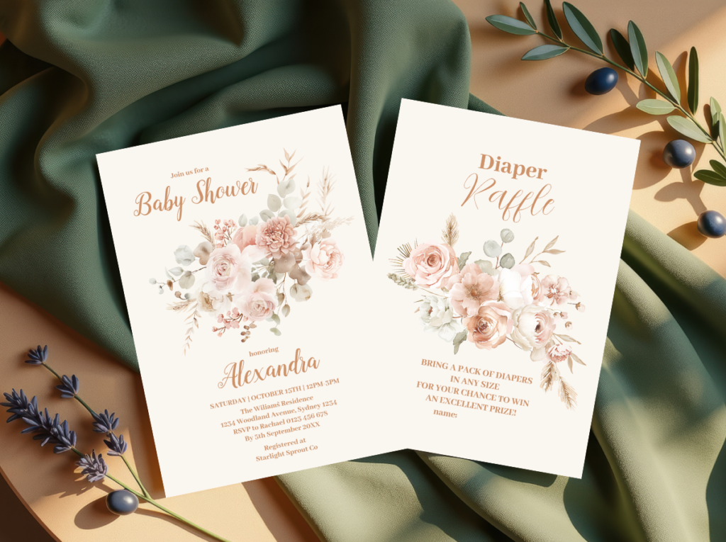
The invitation should be chosen before any decoration is purchased — and the stationery suite it belongs to should supply every printed element in the room. This is the stationery rule, and it produces two results simultaneously: palette consistency guaranteed by the fact that every printed element was produced from the same color files, and a visual contract made with guests before the room is ever seen. The palette on the paper should match the palette in the room; when it does, the theme feels complete from the first envelope to the last favor bag. When it does not — when the invitation is in a different register, a different quality of illustration, or a different palette tone — the room has to overcome the first impression the invitation already created, which is a harder problem than avoiding it by choosing the right stationery first.
Styling Tip — Considered vs. Decorated
An elevated baby shower theme is not more expensive than a generic one — it is more considered. The difference between a shower that looks designed and one that looks decorated is always the same thing: someone made deliberate decisions about palette, texture, and proportion rather than buying everything in the theme aisle of a party supply shop and arranging it on a table. The deliberate decisions are: which palette register does this theme live in (the 60-30-10 rule), which three material categories are represented (soft, natural, printed), and which element should be chosen first to set the visual contract for everything that follows (the invitation). These three decisions cost nothing extra to make. They simply require thought before purchase rather than purchase before thought. Every beautiful shower in this guide was built on exactly this sequence — and the difference between those showers and their generic equivalents is legible to every guest who walks through the door, even those who could not explain what they are seeing.
Section 07 Invitations & Stationery
The theme you choose should be visible in the invitation before it is visible anywhere else. The palette, the motif treatment, the typography, the quality of the illustration: all of these signal the aesthetic world guests are being invited into, before the room is set up, before the decorations are sourced, before any physical space has been changed. When the invitation belongs to the same visual vocabulary as the rest of the celebration — when the dragon on the invitation is illustrated in the same style and palette as the dragon on the banner, the table card, and the favor tag — the theme feels complete and considered. When the invitation was chosen from a different register, the room has to compensate for the first impression it already made.
The practical value of a stationery suite — the full set of printed elements from invitation through favor tag — is that it makes palette consistency automatic. Every printed element is produced from the same color files, the same illustration style, and the same typography, which means the space theme on the invitation matches the space motif on the game card and the favor tag without requiring any additional coordination. This is the efficiency argument for the suite: it eliminates the largest single source of visual incoherence available to any shower planner, at no additional cost beyond the decision to use it.
For the whimsical family themes in particular, the invitation illustration is doing the most work of any element in the shower — it is setting the specific quality of imagination and delight that the room must then continue. A fairy invitation with a beautifully rendered woodland illustration tells guests they are walking into a genuinely enchanted world; a silly goose invitation with a warmly drawn goose in a considered palette tells guests they are walking into a celebration of genuine humor and joy. The five collections below represent the whimsical and boho directions specifically; together they demonstrate the range of palette and illustration quality available across different aesthetic families.
Each collection links to a full suite — invitation, envelope liner, favor tag, place card, menu card, food label, and thank-you card — designed as a single visual world from first communication to last detail. Choose the collection that matches your theme direction, then use its palette and illustration as the reference for every decoration decision that follows.
Celestial Direction
Space Theme
Warm midnight and gold — star and moon motifs in a palette that reads as sophisticated rather than childish.
Enchanted Direction
Fairy Theme
Woodland magic, soft dusty rose and sage — fairy and botanical motifs in a genuinely enchanted illustration style.
Fantasy Direction
Dragon Theme
Emerald and warm gold — dragon motifs rendered in story-book quality that reads as magical rather than aggressive, for any gender.
Joyful Direction
Silly Goose
Dusty sage and warm cream — a charming goose motif in a considered palette that treats humor as genuine design.
Natural Direction
Boho Theme
Earthy, textured, and organically beautiful — macrame and dried botanical motifs in a palette that suits the most texture-forward aesthetic direction.
Frequently Asked Questions
How do I choose a baby shower theme?
Start with the guest of honor rather than with a list of themes. What is her actual aesthetic — her home, her wardrobe, the way she decorates a shelf or sets a table? What kind of celebration would she describe as “exactly her”? Once you have a sense of her aesthetic register, use the four aesthetic families in this guide to identify which family she belongs to: whimsical and playful, warm and nostalgic, natural and organic, or modern and editorial. Then choose a specific theme within that family. This sequence — person to family to theme — produces a more personally resonant result than choosing from a theme list without knowing which family the themes belong to. If you are genuinely uncertain about the guest of honor’s aesthetic, the warm and nostalgic family is the most universally appealing and the least likely to produce a shower that feels like the wrong guess. Within that family, the teddy bear direction is the most emotionally resonant and the most forgiving in execution.
What are the most popular baby shower themes right now?
The teddy bear and botanical themes are consistently the most saved on Pinterest and the most searched across baby shower planning content, and have been for several years — which suggests they are not trending themes but genuinely foundational ones that reflect a lasting preference for warmth, nature, and softness rather than a seasonal trend cycle. Within the whimsical family, space and celestial themes have been growing steadily as they offer gender-neutral options with sophisticated palette potential. The boho direction in the natural family has similarly maintained strong search volume over multiple years, reflecting the broader interior design shift toward organic materials and earthy palettes. The most useful insight about trends: the most beautiful showers in this guide are not themed to what is trending — they are themed to what the guest of honor genuinely loves, which produces a result that feels timelessly personal rather than seasonally correct. A shower themed to a person always outlasts a shower themed to a trend.
How do I do a theme on a budget without it looking cheap?
Three specific decisions produce an elevated theme regardless of budget. First: choose the stationery before any decoration, because palette consistency is free to achieve and expensive to achieve without a reference — the invitation supplies the reference. Second: apply the 60-30-10 palette rule before buying anything, because buying within a deliberate palette rather than within a theme aisle produces more cohesion at lower cost — you are buying fewer, better-chosen things rather than many things in the same general category. Third: invest the available budget in the material categories that produce the highest visual return: linen (highest surface-area-to-cost ratio of any decoration), natural botanicals (adds visual interest and warmth that cannot be replicated with synthetic alternatives), and the stationery suite (which carries the designed quality into every printed element at low per-unit cost). A shower that has beautiful linen, one well-placed botanical arrangement, and coordinated stationery in the theme’s palette looks more designed than a shower that has many themed decorations in inconsistent colors — even when the budget for both is identical.
Can you mix two baby shower themes?
Yes, but only when the two themes belong to the same aesthetic family or share the same palette. A fairy theme and a botanical theme can be combined because they share the same visual vocabulary — woodland, organic materials, soft botanicals, organic illustration style. A space theme and a boho theme can be combined because they share the same palette territory — deep, muted tones with warm neutrals and gold accents. The combinations that do not work are those where the aesthetic families conflict: a preppy theme (graphic, precise, high-contrast) combined with a fairy theme (soft, organic, romantic) produces visual incoherence rather than interesting complexity, because the two families are asking the eye to do contradictory things in the same room. The practical test for any two-theme combination: share the same palette register (both warm, both muted, both high-contrast) and belong to the same or adjacent aesthetic families. If both conditions are met, the combination is likely to work. If either condition is not met, choose one theme and execute it fully rather than compromising both.
Find Your Theme Direction
Choose the Stationery Suite That Starts the Visual World
The invitation is the first decision — and the one that makes every decoration decision after it easier.