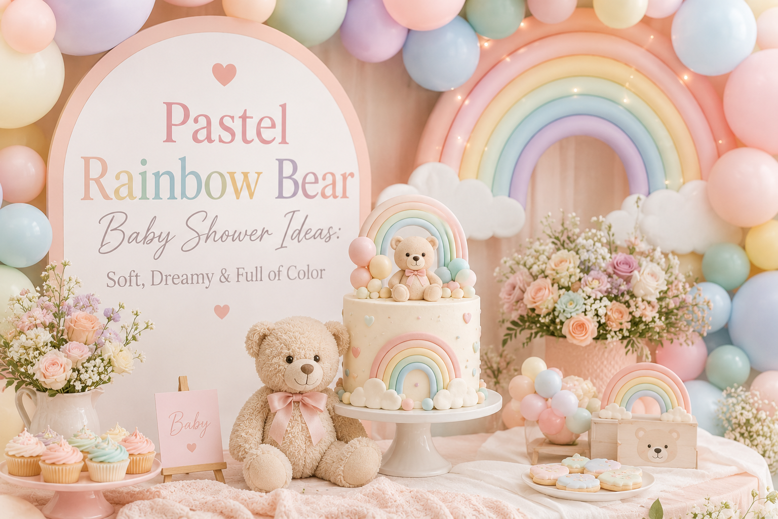
Pastel Rainbow Bear Baby Shower Ideas: Soft, Dreamy & Full of Color
Pastel Rainbow Bear Inspiration
Pastel Rainbow Bear Baby Shower Ideas: Soft, Dreamy & Full of Color
Cloud motifs, soft rainbow palettes, and the specific magic of a shower that feels like a childhood dream — rendered in the gentlest possible tones.
There is a particular kind of baby shower aesthetic that asks for every color at once — and somehow, when it is done right, feels more serene than any single-palette shower ever could. The pastel rainbow bear shower is that aesthetic. Soft dusty rose next to powder blue next to sage green next to lavender next to warm ivory: colors that in their saturated forms would fight each other, but in their softest register belong together completely. Add a cloud motif, a bear with a gentle expression, and a room full of the lightest possible tones, and the result is a celebration that feels like stepping into a watercolor illustration.
This guide covers everything that makes the pastel rainbow bear shower work — the palette logic that keeps multicolor cohesive, the cloud and star motifs that serve as visual anchors, the decoration directions that photograph as beautifully as they feel in the room, and the stationery that sets the dreamy tone before a single guest arrives.
“Some celebrations ask for every color at once — and the trick is keeping them all soft enough that the room feels like a dream, not a carnival.”
Section 01 The Pastel Rainbow Bear Aesthetic
1.1 What Defines the Look
The pastel rainbow bear aesthetic is built on three interlocking properties that, when all three are present, produce a visual world that is simultaneously joyful and serene. The first is a soft multicolor palette — not one or two accent colors against a neutral base, but a full range of hues working in concert: rose, blue, green, lavender, yellow, peach. The second is the specific muted quality of those colors — every tone sits in the same pastel register, which means every tone has been softened with the same amount of white. The third is a motif that floats above the color story rather than competing with it: clouds, stars, or moons — simple, rounded shapes in white or very light tones that give the eye a neutral place to rest between the color moments.
The emotional register of this aesthetic is distinctly different from a single-palette bear shower. Where a honey-and-cream shower feels warm and nostalgic, the pastel rainbow bear shower feels gentle and expansive — like the feeling of looking at a clear sky and knowing the day ahead is going to be good. It is the aesthetic that parents choose when they want the celebration to feel as full of possibility as the arrival of a new person genuinely is. The colors do not tell a single story; they tell all the stories at once, softly.
1.2 The Pastel Harmony Rule
The single most important rule in the pastel rainbow aesthetic is one that most planning guides never state explicitly: every color in the palette must share the same saturation level. This is why pastel rainbow works and bright rainbow doesn’t — not because of the hues chosen, but because of how much white has been mixed into each one. A room in dusty rose, sage green, lavender, powder blue, and soft butter yellow is a cohesive and beautiful palette. A room in hot pink, lime green, purple, turquoise, and primary yellow uses the exact same hues — and looks like a different event entirely. The hues are not the problem. The saturation is.
In practical terms, this means that every element — every balloon, every ribbon, every paper napkin, every floral stem — must pass the same saturation test. Dusty rose and powder blue and sage and lavender all share a muted, milky quality: they look as though they have been left in soft light for a long time and have gently faded toward something even gentler. The moment any single element is brighter or more saturated than the others — a balloon that reads as violet rather than lavender, a ribbon that reads as grass green rather than sage — the palette loses its coherence. That one element draws the eye away from the whole and the dream-quality dissolves.
A practical color test: hold a paint chip, fabric swatch, or balloon next to your other palette elements and ask whether it looks like it was mixed in the same pot. Pastel harmony palette: dusty rose (#E8B4B8 range) + sage green (#B2C9AD range) + lavender (#C9B8D8 range) + powder blue (#B8D0E8 range) + soft butter yellow (#EDE5B4 range). The broken version of the same palette: hot pink (#FF69B4) + lime green (#90EE90) + medium purple (#9370DB) + turquoise (#40E0D0) + bright yellow (#FFD700). Same hue families. Completely different rooms.
Styling Tip
When buying decorations for a pastel rainbow shower, hold everything next to each other before you buy — not next to a white wall or in isolation. Colors that look soft on their own often read as the brightest element in a group once the other pastels are assembled. The test is simple: does this item look like it belongs in a watercolor illustration, or does it look like it belongs on a neon sign? If it’s the latter, leave it. This single check, applied consistently to balloons, ribbons, florals, and paper goods, is what separates a pastel rainbow room that feels dreamy from one that feels chaotic.
Section 02 The Cloud & Sky Motif as the Unifying Thread
2.1 Why Clouds Work as the Design Anchor
In a multicolor palette, the eye needs somewhere to rest between the color moments. This is the functional role of the cloud motif in the pastel rainbow bear aesthetic — it is not simply a decorative element; it is a structural one. White or near-white cloud shapes provide the visual equivalent of a neutral breath: they separate colors without deadening them, and they give the overall palette a sense of space and airiness that a fully saturated multicolor room would lack entirely. When a soft lavender bear sits next to a cloud balloon next to a sage green garland, the cloud is what makes the transition from one color to the next feel intentional rather than random.
Cloud motifs translate into every layer of the room: cloud-shaped balloons above the dessert table, cloud cut-outs on the welcome sign, cloud illustrations on the invitation, cloud-shaped cushions or props in the backdrop. The rounded, soft geometry of the cloud shape is also inherently compatible with the rounded form of the bear — both shapes share the same quality of gentle curves and no sharp edges, which is part of why the cloud-and-bear combination feels so natural together. The cloud is not adding a second motif to the room; it is completing the visual language that the bear begins.
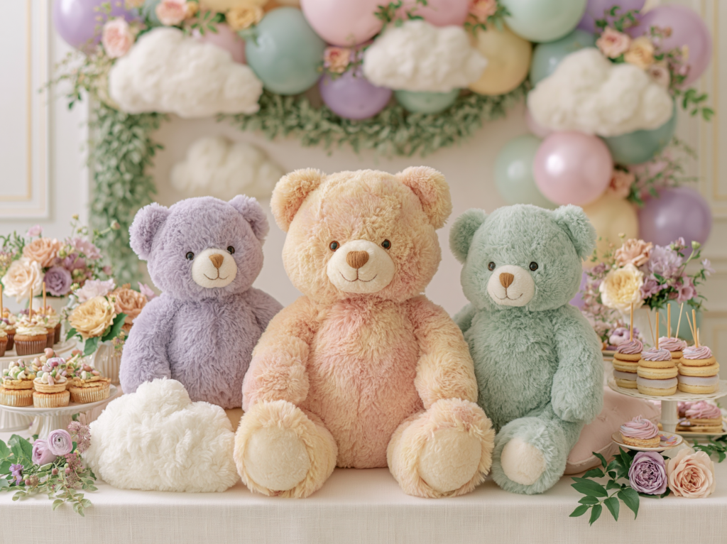
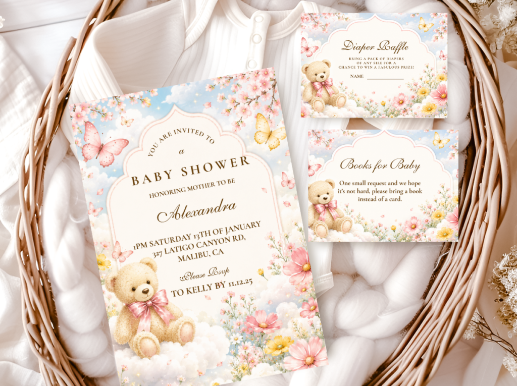
The Bear And Clouds collection brings the cloud motif into a complete stationery suite — soft cloud illustrations, pastel tones, and a bear motif that belongs in the same gentle sky world.
2.2 Stars and Moon: The Dreamy Evening Variation
Where clouds produce the daytime version of this aesthetic — airy, fresh, light — moon and star motifs shift it into something softer and more nocturnal. The moon and star bear shower reads as a nursery in the last light of the day: the colors are the same pastel softness, but the mood has deepened slightly. Lavender becomes more prominent; soft gold stars introduce a warm metallic note that is absent from the cloud direction; the overall palette shifts from sky-blue to more purple-adjacent tones. This is the aesthetic of a ceiling full of glow-in-the-dark stars, a nightlight casting soft shapes on the wall, a world that exists specifically in the gentle time before sleep.
In practical decor terms, the star and moon direction allows for a single metallic accent that the cloud direction does not: soft gold. A brushed gold crescent moon as a balloon topper or wall detail, gold star confetti on the table surface, or gold foil printing on the invitation introduces warmth into the cooler pastel palette without breaking the muted register. Gold at this scale reads as the glow of a bedside lamp rather than the sharpness of party metallic — which is exactly the distinction that keeps the aesthetic in the dreamy register rather than tipping into conventional party decor.
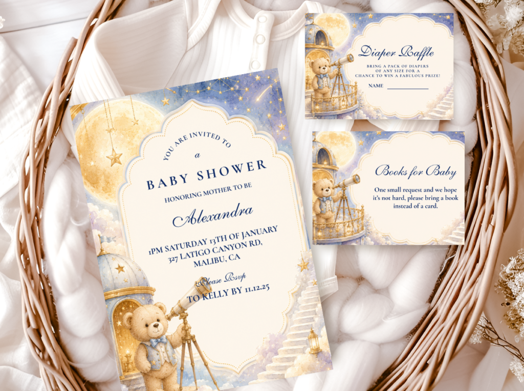
The Bear Moon And Stars collection brings the celestial direction into a full stationery suite — soft star and moon illustrations, lavender and gold tones, and a bear motif designed for the dreamy evening register.
Styling Tip
Cloud balloons are the single most effective way to bring the cloud motif into the room without committing to a full backdrop installation — and they require no special skill to assemble. Three white cloud-shaped balloons at varying heights above the dessert table anchor the aesthetic immediately: the irregular cloud outlines break the visual uniformity of a standard balloon cluster and introduce the same rounded, soft geometry as the bear motif. Position one large at approximately six feet, one medium at four feet, and one small at two feet. The height variation is what makes the arrangement read as composed rather than placed. Add a single pastel balloon in the palette’s lead color alongside each cloud balloon to tie the clouds into the color story.
Section 03 Palette Directions for the Pastel Rainbow Bear Shower
3.1 The Full Pastel Rainbow Direction
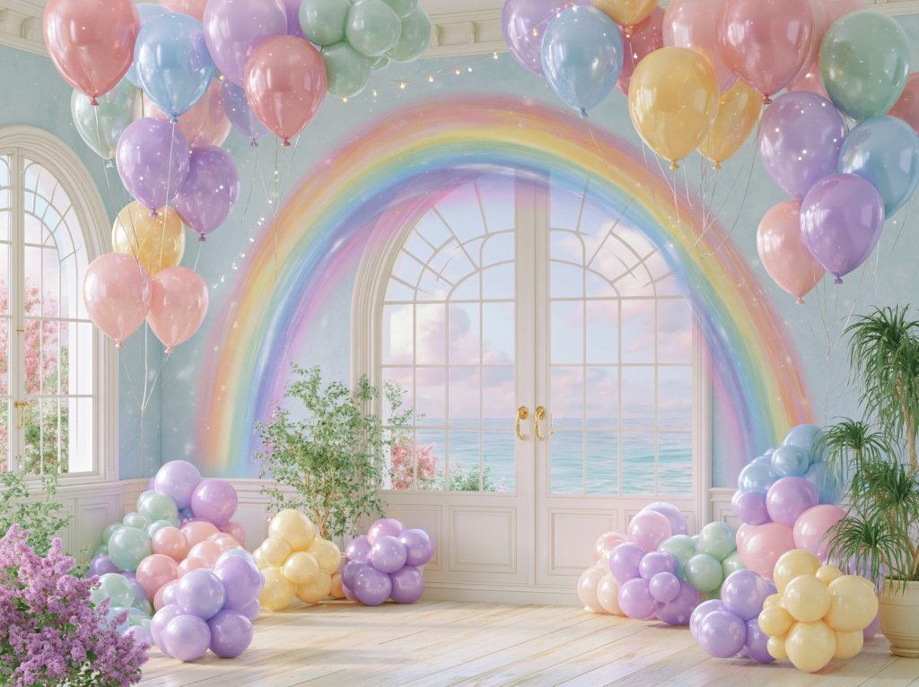
The full pastel rainbow direction uses all five hues — rose, blue, green, lavender, and yellow — in equal proportion, with white as the neutral base that lets them all breathe. No single color dominates; each appears at roughly the same visual weight across the room. This is the most joyful and the most technically demanding direction because maintaining visual balance across five colors requires deliberate distribution: the same colors should appear at approximately the same height levels, and each color should appear in at least two different areas of the room so it reads as a design choice rather than a random addition.
The practical rule for the full rainbow direction is to think in sets: every color element should exist in a set of at least three — three balloons in dusty rose, three in powder blue, three in sage, three in lavender, three in butter yellow — and those sets should be distributed throughout the room rather than grouped by color. Grouped color in a multicolor palette creates a rainbow effect that reads as sequential and organized; distributed color creates an overall soft warmth that reads as cohesive and ambient. The former looks like a color-coded party; the latter looks like a dream.
3.2 The Lavender + Cloud Direction
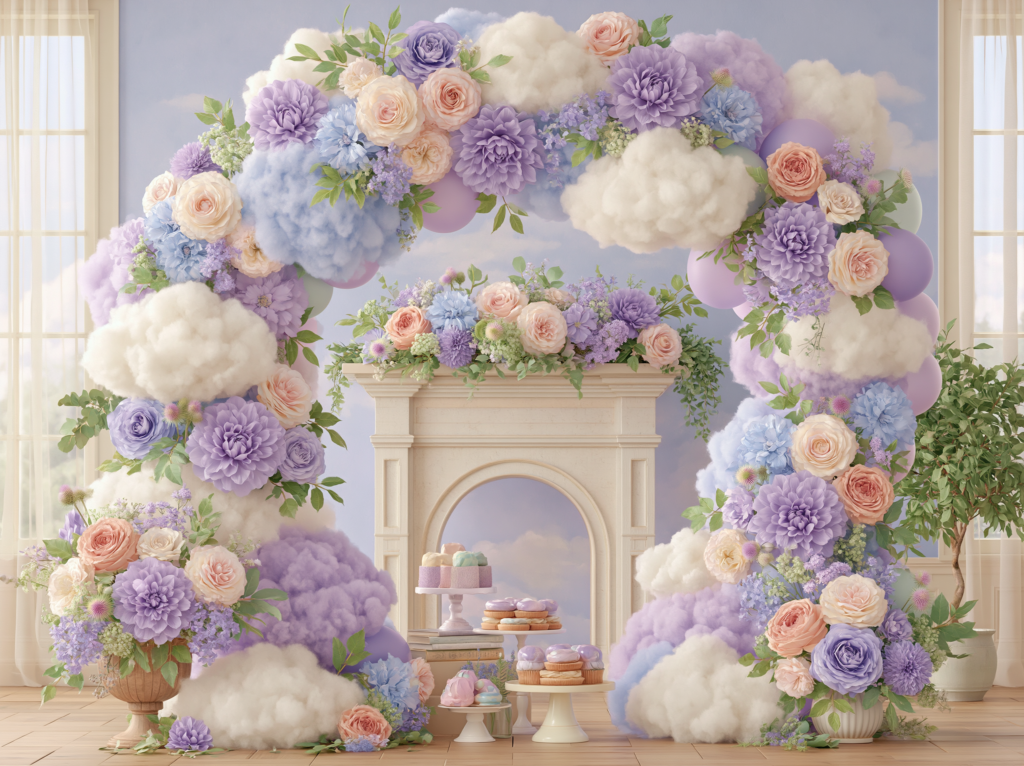
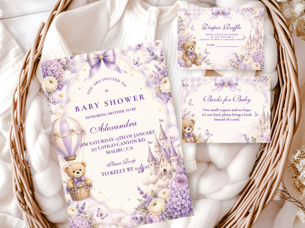
The lavender-led direction is the most sophisticated and Pinterest-consistent version of the pastel rainbow bear aesthetic. It uses lavender as the dominant accent at the 60% mark, with other pastels appearing as supporting notes at lower proportion — a few powder blue elements, a touch of dusty rose, soft green — and white cloud motifs as the consistent neutral thread throughout. The result is a palette that reads as distinctly multicolor but with a single organizing principle: the room has a lavender quality, and everything else orbits it.
This direction works for any guest list — it reads as neither specifically feminine nor masculine, just gentle and beautiful — and it is the one that tends to look the most considered in photographs because the dominant lavender gives the room a visual center of gravity that the fully balanced rainbow direction intentionally lacks. The cloud motif is particularly effective in the lavender direction because the contrast between the soft purple tones and the white clouds creates exactly the sky quality the aesthetic is built around.
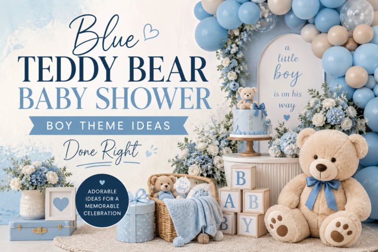
The Purple Teddy Bear collection brings the lavender-led direction into a complete stationery suite — soft purple tones, bear motifs in the correct muted register, and a palette that anchors the cloud and star visual world.
3.3 The Pink + Rainbow Direction
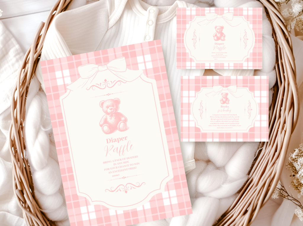
The pink-led version of the pastel rainbow bear shower leads with blush or dusty rose as the dominant hue and uses the other pastels — powder blue, sage, lavender, soft yellow — as supporting accents that appear at lower visual weight throughout the room. This is the girl shower direction of the aesthetic, and it is the most common search intent behind the pastel rainbow bear shower query. The key distinction from a standard pink bear shower is that the supporting pastels prevent the palette from reading as a single-tone pink shower — they introduce depth, variety, and the multicolor quality that makes the aesthetic feel like something other than a conventional girl shower.
The cloud motif works particularly well in the pink direction because white clouds against dusty rose and blush tones create an immediately legible sky quality — the visual connection to clouds at sunset or the inside of a seashell. The bear motif in this direction should be in a soft ivory or warm cream rather than a saturated pink bear; a neutral bear against a pink and multicolor backdrop is more visually sophisticated than a pink bear in a pink room.
The Pink Teddy Bear collection brings the blush-led direction into stationery — dusty rose and warm cream with soft bear motifs that stay in the muted, sophisticated register the pastel rainbow aesthetic requires.
3.4 The Sage + Rainbow Direction
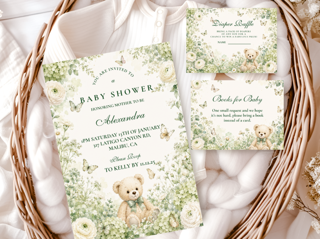
Leading the pastel rainbow palette with sage or mint green produces the most gender-neutral and nature-adjacent version of this aesthetic. Sage green as the dominant color grounds the palette in a way that the other hues do not — green connects to the natural world, to growth, to the freshness of something beginning. The other pastels — lavender, blush, powder blue, soft yellow — orbit the sage as lighter, airier notes. The overall effect is a room that feels simultaneously colorful and grounded, joyful and calm: more garden party than dreamy nursery, more daytime outdoors than celestial interior.
The sage direction pairs especially well with the cloud motif — white clouds against sage and soft pastels read as a garden sky rather than a celestial one, which shifts the aesthetic toward a more outdoor, nature-forward register that suits garden showers and tent events particularly well. Natural textures — linen, rattan, light wood — integrate more seamlessly into the sage-led direction than into the lavender or pink directions because the green palette already speaks the same material language as natural fibers and organic surfaces.
The Green Teddy Bear collection brings the sage-led direction into stationery — nature-forward greens with a bear motif that sits as comfortably in the pastel rainbow world as in a garden or outdoor setting.
Section 04 Decor, Cake & Table Ideas
4.1 Backdrop & Balloon Directions
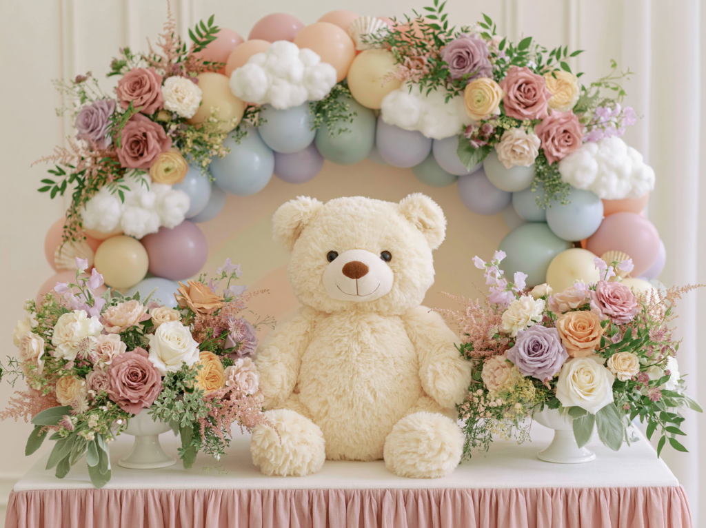
The balloon arrangement is the most visible color statement in the pastel rainbow bear shower and the one that most often goes wrong. The common failure is grouping colors together — a cluster of pink balloons here, a cluster of blue balloons there — which produces a striped or sectioned effect rather than a cohesive multicolor one. The correct approach is to mix the pastel colors within each cluster: every balloon grouping should contain at least three different palette colors, distributed without obvious pattern. The result is a soft, atmospheric mix that reads as rainbow rather than sorted.
For the backdrop, a cloud balloon garland — white cloud-shaped balloons interspersed with the pastel palette — is the most effective and most photographically distinctive option for this aesthetic. Hang it above the dessert table or along the top of the backdrop panel rather than as a floor-to-ceiling arch; the cloud garland reads most effectively when it sits at eye level or slightly above, where it creates the impression of clouds floating at the horizon rather than a balloon installation. A pastel rainbow balloon arch works well for an entrance or welcome moment where the full color range is the first impression guests receive.
4.2 Table Setting Directions
The table setting for the pastel rainbow bear shower uses white as its structural base across every surface element — tablecloth, charger plates, ceramic dinnerware — and lets the pastel colors appear exclusively in the decorative layer. A white linen tablecloth with white charger plates and white ceramic ware is not a blank table; it is a deliberate contrast surface that lets every color element above it be seen in its full soft clarity. When the base surface is also pastel, the colors compete with each other and the overall effect becomes muddy. White is not the neutral; white is the active ingredient that makes the pastel rainbow palette work at the table.
Distribute the palette colors across the table through: a mix of pastel napkins (one color per place setting, rotating through the palette), a centerpiece that contains all five pastel hues in a mixed floral arrangement, and small accent pieces — a plush bear in lavender at one end, a cloud-shaped prop in the center, bud vases in individual pastel tones. Place cards in a light pastel tone alternating across the table — one in dusty rose, one in powder blue, one in sage — create color rhythm at the individual seat level without requiring additional decor at each place.
4.3 Cake Direction
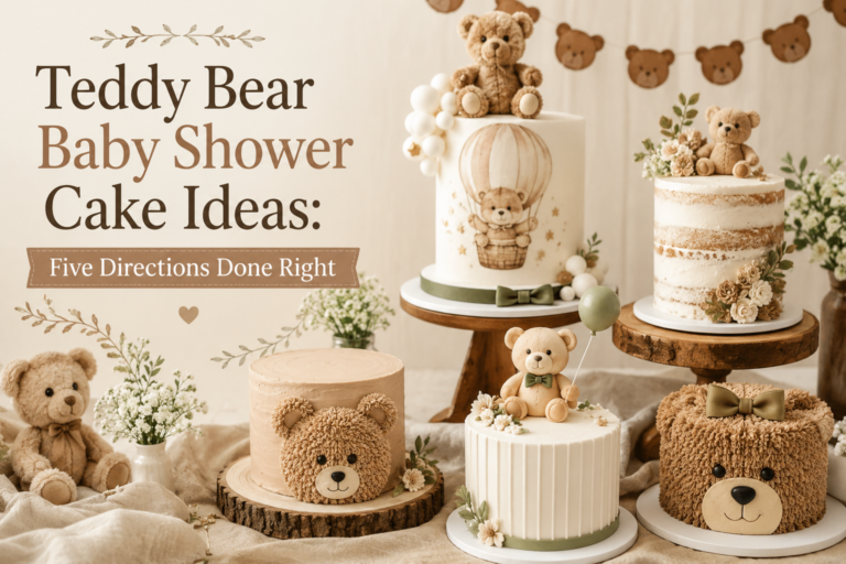
The pastel rainbow bear cake works in two directions: a pastel ombre finish, where the buttercream transitions through the palette hues from base to top in soft gradients, or a pastel layer reveal, where each internal sponge layer is tinted in a different pastel tone that is revealed when the cake is cut. Both approaches keep the external cake surface in the muted register — a white or very pale base buttercream with pastel accent details rather than a fully saturated multicolor exterior, which would overpower everything else on the dessert table.
The topper for the pastel rainbow bear cake should reference the cloud or star motif: a small cloud-shaped fondant or paper detail at the top of the cake, a crescent moon in soft gold for the celestial direction, or a simple dried floral arrangement in the palette’s pastel tones. A plush bear propped at the base of the cake rather than balanced on top reads as more natural and more in keeping with the aesthetic’s soft, unforced quality.
Styling Tip
Use white as the base for everything structural — linens, charger plates, backdrop panels, cake base — and let the pastel colors live exclusively in the decorative layer: balloons, florals, paper details, plush bears, napkins. This single decision prevents the palette from feeling overwhelming and gives every color element room to be seen clearly against the white ground. A pastel rainbow palette on a pastel base surface becomes a color collision; the same pastel rainbow palette on a white base surface becomes a dream. The white is not absence of color — it is the canvas the colors need to exist at their softest and most beautiful.
Section 05 Invitations & Stationery
The invitation is the first moment the pastel rainbow world exists for a guest — it arrives before the shower, before the room, before any decoration is in place, and it sets the entire aesthetic expectation in a single physical object. An invitation in the correct pastel rainbow register does something specific: it signals to the guest that this shower has been genuinely thought about. Soft multicolor illustration, a cloud or star motif in the background, the bear motif in a warm neutral tone against the pastel ground — this is not a generic shower invitation with a bear stamp applied to it. It is an illustrated world that the guest is being invited to step into.
The stationery suite for the pastel rainbow bear shower also serves a practical function beyond aesthetics: it is the palette reference that ensures every other element of the shower can be sourced correctly. When you have a physical invitation in hand showing the specific dusty rose, the specific powder blue, the specific sage — not “pink” and “blue” and “green” but those exact tones — every subsequent purchase decision becomes a matching exercise. The invitation is what prevents the palette from drifting into saturation, because the printed colors are the standard everything else is held against.
The six collections below cover every direction within the pastel rainbow bear world — from the lavender and cloud direction to the celestial star-and-moon aesthetic, the pink-led girl shower direction, the sage-led gender-neutral direction, and the full bear theme range for those still exploring options. Each collection is designed as a complete suite: invitation, envelope liner, favor tag, menu card, place card, and thank-you card — so the stationery decision made at the beginning carries through every printed moment of the celebration.
Choose the collection that matches your palette direction — or browse the full Bear Theme range to explore all collections before deciding. Once the invitation is in hand, the rest of the shower follows from it naturally.
Main Collection
Bear Theme
Browse all bear stationery collections in one place — every palette direction, every motif, every aesthetic register.
Cloud & Sky
Bear And Clouds
Soft cloud illustrations and pastel tones — the stationery suite for the daytime sky direction of the pastel rainbow bear aesthetic.
Celestial & Dreamy
Bear Moon And Stars
Soft star and moon illustrations in lavender and gold tones — the stationery suite for the celestial evening direction.
Lavender-Led
Purple Teddy Bear
Soft purple and lavender tones with a bear motif in the correct muted register — the most sophisticated direction in the pastel rainbow world.
Pink-Led
Pink Teddy Bear
Dusty rose and warm cream — the girl shower direction of the pastel rainbow aesthetic, soft and feminine without tipping into bright or generic pink.
Sage-Led
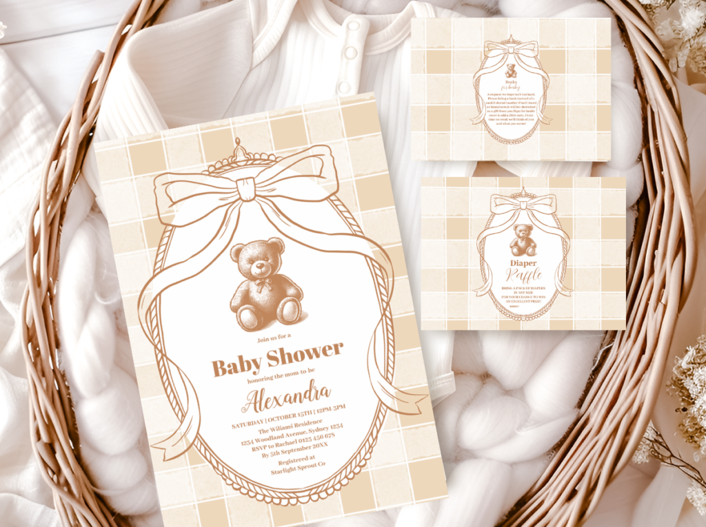
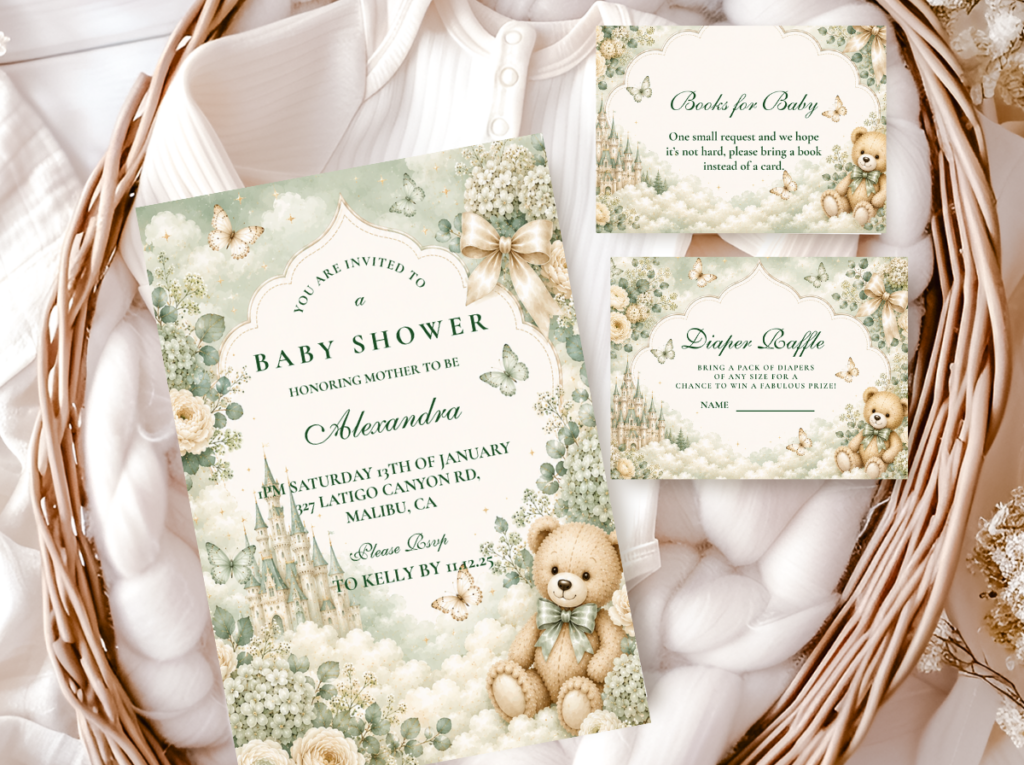
Green Teddy Bear
Nature-forward sage and forest tones — the most gender-neutral direction in the pastel rainbow bear world, grounded and fresh.
Frequently Asked Questions
How do I keep a multicolor palette from looking chaotic?
The answer is almost entirely in the saturation level and the distribution method. On saturation: every color in the palette must share the same muted, milky quality — if any single element is brighter or more saturated than the others, the eye goes to it immediately and the cohesion dissolves. On distribution: mix the colors within each decorative element rather than grouping them by color. A balloon cluster that contains three dusty rose, three powder blue, three sage, and three lavender balloons looks like a soft multicolor dream. Three clusters of one color each look like a sorted party. The palette is not the problem; the arrangement is. White as the structural base (linens, plates, backdrop) gives every color element clarity and prevents the accumulated effect from feeling overwhelming. Finally: limit yourself to five or fewer hues. Beyond five, the palette stops reading as intentional and starts reading as whatever was available.
What are the best color combinations for a pastel bear shower?
The most photographically consistent combinations are: dusty rose + lavender + powder blue + white (the classic pastel rainbow suite, most gender-neutral); lavender + sage + white (the simplest and most sophisticated — three colors rather than five); dusty rose + sage + soft butter yellow + white (the warmest version of the pastel rainbow, leans slightly feminine); and lavender + powder blue + soft gold + white (the celestial version, for the moon and star direction). The common thread in every successful combination is the same muted saturation level across all hues and white as the structural base. The combinations that fail almost always include at least one color that is too bright — typically the yellow, which tips easily from butter into primary.
Cloud motifs vs star motifs — which should I choose?
The choice between cloud and star motifs is primarily a mood decision rather than an aesthetic one — both work within the pastel rainbow bear world, but they produce distinctly different registers. Clouds give the aesthetic a daytime quality: airy, fresh, the feeling of a garden party or a bright Sunday morning. Stars and moons give it a nighttime quality: gentle, celestial, the feeling of a softly lit nursery or a dream. If your shower is in the daytime, outdoors, or in a space with lots of natural light, cloud motifs will feel more natural. If your shower is in the evening, indoors with warm lighting, or if you are drawn to the lavender and soft gold palette direction, the star and moon motifs will suit the mood better. You can also combine them — a cloud and star approach that includes both motifs is entirely coherent because they share the same visual language: rounded soft shapes in white or near-white against a soft sky palette.
How do I make a rainbow theme feel elegant rather than childish?
Three decisions determine whether a rainbow-adjacent palette reads as elegant or juvenile. First, saturation: muted pastels read as considered; bright primaries read as children’s party. This single variable does more to shift the aesthetic register than any other decision. Second, the structural base: white linens, white plates, white backdrop panels give the pastel colors room to be beautiful. Bright or patterned base surfaces make the colors fight each other. Third, material quality: linen over synthetic, glass over plastic, paper goods with a genuine print quality over mass-produced tableware. The rainbow color story is inherently playful — but playful and elegant are not opposites. The materials and saturation level determine which register the playfulness reads in. A room full of soft pastels on white linen with high-quality printed stationery reads as an artful, considered celebration. The same colors in their saturated forms on synthetic tableware reads as a children’s birthday party. The palette is not the problem; the execution is.
Ready to Start Planning?
Find Your Pastel Rainbow Bear Stationery Suite
The stationery that sets the dreamy tone before a single guest arrives.