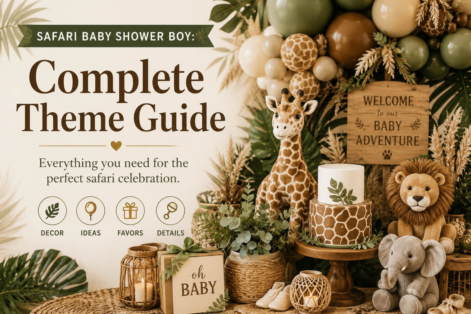
Safari Baby Shower Boy: Complete Theme Guide
Baby Shower · Boy Theme Guide
Safari Baby Shower Boy: Complete Theme Guide
Four boy safari palette directions, the three mistakes that make boy safari look generic, specific decor and stationery guidance, and the collection that carries every detail.
The safari baby shower is the boy shower theme that never feels generic — when it is done correctly. The challenge is that the safari theme is popular enough that a generic version exists: the one with bright green balloons, cartoon animal faces, and primary-colour napkins that looks like every other safari shower on the internet. This guide is about the other safari shower — the one with deep olive and warm brown, watercolour illustration, and antique gold detail that looks tailored, intentional, and completely unlike any other. The difference between the two is not budget; it is three specific decisions, explained below.
Shop the Boy Safari stationery collection
Invitations, welcome signs, favour tags — all coordinated in boy-specific palette directions.
“A boy safari shower is not about putting animals on a table. It is about building a world he is about to enter — wild, warm, and full of wonder. Get the palette right, and the world builds itself.”
Section 01 The Problem With Generic Boy Safari
Most boy safari shower guides list what to buy. This section lists what to avoid — because the three mistakes below are the reason most boy safari showers look generically pleasant rather than specifically beautiful. Each one has a concrete fix.
Mistake 1
The Wrong Green
The problem: Bright lime, primary green, and neon apple green are children’s birthday party colours, not African savanna colours. When a boy safari shower uses bright green as its primary accent, it reads immediately as a generic “wild animal” party rather than as a specific and beautiful safari celebration. Bright green competes with everything on the table and photographs as visually aggressive rather than warm and natural.
The fix: Choose one of three specific green families and apply it consistently: deep olive (warm yellow-toned, the colour of savanna scrub at golden hour — the most specifically adventure-appropriate green for a boy safari); dusty sage (cool grey-toned, the most botanically delicate — best for the more restrained neutral-to-boy direction); or deep forest green (the darkest, most dramatic, most specifically jungle-forward of the three). Any of these three reads as intentional and beautiful. Bright lime does not.
Mistake 2
The Cartoon Animal Style
The problem: Cartoon safari animals with enlarged eyes, bright flat colours, and graphic hard outlines are designed for children’s products and for digital screens. They read as cute and generic in print and in photographs because the visual language is the same as hundreds of other party themes — the animals look interchangeable with cartoon farm animals, cartoon jungle animals, and cartoon woodland animals. The result is a shower that could be any animal theme rather than specifically a safari shower.
The fix: Use watercolour-style safari illustration consistently across every printed element. Watercolour safari animals in natural proportions (a giraffe that is actually giraffe-shaped, an elephant that is actually elephant-proportioned) read as storybook-quality and specifically beautiful in photographs because the soft edges and blended tones belong to the same visual world as natural light. The most important consistency rule: if the invitation is watercolour, the cake topper, the welcome sign, and the favour tags should all be in the same illustration register — not a mix of watercolour stationery beside cartoon cake decorations.
Mistake 3
Green Without a Warm Anchor
The problem: Green alone on a cream base reads as botanical and slightly cold — which can suit a girl-forward direction beautifully but does not communicate the warmth and depth that makes a boy safari shower feel specifically adventurous and grounded. Green without warm brown or antique gold is the palette that most frequently results in “this looks like a botanical shower, not a safari shower.”
The fix: Anchor every green palette direction with at least one warm tone at full visual weight: warm brown as a table element (linen, napkins, centrepiece vessel); honey amber as the balloon accent; or antique gold as the metallic in the stationery and favour details. The warm tone is what gives the palette depth and what connects it specifically to the savanna rather than to a general botanical aesthetic. Without the warm anchor, the green reads as a garden. With it, the green reads as Africa.
✨ Styling Tip
Test your greens before buying in bulk. Hold your sage linen, your olive balloon, and your forest green welcome sign next to each other. If they are three different greens fighting for each other’s visual territory, the palette is broken. Choose one green family — warm olive OR cool sage OR deep forest — and buy everything within that family. Mixed greens are the single most common reason boy safari showers look chaotic rather than cohesive in photographs. One afternoon of palette testing saves a week of post-purchase regret.
Section 02 Four Boy Safari Palette Directions
Four distinct palette directions — each achieving its specific aesthetic through a different combination of the same core elements. The difference is in the green and in the secondary accent; the warm cream base and the warm brown anchor are consistent across all four.
2.1 Jungle Safari — Deep Olive & Warm Brown
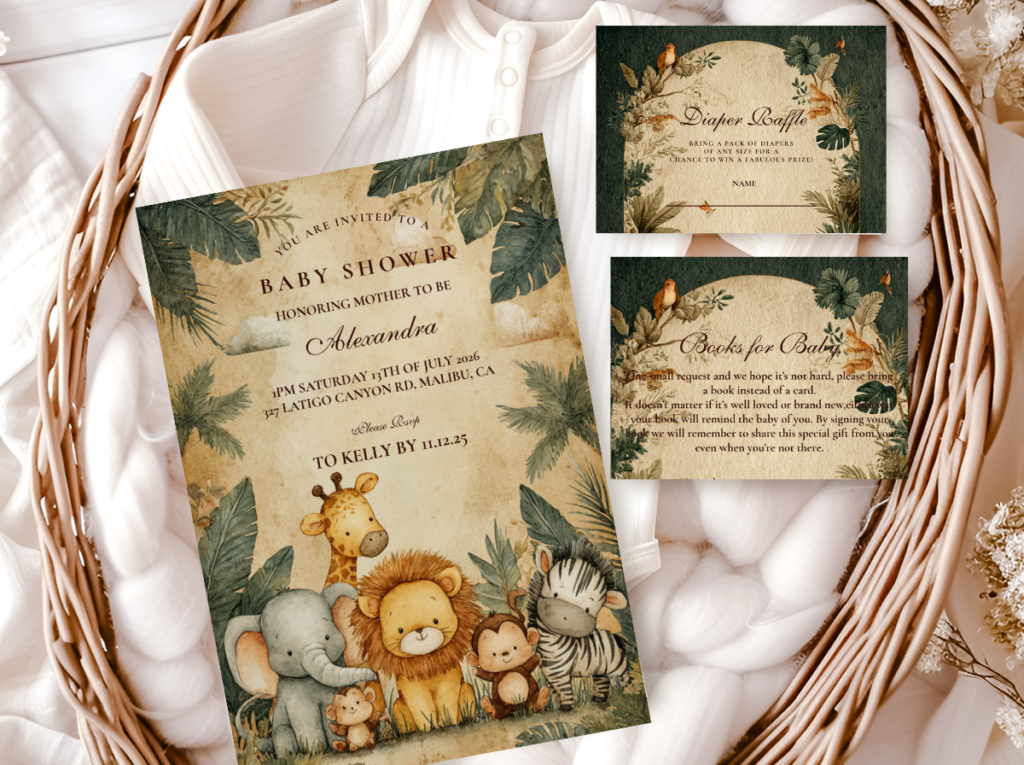
The Jungle Safari direction is the most dramatic and the most consistently saved boy safari direction on Pinterest — it uses deep olive green as the primary accent (the specific dark, warm yellow-toned olive that reads as African scrub vegetation rather than as a generic forest or garden green) with warm brown as the anchor and antique gold as the metallic statement detail. The combination reads as adventure-forward in the specific way of a vintage wildlife illustration: dark, warm, specifically natural, and specifically beautiful. Deep olive on warm cream is the palette pairing most immediately associated with the serious safari aesthetic — the aesthetic that references the wildlife documentary and the explorer’s journal rather than the children’s story.
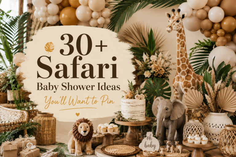
The decoration vocabulary for the Jungle Safari direction: a dark olive or deep forest green backdrop (the deepest of the palette as the background, so the warm cream and brown elements at the table level read as luminous against it); warm oatmeal or cream tablecloths with warm brown napkins; rattan and warm wood vessels as centrepiece bases; dried pampas and dried grasses in honey-warm tones as the botanical element; and watercolour giraffe or elephant illustration on every printed element in the shower’s specific olive and warm brown palette. The antique gold detail should appear at the metallic layer: gold napkin rings, gold fork handles, gold balloon clusters, and gold detail on every piece of stationery.
The Jungle Safari Boy Baby Shower collection carries deep olive and warm gold into every stationery piece — the most dramatically adventure-forward boy safari stationery direction available.
✨ Styling Tip
Jungle safari works best when the green is dark enough to create real contrast against the cream centre. Pale sage on cream is a botanical palette — elegant and beautiful, but not specifically directional for a boy safari. Deep olive on cream is what creates the specific quality of depth and warmth that the boy safari direction requires. If the olive and the cream look similar from across the room, the olive is too pale. It should read as distinctly dark against the warm cream base, the way African scrub vegetation reads as distinctly dark against the savanna sky.
2.2 Blue Safari — Dusty Blue & Warm Brown
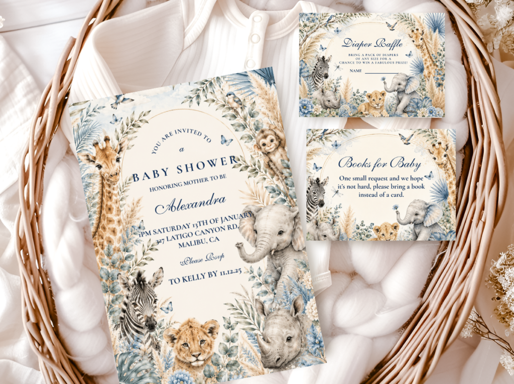
The Blue Safari direction is the most tailored and the most specifically distinctive of the four boy palette directions — it uses dusty blue (a specific muted, slightly grey-toned blue that is warmer and quieter than the bright primary blue of conventional boy shower palettes) with warm brown and cream, producing a palette that reads as specifically masculine in a way that is more sophisticated than its bright-blue equivalent. The dusty blue quality is crucial: the specific desaturated warmth of dusty blue reads as belonging to the same natural colour world as the warm brown and cream of the savanna, in a way that a bright primary blue does not. Bright blue and warm brown together read as a colour clash; dusty blue and warm brown together read as a colour story.
The Blue Safari palette is the most appropriate of the four directions for couples who want a recognisably gender-directed palette without any of the visual cliché of the conventional baby boy party. The dusty blue and warm brown combination is immediately sophisticated, immediately specific to the safari aesthetic (dusty blue references the specific quality of the African sky at dusk, and the specific quality of the dusty blue water source that defines so many savanna landscapes), and immediately beautiful in photographs at any scale.
The Blue Safari Boy Baby Shower collection carries dusty blue and warm brown into every stationery piece — tailored, elegant, and specifically beautiful.
2.3 Gold Safari — Warm Gold & Deep Brown
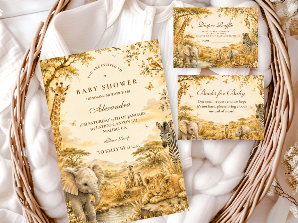
The Gold Safari direction is the most premium and the most editorial of the four boy palette directions — it centres the antique gold element (which is the statement detail in the other three directions) as the primary palette accent, pairing it with deep warm brown and warm ivory rather than cream. The result reads as specifically luxurious: the gold quality of this palette references the specific warm amber-gold of the savanna at its most beautiful — the golden hour light on warm grass, the warm amber quality of honey, the specific warm gold of acacia bark — and the deep warm brown provides the grounding depth that prevents the gold from reading as simply decorative rather than as genuinely warm and natural.
The Gold Safari direction is most appropriate for couples who want their celebration to read as elevated and specifically designed — as a luxury event rather than a party. The antique gold flatware, the warm ivory tablecloth, the deep brown centrepiece vessels, the gold balloon detail, and the antique gold stationery all work together to produce a visual world that reads as specifically beautiful rather than specifically safari, in the same way that a very elegant environment always reads as specifically beautiful before it reads as specifically thematic.
The Gold Safari Boy Baby Shower collection carries warm antique gold and deep brown into every stationery piece — the most premium and most editorial boy safari stationery direction.
2.4 Neutral Safari for a Boy
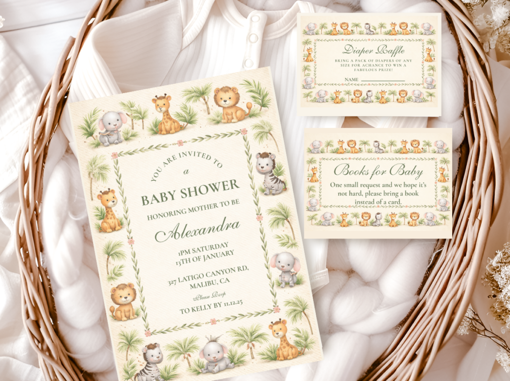
The Neutral Safari for a Boy direction achieves its gender specificity not through palette colour but through texture and motif: warm cream, oatmeal, honey amber, and warm brown with the specifically adventure-forward safari animal vocabulary (giraffe, elephant, rhinoceros — the larger, more specifically powerful animals of the savanna rather than the smaller, more cute-adjacent animals) and a decoration register that is more structured and more intentional than the typically soft and gathered quality of neutral girl shower directions. This is the boy-directed neutral that reads as specifically masculine through the quality and weight of its choices rather than through the application of a gender-coloured accent.
The neutral direction is most appropriate for parents who want the celebration to be about the child’s impending arrival in the world rather than about any specific gender direction — and who want the safari theme’s warmth and adventure quality to communicate that without any colour-based gendering. The warm brown anchor, the rattan and natural wood materials, the watercolour wildlife illustration, and the antique gold detail all produce a visual world that is specifically beautiful and specifically adventure-forward in its register, regardless of the absence of a colour accent.
The Neutral Safari Baby Shower collection carries the warm neutral palette into every stationery piece — the most versatile and most broadly beautiful direction for any safari celebration.
Section 03 Boy Safari Decor at a Glance
Backdrop Directions for Boy Safari
Three backdrop directions that suit the four boy safari palette directions: a jungle balloon arch in deep olive, warm brown, and cream (most appropriate for the Jungle Safari direction — concentrated at one arch height, not distributed randomly); an acacia tree watercolour panel printed at large format and framed or hung as the primary backdrop (most appropriate for the Gold Safari and Blue Safari directions, where the backdrop is a scene from the savanna rather than a balloon installation); and a pampas and dried grass wall cluster in honey and cream tones (most appropriate for the Neutral direction and as a secondary backdrop element in any direction). In all three cases, the backdrop should read as one complete visual statement rather than as multiple competing elements.
Centrepiece Directions Adapted for Boy Safari
The boy safari centrepiece uses the same three-element formula as any safari centrepiece (natural vessel + botanical material + animal detail) but adapts the specific choices to the palette direction: for the Jungle direction, a dark olive or forest green ceramic pot with dried pampas and a wooden elephant figure; for the Blue direction, a warm wood vessel with dried blue-toned flowers and a ceramic giraffe; for the Gold direction, an antique brass vessel with honey-toned dried botanicals and a gold safari animal topper; for the Neutral direction, a rattan basket with warm pampas and a small ceramic animal figure in warm brown. The animal figure should be in natural proportions and in a material consistent with the palette’s register — ceramic or wood rather than plastic.
Table Linen Direction for Boy Safari
Oatmeal linen works better than white linen for the Jungle, Gold, and Neutral boy safari directions because it shares the warm base temperature of the palette; white linen reads as cooler and more modern, which is most appropriate for the Blue Safari direction where the cool quality of dusty blue is part of the aesthetic. For the Jungle direction specifically, a deep olive or deep forest green linen runner over a cream tablecloth provides the high-contrast backdrop that best communicates the Jungle palette’s depth — the dark runner against the light tablecloth reads as specifically designed rather than generically covered.
✨ Styling Tip
For a jungle safari boy shower, use the deep olive or dark forest green as your backdrop colour and let the table be cream and warm brown. Dark backdrop — light table. This contrast rule is the single most reliable way to make a room look designed rather than decorated: when the darkest palette element is behind and above the guests, and the warmest palette elements are in front of and around them at table level, the room has compositional depth that photographs immediately as intentional. Same colour everywhere — green backdrop, green tablecloth, green centrepiece — reads as flat. Contrast reads as considered.
Section 04 Boy Safari Cake & Food at a Glance
Cake Direction for Boy Safari
The most consistently beautiful boy safari cake direction for the Jungle and Neutral palettes: two or three tier cake with warm cream or ivory fondant base, hand-painted watercolour safari scene on the middle or largest tier (savanna grass, acacia silhouette, giraffe or elephant in the shower’s specific palette watercolour quality), and antique gold detail on the tier edges. The safari scene cake is the boy direction that most directly references the adventure quality of the safari theme — the painted scene reads as a wildlife illustration brought to cake scale, and the consistency between the painted scene on the cake and the watercolour illustration on the stationery produces the most complete aesthetic coherence available across all the shower’s elements. For the Gold Safari direction, a buttercream-textured cake in warm ivory with a gold-leaf detail band and a personalised gold safari topper is the most specifically premium-reading cake option.
Food Display Direction
The boy safari food table reads most beautifully when the serving ware is in the same natural material register as the decoration: warm cream ceramic serving dishes; rattan or warm wood serving boards; kraft paper labels and food tent cards in the stationery’s palette direction; and the food items themselves in the warm palette where possible (warm honey tones, caramel, deep brown, cream — a cheese board, a charcuterie arrangement, or a fruit display all read as more contextually appropriate on a safari table than bright-coloured processed foods). The food tent cards (small printed labels identifying each dish) are the food table stationery element that most specifically communicates the shower’s illustration quality at the closest possible range.
Section 05 Invitations & Stationery
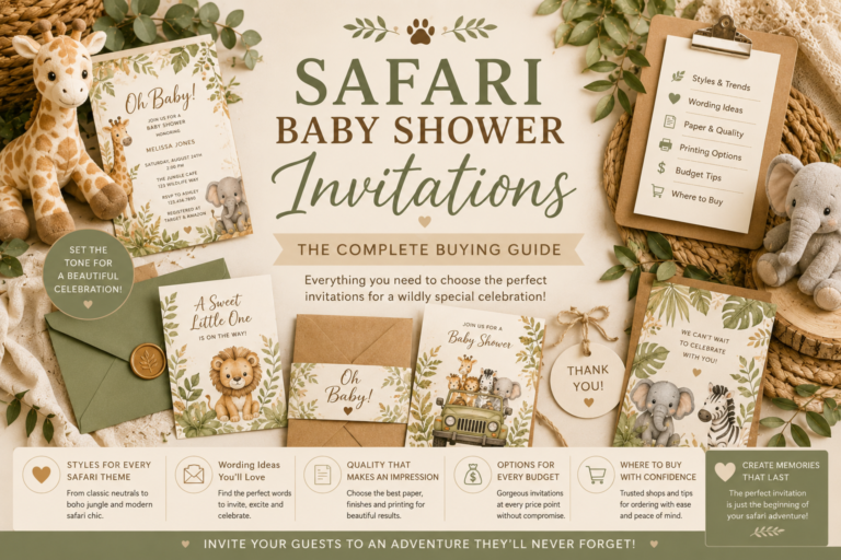
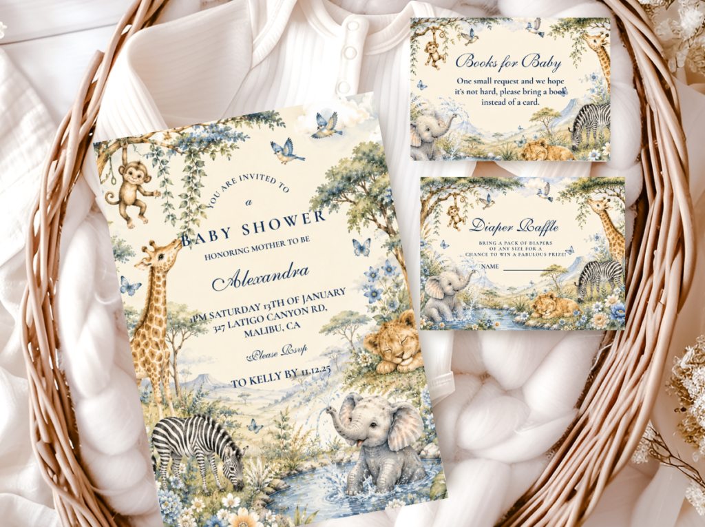
The boy safari invitation is the first object guests receive that belongs to the adventure world being built for the celebration — the first moment at which the palette, the illustration style, and the stationery quality communicate what kind of celebration this will be. A watercolour giraffe on warm olive and honey stock, with the baby’s name in warm brown script and the shower date in antique gold, tells every guest immediately: this celebration has been designed with care, in a specific and beautiful palette, and the world I am being invited into is a warm and genuinely lovely place.
The illustration style of the invitation is the element that most determines whether the shower is remembered as generically safari-themed or as specifically beautiful. Watercolour safari illustration in the shower’s specific palette direction reads as storybook-quality and specifically made for this celebration; cartoon safari illustration on white stock reads as generically purchased from a party supply catalogue. The distinction is visible immediately on a side-by-side comparison, and it is the distinction that the most photographed moments of the shower — the flat lay, the invitation held up against the backdrop, the favour tag examined at the end of the day — most clearly reveal.
The stationery suite should be consistent across every piece: the welcome sign, the menu cards, the place cards, the favour tags, and the thank you cards should all be in the same illustration register and the same palette direction as the invitation. When the boy safari stationery is consistent, the shower reads as a complete and completely designed world. When any piece is sourced from a different design direction or a different illustration style, the coherence breaks — and the shower reads as assembled from compatible sources rather than designed as a single thing.
All six collections below cover every boy safari palette direction and stationery register. Browse all six before deciding — the collection whose palette temperature and illustration style most closely match the intended atmosphere of the celebration is the one that will produce the most cohesive and most beautiful result.
Boy Safari Main
Boy Safari Baby Shower
The primary boy safari collection — warm, adventure-forward, and specifically beautiful.
Jungle Direction
Jungle Safari Boy
Deep olive and warm gold — the most dramatically adventure-forward boy palette direction.
Blue Direction
Blue Safari Boy
Dusty blue and warm brown — tailored and sophisticated, the most elegant boy direction.
Gold Direction
Gold Safari Boy
Antique gold and deep warm brown — the most premium and most editorial boy safari stationery direction.
Neutral Direction
Neutral Safari Baby Shower
Warm cream and antique gold — the most versatile direction for any safari celebration.
All Safari
Safari Theme Collection
The complete umbrella collection — every safari style, every stationery piece.
Frequently Asked Questions
What colors work best for a boy safari baby shower?
The most effective boy safari palettes all share the same foundation: a warm cream or oatmeal base (not cool white — warm neutrals belong to the savanna and cool whites read as generic party); a warm brown anchor that grounds the palette and provides depth; and one specific accent direction. The four accent directions available are: deep olive or dark forest green (the Jungle Safari direction — most dramatic and adventure-forward); dusty blue (the Blue Safari direction — most tailored and specifically masculine without cliché); antique gold as the primary accent rather than a metallic detail (the Gold Safari direction — most premium and editorial); and no accent at all beyond the warm cream, brown, and honey of the Neutral direction. In every case, the specific quality of the accent matters as much as the accent colour — dusty and muted reads as natural and sophisticated; bright and saturated reads as children’s party.
What shade of green looks best for a boy safari shower?
Deep olive is the most consistently beautiful and most specifically appropriate green for a boy safari shower. The specific quality of deep olive — warm, yellow-toned, slightly dusty, and darker than sage but warmer than forest green — is the green most directly referencing the specific visual world of the African savanna. Deep forest green is the most dramatic alternative, most appropriate for the Jungle Safari direction when maximum contrast against a cream base is the intention. Sage green is most appropriate for the more neutral or girl-adjacent directions; it reads as botanical and slightly cool rather than specifically adventure-forward. Bright lime, neon green, and primary green should be avoided entirely: they read as children’s party colours rather than safari palette colours and immediately make the shower look generic rather than specifically designed.
How do I make a safari shower feel specifically like a boy theme?
Three specific decisions create the boy-directional quality of a safari shower. First, illustration style: watercolour safari animals in natural proportions read as storybook-quality and specifically dignified; cartoon animals with large eyes read as cute and non-directional. Second, palette depth: deep olive or dusty blue as the accent colour, rather than pale sage, produces the visual weight that reads as adventure-forward rather than soft and botanical. Third, warm anchor consistency: the warm brown anchor (in linen, in centrepiece vessels, in serving ware, and in the warm brown tones of the stationery) is what gives the palette its depth and its specifically natural quality. Without the warm anchor, even a correctly chosen green palette reads as slightly cold and one-dimensional. The overall register should feel like a wildlife illustration — warm, specific, serious about beauty.
Jungle safari versus regular safari: which is better for a boy shower?
Both are excellent choices for a boy safari shower; the decision is about register and dramatic intensity. The Jungle Safari Boy direction (deep olive and warm gold, the most dramatically dark and most adventure-saturated of the boy palette directions) is most appropriate when the aesthetic intention is maximum drama and adventure-forward impact — when the celebration should feel like walking into a wildlife documentary. The regular boy safari direction (any of the lighter palette options — dusty blue, neutral, or standard olive) is most appropriate when the intention is warm and beautiful rather than specifically dramatic — when the adventure quality should be present but the atmosphere should be inviting rather than intense. The Jungle direction requires more attention to contrast (dark backdrop, light table) and more consistency in palette discipline (the deep olive must be dark enough to read as distinctly different from the cream base); the regular direction is more forgiving across the full range of decoration choices.
Shop the Boy Safari Collection
Boy Safari Baby Shower Stationery — Every Direction
Invitations, welcome signs, favour tags, and more — all coordinated, fully customisable, and available in the full range of boy safari palette directions.