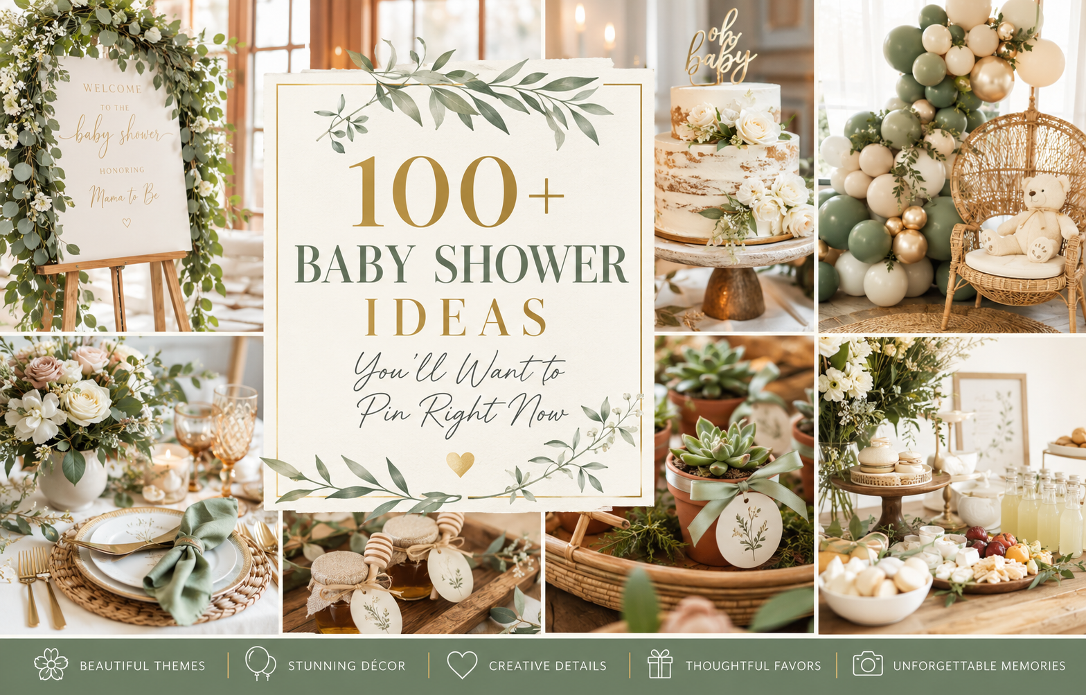
100+ Baby Shower Ideas You’ll Want to Pin Right Now
The Complete Baby Shower Planning Guide
100+ Baby Shower Ideas You’ll Want to Pin Right Now
Theme directions, decoration zones, cake ideas, games, favors, and stationery — every category organized so you can plan the whole celebration from one place.
This is the one Pinterest board you actually need. Not a mood board of unrelated images saved from fifty different accounts — an organized guide to every category of baby shower planning, built around one principle: the most beautiful baby showers are not the most expensive ones or the most elaborate ones. They are the most cohesive ones. Every idea in this guide starts from that principle.
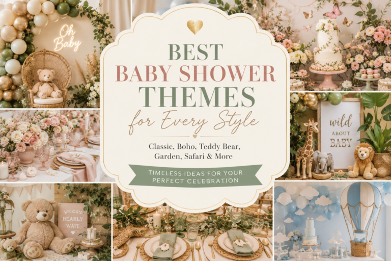
Five theme and palette directions, decoration ideas organized by zone, cake and food directions, games and activities, favor ideas, and the stationery suite that ties everything into one designed world. Start at the top and work through to the end — or jump to the section you need most.
“A baby shower doesn’t need to be elaborate to be beautiful — it needs to be cohesive. Every idea in this list starts from that principle.”
⚠ This post contains affiliate links. If you click and purchase through these links, I may earn a small commission at no extra cost to you. I only recommend products I genuinely believe will add value for my readers. Thank you for supporting Baby Wonderland Studio.
Section 01 The One Decision That Makes Everything Else Easier
Most baby shower planning guides tell you to start with a theme. This one starts somewhere different — with a feeling. A theme is a label (“safari,” “floral,” “bear”). A feeling is a register (“warm and nostalgic,” “fresh and airy,” “whimsical and soft,” “modern and pared-back”). The feeling determines the palette; the palette determines everything else. When you know the feeling you are designing for, every idea in this guide will filter itself naturally into what belongs and what does not. Answer three questions before choosing anything else.
Question 01: What feeling do you want guests to have when they walk in?
Warm and nostalgic — the feeling of a well-loved children’s book, honey jars and plush bears and cream linens and the softness of something that has been cherished. Fresh and garden-party — the feeling of outdoor celebration in natural light, botanicals and pastel florals and the green smell of something growing. Whimsical and playful — the feeling of imagination and delight, unexpected color combinations and motifs that tell a story. Modern and elegant — the feeling of considered restraint, where every element was chosen deliberately and nothing competes for attention. Name the feeling first. The theme follows from it; the palette follows from the theme; and every decoration, cake, favor, and game card follows from the palette.
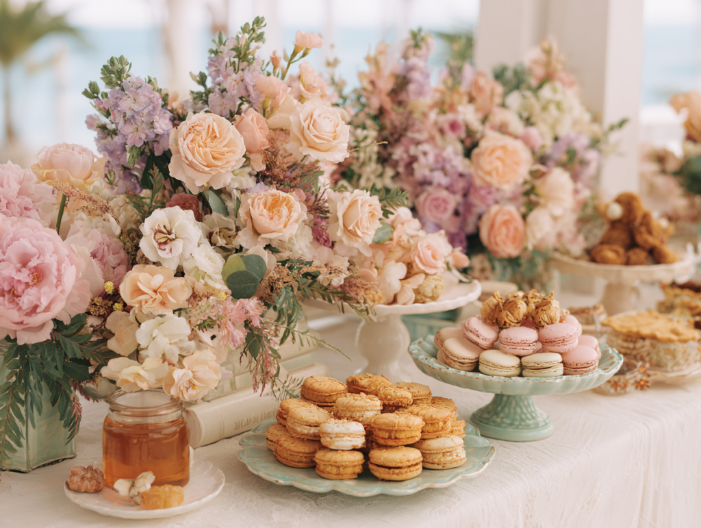
🪵 Wood easel for welcome signs: A natural wood easel positions your welcome sign at exactly the right height and works with every palette direction in this guide — warm enough for the bear and boho directions, clean enough for the garden and modern directions. Reusable for future events.
Question 02: What is your honest budget and time availability?
A well-executed £400 shower produces a more beautiful celebration than a poorly executed £1500 one. The execution gap comes from time, not money: the host who has four hours to dedicate to setup and is working within a realistic budget will produce a more cohesive result than the host who commits to an ambitious vision and runs out of time. Before choosing any idea in this guide, establish two real numbers: the maximum you are willing to spend, and the maximum time you can allocate to planning and setup. Then choose ideas from this guide that fit both numbers honestly. The most beautiful shower is the one that was fully executed, not the one that was ambitiously planned and partially finished.
🎈 Cream and ivory neutral balloon set: The palette foundation for an organic arch across any warm shower direction — cream, ivory, and sage in varied sizes for that effortlessly gathered look. No bright whites or primary colors that pull the eye away from the rest of the room.
Question 03: What does the guest of honor actually love?
Not what is trending on Pinterest this month. Not what you personally love. Not what someone else had at their shower. What does this specific person’s taste look like? What is her nursery color? What does her home feel like? What does she wear, what does her kitchen look like, what kind of flowers would she put on her own table? The shower that feels most meaningful is always the one where guests walk in and think “this is exactly her.” That result does not require a large budget or elaborate execution; it requires genuine attention to the person being celebrated rather than to the aesthetic of the moment. Every other planning decision is easier once this question is answered honestly.
🌿 Warm ivory linen table runner: The single highest-ROI table decoration in this guide — it covers the most surface area, sets the temperature register for everything placed on top of it, and works across every palette direction. Wash and press before the event; wrinkles register at close range.
Styling Tip — Pinterest Board Method
Save ideas to a single Pinterest board before buying anything — and then wait 48 hours before looking at the board again. When you look at it as a whole rather than pin by pin, patterns emerge that are not visible in the moment of saving. The color that appears most often across the images you saved is your palette. The mood that appears most often — warm or fresh or whimsical or graphic — is your feeling. The motif that appears most often is your theme. Your instincts already know what you want; the board just makes them visible in a form you can work from. This method takes twenty minutes and eliminates weeks of indecision because the decisions have already been made by your own choices — you just have not looked at them all at once yet.
Section 02 Theme & Palette Ideas
Five directions, each with a distinct aesthetic register and a palette that extends from the invitation through every element in the room.
2.1 The Garden & Floral Direction
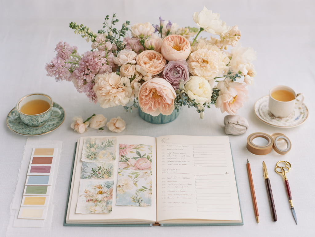
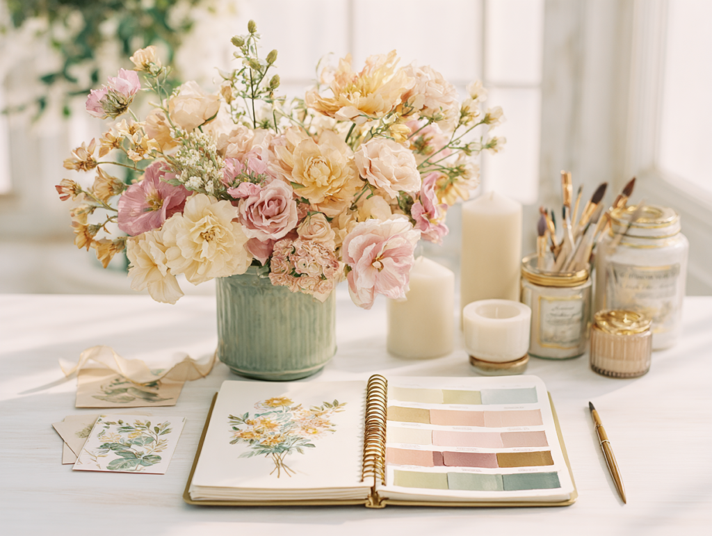
The garden and floral direction builds the palette from soft botanicals — dusty rose, pale lavender, sage green, and warm cream — with fresh or dried florals doing the visual work that balloons do in other directions. It reads as romantic, seasonal, and personal. The table setting is the heart of this direction: loose gathering arrangements of garden roses, ranunculus, and eucalyptus in clear glass or white ceramic vessels, a linen runner in warm ivory, and place cards with a botanical illustration. The backdrop uses a greenery panel or a gathered floral arch rather than a balloon installation, which gives the room a garden-party quality regardless of whether it is indoors or outdoors. The palette is warm throughout — no bright whites or cool blues — and the invitation sets the floral and botanical tone that the room then continues in three dimensions.
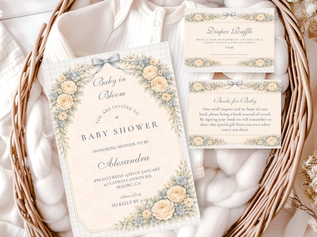
The Baby in Bloom collection builds this exact palette into a complete stationery suite — botanical motifs, soft pastels, and warm ivory that sets the garden tone from the first envelope.
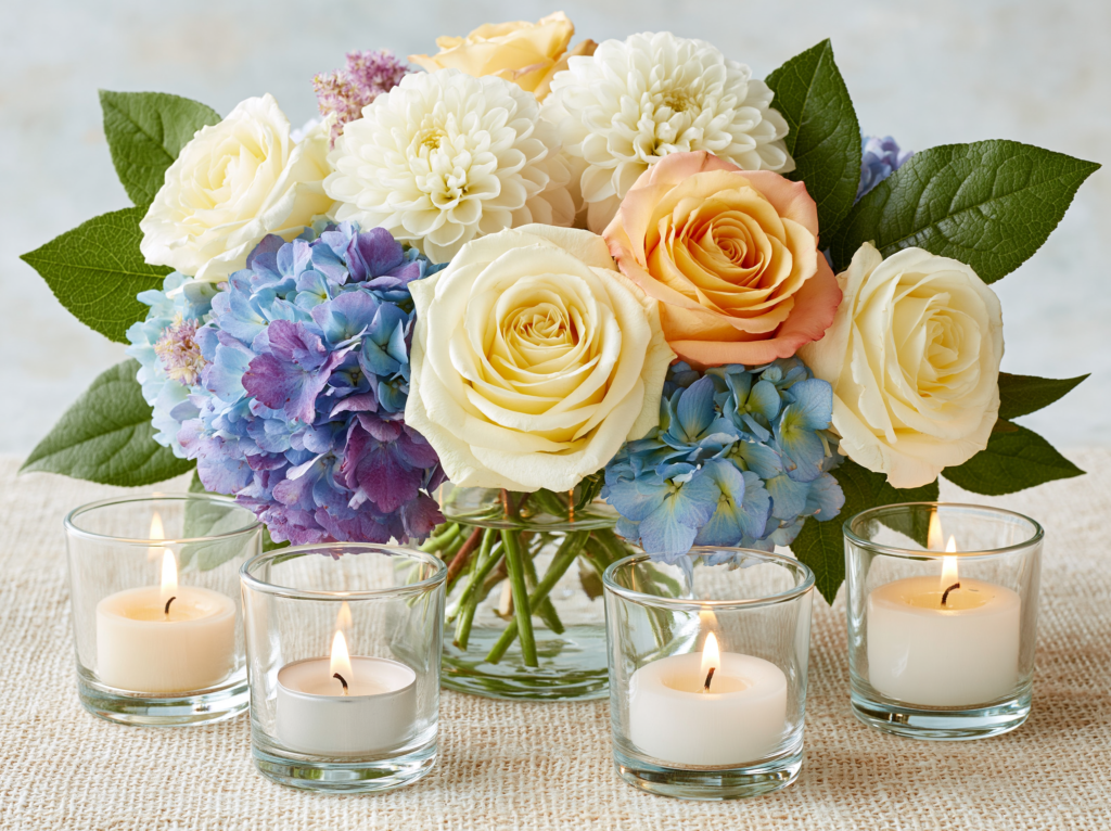
🕯️ Clear glass votive holders: Three to five grouped at the low zone of any centerpiece arrangement — they catch natural light beautifully during the day and transform the room’s warmth at any afternoon or evening event. The lowest-cost decoration with the highest atmospheric return.
2.2 The Warm & Nostalgic Direction
The warm and nostalgic direction is built around the plush bear — the most emotionally resonant baby shower motif because it connects to childhood, to softness, to the universal language of something that is cherished. The palette is honey amber, warm cream, and oatmeal, with the natural brown of the bear prop providing the warm anchor that makes everything around it glow. The textures are organic: linen, rattan, dried botanicals, kraft paper, natural twine. The invitation sets the storybook tone; the room continues it in gathered centerpieces, a warm balloon arch in honey and cream, and small bear props positioned throughout as the visual thread that ties every zone together. This direction photographs beautifully in any light and suits any guest list because its warmth is universally appealing rather than aesthetically specific.
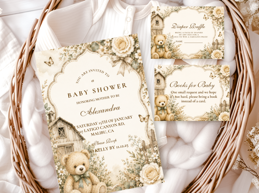
The Bear Theme collection brings the warm and nostalgic direction into stationery — honey tones, warm cream, and bear motifs across the full suite from invitation through every printed element.
🍯 Small honey jars in bulk: The highest-ROI edible favor across every palette direction in this guide — practical, universally liked, and inexpensive per guest when sourced in quantity. Add a custom label printed at home in the shower palette and they read as significantly more considered than their actual cost.
2.3 The Wild & Adventure Direction
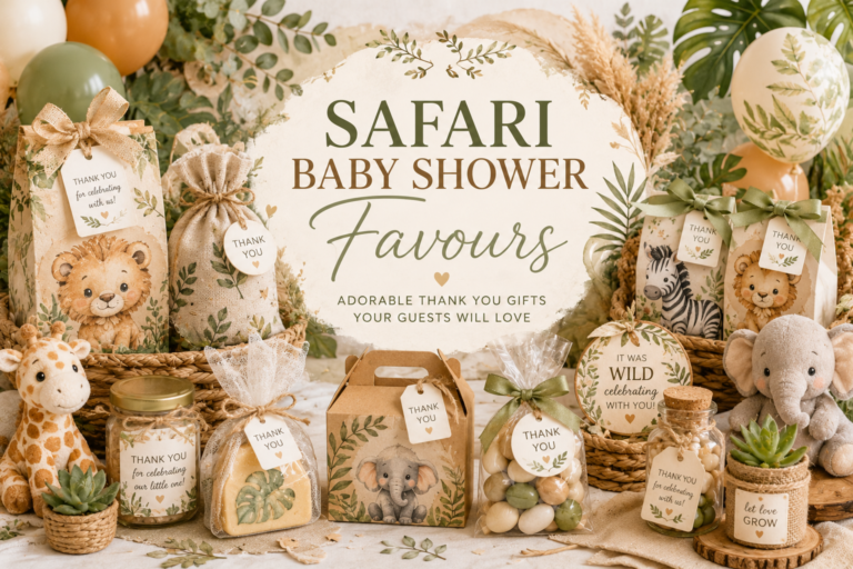
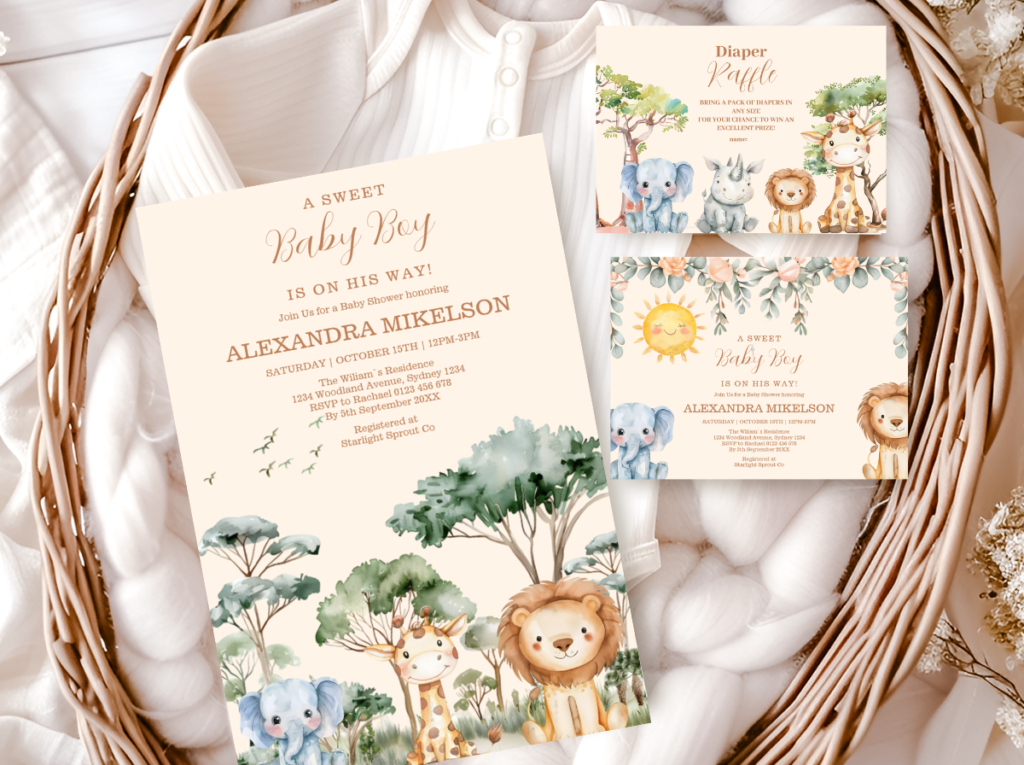
The wild and adventure direction uses safari and jungle animals as the motif vocabulary — giraffes, elephants, lions, and tropical birds — in a palette of warm sage green, caramel, and oatmeal cream rather than the primary yellow and orange that makes most safari shower setups read as a children’s party rather than a designed celebration. The natural world is the inspiration: woven textures (rattan chargers, wicker baskets, jute runners), wood and stone surfaces, dried pampas and palm leaves in tall vessels, and botanical prints that feel like field guide illustrations rather than cartoon animals. The invitation in this direction sets the palette register immediately — a muted, sophisticated illustration of safari animals in warm naturals signals that this shower is a designed celebration of the adventure of new life, not a party theme for a child already born.
The Safari Theme collection brings this palette into stationery — warm naturals and safari animal illustrations that stay sophisticated rather than tipping into primary colors or cartoon style.
2.4 The Free-Spirited Boho Direction
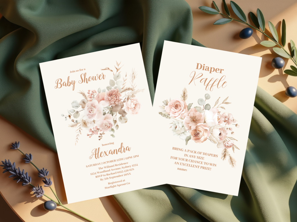
The boho direction is the most material-forward of the five — it is built on texture rather than color, which makes it the most flexible across different palettes and the most forgiving in execution. Macrame backdrops and wall hangings, dried pampas grass and protea in tall rattan vases, woven baskets as display vessels, fringe table runners, and terracotta pots as favors or centerpiece elements: these are the material decisions that define the boho register before any color is chosen. The palette can run from warm terracotta and rust to soft blush and sage to cream and caramel — all of these sit inside the boho texture vocabulary. The invitation in this direction should carry the same organic quality as the decor: hand-drawn or watercolor-style illustration, natural paper stock, and typography that reads as personal rather than typeset.
The Boho Theme collection brings the free-spirited aesthetic into stationery — organic illustration style and earthy, warm tones that match the macrame and dried botanical palette of the boho direction.
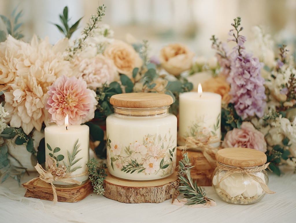
🕯️ Small soy candle favor set: The non-edible favor with the highest retention rate — candles disappear by being burned, which means guests never have to decide whether to keep or discard them. A warm amber or botanical scent suits every palette direction in this guide.
2.5 The Ocean & Sea Direction
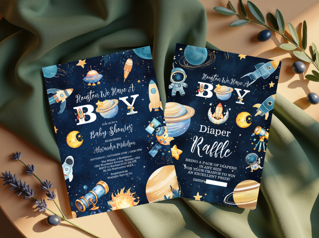
The ocean and sea direction is the most palette-flexible of the five — it works in the soft, warm register of vintage coastal illustration (seafoam, warm sand, sun-bleached cream) or in the cooler, more graphic register of modern maritime (navy, crisp white, rope and driftwood). Sea creatures — octopus, whale, crab, seahorse, turtle — are the motif vocabulary, rendered in a style that matches whichever register is chosen. The warmth register suits a summer outdoor event or a soft, whimsical interior; the graphic register suits a more structured, modern aesthetic. The one palette decision that applies across both registers: the ocean direction should always include at least one warm neutral (sand, cream, warm white) rather than running entirely in cool blue-green tones, because a fully cool palette loses the warmth that makes a baby shower feel celebratory rather than decorative.
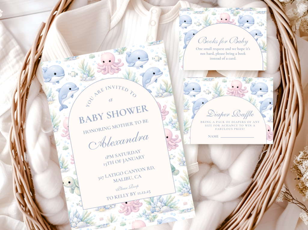
The Sea Animals collection brings the coastal world into stationery — sea creature illustrations in warm coastal tones that work across both the soft vintage and the graphic maritime registers of this direction.
Styling Tip — Palette Before Theme
The most cohesive baby showers are built around one palette direction, not one theme. A safari theme executed in the wrong colors — bright primary yellow and orange rather than warm sage and caramel — reads as a children’s birthday party regardless of how carefully the individual decorations were chosen. The same safari motif in warm neutrals reads as a beautifully designed celebration. This applies to every direction in this guide: the theme is the motif vocabulary (bears, florals, safari animals), and the palette is the register it lives in (warm and nostalgic, fresh and garden-adjacent, modern and earthy). Choose your palette first, then place the theme inside it — not the other way around. The palette decision costs nothing to make and determines the quality of every subsequent decision in the planning process.
Section 03 Decoration Ideas
Organized by zone — these ideas apply across all five palette directions above. Choose the ones that suit your theme and adapt the color to your palette.
3.1 Entrance & Welcome
Welcome sign on a natural wood easel. A printed or hand-lettered welcome sign at the entrance — in the palette typography, with the shower motif — is the first decoration guests see and the one that sets the visual expectation for the room. Position it at eye level, never on the floor or at ceiling height, so it is readable without effort. A warm wood easel works with every palette direction and can be repurposed for the dessert table or photo display later in the event.
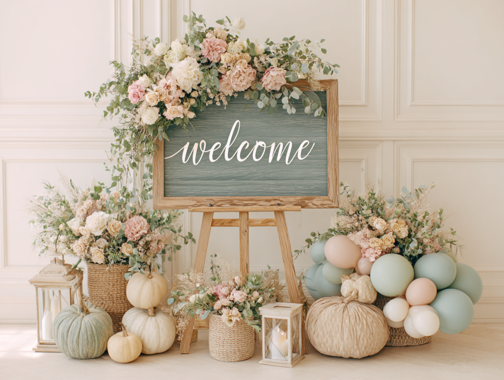
Organic balloon cluster at the entrance. A grouped cluster of seven to nine balloons in the shower’s palette, positioned to one side of the entrance rather than blocking it, frames the arrival moment without creating an obstacle. The cluster should be in the palette’s base tones rather than a separate set of colors — the entrance decoration is the promise of the room inside, and the palette should be consistent from the first moment guests arrive.
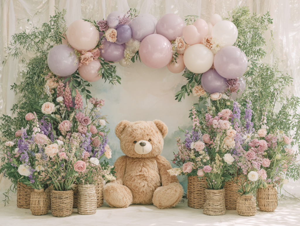
Botanical garland above the door frame. A loose garland of dried or fresh botanicals draped across the entrance door frame — dried eucalyptus and pampas for the boho direction, fresh greenery and roses for the garden direction, palm leaves and dried grasses for the safari direction — adds a natural arch element that photographs well and carries the palette into the first visual moment of the celebration.
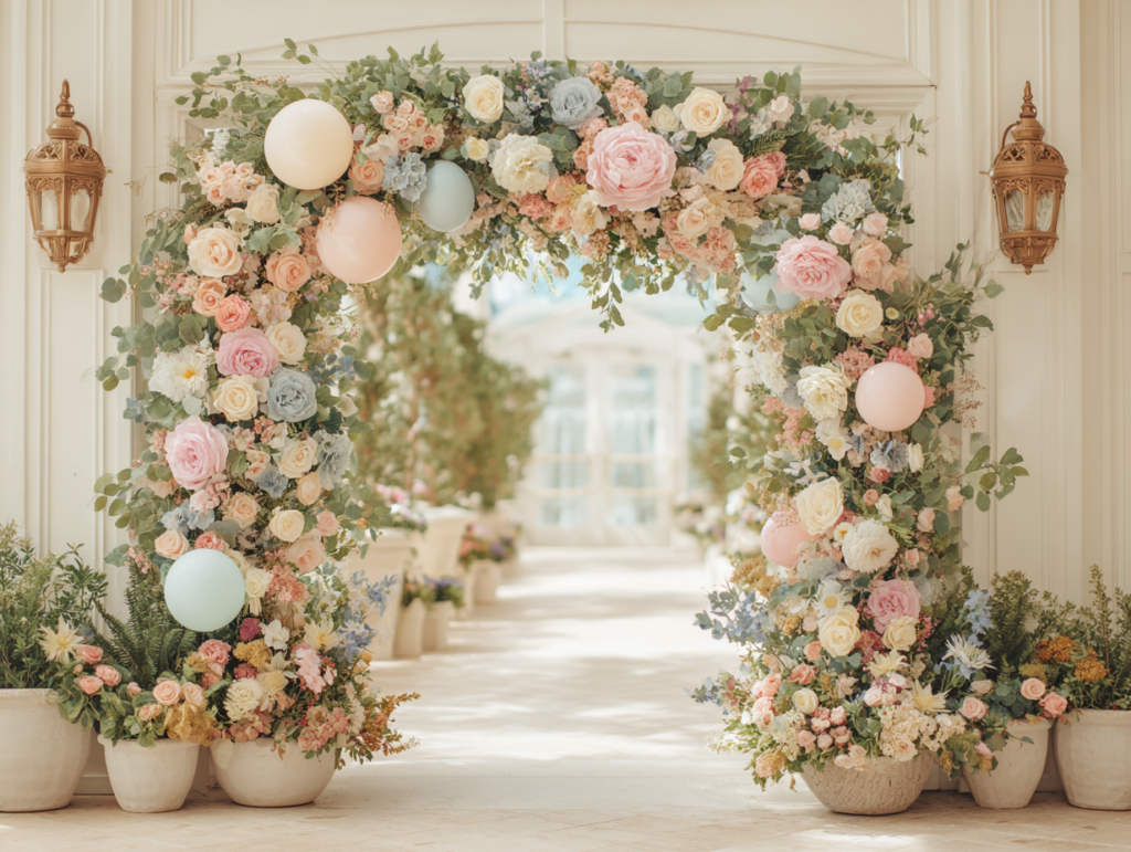
3.2 Backdrop & Photo Wall
Organic balloon arch. An arch of balloons in organic irregular groupings — different sizes, no visible frame, varying heights — suits the warm, soft aesthetic directions better than a structured geometric arch. The palette ratio that works across all five directions: 70–80% in the base warm neutrals (cream, ivory, warm white), 20–30% in the palette’s accent color. Position the arch directly behind the main table or chair arrangement and size it to that surface, not to the full wall width.
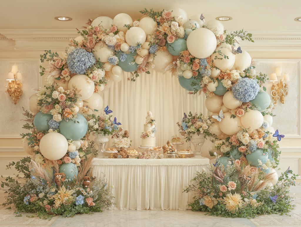
Greenery or dried botanical panel. A panel of fresh greenery, faux eucalyptus, or dried pampas grass behind the main table creates a warm, organic backdrop that photographs well in any light and suits the garden, boho, safari, and bear directions equally. Panels can be scaled to any width and require no special installation — a freestanding frame or a simple wall-mounted rail holds most botanical panel installations.
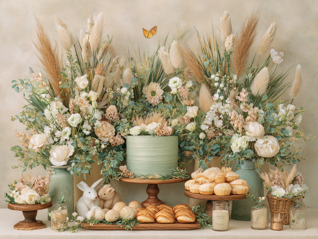
Fabric drape or linen backdrop panel. A length of linen or cotton fabric in a warm palette tone, draped or gathered behind the main table, creates the simplest and most cost-effective backdrop available. A single piece of warm ivory linen draped from a curtain rod and gathered slightly at the sides reads as intentionally soft and romantic; the same linen ironed flat and hung straight reads as modern and minimal. Choose the treatment that matches your direction.
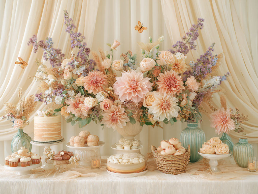
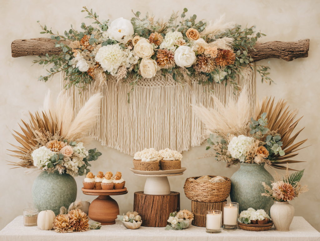
Macrame wall hanging. A large macrame or woven wall piece adds the texture layer that the boho direction requires and that complements the natural material palette of the bear and safari directions. Position it at center-height against the backdrop wall; a large piece does not need any additional backdrop element because its texture creates sufficient visual interest on its own.
3.3 Guest Table Details
Three-height centerpiece grouping. Any centerpiece arrangement that includes elements at three distinct heights — low (a candle or small votive), mid (a small floral arrangement or a central prop), and tall (a botanical stem, a taller vessel, or a dried grass arrangement) — creates the silhouette that makes a table read as designed rather than set. The specific elements matter less than the height variation; even a simple grouping of three objects of different heights in the palette reads as intentional.
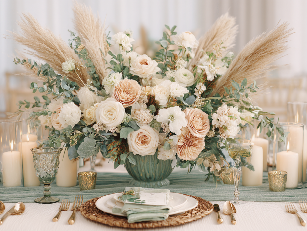
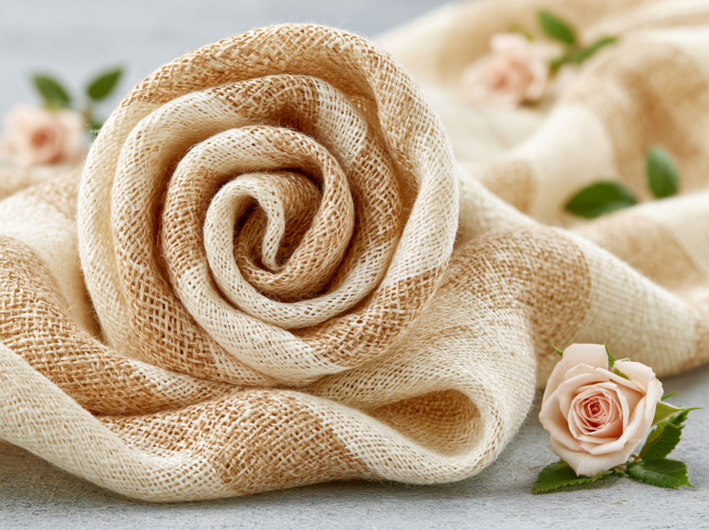
Warm ivory linen runner. A linen runner in warm ivory, oatmeal, or the palette’s neutral base tone is the single highest-ROI table decoration available — it is the largest surface-area element on the table and sets the temperature register for everything placed on top of it. Wash and press the linen before the event; wrinkles read as inattention at close range, and guests sit at this surface for the duration.
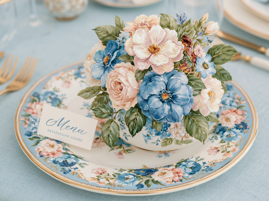
Coordinated place card and menu card. A place card from the shower’s stationery suite — in the same typography, palette, and motif as the invitation — is the printed detail every guest handles at the table. It costs almost nothing per guest when printed at home from the suite, and its presence at the place setting signals that the celebration was designed from the invitation through to the table, which is the difference between a decorated table and a designed one.
Glass votive candle cluster. Three to five clear glass votives with tea lights or small pillar candles, grouped at the low zone of the centerpiece arrangement, add the ambient warmth layer that makes an indoor shower feel intimate and considered. For daytime events, clear glass votives catch natural light and add visual interest even unlit; for afternoon or evening events, they transform the light quality of the room in a way that no other low-budget decoration achieves.
Styling Tip — Budget Allocation
Spend 50% of your decoration budget on two zones only: the backdrop and the guest tables. These are the two zones every guest interacts with directly — the backdrop in every photograph taken at the shower, the tables in person for the entire duration of the event. A strong backdrop with minimal corner decoration looks designed. A weak backdrop with decorated corners looks like a storage room with balloons. A beautiful guest table with a modest backdrop produces a shower that felt warm and personal; a magnificent backdrop with bare tables produces a shower that photographed beautifully and felt slightly impersonal. Invest in the zones that matter most before allocating anything to transitional spaces, secondary walls, or corner details — those should receive no more than 10% of the total budget after the priority zones are funded.
Section 04 Food & Cake Ideas
These ideas apply across all five palette directions — adapt the specific palette colors and motifs to your chosen theme direction.
4.1 Cake Directions
Warm ivory base with palette-matched buttercream accent. A cream or warm ivory base cake with a single accent color in the shower’s palette applied as a buttercream detail — a spatula-textured band, a single floral cluster, or a simple drip — photographs most cohesively with any warm palette direction. The cake reads as part of the room rather than a separate object because it shares the palette’s temperature. Avoid fully colored cakes in the dominant palette color; they tip the dessert table toward monochromatic.
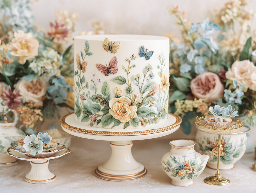
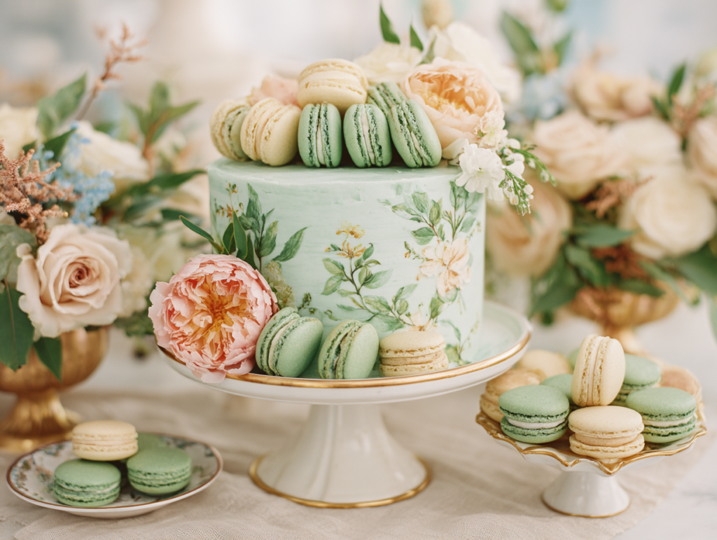
Watercolor wash cake. A white or cream base cake with a diluted watercolor-effect paint in one or two of the palette’s accent colors, applied with a wide brush over the base to create a soft, bleeding wash effect. This technique is achievable by any baker with food coloring and a flat brush, requires no specialist skills, and produces a result that photographs as artisan and considered. Pair with dried botanical topper for any of the nature-adjacent directions.
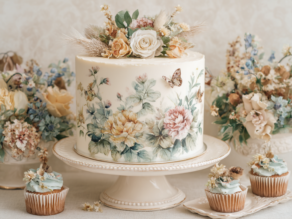
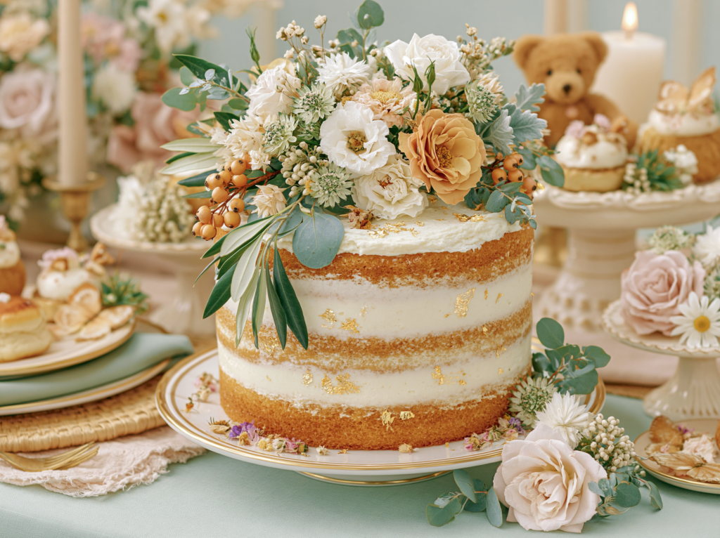
Naked or semi-naked layered cake. A layered cake with exposed or semi-exposed sponge and a restrained frosting layer is the cake format that looks most like itself — warm, natural, and unstudied — which makes it the format that requires the least decoration to look beautiful. A single seasonal fruit or botanical cluster at the base of the top tier and a dusting of edible gold or dried flower petals is the complete decoration for a naked cake in any direction.
4.2 Dessert Table Ideas
Three-height display with labels from the stationery suite. Any dessert table that presents treats at three distinct heights — tall (the cake), mid (a tiered stand of cupcakes or macarons), and low (a flat board of cookies or small bites) — reads as designed. Food labels printed from the stationery suite in the same typography and palette as the invitation tie the dessert table to the rest of the room’s printed identity.
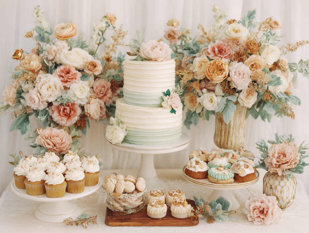
Palette-matched macarons. Macarons are the most visually efficient dessert for any shower display because their uniform circular shape stacks neatly, their color can be matched precisely to the shower palette, and their texture photographs beautifully at any scale. Order them in one or two palette colors rather than a full rainbow — two colors in the same tonal family look designed; six colors look like a generic macaron tower.
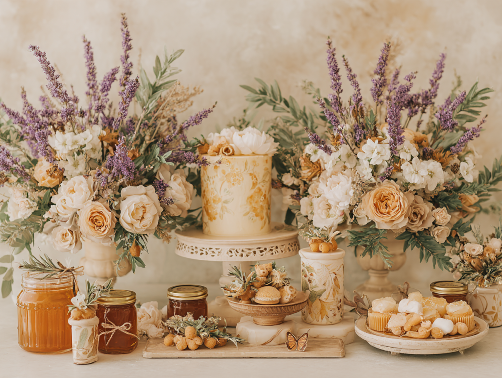
Honey jar display as a dessert element. A grouping of honey jars, jam jars, or small preserve pots with custom labels in the shower palette serves as both a dessert table decoration and a favor display simultaneously — the visual interest of the jars at the low zone of the table, the sweet content accessible to guests, and the labelled-and-tied packaging ready to take home. This is the highest-ROI element available for the dessert table across all five palette directions.
4.3 Brunch & Food Display
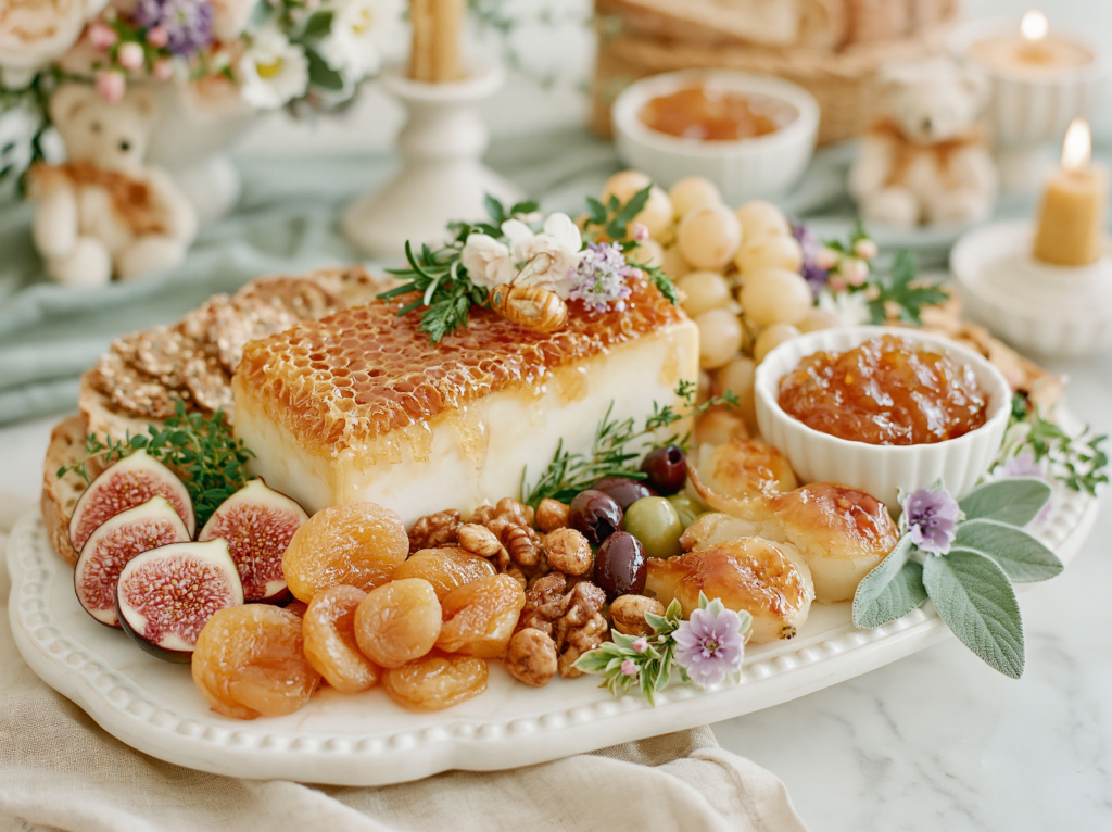
Grazing board with palette-adjacent ingredients. A large grazing board or charcuterie spread in warm, natural tones — honey, fig, dried apricot, aged cheese, seed crackers, and fresh herbs — reads as part of the design rather than a separate catering item when the ingredients share the palette’s warmth. Avoid bright red strawberries and vivid green grapes on a warm neutral palette board; they introduce color notes that do not belong to the palette.
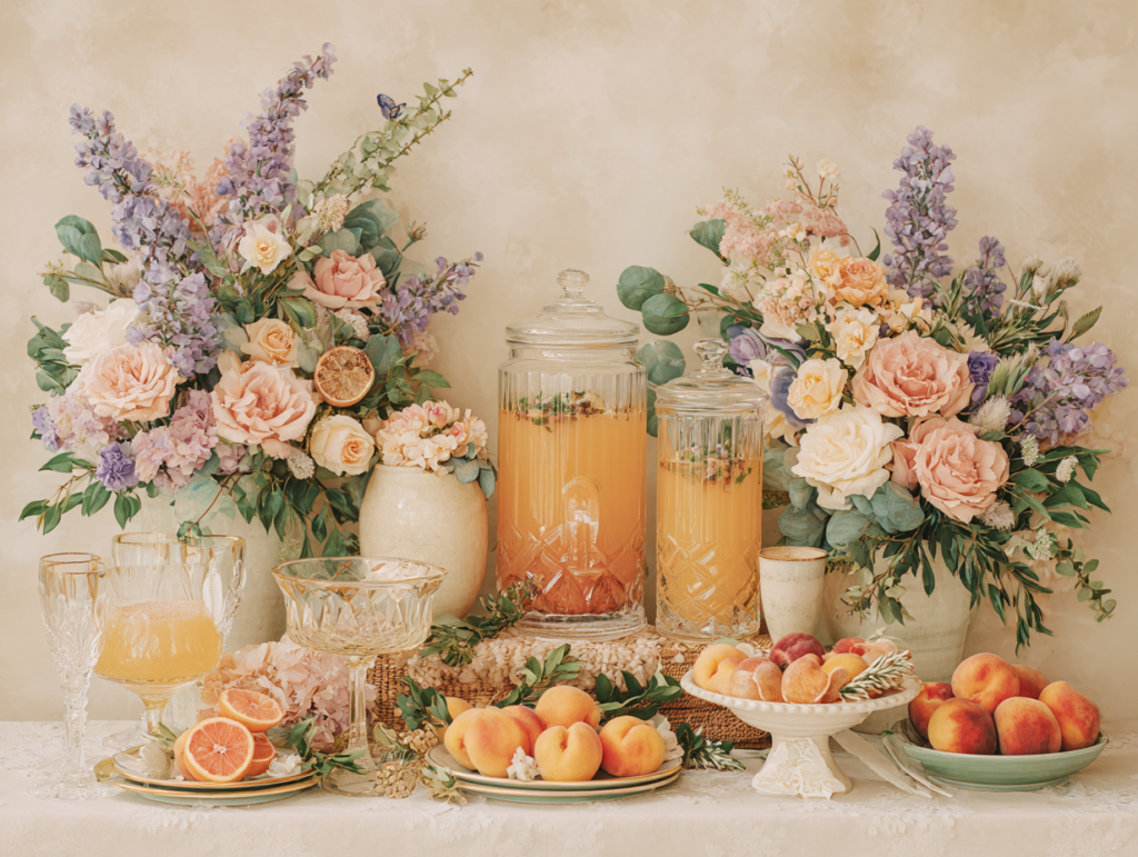
Mimosa or juice bar with palette-matched garnishes. A self-serve drinks station with two or three juice options, sparkling water, and garnishes in the palette’s colors (edible flowers, dried citrus slices, herb sprigs) functions as both a practical drink station and a styled display element. A handwritten or printed menu card from the stationery suite adds the cohesive printed detail that ties the drinks station to the rest of the room.
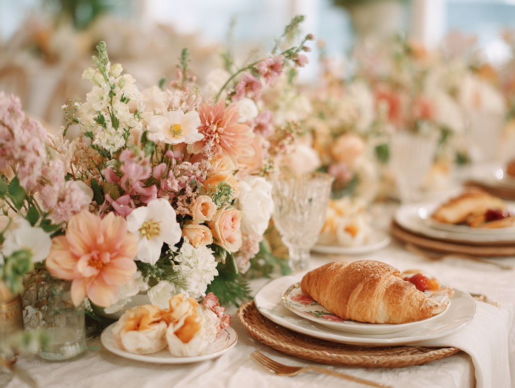
Served brunch plates over buffet. For smaller showers under twenty guests, plated brunch service creates a more intimate and celebratory feeling than a buffet setup — guests sit together and eat together, which creates the shared moment that buffet events rarely achieve. Plated service requires no additional catering investment for home or hired-venue events; it simply requires that the food be portioned and carried to the table rather than set out for self-service.
Section 05 Games & Activities Ideas
For any shower, plan no more than 2 games for a 2-hour event or 3 for a 3-hour event. Total game time should not exceed 35 minutes.
Classic Crowd-Pleasers
Baby shower bingo. The most reliable large-group shower game — runs simultaneously during gift opening so every guest remains engaged without requiring any additional game slot. Print cards in the shower’s palette on warm ivory paper rather than bright white.
Don’t Say Baby. A passive game that runs throughout the whole event without requiring a dedicated game slot. Each guest receives a token at arrival; the guest who catches others saying “baby” takes their token. The guest with the most tokens at the end wins. Use a palette-consistent token rather than a generic clothespin.
Baby Price Is Right. Guests guess the retail price of five to seven baby items; the guest who comes closest without going over wins. Curate the items list to things that belong to the shower’s direction rather than generic baby products.
Prediction & Guessing Games
Due date and baby stats prediction cards. Guests predict birth date, time, weight, and first word. The card becomes a keepsake when it is printed on quality card stock with a space for the guest’s name and a warm message from the host. The parent-to-be contacts the closest predictor after the birth.
Guess the baby item by touch. Mystery baby items in an opaque drawstring bag; guests feel without looking and write their guesses. Choose items that are tactilely ambiguous to create genuine challenge — a muslin square, a silicone teething ring, a small dummy.
Memory & Wishes Activities
Advice cards for the parents. A station with pre-printed cards and a specific prompt generates more genuine responses than a generic “write your advice” instruction. Position the station adjacent to the food or bar area where guests naturally pass. Use pens that have been tested before the event.
Wishes jar. Guests write a wish for the baby on a card or tag and place it in a glass jar the parents take home. Distinct from the advice card — advice is practical and retrospective; wishes are imaginative and forward-looking. Both should be present if space allows.
Decorate a onesie station. Plain onesies, fabric markers in palette colors, a cardboard insert inside each onesie to prevent bleed-through. This station runs passively throughout the event, suits guests who prefer activity over structured games, and produces keepsakes the baby will actually use. Use permanent fabric markers only.
Section 06 Favor Ideas
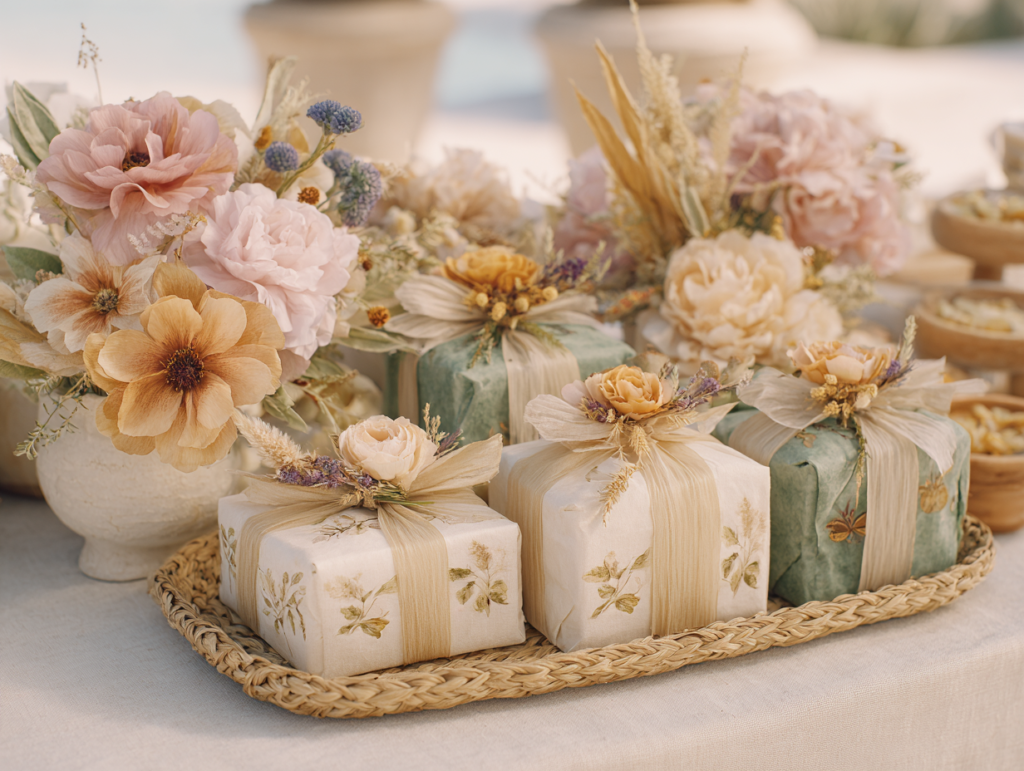
The favor is the last impression guests take home. The most kept favors are edible ones — they disappear by being used and require no decision about whether to keep or discard them.
Edible Favors
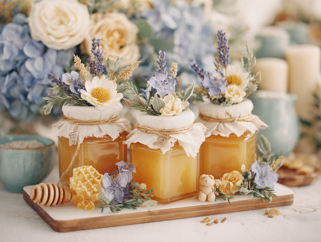
Honey jar with custom label. The most thematically appropriate edible favor across most shower directions — practical, universally liked, and inexpensive when sourced in quantity. A custom label in the shower’s palette transforms a 2 oz honey jar from a supermarket purchase into a designed keepsake. Cost: approximately £2–£4 per guest.
Tea sachet selection. Three to four premium tea bags in a small envelope or sachet with a custom label — “Sip, relax, and celebrate” — works across all five palette directions and suits any guest. Warm herbal selections (chamomile, rooibos, rose) suit the garden and bear directions; bold or earthy blends (chai, vanilla, bergamot) suit the safari and boho directions.
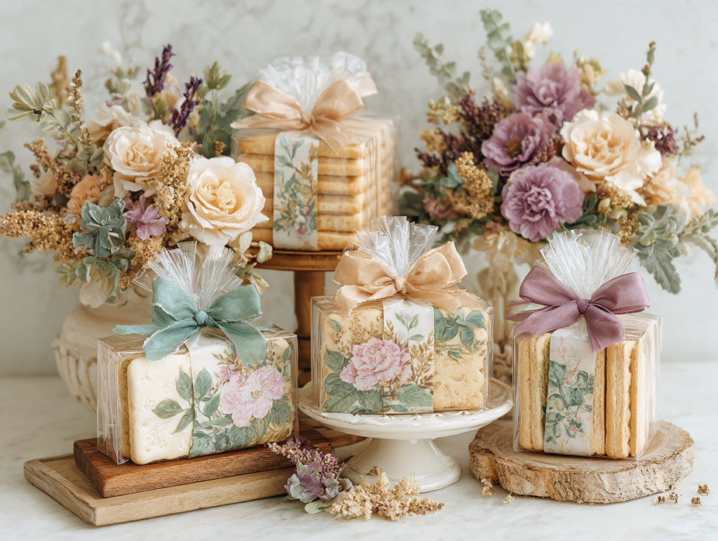
Shortbread or cookie in palette-matched packaging. Plain shortbread in a cellophane bag tied with a palette ribbon and a custom tag is the simplest edible favor to produce at home in quantity. A bear-face stamp in warm brown or a botanical motif stamp on the bag completes the aesthetic without requiring printing or labeling equipment.
Botanical & Keepsake Favors
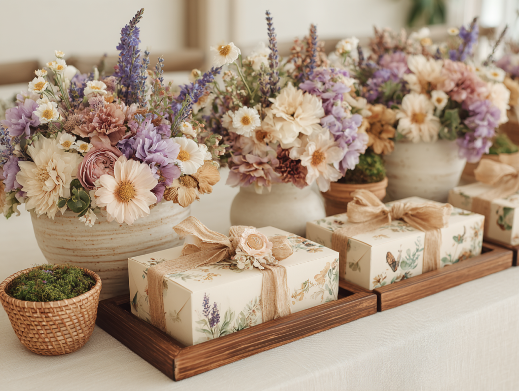
Seed packet in kraft envelope. A seed packet — wildflowers, lavender, chamomile — in a custom kraft envelope with a warm label is sustainable, inexpensive, and universally meaningful. The card that accompanies it (“Watch something beautiful grow”) connects the favor to the theme of new life and new beginnings.
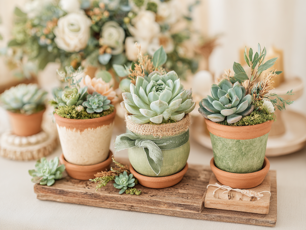
Small succulent in a terracotta pot. The most lasting favor of any category — still alive in a guest’s home weeks after the shower. A sage ribbon tied at the pot rim and a greenery-motif tag with the shower date completes the packaging. Water lightly up to two days before the event and leave dry through the day; plants survive transport better when not overwatered.
Soy candle in a small vessel. A 4 oz soy candle in a cream or clear glass vessel with a custom label in the shower’s palette is the non-edible favor with the highest retention rate. Candles disappear by being burned, which means guests never have to decide what to do with them. A warm amber or botanical scent suits all five palette directions.
Section 07 Invitations & Stationery
Every idea in this guide begins with the invitation — and the invitation should be chosen first, before any other planning decision is made. The palette on the paper should match the palette in the room; when it does, the celebration feels complete from the first envelope to the last favor bag. The specific tone of the cream, the warmth of the accent color, the quality of the illustration and the typography: all of these are established in the invitation and serve as the physical reference for every subsequent decoration decision. Hold a potential balloon, linen, or ribbon next to the invitation before purchasing it — if the colors belong to the same world, buy it; if they do not, leave it.
The stationery suite extends the invitation design into every printed element in the room: place card, menu card, favor tag, food label, advice card prompt, prediction card, welcome sign, and thank-you note. When all of these share the same illustration style, the same typography, and the same palette, the room reads as a single designed world from arrival to departure. When they are sourced individually from different places without a visual reference, each element is separately appealing and collectively incoherent.
The most practical argument for a full suite is the palette consistency it guarantees: when every printed element is produced from the same collection, the palette is consistent by design rather than by careful coordination. The cream on the place card is the same cream as on the invitation, the favor tag, and the menu card, because they were all produced from the same color file. This consistency is impossible to achieve any other way at the same level of reliability, and it is the quality detail guests notice and describe without always being able to name.
The five collections below cover every palette direction in this guide — browse all five before choosing, and choose the stationery suite before making any other planning decision. Each collection links to the full product range for that theme direction.
Garden & Floral
Baby in Bloom
Botanical illustrations and soft pastels — the stationery suite for the garden and floral shower direction.
Warm & Nostalgic
Bear Theme
Honey tones and bear motifs — the stationery suite for the warm, nostalgic shower direction.
Wild & Adventure
Safari Theme
Warm naturals and safari animal illustrations — the stationery suite for the wild and adventure direction.
Free-Spirited Boho
Boho Theme
Organic illustration style and earthy tones — the stationery suite for the macrame and dried botanical boho direction.
Ocean & Sea
Sea Animals
Sea creature illustrations in coastal warm tones — the stationery suite for the ocean and sea shower direction.
Frequently Asked Questions
How far in advance should I plan a baby shower?
Eight to ten weeks before the shower date is the standard planning timeline for a well-executed event. The critical early decisions are the venue (if not a private home), the guest list, and the stationery — invitations should be sent six weeks before the event, which means they need to be ordered, produced, and addressed at least eight weeks out. Decoration sourcing can begin as soon as the palette is established (which can happen in the first week of planning if the stationery is chosen first, as this guide recommends). Custom-made items — cookies, cakes, and specialty favors — typically require four to six weeks of lead time. For a shower during a peak social season (spring through early summer, September through October), add two weeks to all timelines because vendors and venues are more heavily booked. The single most common planning mistake is starting too late and then rushing the stationery, which eliminates the palette reference that makes all other decisions easier.
How many guests is typical for a baby shower?
The most common baby shower size is fifteen to thirty guests, but showers range from intimate gatherings of eight to ten close friends and family to larger events of forty or more. The guest count has practical implications for every planning decision: for under fifteen guests, conversational game formats and plated food service work well; for fifteen to thirty guests, printed card games and buffet or grazing board service are more practical; for over thirty guests, simultaneous games only (bingo, prediction cards) and self-serve food stations are the correct formats. The size of the shower should also inform the decoration investment: a ten-person shower in a living room requires very different decoration decisions than a thirty-person shower in a hired venue, and neither is better — they are different events that warrant different approaches. The most beautiful shower is the one that is appropriately sized for the guest of honor, the budget, and the space.
What is a typical baby shower budget?
Budget ranges vary widely by region, guest count, and aesthetic ambition, but a useful framework is to think in terms of cost per guest rather than total budget. For a home shower, a realistic cost per guest for food, decoration, and favor is £15–£35 (or equivalent). A twenty-guest shower therefore typically costs £300–£700, with significant variation based on decoration ambition, catering choice, and venue. For a venue-based shower, add venue hire to these figures. The single most important budget insight from this guide: the allocation between zones matters more than the total figure. A £400 shower that spends £200 on the backdrop and guest tables (50%) and £40 on favors (10%) will produce a more beautiful result than the same £400 spent evenly across all zones, because the investment concentrates in the areas of highest visual impact. Within any total budget, prioritize in the order established in Section 03 — backdrop, tables, entrance, dessert table, transitional spaces — and stop when the budget is spent.
How do I plan a baby shower on a tight budget without it looking cheap?
Five specific decisions produce the highest visual return at the lowest cost and collectively make a tight budget produce a beautiful result. First: choose the stationery suite before anything else and let it be the palette reference for every subsequent purchase — this costs nothing to do and prevents every expensive mistake caused by incoherent color decisions. Second: spend the available decoration budget on the backdrop and the guest tables only, and leave all other zones for DIY or very minimal investment — a well-styled backdrop and a beautiful table can make an otherwise sparsely decorated room read as intentionally restrained. Third: use linen (rental or purchased) as the primary decoration investment — a warm ivory linen tablecloth is the single highest-ROI decoration in any room because it changes the temperature and quality register of the entire table for the duration of the event. Fourth: choose an edible favor that can be assembled at home — honey jars with custom labels, printed at home on kraft stock, cost £2–£4 per guest and read as significantly more expensive than their actual cost. Fifth: print all game cards, prediction sheets, advice cards, and menu cards at home in the stationery suite palette, on warm ivory card stock rather than bright white — the material costs the same and the result looks designed rather than photocopied.
Start With the Stationery
Find the Collection That Matches Your Vision
The invitation is the first decision — and the one that makes every other decision easier.