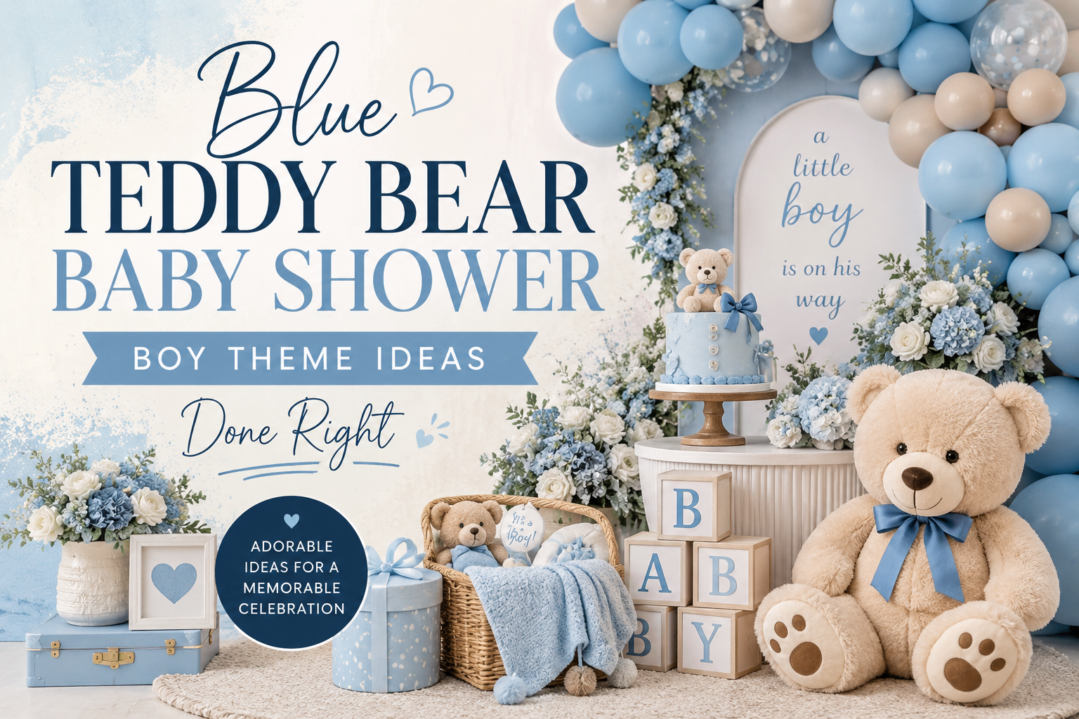
Blue Teddy Bear Baby Shower: Boy Theme Ideas Done Right
Boy Bear Shower Inspiration
Blue Teddy Bear Baby Shower: Boy Theme Ideas Done Right
Four palette directions, the specific blue that actually photographs well, and the warm anchor color that prevents a boy bear shower from reading clinical.
Blue and bear is one of the most saved boy shower combinations on Pinterest right now — and also one of the most commonly executed in a way that looks nothing like what was saved. The gap between the board and the room is almost always the same thing: the wrong blue. Bright baby blue and dusty slate blue are both “blue” in a text description; in a photograph, they produce completely different emotional registers. One reads as a considered, warm, beautifully styled celebration. The other reads as generic. This guide covers how to be in the first category.
Four blue bear palette directions — from the most-saved dusty blue and warm brown combination to the nautical sailor bear and the outdoor adventure fishing direction — plus the decor, cake, and stationery decisions that make each one look like it was planned by someone who thought carefully about it.
“The best boy shower palettes don’t announce themselves — they feel considered, warm, and specific in a way that generic baby blue never does.”
Section 01 The Problem With Generic Baby Blue
Most blue teddy bear shower setups disappoint for the same three reasons. They are not mistakes in execution — the decorations are neat, the table is laid correctly, the balloons are inflated. They are mistakes in decision: specifically, three decisions that were made without enough deliberateness. Here is each one named clearly, with the fix.
Problem 01: The Wrong Blue
The specific shade of blue chosen is the single most important decision in this palette, and it is the one most often made by grabbing the first blue item found at a party supply store. Bright, saturated baby blue — the kind that appears on generic “It’s a Boy” banners and hospital gift bags — immediately reads as dated and generic in a styled setting. It has no warmth in it, no depth, no relationship to the muted, considered tones that make modern boy shower content perform on Pinterest. It competes with everything warm around it rather than sitting inside the palette. When guests arrive and something feels “off” about a blue shower that seemed well-planned, the blue is almost always the culprit.
The fix: dusty blue, slate blue, powder blue with grey in it, or denim blue. These are blues that have been softened — either with white (for a powdery quality) or with grey (for a more sophisticated, muted register). They sit comfortably alongside warm cream and warm brown without creating a temperature conflict. In a room, they read as calm and considered. In a photograph, they allow every warm element alongside them to glow rather than being visually cancelled. A useful self-test: if the blue item you are considering would look at home in a nursery painted in 1998, it is the wrong blue. If it looks like it belongs in a Scandinavian interior or a considered modern home, it is the right one.
Problem 02: No Warm Anchor
Blue is a cool color, and a palette built entirely in cool tones — blue balloons, blue tablecloth, blue cake, blue napkins — reads as cold and clinical in a physical space regardless of how much thought went into it. The warmth that makes a bear shower feel inviting comes from the warm anchor color: warm brown, honey amber, or cream. This is not an accessory to the blue palette; it is what gives the blue palette its character. Without it, the blue reads as a theme color — the kind of blue that was chosen because the baby is a boy, not because it was chosen for aesthetic reasons. With a warm anchor at approximately 30% of the visual palette, the blue transforms from a statement into a conversation.
The fix: warm brown (the bear’s own color) is the most naturally integrated warm anchor for a blue bear palette because it belongs to the theme itself — the honey-brown plush bear sitting against a dusty blue balloon backdrop is the image that pins well because both elements are right. Honey amber works for the vintage direction; warm oatmeal cream works for the more neutral and sophisticated directions. Choose one warm anchor and apply it consistently: in the linen, the bear prop, the floral stems or ribbon color, and the stationery. It does not need to be prominent — 30% of the visual palette is enough to shift the room from cold to warm.
Problem 03: No Texture Layer
A blue balloon arch in front of a blue fabric backdrop above a blue tablecloth with blue paper goods creates a monochromatic room that reads as overwhelmingly single-noted — not cohesively themed. The problem is that every element is in the same material and color family, which means there is no texture variation for the eye to move between. Depth in a single-color-dominant palette comes not from varying the shades of that color but from varying the materials: linen against plush against wood against printed paper. The blue balloon is made of latex; the blue linen is woven; the blue ceramic charger plate has a smooth glaze; the blue invitation is a flat printed surface. These are all blue, but the material differences create the visual interest that makes a monochromatic room feel rich rather than flat.
The fix: when buying any element for the blue bear palette, name its material as well as its color. The table should have at minimum: woven linen (the soft, matte texture), a plush element (the bear), a natural element (wood, rattan, or dried botanicals), and a printed element (the stationery). These four material categories, all in the same palette, create the depth that makes a single-color room feel designed rather than painted.
Styling Tip
Test your blue before you buy in bulk. Pull up your Pinterest board on your phone — specifically the images you have saved that represent the shower you want to create — and hold the item next to the screen in the store. If the blue of the item reads brighter or cooler than the blues in your saved images, it will fight the palette on the day. This test takes thirty seconds and costs nothing, and it is more reliable than any color name on a label or website. Dusty, muted, and slightly greyed blues photograph beautifully alongside warm brown and cream. Bright, saturated blues photograph as the loudest element in the room — which is not the role you want a tablecloth or a balloon arch to play.
Section 02 Four Blue Bear Palette Directions
Each direction below has a distinct aesthetic register, a specific blue, and a specific warm anchor. They are not interchangeable — choose the one that matches the tone of the celebration you want to create.
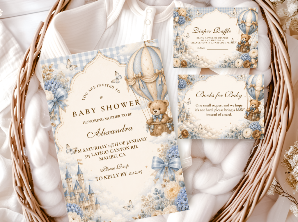
2.1 Dusty Blue & Warm Brown
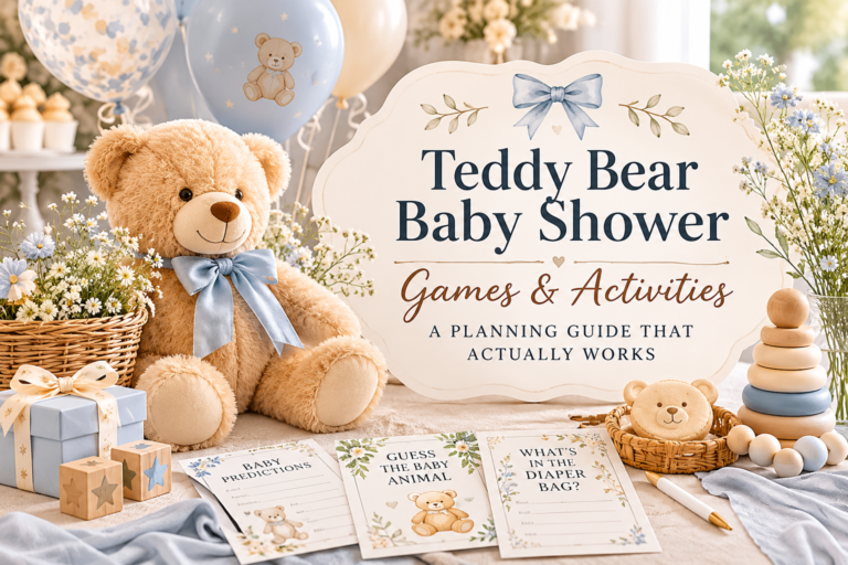
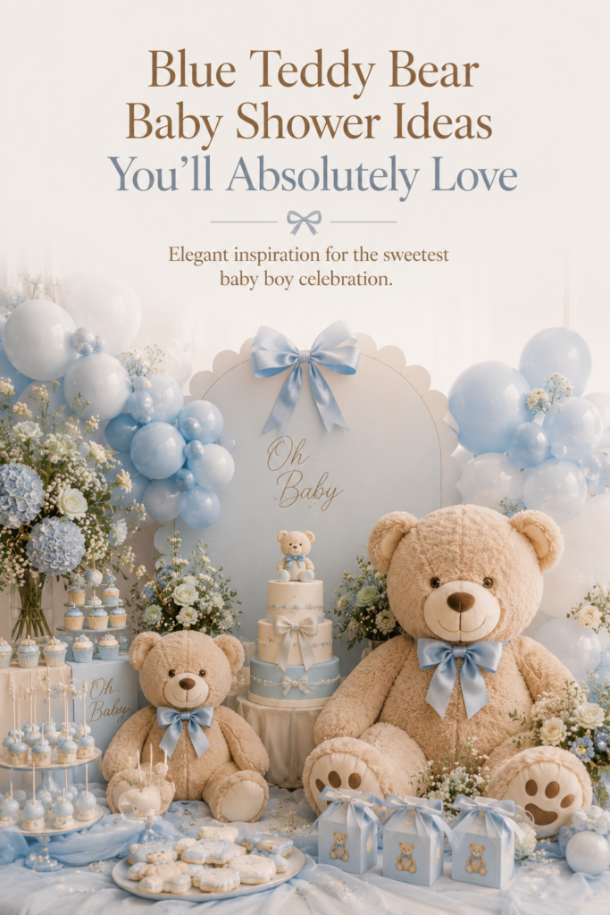
Dusty blue and warm brown is the most-saved and most cohesive boy bear palette combination on Pinterest, and it works because the two colors solve each other’s problems. Dusty blue alone reads as cool and slightly remote; warm brown alone reads as earthy but potentially heavy. Together, with cream as the base that holds them both, the palette reads as simultaneously warm and airy, grounded and gentle — which is exactly the register a bear shower aims for. The bear itself supplies the brown: a honey-brown plush bear against a dusty blue balloon cluster or a dusty blue linen runner is the image at the heart of this palette, and it requires no additional prop or styling intervention to work.
The palette ratios for this direction: cream at 60% (the tablecloth, the cake base, the envelope, the backdrop panel), dusty blue at 30% (the balloons, the ribbon, the invitation accent, the napkin), and warm brown at 10% (the bear, the wood elements, the kraft paper tags). This is the direction that suits any table shape, any ceiling height, and any aesthetic register from casual to formal — because the three colors are individually unpretentious and collectively beautiful. The one ratio error to avoid: too much brown at the 30% level pushes the palette toward vintage honey rather than boy bear; keep the brown at the accent level and the blue as the dominant secondary color.
The Brown and Blue Teddy Bear collection builds this exact palette into a complete stationery suite — dusty blue and warm brown tones with a bear motif that matches the visual anchor of the plush bear on the table.
2.2 Slate Blue & Neutral Cream
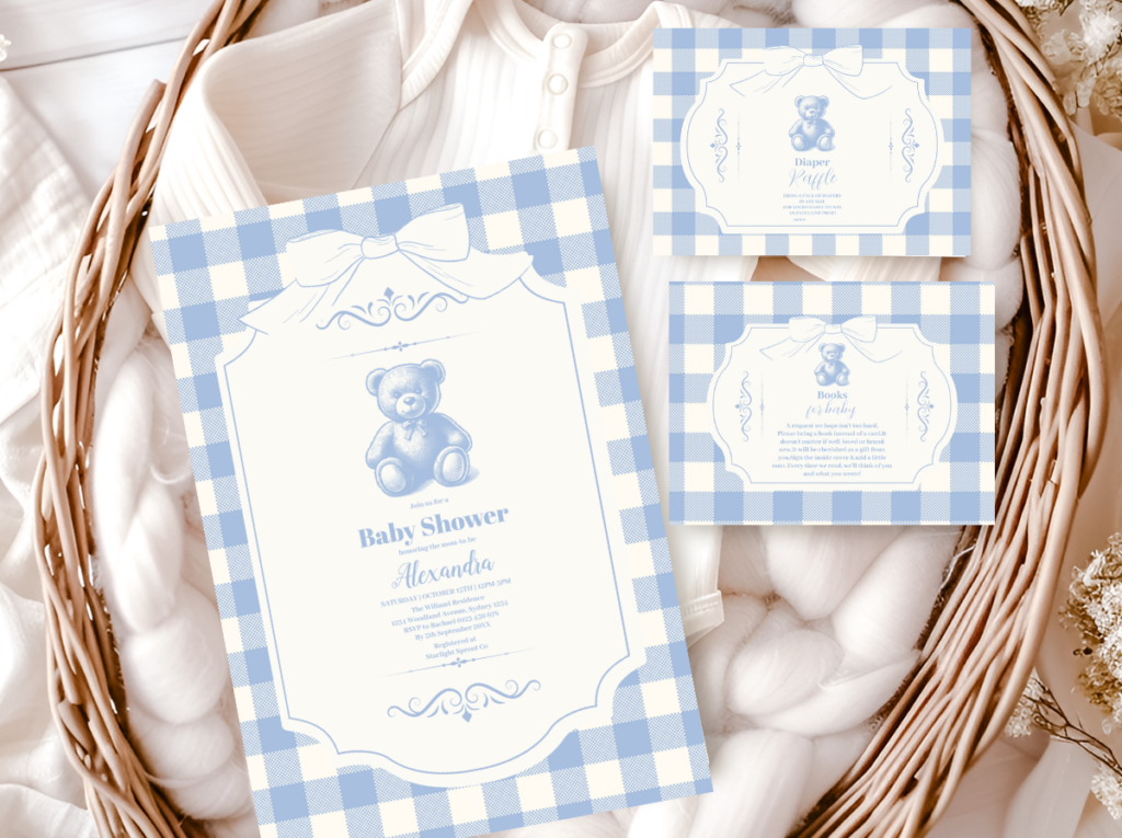
Slate blue and neutral cream is the most sophisticated and least gender-coded direction in the blue bear palette world. Slate blue sits further toward grey than dusty blue — it has a cooler, more architectural quality that reads as quietly elegant rather than warmly nostalgic. Against warm ivory and oatmeal cream (rather than bright white), it produces a palette that feels genuinely designed rather than color-themed. This is the direction that guests describe as “beautiful” without immediately saying “oh, it must be a boy” — the color signals are there, but they are understated enough that the aesthetic register comes first.
The warm anchor in this direction is oatmeal and warm ivory rather than the more explicit warm brown of the dusty blue direction — which makes this palette work for hosts who want a boy shower that reads as simply beautiful rather than explicitly bear-and-blue-themed. The bear prop in this direction should be in warm honey-brown; a grey or white bear loses the theme anchor. Dried pampas or pale wheat stems in a cream vessel introduce the natural texture layer without adding any warmth that would shift the cool slate register. The linen for this direction is warm ivory, not white — the difference between the two against slate blue is the difference between sophisticated and clinical.
The Blue Teddy Bear collection captures the slate blue and neutral cream direction in a complete stationery suite — the exact muted register that makes this palette read as designed rather than themed.
Styling Tip
Slate blue and cream is the palette that reads as a boy shower to parents who look closely, but reads as simply beautiful to every other guest who walks through the door. It makes no loud announcement. It does not deploy every blue object it can find to establish the theme. It trusts the palette to do the work quietly, which is the mark of a shower that has been genuinely considered rather than assembled from a theme. If the goal is a shower that feels elevated rather than themed, this is the combination to choose. The single detail that signals “bear” without requiring any additional explicit thematic decoration is the honey-brown plush bear at the centerpiece — everything else in the room can be pure slate and cream.
2.3 Preppy Navy & White
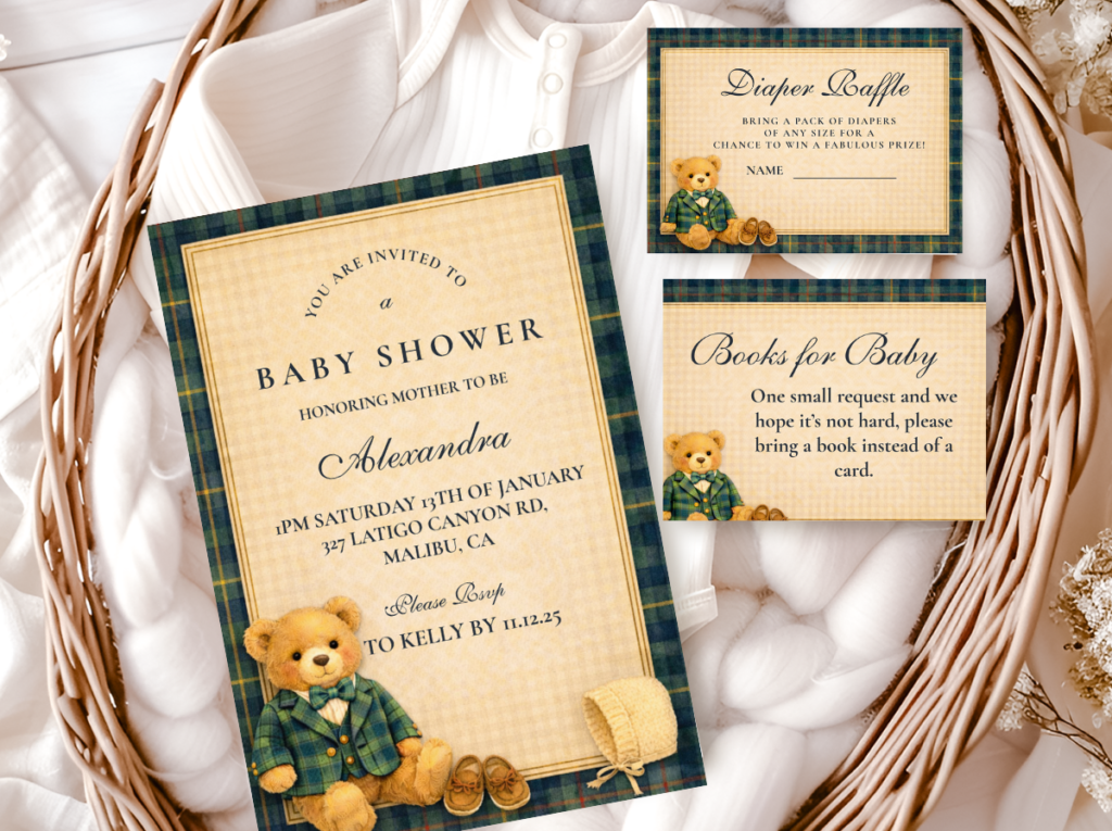
The preppy navy and white direction is the most graphic and structured of the four — and the furthest from soft or romantic. Navy provides the deep, high-contrast anchor that replaces the warmth function that brown performs in the dusty blue direction; white provides the clean ground that makes the navy read as crisp rather than heavy. Gold as the accent detail at the 10% level — a brushed gold flatware piece, a gold envelope liner, a small gold foil detail on the invitation — elevates the two-tone palette without softening it. This is the direction that suits hosts who want a bear shower that reads as tailored and modern rather than warm and nostalgic.
The structural logic of this direction is different from the others: where dusty blue and cream relies on warmth and texture for cohesion, navy and white relies on contrast and geometry. Every element should be crisply placed — the tablecloth pressed, the napkins folded with clean lines, the place card standing upright rather than propped casually. The bear prop in this direction should be in honey-brown or caramel (not navy — a blue bear on a navy table disappears entirely) and should be positioned as the single warm accent in an otherwise cool, high-contrast display. The warmth of the bear makes it the visual focal point without requiring any additional warm elements around it.
The Preppy Teddy Bear collection brings the clean graphic register of the navy and white direction into stationery — structured bear motifs and crisp typography that match the tailored, high-contrast aesthetic of the table.
2.4 Nautical Bear: Blue & Rope & Wood
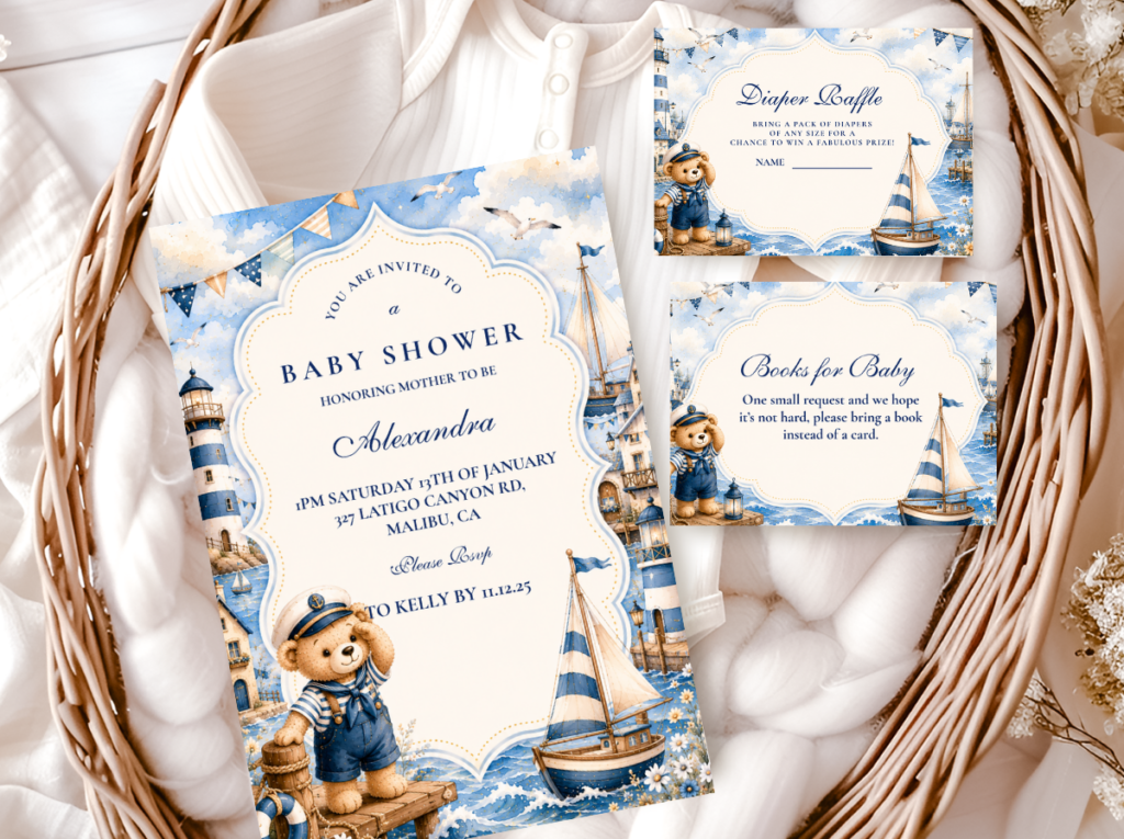
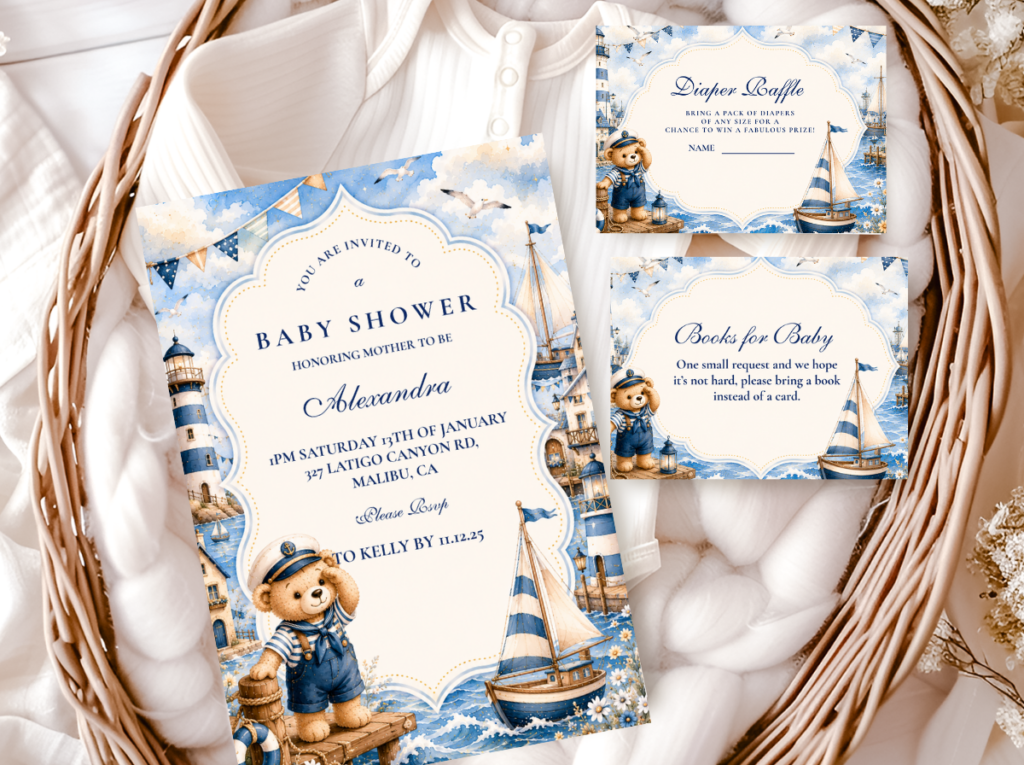
The sailor bear direction is the most narrative of the four — it tells a story rather than simply establishing a color story. Navy and cream form the palette base; rope, driftwood, and raw linen provide the texture and material vocabulary; and the bear becomes a small sailor, an explorer, someone embarking. This direction works because its motif language is so specific that a very small amount of it goes a long way: a rope coil on the table, a wooden oar shape as a prop, a small sailor bear in a striped vest. The palette stays controlled (navy, cream, tan) and the adventure motifs appear as punctuation rather than decoration. When the narrative elements overwhelm the palette, the table reads as a costume shop rather than a styled event.
The texture layer in this direction is built in: rope is one of the most distinctive natural textures available for table styling, and it requires no additional decorating decision beyond where to place it. A coil of natural rope as a table runner anchor, a small wooden vessel as a centerpiece base, and a length of navy grosgrain ribbon are the three material decisions that establish the nautical register without requiring any additional props. The invitation is the most important single element in this direction because it sets the storybook narrative quality — a sailor bear illustration on a warm cream card stock signals the adventure theme before a guest walks through the door, after which the restrained table decor confirms it rather than explaining it.
The Sailor Bear collection brings the nautical narrative into stationery — navy and cream with a sailor bear illustration that sets the adventure tone from the first moment a guest receives the invitation.
Section 03 Adventure Bear: The Boy-Specific Narrative Direction
3.1 The Fishing Bear Aesthetic
The fishing bear direction is for hosts who want a boy bear shower that steps entirely outside the blue palette — who prefer the warmth of an outdoor adventure in greens, browns, and natural tones over any version of the blue color story. The palette here is forest green, warm brown, and oatmeal cream, with the natural textures of outdoor life — weathered wood, rope, dried grasses, linen, kraft paper — providing the material vocabulary. It reads as a celebration of the natural world the baby is arriving into: the woods, the water’s edge, the early morning of a first outdoor adventure.
The palette is entirely warm — which means every element sourced for this direction stays in the green, brown, and cream register without exception. A fishing motif bear on the invitation, a small illustrated fishing scene on the welcome sign, kraft paper tags with a fishing rod or fish illustration at the table. The centerpiece uses a small wooden bucket or crate as the vessel, dried grasses and moss at the base, and a bear prop with a fishing rod or overalls as the focal element. This direction is the most distinctive and narrative of all the boy bear options and photographs with the most warmth and depth because every element in it is a natural, organic material.
The Bear Fishing collection brings the outdoor adventure narrative into stationery — warm greens, natural tones, and a fishing bear illustration that sets the direction from the invitation onward.
3.2 How to Layer Adventure Motifs Without Losing Cohesion
Adventure-themed bear showers — fishing, sailing, camping, or hiking — share a common failure mode: the motif proliferates. A fishing bear shower becomes one with fishing rods as centerpieces, fish-shaped favor bags, a fishing net draped over the dessert table, a lake mural on the backdrop, and tackle boxes as place settings. The abundance of motifs reads as a themed party store rather than a considered celebration. The cohesion dissolves not because the individual elements are wrong but because they compete with each other rather than reinforcing a single palette story.
The rule that prevents this is straightforward: adventure motifs belong in the paper details, and the palette does the rest of the work. A fishing bear on the invitation tells every guest the theme before they arrive; a fishing bear on the welcome sign at the entrance confirms it. The table itself — the linen, the centerpiece, the favor jars — does not need to reproduce fishing imagery because the palette of warm green, brown, and cream is already doing that work in a quieter register. When guests arrive to a room full of organic textures, warm naturals, and a single fishing bear prop, the room feels thoughtfully interpreted. When guests arrive to a room that has reproduced every fishing-adjacent object it could find, the room feels merchandised.
Styling Tip
Adventure-themed bear showers work best when the adventure motif appears in the paper details — the invitation, the tags, the welcome sign — and the palette does the rest of the styling work independently. A fishing bear on the invitation signals the theme immediately and completely; you do not also need fishing rods as centerpieces, fishing lures as favors, and a lake-scene backdrop. Each additional literal motif element added to the room reduces the sophistication of the overall result by a measurable amount. One strong motif, repeated in print across the stationery suite, is always more elegant than many motifs competing for the same attention across every surface in the room. The restraint is the design decision; the proliferation is the absence of one.
Section 04 Decor, Cake & Table Notes for the Boy Bear Shower
4.1 Centerpiece Directions Adapted for Blue Palettes
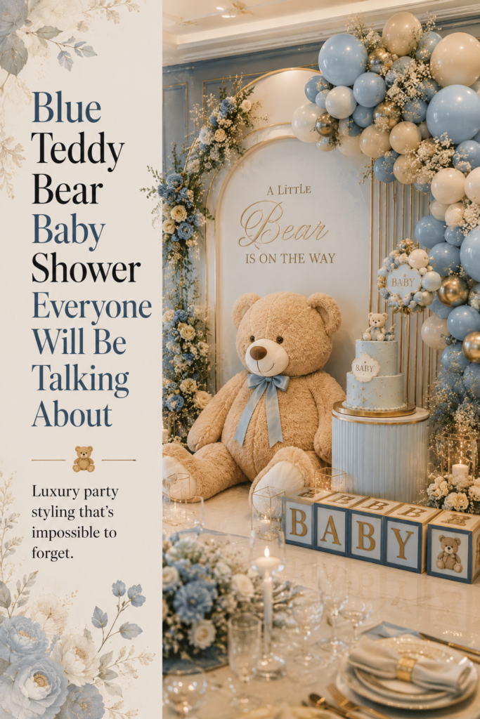
The key centerpiece adaptation for blue palettes is the vessel choice: where a cream or honey palette suits amber glass, terracotta, or rattan, a blue palette suits white ceramic, clear glass, or raw wood — surfaces that do not compete with the blue but reflect it. The bear prop in any blue centerpiece should be in warm honey-brown rather than blue or grey, because the warm-cool contrast is what makes it read as the focal point. A plush bear that matches the palette disappears; a warm bear against a cool blue background reads as the statement piece.
4.2 Cake Direction for the Blue Bear Shower
The blue and brown cake combination that works is a warm ivory or cream base with dusty blue buttercream accents — not a fully blue cake, which reads as heavy and loses the warmth of the palette. The specific combination to avoid is bright blue buttercream against white fondant, which is the generic boy cake and reads as generic the moment it is placed in the same frame as a considered table setting. A honey amber drip on a cream cake with a dusty blue accent and a warm brown bear topper is the direction that photographs most cohesively with the blue and brown palette.
4.3 Table Linen Direction
White linen — specifically warm ivory rather than optical bright white — is the correct base for all four blue bear palette directions. Blue linen on a blue-palette table doubles the dominant color and loses the contrast that makes the palette readable. Oatmeal linen works for the dusty blue and warm brown direction; warm ivory works for the slate blue and neutral direction; crisp white works for the navy and preppy direction; natural undyed linen works for the fishing and nautical directions. The one combination to avoid for all blue palettes: bright white linen, which reads as hospital-adjacent against any cool blue and removes the warmth the palette needs.
Section 05 Invitations & Stationery
The invitation is where the blue palette makes its first impression — before the balloons, before the table, before the backdrop. A dusty blue illustration on warm kraft or ivory paper stock, a bear motif in warm honey-brown, a typography treatment that reads as considered rather than printed-off — this is what creates the expectation that the room will match. When the invitation is in the right register, the shower has a coherent visual story from the first communication. When the invitation is in a different register than the room (brighter, cooler, or more generic), the visual coherence guests feel walking through the door is diminished before they have seen a single decoration.
The stationery suite also serves a practical palette-anchoring function: when place cards, menu cards, favor tags, and table signage all share the same blue tone as the invitation, every element sourced for the room can be checked against it. The printed blue of the invitation becomes the standard every other blue in the room is held against. This is the most reliable method for avoiding the wrong-blue mistake described in Section 01 — the invitation is the most precise and most consistent blue object you will have in hand during the planning process, and holding any potential purchase next to it tells you immediately whether it belongs in the palette.
The adventure-direction collections — Sailor Bear and Bear Fishing — extend the stationery beyond a color suite into a narrative one: the illustration on the invitation tells a story that the room then expresses through palette and texture rather than literal motif. When a guest receives a sailor bear invitation, they arrive expecting something warm, adventurous, and considered. The stationery has done the communication work; the room does the aesthetic work. Together, they produce the coherent experience that guests remember and describe.
The six collections below cover every direction in this guide — from the most-saved dusty blue and warm brown palette to the slate blue modern direction, the preppy navy suite, the sailor bear narrative, the fishing bear adventure, and the full bear theme range for those still exploring. Each links to the complete product range: invitation, envelope liner, favor tag, menu card, place card, and thank-you card, designed as a single suite from the first guest communication to the last.
Main Collection
Bear Theme
Browse all bear stationery directions together before committing to a palette or motif direction.
Most-Saved Direction
Brown And Blue Teddy Bear
Dusty blue and warm brown in a complete stationery suite — the most Pinterest-consistent boy bear palette direction.
Sophisticated Direction
Blue Teddy Bear
Slate blue and neutral cream — the most elevated and least explicitly themed boy bear palette direction.
Graphic Direction
Preppy Teddy Bear
Navy and white with crisp bear typography — the most structured and tailored direction in the boy bear world.
Nautical Direction
Sailor Bear
Navy, cream, and rope textures with a sailor bear illustration — the storybook adventure direction for the nautical boy shower.
Adventure Direction
Bear Fishing
Warm greens and naturals with a fishing bear illustration — the outdoor adventure direction for hosts stepping outside blue entirely.
Frequently Asked Questions
What shade of blue works best for a boy bear shower?
Dusty blue and slate blue are consistently the most successful shades for the boy bear shower aesthetic. Dusty blue — sometimes called cornflower blue or French blue when it sits in the muted, soft range — has warmth in it that prevents it from reading as cold, and it pairs with warm brown most naturally because both colors share the same soft, slightly aged quality. Slate blue is cooler and more architectural; it suits the more sophisticated, neutral direction and pairs most effectively with oatmeal and ivory cream rather than warm brown. Both photograph beautifully in flat lays and room shots. Powder blue (very light, almost white-adjacent) works as a secondary accent but rarely carries a palette well as the dominant color. The blues to avoid: bright primary blue, electric blue, royal blue, and turquoise. All of these read as too saturated against the warm neutrals that give the bear theme its character, and all of them photograph as the loudest element in any frame they appear in.
How do I combine blue and brown without it looking muddy?
The muddy result almost always comes from too much brown at too high a proportion, or from choosing the wrong tone of brown. Warm brown — caramel, honey, tan, chestnut — sits alongside dusty blue without conflict because both are muted and both sit in the warm-neutral half of the color spectrum despite their different hue families. Cool brown — grey-brown, taupe, greige — is the tone that reads as muddy against blue because it has the same cool undertone as the blue, and the two tones compete rather than complement. Keep the brown firmly warm: the plush bear in honey-brown, the wood elements in caramel, the kraft paper in warm tan, the ribbon in chestnut or amber. Keep the blue firmly muted: the dusty register rather than the saturated one. And keep the cream base at 60% of the visual palette so both colors have neutral ground to rest against. The combination fails when either color tips into too much volume or too cool a register; it succeeds when both stay soft, warm, and at the right proportional balance (blue at 30%, brown at 10%, cream at 60%).
Can a bear shower work for a boy without using blue?
Completely. The bear theme is not inherently gendered — the warmth and nostalgia of the aesthetic work in any palette. The fishing bear direction in this guide uses no blue at all, relying instead on warm forest greens, earthy browns, and natural oatmeal tones for a completely cohesive boy shower palette. The classic neutral direction (warm cream, oatmeal, and honey amber) is equally appropriate and carries no gender signal in either direction — it reads as warm and beautiful for any baby. The reasons parents reach for blue are understandable, but the bear theme’s strongest palette directions are built on warmth rather than color coding, and warmth is not a blue-exclusive property. A dusty sage and warm brown bear shower, a honey amber and cream bear shower, or a forest green and natural bear shower all read as intentional and considered in a way that generic baby blue rarely achieves.
What’s the difference between a nautical bear and a regular bear theme?
The difference is narrative. A regular bear theme is built around the object — the plush bear — and its associated visual language of warmth, softness, and nostalgia. The bear is a character in a story of comfort and childhood. The nautical bear theme adds a specific narrative direction to that character: the bear as a sailor, an adventurer, someone embarking on a journey. This shifts the aesthetic from warm and domestic to warm and adventurous — the same palette tones (navy, cream, warm brown) but a different emotional register. In practical terms, the nautical direction introduces motifs — rope, wood, the sailing vessel, striped detail — that the standard bear theme does not include, and the stationery illustration becomes the most important element because it establishes the narrative that the decor then expresses through materials and texture rather than literal prop reproduction. A nautical bear shower can look very similar to a standard bear shower in its physical setup; it is the invitation and paper details that give it its specific character before a guest sees a single decoration.
Ready to Start Planning?
Find Your Boy Bear Shower Stationery Suite
The palette reference that makes every other blue decision in the room easier.