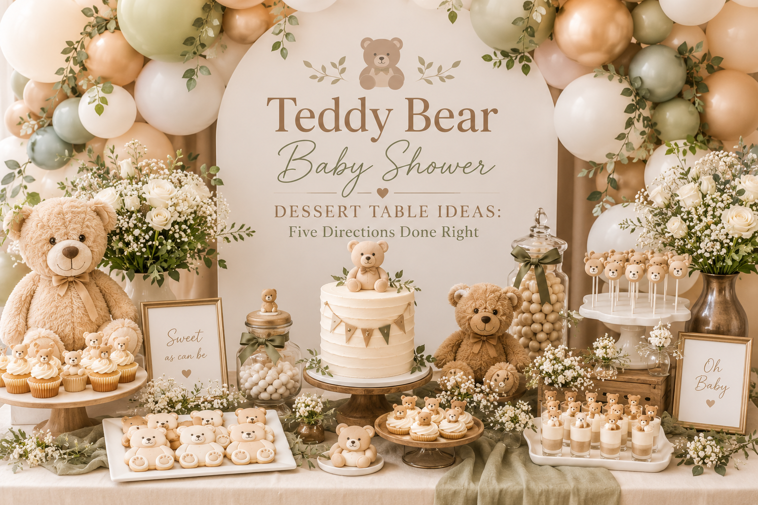
Teddy Bear Baby Shower Dessert Table Ideas: Five Directions Done Right
Bear Baby Shower Dessert Table Guide
Teddy Bear Baby Shower Dessert Table Ideas: Five Directions Done Right
What makes a bear dessert table look styled rather than assembled — and the specific decisions that get you there.
The dessert table is the most photographed station at any bear-themed baby shower. Guests gravitate to it, phones come out, and the image that ends up saved and shared is almost always the one that captures the whole spread in a single frame. And yet, of all the decisions that go into a bear shower, the dessert table is the one that most commonly arrives looking incomplete — not because the treats are bad, but because the styling decisions that make treats look like a table were never made. This guide covers those decisions, from the height logic that creates the silhouette to the five distinct aesthetic directions that each suit a different palette and register.
Everything here is specific to the dessert table — how it is structured, how it is styled, how it is photographed, and how every printed detail on its surface ties back to the stationery suite that started the whole aesthetic.
“A dessert table is not a collection of sweets — it is a styled moment that happens to be edible.”
Section 01 Why Most Teddy Bear Dessert Tables Look Unfinished
Most bear dessert tables that disappoint do so for three specific, avoidable reasons. None of them involve the quality of the food. All of them are styling decisions that were either made incorrectly or not made at all. Understanding what they are is the fastest path to not repeating them.
Mistake 01: No Height Variation
When every item on a dessert table sits at the same height, the table has a flat silhouette — and a flat silhouette reads as a collection of items rather than a designed display. The problem is particularly common because it looks fine when you are standing directly in front of it and only reveals itself in the photograph taken from across the room, which is the photograph that actually gets shared. A table where the cake, the cupcakes, the cookies, and the macarons all sit at table level produces a single horizontal band of food. It has no depth, no drama, no invitation to look.
The fix: Build in three distinct height zones before a single treat is placed. The tall zone (the cake tier, a tall floral arrangement, or a balloon cluster at the back) establishes the ceiling of the display. The mid zone (a cupcake stand, a cake slice tower, a medium riser with a treat arrangement) creates the visual center of gravity. The low zone (macarons laid flat on a wooden board, cookies on a platter, small jars at table level) grounds the display and fills it out. These three zones should be visible simultaneously from the point in the room where a guest would naturally take a photograph. If they are not, the low zone needs height before anything else is added.
Mistake 02: Treats in Random Colors
This is the most common source of a bear dessert table that looks busy rather than beautiful. Individual items look fine in isolation — the macarons are lovely, the cake is well-made, the cookies are nicely decorated — but together on the table they create a visual argument rather than a conversation. The problem is that each item was sourced or ordered without considering how its color would read next to the other items on the same surface. A pale pink macaron next to a bright blue cupcake next to a white chocolate bark next to an orange-frosted cookie creates a table that reads as random regardless of how well each individual item was made.
The fix: Treat the color of every sweet as a styling decision, not a bakery default. Before ordering or making anything for the table, establish a palette of three to four tones — for example, warm cream, honey amber, and dusty rose — and specify that every item on the table must fall within that range. This means briefing bakers with specific tone references, not just flavor requests. The color of the frosting, the macaron shell, the cookie icing, and the cake tier are as much part of the visual palette as the tablecloth and the florals. A table where every item shares the same warm tonal range reads as designed. A table where items were sourced independently of each other reads as assembled.
Mistake 03: The Backdrop Is an Afterthought
A dessert table placed against a plain, undecorated wall has no visual anchor. The treats float in front of a neutral background with nothing to hold them in space — which means the photograph of the table looks like a table rather than a moment. This mistake is particularly invisible in planning because when you are close to the table, the food is the thing you see. It only becomes apparent in the wide-angle photo from across the room, where the wall suddenly becomes the dominant visual element and the table looks like it is in front of a painted backdrop rather than part of a designed space.
The fix: The backdrop behind the dessert table needs at minimum one visual element at height: a balloon cluster, a garland, a fabric panel, a floral installation, or a framed sign. The simplest effective option is a loose balloon cluster in the shower’s palette positioned slightly behind and above the tall zone of the table. It takes approximately twenty minutes to assemble and immediately transforms the table from “treats on a surface” to “designed dessert station.” For a more considered approach, a dried floral garland draped across the wall above the table adds texture and warmth without requiring any construction. The backdrop does not need to be elaborate — it needs to exist.
Styling Tip
Style your dessert table in three height zones before placing a single treat: low (macarons, cookies flat on a board, small jars at table level), mid (cupcake stand, riser with a treat arrangement, medium floral grouping), and tall (tiered cake, tall floral arrangement, or balloon cluster at the back). Every zone should be simultaneously visible from the point in the room where a guest would naturally take a photograph — stand there before setup is complete and take a test photo. If you cannot see all three height zones in the frame, add height to the lowest zone before adding any more treats. More food at the same height does not solve a height problem; it compounds it.
Section 02 Five Dessert Table Directions for the Bear Theme
Each direction below is built around a specific palette and aesthetic register. Choose the one that matches your shower, then use the brief language to source everything in the same visual world.
2.1 The Vintage Honey Dessert Table
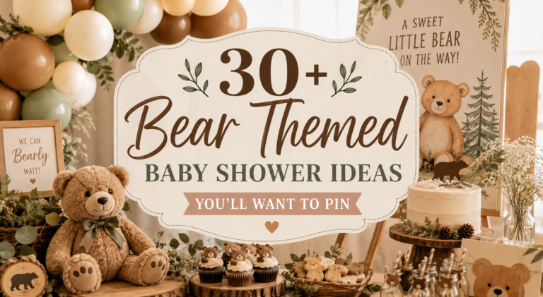
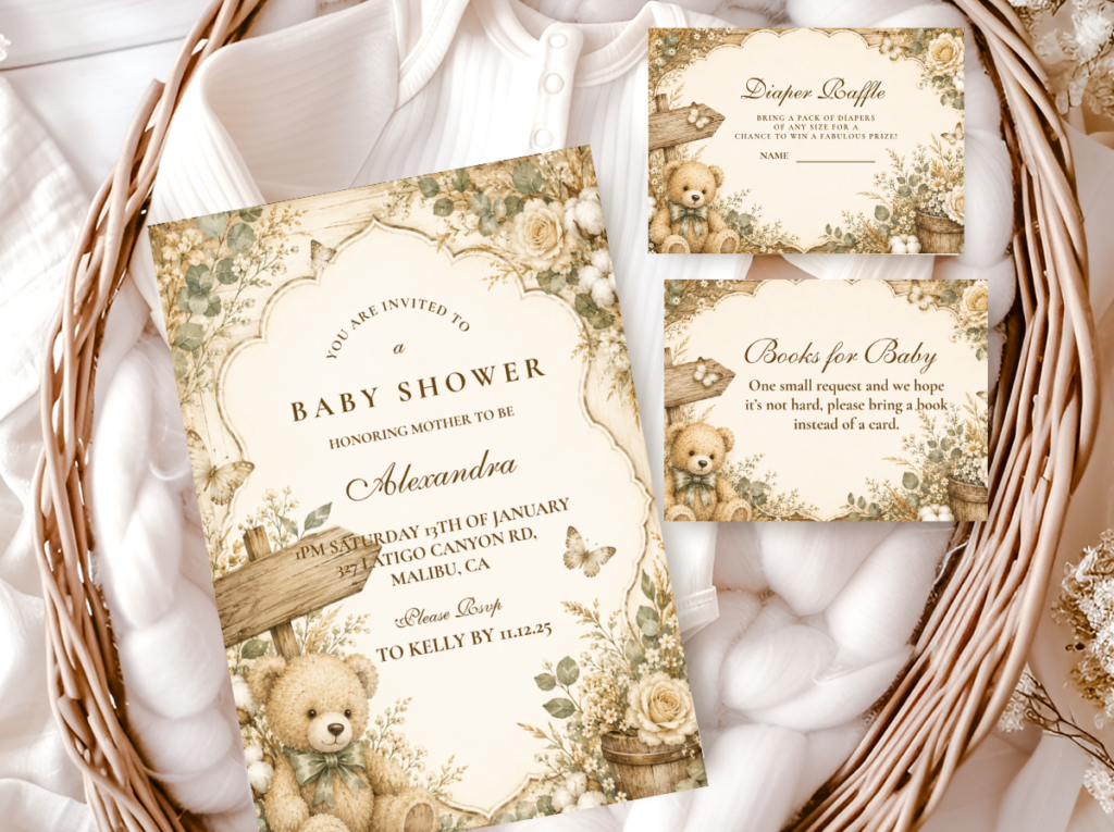
The vintage honey direction is the most storybook-appropriate of the five and the one that generates the most saves in the bear shower category. The palette is honey amber, warm cream, and soft rust or terracotta at the accent level — all tones that belong to the same warm, slightly aged register as a well-loved illustrated children’s book. The treats echo this palette precisely: shortbread bears in natural honey-gold, cupcakes in warm ivory buttercream with a honey amber drip on the top tier, macarons in dusty cream and pale rust, and small glass honey jars (the most literal and most effective detail in this aesthetic) grouped at the low zone with kraft labels and twine.
The structural elements of this table are warm wood: a live-edge wood slice or wooden board as the surface for the low zone, small wooden risers at varying heights for the mid zone, and a kraft paper table runner under the whole display. Kraft labels on every jar and stand — matching the typography of the invitation suite — are the detail that ties the honey jars and treat labels into the printed aesthetic of the shower rather than treating them as food packaging. The backdrop for this direction is a loose dried botanical garland in honey and rust tones, or a simple warm-tone balloon cluster. Nothing sharp, nothing shiny, nothing that reads as current rather than timeless.
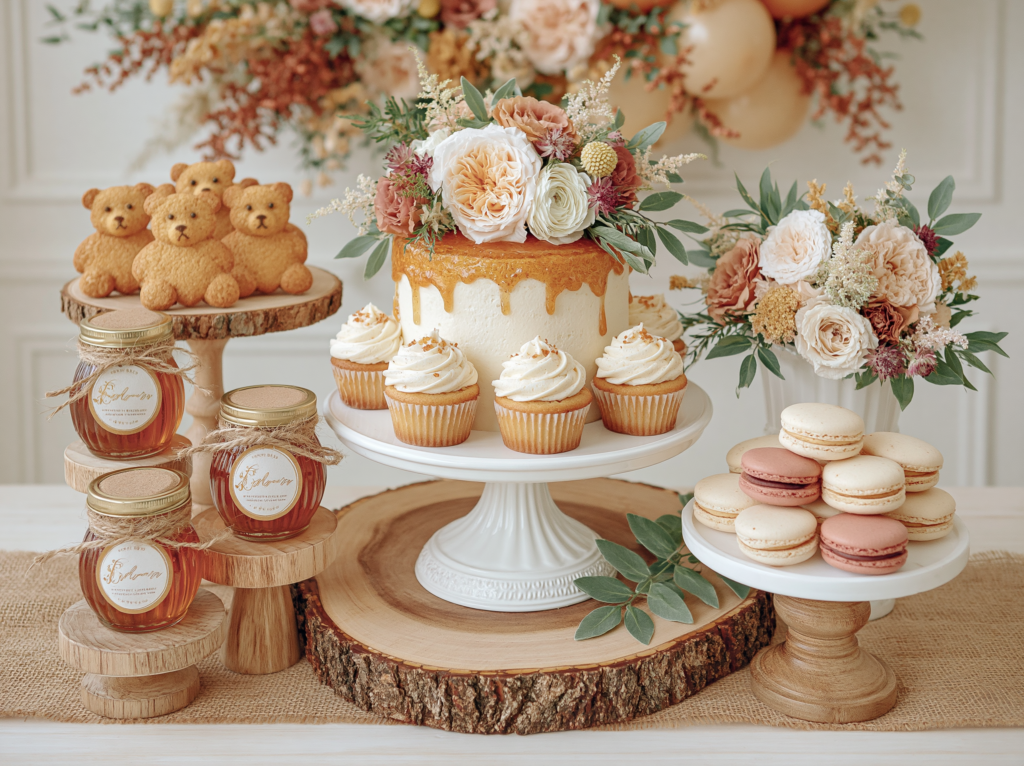
The Vintage Teddy Bear collection matches the honey-and-kraft aesthetic of this dessert table — heritage typography, warm tones, and bear motifs that tie the labels and tags directly into the invitation suite.
2.2 The Rustic Natural Dessert Table
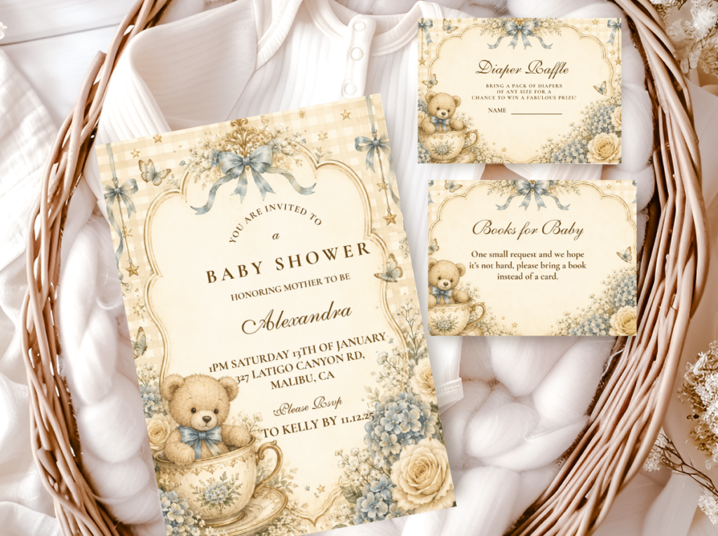
The rustic natural direction is the most texture-forward of the five and the one that works best in outdoor or garden settings where natural light makes every material quality visible. The palette stays in warm neutrals — oatmeal, warm ivory, caramel, and muted sage as an accent — but the design emphasis is on materials rather than color: rough-weave linen, live-edge wood, dried botanicals, woven baskets, unbleached kraft paper. The table itself should have a linen or jute runner running its full length before anything else is placed on it; this single material decision does more to establish the rustic register than any individual decoration.
Treats in this direction should lean into imperfection rather than precision: a semi-naked cake with exposed sponge rather than smooth fondant, bear-shaped shortbread with a simple brown sugar glaze rather than elaborate icing, caramel cake pops in warm brown coating, and small jars of layered pudding or jam with handwritten labels. The height structure uses wooden boards and natural-bark stands rather than acrylic risers or chrome cake stands — the material of every structural element matters as much as the treats it supports. Dried pampas, wheat stalks, and eucalyptus in the backdrop complete the organic, earthy quality of the display.
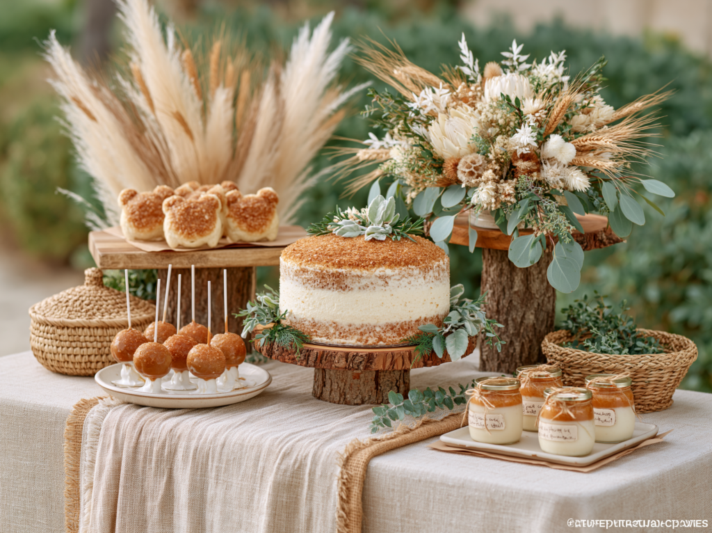
The Rustic Teddy Bear collection matches the organic, texture-forward quality of this table — natural-effect stock, warm typography, and bear motifs designed for the linen-and-wood aesthetic.
Styling Tip
A linen or jute table runner under your dessert display does more visual work than any individual decoration on the table — it grounds the display, adds the first texture layer, and immediately signals “styled” rather than “set up.” Use it even if you use nothing else from this list. The runner should extend the full length of the table and hang slightly over the front edge; a runner that stops short of the table edge looks like a placemat rather than a styling decision. Natural linen or undyed jute in warm ivory or oatmeal works for every bear aesthetic direction; it is the single most universally applicable dessert table investment available.
2.3 The Floral Bear Dessert Table
The floral bear direction is the most romantic of the five and the one that adapts most naturally to different palette directions — because the florals change color while the structural logic stays constant. The principle is that fresh or faux flowers in the shower’s palette are woven between the treats at every height zone, creating a continuous thread of botanical color that connects the low jars to the mid cupcake stands to the tall cake. The florals are not arranged in a single centrepiece; they are distributed through the display so that wherever the eye lands, it finds a flower alongside the food.
The treats in the floral direction echo the botanical palette: floral-topped cupcakes with buttercream roses in dusty rose or soft sage, macarons in the same palette tones, a semi-naked or buttercream floral cake at the tall zone. The structural elements are white or warm cream — white ceramic stands, white or ivory linen runner — to let the florals read clearly against a neutral ground. The backdrop for this direction is the most important of the five: a loose floral installation or garland behind the table at height creates the sense that the flowers continue upward beyond the table surface, giving the whole display a garden-room quality that photographs beautifully from any angle.
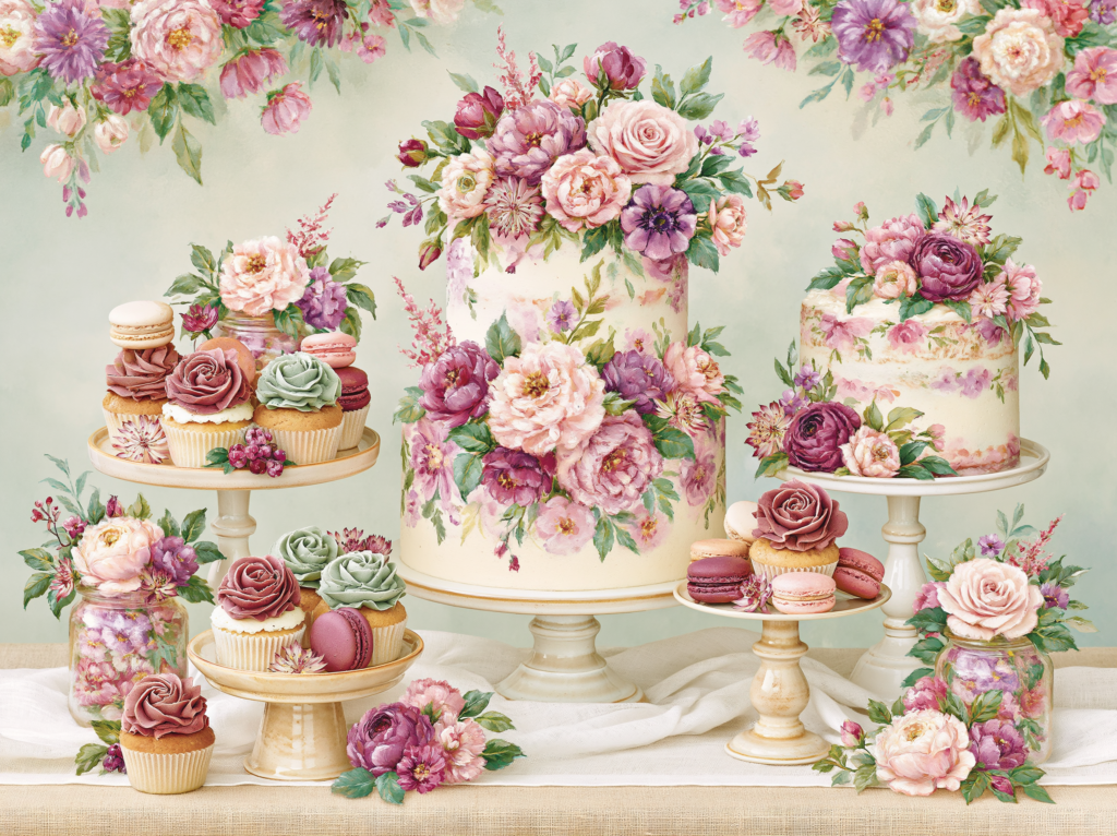
The Floral Teddy Bear collection pairs the botanical dessert table direction with stationery in the same floral register — soft botanical motifs and warm cream tones that tie the table labels into the invitation suite.
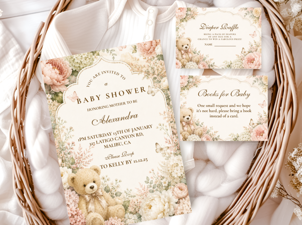
2.4 The Neutral & Cream Dessert Table
The neutral and cream direction is the most elegant and the most photographically consistent — it works in front of any backdrop, in any light, at any time of day, because its palette generates no visual conflict with anything in its environment. Every element on the table exists in the same warm ivory-to-cream tonal range: white chocolate bark, cream-shell macarons, ivory buttercream cupcakes, pale almond-toned cake pops, meringues in natural white. The visual interest in this direction comes entirely from texture and shape variation rather than color contrast — which means the quality of every individual item needs to be higher, because there is no color drama to distract from any imperfection.
The structural elements for this direction lean toward soft contrast: a warm ivory linen runner on a white tablecloth, cream ceramic stands alongside warm wood risers, small clear glass jars of pale treats at the low zone. The single accent detail that lifts the all-cream palette is a small arrangement of dried botanicals in honey and oatmeal tones — not a full floral moment, but a three-stem cluster in a small bud vase that introduces just enough warmth to prevent the table from reading as a wedding buffet rather than a bear shower. Kraft labels in this direction should use very light print — the darkness of the label is the primary color contrast on the table and should be calibrated accordingly.
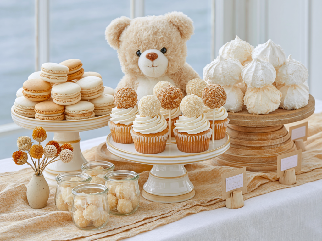
The Neutral Teddy Bear collection pairs the cream direction with stationery in the same warm ivory register — restrained bear motifs and warm white tones that tie every label and tag into the same elegant visual language.
2.5 The Classic Brown Bear Dessert Table
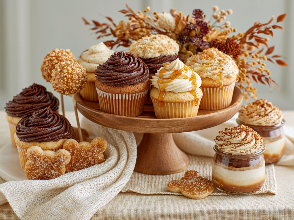
The brown bear direction is the most grounded and the most explicitly bear-themed of the five — because the warm chocolate and caramel tones of the palette are the same tones as a honey-brown plush bear itself. Every treat on the table is in the same warm brown register: chocolate-frosted cupcakes in warm cocoa rather than cool dark chocolate, caramel cake pops, bear-shaped shortbread in brown sugar glaze, layered chocolate and caramel mousse in small glass jars. The consistent warm-brown tonal range is what prevents this direction from reading as heavy: when every element shares the same amber-to-caramel spectrum rather than mixing dark and light browns randomly, the palette feels rich and warm rather than muddy.
The contrast element that lifts the brown palette is warm cream — the linen runner, the tablecloth, the small label tags — which gives the chocolate tones something light to read against. A honey amber drip on the mid-zone cupcakes and a cluster of dried amber and rust-toned botanicals at the tall zone are the two accent details that tie the brown palette back to the broader bear aesthetic without requiring any additional decoration. The one mistake to avoid in this direction: mixing cool dark chocolate tones (which read as almost black-adjacent) with the warm caramel and amber range. Keep every brown on the warm side of the spectrum and the table will feel inviting rather than heavy.
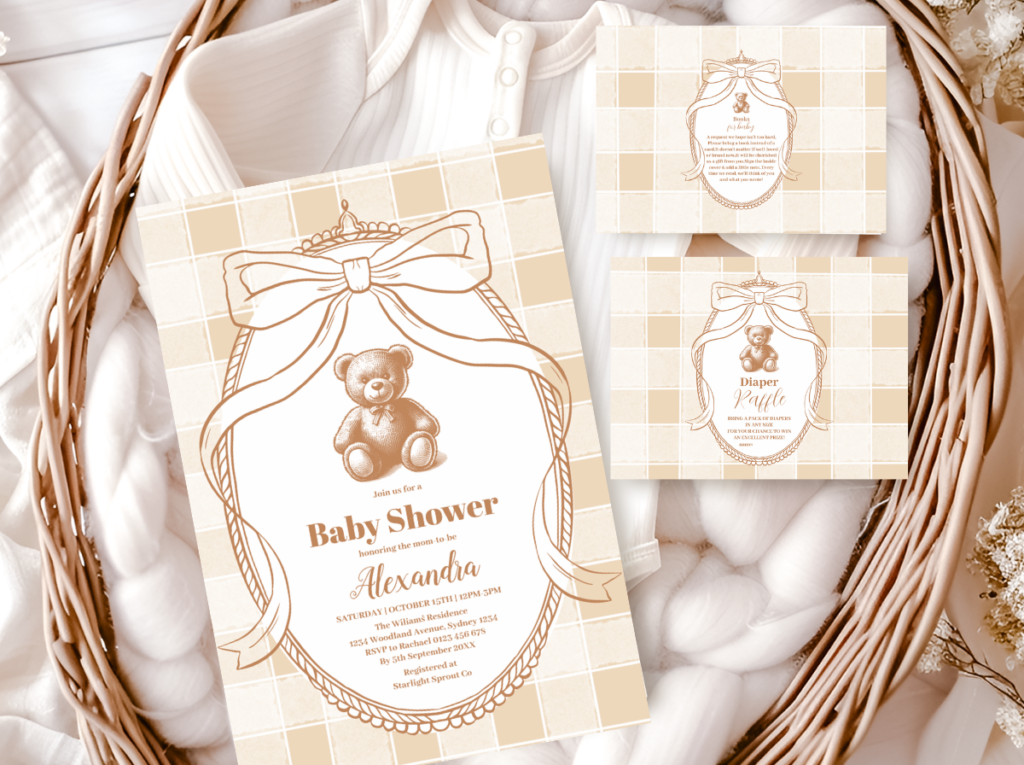
The Brown Bear collection brings warm chocolate and caramel tones into the stationery suite — rich tan and warm brown that ties every label on the dessert table directly into the invitation palette.
Section 03 The Treats Themselves: Styling Notes
3.1 Which Treats Photograph Best and Why
Three treats consistently outperform all others in dessert table photography: macarons, decorated cookies, and cupcakes. The reasons are structural. Macarons are uniform in size, stackable (which solves the height problem in the low zone), and available in any color — their smooth shells photograph cleanly and their gentle pastel range sits comfortably within any bear shower palette. Decorated cookies are the most bear-theme-specific treat because the bear shape is immediately legible in a photograph and the iced surface can be customized to carry any palette color with precision. Cupcakes work because the buttercream swirl or flat-frosted top provides a surface large enough to photograph as an individual element and small enough to arrange in a tiered stand that reads as a mid-zone centerpiece.
Treats that tend to photograph less well on dessert tables: cake pops in opaque candy coating (they read as uniform shapes without texture in a wide shot unless styled very carefully), brownies or slice treats (their cut edges read as rough in photographs unless individually plated), and any treat that requires individual packaging to look presentable (wrapped items introduce a layer of visual noise that slows the eye). None of these are bad choices for the table — they are simply less reliable as photography anchors. Use the three photogenic treats as the visual heroes and supplement with supporting treats around them.
3.2 Coordinating Treat Colors to the Palette
The most reliable method for coordinating treat colors to the shower palette is to establish a palette of three tones before ordering or making anything, then specify those tones to every baker or treat supplier as the only colors permitted on the table. Not “blush and cream” — the specific tones: warm cream closer to ivory than white, dusty rose rather than bright pink, honey amber rather than yellow. This level of specificity feels excessive until you see the difference between a table where it was applied and one where it was not.
For store-bought treats that cannot be color-specified, the solution is to select only items that fall within the warm neutral range by default — natural shortbread (honey-toned), plain meringues (white to cream), salted caramel items (amber-toned), and white chocolate items (ivory-toned). Avoid anything in artificially bright colors or with multi-colored decorations. A table of undecorated natural treats in the warm tonal range looks more considered than a table of brightly decorated treats in random colors, even if the latter required more effort to produce.
3.3 Labels, Tags, and Signage on the Dessert Table
The printed details on a dessert table — the label on a honey jar, the tent card in front of the bear cookies, the tag tied to a favor jar — are a design layer that most setups either skip entirely or treat as a practical necessity rather than a styling decision. When these printed elements are in the same typography and palette as the invitation suite, the table reads as fully designed. When they are in a different font, a different tone, or printed on bright white stock against a warm cream table, they create a small but persistent visual dissonance that the eye registers even if the person does not consciously notice it.
The most effective signage options for the bear dessert table, in order of visual impact: tent cards in warm cream card stock with the treat name in the invitation suite’s typography; kraft tags tied with twine to jar necks and stand handles; a small chalkboard sign at the tall zone with the shower name or a short phrase; and adhesive labels on the base of any opaque jar or container. Of these, the tent cards and kraft tags are the most universally applicable and the easiest to produce from any invitation suite — most collections include favor tags and food labels that can be printed and trimmed at home the day before the shower.
Styling Tip
Order or make one extra dozen of your smallest treat — macarons or mini cookies — beyond what you need for guests. Use the surplus to fill visual gaps on the table and add height to any zone that reads as too sparse. A dessert table that looks abundant photographs significantly better than one that looks exactly portioned — even when the guest count is identical. Gaps between items draw the eye and make the table look like it has not been finished. Small treats fill these gaps without adding significant cost and without requiring any additional styling decisions. If your budget allows only one over-order, make it the macaron: it fills space beautifully, adds palette color precisely, and photographs as one of the most recognizable elements of a styled dessert table.
Section 04 Invitations & Stationery
Every printed detail on the dessert table is a stationery decision — the label on the honey jar, the tent card in front of the bear-shaped shortbread, the tag tied to the favor bags at the edge of the display. When these elements belong to the same visual family as the invitation, the dessert table reads as a fully designed moment. When they do not — different font, different stock color, different bear motif treatment — the table looks like a collection of individual decisions that were never coordinated. The difference between a dessert table that guests photograph and describe as “so beautiful” and one they describe as “really nice” is almost always in this level of printed detail cohesion.
The practical implication is straightforward: choose your stationery collection before you finalize any dessert table detail. The invitation establishes the palette reference — the specific tone of the cream, the warmth of the honey accent, the treatment of the bear motif — and every label, tag, and tent card on the table should match it. Most collections include food labels and favor tags alongside the invitation suite; these are the elements that do the visual work on the table itself. Print them on the same or similar stock as the invitation and trim them to the same corner radius for the most cohesive result.
The six collections below cover every dessert table direction in this guide. Vintage Teddy Bear for the honey and kraft direction; Rustic Teddy Bear for the linen-and-wood direction; Floral Teddy Bear for the botanical direction; Neutral Teddy Bear for the all-cream direction; Brown Bear for the chocolate and caramel direction. The main Bear Theme catalogue brings all collections together for those still deciding. Choose the stationery first — the dessert table styling follows naturally from it.
Each collection links to the full product range — invitations, favor tags, food labels, menu cards, place cards, and thank-you cards — designed as a complete suite from the first guest communication to the last detail on the dessert table.
Main Collection
Bear Theme
Browse all bear stationery directions in one place before committing to a palette.
Matches: Honey Table
Vintage Teddy Bear
Honey tones and heritage typography — the stationery suite for the vintage honey dessert table direction.
Matches: Rustic Table
Rustic Teddy Bear
Natural linen-effect stock and organic motifs — the stationery pair for the rustic texture-forward table direction.
Matches: Floral Table
Floral Teddy Bear
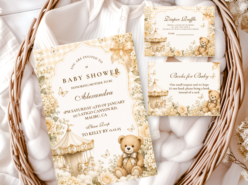
Soft botanical motifs and warm cream — the stationery pair for the floral bear dessert table across any palette direction.
Matches: Neutral Table
Neutral Teddy Bear
Warm ivory and restrained bear motifs — the stationery pair for the all-cream elegant dessert table direction.
Matches: Brown Bear Table
Brown Bear
Rich tan and chocolate tones — the stationery pair for the brown bear dessert table direction, warm and grounded.
Frequently Asked Questions
How many treats per guest for a baby shower dessert table?
The standard planning figure is four to six individual treat portions per guest for a standalone dessert table where no other food is being served, or two to three portions per guest when the dessert table accompanies a meal. However, the visual abundance of the table matters as much as the per-guest count — a table with four treat varieties in generous quantities reads as more generous and more beautiful than a table with eight varieties in meager quantities. Concentrate the quantity in your three photogenic heroes (macarons, decorated cookies, cupcakes) and supplement with smaller quantities of supporting treats. Order or make slightly more than the per-guest calculation suggests for each of the three heroes — the surplus fills visual gaps, adds height to low zones, and ensures the table still looks abundant mid-party rather than depleted. A table that looks full throughout the event reads as a success; a table that shows clear gaps by the second hour reads as under-catered regardless of whether every guest was served adequately.
What should I order versus make myself for a bear dessert table?
The decision between ordering and making should be based on which treats require precision decoration and which do not. Order anything that requires custom color-matching — macarons in specific palette tones, decorated cookies with bear icing, cupcakes with custom buttercream colors — because these are the items where a professional baker’s precision makes the biggest visual difference and where DIY imprecision is most visible in photographs. Make or source without customization anything that works in a natural, undyed form: shortbread (honey-toned by default), meringues (naturally white to cream), caramel items, and any treat that reads well in its natural color within the warm palette. The hybrid approach — order the custom-colored hero treats and make or buy-plain the supporting treats — produces the best result for most budgets and skill levels, because it concentrates professional precision where it matters most visually and reduces cost where it matters least.
How far in advance can I set up a bear shower dessert table?
The structural setup — table placement, runners, risers, stands, backdrop, labels and signage — can be done the day before with no food safety concerns. Setting up the structural layer in advance means that on the day of the shower, you are only placing food items rather than making styling decisions under time pressure. Food items should be placed as close to the start of the shower as practical: macarons and decorated cookies can be placed two to three hours before guests arrive without quality issues; buttercream cupcakes are best placed one to two hours before; fresh floral elements should be placed in the last thirty minutes before guests arrive. Fresh flowers on or near a food display should be confirmed food-safe before use, and any flowers in direct contact with food surfaces should be in a separate sealed vessel. Honey jars and packaged items can be placed the day before as part of the structural setup.
How do I keep fresh flowers on a dessert table food-safe?
The simplest and most reliable approach is to keep fresh flowers in their own sealed vessel — a small vase, jar, or floral foam block — and never allow stems or petals to touch food surfaces directly. Position floral arrangements between treat displays rather than on top of or inside treat plates. If flowers are being used as cake or cupcake toppers, they should be either food-safe varieties confirmed by the grower (not all flowers are; most floristry-grade flowers are treated with pesticides not suitable for food contact), or placed in a small food-grade barrier (a wrapped stem, a small plastic pick) that prevents direct stem-to-food contact. Dried botanicals are a simpler solution for most dessert table setups: they require no water, no food-safety protocols, and no last-minute handling — they can be placed as part of the structural setup the day before and remain in position throughout the event without any attention. For the bear shower aesthetic, dried botanicals in honey and rust tones typically read as more cohesive than fresh flowers anyway, which makes them both the safer and the more aesthetically consistent choice for most directions.
Ready to Start Planning?
Find the Stationery That Ties Your Dessert Table Together
Choose stationery first — the labels, tags, and tent cards follow naturally from it.