Butterfly Boho Baby Shower Ideas: One Illustration Choice That Decides Everything
Baby Shower · Boho Butterfly Guide
Butterfly Boho Baby Shower Ideas
The one illustration decision that determines whether butterfly boho reads as elegant or as a children’s party, two complete palette directions, the decor and cake guide, and the full stationery showcase.
Butterfly boho is one of the most naturally symbolic themes in the entire boho family — a transformation motif for a shower that is celebrating one of the most complete transformations in human experience — but it is also one of the easiest to get wrong in a single, avoidable way. The butterfly itself is not the risk. How it is rendered is. The same shape, painted in soft watercolour, reads as elegantly boho; the same shape printed in glitter cartoon reads as a children’s party. Below is the rule that governs that choice, and everything that follows from it.
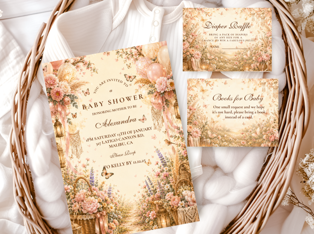
Shop the Butterfly Boho collection.
Invitations, welcome signs, and every suite element in the watercolour butterfly illustration style.
“A butterfly boho shower celebrates the most beautiful transformation in nature — and the most beautiful one yet to come.”
Section 01 The Butterfly Boho Rule — Illustration Style Is Everything
A watercolour butterfly belongs to the boho world. A cartoon or glitter butterfly belongs to a children’s party. These are not matters of personal preference — they are matters of aesthetic register, and the butterfly motif makes the distinction more visible than almost any other single design decision in a baby shower, because the butterfly is such an immediately recognisable shape that guests register its style before they register anything else about the room they have walked into.
The motif only works in a boho setting when it is rendered with the same organic warmth as the botanical elements surrounding it: soft edges, muted colour, visible brushstroke quality, the specific quality of something painted rather than generated from a clip-art library. A watercolour butterfly beside dried pampas and a rattan vessel reads as part of the same organic world. A bright, precisely outlined, glitter-edged butterfly in the same space reads as an object from a completely different aesthetic world placed inside the boho room, and the contrast makes the boho elements look like a background rather than a world.
It is worth naming why this motif carries more symbolic weight than most. A butterfly’s transformation — the complete change from one form of life to another — is one of the most direct metaphors available for what a baby shower is actually celebrating. That symbolic resonance is exactly why the illustration deserves more care than a purely decorative motif might: when the butterfly is rendered correctly, its meaning is felt rather than explained. When it is rendered incorrectly, the symbolism is lost and what remains is a cartoon shape.
✨ Styling Tip
One watercolour butterfly illustration on the invitation signals the entire aesthetic to every guest before they arrive. That single illustration — on warm ivory card stock, beside a loose botanical element, with the butterfly landing on or emerging from the botanical rather than floating independently — establishes the world the shower inhabits. The decor can then be primarily botanical boho without repeating the butterfly on every surface. One considered appearance of the butterfly motif per zone reads as designed; the same image on every surface a guest touches reads as a theme applied rather than a world built.
The Butterfly Boho collection carries the watercolour butterfly illustration in the warm palette that belongs specifically to this direction — the full suite from invitation through to favour tag.
Section 02 Two Butterfly Boho Palette Directions
Two complete palette directions, both built on the same watercolour illustration rule from Section 01. In both: soft edges, muted colour, the butterfly landing on botanical elements rather than floating independently. The palette shift between them is in which colour leads.
Most Feminine
Pink Butterfly Boho
Dusty Rose · Warm Blush · Sage · Warm Cream
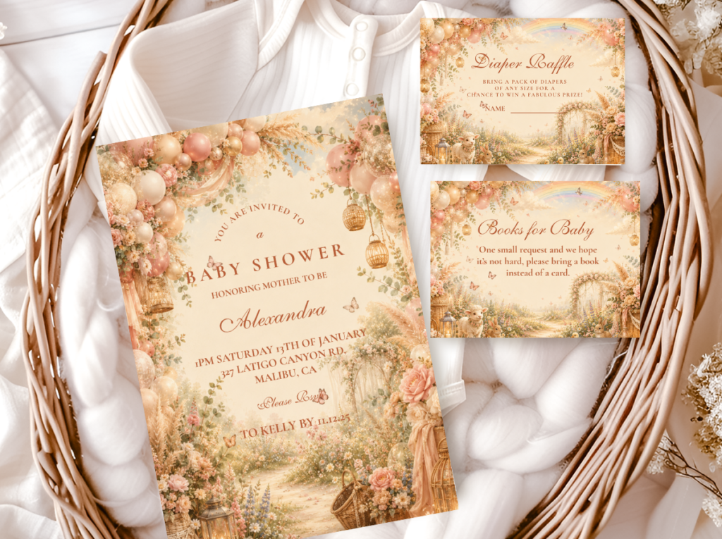
What it is: Dusty rose and warm blush as the primary palette, with sage and warm cream as the botanical accent tones. The butterfly illustration sits in dusty rose and warm blush tones — the same palette as the surrounding botanical material, so the butterfly reads as emerging from the same warm world rather than as a separate illustrative element placed on top of it.
Palette rule: Dusty rose must be warm and slightly peachy — not cool pink, not candy pink, not bright rose. The test: does the pink read as warm and slightly aged, or as bright and saturated? Warm and slightly aged belongs to the Pink Butterfly Boho palette. Bright and saturated does not, regardless of how softly the butterfly is drawn.
The Pink Butterfly Boho direction is the most feminine and the most Pinterest-consistent of the two directions — the dusty rose palette paired with a watercolour butterfly illustration produces the specific quality of a warm, romantic, specifically designed celebration rather than a pink-themed party. It pairs naturally with the Pink Boho stationery collection and with the decor elements of any pink boho direction: dried rose botanical arrangements, dusty rose linen, terracotta accent vessels.
Most Nature-Forward
Wildflower Butterfly Boho
Dusty Rose · Sage · Soft Lavender · Warm Yellow · Cream
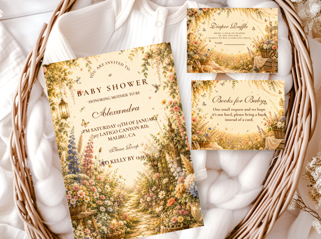
What it is: A full muted wildflower meadow palette, with the butterfly illustration appearing to emerge directly from the botanical elements rather than sitting apart from them as a distinct motif. The butterfly here is part of a living scene — landing among wildflowers and botanical stems — rather than a transformation symbol placed against a plain or decorative background.
Palette rule: Every colour in the wildflower palette must sit at the same muted saturation level — the same rule that governs the Classic Meadow direction in the wildflower boho article. The butterfly illustration must also sit at this saturation level: a bright or heavily saturated butterfly in a muted wildflower palette reads as a motif from a different palette applied to the arrangement rather than as a natural element within it.
The Wildflower Butterfly Boho direction is the most joyful and the most specifically nature-forward of the two — the butterfly emerging from a full meadow botanical scene communicates the transformation symbolism most completely, because the butterfly is surrounded by the living world it belongs to. Because the palette carries more colour variety than the pink direction, the butterfly illustration can afford to be slightly more visually present within the composition without overwhelming the room.
✨ Styling Tip
Butterfly boho decor works best when butterflies appear to land on botanical elements — on the centrepiece arrangement, on the cake, on the welcome sign — rather than floating independently against a plain background or wall. Landing butterflies read as part of the natural world: they have arrived somewhere, they have chosen a surface, they belong where they are. Floating butterflies read as decoration — as objects placed by a person rather than as creatures from the natural world. The landing-versus-floating distinction applies to every butterfly element at the shower: in the illustration on the invitation, in the paper butterfly accents on the arch, and in the cake topper.
Section 03 Butterfly Boho Decor, Cake & Table
The butterfly motif does its best work when it appears once per zone — once on the arch, once on the centrepiece, once on the cake — rather than repeatedly on every surface. Restraint with a single motif communicates considered design; repetition on every surface communicates a theme applied. The botanical elements carry the boho aesthetic at the room scale; the butterfly provides the specific symbolic detail that makes this shower distinctly its own.
Arch & Backdrop
Dried botanical arch with one or two butterfly accents landing among the greenery
A dried botanical arch in the shower’s palette direction — pampas grass, dried eucalyptus, dried florals, dried grasses — assembled asymmetrically in the standard boho arch format. One or two paper or dried botanical butterfly accents wired into the arch at irregular positions, appearing to have landed among the botanical material rather than placed symmetrically within it. No butterfly garland, no butterfly banner, no repeating butterfly print across the arch surface — one or two landing-quality butterfly accents within a full botanical arch reads as specifically designed. More than three reads as a butterfly theme applied to a boho arch.
Centrepiece
Botanical centrepiece with a single butterfly detail — the motif as accent, not hero
A standard boho centrepiece in the shower’s palette direction — dried botanical arrangement in a rattan or terracotta vessel, three height levels, odd number of primary stems, one element overhanging the vessel rim — with one paper or wire butterfly accent positioned landing on the tallest stem or tucked among the mid-level botanical material. The butterfly is one element in the centrepiece, not the centrepiece’s purpose. Guests should notice the centrepiece first and the butterfly second. If the butterfly is noticed first, it is too large or too prominently positioned.
Cake
Semi-naked buttercream with paper or sugar-work butterfly topper — never plastic
A semi-naked buttercream in warm ivory or oatmeal (70% exposed sponge, 30% buttercream). The topper: a paper butterfly or a sugar-work butterfly — paper in the watercolour print of the invitation’s illustration style; sugar-work in the same muted palette as the cake icing. The butterfly should appear to be landing on a small dried botanical cluster at the top of the cake rather than mounted on a wire spike protruding from the centre. Never a plastic butterfly topper — plastic breaks the organic aesthetic at the single most photographed moment of the shower. A plastic butterfly on a beautiful semi-naked boho cake reads as a children’s birthday party cake placed inside the boho room.
Favours & Guest Book Table
Light botanical touch rather than repeated butterfly motif
Favour tags and guest book table elements carry the butterfly motif most appropriately in the stationery illustration style — a small watercolour butterfly printed on a kraft tag beside a botanical element, not a standalone butterfly stamp repeated across every surface. The favour tag in the Butterfly Boho illustration style ties the favour directly to the invitation and the welcome sign within the same designed world. Favour packaging in kraft paper and natural twine belongs to the boho material vocabulary; a butterfly-printed cellophane bag does not.
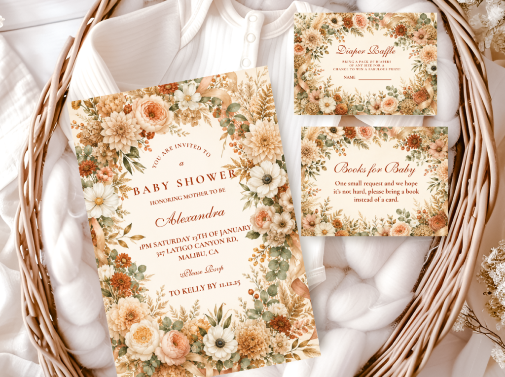
The Floral Boho collection carries warm botanical table stationery — place cards and coordinated suite elements that belong to the same organic world as the butterfly boho palette.
Section 04 Invitations & Stationery
The invitation is the one place the butterfly motif gets to appear at full strength — because it is the single dedicated stationery moment when the butterfly earns its full illustration presence. A watercolour butterfly resting on a botanical branch, printed on warm ivory card stock with calligraphy-style script in warm brown, signals the entire aesthetic in one glance: warm, organic, symbolic, and specifically boho. A glittered or cartoon butterfly on bright white card stock signals something closer to a party supply aisle.
Whichever direction the shower follows — the feminine warmth of Pink Butterfly Boho or the nature-forward scene of Wildflower Butterfly Boho — the invitation should show the butterfly landing on or emerging from a botanical element rather than floating alone on the page. That consistency between the first piece of paper a guest opens and the room they walk into on the day is what makes the whole theme read as considered rather than assembled from separate sources. Even the envelope liner and the wax seal are worth checking against the same watercolour-only rule — a glittery sticker closure on an otherwise elegant invitation breaks the aesthetic before the card is read.
Primary
Butterfly Boho
Watercolour butterfly in warm palette — the defining stationery direction for this theme.
Most Feminine
Pink Boho
Dusty rose and warm blush — the primary palette stationery for Pink Butterfly Boho direction.
Most Joyful
Wildflower Boho
Loose warm meadow illustration — botanical world for the Wildflower Butterfly direction.
Most Abundant
Floral Boho
Warm dried floral botanical — romantic table stationery alongside the butterfly motif.
Most Editorial
Botanical Boho
Deep sage and warm ivory — refined botanical for a more minimal butterfly boho direction.
Earthy Base
Boho General
Classic terracotta and oatmeal — the warm earthy foundation for any butterfly boho direction.
Frequently Asked Questions
How do I make butterfly boho look elegant instead of childish?
Two decisions applied simultaneously. First: watercolour illustration only — soft edges, muted colour, visible brushstroke quality, the butterfly rendered as a painted creature from the natural world rather than as a clip-art or glitter graphic. Second: the butterfly must appear to land on botanical elements rather than float independently. A landing watercolour butterfly on a botanical branch on the invitation, on a dried botanical arch accent, and on a semi-naked cake topper reads as elegantly boho at every scale. A floating cartoon or glitter butterfly in the same positions reads as a children’s party theme at the same scale. The distinction is entirely in the illustration quality and the landing-versus-floating placement, not in the butterfly shape itself.
What colours work for butterfly boho?
Two palette directions: Pink Butterfly Boho (dusty rose and warm blush as the lead colours — warm and slightly peachy, never bright or cool-toned; sage and warm cream as the botanical accent); and Wildflower Butterfly Boho (a full muted meadow palette of dusty rose, sage, soft lavender, warm yellow, and cream, all at the same muted saturation level). In both directions: no bright, saturated, or glitter-toned colours. The butterfly illustration must sit at the same muted saturation level as the surrounding palette — a more saturated butterfly in a muted palette reads as a motif from a different world applied to the arrangement. Bright, metallic, or glitter treatments belong to a different aesthetic register from boho.
Can butterfly boho work for a boy shower?
Yes — by pairing the same watercolour butterfly illustration with a deeper, more neutral botanical palette: deep olive green, warm brown, and antique gold in the woodland boho palette family, with the butterfly rendered in warm cream or dusty sage tones rather than in dusty rose. The butterfly in a woodland or botanical palette direction reads as a natural creature from the forest world rather than as a feminine motif — because the specific combination of warm, muted, natural colours removes any gender coding from the shape. The illustration quality rule (watercolour, soft edges, landing on botanicals) remains unchanged; only the palette direction shifts.
Bring the Theme Together
Butterfly Boho Baby Shower Stationery
Watercolour butterfly in warm botanical palette — invitations, welcome signs, and favour tags in the illustration style that makes the motif work.